In a world where logos are the face of brands, creativity plays a crucial role in capturing attention. Twenty creative graphic design logos stand out not just for their imagery, but also for the stories they tell. These logos reflect innovation and thought, showcasing how design can communicate values and connect with an audience.
As viewers, people often glance at logos but may not realize the thought and artistry behind them. Every curve, color, and shape is chosen to create a lasting impression. Through this exploration of inventive logos, readers will uncover how effective design can elevate a brand’s presence and spark curiosity.
1) Negative Space Logos: Clever use of hidden shapes
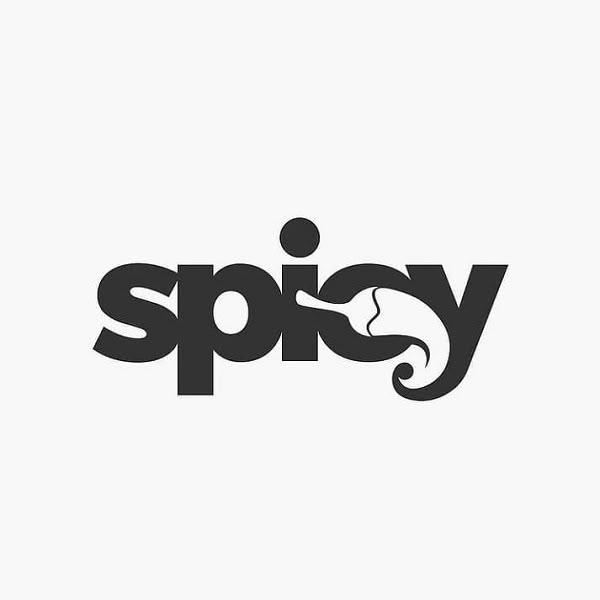
Negative space logos use empty areas to form recognizable shapes. This clever design technique engages viewers by revealing hidden images. These logos often have a double meaning, which adds depth.
For example, the famous FedEx logo uses negative space to create an arrow between the letters. This arrow symbolizes speed and precision, essential values for the company.
Another example is the logo for the World Wildlife Fund. It features a panda created with negative space. The simple design highlights the animal while emphasizing conservation.
Designers find that using negative space makes logos memorable. It encourages people to look closer and appreciate the cleverness in the design. This technique shows how effective simplicity can be in logo design.
Negative space logos are not just visually appealing; they also tell a story. By hiding shapes in plain sight, brands can communicate their messages in an engaging way.
2) Geometric Logos: Modern minimalistic shapes
Geometric logos use simple shapes like circles, squares, and triangles. This style emphasizes clarity and clean lines. Many brands prefer this approach for its visual impact.


Minimalism in design makes these logos stand out. Fewer elements create a stronger impression. They focus on basic shapes to convey messages effectively.
Geometric logos are often versatile. They work well in different sizes and formats. This adaptability makes them suitable for digital and print media.

A good color palette enhances geometric logos. Simple colors can make designs more memorable. Bright tones or pastels often add to their appeal.
The trend of geometric logos has roots in early 20th-century design. Artists wanted to simplify visuals while still expressing ideas. Today, this style continues to influence modern graphic design.
3) Hand-Drawn Logos: Organic and Personal Touches
Hand-drawn logos offer a unique charm that sets them apart. They bring a sense of warmth and individuality to any brand. These logos often reflect the artist’s style, making them personal.
Using sketches and illustrations adds character. They can feel more relatable than digital designs. This approach can connect better with audiences who appreciate authenticity.
Many businesses choose hand-drawn logos to express creativity. These logos can evoke nostalgia. They remind people of craftsmanship and personal attention.
Hand-lettered designs are also popular. They showcase the beauty of letters and can fit various brands. These designs resonate well in environments that value tradition.
Incorporating hand-drawn elements can strengthen brand identity. It makes logos stand out in a crowded market. When done right, these logos tell a story about the brand’s values and mission.
4) Monogram Logos: Elegant initials combinations
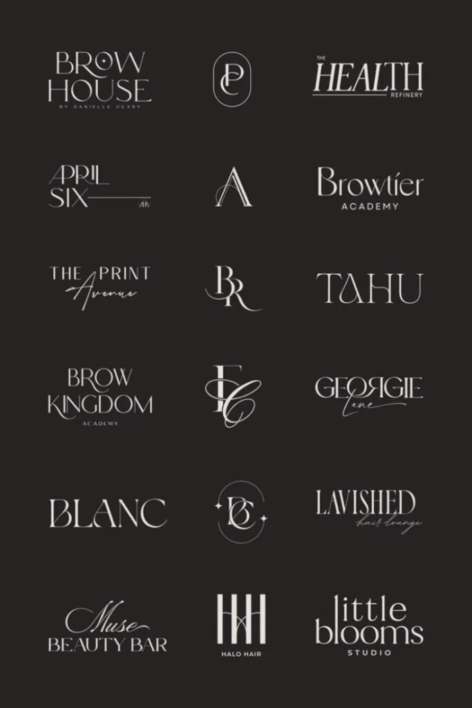
Monogram logos are a stylish way to represent a brand. They combine two or more initials into a single design. This creates a unique mark that stands out.
Many famous brands use monograms to show their identity. These logos are often seen as classy and sophisticated. They can be simple or intricate, depending on the brand’s style.
Graphic designers focus on the balance of letters in monograms. They ensure that the letters flow together well. Colors and fonts also play a huge role in the final look.
Monograms work great for luxury brands. They often use elegant scripts or bold fonts to create an impression. A well-designed monogram can make a brand feel more memorable.
Incorporating negative space can enhance a monogram’s design. It allows for creativity and originality. Monograms are not just letters; they tell a story about the brand.
5) Vintage Logos: Nostalgic and Timeless Designs


Vintage logos often bring a sense of nostalgia. They connect people to memories of the past and evoke emotions linked to simpler times. These designs use classic elements that remain appealing.
Designers frequently employ retro color schemes and typography. This choice highlights elements that were popular in earlier decades. Logos from brands like Coca-Cola and Ford exemplify this trend.
Vintage logos attract attention in advertising and branding. They use familiar visuals that consumers recognize and trust. This familiarity can foster loyalty among customers.
Many designers modernize vintage logos for today’s market. They refresh these designs while keeping the original charm. This blend of old and new keeps logos relevant and eye-catching.
The appeal of vintage logos lies in their ability to tell stories. Each logo often reflects its brand’s history and heritage. This storytelling aspect adds depth that resonates with audiences.
6) Wordmark Logos: Custom Typography Focus
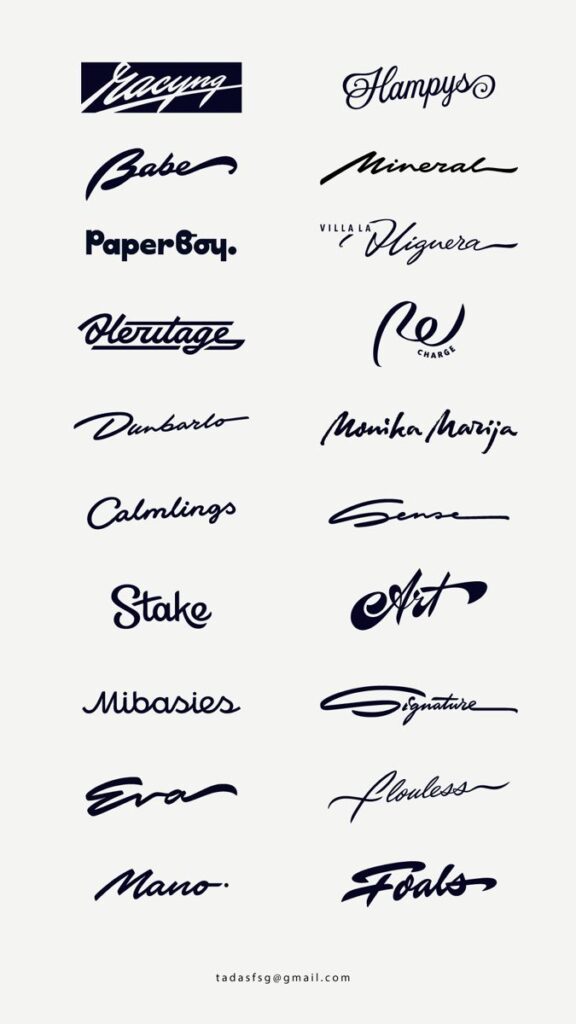
Wordmark logos use custom typography to create a unique identity. They focus on the name of a brand, turning it into a memorable visual. This style highlights the text itself, making it a key element of the logo.
Designers often choose specific fonts or create new ones to match a brand’s personality. For instance, the Google logo uses simple, clean type to convey approachability. Meanwhile, the Coca-Cola logo features flowing script, suggesting tradition and quality.
Invisible elements play a large role in wordmark logos. The spacing, alignment, and size of letters can affect how a brand is perceived. Small tweaks can evoke feelings of elegance, fun, or trust.
Wordmark logos are often versatile. They can appear on various backgrounds and adapt to different media. Brands like Visa and eBay prove that effective typography can stand alone and be easily recognized.
7) Mascot Logos: Playful Character Branding
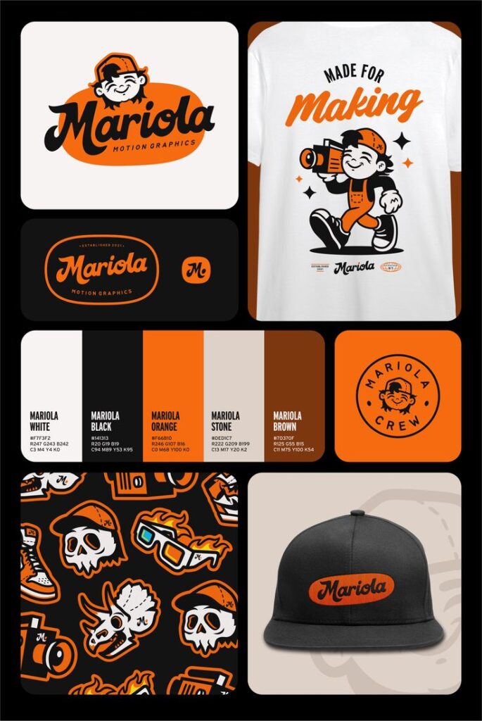
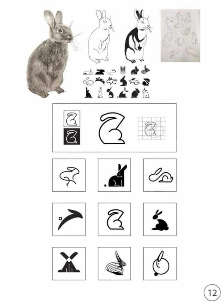
Mascot logos are a fun and engaging way for brands to connect with their audience. These logos often feature a character, giving a friendly face to a company’s identity.
Characters can create a sense of trust and familiarity. A playful mascot can appeal to both children and adults, making the brand more memorable.
Examples include cartoon animals or people that represent the brand’s values. They can be used in advertising, merchandise, and on social media to promote a friendly image.
Designing an effective mascot involves understanding the target audience. The character should reflect the brand’s personality and mission in a way that resonates with customers.
Mascot logos can also enhance brand storytelling. They can embody the brand’s message, making it easier for consumers to relate to the company.
These logos thrive on creativity. The more unique and engaging the character, the more likely it is to stand out in a crowded market.
8) Abstract Logos: Unique conceptual visuals
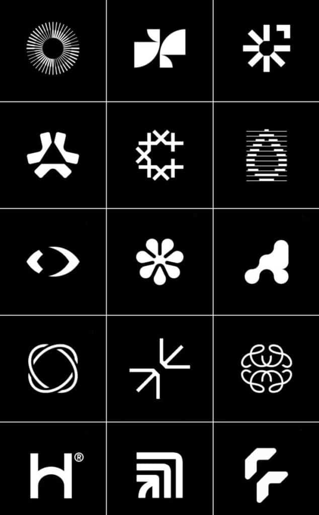

Abstract logos use shapes and colors to create a distinct identity. They often avoid direct representation and focus on conveying ideas or emotions.
These logos can spark curiosity and invite interpretation. This quality encourages viewers to engage with the brand in a personal way.
Designers mix various elements creatively. This approach helps form unique visuals that stand out in a crowded market.
Some popular brands use abstract logos effectively. These logos become memorable by representing the brand’s core values without being literal.
Abstract logos often rely on balance, contrast, and harmony. These design principles enhance the visual impact and make the logos appealing.
The beauty of abstract logos lies in their versatility. They can fit various industries, from tech to art, making them suitable for many businesses.
9) Gradient Logos: Smooth color transitions


Gradient logos use smooth color transitions to create depth and interest. They often combine two or more colors to form a seamless blend. This technique adds a modern touch to logos.
Many brands are turning to gradients for their visual appeal. The smooth shift between colors can evoke a feeling of movement and growth. This style is popular in digital design, especially for apps and websites.
Using gradients can make a logo stand out. It helps in catching the eye of the viewer. A well-executed gradient logo can convey sophistication and creativity.
When designing with gradients, it’s important to choose colors that complement each other. The right choices can enhance brand identity. Subtle gradation can provide a softer look, while bold transitions can add energy.
Gradient logos can work well in various applications. They adapt nicely from online platforms to printed materials. This versatility makes them a favorite among many graphic designers.
10) Letterform Logos: Single Letter Symbols

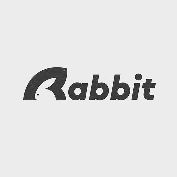
Letterform logos focus on a single letter as a design element. These logos can effectively represent a brand’s identity with simplicity. Using one letter creates a strong visual impact.
Many brands choose letterform logos because they are memorable. A well-designed letter can stand out and leave a lasting impression. It can be both simple and stylish.
Designers often play with typography when creating letterform logos. They might use bold styles or unique shapes to enhance recognition. These logos can also adapt to various sizes and uses.
Some popular examples include the letter “M” for McDonald’s and “G” for Google. Each logo captures the brand’s essence through clever design. Letterform logos can also convey a sense of professionalism and trust.
In graphic design, single letter symbols show creativity and thoughtfulness. They highlight how less can be more in logo design. A great letterform logo invites curiosity and connects with its audience.
11) Emblem Logos: Badge-like structured designs
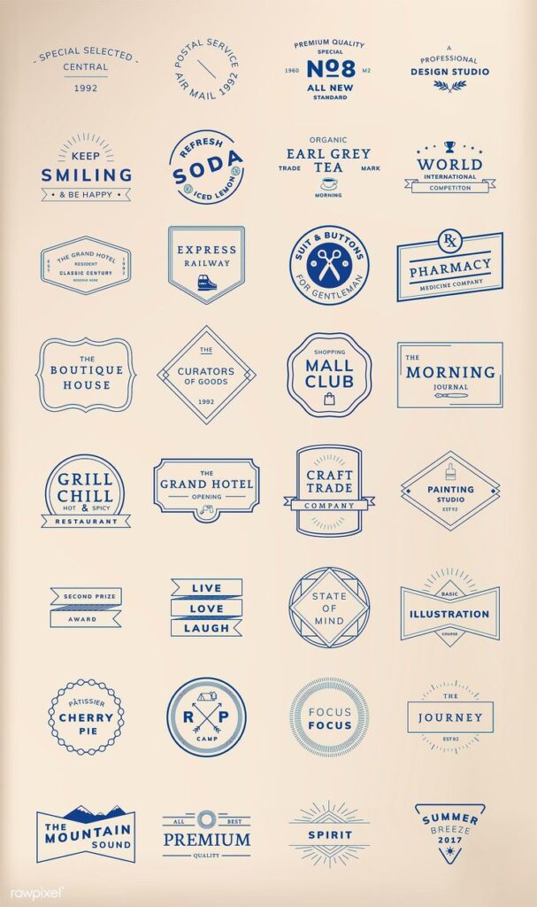
Emblem logos feature a badge-like design that combines text and imagery in a unified shape. These designs often evoke tradition and authority, making them popular for universities and organizations.
These logos typically encase the elements within a circle or shield. This structure gives them a formal appearance that enhances brand identity.
Emblems can be intricate, with detailed graphics that tell a story. They often symbolize heritage and values, attracting a loyal audience.
Many famous brands use emblem logos to convey trust and reliability. Sports teams and educational institutions frequently adopt this style to instill pride and connection.
Overall, emblem logos stand out for their classic look and meaningful symbols. They effectively communicate a brand’s mission while being visually appealing.
12) Line Art Logos: Fine, intricate outlines
Line art logos use thin, clean lines to create detailed shapes and forms. These designs focus on simplicity and elegance, often featuring only outlines without filled colors.
Artists and designers appreciate line art for its ability to convey ideas clearly. The intricate details in these logos allow for unique visual identities.
Many brands choose line art logos for their modern and sophisticated look. They work well in both digital and print formats, making them versatile for various uses.
Line art can also suggest movement and flow, drawing the viewer’s eye. This style helps brands stand out while maintaining an elegant aesthetic.
Overall, line art logos provide a creative way to express brand values. They invite viewers to engage with the design, sparking curiosity and interest.
13) 3D Logos: Depth and Realistic Effects
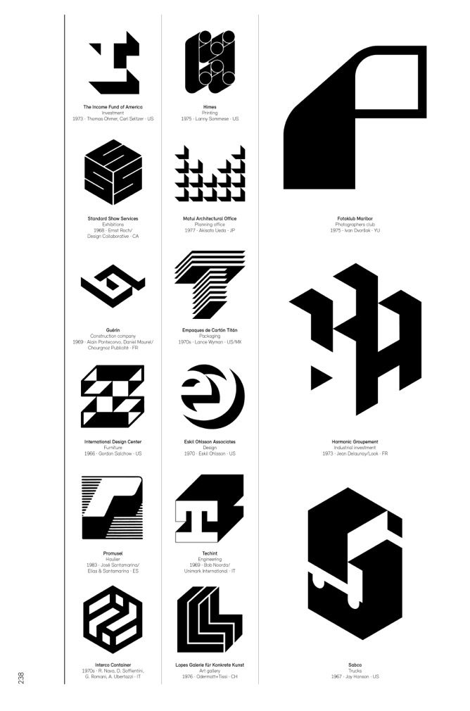
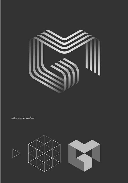
3D logos offer a unique visual impact that attracts viewers. They create an illusion of depth, making logos stand out more than traditional designs. This depth can make a logo feel more dynamic and engaging.
Using shading and highlights gives a logo a realistic effect. Designers can make logos appear as if they are three-dimensional objects. This technique adds interest and can communicate a brand’s modernity.
Many companies choose 3D logos to convey innovation. The visual depth can symbolize growth and forward-thinking. They can also evoke feelings of trust, as realistic designs often feel more approachable.
Effective use of space and light in 3D logos enhances their appeal. When done right, these elements draw the eye and make the logo memorable. Brands like Sony and NBA utilize 3D logos to great effect, showcasing their identity in a vibrant way.
Incorporating 3D elements can make a logo feel fresh. These designs can adapt well to different mediums, from print to digital. Overall, 3D logos can effectively enrich a brand’s image.
14) Flat Design Logos: Simple and Bold Colors

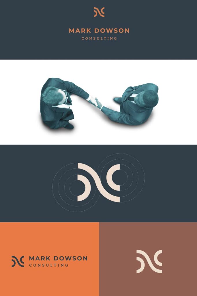
Flat design logos use minimalistic elements to create a clean look. They often avoid gradients and complex textures, focusing on simple shapes. This method makes logos easy to recognize and memorable.
Bold colors are a key part of flat design. Bright, striking hues create strong visual impact. They help logos stand out in a crowded market.
This style has gained popularity due to its versatile nature. Flat design looks good on both digital and print media. It adapts well to various backgrounds, making it flexible for different uses.
Many brands choose flat design to convey modernity and clarity. Companies want to show that they are innovative and approachable. This makes flat logos a popular choice for startups and tech companies.
Overall, flat design logos combine simplicity with strong colors to create effective brand identities. They reflect a trend toward clear and direct communication in design.
15) Responsive Logos: Adaptable on all devices

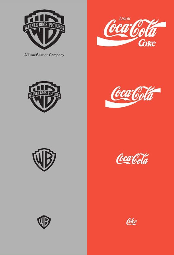
Responsive logos are designed to look good on any device. They adjust their size and shape based on the screen they appear on. This helps brands maintain a strong identity across all platforms.
With the rise of smartphones and tablets, it’s important for logos to be clear and recognizable. A responsive logo can be simplified for smaller screens while keeping the core brand elements intact. This flexibility allows brands to reach more customers.
Many companies are now using responsive logo designs. This trend helps brands stay relevant in a digital age. It also shows that a company values user experience by ensuring its logo is effective everywhere.
Responsive logos can improve brand visibility. They make a logo more appealing and functional on websites, apps, and social media. As technology evolves, responsive logos will continue to be a key part of graphic design. Brands that invest in this approach show their commitment to quality and innovation.
16) Negative Space Animal Logos


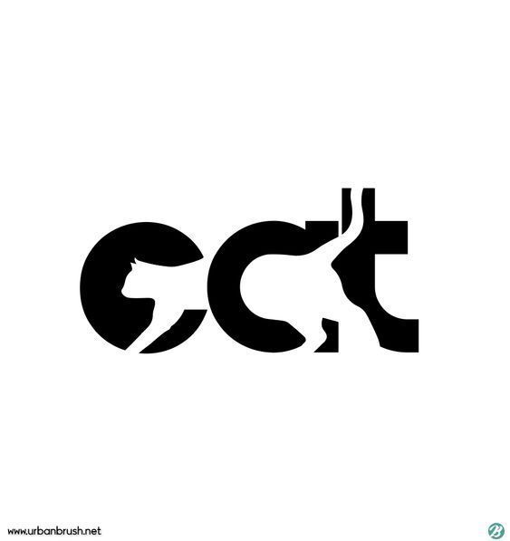
Negative space animal logos use the space around and between images to create hidden shapes. This technique adds depth and intrigue to designs.
For example, a logo might use the shape of a lion’s face while also forming a complementary shape of a paw. This clever use of space captures attention and encourages viewers to look closer.
Another notable design is the use of a bird silhouette that also outlines a tree. This approach creates a strong visual connection between the animal and its habitat.
Logos like this stand out because they are simple yet memorable. They encourage creativity in both design and interpretation.
Brands often prefer these logos because they convey more than one idea. The dual meaning can represent values like strength, freedom, or nature, making them versatile for various businesses.
Overall, negative space animal logos showcase how creative thinking can lead to impactful design. They remind viewers of the beauty in simplicity and cleverness in visual storytelling.
17) Double Exposure Logos: Overlapping Imagery
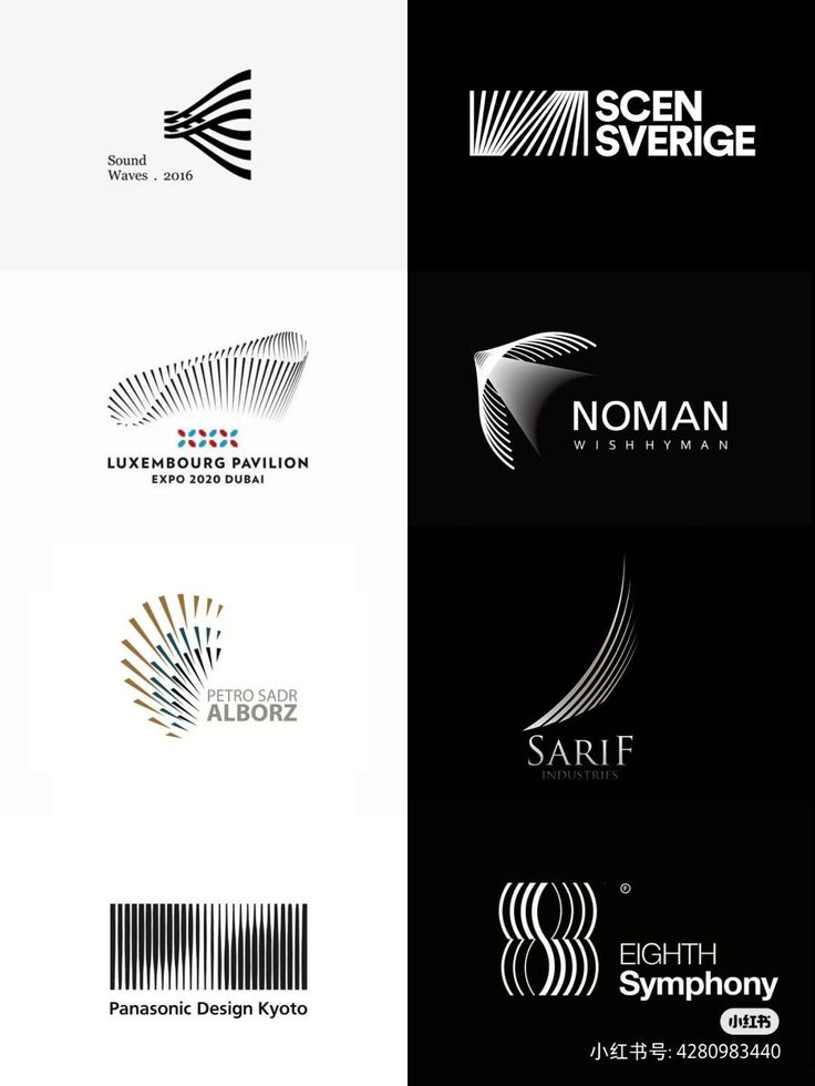
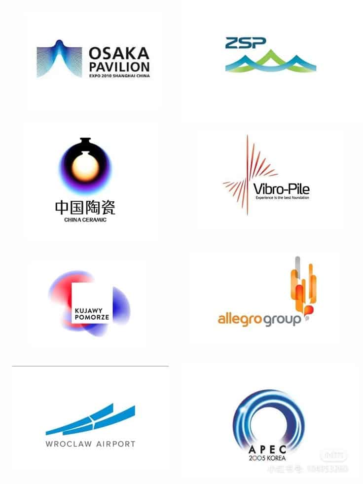
Double exposure logos combine two images into one design. This technique creates a unique visual effect that captures attention. The overlapping imagery tells a story or represents various aspects of a brand.
These logos can show the connection between a product and its message. For example, a mountain range might blend with a silhouette of a hiker. This could suggest adventure and exploration.
Designers often choose images that have a strong contrast. This helps both visuals stand out while merging smoothly. Color choices also play a vital role. Bright colors can make the design pop, while muted tones create a softer look.
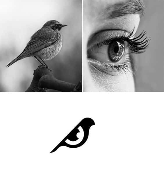

Double exposure logos are highly creative, allowing for personal interpretation. This opens opportunities for brands to express their identity in a memorable way. By using this style, designers can craft logos that are not only beautiful but also meaningful.
18) Minimalist Typography Logos


Minimalist typography logos focus on simplicity. They use clean lines and clear fonts to convey a message without distractions.
These logos often prioritize legibility, making sure the brand name is easy to read. Color choices are typically limited, enhancing the logo’s clarity.
Many brands embrace this style for its modern feel. Minimalist typography can create a powerful visual impact.
Famous examples include popular tech companies. Their logos demonstrate how less can be more in design.
The Bauhaus movement greatly influenced this approach. Its emphasis on functional design paved the way for minimalist styles.
Overall, minimalist typography logos work well across various platforms. They are easy to recognize and remember, making them effective for branding.
19) Iconic Logo Redesigns That Inspire
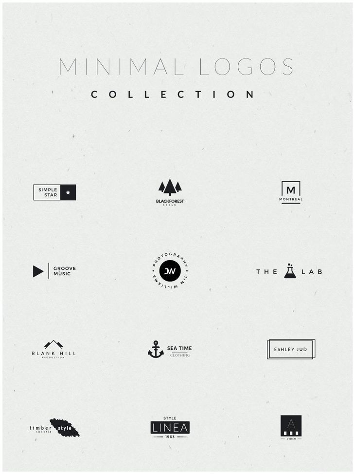

Logo redesigns can breathe new life into brands. They reflect changes in culture, style, and focus. Famous examples show how a logo update can inspire and attract new audiences.
A great example is the Starbucks logo. The company simplified its design over the years, focusing more on the siren symbol. This change made the logo more modern and recognizable.
Another inspiring redesign is the Apple logo. Originally a complex image, it transformed into a simple, sleek design. This shift matched Apple’s focus on clean, user-friendly technology.
The Airbnb logo is another notable example. It combines a heart and a location marker. This design communicates a sense of belonging and community, making it memorable.
Lastly, the rebranding of McDonald’s showed a fresh take on their classic logo. The iconic golden arches maintain their core shape but have updated colors that feel modern. This helps the brand stay relevant while keeping its strong identity.
These redesigns illustrate how updating a logo can inspire and connect with people. Each change plays a role in telling a brand’s story.
20) Nature-Inspired Logos
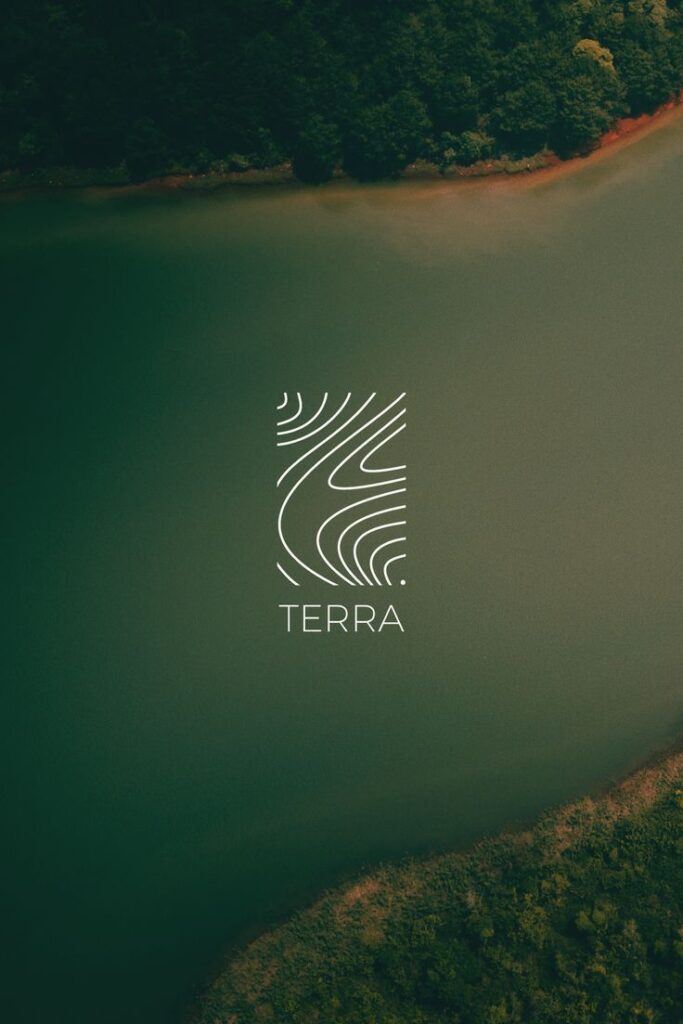
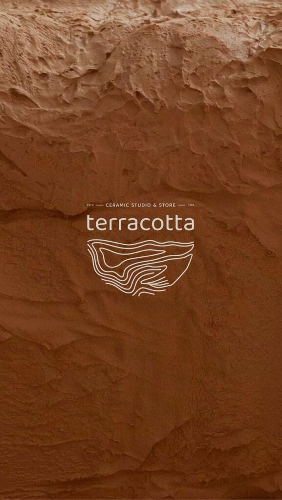
Nature-inspired logos use elements from the natural world to create unique designs. These logos often feature plants, animals, or landscapes that connect the brand to nature.
Many designers take color palettes from nature. Natural greens, blues, and earth tones help convey feelings of calm and sustainability. This approach appeals to eco-conscious consumers.
Shapes inspired by nature can also be effective. Curved lines that mimic leaves or waves can create a sense of movement. This reflects the brand’s connection to the environment.
For example, a logo shaped like a tree can symbolize growth and stability. Similarly, a logo featuring water can represent clarity and life.
Nature-inspired logos are particularly popular among businesses focused on health, wellness, and sustainability. They can help brands stand out in competitive markets.
Combining images from nature with clean typography often enhances the logo’s visual impact. This method makes the logo memorable and engaging.
Key Elements of Creative Graphic Design Logos
Creative graphic design logos rely on specific elements to communicate a brand’s identity effectively. Among the most important are color choices and typography, both of which can greatly influence how a logo is perceived.
Color Theory and Brand Identity
Color plays a critical role in logo design. It can evoke emotions and signal brand values. For instance:
- Red: Excitement, energy, passion
- Blue: Trust, calmness, professionalism
- Green: Growth, nature, health
- Yellow: Optimism, clarity, warmth
Choosing the right color can enhance brand recognition. Brands often use 2-3 colors that reflect their personality. It’s essential to consider color combinations. For example, contrasting colors can make a logo stand out. Simple color palettes are usually more memorable.
Many designers also look at how colors appear in digital and print formats. Testing colors in different contexts helps ensure they convey the intended message. Being mindful of cultural meanings is also important since colors can carry different connotations in various cultures.
Typography Choices in Logo Design
Typography significantly impacts logo effectiveness. The choice of font sets the tone for the brand. Major categories include:
- Serif Fonts: Classic, trustworthy, formal
- Sans-Serif Fonts: Modern, clean, friendly
- Script Fonts: Elegant, creative, personal
The font should match the brand’s style and values. For instance, a tech company might choose a sleek sans-serif font to convey innovation. On the other hand, a luxury brand might opt for an elegant serif typeface.
Readability is another key factor. A font that is hard to read can confuse potential customers. Logos should be recognizable at any size. Therefore, testing fonts in various sizes ensures clarity.
Incorporating unique typographic elements, like customized letters, can also enhance originality. Consistency in font use across branding materials helps reinforce brand identity.
Trends Shaping Modern Logo Creativity
Modern logos reflect creativity through distinct trends. Two main influences on logo design today include minimalism and the effective use of negative space. Both methods attract attention, communicate messages clearly, and enhance brand identity.
Minimalism in Logo Concepts
Minimalism focuses on simplicity and functionality. Designers create logos with fewer elements, which makes them easy to recognize. A minimalist logo often uses basic shapes and limited colors. This clarity helps brands stand out in a crowded market.
For example, consider the famous Apple logo. Its simple silhouette is unforgettable. Minimalist designs work well across various platforms, from websites to business cards.
Benefits of Minimalism:
- Enhances recognition.
- Reduces distractions.
- Adapts easily to different applications.
Many brands adopt minimalism to convey sophistication. A clean logo can create a strong impression, making a brand appear modern and trustworthy.
Use of Negative Space
Negative space involves using the area around and between the main subjects in a logo. This technique creates hidden meanings and adds depth to the design. Clever use of negative space can make logos more engaging and memorable.
An example is the FedEx logo, which includes an arrow formed by the letters. This subtle detail emphasizes speed and precision.
Advantages of Negative Space:
- Sparks viewer curiosity.
- Allows for clever design elements.
- Adds layers of meaning.
Designers leverage negative space to create unique identities for brands. This approach makes logos visually intriguing while enhancing storytelling.
- 24.4Kshares
- Facebook0
- Pinterest24.4K
- Twitter3
- Reddit0

