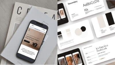
Coffee shop logos do a lot of work in a tiny space. They have to feel warm on a cup, clear on a street sign, trustworthy on a delivery bag, and memorable when someone sees the cafe name for two seconds on social media.
The strongest cafe logo ideas are not just pretty marks. They choose one promise, such as slow specialty coffee, quick takeaway, neighborhood comfort, or bakery-style sweetness, and turn it into a shape, type style, and color system people can recognize.
Use the examples below as a practical gallery. Look at the logo itself, then check how it behaves on cups, signs, packaging, fonts, photos, and full cafe branding systems.
- Coffee Shop Logos: Quick Design Checklist
- Cafe Logo Ideas from the Gallery
- What Makes a Coffee Shop Logo Work?
- Key Elements of Effective Coffee Shop Logo Design
- Popular Coffee Shop Logo Styles
- Coffee Shop Branding Assets to Prepare
- Design Resources for Better Cafe Logos
- Common Coffee Logo Mistakes to Avoid
- Coffee Shop Logo FAQ
Coffee Shop Logos: Quick Design Checklist
A good coffee shop logo is simple enough to read quickly, specific enough to feel ownable, and flexible enough to work across cups, signs, menus, packaging, and digital profiles. Start with one clear symbol or wordmark, test it in one color, then build the warmer brand details around it.
| Logo decision | What to check | Why it matters |
|---|---|---|
| Main mark | Cup, bean, initials, badge, abstract symbol, or wordmark | The mark has to be understood before the customer reads a full menu. |
| Typography | Readable from a sign, cup sleeve, and social avatar | A beautiful cafe name fails if the letters collapse at small sizes. |
| Color palette | Warm neutrals plus one useful accent | Coffee branding needs appetite, contrast, and enough difference from local competitors. |
| Applications | Cup, bag, sign, sticker, menu, website, and profile image | A logo that only works on a flat mockup is not ready for a working cafe. |
| File package | SVG, AI/EPS, PNG, JPG, one-color, reversed, icon-only | The team needs clean files for print, web, signage, and vendors. |
Cafe Logo Ideas from the Gallery
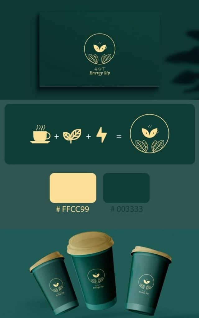
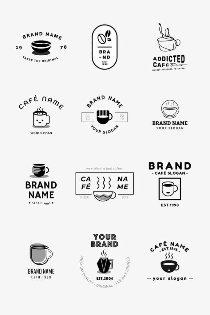
The first two examples show opposite but useful directions: a bright modern takeaway mark and a set of vintage badges. One feels fast and energetic; the other feels established and nostalgic. Neither direction is automatically better. The right choice depends on the cafe’s menu, price point, neighborhood, and customer rhythm.
For a new shop, write down three words before choosing a style. A logo for a quiet roastery might need restraint and craft. A student-friendly espresso bar might need bolder color and faster recognition. A bakery cafe might need softer lettering and more packaging warmth.
What Makes a Coffee Shop Logo Work?
A coffee shop logo works when the customer can understand it at a glance and remember it later. That sounds simple, but cafes often make the mark carry too many jobs: cup, bean, steam, slogan, established date, city name, and decorative border all fighting for attention.
The better route is to choose one hero idea. It might be a clean wordmark, a cup silhouette, a hand grinder, a leaf, a monogram, a badge, or a custom illustration. Everything else should support that idea instead of competing with it.


Logo Systems Beat One-Off Marks
The Vietnamese coffee and carrier examples show the difference between a logo and a usable identity. A cafe needs the mark to travel across paper, cardboard, signage, cards, merchandise, and social content. If each application feels related, the shop looks more professional before a customer even tastes the drink.
Key Elements of Effective Coffee Shop Logo Design
The core elements are shape, type, color, contrast, and application. A beautiful sketch still needs production discipline: the line weight must print cleanly, the name must be readable, and the color version must still make sense in black and white.



Color Palettes for Coffee Branding
Coffee palettes often start with brown, cream, black, deep green, burgundy, or warm yellow because those colors feel close to roast, warmth, and hospitality. The risk is sameness. If every nearby cafe uses the same espresso brown, a controlled accent color can do more for memory than another bean icon.
For deeper palette work, pair this article with Sky Rye Design guides on colors for your logo design and broader color palette inspiration. Keep the accent color strong enough for signage, but not so loud that it fights with food and drink photography.


Typography for Cafe Logos
Typography decides the voice of the cafe. A geometric sans serif can feel modern and efficient. A serif can feel editorial or premium. A script can feel handmade, but only if the shop name remains readable when printed small on a cup lid, loyalty card, or sticker.
If you are still shaping the mark, compare the basics of logo design principles with more general logo design ideas for business. Those broader rules help prevent a charming cafe concept from becoming hard to use.


Icons: Cups, Beans, Steam, Leaves, and Abstract Marks
A cup or bean can work because people understand it immediately. The challenge is making it yours. Change the proportion, line rhythm, negative space, letter integration, or surrounding badge shape before adding more symbols.
A more restrained direction can come from studying a minimalist logo, while a fuller concept may need the discipline in logo design principles every beginner should know. In cafe branding, simplicity usually wins because the logo appears on small, curved, textured surfaces.


Popular Coffee Shop Logo Styles
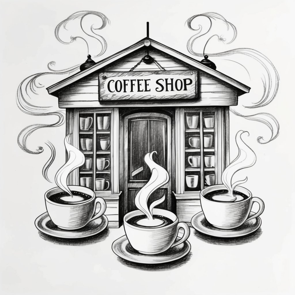
Most coffee shop logo ideas fall into a few families: minimalist, vintage, rustic, premium roastery, playful bakery cafe, organic, and bold takeaway. The style should come from the actual customer experience, not from whatever looks fashionable in a template gallery.
Modern Minimalist Coffee Shop Logos
Minimalist coffee logos use fewer lines, fewer colors, and stronger spacing. They are often the safest choice for specialty cafes because the mark feels clean on bags, cups, web headers, uniforms, and small labels.

Vintage and Retro Cafe Logos
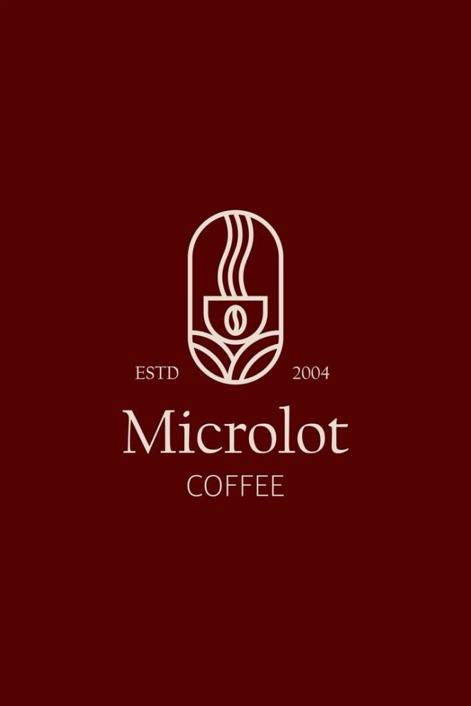
Vintage cafe logos lean on badges, serif or script type, established dates, ribbons, and roast-house cues. They work best when the design still has breathing room. Too many decorative parts can make the logo feel like a stock label rather than a real cafe identity.


Brand Systems for Cups, Packaging, and Merchandise
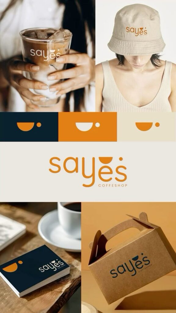
The strongest examples in the gallery show more than a flat logo. They show a system: the same mark on cups, bags, labels, social graphics, signs, and merchandise. This is where a coffee brand starts to feel real.

Coffee Shop Branding Assets to Prepare
Before launch, prepare a small brand kit instead of sending one lonely JPG to every vendor. A cafe usually needs a primary logo, secondary logo, icon, one-color version, reversed version, color palette, type choices, spacing rules, and examples for cups and signs.
If the team is still comparing production routes, Sky Rye Design also has a practical guide to logo maker tools and a behavioral guide on how branding affects customers. Use those after the concept direction is clear, not before.


Photography and Moodboards
Photography should support the logo rather than replace it. Espresso texture, wood grain, pastries, cups, bags, and shop interiors can guide the palette and tone. They also help you spot when a logo feels too cold, too generic, or too far away from the actual cafe experience.
Packaging and Signage Tests
A logo that looks sharp on a white screen may fail on brown kraft paper, matte cups, glass doors, chalk menus, or a backlit sign. Test it in the messier places first. If it survives those surfaces, the digital version will usually be easy.


Design Resources for Better Cafe Logos
Use outside references as checkpoints, not as shortcuts. A good resource helps you test font licensing, palette contrast, trademark risk, and visual originality before the cafe invests in signage or packaging.
- Explore font families on Google Fonts and test the cafe name at sign, menu, and cup-sleeve sizes.
- Build and compare warm palettes with Adobe Color before locking brown, cream, green, or red combinations.
- Use Coolors to check quick palette variations and avoid a one-note coffee-brown brand.
- Review ownership basics through the USPTO trademark basics before printing a logo at scale.
- Compare template conventions on Canva cafe logo templates, then customize enough to avoid a generic look.
- Look at professional presentation styles on Behance coffee logo projects for moodboards and identity systems.
- Check market patterns through 99designs coffee logo inspiration, then deliberately choose what your cafe will not copy.
Common Coffee Logo Mistakes to Avoid
- Using a cup, bean, steam, slogan, city name, and established date all in the same small mark.
- Choosing script lettering that looks beautiful large but becomes unreadable on a cup or social avatar.
- Relying only on coffee-brown without testing contrast against packaging, signage, and interior photos.
- Skipping a one-color version, which vendors often need for stamps, labels, and simple print runs.
- Using a template commercially without checking licensing, font rights, and visual similarity.
- Approving the logo before seeing it on the actual storefront, menu, cups, bags, and profile image.
Coffee Shop Logo FAQ
What makes a good coffee shop logo?
A good coffee shop logo is readable, memorable, and matched to the cafe’s real personality. It should work on a storefront sign, takeaway cup, menu, sticker, and small social profile image without losing the main mark.
Should a cafe logo include a coffee cup or bean?
It can, but it does not have to. Cups, beans, steam, and grinders are easy to understand, while abstract marks, initials, animals, leaves, or building details can feel more distinctive if they still connect to the shop’s story.
What colors work best for coffee shop logos?
Warm browns, creams, greens, black, deep red, and soft neutrals are common because they match coffee, comfort, and natural ingredients. A brighter accent can help a cafe stand out, but the palette should still be legible in print and signage.
How do I make a coffee shop logo look unique?
Start with the cafe’s specific promise: slow mornings, specialty beans, bakery pairings, late-night study tables, or fast takeaway service. Then choose one visual idea and simplify it instead of stacking every coffee symbol into one mark.
What logo files does a coffee shop need?
A cafe should keep vector files such as SVG, AI, or EPS, plus PNG and JPG exports for daily use. It also helps to have horizontal, stacked, icon-only, one-color, and reversed versions of the logo.
Can I use a coffee shop logo maker or template?
Yes for rough ideas, moodboards, and early testing, but check the license, originality, font rights, and export formats before using a template commercially. A template should be customized enough that the final cafe brand does not look generic.
- 13.2Kshares
- Facebook0
- Pinterest13.2K
- Twitter1
- Reddit0