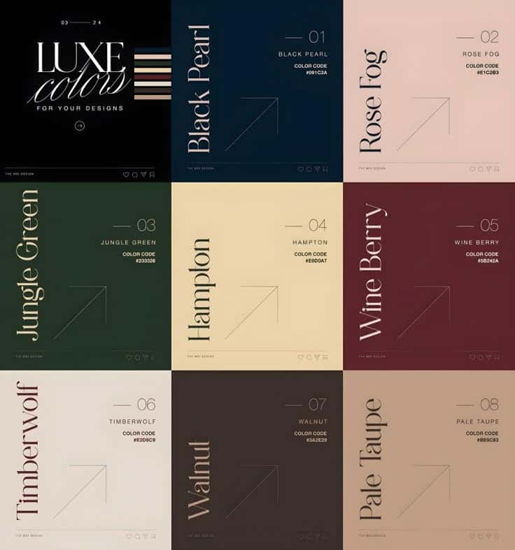

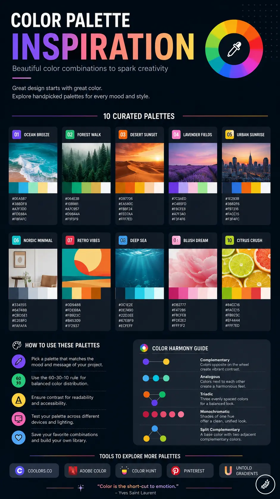
Color palette inspiration is easier to use when you stop hunting for “pretty colors” and start looking for a working system. A strong palette has a base color, a neutral, one or two supporting colors, and an accent that tells the eye where to look.
- Key takeaways
- How to use color palette inspiration
- Understanding color palettes
- Where to find color palette inspiration
- Tools for discovering color palettes
- How to choose the right color palette
- Color palette trends by project type
- Applying color palette inspiration
- Tips for creating custom color palettes
- Common color palette mistakes to avoid
- Additional resources for color palette inspiration
- Related color and design guides
- Color palette inspiration FAQ
- What is color palette inspiration?
- How do I choose a color palette for a design project?
- What are the best color palette ideas for beginners?
- How many colors should a palette have?
- Where can I find color combinations that look natural?
- How do I test if a color palette is accessible?
- What is the easiest way to make a color palette feel more professional?
I like to test a palette the same way I test a layout: first in a tiny thumbnail, then in the real context. A set of swatches can look perfect on Pinterest and still fail on a website button, a living room wall, a fashion outfit, or a printed poster if the contrast, lighting, and material are wrong.
Key takeaways
- Use color palette ideas from sources that already share the same light, such as nature photos, interiors, textiles, paintings, or real brand systems.
- Build around roles: dominant color, supporting colors, neutral, accent, and accessibility-safe contrast.
- Test the palette in the final medium before you trust it. Screens, fabric, paint, and print all shift color differently.
How to use color palette inspiration
Use color palette inspiration as a starting point, not a finished answer. Pull the mood from a reference, then rebuild it for your project by checking value, saturation, temperature, and contrast. If the design has text, buttons, icons, or signage, readability comes before mood. If it is a room, outfit, artwork, or mood board, test the palette beside the actual materials so the colors do not flatten or fight each other.
| Resource | Description | Best for |
|---|---|---|
| Coolors | Generate and refine fast palette ideas | Quick palette creation |
| Adobe Color | Explore harmonies and save color themes | Professional design systems |
| Color Hunt | Browse hand-picked color palettes | Visual inspiration |
| Canva color palettes | Search ready-made palette references | Beginners and social design |
| WCAG contrast guidance | Check readable text and background contrast | Accessibility |
Understanding color palettes
A color palette is the set of colors a project agrees to use. It controls mood, hierarchy, rhythm, and recognition. The best palettes are not just attractive swatches; they give each color a job, so backgrounds, text, accents, shadows, and highlights do not compete.
What is a color palette?
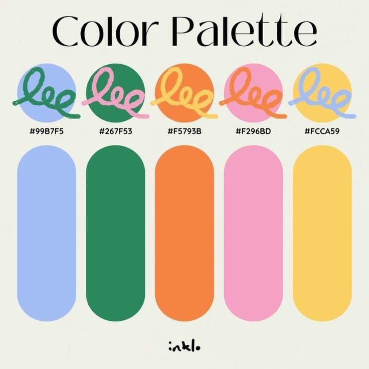
Visual note: this bright blue, green, orange, pink, and yellow set works because the colors are clean and high-energy. Use more white space or neutral type if you apply it to a real layout.
A color palette is a chosen group of colors used across an artwork, brand, room, outfit, interface, or printed piece. Small palettes are often easier to control because every shade has a purpose. Larger palettes need tints and shades, but they still need a clear main family.
Give the palette roles before judging the beauty of the colors. The dominant color carries the mood, the neutral gives the eye somewhere to rest, secondary colors support the structure, and the accent draws attention. That role system is what keeps color combinations from turning into noise.
Color theory basics
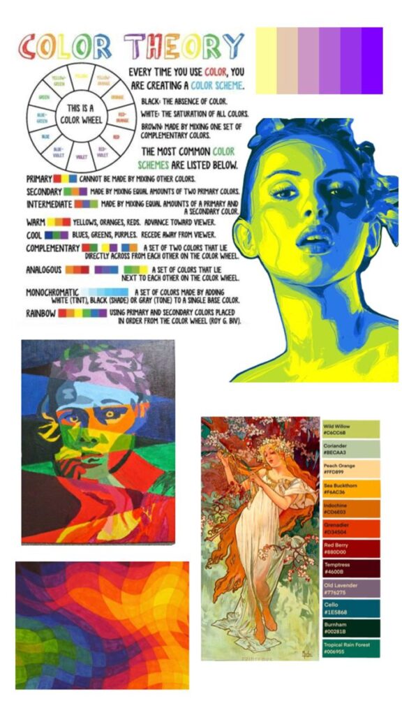
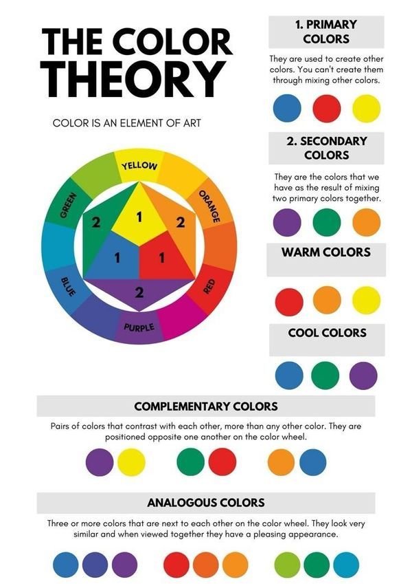
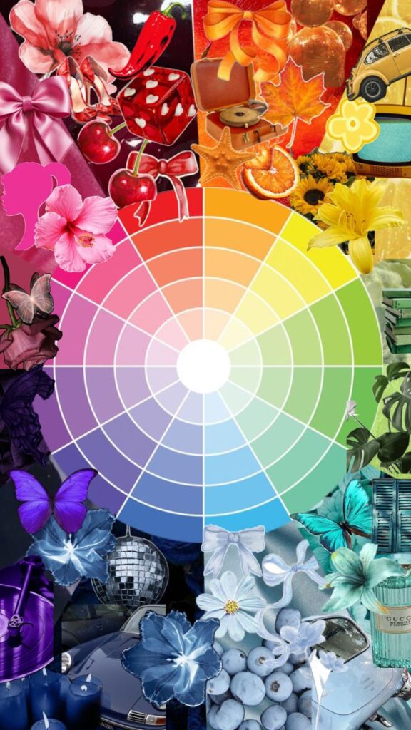
Color theory explains why some combinations feel calm, sharp, playful, formal, or difficult to read. The wheel is the starting point: red, blue, and yellow form a traditional primary set, and mixing them creates secondary colors. For a deeper primer, the Interaction Design Foundation color theory guide is a useful reference.
When a palette feels wrong, check hue, saturation, and value before replacing everything. Hue is the color family, saturation is the intensity, and value is how light or dark it appears. Many “bad” palettes only need one saturated color softened or one dark value added for structure.
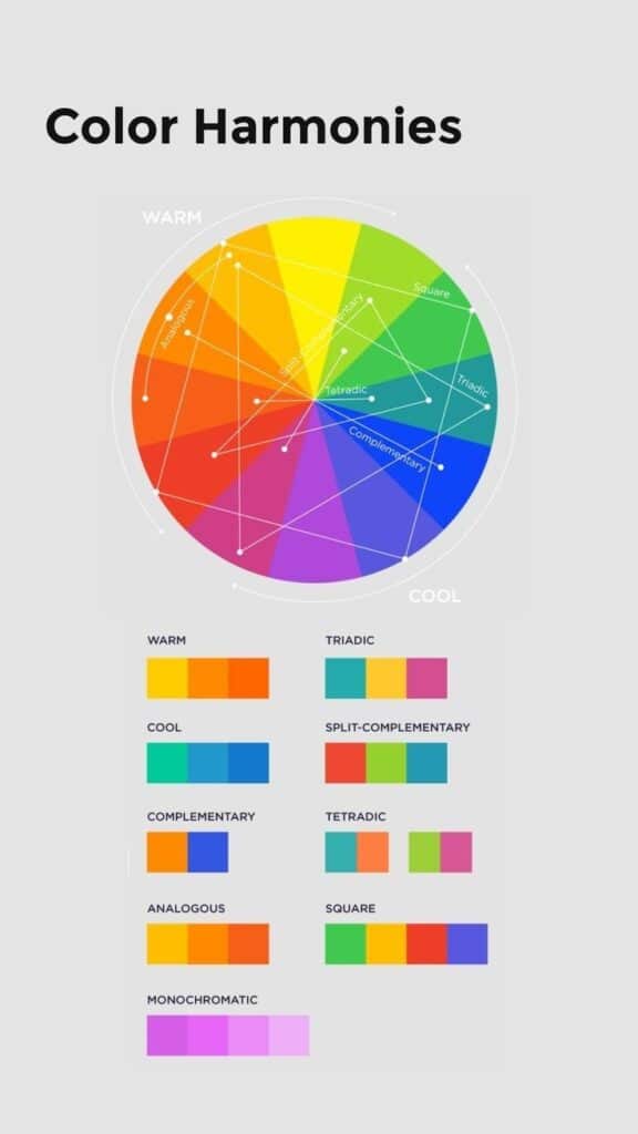
Types of color schemes

Visual note: this wheel is best used as a constraint. Pick the harmony first, then soften values until the palette feels usable rather than theoretical.
Color schemes organize colors from the wheel into preset combinations:
- Monochromatic: Uses variations of one color. It creates a calm, uniform look.
- Analogous: Uses colors next to each other on the wheel. It feels natural and pleasing.
- Complementary: Uses colors opposite on the wheel. It makes designs stand out with high contrast.
- Triadic: Uses three colors evenly spaced around the wheel for balance and color richness.
These schemes are useful because they give you a starting constraint. After that, adjust the values. A complementary palette with equal saturation can be brutal; the same pairing becomes elegant when one color is muted and the other is used as a small accent.
Where to find color palette inspiration
The strongest color palette ideas usually come from places where the colors already live together. A mountain photo, a fabric sample, a vintage poster, or a ceramic glaze can teach more than a random generator because the colors already share light, texture, and scale.
Nature and outdoor light


Nature gives you ready-made value relationships. Autumn leaves are not just red and orange; they include brown stems, dull shadows, dusty paths, and gray sky. Those quieter colors are usually what make the bright colors usable.
Sky colors at sunrise and sunset mix soft pastels with brighter hues, useful for gentle yet lively combinations. Water and plants add cool greens and blues that work well in calm or refreshing designs.
When sampling from nature, do not keep every color at full intensity. Pull the main hues, then rebuild the palette with one strong accent and several quieter supports. That keeps the design grounded instead of making it look like a raw photo sample.
Art and design movements
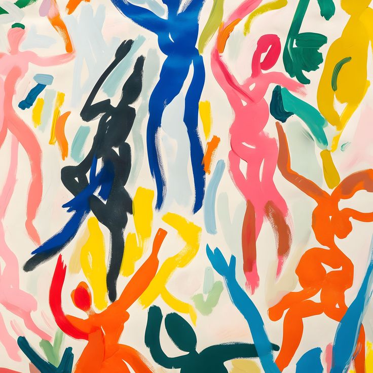

Different art and design movements provide clear guidelines for choosing colors. For example, the Bauhaus movement favors simple, bold primary colors paired with black and white for clarity and impact.
Impressionism focuses on light and softness, often blending colors like soft yellows, light blues, and gentle greens. This style works well for more subtle, nuanced palettes.
Modern minimalism often uses neutral tones with occasional bright accents to keep the look clean. Studying these movements helps understand how color sets tone and affects mood in a design.
Cultural color references
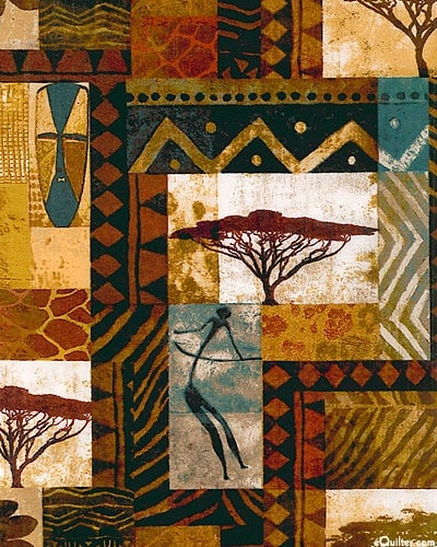

Colors have different meanings across cultures, which strongly influence palette choices. For example, red symbolizes good luck in Chinese culture and is often paired with gold for festive designs.
In many Middle Eastern cultures, blues and turquoises are popular for their calming and protective qualities. Earth tones play a strong role in African art, often symbolizing nature and heritage.
Knowing cultural meanings helps designers respect traditions and create palettes that communicate the right message to the right audience. Colors chosen with this in mind avoid misunderstandings and enhance connection.
Tools for discovering color palettes
Tools speed up the search, but they should not make the decision for you. Use them to explore color combinations, save HEX values, compare harmonies, and test contrast. Then bring the palette back into the project and see if it still works under real constraints.
Digital color generators
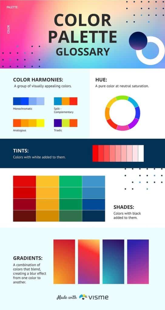

Digital generators are good when you need quick palette exploration. Try Coolors, Adobe Color, Color Hunt, or Canva color palettes to compare schemes, save HEX values, and test different levels of saturation.
My rule is simple: generate fast, decide slowly. A tool can give you twenty attractive palettes in a minute, but only the layout can tell you whether the CTA color, body text, borders, and background have enough separation.
Mobile apps
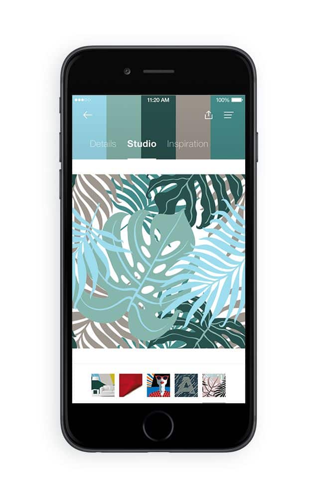
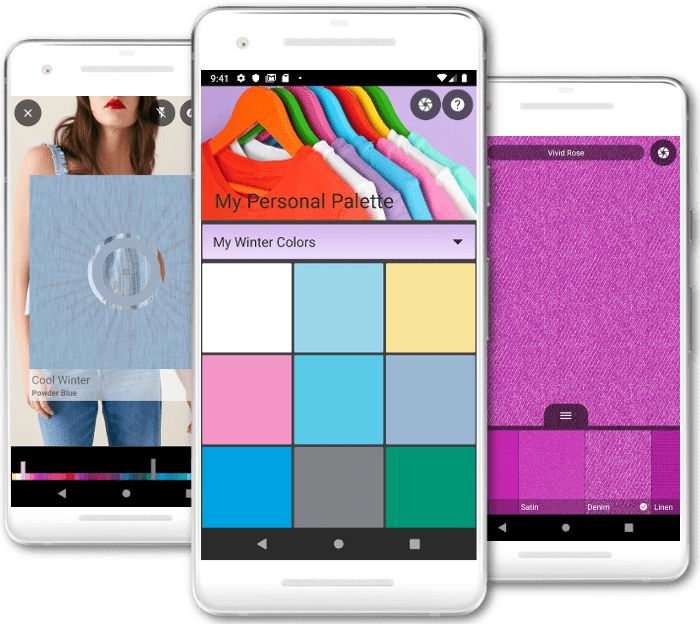
Mobile apps are useful when inspiration is physical: a wall color, a textile, a flower market, a ceramic plate, or a city street at dusk. Capture the color, but always compare the sampled swatch with your eye. Cameras exaggerate shadows and white balance.
Save several versions of the same palette: the raw sample, a muted version, a high-contrast version, and a print-safe version. This gives you options when the first pretty swatch set starts failing in a real composition.
Physical swatch books
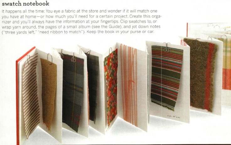
Physical swatch books still matter because color is material. Paint, fabric, paper, and screen light never behave exactly the same. A swatch book lets you see undertones, surface texture, and lighting shifts before the palette becomes expensive.
Use physical references when you need accuracy with clients, manufacturers, painters, or printers. A named swatch prevents vague feedback like “make it warmer” from turning into five different interpretations.
How to choose the right color palette
Choosing the right color palette starts with purpose. Before picking colors, define what the project needs to do: calm a room, make a button obvious, make a logo recognizable, make a fashion look feel seasonal, or give an artwork a clear emotional temperature.
Start with brand identity
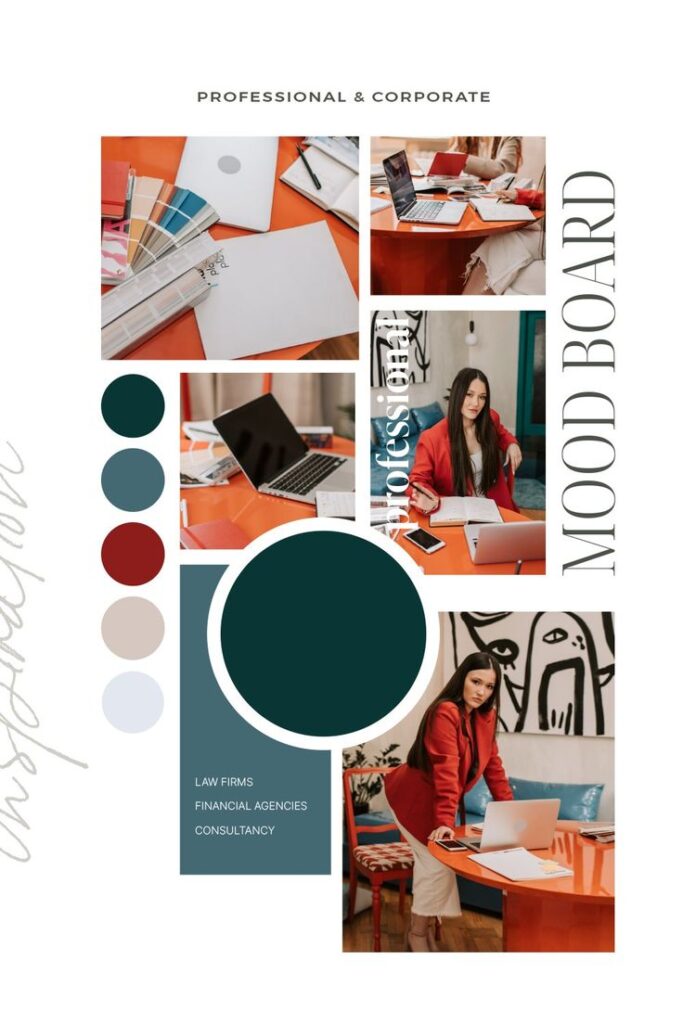
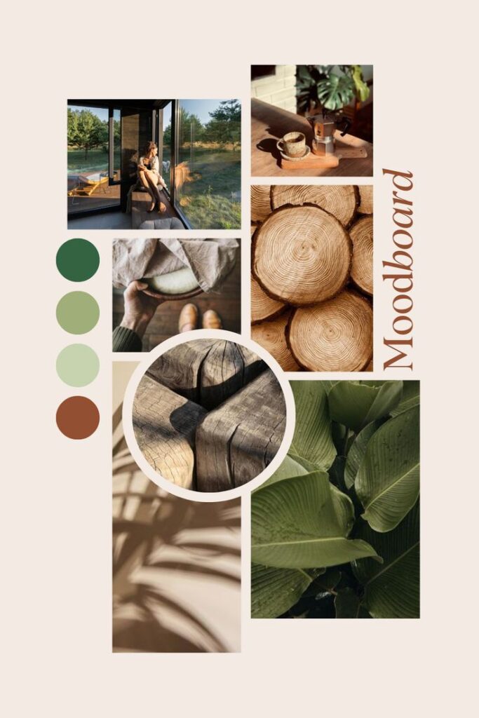
For branding, color has to be recognizable at small sizes and repeated across many surfaces. Blue and gray can signal trust, but they can also look forgettable if every competitor uses the same mix. A playful brand can use brighter colors, but it still needs a neutral and a readable text system.
A brand palette should survive the boring tests: black-and-white print, a tiny social icon, packaging beside other products, a website button, and a low-light photo. If the palette only works in a polished mood board, it is not finished yet.
Check mood and color psychology
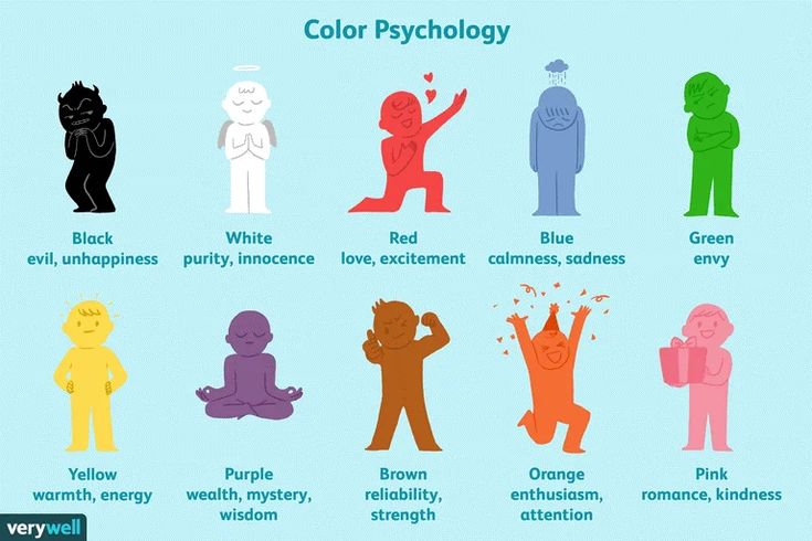
Color psychology is useful, but context decides the final meaning. Red can feel urgent, romantic, festive, or aggressive. Green can feel calm, medical, ecological, or cheap depending on the material, typography, and neighboring colors.
Instead of asking whether a color is “good,” ask what it does in the system. Too much black may feel heavy in a wellness brand, but it can look precise in luxury packaging. Balance is the point.
Match the audience and context
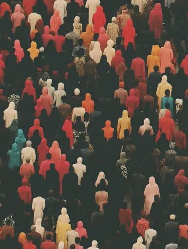
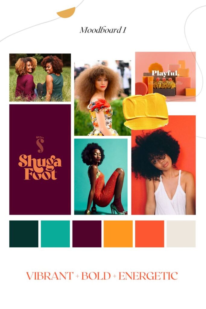
Audience matters, but avoid lazy assumptions. A younger audience does not automatically want neon, and an older audience does not automatically want beige. Look at the actual context: product category, cultural references, price point, lighting, and how much information the design has to carry.
Cultural meaning also matters. White may represent purity in some cultures but mourning in others. Researching the target audience helps avoid color choices that confuse or offend.
If the palette supports a product, test it with real users or at least compare it against analytics, click behavior, and conversion paths. Preference and performance are not always the same thing.
Color palette trends by project type
Trends are useful when they reveal what people are used to seeing. They become risky when they replace judgment. Use trends as a pressure test: will this palette still make sense when the next color cycle arrives?
Current popular palettes
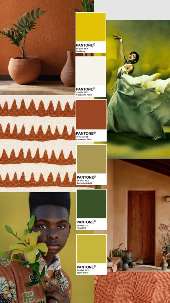
Visual note: terracotta, olive, lime, and warm neutrals give this palette an earthy base with a lively accent range.
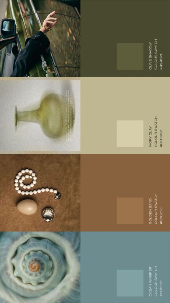
Earth tones mixed with bright accent colors are widely used. Colors like terracotta, olive green, and warm beige are common. Bright blues, yellows, and reds add contrast without overwhelming.
Palettes with muted pastels are also trending. Soft pinks, light lavenders, and pale mint create calm and approachable looks.
Digital design often favors controlled contrast: neutral surfaces, strong action colors, and enough separation between states. The Material Design color system is a good example of treating color as roles rather than decoration.
Seasonal color inspiration
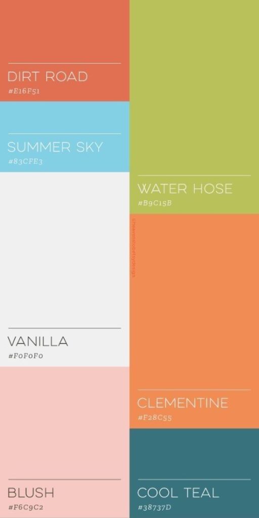
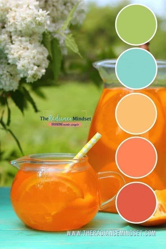
Spring palettes often involve fresh greens, soft blues, and gentle pinks to reflect new growth. Summer leans toward vibrant oranges, yellows, and bright blues that evoke warmth and energy.
Autumn palettes focus on deep reds, burnt oranges, and mustard yellows, bringing a cozy feeling. Winter uses cool blues, greys, and deep purples for a calm and quiet tone.
Seasonal palettes work best when you borrow the feeling, not the cliche. Autumn does not have to mean only pumpkin orange; it can also mean fog gray, dried grass, oxblood, warm wood, and dull gold.
Industry-specific trends

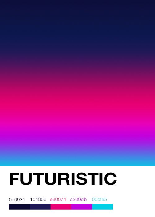
Tech companies prefer sleek, modern palettes with dark backgrounds and bright neon accents. This helps create a futuristic, clear look.
Fashion brands often use bold, statement colors tied to the season’s theme. Luxury brands choose minimalistic palettes with black, white, and metallics to keep elegance.
Health and wellness industries use soft, earthy palettes with greens and blues to promote calm and trust. Each industry carefully picks colors to fit its message and audience.
Applying color palette inspiration
Using a color palette well depends on the type of project. It involves choosing colors that fit the space, brand, or style. Effective use of color can create mood, highlight features, and improve the overall look.
Interior design applications
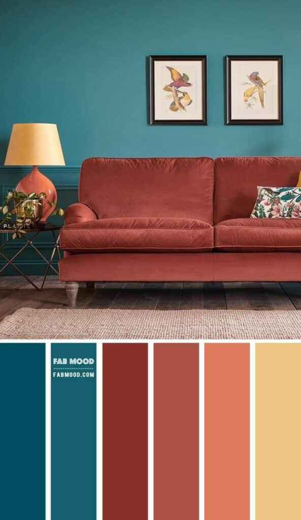
Visual note: the living room palette works because teal, terracotta, and warm neutrals repeat across large and small surfaces.
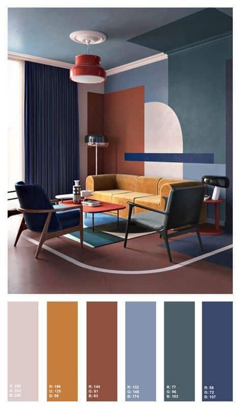
In interiors, a palette has to live with light and material. Warm colors can make a room feel closer and cozier, while cooler blues and greens can calm the space. But the final effect depends on the wall finish, flooring, fabric, daylight, and artificial light.
Designers often use a base color, a secondary color, and an accent color. The base covers large areas like walls, secondary may be used on furniture, and accents appear in decor items.
Always test interior colors at different times of day. A wall that looks creamy in morning light can turn yellow at night, and a blue that feels elegant on a swatch can go cold across an entire wall.
Graphic design projects
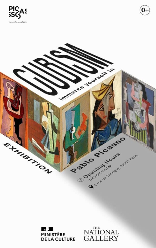
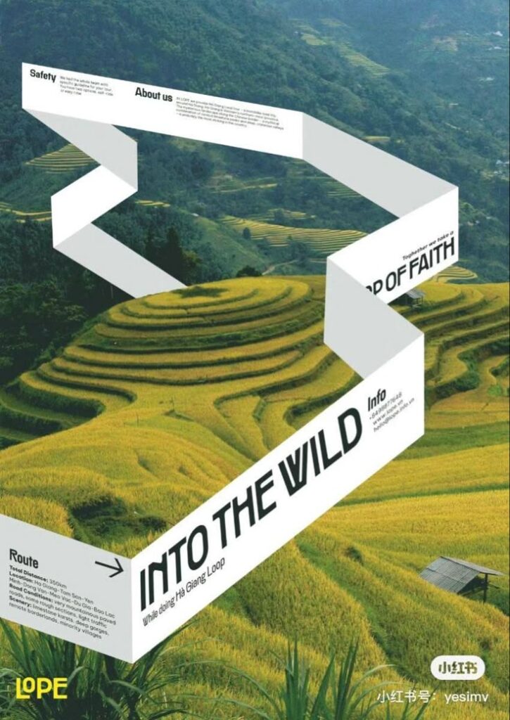
Graphic designers use color to control attention. A poster, logo, landing page, and social template all need enough hierarchy that the viewer knows where to look first, second, and last.
They often pick 3-5 colors: a primary for backgrounds, secondary for highlights, and sometimes extra shades for contrast. Using too many colors can confuse the message or look chaotic.
Readability is not optional. Check text/background pairs early with the WCAG contrast guidance, especially for body copy, buttons, form labels, and navigation.
Fashion and textiles
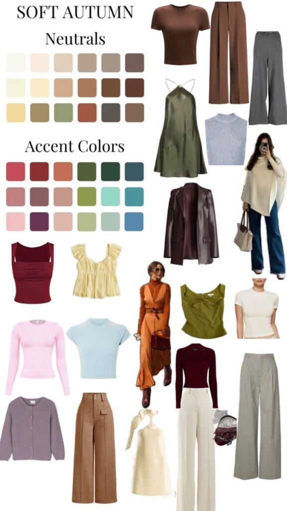
Visual note: soft autumn fashion palettes rely on muted warmth. The colors should look related, not identical.
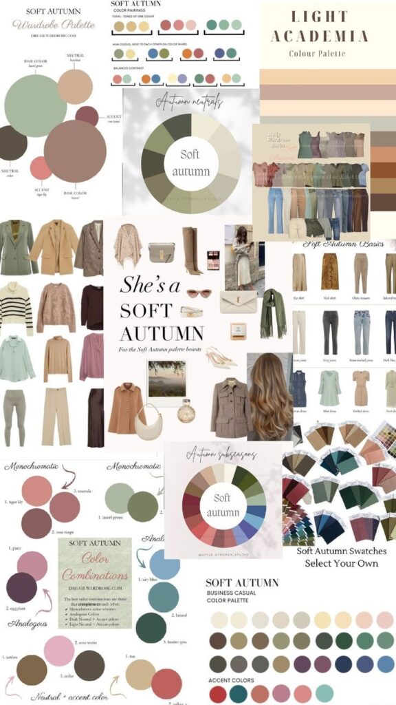
In fashion, color palettes shape the season’s trends and collections. Designers select palettes that match the mood they want for their line, like soft pastels for spring or deep earthy tones for fall.
Combining colors in clothing involves balance. Using a bold color with neutrals helps avoid overdoing it. Patterns also play a role, mixing multiple colors in textured or printed fabrics.
Fabric type influences how colors look. Silk may reflect light differently than cotton, altering the palette’s impact. Designers test colors on fabrics before production to ensure the right effect.
Tips for creating custom color palettes
Creating a custom color palette requires careful choices to ensure visual balance. It involves managing contrast, testing colors in real settings, and finding new, interesting pairings that stand out without clashing.
Balance contrast and harmony
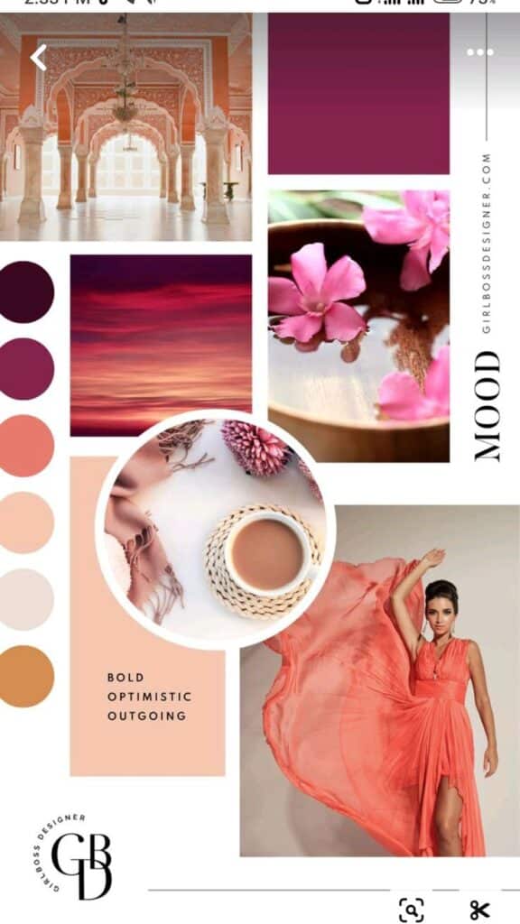
Balance contrast and harmony by deciding where the eye should land. Contrast makes text, buttons, icons, and focal points stand out. Harmony keeps the supporting colors from pulling attention away from the main message.
A good method is to use one dominant color and add supporting colors with different tones or shades. For example, pairing a dark blue with a light gray provides contrast but stays calm. Too much contrast can cause strain on the eyes, while too little can make the design look flat.
Using tools like color wheels helps in picking complementary or analogous colors that naturally balance each other. Adjusting saturation and brightness can also fine-tune the palette for the right feel.
Test and refine the palette
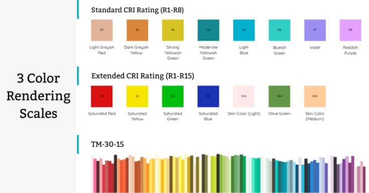
Visual note: this chart is a reminder that lighting changes color. Test paint, fabric, and print samples before treating a palette as final.
Testing is where a palette becomes real. Put the colors into the actual layout, room, outfit, painting, or packaging mockup. Screens, print, textiles, paint, and watercolor paper all shift color in different ways.
Refining means making changes based on how the colors perform in context. Sometimes a color that looks good alone might clash or be hard to read when combined. Keeping testing notes and comparing versions helps improve the palette step by step.
Using mockups or samples speeds up this process. It also helps to get feedback from others, as fresh eyes can catch issues that were missed.
Source unusual color combinations

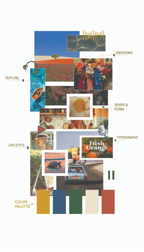
Unusual color combinations usually come from specific references, not random novelty. Look at market stalls, old signage, mineral samples, album covers, film stills, textiles, and travel photos. Then simplify the palette until the strange pairing feels intentional.
One approach is to use photo references, extracting colors from interesting images. This technique often produces combinations that feel natural but unexpected.
Other sources include fashion trends, travel photos, and traditional crafts. By mixing colors that are rare to see together, the palette gains personality and a fresh look.
Recording these combinations in a swatch library ensures they can be reused or adjusted later.
Common color palette mistakes to avoid
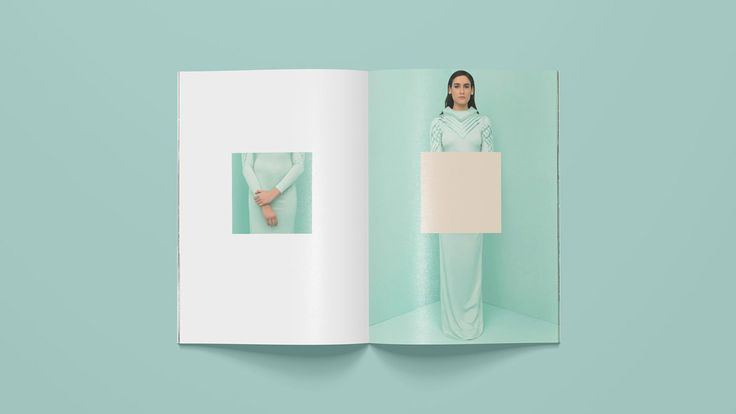
The first mistake is choosing colors because you like them individually. A palette is a relationship. Each color has to support the message, hierarchy, mood, and medium of the project.
The second mistake is using too many colors at equal strength. Limit the main palette, then create tints and shades only when the design needs them.
Ignoring contrast is the mistake that hurts usability fastest. Colors that are too close in value can make text, icons, and details disappear even when the hues look different on a swatch board.
Sometimes, people pick trendy colors without considering the context. Trends change quickly, and colors that work now might look outdated soon. It is useful to choose colors that fit the project’s goals and time frame.
Using colors that clash is another mistake. Colors should complement each other, not fight for attention. Tools like color wheels or online color harmony guides can help avoid clashing palettes.
Accessibility belongs in the palette stage. Do not rely on color alone for warnings, selection states, or instructions. Add labels, icons, underline styles, texture, or layout cues so the design still works for people who see color differently.
Additional resources for color palette inspiration
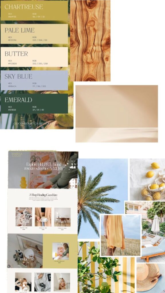
Visual note: chartreuse and emerald can feel sharp, so the butter and sky-blue tones soften the palette enough for mood boards or fresh branding.
There are many tools online that help people find the right color combinations. Websites like Coolors and Adobe Color let users create and explore palettes easily. They offer options to adjust colors and see how they work together in real time.
In addition to websites, apps like Canva provide templates and ready-made palettes. These resources are useful for beginners and professionals alike. They make the process of choosing colors faster and more visual.
Books about color theory can also be helpful. Titles such as Interaction of Color by Josef Albers explain how colors affect perception. These books offer a deeper understanding beyond just picking colors.
For inspiration from nature or art, people often use Pinterest or Instagram. These platforms show real-world examples of color use in design, fashion, and photography. They can spark new ideas by showing how colors come alive in different settings.
Here is a short list of useful resources:
| Resource | Description | Best For |
|---|---|---|
| Coolors | Generate and tweak color palettes | Quick palette creation |
| Adobe Color | Explore and save color themes | Professional design |
| Canva | Design tool with color templates | Beginners and marketers |
| Visual idea board with diverse color styles | Creative inspiration | |
| Interaction of Color | Book on color theory and perception | Deep learning |
These resources support a wide range of needs, from simple inspiration to detailed study. They help turn ideas into effective color combinations.
Related color and design guides
If you want to keep building the cluster, start with website color schemes for UI work, the brand color palette guide for identity projects, and logo color choices when the palette has to support a mark.
For applied examples, compare a living room color palette, summer outfit color combinations, watercolor mixing ideas, and older color palette photo inspiration before deciding how much contrast or softness your own project needs.
Color palette inspiration FAQ
What is color palette inspiration?
Color palette inspiration is the process of finding color combinations from real sources such as nature, art, interiors, fashion, product design, or existing brand systems. The useful part is not copying a pretty set of colors. It is noticing the color roles: the base shade, supporting neutral, accent color, contrast level, and mood.
How do I choose a color palette for a design project?
Start with the job of the design. A website needs readable contrast and clear action colors, while a room or outfit can lean more on texture, lighting, and mood. Choose one dominant color, one or two supporting colors, one neutral, and one accent. Then test the palette in the actual layout before committing.
What are the best color palette ideas for beginners?
Beginners usually get the cleanest results from simple palettes: monochromatic, analogous, complementary, or a neutral base with one accent. Try cream, warm gray, and terracotta for a soft interior; navy, white, and coral for a crisp brand; or sage, ivory, and dusty pink for a calm mood board.
How many colors should a palette have?
Most practical palettes need three to five colors. Use one dominant color, one or two secondary colors, a neutral, and an accent. Larger systems can include tints and shades, but the main palette should still be easy to explain. If every color is trying to be the star, the design will feel noisy.
Where can I find color combinations that look natural?
Look at places where colors already share the same light: landscapes, food photography, textiles, vintage posters, ceramics, flowers, and city streets. Pulling colors from one photo often works because the values and temperature already belong together. After sampling, adjust saturation and contrast so the palette works in your actual design.
How do I test if a color palette is accessible?
Test text and background pairs first. The palette can be beautiful and still fail if the body copy, buttons, or labels are hard to read. Check contrast ratios, review the design in grayscale, and avoid using color as the only way to communicate state. Accessibility testing should happen before the palette becomes a finished brand or UI system.
What is the easiest way to make a color palette feel more professional?
Reduce the number of saturated colors and give each color a clear role. Professional palettes usually have restraint: a quiet base, controlled contrast, and accents used in repeatable places. I usually test a palette by asking whether it still works when the images are removed. If it does, the color system is doing real work.
- 16.8Kshares
- Facebook0
- Pinterest16.8K
- Twitter0
- Reddit0