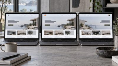

Website color schemes work best when they are treated as a UI system, not a decoration pass. A good UI color palette has enough contrast to read, enough hierarchy to guide action, and enough restraint that buttons, alerts, links, and backgrounds each have a clear job.
The practical target is simple: choose one dominant neutral system, one primary action color, one supporting accent, and a small set of semantic colors for success, warning, error, and information. Then test the pairings before they reach production.
I still start color work in grayscale first. If the layout does not read without hue, a brighter palette will only hide the problem for a few minutes. Color should sharpen the interface, not carry it.
Best website color schemes for UI/UX design
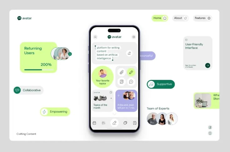
The best website color schemes usually follow a controlled pattern: light or dark neutral surfaces, high-contrast text, one recognizable brand color, and semantic colors that never rely on hue alone. For SaaS and product interfaces, blue and navy still signal trust; green works well for progress and confirmation; purple can feel innovative when it is not overused; warm neutrals make editorial and creator tools feel calmer.
| Use case | Good palette direction | Why it works |
|---|---|---|
| B2B SaaS | Navy, white, cool gray, controlled blue accent | High trust, clear hierarchy, predictable CTA behavior. |
| Portfolio website | Warm neutral, charcoal text, one bold accent | Keeps the work visible while still feeling designed. |
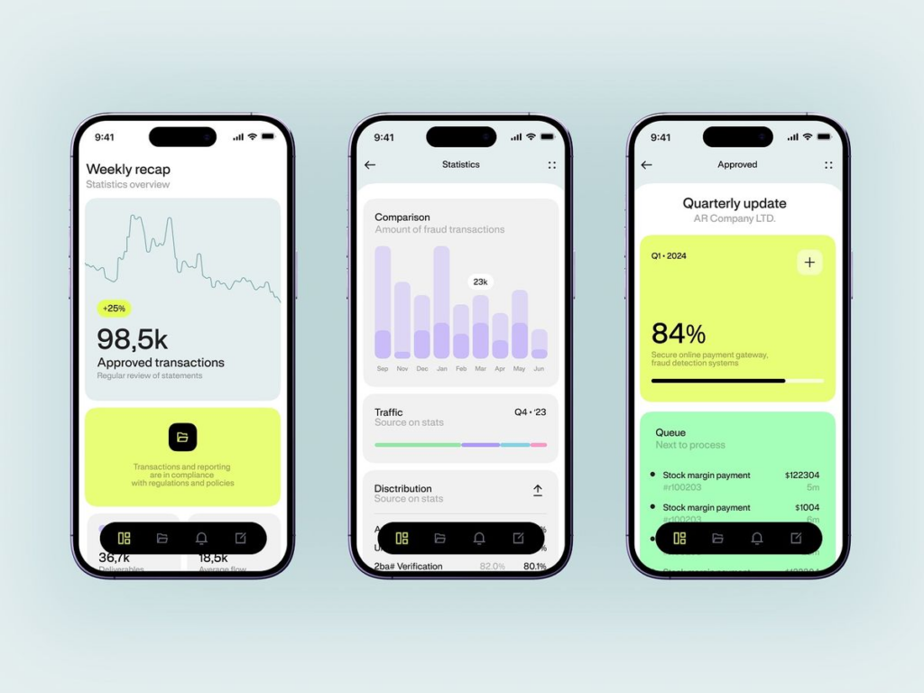
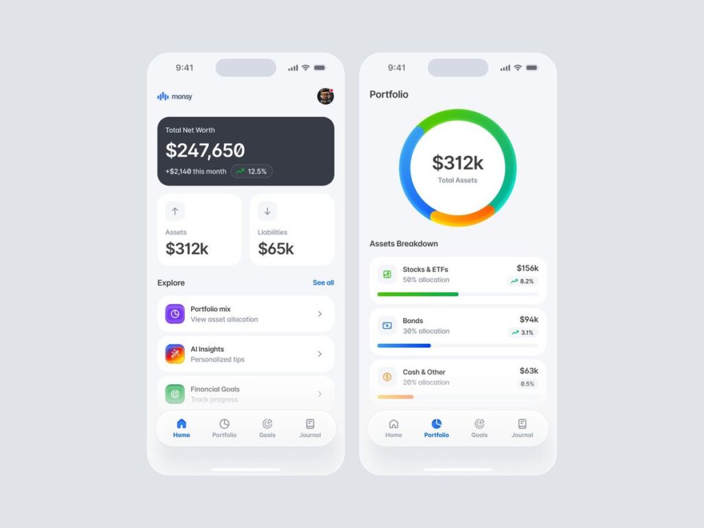
| Finance app | Deep navy, white, muted green, gold accent | Feels stable without losing conversion focus. |
| Developer tool | Dark surface, off-white text, violet or cyan accent | Supports long sessions and makes active states easy to spot. |
| Wellness app | Soft green, cream, warm gray, low-saturation accent | Reduces visual noise while keeping confirmation states clear. |
- 1. How website color schemes actually work
- 2. WCAG Accessibility: The Non-Negotiable Foundation
- 3. Color Psychology: What Each Hue Signals to Users
- 4. Eight proven UI color palettes with HEX codes
- 5. Semantic Color Roles: Every Product Interface Needs These Eight
- 6. Dark Mode: Design It, Don't Just Invert It
- 7. 2026 Trends Worth Building Into Your System Now
- 8. Implementation Checklist
- 9. UI color palette FAQ
- The business case for getting website color schemes right
This guide covers the UI/UX color palettes that consistently perform in web and SaaS design — with exact HEX codes, WCAG contrast data, the psychology behind each combination, and clear guidance on when to use them. No theory without application. No palette recommendations without accessibility scores.
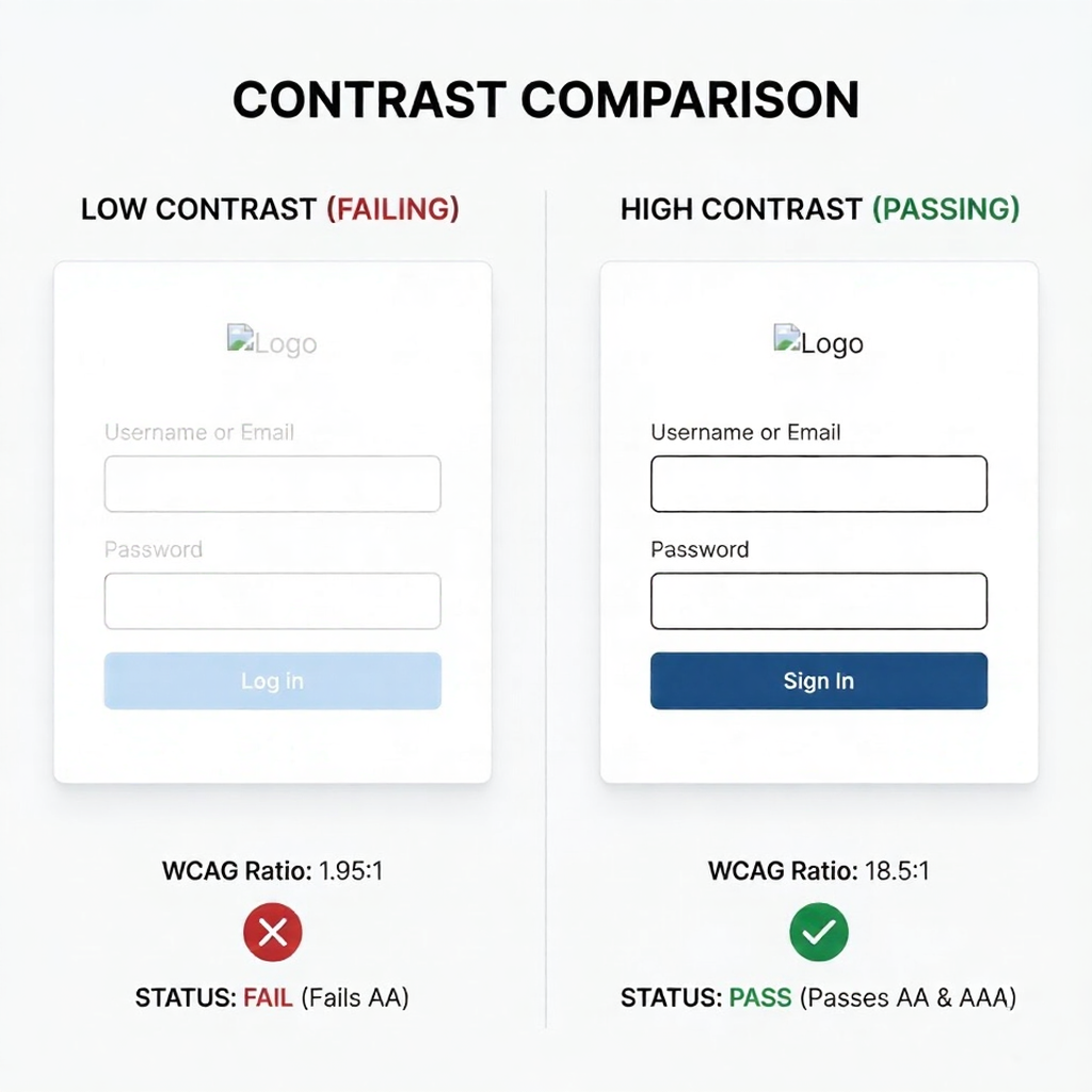
⚠ Legal note: As of June 2025, the European Accessibility Act requires WCAG 2.1 AA compliance for all commercial digital products sold in the EU. In the US, 4,605 ADA web accessibility lawsuits were filed in 2024. Non-compliance is no longer a design oversight — it’s a legal liability.
1. How website color schemes actually work
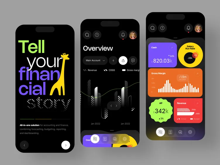
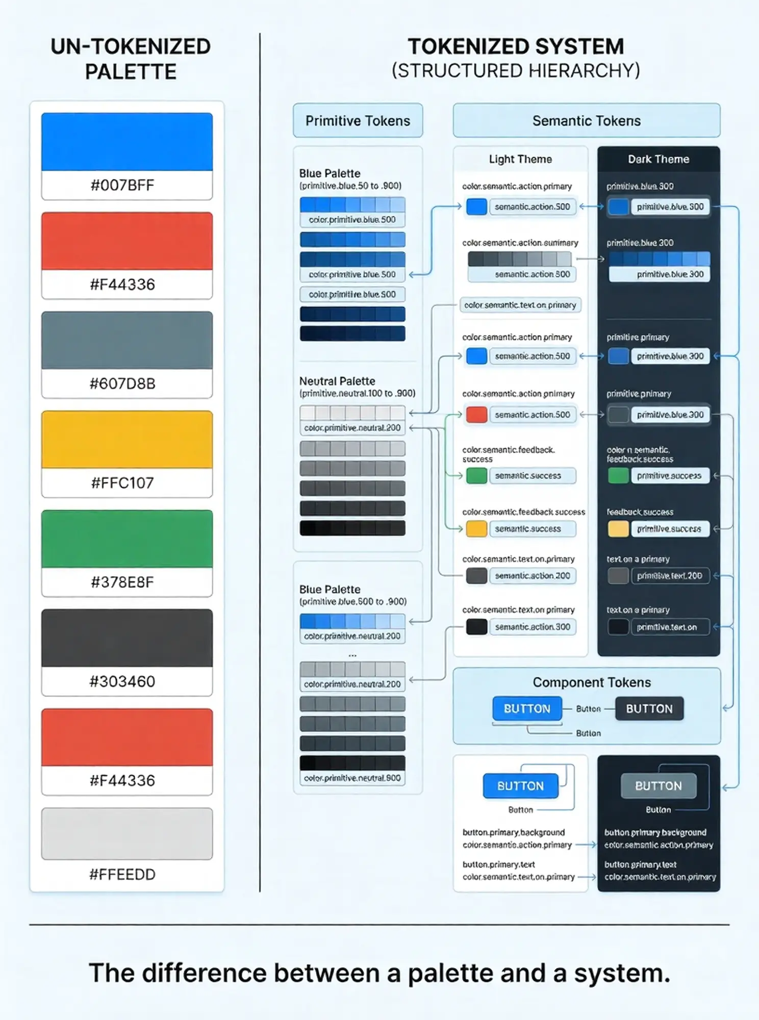
Before selecting a palette, every designer and developer working on a product interface needs to understand what a color system is and how its components relate to each other. Choosing five colors you like is not a color system. A color system is a structured, scalable set of values with defined roles and relationships.
The Three-Layer Architecture
- Primitive tokens — Raw HEX values organized into named scales. Example: blue-100 through blue-900, where 100 is the lightest and 900 the darkest. You don’t apply primitives directly to UI components.
- Semantic tokens — Purpose-assigned values that reference primitives. Example: color/text/primary → references blue-800. Semantic tokens are what designers apply to components. This abstraction layer is what makes dark mode and theme switching technically feasible without rewriting component code.
- Component tokens — Component-specific values that reference semantic tokens. Example: button/primary/background → references color/interactive/brand. This layer rarely changes independently of the semantic layer.
Stripe’s engineering team documented this architecture publicly when they rebuilt their accessible color system around CIELAB (perceptually uniform) color space — the key insight being that standard HSL values don’t map linearly to how human vision perceives contrast. Their new palette ensured every default text color passed WCAG AA at 4.5:1 contrast over white backgrounds, and over the lightest tinted backgrounds in their product. That dual compliance eliminated hundreds of case-by-case contrast decisions from their design process.
The 60-30-10 Distribution Rule
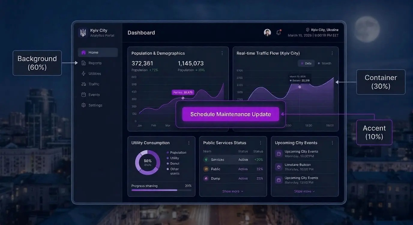
The established professional split for UI color distribution:
- 60% — Dominant neutral (backgrounds, containers, surfaces). This is where off-whites, light greys, and dark base tones live.
- 30% — Secondary / supporting color (sidebars, cards, secondary containers). This creates visual structure without competition with the primary.
- 10% — Accent / action color (CTAs, active states, key links, alerts). High saturation, maximum contrast, used sparingly so it retains signal value.
Violating this distribution — particularly by overusing the accent color — is the single most common cause of the ‘busy’ or ‘overwhelming’ UI that drives users to exit. The accent color’s persuasive power comes from its scarcity. Use it everywhere and it stops functioning.
2. WCAG Accessibility: The Non-Negotiable Foundation
According to WebAIM’s 2024 Million analysis, color contrast failure is the #1 accessibility violation on the web, present on 83.6% of home pages. These aren’t edge-case products — they’re mainstream commercial websites with paying users who can’t read their content.
WCAG 2.2 Contrast Requirements
- Level AA (minimum for commercial web) — 4.5:1 for normal text (under 18pt regular or 14pt bold). 3:1 for large text and UI components including buttons, form fields, and focus indicators.
- Level AAA (recommended for critical content) — 7:1 for normal text. 4.5:1 for large text. Required for medical, legal, and financial digital products where misreading has consequences.
- Non-text contrast (WCAG 2.2 1.4.11) — 3:1 minimum contrast between UI components and their adjacent colors. This applies to button outlines, form field borders, checkbox states, and focus rings.
The Four Color Combinations That Consistently Fail Audits
- Light grey text on white backgrounds — Common in ‘minimal’ UI design. #999999 on #FFFFFF = 2.85:1. Fails AA for normal text.
- Red on green (or green on red) — Affects approximately 8% of males with red-green colour blindness (deuteranopia). Never use color as the sole indicator of success/error states.
- Blue text links on blue-tinted backgrounds — Especially common in SaaS with blue-heavy brand palettes. An #0066CC link on an #E8F0FE tinted card may fail at 3.1:1.
- White text on medium-saturation colors — White (#FFFFFF) on a standard brand blue like #4A9EFF achieves only 3.1:1 — fails for normal text. The blue must be significantly darkened.
TOOL: WebAIM Contrast Checker (webaim.org/resources/contrastchecker) — paste any two HEX codes to get the exact ratio and AA/AAA pass/fail status. Takes 30 seconds per pair. Run every CTA, body text, and form label combination before shipping.
3. Color Psychology: What Each Hue Signals to Users
Color psychology in UI is not abstract — it has commercial consequences. Studies cited by Nielsen Norman Group establish that users form first impressions of digital interfaces in approximately 50 milliseconds, with color as the primary driver. The emotional associations users bring to colors are not arbitrary; they’re deeply conditioned by decades of brand and cultural exposure.
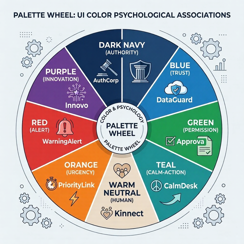
Hue-by-Hue Reference for Web and SaaS
- Blue (#0A2540, #1D4ED8, #2563EB range) — Trust, reliability, competence. The default choice for fintech, B2B SaaS, and any product where user confidence is the primary conversion factor. Stripe (#0A2540 primary, #635BFF accent), PayPal, Salesforce, and LinkedIn all anchor their UI in blue for this reason. Limitation: common to the point of being commoditised in enterprise SaaS; differentiation requires strong secondary palette choices.
- Green (#16A34A, #22C55E, #4ADE80 range) — Health, growth, success, permission. The universal color for success states, positive metrics, and CTA in health/wellness contexts. The ‘go’ signal in traffic light convention means green CTAs have strong conditioned associations with positive action. Use darker greens (#15803D or deeper) to meet contrast requirements on light backgrounds.
- Purple (#7C3AED, #6D28D9 range) — Innovation, premium quality, creativity. Strong current choice for AI-forward SaaS products (GitHub Copilot, various AI tooling). More distinctive than blue in the B2B landscape while maintaining a ‘serious technology’ signal. Pairs well with near-black neutrals.
- Orange (#EA580C, #F97316 range) — Energy, urgency, affordability. High-attention CTA color with strong click-through performance in e-commerce. Less common in enterprise B2B — can read as aggressive or low-end when used as a primary color in professional tools. More effective as a focused accent on dark-mode or neutral-ground interfaces.
- Dark navy / near-black (#0F172A, #1E293B range) — Sophistication, authority, precision. The dominant choice for dark-mode SaaS interfaces targeting technical users (developers, data teams, security platforms). Linear, Vercel, and Supabase use this as their primary surface. Extremely effective for interfaces where data density and sustained readability matter over brand expression.
- Warm neutral (#F5F0EB, #E8E0D5 range) — Human, approachable, editorial. The 2025–2026 reaction against cold corporate white. Notion-adjacent products use warm off-whites to reduce eye strain and suggest a ‘thoughtful’ brand positioning. Pairs well with deep brown (#3D2B1F range) text rather than pure black.
[Image: Psychology hue chart — six color swatches (blue, green, purple, orange, dark navy, warm neutral) each labeled with their psychological associations and 3–4 real product examples using each hue as their primary — clean tabular layout, no borders]
4. Eight proven UI color palettes with HEX codes
The following palettes are built for functional production use — not mood board aesthetics. Each includes specific HEX values, contrast ratios for the critical text-on-background pair, and explicit use-case guidance.
Palette 1 — B2B SaaS Trust (Light Mode)
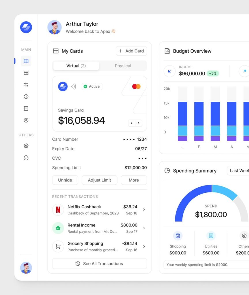
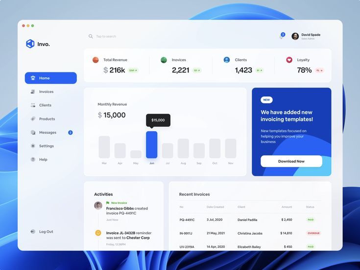
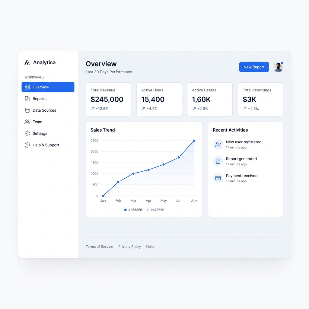
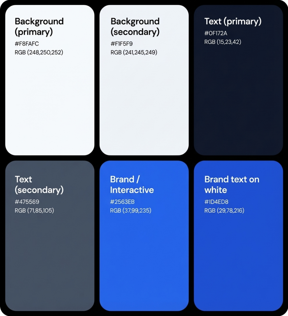
| B2B SaaS Trust | HEX Codes | Best Used For |
| Background (primary) | #FFFFFF / #F8FAFC | Main canvas, modal backgrounds |
| Background (secondary) | #F1F5F9 | Cards, sidebar, table rows |
| Text (primary) | #0F172A | Body text, headings — 18.9:1 on white |
| Text (secondary) | #475569 | Labels, captions — 5.9:1 on white |
| Brand / Interactive | #2563EB | CTAs, links, active states |
| Brand text on white | #1D4ED8 | Linked text — 5.9:1, AA pass |
| Success | #15803D | Confirmations, positive metrics |
| Destructive / Error | #DC2626 | Errors, destructive actions |
| Use case: Enterprise SaaS, B2B tools, fintech dashboards, project management | Min. contrast: #0F172A on #FFFFFF = 18.9:1 (AAA). #2563EB CTA on #FFFFFF = 4.5:1 (AA pass) | ||
Palette 2 — Dark Mode Developer / Data
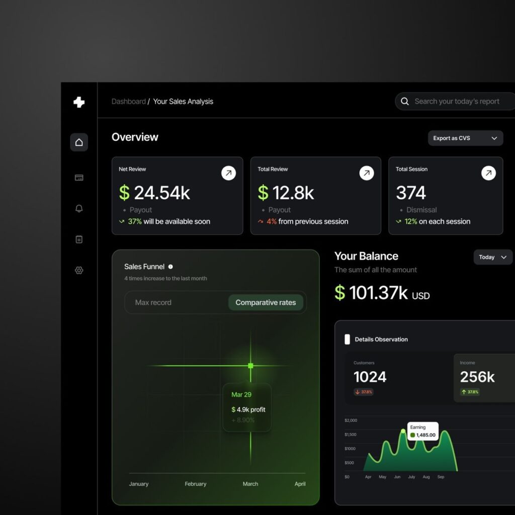
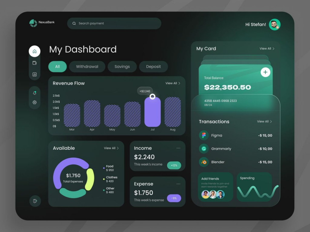
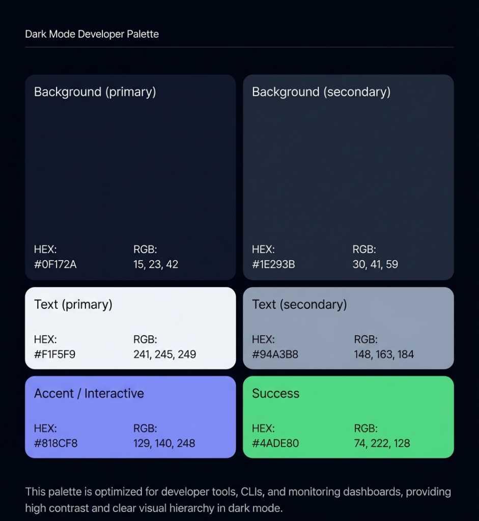
| Dark Mode Developer | HEX Codes | Best Used For |
| Background (primary) | #0F172A | Main canvas |
| Background (secondary) | #1E293B | Cards, panels, modals |
| Background (tertiary) | #334155 | Hover states, active rows |
| Text (primary) | #F1F5F9 | Body text — 15.4:1 on #0F172A |
| Text (secondary) | #94A3B8 | Labels, timestamps — 5.2:1 |
| Accent / Interactive | #818CF8 | Links, focus states, CTAs |
| Success | #4ADE80 | Positive states, uptime green |
| Warning | #FBBF24 | Alerts, rate limit warnings |
| Use case: Developer tools, CLI apps, monitoring dashboards, IDEs, data platforms | Min. contrast: #F1F5F9 on #0F172A = 15.4:1 (AAA). Accent #818CF8 on #0F172A = 4.7:1 (AA pass) | ||
Palette 3 — AI / Innovation (Purple-Accent Dark)
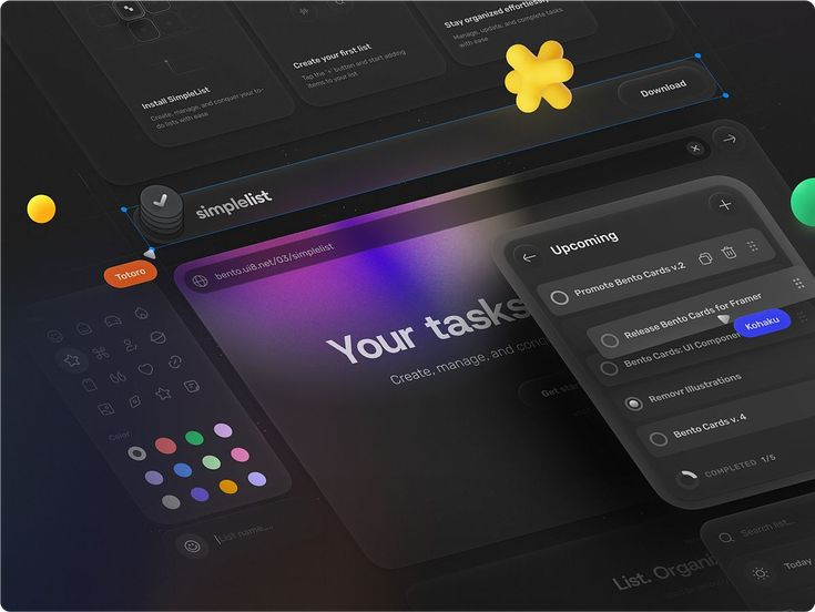
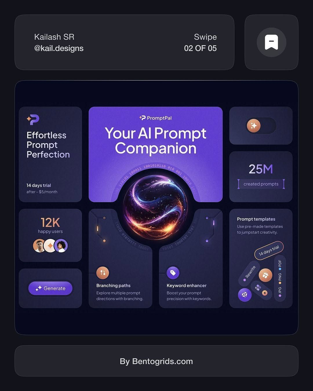
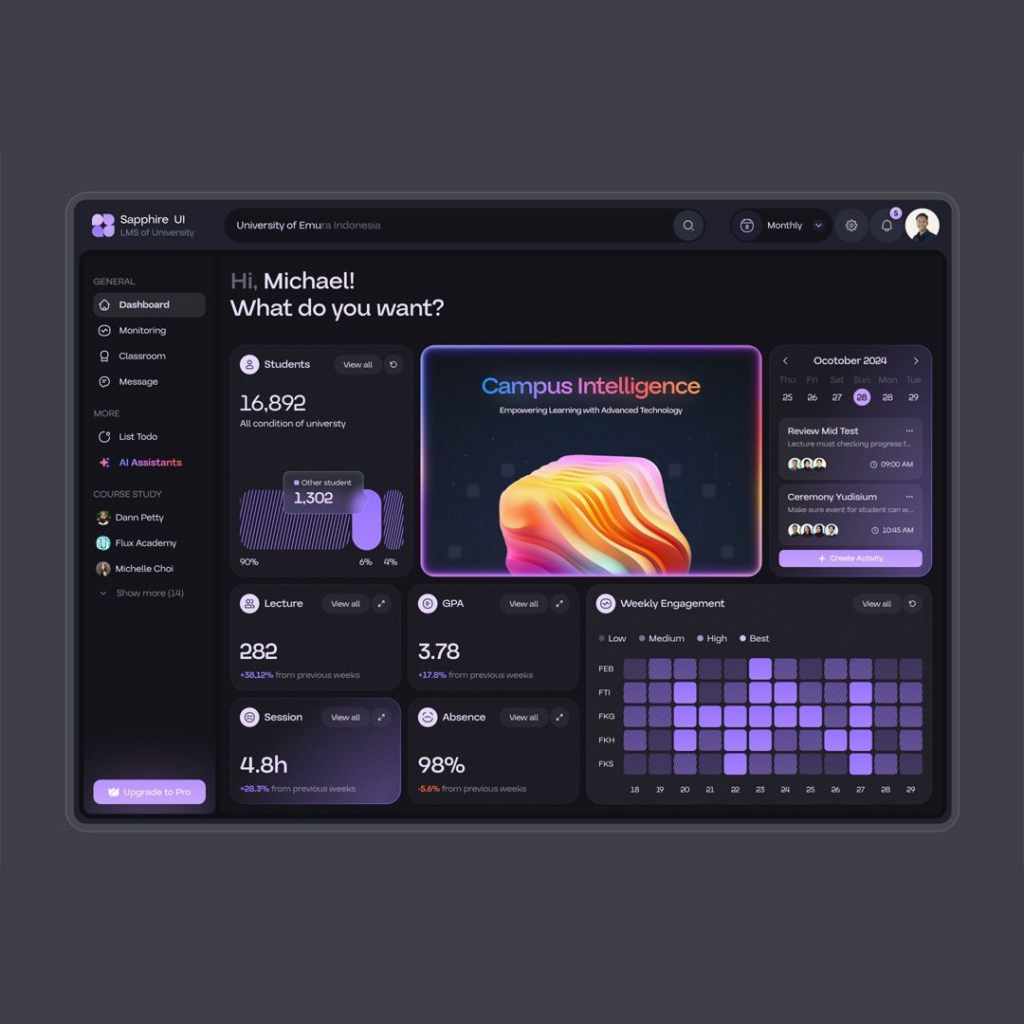
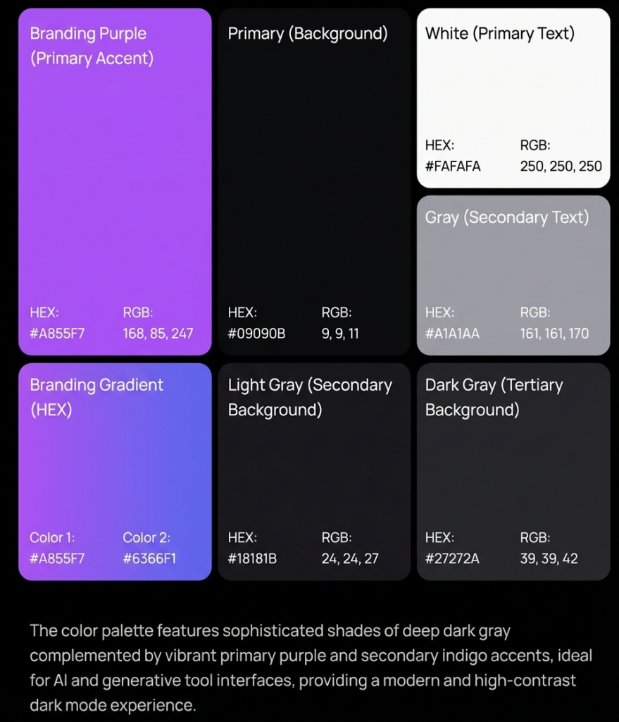
| AI / Innovation Dark | HEX Codes | Best Used For |
| Background (primary) | #09090B | Main canvas |
| Background (secondary) | #18181B | Cards, containers |
| Background (tertiary) | #27272A | Hover, selected |
| Text (primary) | #FAFAFA | Body text — 19.1:1 on #09090B |
| Text (secondary) | #A1A1AA | Descriptions, metadata |
| Accent (primary) | #A855F7 | CTAs, primary interactive |
| Accent (secondary) | #6366F1 | Secondary actions, tags |
| Border | #3F3F46 | Dividers, card outlines |
| Use case: AI SaaS products, generative tool interfaces, creative tech platforms | Min. contrast: #FAFAFA on #09090B = 19.1:1 (AAA). Purple #A855F7 on #09090B = 6.1:1 (AA pass) | ||
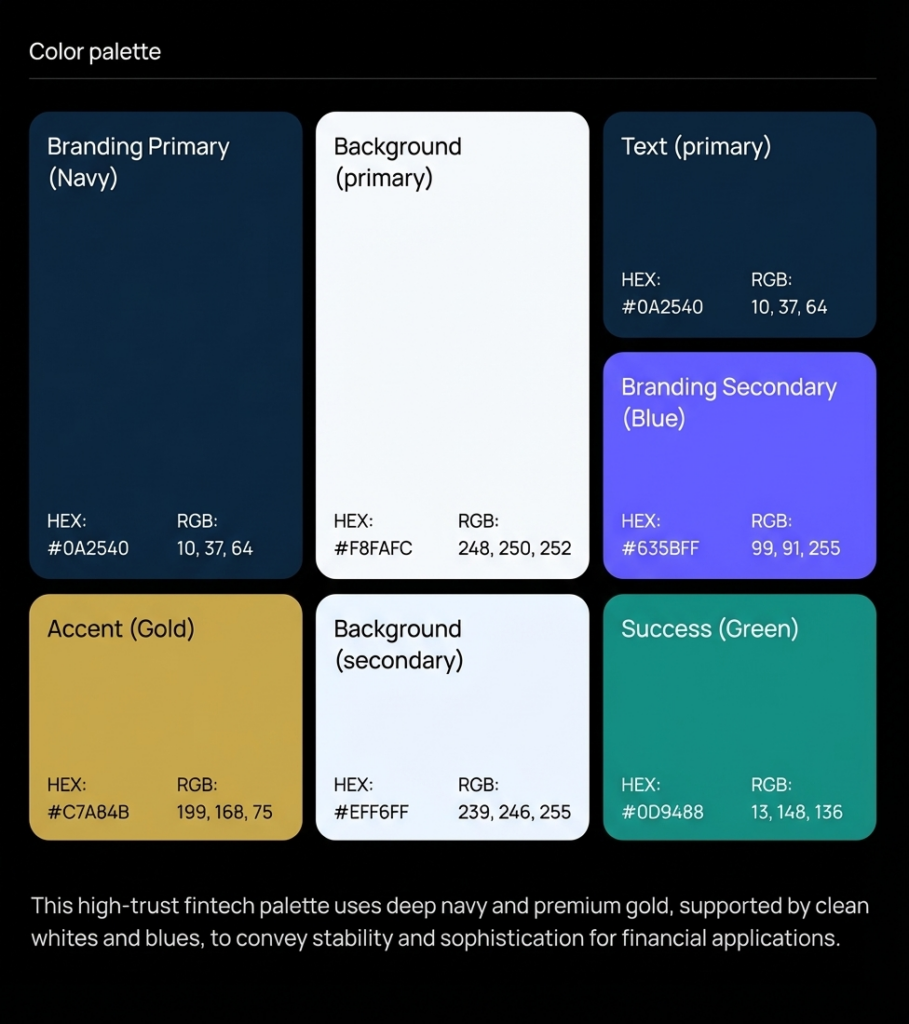
Palette 4 — Fintech / High Trust (Navy-Gold)
| Fintech High Trust | HEX Codes | Best Used For |
| Background (primary) | #F8FAFC | Main canvas |
| Background (secondary) | #EFF6FF | Account panels, data cards |
| Text (primary) | #0A2540 | Body text — 16.7:1 on #F8FAFC |
| Brand primary | #0A2540 | Headers, logo, authority elements |
| Brand secondary | #635BFF | Interactive, CTA, links |
| Accent (gold) | #C7A84B | Premium indicators, selected state |
| Success | #0D9488 | Positive transactions, confirmations |
| Error | #B91C1C | Failed transactions, alerts |
| Use case: Payment platforms, banking apps, insurance, investment tools. Stripe-influenced. | Min. contrast: #0A2540 on #F8FAFC = 16.7:1 (AAA). Stripe brand reference: primary #0A2540, accent #635BFF | ||
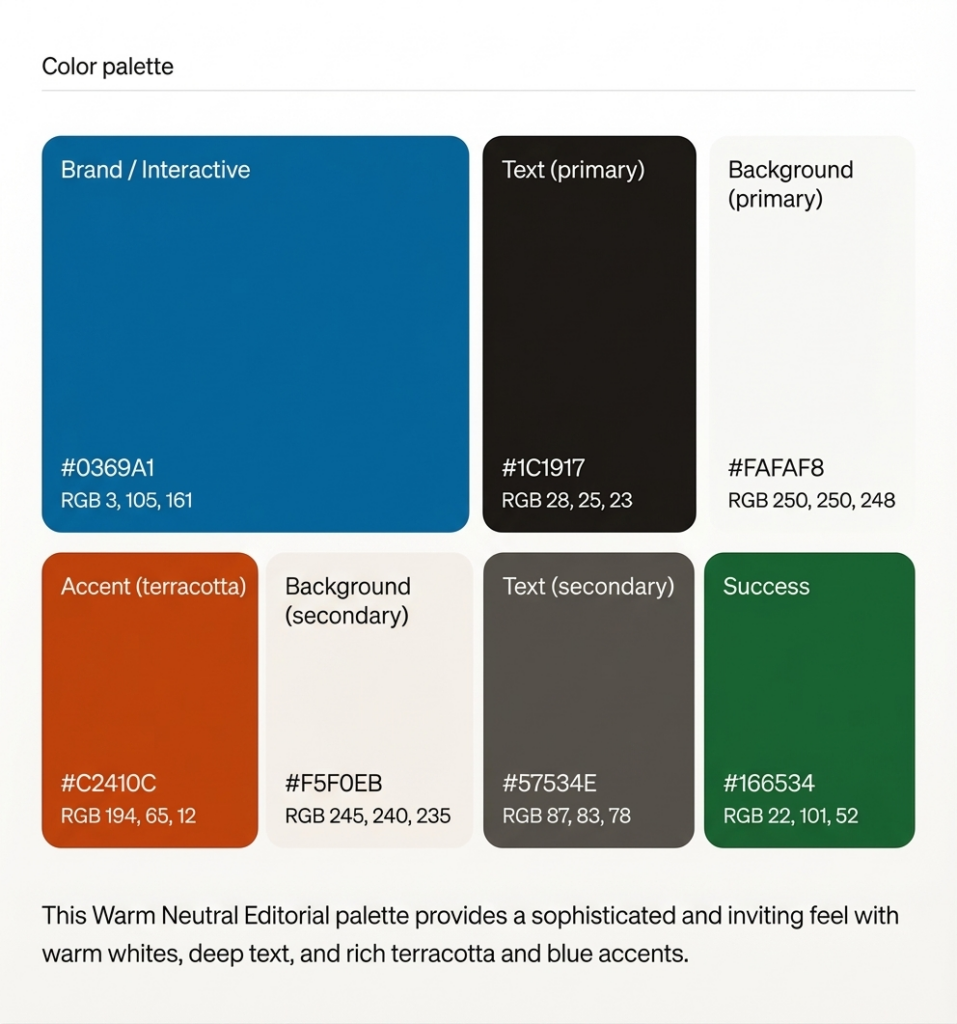
Palette 5 — Warm Neutral / Editorial SaaS
| Warm Neutral Editorial | HEX Codes | Best Used For |
| Background (primary) | #FAFAF8 | Main canvas (warm white) |
| Background (secondary) | #F5F0EB | Cards, sidebars |
| Text (primary) | #1C1917 | Body — 17.5:1 on warm white |
| Text (secondary) | #57534E | Secondary labels — 6.8:1 |
| Brand / Interactive | #0369A1 | Links, CTAs on warm ground |
| Accent (terracotta) | #C2410C | Highlight states, selected |
| Success | #166534 | Completion states |
| Border | #D6D3D1 | Dividers, table rules |
| Use case: Content SaaS, documentation tools, knowledge bases, note-taking apps. Notion-adjacent. | Min. contrast: #1C1917 on #FAFAF8 = 17.5:1 (AAA). Warm palette reduces reported eye fatigue vs pure white. | ||
5. Semantic Color Roles: Every Product Interface Needs These Eight
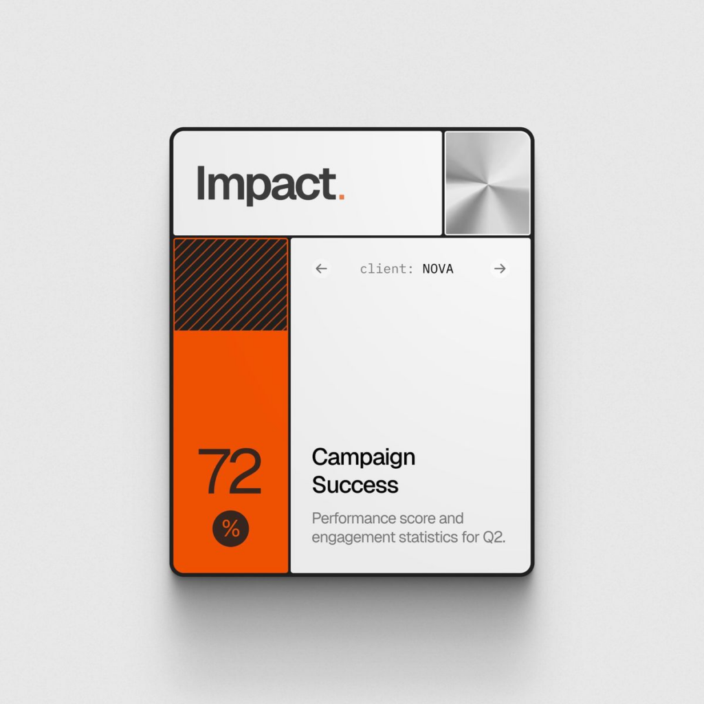
Regardless of which palette you choose, every web product interface requires the same eight semantic color roles. Missing any of them forces the product team to make ad-hoc color decisions that compound into visual inconsistency, accessibility failures, and component library debt.
- surface/default — The primary background. Usually the lightest neutral in light mode, the deepest neutral in dark mode.
- surface/elevated — Background for elements that ‘float’ above the default surface: modals, dropdowns, tooltips, floating panels. Slightly lighter than default in dark mode; slightly darker in light mode.
- text/primary — All body text and primary headings. Must achieve AAA (7:1) against the default surface wherever possible. Never use pure black (#000000) — use near-black (#0F172A, #1C1917) for better typographic color.
- text/secondary — Labels, captions, metadata, placeholder text. Minimum AA (4.5:1) required. This is where most low-contrast failures originate — secondary text gets ‘greyed out’ below the minimum threshold.
- interactive/default — The primary action color. Applied to primary buttons, active links, checkboxes, toggle active states. Must meet AA (4.5:1) for text labels on or adjacent to interactive elements.
- interactive/hover and interactive/active — 10–15% darker than the default interactive color. These must also pass contrast checks against their containing background — hovering the button doesn’t eliminate the accessibility requirement.
- semantic/success, warning, error, info — Status colors for system feedback. Critical rule: never communicate state through color alone. Always pair with an icon, label, or pattern. 8% of males are red-green colour blind — a red error state without a warning icon is invisible to them.
- border/default — The color for UI dividers, table borders, card outlines, form field borders. Must meet 3:1 against its adjacent background (WCAG 2.2 1.4.11 non-text contrast). This is the most commonly failed non-text contrast requirement.
Design system principle (from Stripe’s engineering blog): ‘Choosing accessible color combinations required each designer or engineer to understand the guidelines and select color pairs in each situation. That process doesn’t scale. A well-built semantic token system makes the accessible choice the default choice.’ Build the compliance into the system, so teams don’t need to think about it per-component.
6. Dark Mode: Design It, Don’t Just Invert It
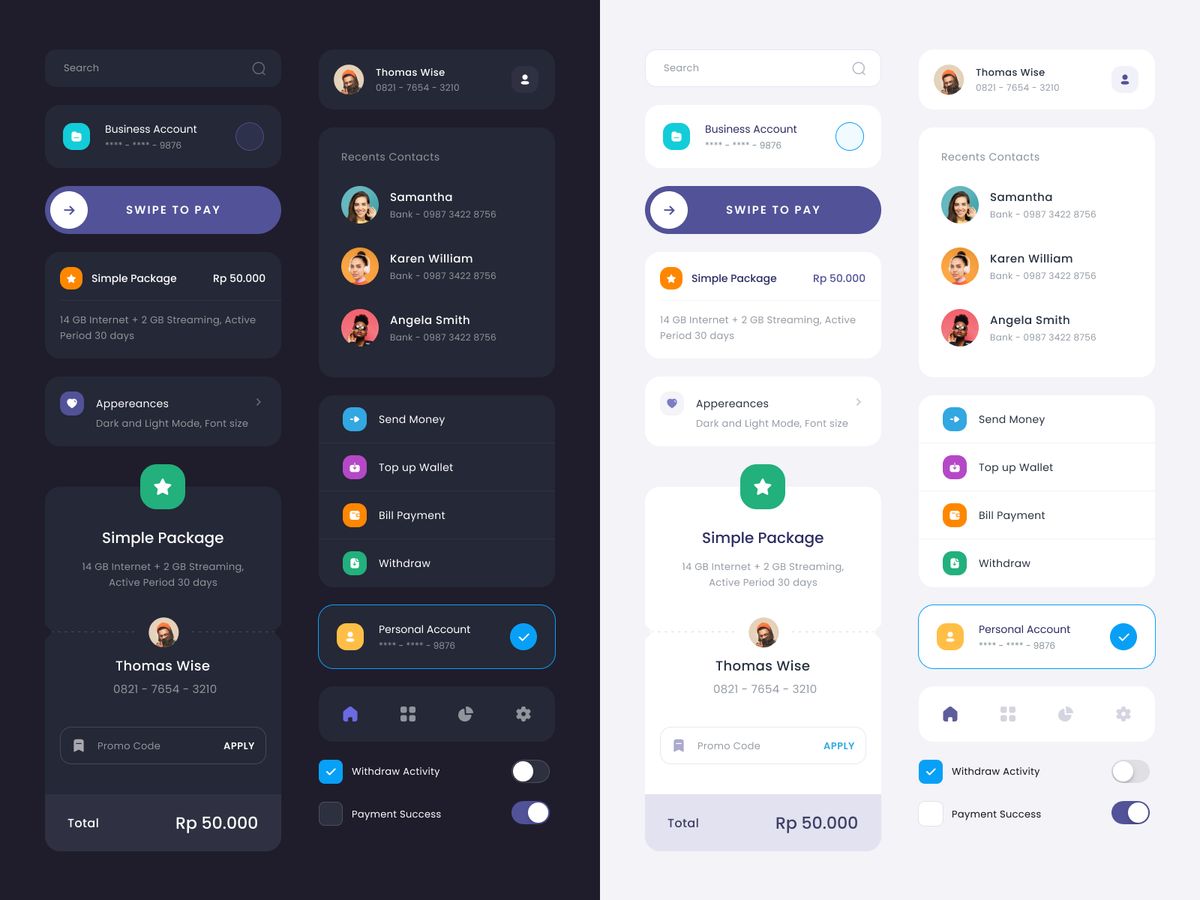
As of 2025, 81.9% of users enable dark mode on at least some of their devices (UX Studio research). Dark mode is no longer a ‘nice to have’ — for developer tools, data platforms, and any product with high session length, it’s a baseline expectation.
Inverting a light palette does not produce a usable dark mode. The problems:
- Saturation inversion — Saturated colors that work on white become visually aggressive on dark backgrounds. A #2563EB button that works perfectly on white has a very different visual weight on #0F172A. Reduce saturation and increase lightness for the dark-mode version.
- Shadow logic reversal — Light mode uses drop shadows to indicate elevation. Dark mode must use lighter-than-background fills to indicate the same elevation (frosted glass / elevated surface patterns). Applying dark mode shadows over dark backgrounds reads as borders, not elevation.
- Text color is not simply white — Pure white (#FFFFFF) on deep dark backgrounds creates a harsh contrast that causes eye fatigue with extended use. Prefer #F1F5F9, #E2E8F0, or #FAFAFA — these hit high contrast ratios without the harshness.
The technical solution is semantic color tokens. When your text/primary token maps to #0F172A in light mode and #F1F5F9 in dark mode, switching modes requires changing which primitive each semantic token references — not touching component code. This is how Vercel, Linear, and Radix UI implement theme switching at scale.
7. 2026 Trends Worth Building Into Your System Now
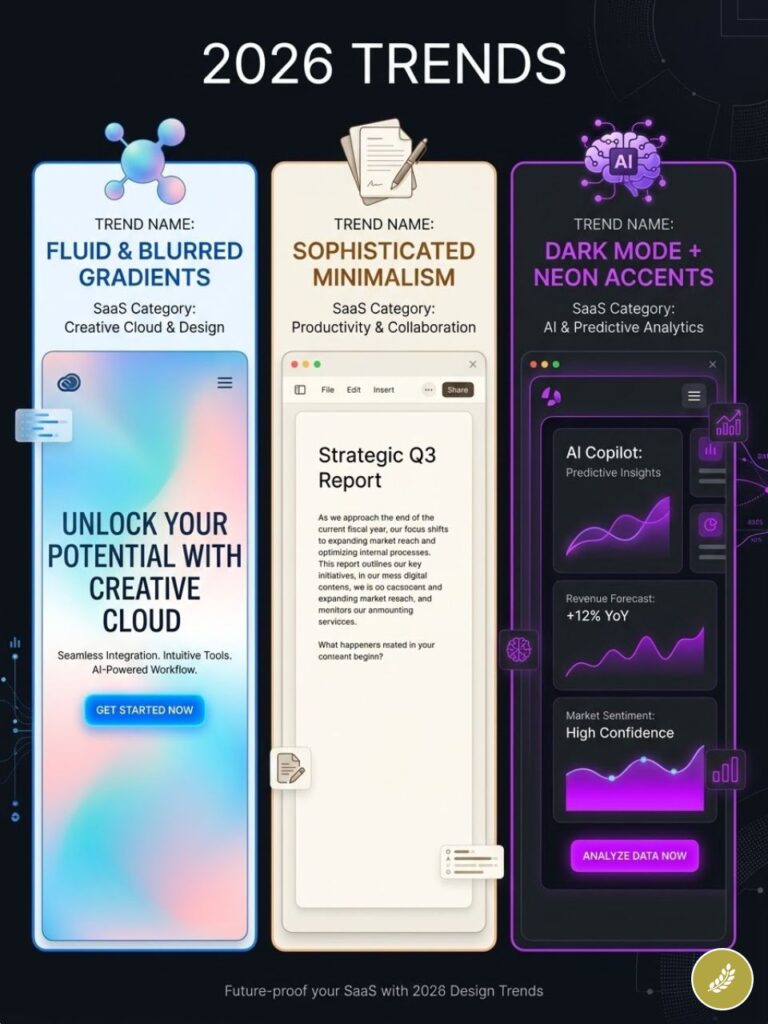
The following are structural shifts in UI color practice, not aesthetic trends. They carry enough momentum to affect how users evaluate product interfaces within the next 12–18 months.
Mesh and Ambient Gradients
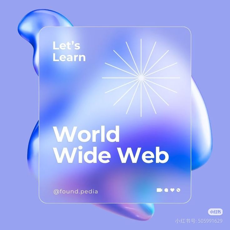
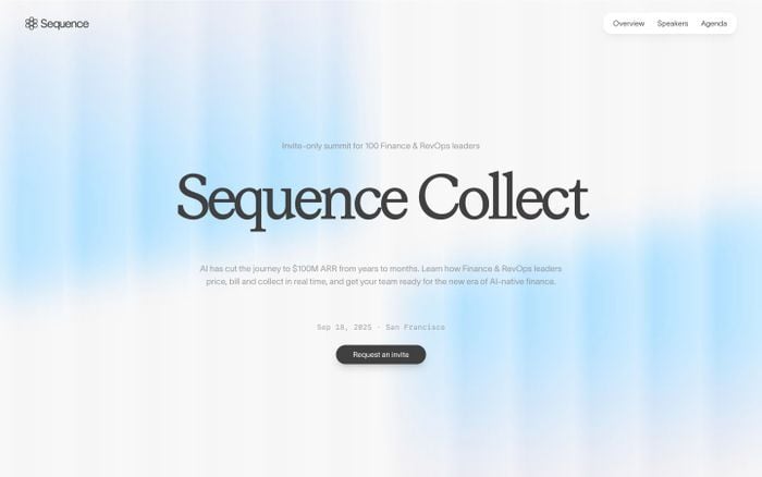
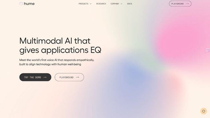
Flat hero sections are being replaced by mesh gradients — multi-point, non-linear blends that create an ambient ‘light from behind’ effect. These communicate technological sophistication in SaaS contexts and are the primary visual differentiator for AI-adjacent product marketing in 2025–2026. Implementation note: use them on marketing surfaces (hero, pricing sections). Do not apply inside the product UI — the complexity competes with content and destroys contrast reliability.
Warm Neutrals as the New ‘Clean’
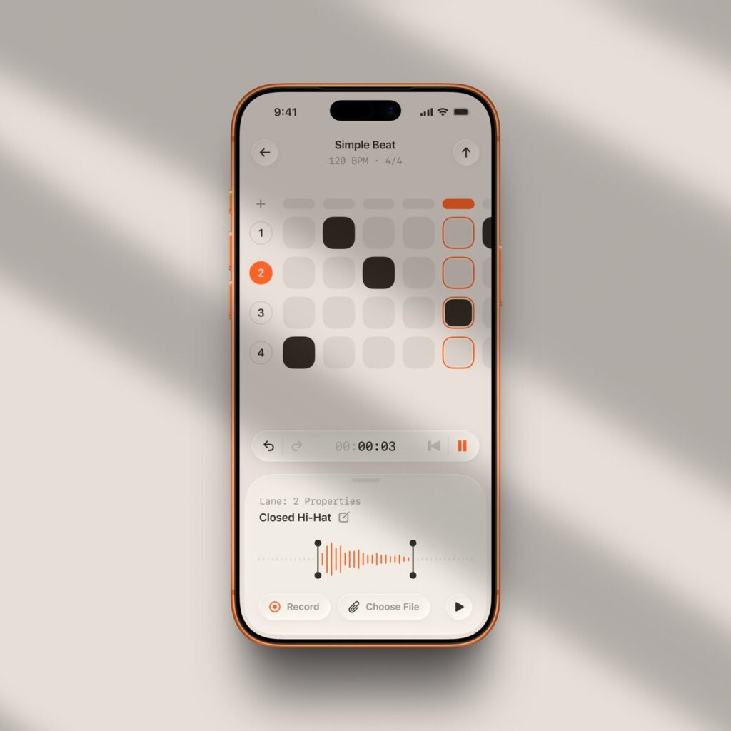
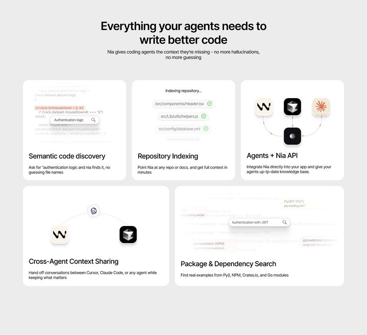
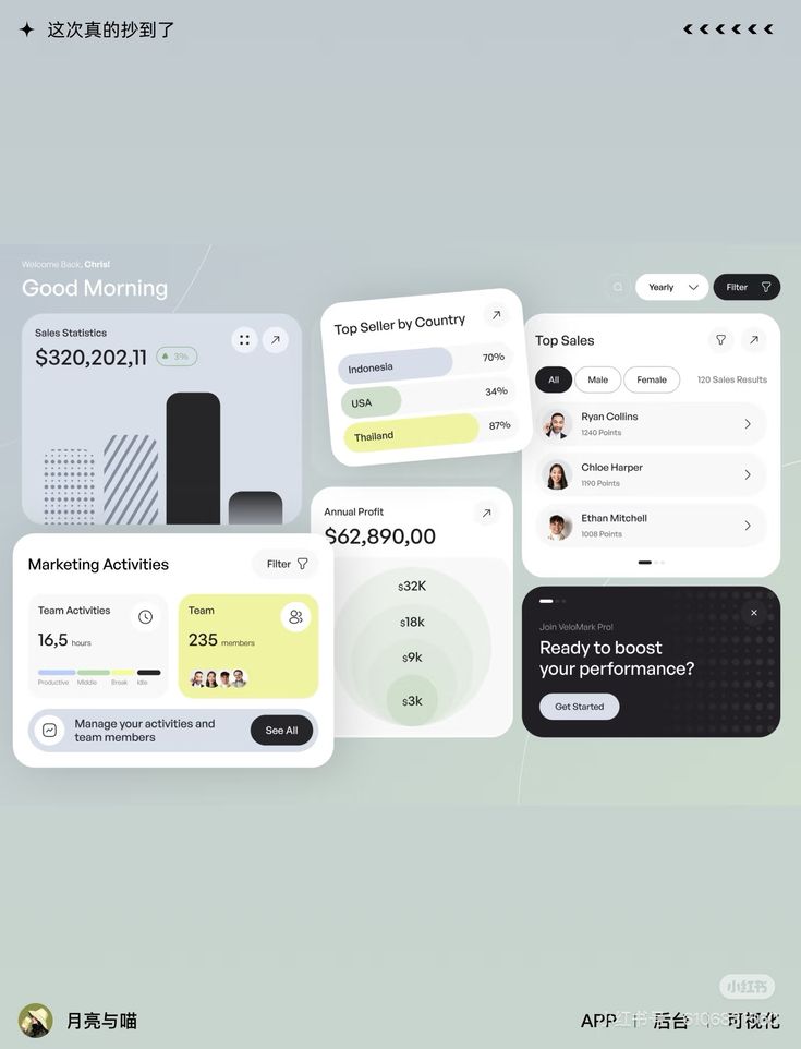
Pantone’s 2026 Color of the Year — Cloud Dancer (PANTONE 11-4201), a warm, very pale neutral — signals the broader shift from cold corporate white to organic off-white in product design. Warm neutrals (#F8F5F1, #FAFAF8) reduce reported screen fatigue, position brands as more human and editorial, and are increasingly common in document editors, content platforms, and knowledge management tools. Pure white (#FFFFFF) backgrounds are beginning to read as impersonal in these contexts.
Accessible Color as Baseline Requirement
The European Accessibility Act (EAA) took effect June 28, 2025, requiring WCAG 2.1 AA compliance for digital products sold to EU consumers. US ADA litigation hit 4,605 cases in 2024. Teams building color systems in 2026 should treat AA compliance as a structural requirement, not a post-launch audit item. The most efficient implementation: build WCAG-validated semantic tokens before component development begins, so compliance is built in rather than retrofit.
Tokenized Design Systems for AI-Assisted UI
As AI UI generation tools mature (Figma’s AI features, v0, Cursor), teams with documented, tokenized color systems get better AI-assisted output. AI tools can follow token-based constraints more reliably than they can interpret ‘use our brand blue.’ Documenting your palette as a formal token system is now infrastructure work, not design-team documentation.
8. Implementation Checklist
Before shipping any color system into production, verify the following:
Accessibility
- Run every body text / background pair through WebAIM Contrast Checker. Minimum 4.5:1 for body, 3:1 for large text.
- Run every UI component color (button outlines, form field borders, checkboxes) against adjacent background — minimum 3:1 (WCAG 2.2 1.4.11).
- Verify no state (error, warning, success, selected) is communicated by color alone. Every state must have a non-color secondary indicator.
- Test the entire UI with a greyscale filter applied. If interactive elements are not distinguishable from static content in greyscale, contrast is insufficient.
- Test with a red-green colorblindness simulator (Coblis or the Figma Stark plugin). Error states using red must remain legible.
System Completeness
- All eight semantic roles defined: surface/default, surface/elevated, text/primary, text/secondary, interactive/default, interactive/hover, semantic states (success/warning/error/info), border/default.
- Dark mode variants mapped for all semantic tokens — not just background and text, but interactive and status colors.
- Hover and focus states defined and contrast-checked for all interactive elements.
- Color variables exported as CSS custom properties (–color-text-primary), Figma variables, or design tokens JSON for cross-team consistency.
Brand Integrity
- Brand primary color checked for contrast at the tones used in the product interface — not just the marketing-approved version.
- Accent color usage documented: where it is and isn’t used. Reserve it for primary CTAs, active states, and critical alerts only.
- All grey scales validated — medium greys (#808080 range) are almost never accessible as text or border colors. Use only light and dark greys with defined contrast-checked pairings.
Related UI color and design guides
Use these related guides when you want to connect your website color scheme to the rest of the interface system:
- UI/UX design guide for the full product-design workflow.
- website UI design for layout patterns, buttons, and screen hierarchy.
- UI/UX design trends in 2026 for current visual direction.
- modern website design trends for web color and layout context.
- UI design secrets for conversion-focused interface details.
- SaaS product design services for product-interface planning.
- user experience basics for designing color around real tasks.
- modular design for turning palette decisions into reusable UI components.
- scalable UI design systems for component libraries and tokens.
- effective design system guidance for documenting color rules.
Sources and color tools
- WCAG 2.2 quick reference
- WebAIM Contrast Checker
- WebAIM Million accessibility report
- Material Design color system
- IBM Carbon color guidance
- Apple Human Interface Guidelines on color
- Figma color styles and design systems
- Stripe brand refresh notes
9. UI color palette FAQ
Q: What are the best website color schemes for UI design?
The best website color schemes for UI design start with strong neutrals, readable text, one primary action color, and semantic colors for success, warning, error, and information. For B2B SaaS, navy, white, cool gray, and a blue accent are still reliable. For portfolios, warm neutrals with charcoal text often work better because they let the work stand forward.
Q: How many colors should a UI color palette have?
A practical UI color palette needs about 12-16 values: four to six neutrals, one or two brand or interactive colors, hover and active states, four semantic colors, and borders. Mature systems can grow into full 100-900 scales, but early products should start smaller. If a color has no role, it does not belong in the system yet.
Q: What is a good UI color palette for SaaS?
A good SaaS UI color palette usually uses a quiet surface system, high-contrast text, a trustworthy primary color, and restrained accents. Deep navy, white, slate gray, and blue or violet accents work well for analytics, finance, and B2B tools. The important part is not the hue alone; it is whether the palette supports states, charts, forms, and CTAs without confusion.
Q: How do I choose accessible color combinations for websites?
Choose accessible color combinations by testing text, buttons, links, icons, borders, and focus states against their actual backgrounds. WCAG AA requires 4.5:1 contrast for normal text and 3:1 for large text and many UI components. Do not rely on red and green alone for states; pair color with labels, icons, or patterns so the message survives color-vision differences.
Q: Is there a reliable formula for choosing a CTA button color?
The most reliable CTA color is the option with the strongest useful contrast against its surrounding area while still meeting contrast for the button label. Keep that color mostly reserved for primary action. If the same accent appears on badges, charts, backgrounds, and decorative icons, users stop reading it as an action cue.
Q: Should primary CTAs always be the brand color?
No. A brand color only works as a CTA if it has enough contrast and is not already used everywhere else. Many brand blues, yellows, and greens are too light for white text. In that case, use a darker accessible variant for the button and keep the original brand color for illustration, decoration, or secondary accents.
Q: How do I handle color tokens in a design-development handoff?
Use three layers: primitive tokens for raw HEX values, semantic tokens for roles like text-primary or surface-muted, and component tokens for specific UI parts. This makes dark mode, white-label themes, and future palette changes easier. A developer should never have to guess which blue a designer meant.
Q: What tools should designers use for color accessibility?
Use WebAIM Contrast Checker for quick HEX checks, Stark in Figma for in-file audits, Coblis for color-blindness simulation, and a token workflow such as Tokens Studio when the palette needs to move from design to code. The tool matters less than testing the real foreground and background pairings before launch.
The business case for getting website color schemes right
Color decisions made early in product development are expensive to change later. A semantic token architecture built correctly in month one takes 2–3 days. Retrofitting it after 40 components are built takes 2–3 weeks. Retrofitting it after a public accessibility audit flags 300 contrast violations takes longer, costs more, and arrives with reputational damage attached.
The products that handle this correctly — Stripe, Linear, Vercel, Radix — don’t get praised for their color systems specifically. They get described as ‘clean,’ ‘professional,’ ‘easy to use’ — the exact language that drives SaaS conversion and reduces churn. The color system is invisible when it works. It’s only visible when it doesn’t.
Build the architecture first. Validate against WCAG before you ship. Treat the accent color like a limited resource. Everything else follows from those three decisions.
Color systems work better when they connect to modular UI components, spacing rules, and reusable states instead of isolated swatches.
For a broader source list, use color palette inspiration before you lock the UI tokens; it helps you separate mood, contrast, and action colors instead of treating the interface like a decoration pass.
- 2.0Kshares
- Facebook0
- Pinterest2.0K
- Twitter0
- Reddit0