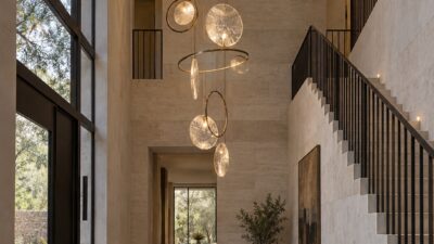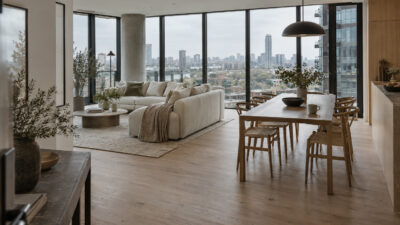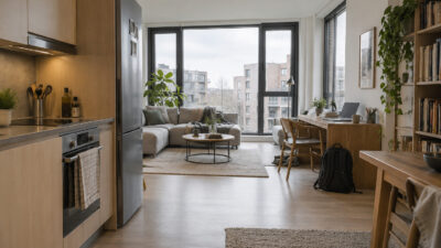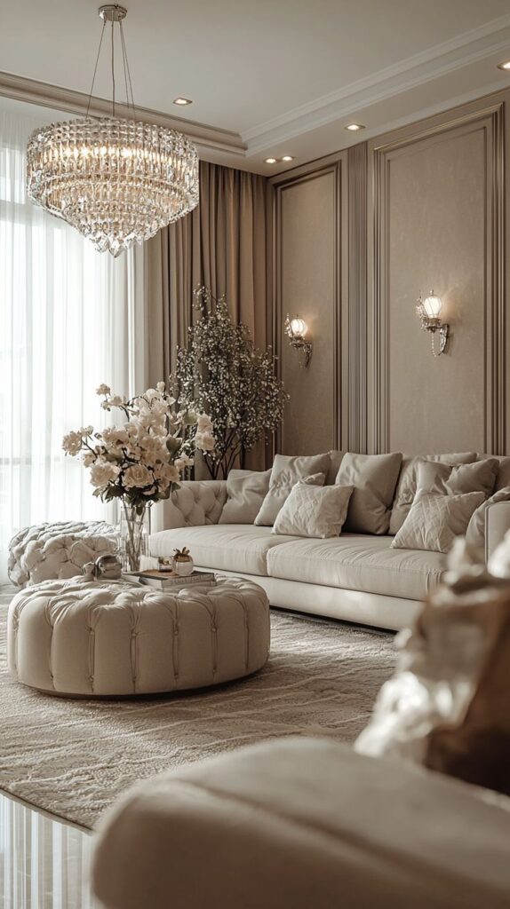
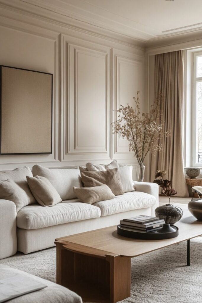
A strong living room color palette starts with one base shade, one supporting neutral, and one accent color you can repeat in textiles, wall art, and small decor. Pantone colors are useful here because they give you a precise reference point instead of a vague idea like “warm beige” or “soft green.”
Use this guide to choose Pantone colors for living rooms by room size, natural light, furniture undertone, and the mood you want: calm, earthy, bright, or dramatic. I would test every color beside the sofa fabric and flooring first; a shade that looks elegant on a screen can turn muddy next to the wrong wood tone.
Key takeaways
- Pantone colors provide a reliable way to design a balanced living room.
- Following Pantone trends can keep the space modern and well-coordinated.
- Using Pantone guides simplifies selecting paint and décor materials.
How to build a living room color palette with Pantone colors
To build a living room color palette with Pantone colors, choose a calm base for the largest surfaces, then repeat one accent shade in three smaller places: pillows, artwork, ceramics, a rug border, or a chair. Keep the strongest Pantone color off the biggest wall unless the room has good daylight and simple furniture. In small rooms, a light neutral base with one saturated accent usually feels larger and cleaner. In large rooms, deeper browns, blues, greens, or terracotta shades can make the seating area feel more grounded.
| Living room goal | Best palette move | Where to use the Pantone color |
|---|---|---|
| Make the room feel bigger | Use pale warm neutrals with one soft accent | Cushions, art, side table decor |
| Add warmth | Pair beige, brown, clay, or muted terracotta | Rug, throw blanket, accent chair |
| Create a calm space | Use blue-green or sage with warm white | Wall art, curtains, ceramics |
| Make a bold statement | Keep the walls quiet and repeat one strong color | Sofa, single wall, large artwork |
Understanding Pantone Colors for Living Rooms
Pantone colors help homeowners pick shades that create harmony and balance in living rooms. They offer precise options for matching furniture, walls, and decor. Knowing the benefits and trends can guide smart color choices.
What Are Pantone Colors
Pantone colors are standardized shades created by the Pantone Color Institute. Each color has a unique code that designers and manufacturers use worldwide. This system ensures exact color matching across different materials and brands.
For living rooms, Pantone colors provide reliable references. This means paint, fabric, and accessories can all share the same tone without guessing or mismatching. It simplifies decorating and refreshing rooms without surprises.
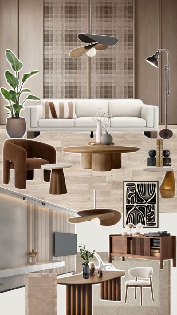
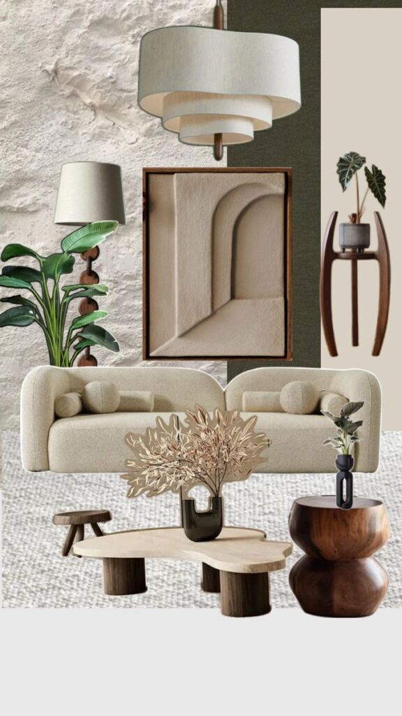
Benefits of Using Pantone in Home Design
Using Pantone colors in home design brings consistency and accuracy. Homeowners can confidently select paint and decor that fit together. This reduces waste and saves time during decorating.
Pantone colors also make communication easier with professionals. Interior designers, painters, and suppliers can all understand exactly which color is meant. This avoids confusion and costly mistakes.
Additionally, Pantone offers a wide range of colors. From calming neutrals to bold accents, there is a Pantone shade for every style. This variety supports creative and personalized living room designs.
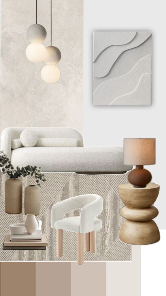
Pantone Trends in Interior Spaces
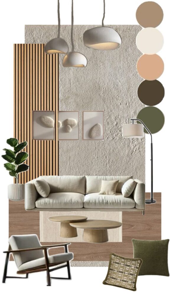
Pantone releases new colors and trends yearly that influence interior design. Currently, earthy tones like clay, olive green, and warm beige are popular for living rooms. These hues add natural warmth and comfort.
Another trend involves combining muted pastels with bright accents. This mix brightens spaces while keeping a calm atmosphere. It works well in both modern and traditional living rooms.
Designers also use Pantone’s Color of the Year as a trend guide. Incorporating this shade in furniture or accessories keeps the living room stylish and current.
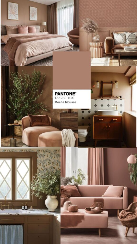
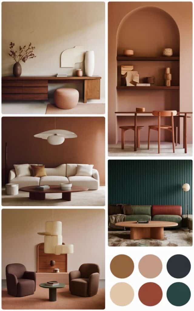
Choosing the right Pantone colors for your living room
Selecting the best Pantone colors means thinking about the existing style, space, and light in the living room. The right shades can change how the room feels and interacts with furniture and natural light.
Start with your living room color palette
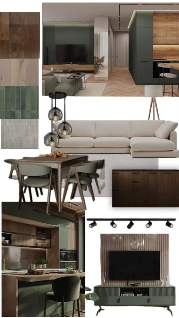
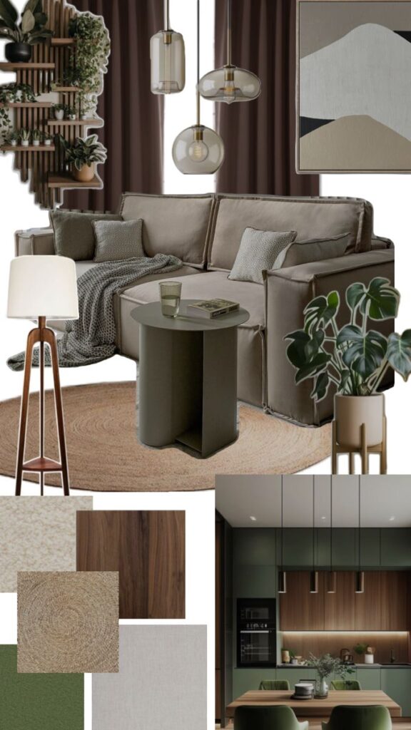
Start by looking at the room’s main features, such as walls, floors, and fixed furniture pieces. These will guide which Pantone colors fit well.
Choose a base color for large areas like walls. It should set the room’s overall mood. Add one or two accent colors for smaller elements like cushions or lamps.
Using a color wheel can help find matching or contrasting Pantone tones. For example, soft cool grays match well with warmer earth tones. This balance creates harmony in the space.
Pantone Colors That Enhance Space and Light
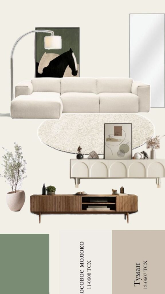
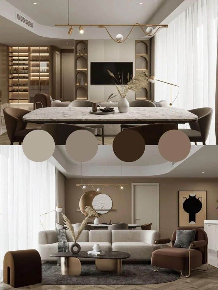
Light plays a big role in how colors appear. Bright rooms can handle cooler and darker Pantone shades because natural light balances the tone.
In rooms with little natural light, lighter Pantone colors such as soft whites, pale blues, or creamy yellows work better. These shades help reflect light and make the space feel bigger.
Consider using matte finishes for walls with darker Pantone colors. This reduces glare and creates a cozy feel without overwhelming the room.
Complementing Existing Furnishings
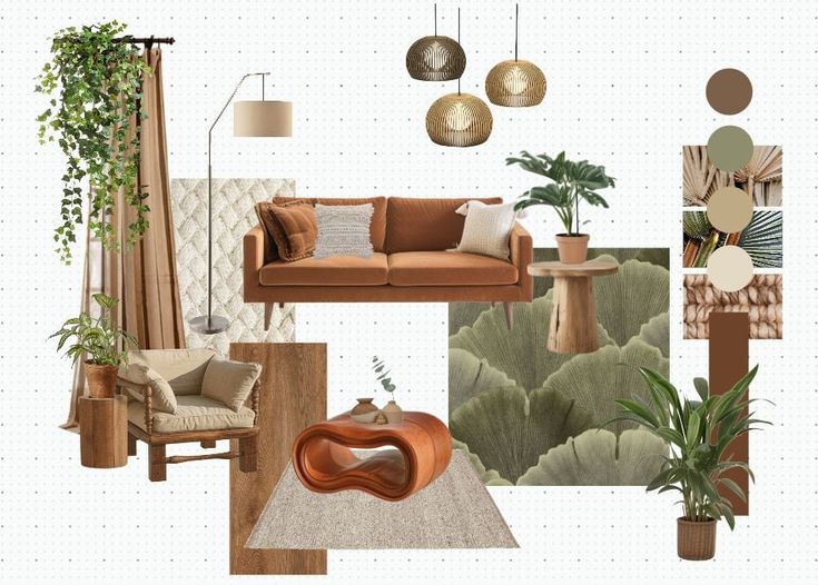
Pantone colors should coordinate with the furniture style and colors already present.
If the furniture is neutral like beige or gray, try stronger accent colors such as deep blues or muted greens. This adds visual interest without clashing.
For rooms with bold furniture colors, softer Pantone tones can balance the design. Shades like blush pink or light taupe provide calm without competing.
Using Pantone color samples near the furniture helps ensure the shades work well together in natural and artificial lighting.
Selecting Colors for Different Room Sizes
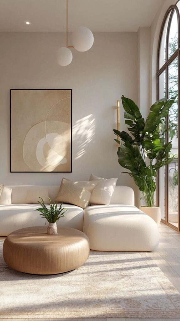
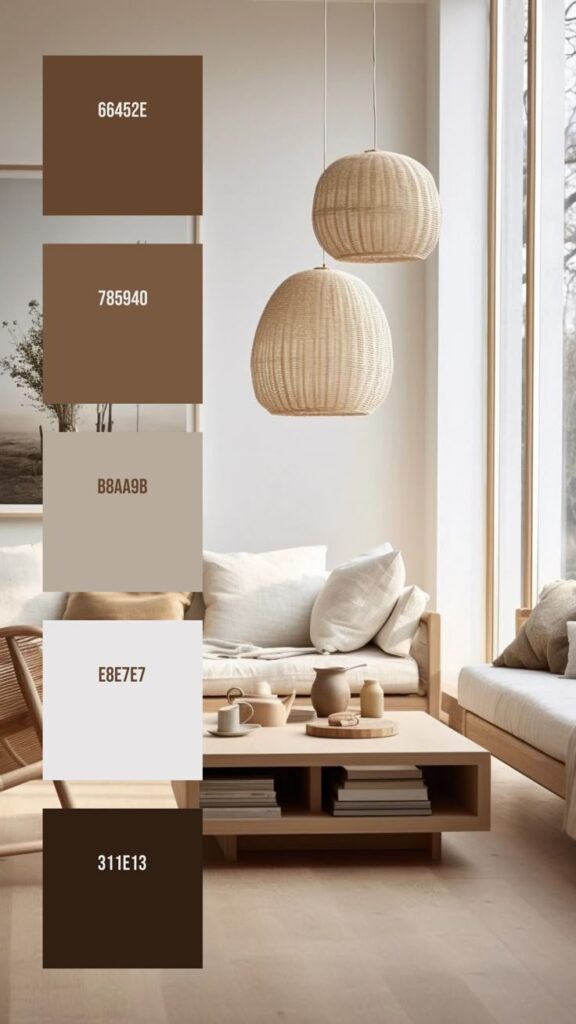
Small living rooms benefit from lighter Pantone colors. Shades like Pale Dogwood (Pantone 13-1404) or Misty Blue (Pantone 16-4120) open up the space visually.
In larger living rooms, deeper and richer Pantone colors like Marsala (Pantone 18-1438) or Forest Biome (Pantone 19-6311) create warmth and a sense of intimacy.
Try combining multiple Pantone colors to divide the room into zones. For example, an accent wall in a dark tone with lighter surrounding walls adds depth without shrinking the room.
Popular living room color palette ideas
Living rooms can be styled with a variety of color palettes to set the right mood and atmosphere. Some palettes focus on soft neutrals, while others use bright colors or calming tones. Warm earth tones also create inviting and cozy spaces.
Modern Neutrals
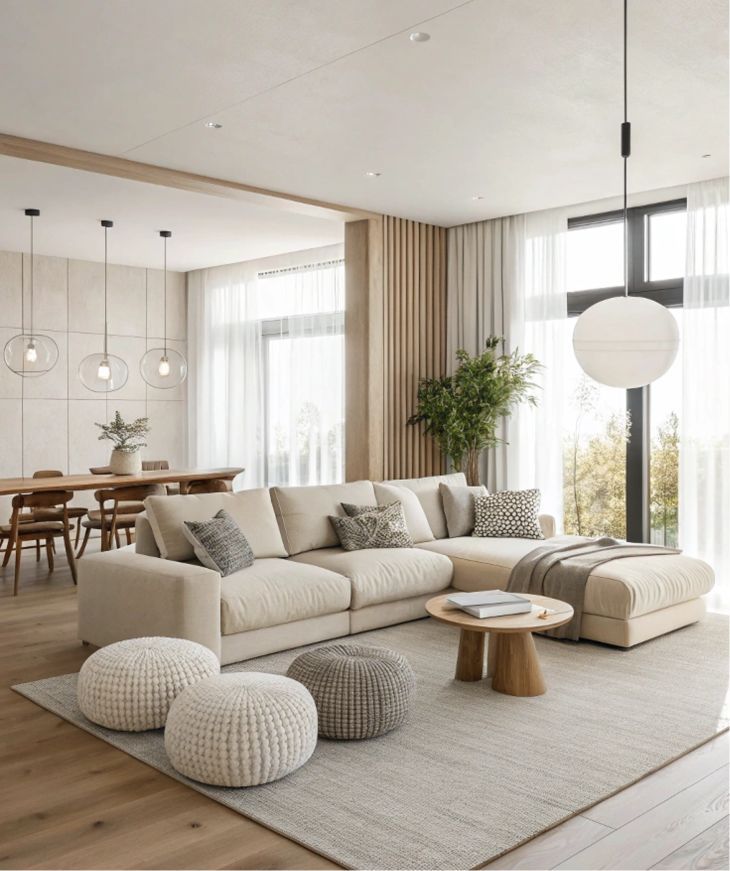
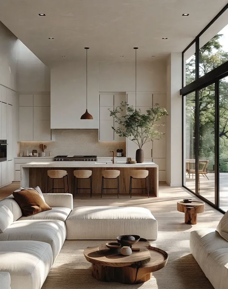
Modern neutral palettes often include shades like Pantone Warm Gray, Pale Silver, and Soft Ivory. These colors create a clean, sleek look that works well in minimalist or contemporary spaces.
Using different shades of gray and beige can add depth without overwhelming the room. Textured fabrics and natural materials like wood help prevent the space from feeling cold.
White accents, such as trims or furniture, pair well with neutral walls to brighten the room. This palette is flexible and can be combined with other colors for small pops of contrast.
Bold and Vibrant Selections
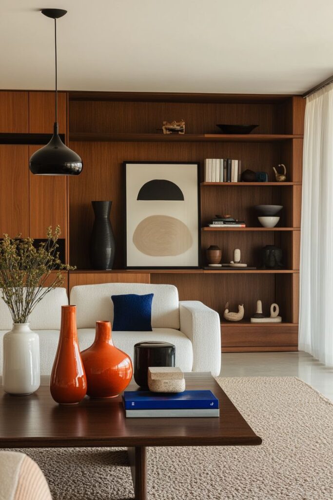
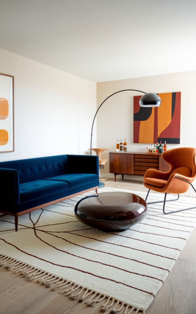
Bold palettes feature bright Pantone colors like Fiery Red, Citrus Orange, and Lime Green. These hues bring energy and personality to living rooms.
They work best in spaces needing vibrancy or focal areas. For example, a bright orange sofa can stand out against neutral walls.
When using bold colors, balance them by keeping other elements simple. Limit bold colors to one or two main pieces and use muted tones for the rest of the room to avoid visual chaos.
Calming Blues and Greens
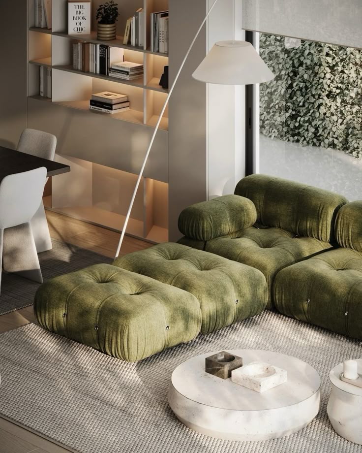
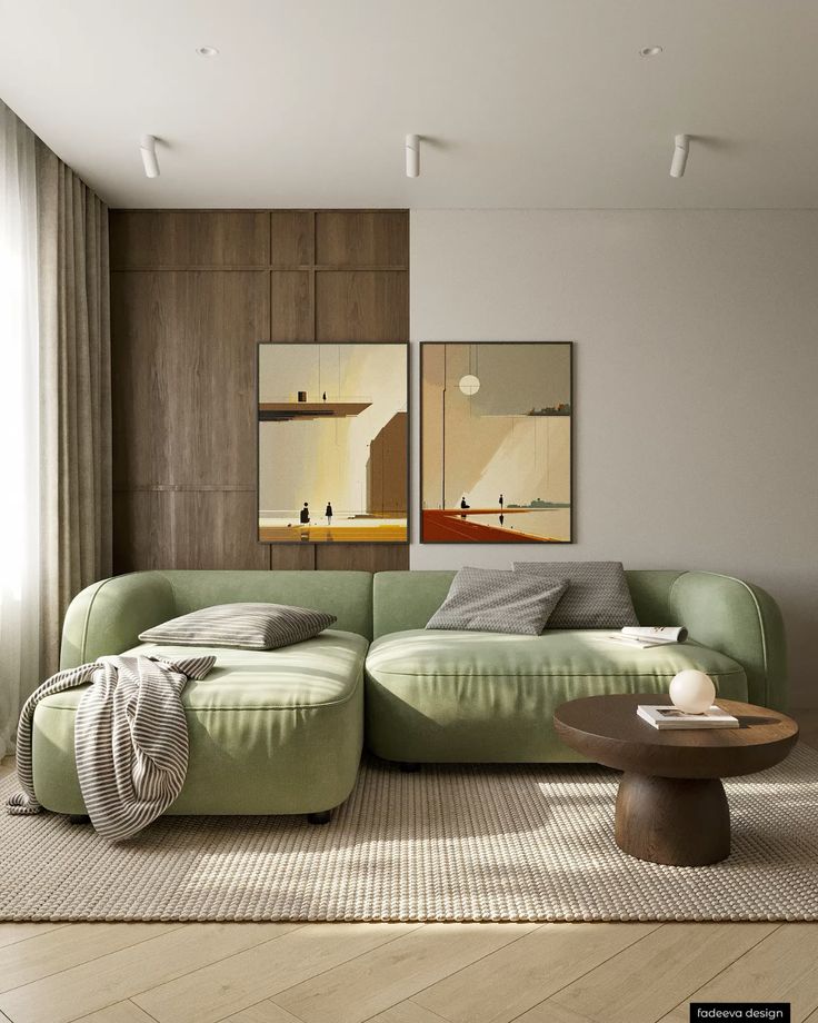
Blues and greens like Serenity Blue, Mint, and Sage create peaceful environments. These colors tend to reduce stress and encourage relaxation.
A soft blue wall with green accents in pillows or rugs is popular. These shades pair well with natural light and wooden furniture.
Using cooler tones gives the room a fresh, airy feeling. Combining different blue and green shades adds variety while keeping the space calm.
Warm Earth Tones
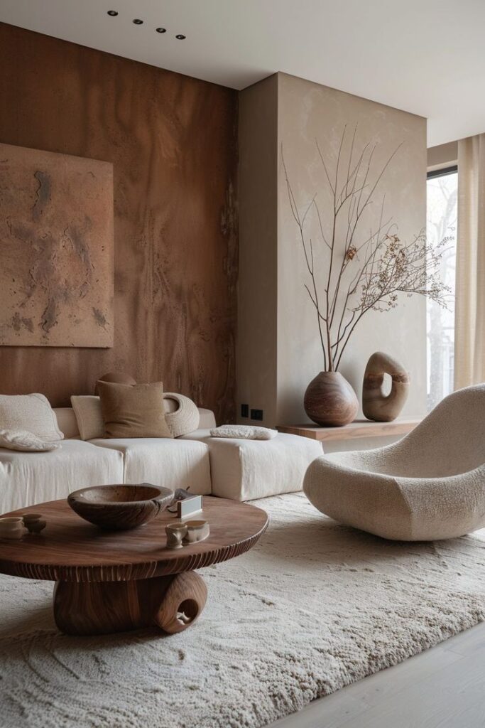
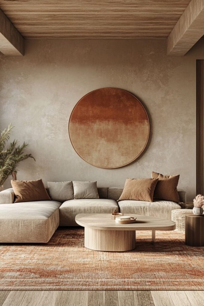
Earth tones use Pantone colors such as Terracotta, Mustard Yellow, and Olive Green. These rich hues bring warmth and comfort to living rooms.
They work well with rustic or traditional styles. Earth tones feel inviting and create a grounded space.
Mixing these colors with soft creams or light browns keeps the palette balanced. Adding natural textures like leather or woven fabrics enhances the warm feel.
Incorporating Pantone Colors into Living Room Design
Using Pantone colors in a living room involves choosing the right place to apply the color, such as walls, furniture, or smaller decorative items. Balancing bold shades with softer tones helps create a space that feels both stylish and comfortable.
Accent Walls with Pantone Shades
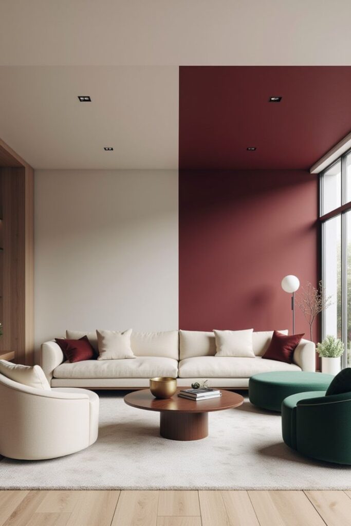
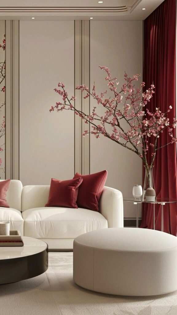
An accent wall painted with a Pantone color can add depth and interest. Popular choices include Classic Blue or Softer Pastels like Pantone 13-1520 Rose Quartz. These colors work well behind a sofa or fireplace to draw focus.
When picking a color, consider the room’s natural lighting. Darker Pantone shades may work better in large, bright rooms, while lighter colors suit smaller or dimmer spaces.
Applying Pantone on just one wall prevents the space from feeling overwhelming. Pairing the accent wall with neutral shades like gray or beige helps maintain balance.
Pantone Colors for Furniture
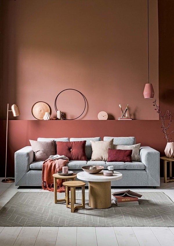
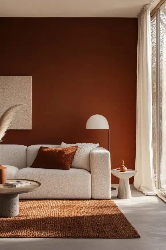
Using Pantone colors on furniture can make pieces stand out as focal points. Chairs, sofas, or ottomans in Living Coral (Pantone 16-1546) or Greenery (Pantone 15-0343) bring life to the room.
Furniture with Pantone colors should complement the wall and floor colors. It’s best to pick one or two key pieces to avoid a cluttered look.
Materials like velvet, linen, or leather can change how the Pantone color appears, so testing fabric swatches in the actual room light is important.
Coordinating Decor and Accessories
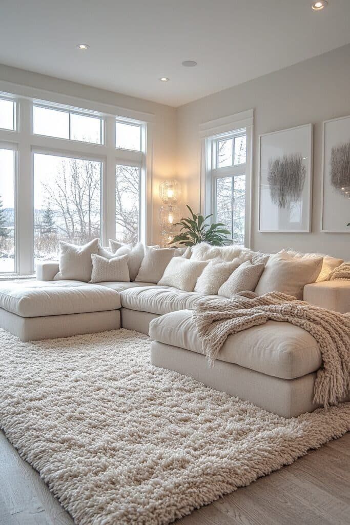
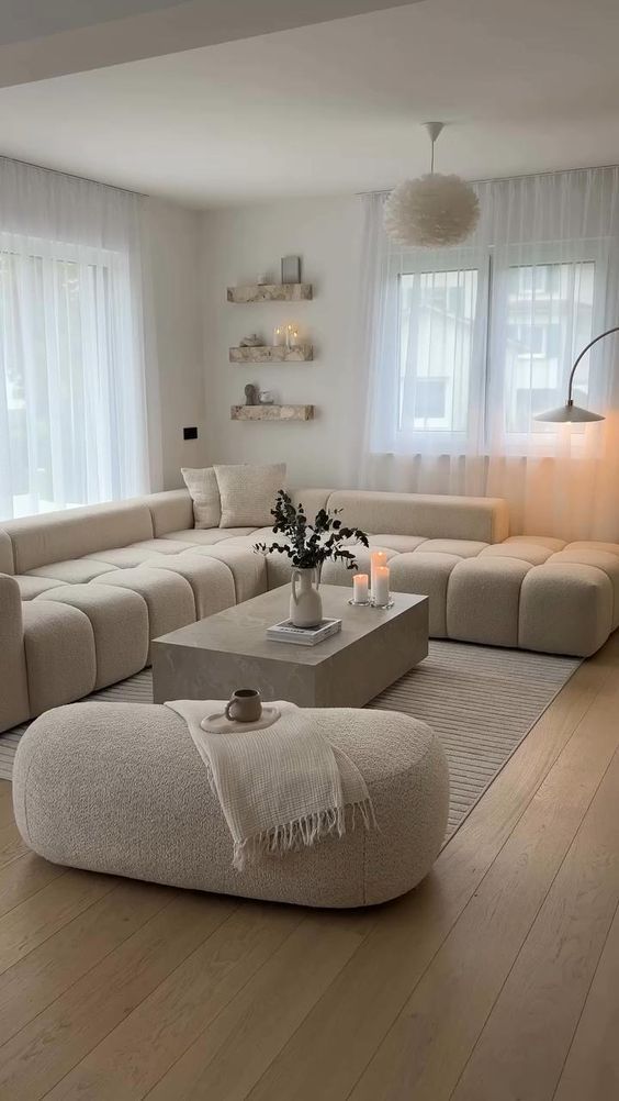
Decorative items like cushions, rugs, and artwork offer flexible ways to introduce Pantone colors without large commitments. Choosing accessories in Pantone’s Neutral or Earth Tones helps tie the room together while adding subtle color pops.
Layering colors works well—pairing a bright Pantone shade with soft, muted hues creates harmony. For example, cushions in Pantone Terracotta can warm up a room with cooler wall colors.
Use metallic accents, like gold or chrome, sparingly to enhance Pantone colors and add a polished finish to the living room design.
Pantone Color of the Year in living room decor
The Pantone Color of the Year can be useful for living room decor, but it works best as a reference, not a rule. In 2026, Pantone named Cloud Dancer, a clean white, as its Color of the Year. That makes it especially practical for living rooms because white is often the base that lets wood, stone, textiles, and accent colors breathe.
Integrating the Latest Pantone Color
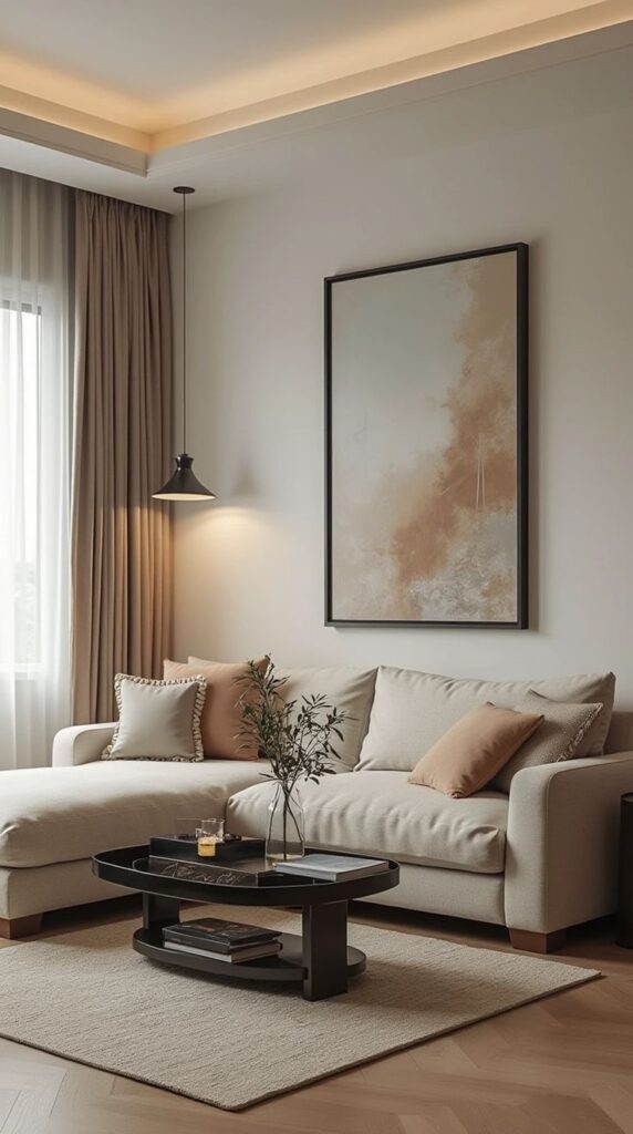
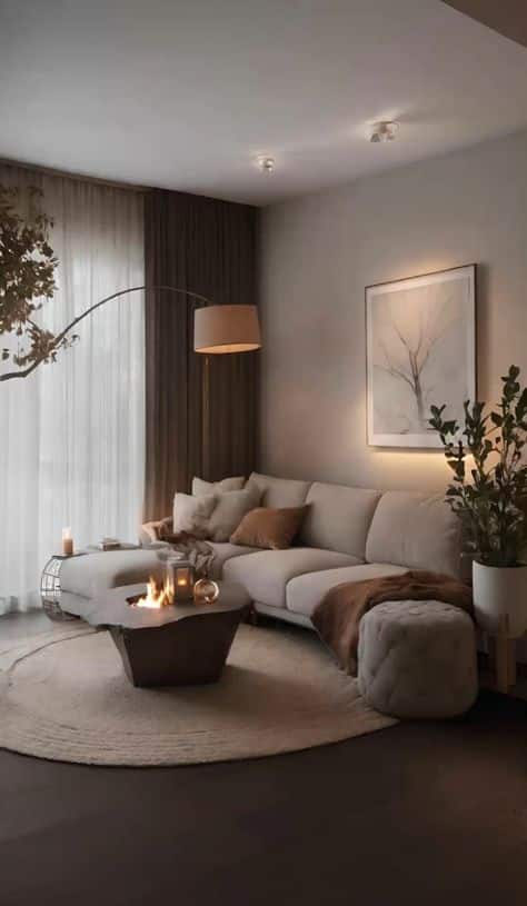
For a Cloud Dancer-inspired room, use white as the quiet base rather than the whole story. Pair it with warm oak, cream upholstery, black metal, muted sage, clay, or cocoa brown so the living room does not feel flat.
If you prefer bolder Pantone shades, keep Cloud Dancer or another warm white on the walls and repeat the accent color in smaller pieces. This gives you a trend-aware palette without repainting the room every season.
This approach keeps the room current without chasing every trend. It also makes the palette easier to update when pillows, artwork, flowers, or a rug change.
Past Pantone Colors of the Year in Living Rooms
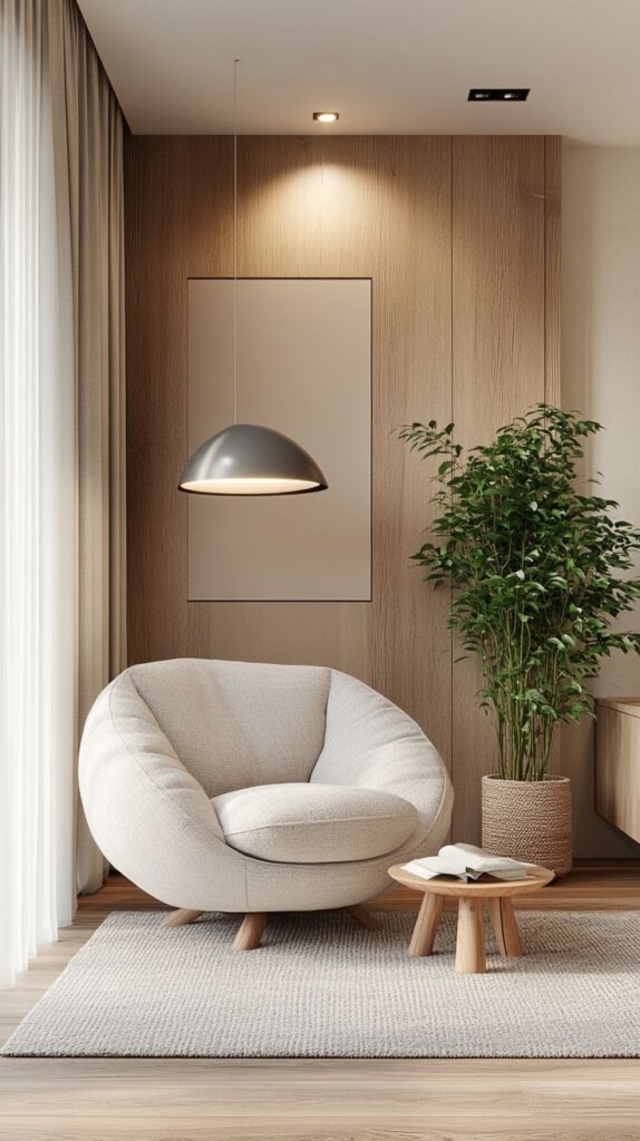
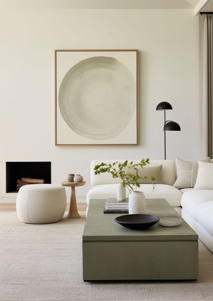
Previous Pantone Colors of the Year have shaped living room decor in distinct ways. For instance, Classic Blue encouraged calm and stable spaces, often appearing in couches and walls.
Living Coral brightened rooms with warmth and energy. It was popular in cushions, vases, and throw blankets to add life without heavy commitment.
Each past color brought a unique mood, such as neutrality with Ultra Violet or freshness with Greenery. These choices often acted as accent colors rather than the main theme, helping living rooms remain stylish yet flexible.
Tips for Achieving a Balanced Pantone-Inspired Living Room
A well-designed living room using Pantone colors relies on careful color pairing, thoughtful use of contrast, and proper lighting. These factors help maintain harmony and make the space visually interesting. Attention to detail in these areas ensures a cohesive and inviting environment.
Mixing Pantone Colors Effectively
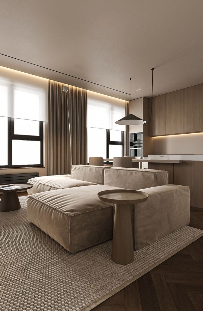
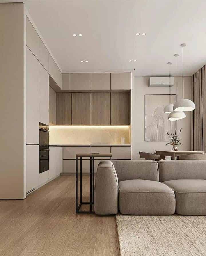
Mixing Pantone colors works best when one dominant color is supported by one or two accent shades. Start by choosing a base color for walls or large furniture pieces. Add accents through pillows, rugs, or artwork in complementary or analogous Pantone tones.
A useful trick is to pick colors from the same family, such as different blues or greens, to keep the room calm. For a bolder look, contrast warm and cool shades, like a deep orange with a soft teal. Avoid using too many bright colors at once; this can make the space feel cluttered.
Creating Contrast and Depth
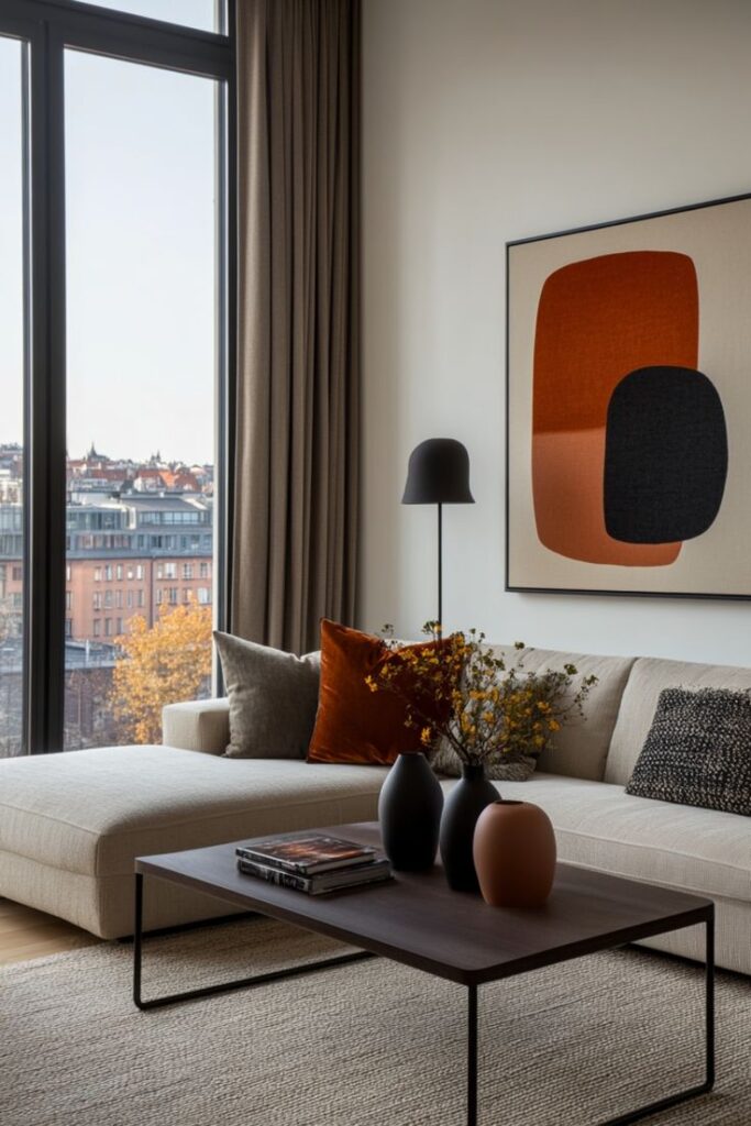
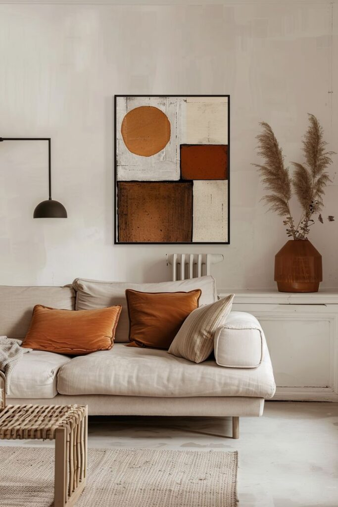
Contrast adds interest and depth to a living room. Pair light and dark Pantone colors to define areas and draw the eye. For example, dark furniture can stand out against light walls painted with soft Pantone shades.
Texture also plays a role. Use materials like wood, metal, or fabric to break up color blocks. Combining matte and glossy finishes can give the room dimension. Contrast can be subtle but should always guide how people move and focus within the space.
Lighting Considerations
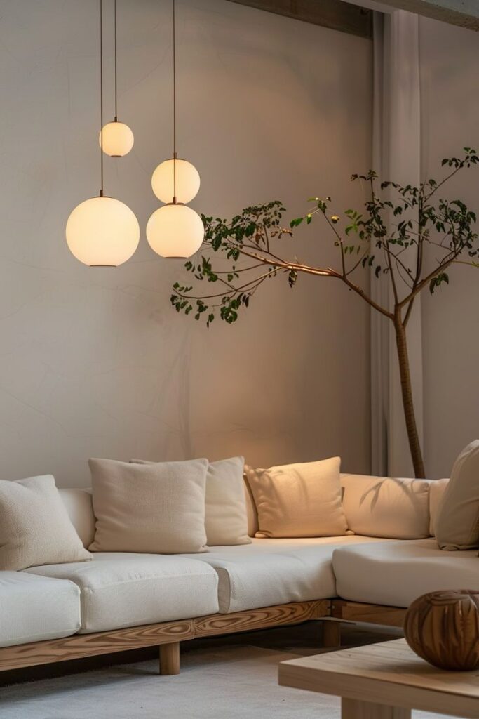
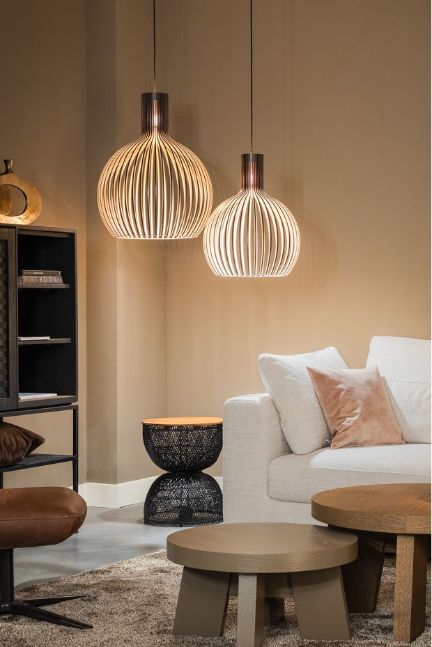
Lighting affects how Pantone colors appear. Natural light shows colors most accurately, so place furniture strategically near windows. In rooms with less daylight, warm light bulbs help Pantone colors feel cozy.
Avoid harsh white lights, which can wash out color tones or create shadows. Use multiple light sources like floor lamps, ceiling lights, and table lamps to evenly light different parts of the room. Adjustable lighting lets occupants change the mood based on time of day or activity.
Maintaining and Updating Pantone-Inspired Living Rooms
Living rooms with Pantone colors need regular attention to stay fresh and balanced. Small changes can make a big difference. It is important to know how to update colors and keep the space inviting.
Easy Ways to Refresh Your Palette
Changing cushions or curtains in complementary Pantone shades is a quick way to refresh the room. For example, swapping a cushion in “Living Coral” for one in “Classic Blue” adds new energy without a full redesign.
Painting an accent wall in a trending Pantone color can update the look. Adding small decor items like vases or lamps in muted or neutral tones keeps the main colors from clashing.
Replace rugs or throws seasonally with Pantone-inspired options. This keeps the palette dynamic and fits changes in weather or mood.
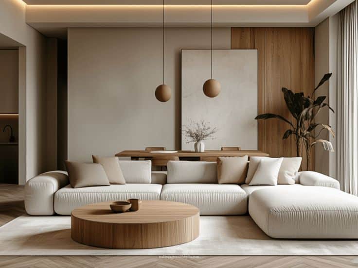
Adapting to Changing Trends
Pantone updates its colors each year, so adapting popular shades can keep the living room current. People should choose 1-2 core colors to stay consistent and introduce trendy tones carefully.
Neutral bases like “Ultimate Gray” allow easy switching of accent colors. This approach helps avoid repainting or big expenses.
Trying new Pantone shades in art pieces or plant pots is less permanent and allows easy updates. This strategy keeps the room modern while respecting the original palette.
Where to Find Authentic Pantone Paints and Materials
Pantone references are helpful for living rooms, but paint and fabric still need real-world testing. The goal is not to buy everything from one source; it is to keep the undertones consistent from wall color to sofa fabric and decor.
Sourcing Quality Pantone Paints
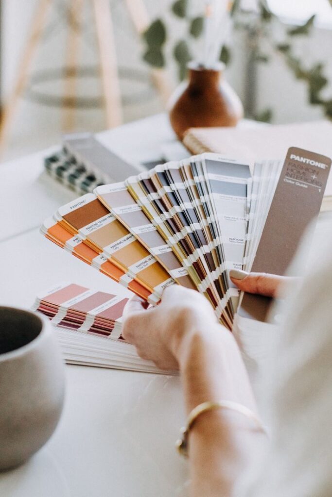

Pantone is most useful as a color reference. For wall paint, bring a physical Pantone reference or a professionally matched sample to a trusted paint supplier, then test the paint in your actual room before committing.
Do not rely on a phone screen for final color decisions. Screens shift white balance, and glossy product photos can make beige, clay, sage, or blue look cleaner than they will under warm bulbs.
Paint a sample board and move it around the living room for a full day. Check it beside the sofa, floor, curtains, and the darkest corner before choosing the final finish.
Selecting Pantone Home Accessories
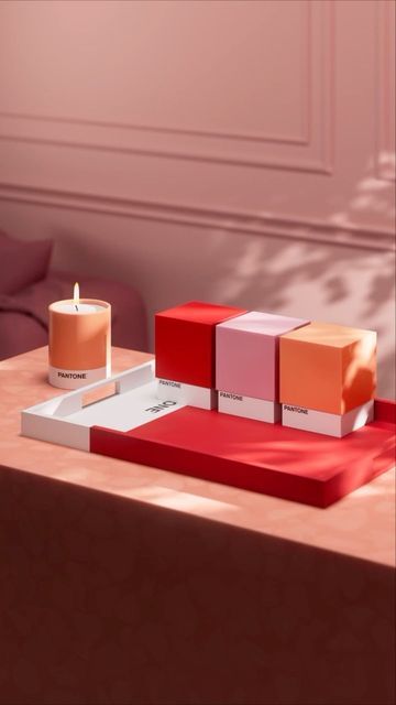
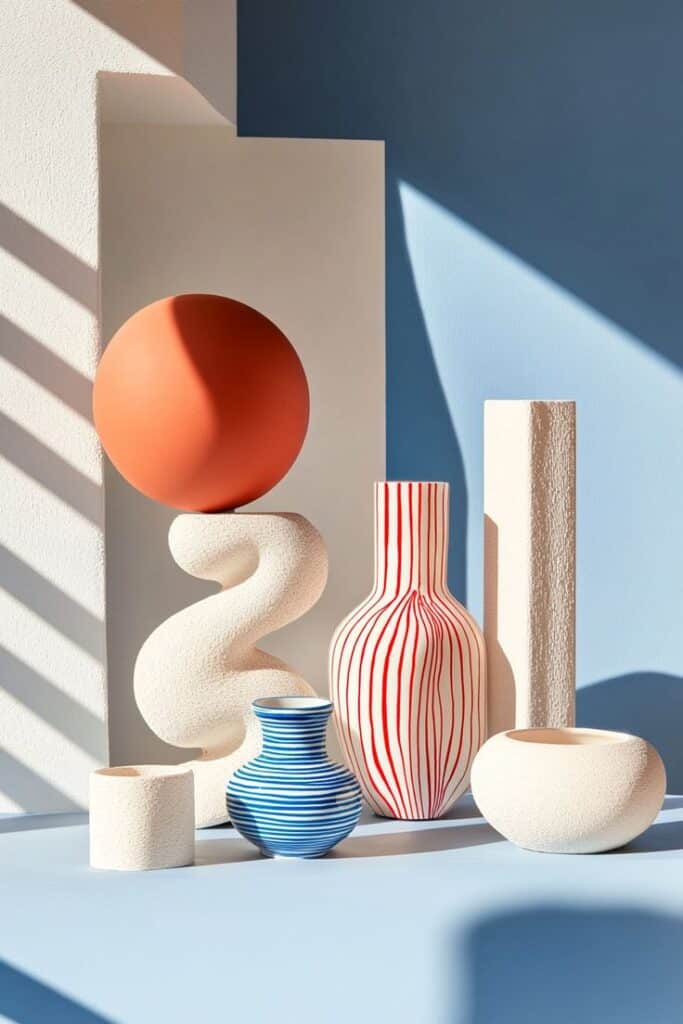
Home accessories like cushions, rugs, lamps, and ceramics are the safest place to echo a Pantone-inspired shade. You can get the mood of the color without committing the entire room to it.
When color accuracy matters, compare the product photo with a physical sample or swatch. Velvet, boucle, linen, ceramic glaze, and glossy metal can all shift the same color in different directions.
For custom upholstery or curtains, ask for a cutting before approving the order. Place it beside your wall sample and rug in the room; that small check can save an expensive mismatch.
Related living room color guides
Use these next if you are refining the whole room rather than choosing one paint chip in isolation.
- living room interior design ideas
- canvas wall art for living room color balance
- calm beige interior design ideas
- professional interior painting guide
- types of carpet for color and texture
- interior design textures cheat sheet
- best modular sofas for small spaces
- fireplace decor ideas for warm palettes
- wallpaper and textured wall finishes
- paint finishes for matte, satin, and gloss
Color tools and references
For physical matching, trend context, and paint-brand comparison, these references are more useful than choosing color from a social media screenshot.
- Pantone Color of the Year 2026
- Pantone Color Finder
- Pantone Connect
- Pantone Fashion, Home + Interiors products
- Benjamin Moore Color Trends 2026
- Sherwin-Williams Colormix Forecast 2026
- BEHR 2026 Color of the Year
- Farrow & Ball color advice
Living room color palette FAQ
Q: What is a living room color palette?
A: A living room color palette is the planned set of colors used across walls, furniture, textiles, flooring, and decor. A simple palette usually has one base color, one supporting neutral, and one accent shade. Pantone colors can help because they give you a precise reference when comparing paint, fabric, rugs, and accessories.
Q: How do you choose Pantone colors for living rooms?
A: Start with the room, not the trend. Look at daylight, flooring, sofa fabric, wood tones, and fixed finishes first. Then choose a Pantone-inspired base color for the largest surfaces and repeat one accent color in smaller details. Test physical samples in morning, afternoon, and evening light before buying paint or large furniture.
Q: What Pantone colors work best in a small living room?
A: Small living rooms usually look better with lighter warm neutrals, soft whites, pale blues, muted sage, or gentle beige tones. Use stronger Pantone colors in pillows, artwork, lamps, or a single chair instead of covering every wall. This keeps the room open while still giving the palette a clear personality.
Q: Are warm neutral living room colors still popular in 2026?
A: Yes. Warm neutral living room colors remain practical because they work with wood, stone, woven rugs, cream upholstery, and black metal details. The key is undertone control: avoid mixing too many pink, yellow, gray, and green neutrals in one room unless you test them side by side.
Q: Should the sofa match the wall color?
A: The sofa does not need to match the wall color exactly. It should belong to the same palette. A beige sofa can sit against warm white, olive, clay, or deep blue walls if the undertones work together. If the sofa is bold, keep the walls quieter and repeat the sofa color in one or two small accents.
Q: How many colors should a living room color scheme use?
A: Most living room color schemes work best with three to five colors: a base wall color, one or two neutrals, one main accent, and sometimes a dark grounding tone. More colors can work, but only if they repeat intentionally across the room instead of appearing as random one-off pieces.
Q: Can I use Pantone Color of the Year without repainting?
A: Yes. Use Pantone Color of the Year through low-commitment pieces such as cushions, throws, artwork, vases, lampshades, or flowers. In 2026, Cloud Dancer works especially well as a clean base or trim reference, while warmer woods and muted accents keep the room from feeling too stark.
Q: What is the biggest mistake when choosing living room colors?
A: The biggest mistake is choosing colors in isolation. A paint chip may look beautiful alone and still clash with the sofa, rug, flooring, or warm bulbs. Always test colors beside the materials already in the room, then check them in both daylight and evening light.
If you are still collecting references, start with a living room color palette that shows one base shade, one material tone, and one accent you can repeat in textiles or wall art.
- 2.5Kshares
- Facebook0
- Pinterest2.5K
- Twitter0
- Reddit0