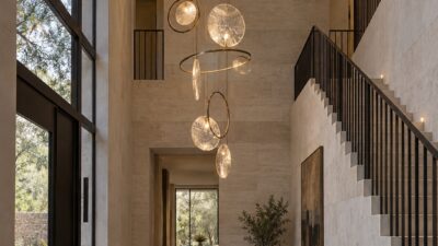
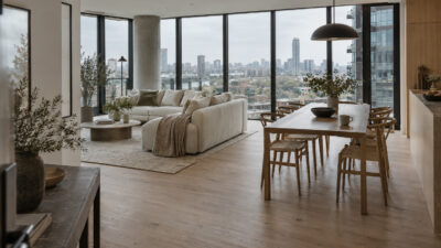
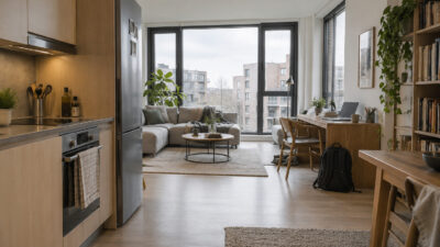
Balance in interior design is easy to feel and surprisingly hard to fake. You can walk into a room with expensive furniture, perfect paint, and a huge sofa, and still feel that something is off. Then you visit a small apartment with a simple rug, one good lamp, a clean traffic path, and a few personal objects, and the whole place feels calm.
That difference is usually not money. It is composition.
I learned to read rooms the same way I learned to read sketches in academic drawing: first the big shapes, then the value balance, then the small details. Industrial design made me even pickier. A car, a chair, a room, and a jewelry piece all have the same basic problem: if the proportions are wrong, decoration will not save them.
- What balance means in interior design
- Start with a calm color palette
- Arrange furniture for flow and conversation
- Use proportion, rhythm, and visual weight
- Make comfort part of the design
- Add storage without breaking visual harmony
- Let personal style show without crowding the room
- Common mistakes that make a room feel unbalanced
- A simple room balance checklist
- FAQ
- Final takeaway
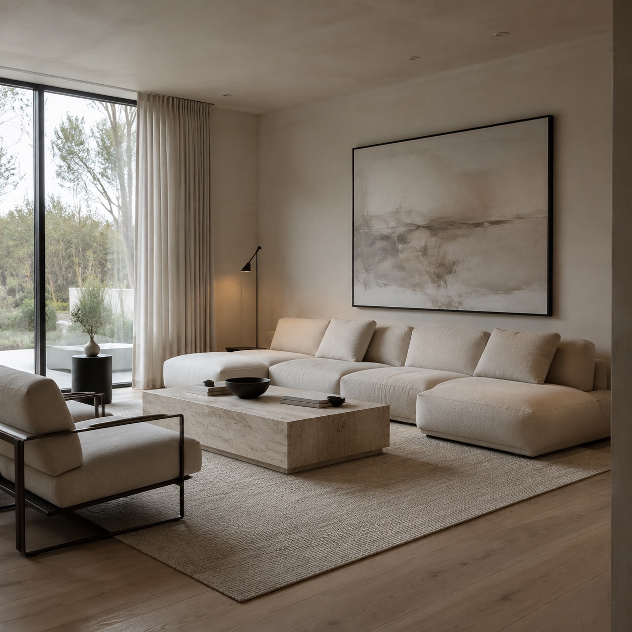
This guide rewrites the usual “make your home cozy” advice into a more useful design method. We will look at color, furniture flow, visual weight, lighting, texture, storage, and the small choices that make a room feel personal without turning it into a storage shelf with pillows.
What balance means in interior design
Balance does not mean everything has to match. It means the room feels stable, readable, and comfortable to move through. Your eye does not get stuck in one heavy corner. Your body does not have to squeeze around furniture. The colors do not fight each other before you even sit down.
Think of a living room as a simple composition. The sofa, windows, rug, shelves, art, plants, lamps, and empty space all carry visual weight. Dark colors feel heavier than light colors. Tall cabinets feel heavier than low benches. A black leather sofa feels heavier than a cream linen sofa with thin legs. A large blank wall can feel heavy too, especially when everything else in the room is low.
Good balance comes from distributing that weight with intention. A tall bookcase on one side might need a large artwork, floor lamp, or plant on the other. A bulky sofa might need slim tables and lighter chairs. A cool gray room might need wood, woven texture, or warm light so it does not feel flat.
There are three useful types of balance in interior design.
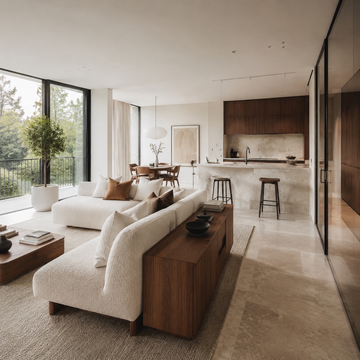
Symmetrical balance is the easiest to spot. Two matching lamps, two chairs, a centered sofa, art aligned over the fireplace. It feels formal and calm, but it can become stiff if every object has a twin.
Asymmetrical balance feels more natural. A large sofa can balance with two lighter chairs. A dark wall can balance with a pale rug and bright window. This is the kind of balance most lived-in homes need.
Radial balance happens when the room gathers around a center point, like a round dining table, a fireplace, or a conversation area. It works beautifully in open-plan spaces because it gives the room a clear center without building walls.
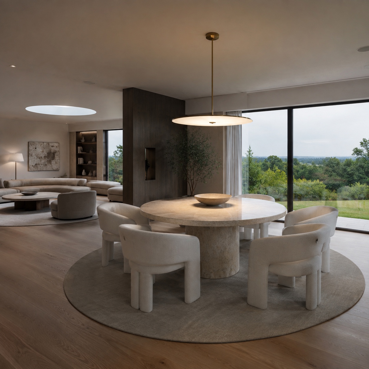
The trick is not memorizing design terms. The trick is asking one simple question: does this side of the room feel heavier than the other?
Start with a calm color palette
Color is the quickest way to change the mood of a room, but it is also where many rooms start to wobble. Too many strong colors make the eye jump around. Too many pale colors can feel unfinished. A balanced room usually has a clear base, a few supporting tones, and one or two accents that repeat.
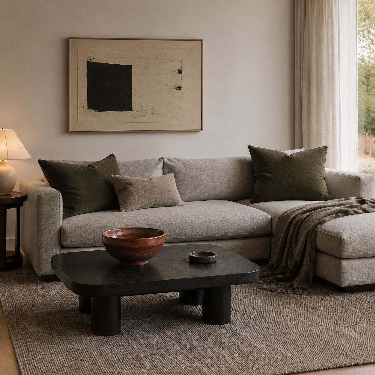
I usually start with the largest surfaces: walls, floor, sofa, curtains, and rug. These pieces set the room’s temperature before the accessories arrive. If the walls are warm white, the floor is oak, and the sofa is oatmeal linen, you already have a soft base. Add black metal, olive green, or terracotta in small doses and the room starts to feel designed instead of random.
Neutral does not mean boring. A warm white wall, a greige wool rug, a walnut coffee table, and a cream bouclé chair can have more depth than a room filled with five loud accent colors. The difference is texture, not noise.
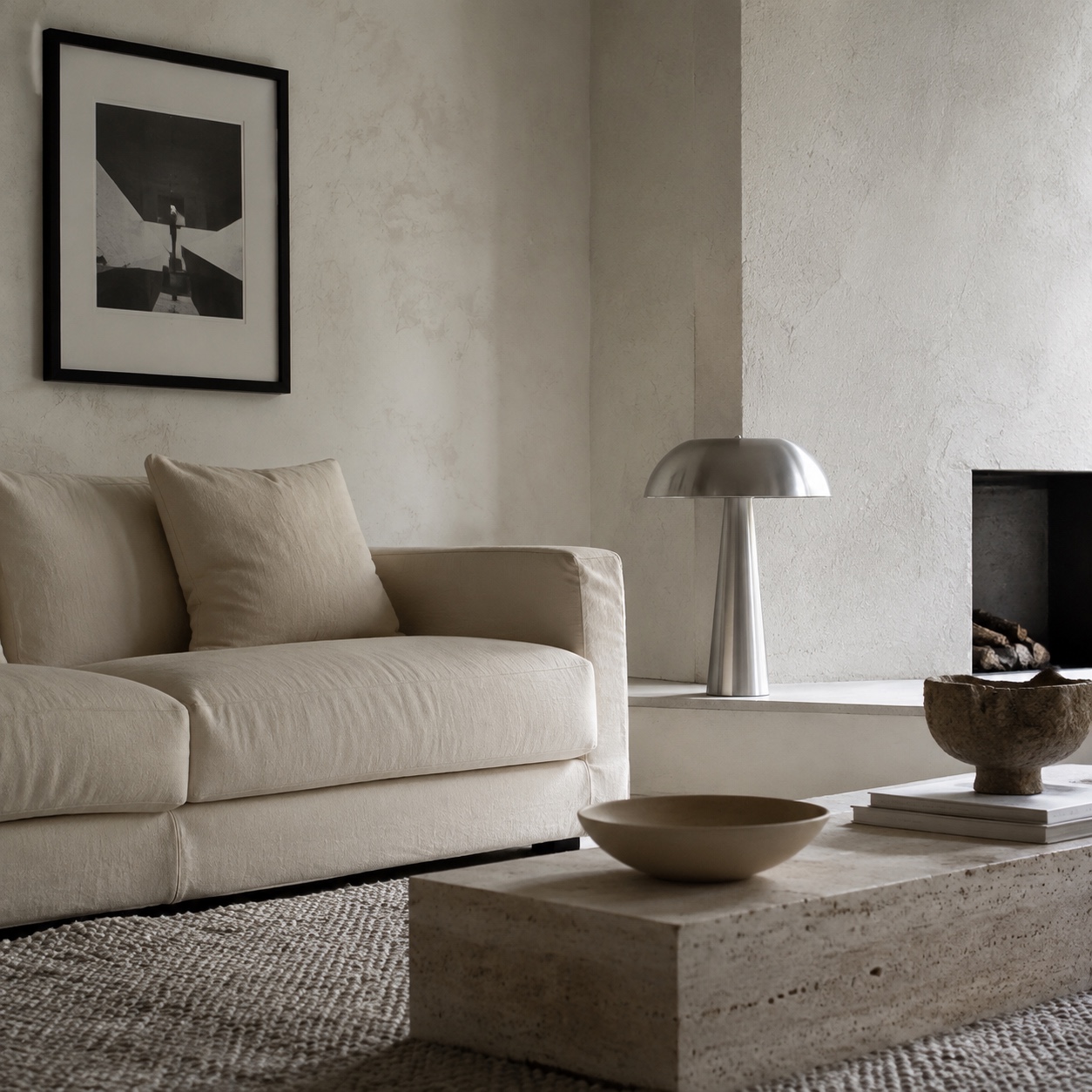
For a simple living space, try the 70-20-10 rule as a starting point. About 70 percent of the room is your main color family, 20 percent is a supporting tone, and 10 percent is the accent. You do not need to calculate it like a tax form. Just use it as a quick visual check.
For example, a balanced room might use soft white walls and a pale oak floor as the base, warm gray upholstery as the supporting color, and black, rust, or deep green as the accent. Repeat the accent in three places: a lamp, a cushion, and a small artwork. Three quiet repeats often work better than one huge statement piece.
If your room already feels busy, remove color before buying more decor. Put away half the small objects for a week. Take one bright cushion off the sofa. Replace a patterned throw with a plain textured one. Rooms often improve when you subtract the thing that is shouting.
And look at undertones. Cool white walls with warm beige furniture can work, but only if another element bridges the gap. A rug with both warm and cool threads can do it. So can natural wood, stone, or art with a mixed palette. Without that bridge, the room can feel like two different design decisions arguing politely.
Arrange furniture for flow and conversation
A room can look good in a photo and still be annoying to live in. That usually comes down to flow.
Furniture flow means you can walk through the room without stepping sideways, bumping your knee, or shifting a chair every time someone opens a cabinet. Leave the main path at least 30 inches wide where you can. In smaller rooms, 24 inches may be all you get, but do not make every route that tight. Your body notices.
Start with the biggest piece. In a living room, that is usually the sofa. Do not push it against the wall by default. Sometimes pulling it forward 4 to 8 inches gives the wall and furniture a little breathing room, especially if you have curtains, floor lamps, or art behind it. In open-plan rooms, floating the sofa can define the seating area better than a rug alone.
Then place the chairs. Sofas and chairs that face each other support conversation, while every seat facing a television makes the room feel like a waiting area. If the TV matters, fine. Just do not let it become the only reason the furniture exists.
Coffee table distance matters too. Keep it roughly 14 to 18 inches from the sofa. Close enough to reach a cup. Far enough for knees. Side tables should sit near arm height when possible, not floating awkwardly below the sofa arm or towering above it.
Small homes make this more sensitive. In compact rentals or student housing, every piece has to earn its footprint. A storage ottoman can replace a coffee table. A narrow bench can work as seating, shoe storage, and a visual line under a window. In places like student apartments in Auburn, where one room may have to handle studying, eating, relaxing, and hosting, layout decisions matter more than extra decor.
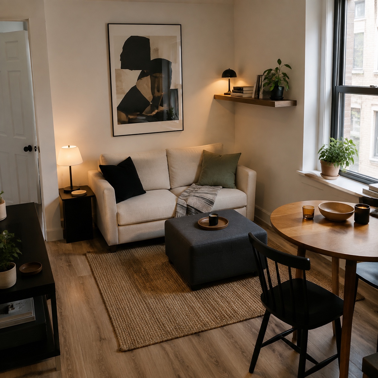
One practical test: walk the room holding a full mug. If you have to twist your body to avoid a table corner, the layout is not done yet.
This is where living room layout ideas can help, but be careful with inspiration images. Many photos are styled for one camera angle. They hide awkward traffic paths, undersized rugs, and chairs no one can actually pull out. Use photos for proportion and mood, then measure your own space like a designer.
Use proportion, rhythm, and visual weight
Proportion in interior design is about how sizes relate to each other. A tiny rug under a large sofa makes the whole seating area feel nervous. A huge pendant over a small table can feel theatrical in the wrong way. A slim side table beside an oversized sectional might disappear completely.
The rug is usually the easiest proportion fix. In a living room, at least the front legs of the sofa and chairs should sit on the rug. If the rug floats in the middle like an island, it shrinks the room visually. A larger rug costs more, yes, but it can make budget furniture look more intentional.
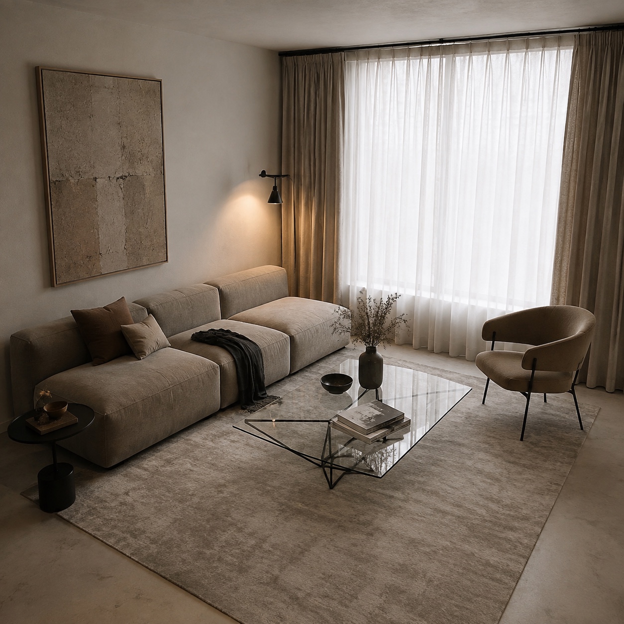
Art scale is another common mistake. A small print centered over a large sofa looks lonely. Aim for artwork or a grouping that spans about two-thirds of the sofa width. It does not have to be one expensive piece. A pair of framed prints, a textile panel, or a simple gallery arrangement can work if the outside edges feel controlled.
Visual weight is less obvious than size. A glass coffee table may be physically large but visually light. A black stone table may be smaller and still feel heavier. A chair with thin legs feels lighter than a skirted chair. A cabinet in dark walnut will pull more attention than the same cabinet in pale ash.
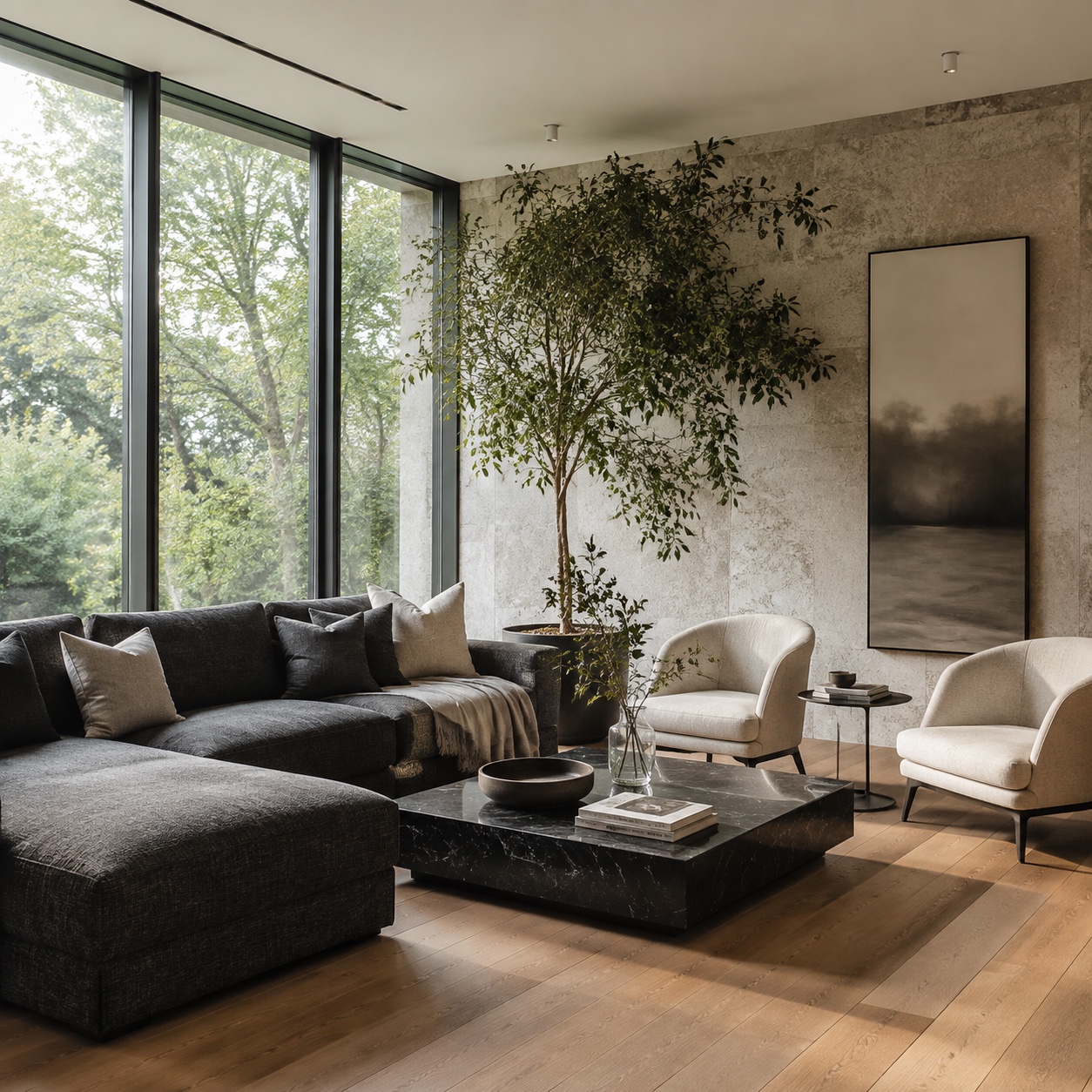
This is exactly the kind of thing automotive design trains into you. On a car, the beltline, wheel arches, glass area, and stance decide whether the design feels planted or awkward. A room has its own stance. The sofa is the body mass. The rug is the ground plane. Lamps and shelves create vertical rhythm. Windows act like bright voids.
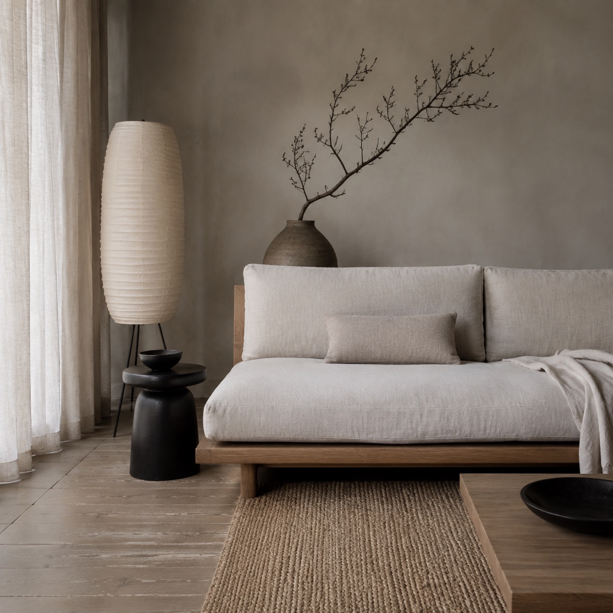
Rhythm comes from repetition. Repeat a material, shape, line, or color so the eye has something to follow. A black window frame can connect to a black floor lamp and thin black picture frames. A rounded sofa arm can connect to a round coffee table and a ceramic vase. Wood tones can repeat in the table, shelf, and picture frames.
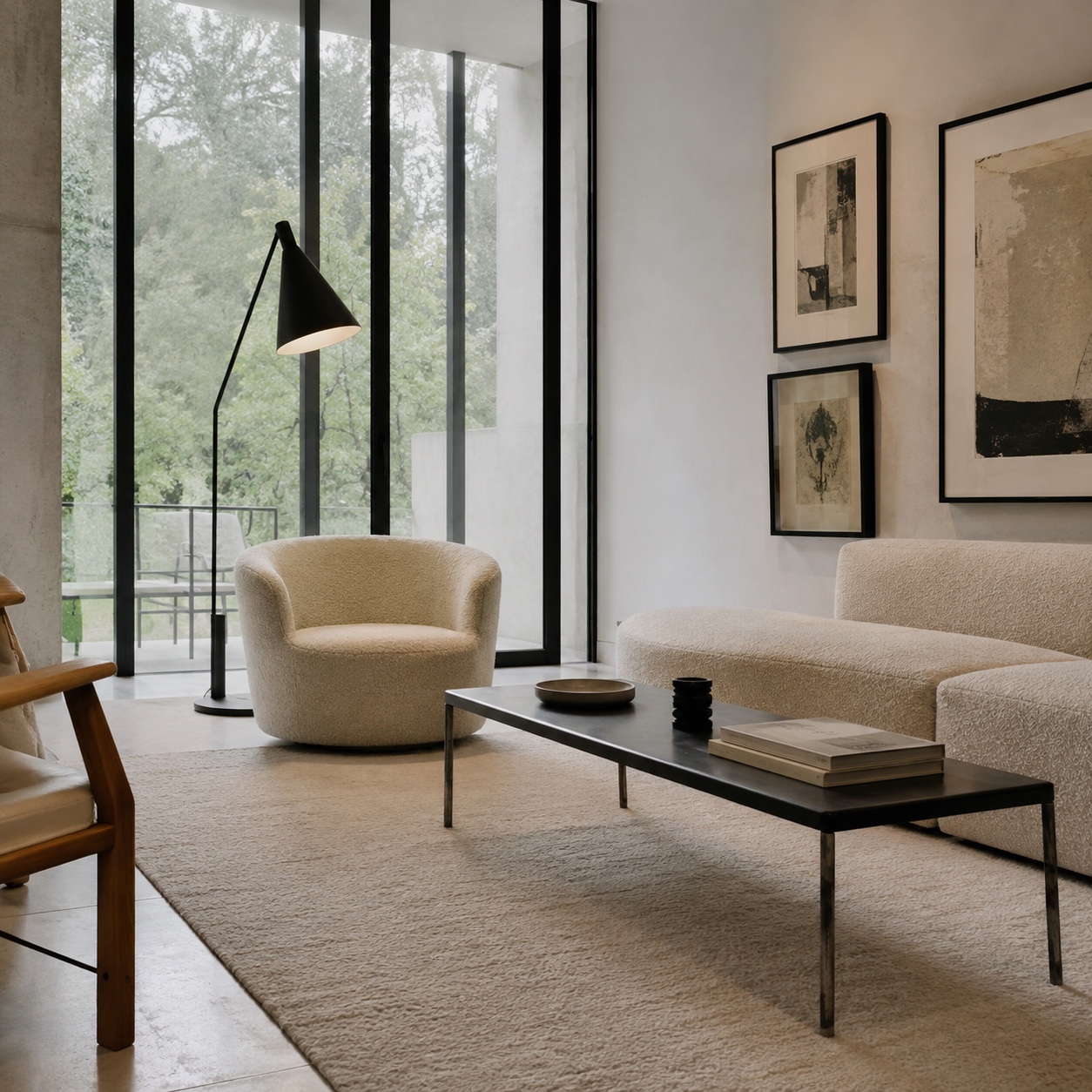
But do not repeat everything. A room where every wood tone, metal finish, and fabric matches exactly can feel like a showroom. Mix carefully: two wood tones are easy, three can work, four need discipline. For metals, I like one main finish and one accent. Brushed nickel with black. Brass with bronze. Chrome with stainless steel. Keep the finish family tight and the room will feel calmer.
Make comfort part of the design
Comfort is not the opposite of style. It is one of the ways style proves itself.
A chair can look beautiful and still be useless if the seat is too deep, the back angle is wrong, or the fabric feels scratchy. I have made this mistake with objects on the design side too. A form can look perfect in a sketch, then feel wrong when your hand touches it or your body uses it. The body always tells the truth.
Start with the seating you use most. Sit on the sofa for at least ten minutes before judging it. Not thirty seconds in a showroom. Ten minutes. Notice whether your feet reach the floor, whether your lower back has support, and whether the cushion pushes you forward. A deep sofa can be wonderful for lounging and terrible for guests who prefer upright sitting.
Textures make comfort visible. Linen, wool, leather, cotton, boucle, rattan, and wood all change how a room feels before anyone touches them. Smooth surfaces feel cooler and sharper. Woven surfaces feel warmer and more relaxed. A room with painted drywall, glass, metal, and a slick floor may need fabric and natural fibers to soften it.
This is where small textiles do real work. Rugs, curtains, pillows, throws, and upholstered benches can make a room feel warmer without adding visual clutter. The key is choosing texture before pattern. A plain wool throw often looks better than a busy printed one if the room already has art, books, plants, and open shelving.
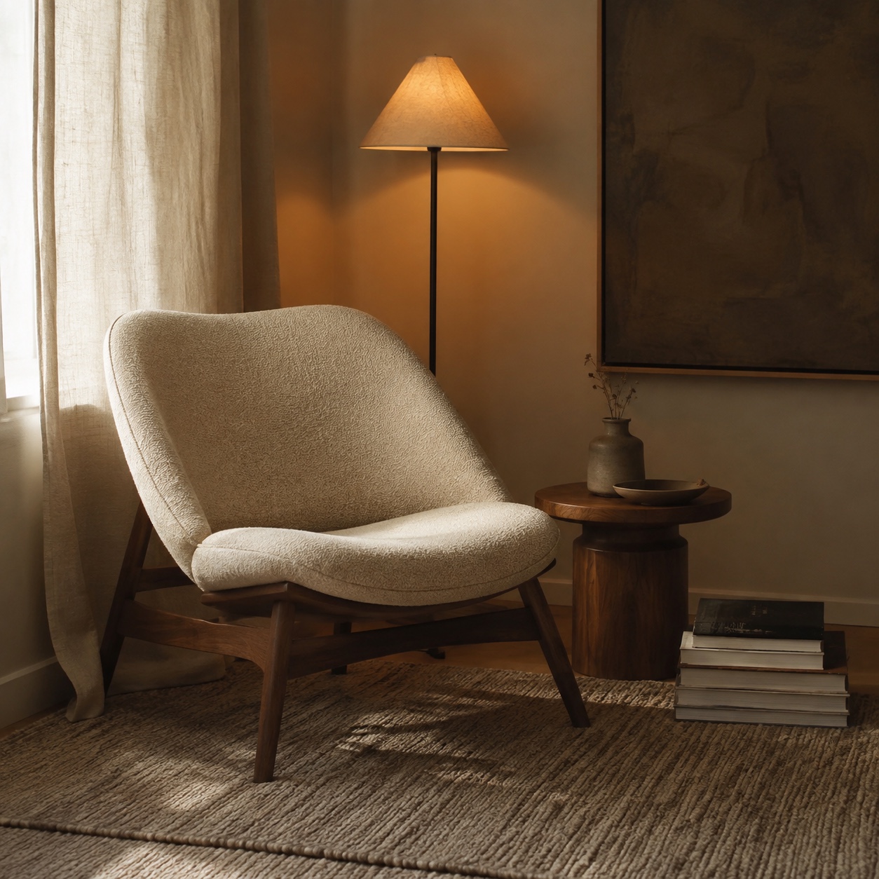
Lighting has a huge effect on comfort. Overhead light alone is rarely flattering. It flattens faces, throws hard shadows, and makes a living room feel like a corridor. Use layers instead: ambient light for the room, task light for reading, and accent light for art, shelves, or a plant.
Aim for warm bulbs in living spaces, usually around 2700K to 3000K. If you work or draw in the same room, add a task lamp with a cleaner neutral light around 4000K, but keep it focused. You do not need the whole room to feel like a studio at midnight.
Comfort also includes sound. A rug, curtains, upholstered furniture, and bookshelves absorb echo. If your living room feels cold even with warm colors, clap once and listen. A harsh echo means the room needs softness, not another candle.
Add storage without breaking visual harmony
Clutter is not a moral failure. It is usually a storage failure.
Every room collects life: chargers, books, keys, mail, blankets, headphones, art supplies, remote controls, cables, receipts, bags. If those objects have no place to land, they will choose your coffee table. Then the room feels unbalanced, even if the furniture plan is good.
Good storage starts with honesty. What do you actually use in this room every day? Put those objects close to where you use them. Keep the rest behind doors, in drawers, or in another room. A beautiful basket across the room from the sofa will not help if the blanket lives on the sofa every night.
Closed storage calms a room quickly. Cabinets, drawers, lidded boxes, and benches with hidden compartments hide the visual noise. Open shelving can look beautiful, but it asks for editing. Leave air around objects. Stack some books horizontally, some vertically. Mix heights. Do not fill every inch.
Simple storage works best when it disappears into the habits of the room. A tray near the entry can hold keys and sunglasses. A low cabinet can hide board games and cables. A storage bench can hold extra cushions, shoes, or seasonal throws. If the storage requires too many steps, you will stop using it.
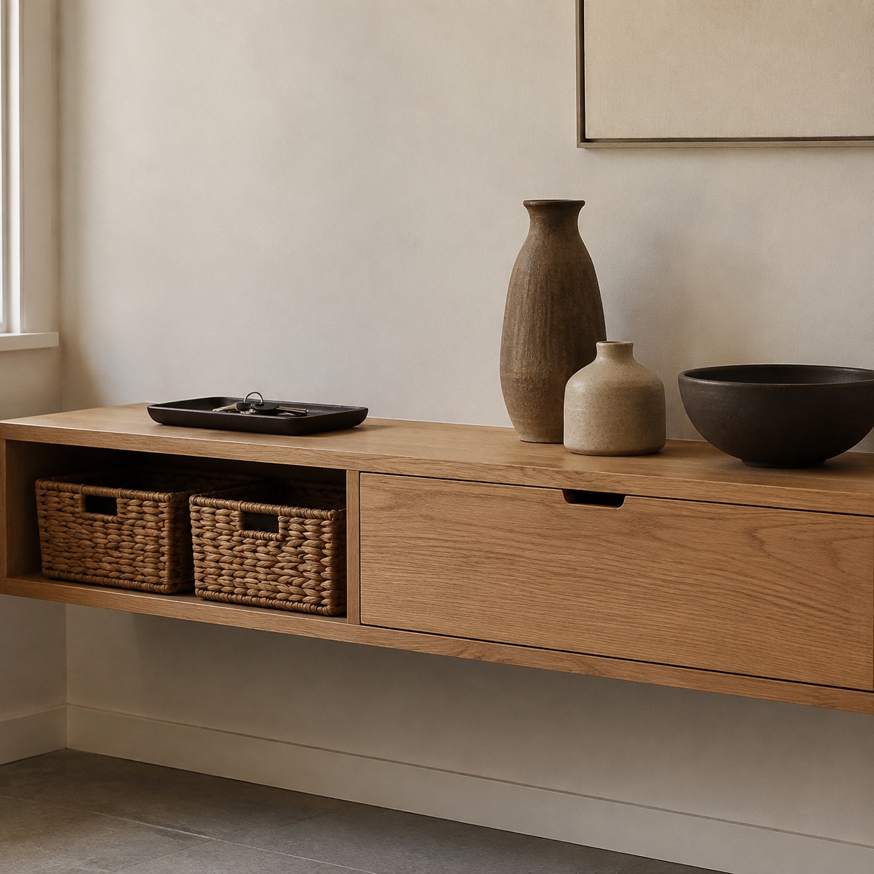
Multi-use furniture is useful in small spaces, but choose pieces that still look good on their own. A cheap folding table that always looks temporary will keep the room feeling unfinished. A wall-mounted drop-leaf desk, a slim console, or a storage ottoman in a good fabric can solve the same problem with more dignity.
One designer rule I use: do not let storage become the main visual story unless the room is a library, studio, or workshop. If shelves dominate the wall, style them with larger quiet shapes, not dozens of tiny objects. Small things create visual static.
And leave one surface almost empty. A clear coffee table, console, or sideboard gives the eye a resting point. You can still live in the room. You just need one place that says, “The room is under control.”
Let personal style show without crowding the room
A harmonious room should not feel anonymous. Balance is not the same as perfection. If a room has no personal objects, it may look clean, but it will not feel like home.
Personal style works best when it has editing. Choose objects that carry memory, texture, or a strong visual shape. A framed sketch. A book from a trip. A ceramic bowl. A black-and-white family photo. A small sculpture. A travel print from Kyiv, Berlin, Lisbon, or wherever your eye still remembers the light.
I like rooms that show what the person actually does. If you draw, let a sketchbook live on the side table. If you drink tea, a good tray and two cups can look better than generic decor. If you hike, a framed mountain photograph can have more life than a print chosen only because it matches the sofa.
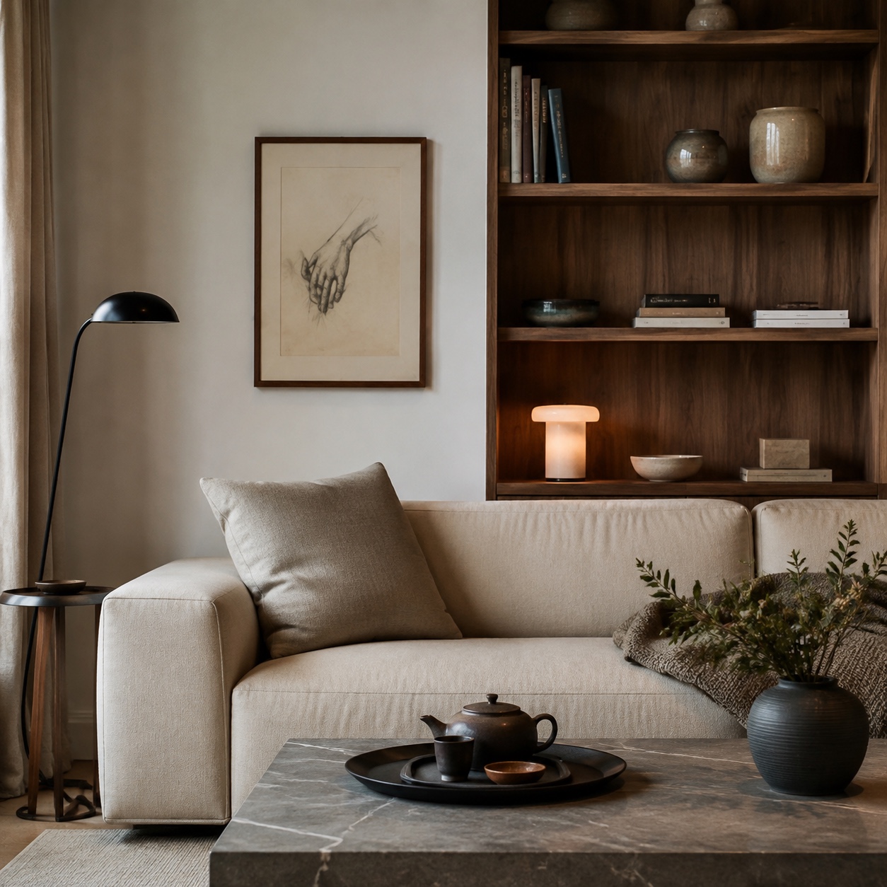
The mistake is giving every meaningful object equal volume. Not everything needs display space. Some pieces can rotate. Keep a small box or cabinet for seasonal objects and switch them every few months. This keeps the room fresh without buying more.
Use contrast to protect personal pieces. A colorful artwork looks stronger on a quiet wall. A sculptural chair reads better beside a plain rug. A handmade bowl feels more valuable on a simple table than in a crowd of small accessories.
If you love maximalism, the same rule still applies. Maximalist rooms need structure even more than minimal ones. Repeat a color family. Keep frames related. Group objects by height, material, or theme. Let one wall carry the drama and give the opposite side a little rest.
Personal style should make the room easier to recognize as yours, not harder to use.
Common mistakes that make a room feel unbalanced
The first mistake is buying small decor before fixing large shapes. Pillows cannot solve a wrong sofa scale. A vase cannot fix a rug that is too small. Start with layout, rug, lighting, and storage, then add the small pieces.
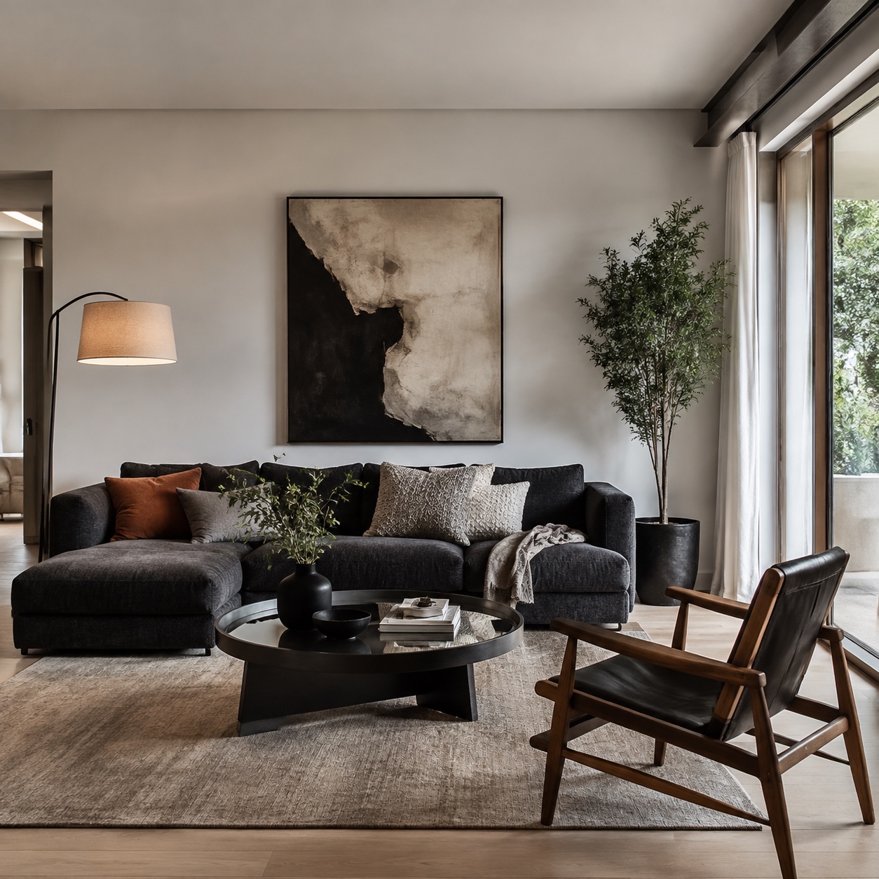
The second mistake is treating every wall as a display wall. Empty space is not wasted space. In drawing, the untouched paper can be as important as the graphite. Rooms work the same way. A blank area beside a busy shelf gives the shelf more power.
The third mistake is using only one type of light. One ceiling fixture creates a flat room. Add a floor lamp near the sofa, a table lamp near a chair, and a small accent light near art or shelving. Put them on dimmers if you can.
The fourth mistake is ignoring height. If everything in the room sits at the same level, it feels squat. Add height with curtains hung close to the ceiling, a tall plant, a narrow bookcase, vertical art, or a floor lamp. If everything is tall and heavy, bring the eye down with a low bench, long console, or wide rug.
The fifth mistake is copying a trend without checking your actual room. Warm minimalism, Japandi, dark academia, organic modern, and quiet luxury all depend on architecture, light, and material quality. A style that looks beautiful in a sunlit house with oak floors can feel dull in a small north-facing rental unless you adjust the palette and lighting.
And the sixth mistake is forgetting daily friction. Where does the laptop charger go? Where do shoes land? Where does the throw blanket live? Where do guests put drinks? A room that answers those questions will feel more harmonious than a room that only looks good for a photo.
A simple room balance checklist
Before buying anything new, stand in the doorway and scan the room in ten seconds.
Where does your eye go first? If it jumps to clutter, glare, or one dark heavy object, fix that first. If it lands on the seating area, a good artwork, or a beautiful window, the room already has a stronger center.
Check the floor. Is the rug large enough to connect the furniture? Are there clear paths? Do chair legs scrape against the edge of the rug every time someone sits down?
Check the walls. Is the art the right scale? Are curtains hung high enough? Is one side visually heavier than the other?
Check the light. Can you make the room bright, soft, and low-lit without changing bulbs? A good living room should have more than one mood.
Check the surfaces. Is every tabletop full? Clear one of them. Not all of them. One is enough to change the feeling.
Check the color. If the room feels scattered, repeat one color in three places. If it feels flat, add texture before adding another bright shade.
Finally, sit down where you actually sit. A room is not finished from the doorway. It is finished from the sofa, the desk, the reading chair, the dining table, and the path you walk every day.
FAQ
What is balance in interior design?
Balance in interior design means the room feels visually stable and comfortable to use. Furniture, color, light, texture, and empty space all carry weight. A balanced room distributes that weight so one corner does not feel overloaded while another feels bare.
What are the main types of balance in interior design?
The main types are symmetrical, asymmetrical, and radial balance. Symmetry uses matching elements on both sides. Asymmetry balances different objects with similar visual weight. Radial balance arranges furniture or decor around a center point, like a fireplace or round table.
How do I make a living room feel more harmonious?
Start with layout. Keep walkways clear, place seating for conversation, use a rug large enough to connect the furniture, and repeat a few colors or materials. Then layer lighting and texture. Harmony usually comes from fewer stronger decisions, not more accessories.
What colors make a room feel balanced?
Warm whites, soft grays, beige, taupe, pale oak, muted green, clay, and charcoal can all work well. The exact color matters less than the relationship between colors. Pick a calm base, add a supporting tone, then repeat one accent in small places.
How can small apartments feel more spacious?
Use furniture with visible legs, choose a larger simple rug instead of several small ones, keep main walkways clear, and use closed storage for visual clutter. In small rooms, every object should help with comfort, storage, or proportion.
Can a room be balanced without being minimal?
Yes. Maximalist rooms can feel balanced when color, scale, and grouping are controlled. Repeat colors, vary object height, leave some negative space, and group small items together so they read as one larger shape.
Final takeaway
A harmonious living space is not built by chasing the newest style. It comes from slower decisions: the right scale rug, a clear path through the room, lighting that flatters real life, storage that fits your habits, and personal objects that have room to breathe.
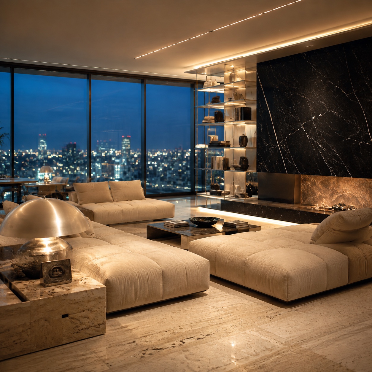
Start with one corner. Move the lamp. Clear the table. Pull the sofa forward. Repeat one color. Replace one harsh bulb. Small changes show you what the room wants next.
That is the part I like most about interiors. A room tells you when the balance is close. You stop adjusting, sit down, and the space finally feels easy.
- 18shares
- Facebook0
- Pinterest18
- Twitter0
- Reddit0