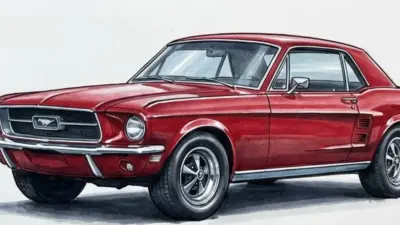
Search “how to draw a Toyota” and you get almost nothing but flat, cartoon-simple tutorials for one model at a time — a Corolla drawn like a kid’s toy, a Supra reduced to a few curved lines with no sense of where the weight actually sits. That’s a strange gap, because Toyota’s lineup spans some of the most distinct silhouettes in automotive design history: the Supra’s wide haunches, the Land Cruiser’s boxy off-road stance, the 2000GT’s impossibly long hood-to-cabin ratio.
I’ve spent years doing production surfacing work on cars like the Jaguar F-Pace and Mazda CX-5, and one thing carries directly into drawing: proportion and stance tell you what a car is before a single detail line gets added. A Supra drawn with Corolla proportions just looks wrong, no matter how carefully you render the badge.
- Getting Toyota proportions right before you draw a single line
- How to draw 10 iconic Toyota models step by step
- Materials and technique: graphite, marker, and digital rendering for car surfaces
- Fixing the mistakes that make Toyota sketches look generic
- Final thoughts
- Toyota drawing reference gallery
- FAQ
- Q: What's the easiest Toyota to draw?
- Q: How do you draw a Toyota Supra step by step?
- Q: What pencil is best for car drawing?
- Q: How do you make a car sketch look realistic?
- Q: What's the difference between drawing a Supra and a Land Cruiser?
- Q: How long does a detailed car drawing take?
- Q: Can beginners draw JDM cars?
I’ll walk you through the proportion logic that applies across Toyota’s design language, then take you step by step through ten models spanning JDM icons, off-road trucks, everyday sedans, and classic design history. By the end you’ll understand why most tutorials online get the shape right but the stance wrong — and stance is the part that actually reads as “Toyota.”
Getting Toyota proportions right before you draw a single line
Toyota’s lineup covers everything from a mid-engine sports car to a body-on-frame truck, so there’s no single proportion formula that works across the brand. What does carry across every model is a way of thinking about proportion before you think about shape.
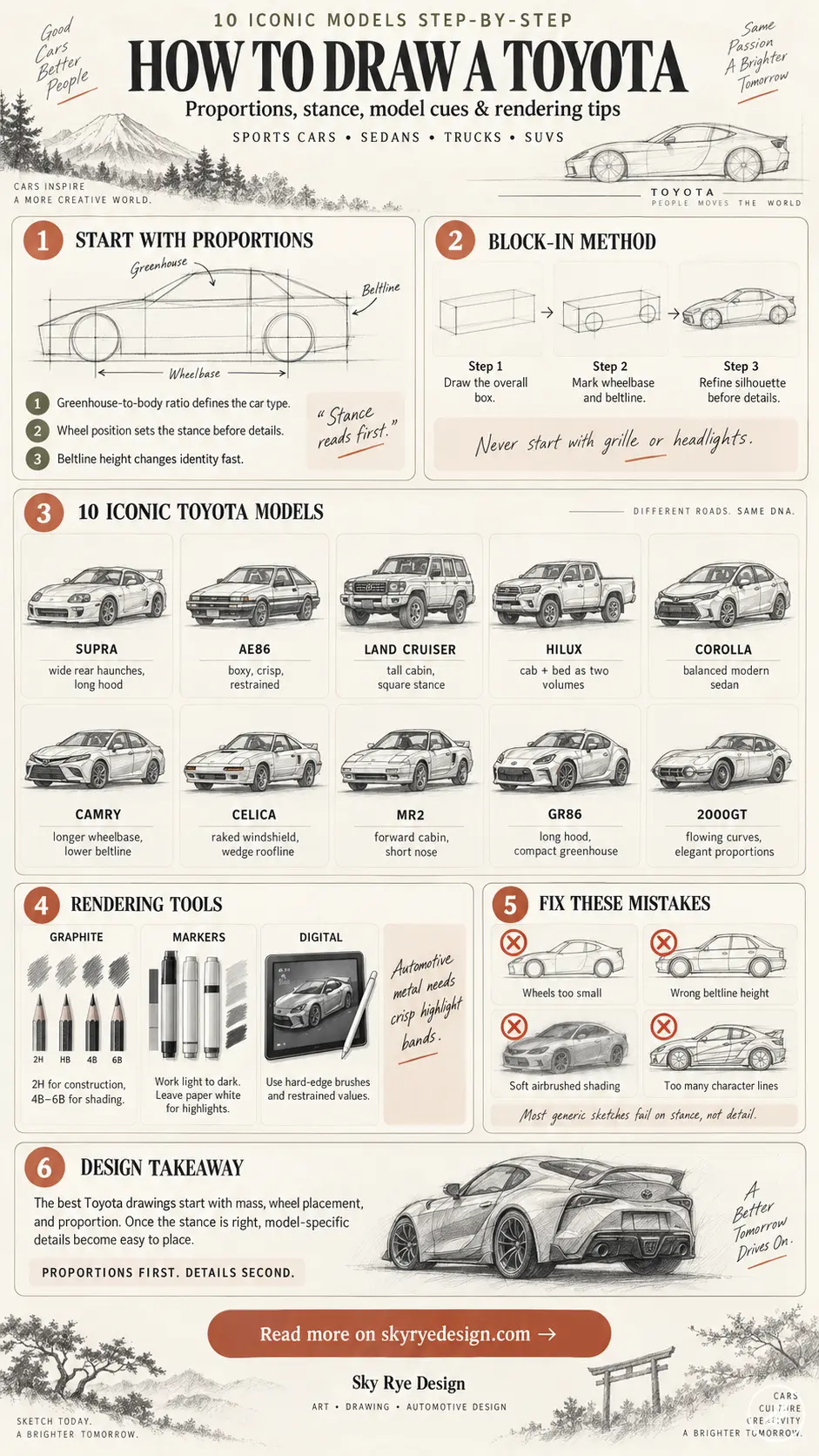
Start with the greenhouse-to-body ratio — how much of the car’s height is cabin versus how much is bodywork below the windows. A Supra has a low, compressed greenhouse sitting on a wide, muscular lower body; a Land Cruiser has almost the opposite relationship, a tall, boxy cabin with minimal lower-body flare. Get that ratio wrong first and no amount of detail work fixes it later.
I think about this the same way I approached surfacing work on the Mazda CX-5 — you’re not drawing panels, you’re deciding where the mass sits before anything else gets resolved. A car’s wheels tell you where the weight goes: wheels pushed to the far corners with minimal overhang read as sporty and planted, while wheels tucked further under the body with more overhang front and back read as practical or utilitarian. That single relationship — wheel position relative to the body’s overall length — does more to establish a model’s identity than the grille shape or headlight design most beginners fixate on first.
Block-in method for any Toyota model
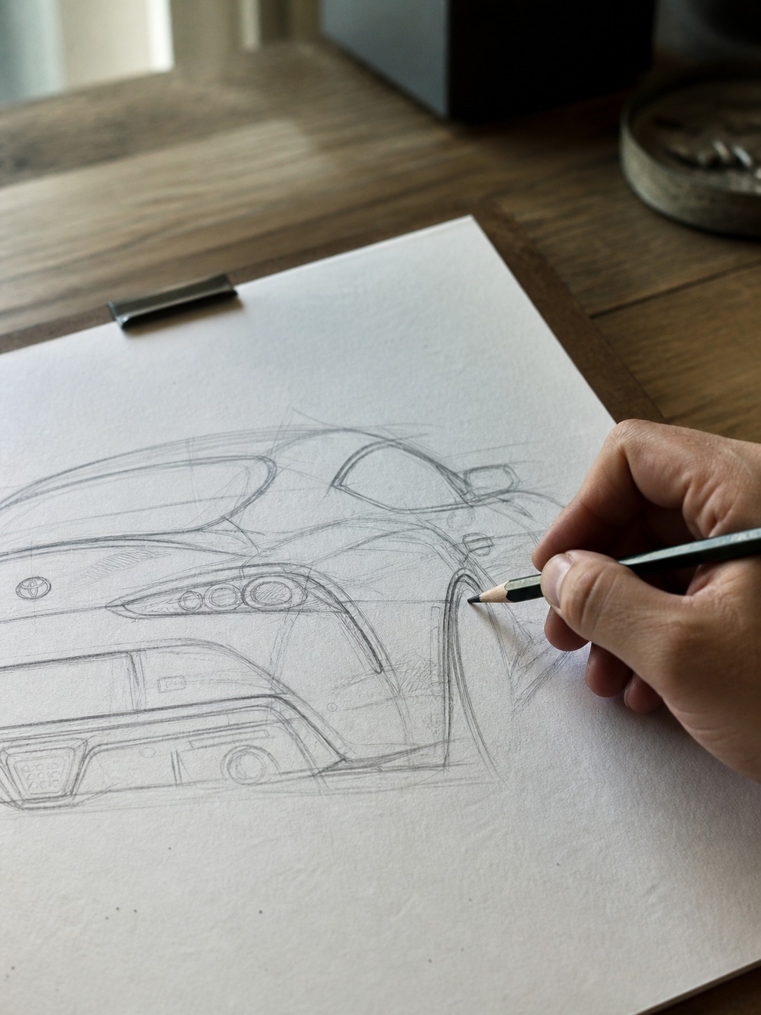
Start with a simple side-view box representing the car’s overall length and height. Mark the wheelbase — the distance between front and rear wheel centers — as roughly two-thirds of the total box length for most passenger cars, closer to three-quarters for trucks and SUVs with more front/rear overhang. Drop the beltline (where the body meets the glass) at the height that matches your target model’s greenhouse ratio. Everything else — grille shape, character lines, badge placement — gets layered on top of this foundation, never before it.
How to draw 10 iconic Toyota models step by step
With proportion logic established, here’s how that translates into ten specific models — each one chosen because it teaches a genuinely different design lesson, not just because it’s popular.
Toyota Supra (MK4/A90)
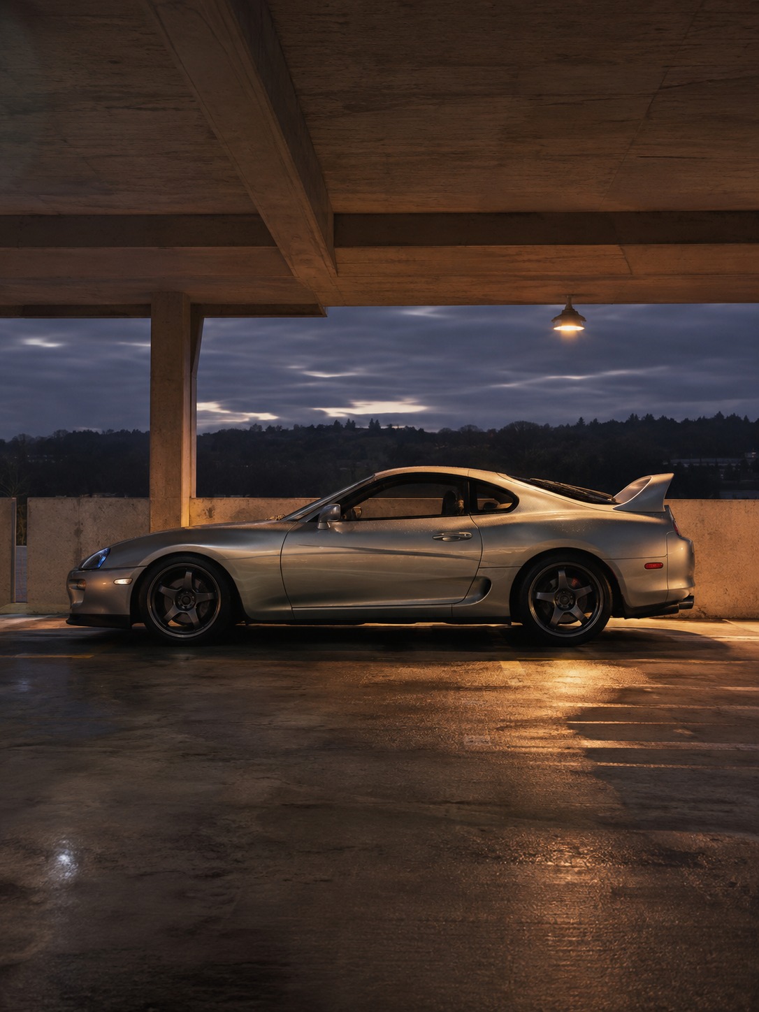
The Supra is the most-searched Toyota to draw by a wide margin, and for good reason — it’s got one of the most confident stances in the brand’s history. Start with wide, muscular rear haunches that flare out noticeably beyond the greenhouse width; this is the single detail beginners underdraw most, and it’s the reason so many online Supra sketches look flat instead of aggressive.
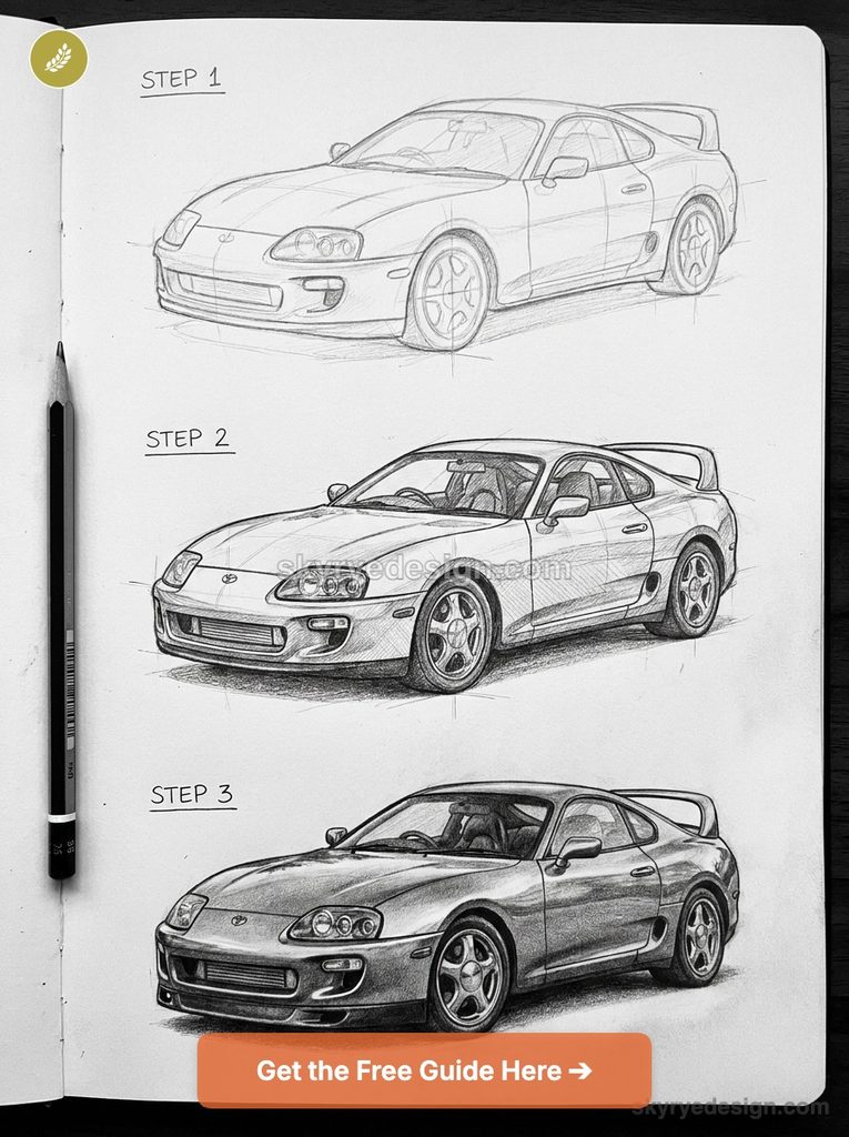
The hood is long relative to the cabin, with a subtle power bulge running down the center. Keep the beltline low and the greenhouse compressed — that low-slung cabin sitting on a wide lower body is the exact proportion relationship covered in the last section, just pushed to its sportiest extreme. Finish with the signature double-bubble roofline on the A90 if you’re drawing the modern version, or the flatter, more angular roof if you’re working from the MK4.
Toyota AE86 (Corolla Trueno)
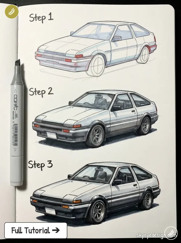
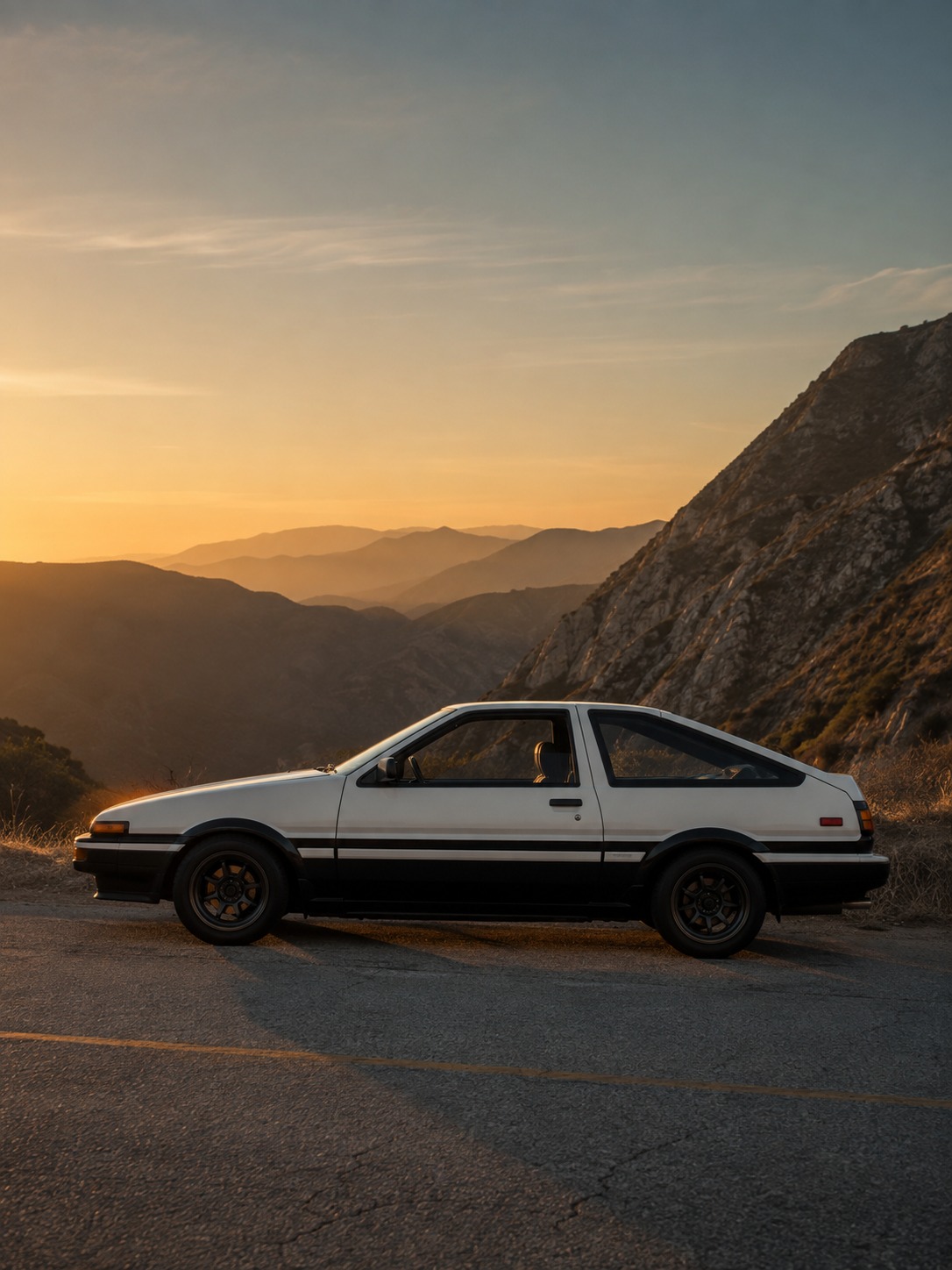
The AE86 teaches restraint, which makes it a genuinely useful exercise after the Supra’s drama. Boxy, upright, almost architectural in its simplicity — this is 1980s Japanese design language at its cleanest. Keep panel lines crisp and minimal; the AE86’s character comes from flat surfaces meeting at confident angles, not from curves or flares. The pop-up headlights (on the Trueno variant) are worth getting right since they’re the model’s most recognizable feature — draw them in the closed position for a cleaner silhouette, or popped up if you want the more dynamic, “alert” read the car is known for in drift and anime culture.
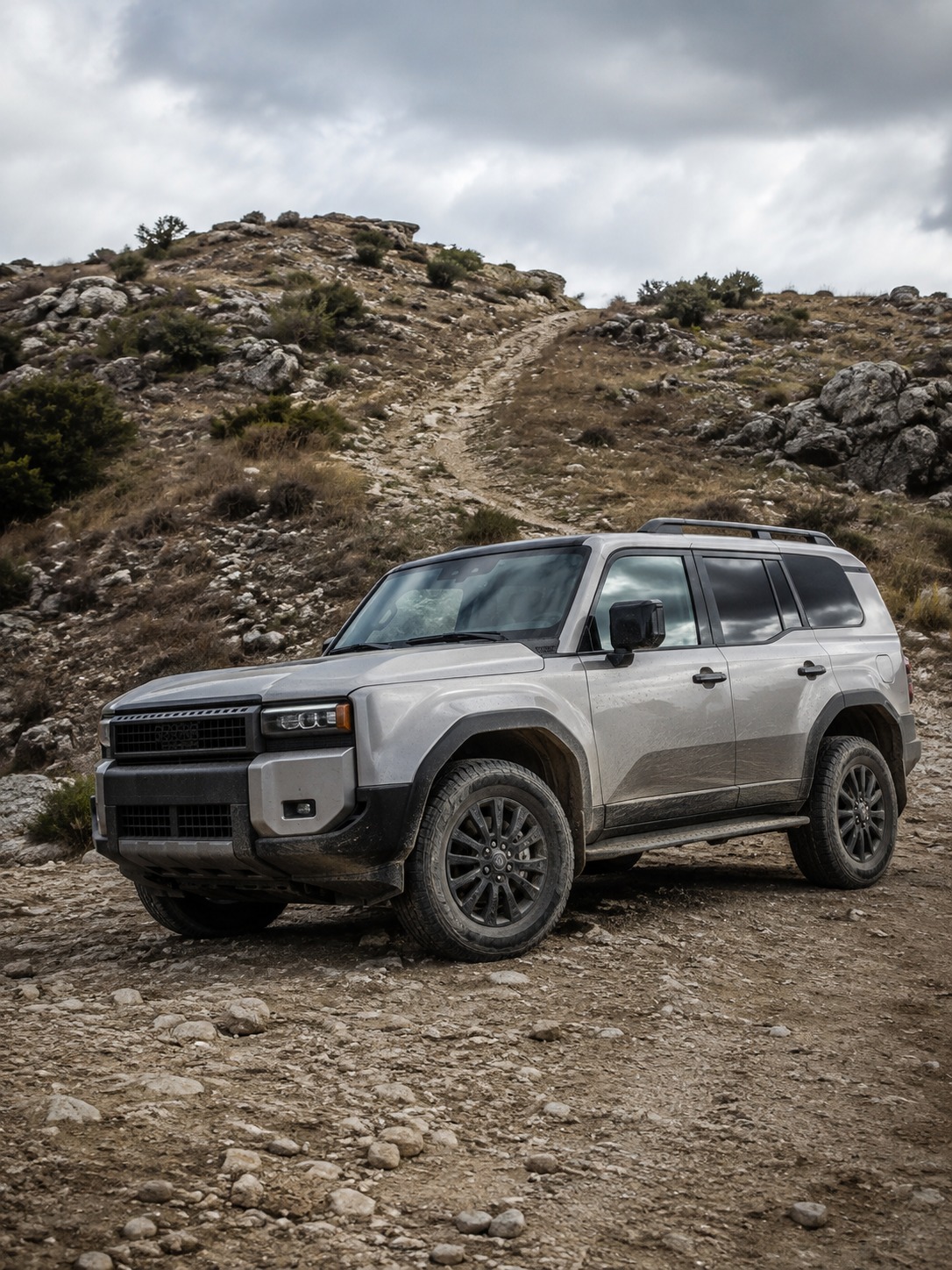
Toyota Land Cruiser
This is where the proportion lesson from earlier gets tested against its opposite case. Tall greenhouse, minimal lower-body flare, wheels pushed further under the body with real overhang front and back — every instinct from drawing the Supra needs to be reversed here. Keep the beltline high and the roofline nearly flat and rectangular.
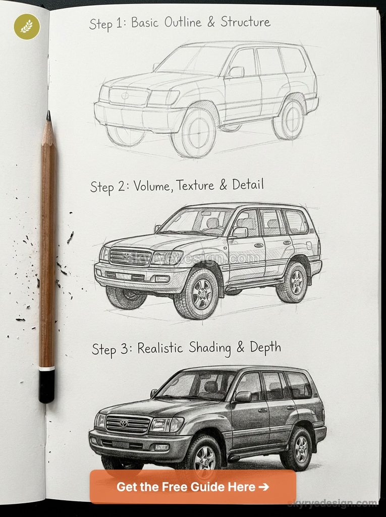
The Land Cruiser’s visual weight comes from its height and boxiness, not from any single character line, so resist the urge to add curves that would undercut the utilitarian read. Wide, substantial wheel arches matter more here than anywhere else in this list — they’re doing the job that a haunch flare does on a sports car, just communicating capability instead of speed.
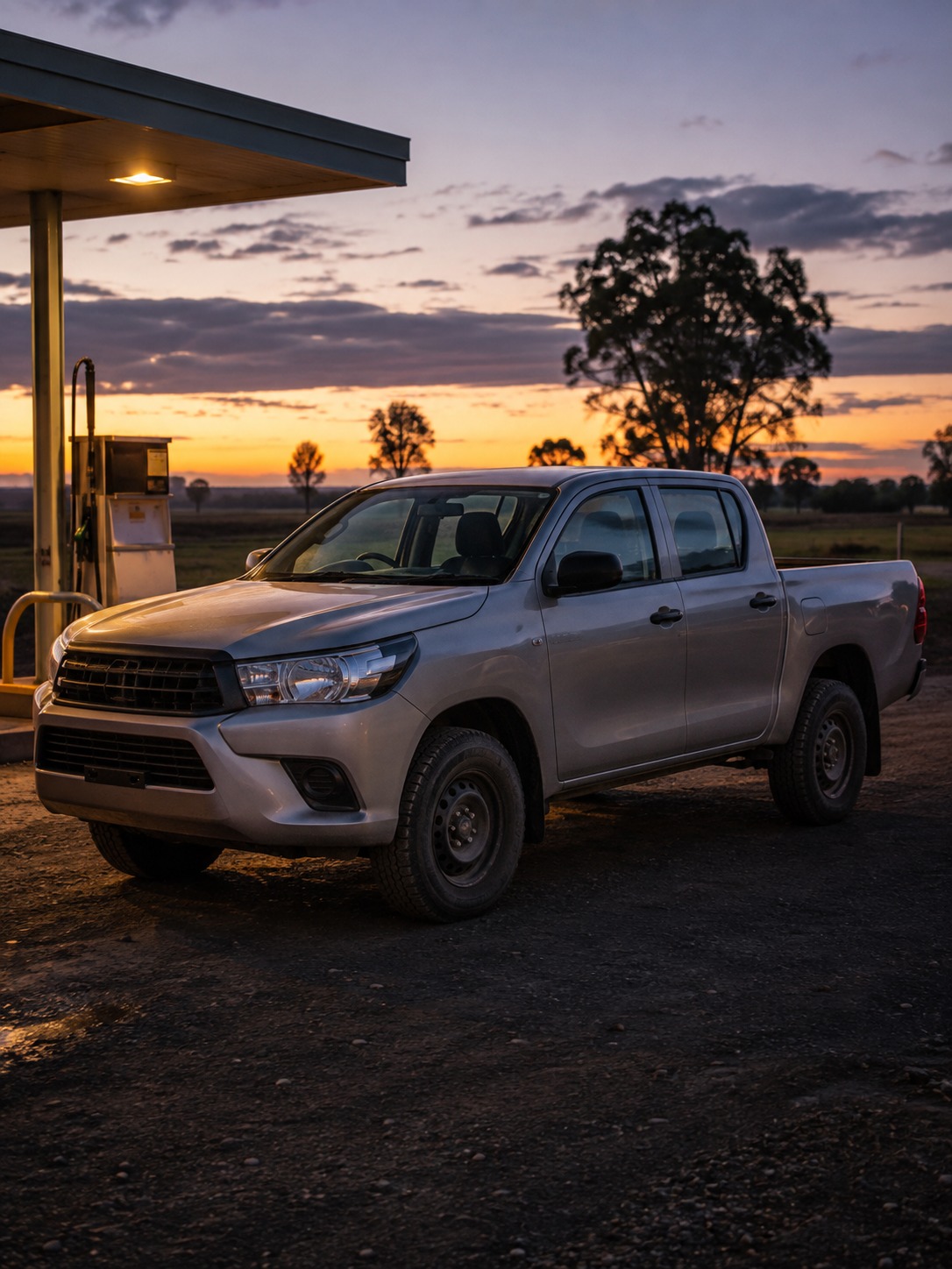
Toyota Hilux
Drawing a pickup means thinking in two separate volumes instead of one continuous body — the cab and the bed are distinct forms joined at a hard line, not blended together the way a sedan’s proportions flow. Keep the cab relatively compact and upright, then let the bed run long and flat behind it.
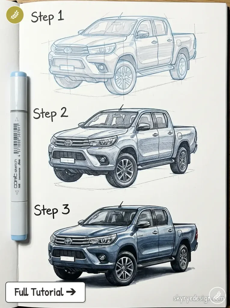
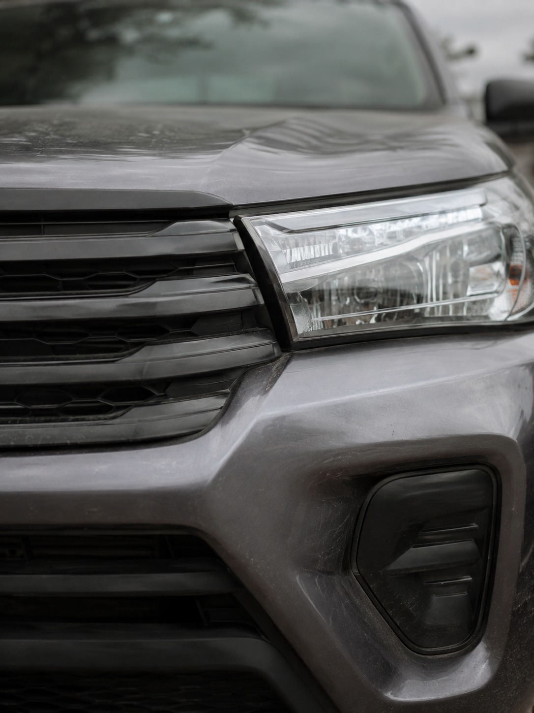
The Hilux’s front end carries real visual weight — a tall, upright grille and stacked or wide headlights that read as capability rather than aggression. Ground clearance matters more here than on any other model in this list; leave generous space between the wheel arches and the body’s lower edge, since that gap is doing real communicative work about what the vehicle is built for. I’d treat the bed’s side panel as one clean, uninterrupted surface — resist adding character lines here, since the Hilux’s identity comes from its overall volume relationships, not surface detail.
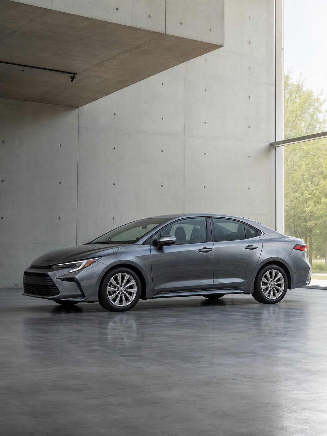
Toyota Corolla (modern)
The current Corolla is a genuinely useful exercise in restrained, contemporary sedan design — it’s easy to draw badly because there’s very little to hide behind. Keep the greenhouse-to-body ratio balanced rather than pushed toward either sporty or utilitarian extremes; this is a proportion right in the middle of everything else on this list, which is exactly why it reads as “normal car” at a glance.
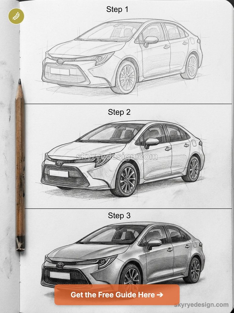
The front end carries Toyota’s current design language — a wide lower grille intake and narrower upper element, connected by headlights that taper toward the fenders. Where beginners go wrong is adding too many character lines trying to make it look “interesting.” The modern Corolla’s actual sophistication is in a small number of confident surfaces meeting at precise angles, not in busy detail.
Toyota Camry
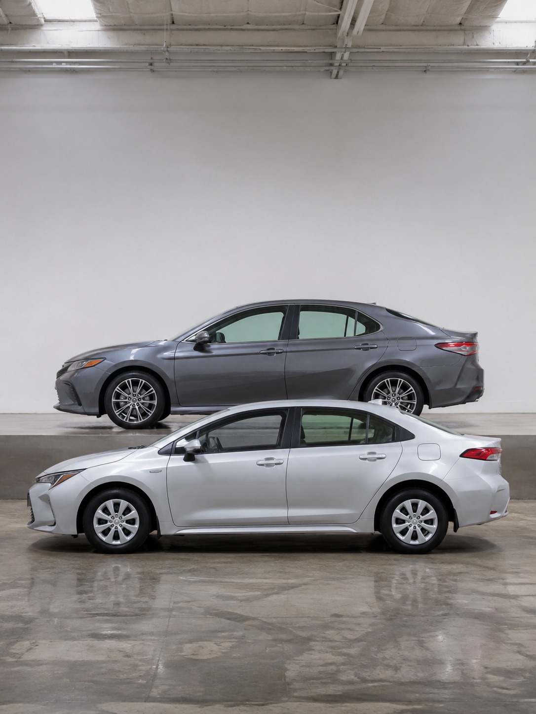
The Camry sits one size class up from the Corolla, and the proportion shift is worth studying directly against it if you’re drawing both. Slightly longer wheelbase, a bit more length ahead of the front axle, and a marginally lower, more assertive beltline than the Corolla’s.
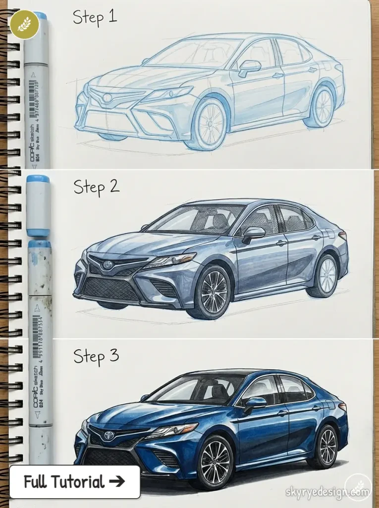
I’d draw these two back to back if you’re working through this list — the comparison teaches you more about how Toyota scales its design language across a size range than either car does in isolation. The Camry’s front fascia carries more aggressive character lines than the Corolla’s, particularly through the hood, which is worth exaggerating slightly in a sketch to communicate the model’s slightly sportier positioning within the sedan lineup.
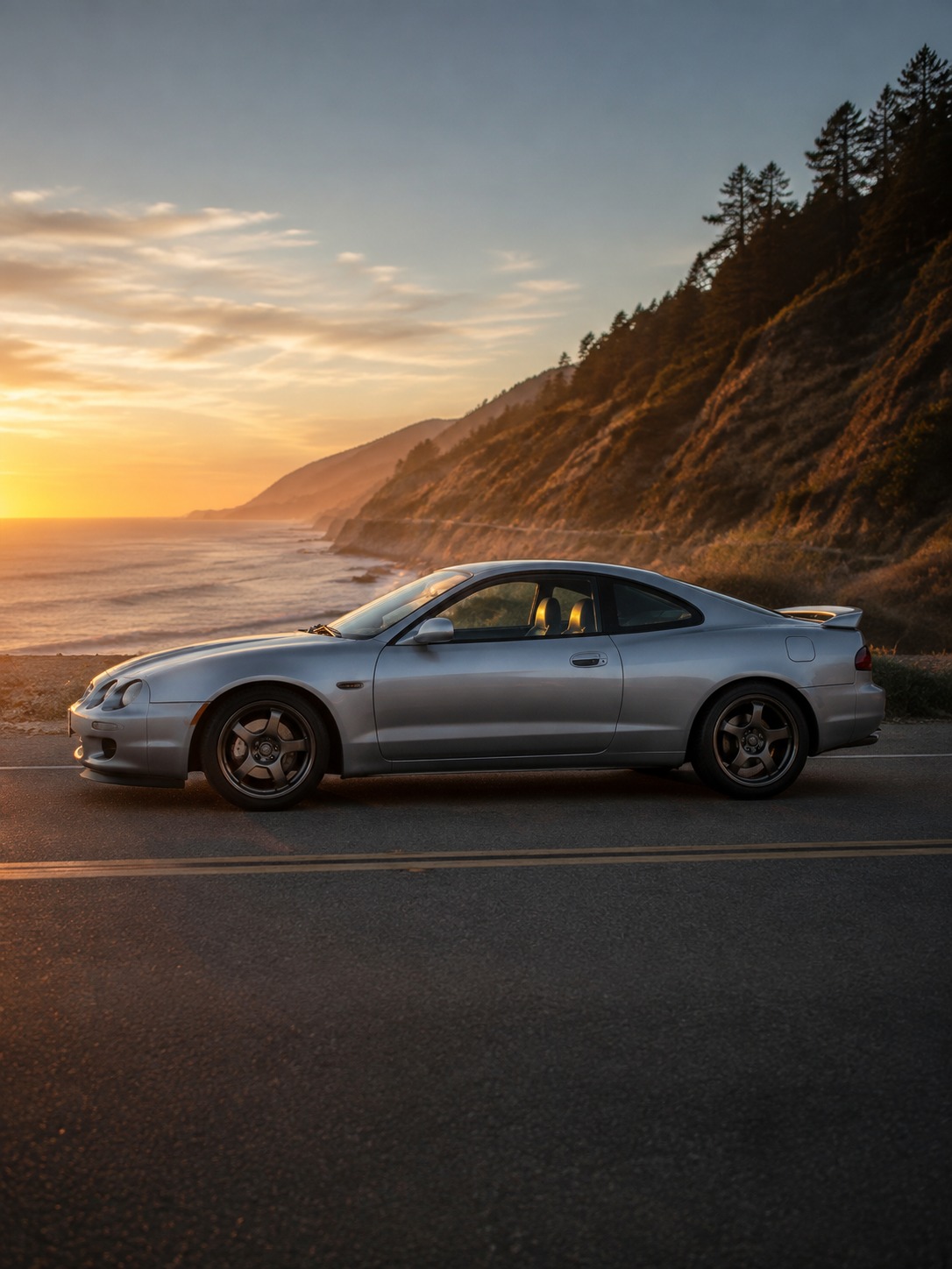
Toyota Celica
The Celica is worth drawing specifically for its roofline — later generations, particularly the 2000s ZZT230, have a dramatically raked windshield and a roof that tapers hard toward the rear, giving the car a coupe silhouette that’s more dynamic than its actual mechanical layout (front-wheel drive, most generations) would suggest.
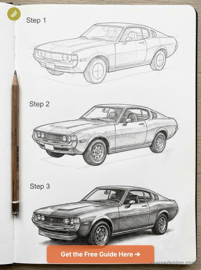
This is a good lesson in how roofline angle alone can communicate sportiness independent of what’s actually under the hood. Keep the beltline rising slightly toward the rear, and let the rear quarter panel taper inward toward a compact tail — that convergence of roofline and body line toward the back is what gives the Celica its wedge-like read from a three-quarter angle.
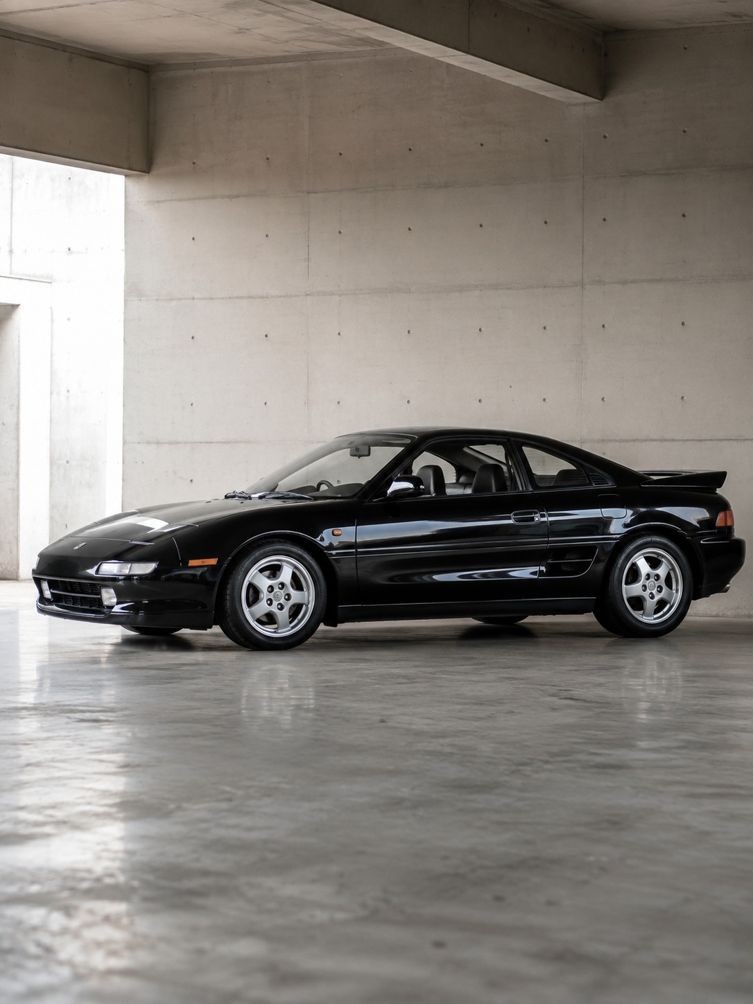
Toyota MR2
Mid-engine proportions are genuinely different from anything else on this list, and they trip up a lot of beginners who apply front-engine logic out of habit. The cabin sits further forward relative to the wheelbase than on a front-engine car, and there’s a short, aggressive overhang behind the rear wheels rather than a long trunk.
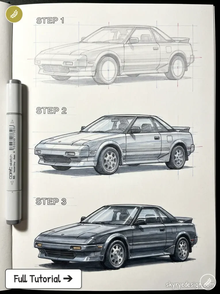
Keep the hood low and short — there’s no engine under there — and let the car’s visual mass concentrate around the doors and rear haunches instead of stretching front to back. The MR2’s low overall height relative to its width is worth exaggerating slightly in a sketch; it’s a genuinely compact car, and underdrawing that compactness is the most common mistake I see.
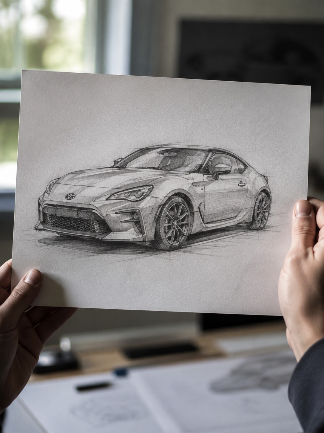
Toyota GR86 / GT86
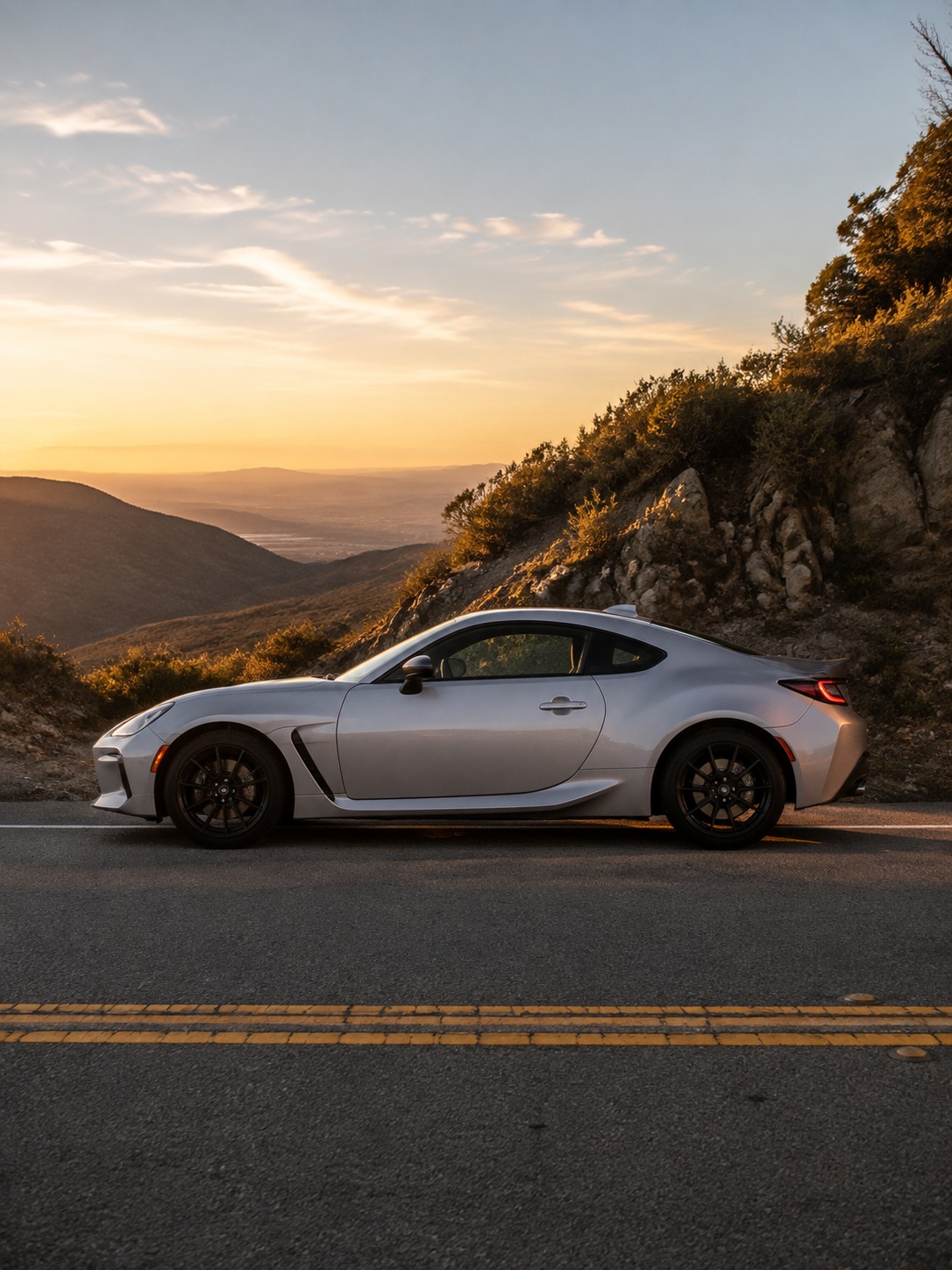
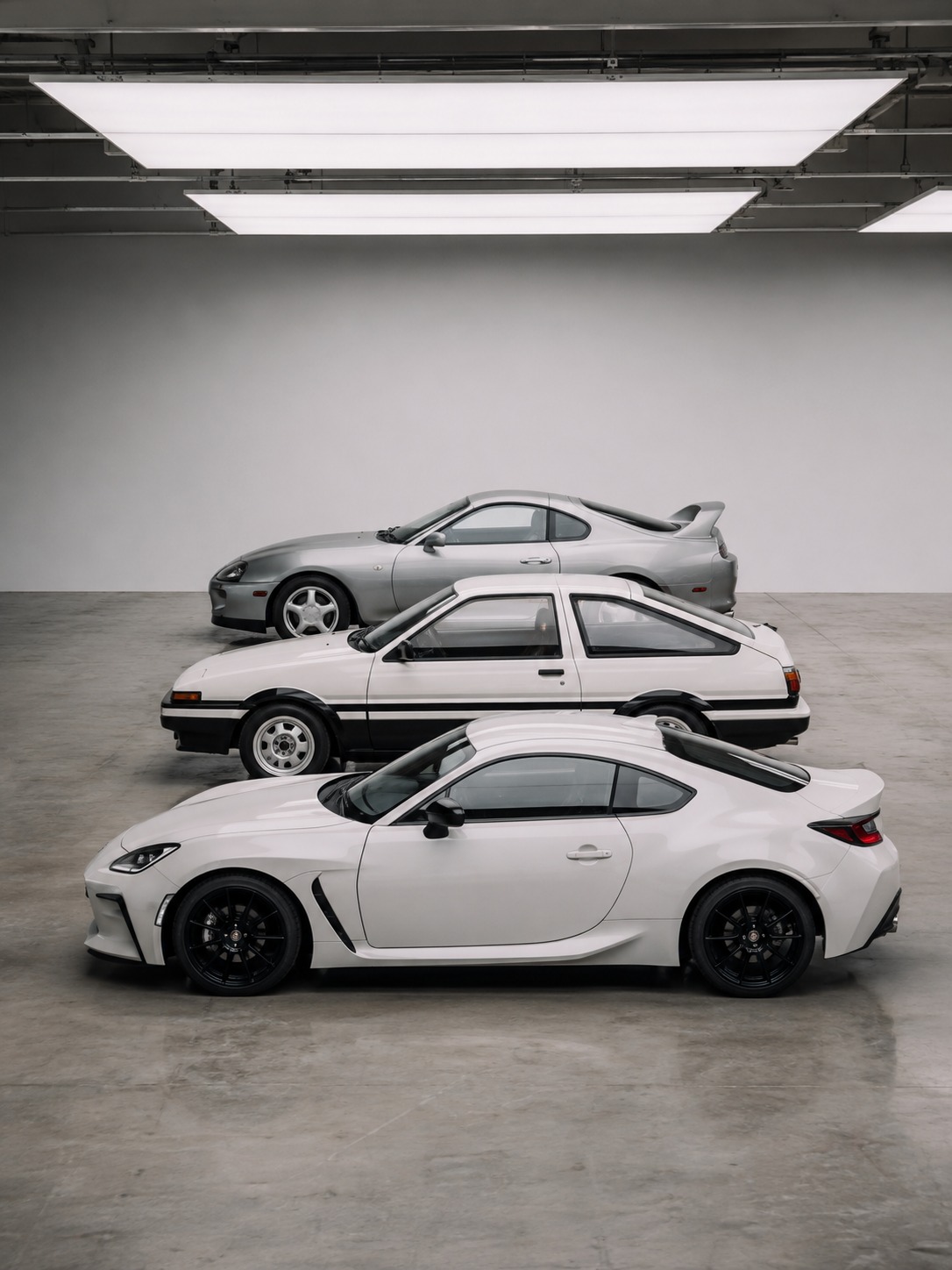
The GR86 (and its GT86/FR-S predecessor) is a modern interpretation of the same long-hood, short-deck sports coupe proportions the Celica used decades earlier, which makes it worth drawing right after the Celica if you want to see the design lineage directly.
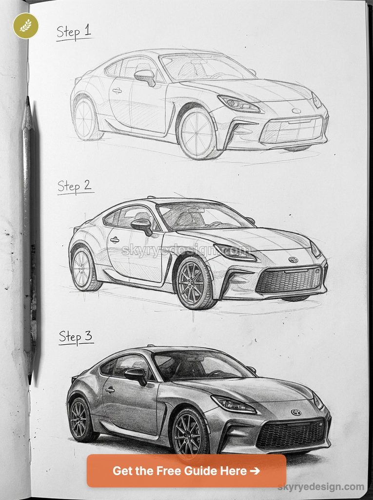
Keep the hood long and low, the cabin pushed back toward the rear axle, and the greenhouse compact relative to the body — classic front-engine, rear-wheel-drive sports car proportion. The character line running from the front fender through the door and into the rear haunch is the model’s most important surfacing detail; keep it as one continuous, confident stroke rather than breaking it into segments, since that line is doing the job of visually connecting the car’s front and rear masses.
Toyota 2000GT
The 2000GT is the odd one out on this list in the best way — a mid-1960s design that still holds up as one of the most elegant shapes Toyota has ever produced, and drawing it teaches proportion lessons none of the modern models on this list can. The hood-to-cabin ratio is extreme: a long, low hood stretching well ahead of a small, compact cabin pushed almost to the rear axle. Headlights sit low and are genuinely small relative to the body, which is a proportion relationship almost nothing in Toyota’s modern lineup uses anymore, since contemporary lighting and safety requirements push headlight assemblies larger.
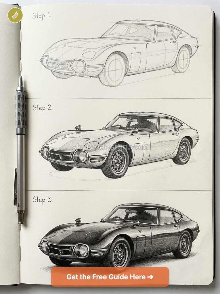
Keep the beltline low across the entire length of the car and let the body taper gently from the widest point at the doors toward both the nose and tail — there’s very little hard-edged surfacing here compared to everything else on this list; the 2000GT’s character comes almost entirely from continuous, flowing curves.
This is the model I’d recommend drawing last if you’re working through the full set, because it forces you to unlearn the more assertive, character-line-driven approach the modern cars on this list depend on. Some of the most interesting historical Japanese design work — this car included — was working from a completely different set of proportion instincts than what dominates the industry today, and there’s real value in understanding both languages rather than only the current one.
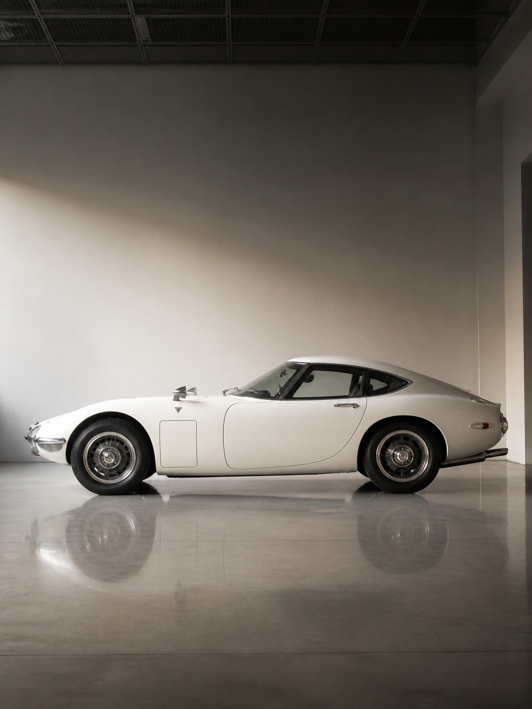
TIP: Draw the 2000GT last if you’re working through the full set of ten — its flowing, curve-driven surfacing is the opposite of the character-line approach every modern model on this list depends on.
Materials and technique: graphite, marker, and digital rendering for car surfaces
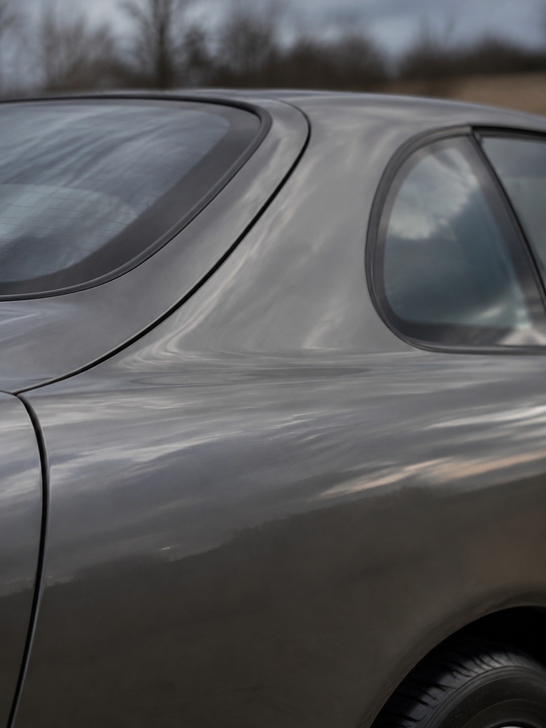
A car’s body is essentially a collection of large, reflective, continuously curved surfaces, which makes it a genuinely different rendering problem than most subjects — you’re drawing light behavior almost as much as you’re drawing the object itself.
Graphite technique
Work from a hard pencil (2H) for your construction and proportion lines, then shift to a softer pencil (4B or 6B) for shading once the structure is locked in. The key move for reading as “metal” rather than “flat shape” is a hard-edged highlight — a crisp white or untouched paper strip running along a character line or the top of a fender — bordered immediately by a darker value with no gradual transition. Automotive surfaces bounce light in sharp bands, not soft gradients, so resist the instinct to blend everything smoothly. A kneaded eraser is essential for pulling back highlights along curved surfaces like a hood or roof.
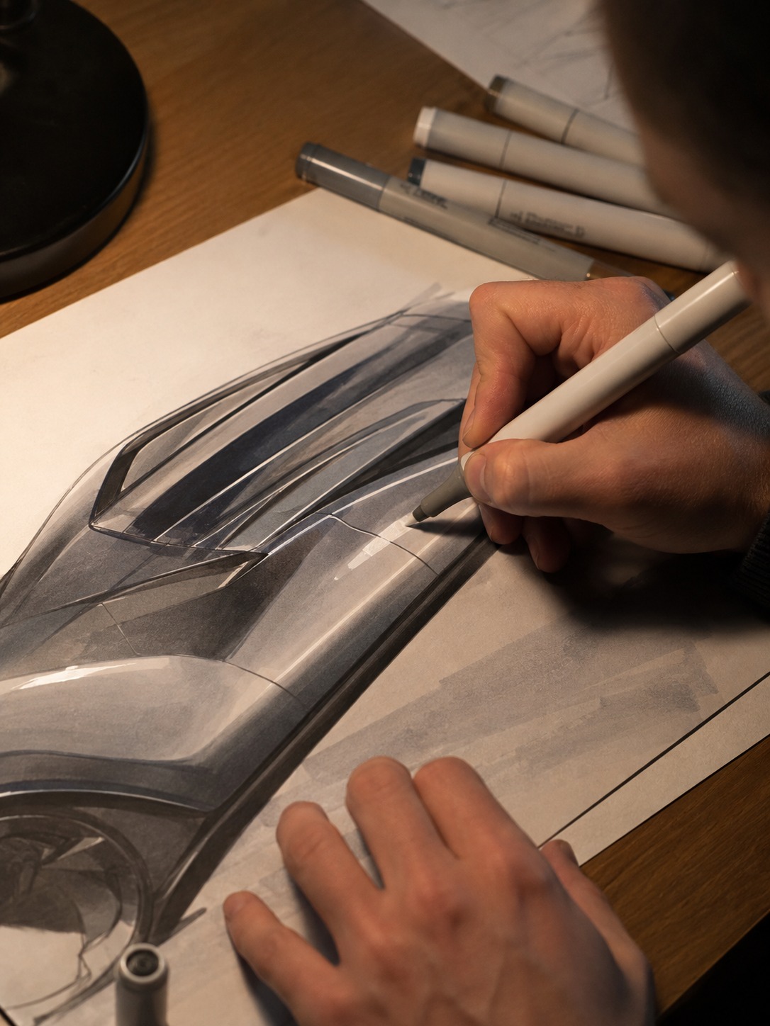
Marker technique
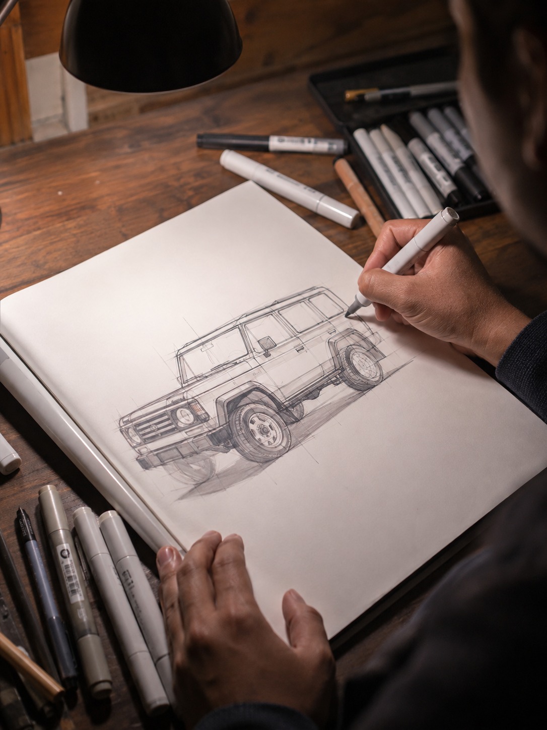
Alcohol-based markers (Copic or similar) are close to the industry-standard tool for automotive concept sketching, and for good reason — they let you lay down flat color fields quickly, then layer darker tones for shadow with minimal blending time. Work light to dark, always. Leave the paper white for your primary highlight rather than trying to add white back in later, since most markers don’t allow for clean correction. A single grey marker one or two shades darker than your base color, applied along the lower edge of character lines, does most of the work of reading as dimensional metal.
Digital rendering
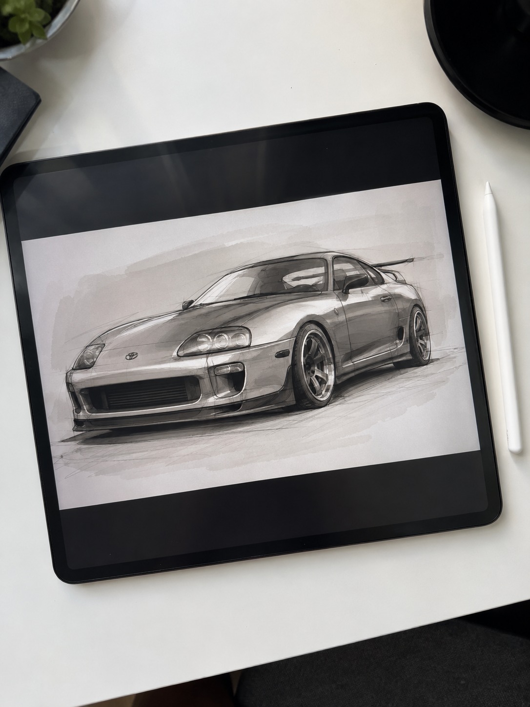
In Procreate or Photoshop, use a hard-edged round brush rather than a textured one — car surfaces want clean, confident edges, not the soft organic texture you’d use for fur or foliage. Build reflections using a gradient map or a separate highlight layer set to a high-contrast blend mode, and keep your color palette restrained; most concept car sketches use no more than four or five values per panel. Digital’s real advantage here is the ability to nudge a highlight’s exact position after the fact, which is genuinely useful while you’re still training your eye for where automotive highlights actually fall.
Fixing the mistakes that make Toyota sketches look generic
If a sketch still doesn’t read as a specific Toyota model after all this, it’s almost always one of three issues. Here’s the troubleshooting pass I run before calling a car drawing finished.
Mistake 1: Wheels drawn too small or positioned wrong relative to the body. This is the single most common issue, and it undermines everything else in the drawing regardless of how well the rest is rendered. Go back and check wheel position against the proportion logic from the first section — sporty models need wheels pushed to the corners with minimal overhang, trucks and SUVs need visible overhang front and back. Undersized wheels make any car look like a toy, no matter how carefully the body panels are drawn.
Mistake 2: Beltline height doesn’t match the model’s identity. A Land Cruiser drawn with a Supra’s low beltline looks wrong even if every other proportion is correct, because beltline height is one of the fastest visual cues for what kind of vehicle you’re looking at. Check this against the greenhouse-to-body ratio you established during block-in — it should match the character of the specific model, not default to whatever felt natural to draw.
Mistake 3: Flat, gradual shading instead of hard-edged highlights. This is the fastest way to make a technically well-proportioned car sketch look unconvincing. Automotive surfaces reflect light in sharp, defined bands, not soft gradients — if your shading looks smooth and airbrushed rather than crisp, the drawing will read as generic regardless of how accurate the underlying shape is. Go back to the highlight technique from the materials section and check for hard edges between light and shadow values.
Run this three-point check against your reference before finishing. In my experience, wheel position and beltline height resolve most of the “this looks like a generic car, not a specific Toyota” problem before you even touch rendering technique.
Final thoughts
For a wider comparison of car proportions, pair this Toyota exercise with the Mazda drawing guide and the Lexus car drawing reference pack. Drawing those three brands back to back makes the differences in stance, surfacing, and luxury-detail language much easier to see.
A convincing Toyota sketch comes down to proportion and stance more than detail — get the greenhouse-to-body ratio, wheel position, and beltline height right for the specific model you’re drawing, and the rendering technique does the rest of the work. The ten models in this guide span everything from a mid-engine sports car to a body-on-frame truck specifically because each one teaches a different piece of that proportion logic.
If you’ve worked through the full set, you’ve effectively trained your eye across most of the proportion vocabulary you’ll need for any car — Toyota or otherwise.
Toyota drawing reference gallery
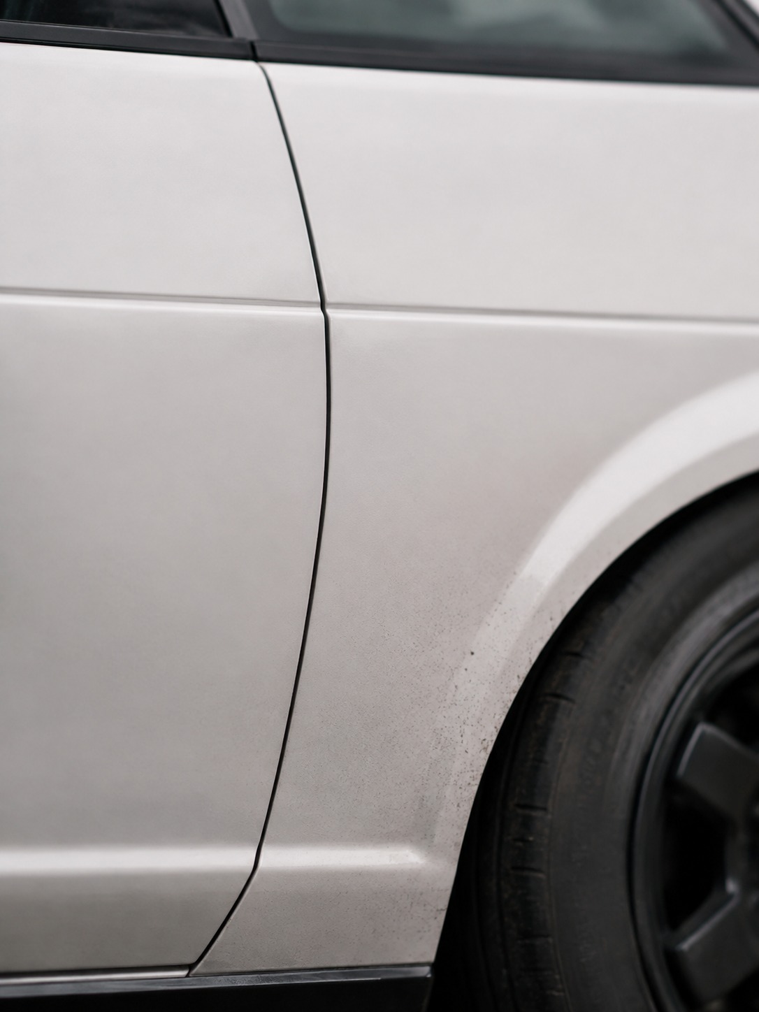
Use these extra angles as quick proportion checks while you sketch. They are especially useful after you have drawn one clean side view and want to understand how Toyota surfaces change around the doors, fenders, roofline, and grille.
FAQ
Q: What’s the easiest Toyota to draw?
The AE86 (Corolla Trueno) is the most forgiving starting point — its boxy, flat-surfaced design has minimal curves to get wrong, and confident straight lines matter more than precise curve control. The modern Corolla is a close second, though its subtlety makes small proportion errors more noticeable than the AE86’s simpler forms.
Q: How do you draw a Toyota Supra step by step?
Start with a low, compressed greenhouse sitting on a wide lower body, then build out the rear haunches so they flare noticeably beyond the greenhouse width — this is the detail most tutorials underdraw. Add a long hood with a subtle center power bulge, keep the beltline low throughout, and finish with either the A90’s double-bubble roofline or the MK4’s flatter, more angular roof.
Q: What pencil is best for car drawing?
A 2H for construction and proportion lines, then a 4B or 6B for shading once the structure is locked in. The harder pencil keeps early guidelines light and easy to erase, while the softer pencil gives you the value range needed for the hard-edged highlights automotive surfaces require.
Q: How do you make a car sketch look realistic?
Focus on hard-edged highlights rather than soft, gradual shading — automotive surfaces reflect light in sharp bands, not gentle gradients. A crisp highlight strip along a character line, bordered immediately by a darker value with no blending between them, does more for realism than any amount of fine detail elsewhere.
Q: What’s the difference between drawing a Supra and a Land Cruiser?
Almost every proportion instinct reverses between the two. The Supra wants a low beltline, compressed greenhouse, and wheels pushed to the corners with minimal overhang; the Land Cruiser wants a high beltline, tall boxy greenhouse, and wheels tucked further under the body with real overhang front and back.
Q: How long does a detailed car drawing take?
A fully rendered graphite or marker piece with proper highlight work typically takes 2-4 hours, depending on the model’s complexity and how much surface detail you’re including. A simpler proportion-and-line sketch following just the block-in method can be done in 20-30 minutes.
Q: Can beginners draw JDM cars?
Yes, as long as proportion comes before detail. Most beginner JDM sketches fail not from lack of skill but from jumping straight to character lines and badges before the underlying stance and wheel position are correct — get those two things right first and the rest follows more easily than expected.
- 135shares
- Facebook0
- Pinterest135
- Twitter0
- Reddit0