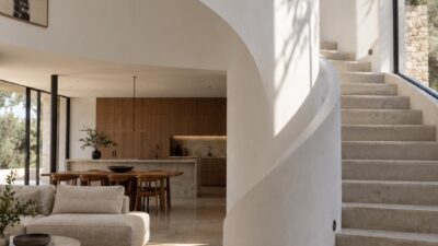
Interior design principles aren’t decorating laws — they’re checks.Interior design principles aren’t decorating laws — they’re checks. Before I pick a sofa, paint color, rug, or artwork, I run through the same short list: purpose, mood, balance, color, texture, lighting, detail, personal meaning. Miss one and the room usually tells you eventually, in the way it never quite feels settled.
- The 7 golden rules of interior design at a glance
- 1. Decide the room purpose first
- 2. Choose the mood and character
- 3. Use symmetry and balance for harmony
- 4. Treat color and texture as one decision
- 5. Layer the lighting
- 6. Edit the details
- 7. Make the room personal
- Common interior design mistakes to avoid
- Related interior design guides
- Sources and further reading
- Conclusion
- FAQ
- Q: What are the 7 golden rules of interior design?
- Q: What is the most important interior design principle?
- Q: How do beginners start interior design at home?
- Q: How do you make a room feel balanced?
- Q: What is the 60-30-10 rule in interior design?
- Q: Why is lighting so important in interior design?
- Q: How many accessories should a room have?
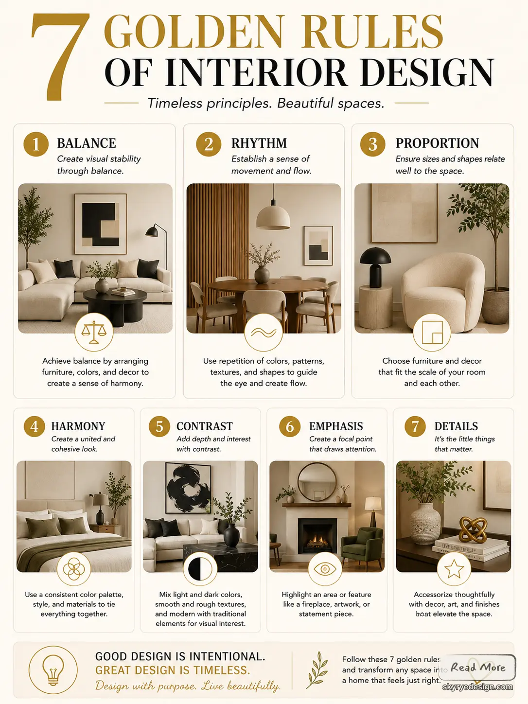
The original version of this post had seven golden rules and images. I’ve kept those visuals, added seven new examples, and actually explained how each principle plays out in a real home — not a staged showroom, a place someone lives in. The goal is practical: rooms that are easier to plan, easier to be in, and less dependent on buying things and hoping they work.
The 7 golden rules of interior design at a glance
| Rule | What it fixes | Quick check |
|---|---|---|
| Purpose | Rooms that look nice but do not work | Can you name the main activity in one sentence? |
| Mood | Mixed furniture and unclear style | Do three adjectives describe the room? |
| Balance | A room that feels heavy on one side | Is visual weight spread across the space? |
| Color and texture | Flat rooms with no depth | Do smooth, soft, rough, and matte surfaces work together? |
| Lighting | Harsh or gloomy rooms | Are ambient, task, and accent lights all present? |
| Details | Cluttered or unfinished surfaces | Does each object earn its place? |
| Personal meaning | Rooms that feel staged | Is there something only you would choose? |
If you are redesigning one room, do not try to solve all seven rules in one pass. Start with purpose and layout, then mood, then lighting. Color, texture, details, and personal objects become much easier once the room has a clear job.
1. Decide the room purpose first
A room gets easier to design when you know what it must do before you buy anything. A living room for conversation needs a different layout from a living room built around television, reading, or entertaining. Start with the main activity, then arrange seating, storage, lighting, and walkways around that job.
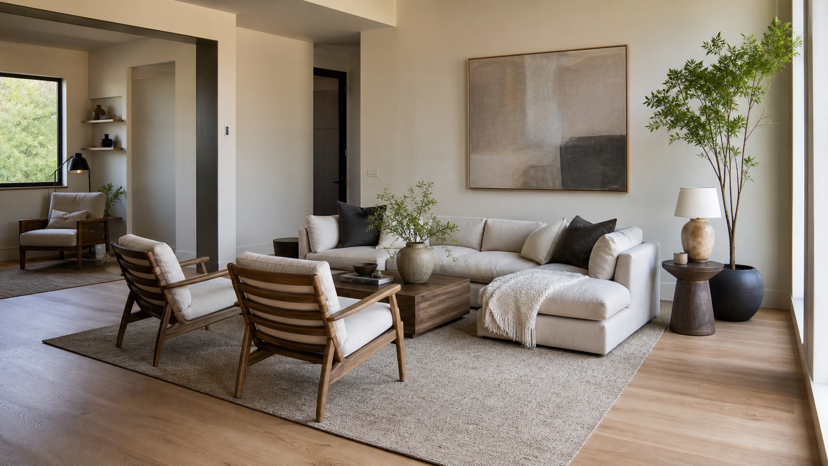
Designer check: stand at the door and ask, “What is this room asking me to do first?” If the answer is unclear, the layout needs simplifying before the decor needs changing.
2. Choose the mood and character
The second rule is emotional. Decide whether the room should feel calm, bright, formal, playful, dramatic, or restorative. That decision guides the palette, furniture silhouettes, fabric weight, artwork, and lighting temperature. Without a mood direction, a room often becomes a collection of nice objects that do not quite speak to each other.
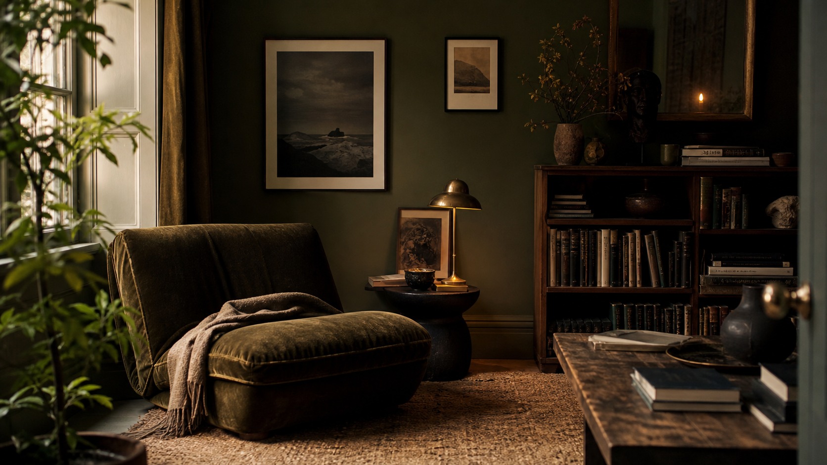

A useful test is to pick three adjectives before shopping. For example: “quiet, natural, grounded” will lead to different choices than “glamorous, bold, social.”
3. Use symmetry and balance for harmony
Symmetry creates order quickly, especially around beds, fireplaces, dining tables, and sofas. Balance is broader: it means the visual weight of furniture, color, height, and texture feels stable across the room. You can balance a heavy sofa with two lighter chairs, a dark wall with a pale rug, or a tall bookcase with art and lighting on the opposite side.
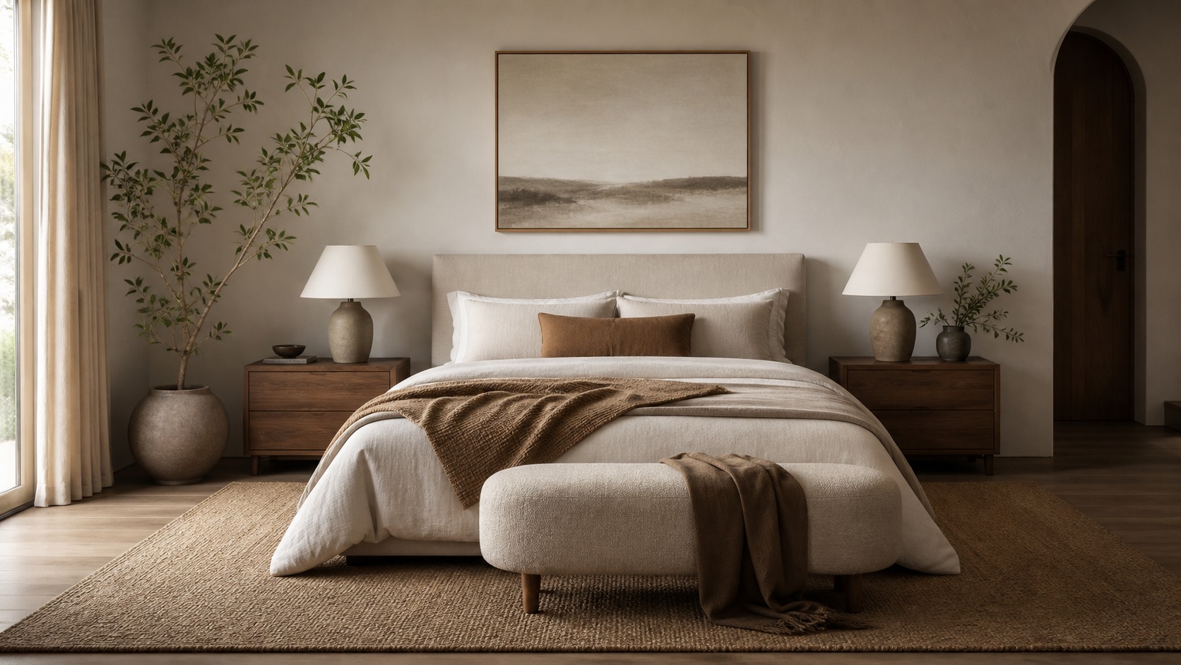
Do not make everything perfectly mirrored unless the room needs formality. A little asymmetry keeps the space human.
For a room-by-room example of this idea, the living room interior design ideas guide shows how seating, circulation, and focal points work together after the main purpose is clear.
4. Treat color and texture as one decision
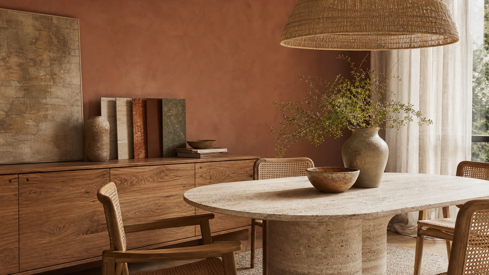
Color sets the temperature of a room, but texture decides whether that color feels flat or rich. A beige room with linen, oak, plaster, ceramic, and wool can feel layered; the same beige in only smooth surfaces can feel unfinished. Choose a palette, then choose materials that make the palette tactile.

When a room looks technically “right” but still feels cold, the missing piece is often texture rather than another accent color.
5. Layer the lighting
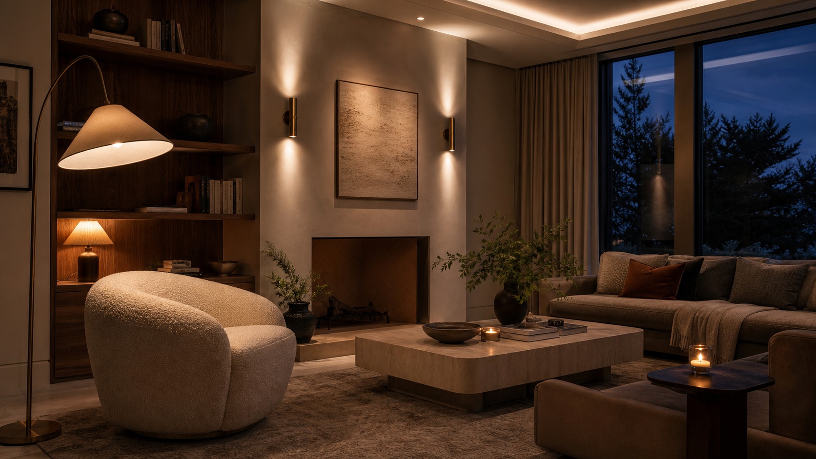
Lighting is not one ceiling fixture. Good interior design usually needs ambient light for general visibility, task light for reading or work, and accent light for art, shelves, plants, or architectural features. The strongest rooms use several lower light sources instead of one harsh overhead source.
For evening rooms, I like to check the corners. If every corner is dark, the room feels smaller and less welcoming than it needs to.
Lighting deserves its own pass. If that is the part your room is missing, the LED lights for room guide has more ideas for mood, zones, and practical placement.
6. Edit the details
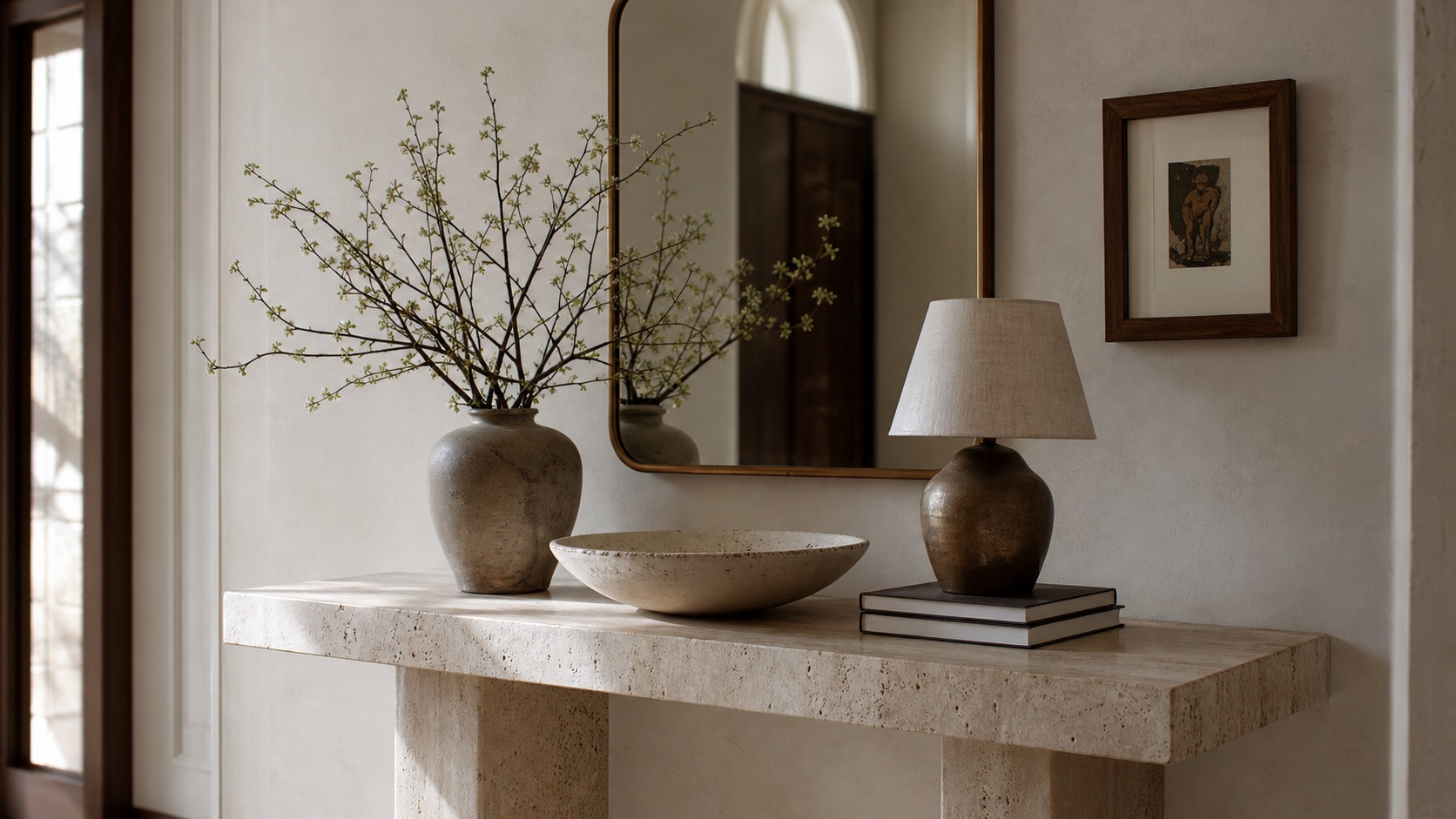
Details finish a room, but too many details make the design noisy. Use accessories to reinforce the room’s purpose and mood: one strong lamp, a bowl for keys, a vase with branches, books you actually open, or artwork that changes the scale of a wall. Leave negative space around objects so they can be seen.
A good styling rule: remove one item from every surface after you think you are done. The remaining pieces usually look more intentional.
7. Make the room personal
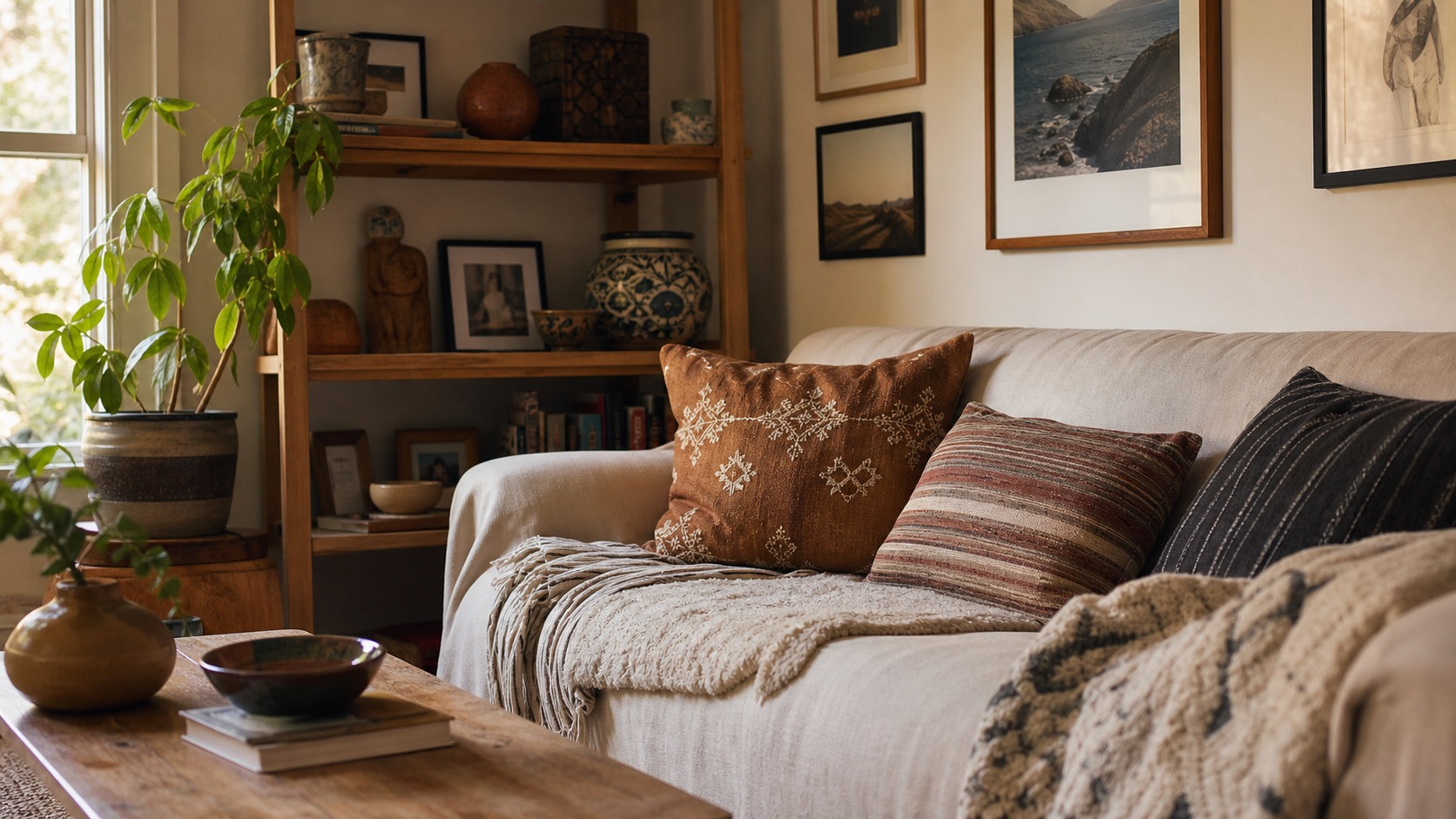
The final rule is the one that makes a house feel like yours. Use objects with memory, craft, travel, family, or personal taste, but edit them into the design instead of scattering them everywhere. A room should reveal the person who lives there without turning every shelf into a storage display.
Personal does not mean cluttered. It means the room has a point of view: a painting you love, a handmade bowl, a stack of books, a textile, or a small object that makes you pause.

Common interior design mistakes to avoid
The most common mistake is starting with decor before the room has a plan. A beautiful chair in the wrong place is still a problem. The second mistake is copying a full room from Pinterest without checking scale, daylight, ceiling height, and storage needs. The third is using one overhead light and expecting it to create atmosphere.
When I review a room, I look for the quiet structural problems first: blocked pathways, furniture floating without a reason, rugs that are too small, artwork hung too high, and accessories fighting the main focal point. Fixing those details usually changes the room more than buying another decorative object.
Related interior design guides
Use these next if you want to apply the seven rules to specific rooms, materials, or design decisions:
- living room design ideas
- moody interior design
- interior design books
- types of carpet
- canvas wall art for living room
- professional interior painting
- biophilic interior design trends
- modular sofas for small spaces
- Lovesac alternatives for modular living rooms
- wedding table settings
Sources and further reading
- NCIDQ interior design qualification information
- International Interior Design Association
- American Society of Interior Designers
- Lighting Design Lab
- WELL Building Standard
- Architectural Digest interior design guidance
For a whole-home version of the same design problem, this aging in place home design decisions explains how entries, bathrooms, lighting, kitchens, flooring, laundry, and outdoor rooms can work together in a 55+ home.
Conclusion
The best interior design rules don’t push every home toward the same look. They just help you notice what’s off. Purpose gives a room direction. Mood gives it character. Balance makes it calm. Color and texture add depth. Lighting makes it actually usable at different times of day. Details finish the story. Personal objects make it yours instead of a showroom.
In addition to these rule-based layouts, combining furniture placement with the daylighting strategies of solar passive design can turn any room into an inviting space.
If I could only change one thing today, I’d start with the room that bothers me most and name what it’s supposed to do. Not “feel cozy” — something specific, like “this is where I read in the morning and I need it quiet and bright.” Then I’d pull out whatever fights that. One decision like that usually makes the next six rules obvious instead of overwhelming.
For a bedroom-specific version of this design problem, use these couple bedroom decor decisions to balance lighting, bedding, wall decor, storage, and shared taste without making the room feel generic.
FAQ
Q: What are the 7 golden rules of interior design?
The seven golden rules are purpose, mood, balance, color and texture, lighting, edited details, and personal meaning. They help you plan a room before buying furniture or decor. Start with the room’s main function, then build atmosphere, layout, material choices, light layers, accessories, and personal objects around that function.
Q: What is the most important interior design principle?
Purpose is usually the most important principle because it controls the rest of the room. A space for conversation, work, sleep, or entertaining needs different furniture placement, lighting, storage, and texture. Once the purpose is clear, style decisions become easier and less random.
Q: How do beginners start interior design at home?
Beginners should start by editing the room, measuring the main furniture, and deciding what the room must do. Then choose a focal point, arrange the largest pieces, add layered lighting, and only then bring in color, texture, and accessories. Do not start with small decor before the layout works.
Q: How do you make a room feel balanced?
Balance comes from spreading visual weight across the room. Large furniture, dark colors, tall shelves, busy patterns, and strong artwork all feel visually heavy. Pair them with lighter pieces, open space, repeated colors, or objects of similar height so one side of the room does not feel overloaded.
Q: What is the 60-30-10 rule in interior design?
The 60-30-10 rule is a simple color guideline: about 60% of the room is a dominant color, 30% is a secondary color, and 10% is an accent. It is not a law, but it helps beginners avoid using too many competing colors at once.
Q: Why is lighting so important in interior design?
Lighting changes how color, texture, scale, and mood appear. A room with only one overhead light can look flat and harsh. Layer ambient, task, and accent lighting so the room works for cleaning, reading, relaxing, entertaining, and evening atmosphere.
Q: How many accessories should a room have?
There is no fixed number, but every accessory should support the room’s mood, scale, or story. Group small objects in odd numbers, vary height and texture, and leave empty space around them. If every surface is full, the room usually needs editing rather than more decor.
Flooring is one of the big structure decisions in a room; this light oak flooring design guide shows how to connect it with color, furniture, and lighting.
If you want a warmer room language, this english cottage style guide applies the same balance, color, texture, and lighting principles to a collected home.
In tight, functional floor plans, utilizing underused vertical wall spaces is essential. Check out our detailed list of bathroom storage hacks for space-saving layouts.
Maintaining interior visual flow helps unify the different historical styles of houses with modern living spaces.
The same visual logic applies to rooms: rhythm in design comes from repeated shapes, intervals, colors, and lighting points that move the eye without making the space feel mechanical.
These principles also apply to practical details like coffee corner ideas, where proportion, rhythm, and negative space keep the station from turning into clutter.
- 2.5Kshares
- Facebook0
- Pinterest2.5K
- Twitter0
- Reddit0