Good graphic design portfolio examples do more than show attractive work. They show how a designer thinks: what they choose first, how they explain a project, how they pace images, and where they let the work breathe. That structure matters because the portfolio itself is the first design problem a client or hiring manager sees you solve.
The first portfolio review I ever sat through as a junior designer made that painfully clear. The senior designer barely talked about the individual projects. He spent more time on the order, captions, spacing, and case-study logic, then said something I still use as a filter: if you cannot organize your own work clearly, why should someone trust you to organize theirs?
I have built and reviewed portfolios across branding, automotive concepts, jewelry, web applications, dashboards, and visual communication. The strong ones all share the same habit: they make the viewer’s job easier. The ten portfolios below are worth studying because each one solves that problem in a different way.
- Graphic design portfolio examples: what works
- 10 graphic design portfolio examples to study
- What these portfolios have in common
- Practical steps for building your own
- Graphic design portfolio examples FAQ
- What should a graphic design portfolio include?
- How many projects should be in a graphic design portfolio?
- What makes a graphic design portfolio stand out?
- Should a graphic design portfolio have a personal style?
- What is the best platform to build a graphic design portfolio?
- How often should you update a graphic design portfolio?
- Should a graphic design portfolio include personal projects?
The ten examples below are real, currently live sites from working graphic designers and studios. Each one solves the portfolio problem differently. The analysis focuses on what each site gets structurally right and what you can take from it regardless of your current experience level.

Studying graphic design magazine examples is useful for portfolio research because magazines show how to sequence projects, write captions, and make case studies feel editorial.
A portfolio case study becomes stronger when it shows how a logo was tested, so a simple Canva logo workflow can be useful for explaining early brand exploration before the polished presentation.
Graphic design portfolio examples: what works
Before looking at specific examples, three principles separate portfolios that attract serious work from ones that are just online storage for past projects. Understanding them makes the examples below easier to read critically.
For a quick read, judge each portfolio by four things: the first project, the case-study writing, the image sequence, and the contact path. If those four parts feel clear, the portfolio usually feels more senior even when the designer has fewer projects.
| Portfolio element | What to study | Why it matters |
|---|---|---|
| Lead project | The first case study and thumbnail | It tells the viewer what kind of designer they are meeting. |
| Case-study structure | Problem, decision, process, result | It proves thinking, not only taste. |
| Image pacing | Hero images, details, mockups, captions | It keeps the work readable instead of turning it into a dump of screenshots. |
| Visual system | Type, spacing, color, navigation | The portfolio site itself becomes evidence of design judgment. |
First: curation over completeness. A portfolio of 10 strong projects is more persuasive than one of 30 mixed-quality ones. Every weak piece in a portfolio lowers the perceived ceiling of what you’re capable of. Second: context over visuals alone. Showing what you made without explaining why you made it that way is showing your output, not your thinking. Clients and employers hire both. Third: the portfolio itself is a design project. The typography, layout, navigation, and image quality of the portfolio communicate your standard of work before a single project page is opened.
What to look for when studying any portfolio
When I look at a portfolio, the questions I’m asking are: can I tell immediately what this designer does? Is there a clear lead piece or does the opening feel random? Do the case studies explain the reasoning or just the result? Is the visual language of the portfolio itself well-executed? Would I know how to contact this person and what to ask for?
The examples below are chosen because each one answers at least three of those questions clearly. None of them is perfect. A few are deliberately unconventional. But all of them solve the core problem: they communicate a point of view.
10 graphic design portfolio examples to study
#1 Jessica Hische
Hand lettering and type design | San Francisco
Hische is a lettering artist who has worked with Wes Anderson, Penguin Books, Starbucks, and Google, among others. Her portfolio is a direct expression of her specialism: the site typography is her own work, the logo is custom lettering, and the first visual impression is type. There is no ambiguity about what she does or how well she does it.
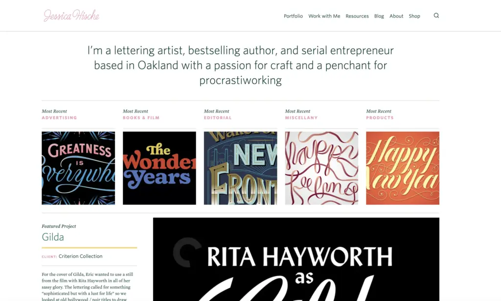
Case study pages are cleanly structured with a short client context paragraph and large, high-quality imagery. The white space is generous, which lets the intricacy of the lettering read without visual competition. Her personal branding, including the Daily Drop Cap project and a section on her book In Progress, is integrated into the portfolio without crowding the client work.
→ Key takeaway: Let the portfolio’s own design demonstrate your specialty. If you work with type, lead with type in the portfolio itself.
#2 Stefan Sagmeister
Conceptual graphic design and art direction | New York / Vienna
Sagmeister is one of the most recognized designers in the world, known for projects including the Jewish Museum New York identity, large-scale installations, and the Now Is Better project shown internationally in 2023 and 2024. His portfolio site uses a grid of images on the homepage with hover states that reveal project names and the name follows the cursor, which is a simple but effective piece of interaction that signals technical confidence without overwhelming the work.
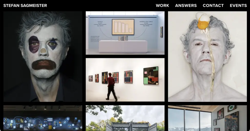
The range of projects on the site is deliberately broad: corporate identity alongside art installations alongside film. Rather than filtering by type, Sagmeister uses the case study pages to provide varying depth depending on the project scale. Major campaigns receive extensive documentation. Smaller pieces appear as curated collections. The personal and experimental work is not hidden, which communicates that the commercial work is a choice rather than a constraint.
→ Key takeaway: Show experimental work alongside commercial work. Clients who want a designer with a point of view are attracted to creative risk-taking.
#3 &Walsh (Jessica Walsh)
Creative direction and brand identity | New York
Walsh co-founded Sagmeister & Walsh before launching her own studio &Walsh, whose clients include Apple, Levi’s, and The New York Times. The studio portfolio leads with bold typographic systems and high-contrast photography. The opening experience is visually aggressive in a controlled way: large type, strong color, and a clear confidence in the studio’s visual language. It immediately positions &Walsh as a creative direction studio rather than a service provider.
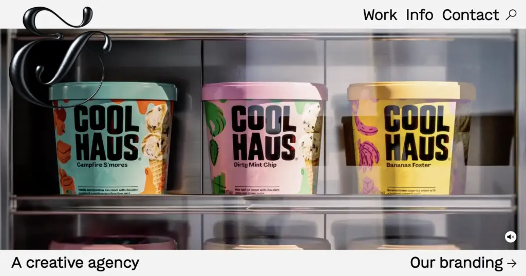
The work is organized to put signature projects first. Scroll further and the range becomes visible, but the first impression is dominated by the work that best represents the studio’s identity. This curation logic, showing your best work before your broadest work, is deliberate and effective. The contact page is direct and specific about what the studio takes on.
→ Key takeaway: Position your strongest project first, not your most recent one. First impressions in portfolios work the same way they do in everything else.
#4 Pentagram
Multidisciplinary design partnership | New York, London, Berlin, Austin
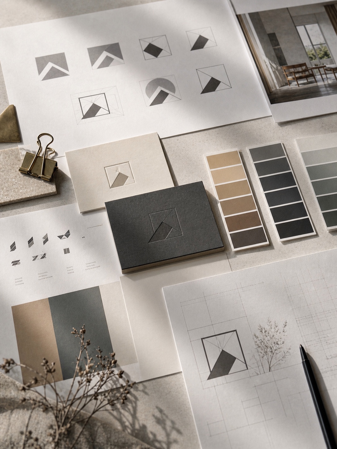
Pentagram is structured differently from any other entry on this list: it’s a partnership of individually credited designers, and each partner maintains their own portfolio within the studio site. This produces a model where individual voices and specialisms are visible while the studio brand provides the overall frame. For someone studying portfolio structure, the way Pentagram handles project pages is worth close attention.
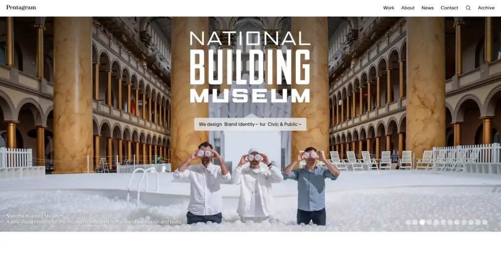
Each project has a headline that captures the problem, a short body that explains the context and approach, and the imagery that shows the result. The writing is edited to a high standard: no generic descriptions, no vague claims about “innovative design.” The language is specific and confident. Studying five or six Pentagram project pages is a useful exercise in how to write design case studies.
→ Key takeaway: Project headlines should describe the problem or the result, not just the client name. “A new identity for a 40-year-old institution” is more interesting than “MoMA identity.”
#5 Timothy Goodman
Illustration, mural art, and graphic design | New York
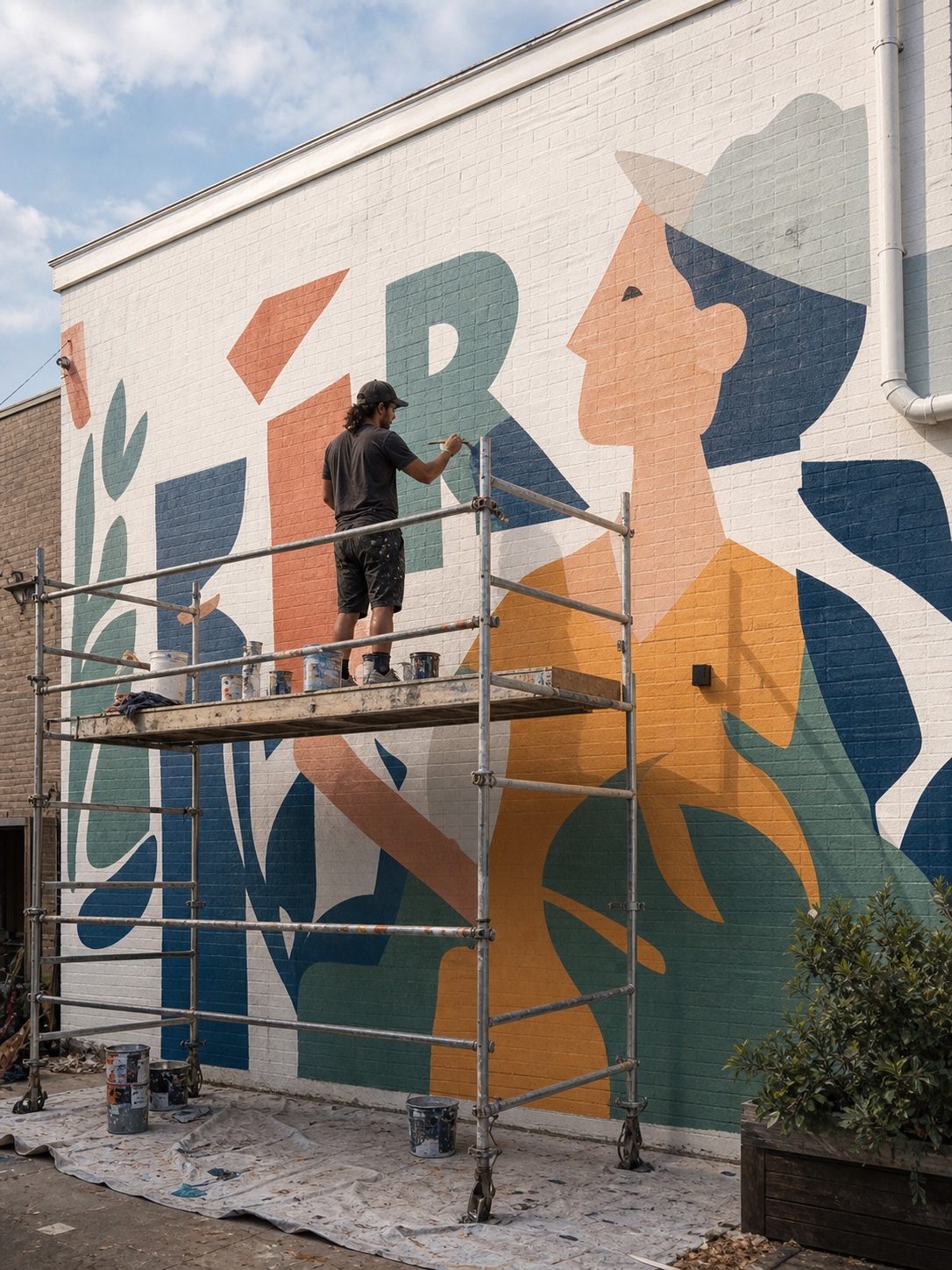
Goodman’s portfolio is built around storytelling rather than a clean typographic system. His site has the visual energy of his work, which spans hand-drawn illustration, mural commissions, and graphic design for clients including The New York Times and Google. The site is deliberately eclectic and immersive in a way that would read as chaotic from most designers, but that maps directly to how he works.
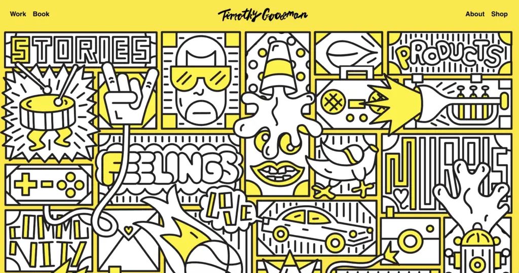
Each project is presented as a mini-story: the context, the process images, the finished result, and often a personal reflection on what the project meant to him. This approach communicates personality alongside craft, which is unusual in a professional portfolio and effective for the type of work Goodman attracts. The writing is personal without being self-indulgent.
→ Key takeaway: If your work has a strong narrative dimension, let the presentation reflect that. Process images and personal reflection can be stronger than a polished final shot alone.
Want to build a portfolio worth showing?
Skillshare has courses on graphic design fundamentals, portfolio building, brand identity, and typography. Use code AFF30D25 for 30% off your first month.
#6 Kelli Anderson
Graphic design, paper engineering, and interactive installations | Brooklyn
Anderson’s work occupies a specific niche: she designs across physical and digital media, with projects including a paper-based functioning camera, interactive books, and visual identity work. Her portfolio is notable for handling that range without losing coherence. The site uses a clean organized layout with clear categorization: design, paper, code, teaching.

What makes the site instructive is how the case studies handle unusual projects. A paper camera is not a standard design deliverable. Anderson explains the concept, the making, and the reception in a way that makes clear what the design thinking was, not just what the object looks like. For designers whose work resists easy category, this is the model to study.
→ Key takeaway: When your work is difficult to categorize, invest more in the explanation, not less. The case study needs to do the contextualizing work that a project type label would normally provide.
#7 Louise Fili
Lettering, typography, and branding | New York
Fili is one of the defining figures in American typography, and her portfolio reflects a thirty-year body of work in branding, book design, restaurant identity, and packaging. The site is deliberately restrained: clean typography (appropriate for a typographer), project images that fill the frame without styling distraction, and a structure organized entirely around what she does rather than who she has done it for.
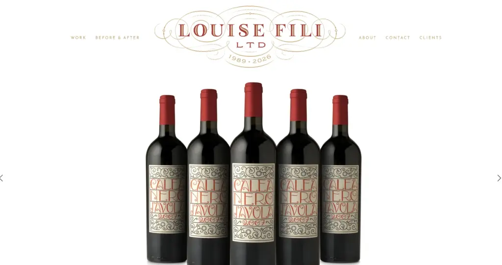
The organizing principle of Fili’s portfolio is specialism. The site communicates in the first thirty seconds that she works in lettering and type-driven branding. Every project reinforces that. For a designer who has a clearly defined niche, this approach is more effective than demonstrating range: it attracts exactly the work that fits the specialty.
→ Key takeaway: Organizing your portfolio around what you do, rather than who you have done it for, positions you as a specialist rather than a generalist. Specialists attract more specific and better-matched briefs.
#8 Marian Bantjes
Intricate ornamental design and calligraphy | British Columbia
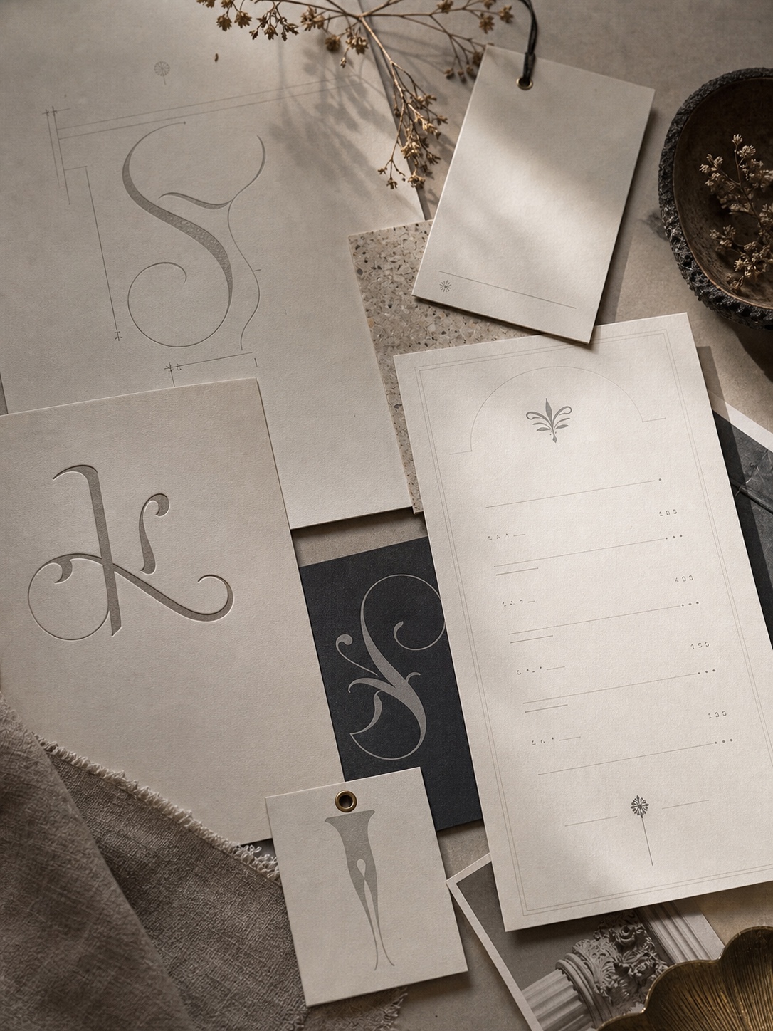
Bantjes produces work that is genuinely unusual in contemporary graphic design: intricate ornamental patterns, hand-drawn calligraphy at extraordinary scale, and decorative systems that draw on historical visual traditions. Her portfolio is built around showing this work in the best possible detail, because the detail is the point.
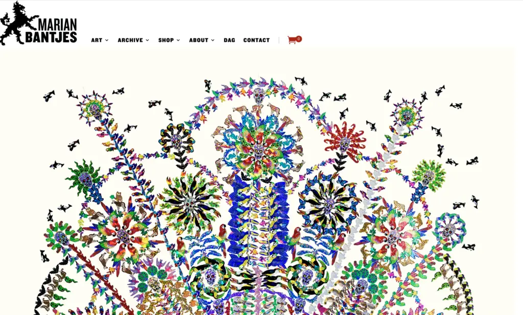
The photography on the site is exceptional. Macro shots allow the viewer to see the fineness of the line work that would be invisible in standard project photos. For designers whose work contains detail that screens typically compress, the photography strategy deserves the same attention as the work itself. Bantjes also shows the scale of pieces next to human figures, which communicates what cannot be communicated by the image alone.
→ Key takeaway: Photograph your work specifically for the thing that makes it distinctive. If scale is the point, show scale. If detail is the point, show detail. Standard grid thumbnails flatten everything.
#9 Lotte Nieminen
Branding, packaging, and editorial design | Helsinki / New York
Nieminen’s portfolio is one of the most considered examples of minimalist presentation in current practice. The site is almost entirely white, the navigation is type-only, and the project images are presented at generous scale without any template styling around them. The effect is that the work, which spans branding, packaging for Finnish and New York clients, and editorial illustration, looks significantly more considered than it might in a busier presentation.
The case studies are brief, which suits the work: these are visual projects and they communicate visually. Where more context would help (packaging design, where the brief and market context matter), Nieminen provides a short paragraph. Where it would not (editorial illustration), she lets the image carry it. The editorial judgment about when to explain and when to show is itself a design decision.
→ Key takeaway: White space and restrained presentation raise the perceived quality of any work. The packaging does not need to be more expensive to look more expensive if the photography and layout communicate care.
#10 Annie Atkins
Graphic prop design for film | Dublin
Atkins designs graphic props for film: the newspapers, menus, letters, and printed ephemera that appear on screen in productions including The Grand Budapest Hotel, Isle of Dogs, and Bridge of Spies, all Wes Anderson productions, as well as Steven Spielberg. Her work is meticulous, research-driven, and historically specific. Her portfolio presents the same problem as Kelli Anderson’s: the work resists easy category.
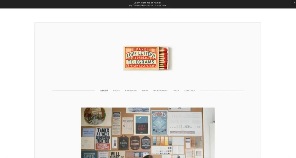
The solution she uses is to lead with the question that most visitors arrive with, which is “what does a graphic prop designer actually do?” The About page answers this directly and in plain language before the portfolio projects begin. This front-loading of context removes the confusion that would otherwise accompany a visitor looking at a folder of period-accurate German newspapers from a 1930s hotel. Once the context is established, the work is remarkable rather than bewildering.
→ Key takeaway: If your work operates in an unfamiliar context, define the context before you show the work. The explanation is not a concession to uncertainty. It is a design decision about how to sequence information.

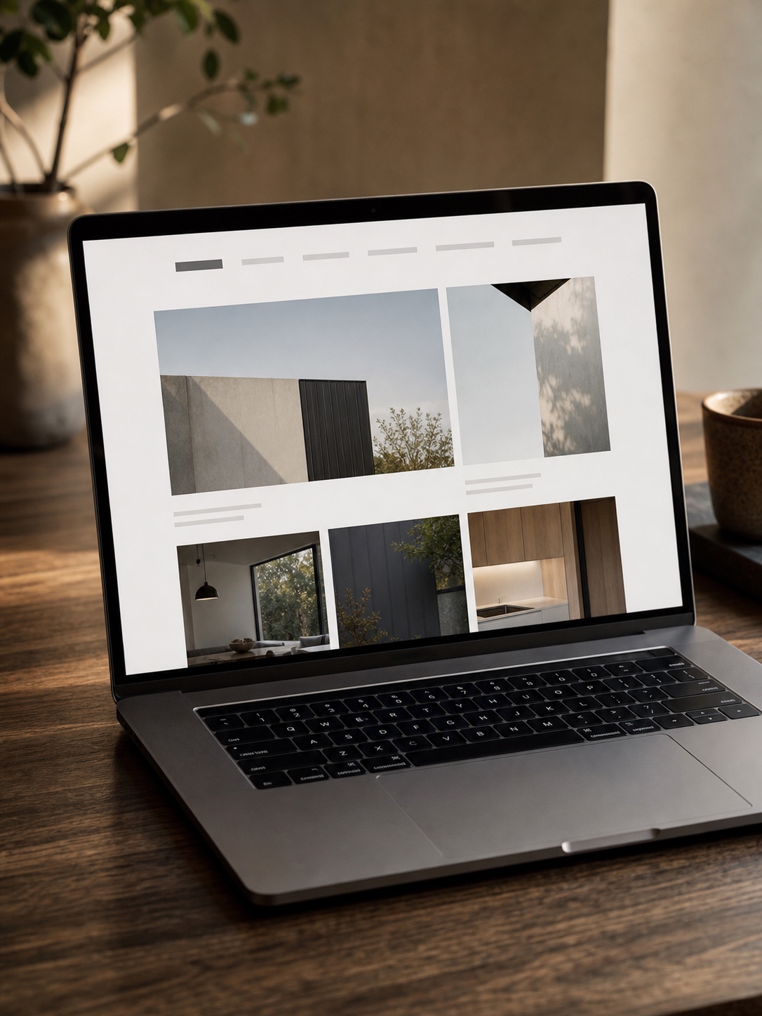
The same editing principles apply beyond graphic design. This review of architecture portfolio case studies compares how ten firms organize project discovery, process evidence, visual pacing, and client calls to action.
What these portfolios have in common
Looking across all ten, a few patterns appear consistently. None of them try to do everything. Each one has a clear hierarchy of what to show first and why. All of them have case study pages that go beyond the deliverable and explain at least something about the thinking behind it. And all of them are visually consistent, where the portfolio site itself reads as a designed object rather than a template populated with images.
The variation is in how they achieve those qualities. Hische uses her own lettering as the portfolio’s visual identity. Sagmeister mixes scale and depth across case studies depending on the project’s significance. Pentagram uses editorial writing discipline at the project headline level. Atkins uses context-setting prose to bridge the gap between her audience’s knowledge and her work’s specificity.
The curation decision is the hardest part
Every designer I know finds curation difficult. There’s an understandable reluctance to exclude work you’re proud of, especially from early projects where the conditions were difficult or the constraints were unusual. But the standard for inclusion should be whether the piece raises the overall perceived quality of the portfolio, not whether the piece is something you worked hard on or whether a client was pleased with it.
I apply a test when reviewing my own work for a portfolio context: if someone whose work I admire saw this piece, would they think it was produced by the designer I want to be, or by someone I used to be? That distinction is honest in a way that positive self-assessment often isn’t.
Writing about work is a skill that needs practice
The weakest element in most designer portfolios I review is the writing. Not because designers can’t write, but because case study writing is a specific genre with its own conventions, and most designers haven’t practiced it. The Pentagram partner pages are the most useful reference for this: clear problem statements, specific decisions, and outcomes described without vague superlatives.
A useful exercise: write the case study for one project as if you were explaining it to a client in a pitch meeting. What problem did they come with? What did you discover when you looked at it? What did you decide to do and why? What happened when it was out in the world? That narrative structure, problem, discovery, decision, result, is more persuasive than a paragraph of design description and a list of deliverables.
For every project you add to your portfolio: write the case study the same week the project completes, while the decision-making is still fresh. If you wait three months, you’ll have the images but you’ll have forgotten why you made the specific choices you did, and the case study will show it.
Portfolio consistency starts before layout and case-study writing. If the work feels visually disconnected, use this process for finding a consistent art style to define two or three recurring anchors, test them across a series, and decide which projects belong together.
Practical steps for building your own
The ten examples above are all from established designers with years of work behind them. If you’re earlier in your career, the principles transfer but the application is different. You have fewer projects, less client context, and potentially more personal work than commissioned work. None of those are disadvantages if the presentation handles them correctly.
Start with three projects done right
A portfolio with three genuinely good case studies, each with clear context, strong process documentation, and well-executed final imagery, is more compelling than one with ten projects presented as thumbnail grids with one-line descriptions. The quantity question resolves over time. The quality question resolves through the effort you put into each entry.
Choose the three projects that best represent the designer you want to be hired as, not the three most recent ones or the three your clients liked best. If those overlap, good. If they don’t, the portfolio should reflect where you’re going, not where you’ve been.
The portfolio is a product, not a document
Most designers treat their portfolio as a storage location for past work. The designers whose portfolios appear in lists like this one treat it as a product they’re responsible for maintaining and improving. They update it when better work is available, they revise case study writing when they find clearer language, and they look at the whole thing periodically and ask whether it still represents them accurately.
That orientation, the portfolio as a designed product with ongoing responsibility rather than a completed document, is the difference that shows up in the quality of what you find when you look at the best examples in the field.
Graphic design portfolio examples FAQ
Q: What should a graphic design portfolio include?
A: A graphic design portfolio should include 8 to 12 of your strongest projects, not every file you have made. Each project needs a short case study: the client or context, the problem, the main design decisions, and the result. Add a short bio, contact path, and specialist experience, but remove filler work that no longer represents your current level.
Q: How many projects should be in a graphic design portfolio?
A: Most graphic design portfolios work best with 8 to 12 projects. Fewer can feel thin unless the case studies are unusually strong; more than 15 usually needs very sharp curation. If you are early in your career, three excellent projects with process notes, sketches, and final mockups are better than ten average thumbnails.
Q: What makes a graphic design portfolio stand out?
A: A standout portfolio has clear curation, useful context, and consistent presentation. The work should be strong, but the case studies also need to explain what problem was solved and why the design choices made sense. I look for one clear lead project, readable captions, strong image quality, and a contact path that does not make the visitor hunt.
Q: How do I start my graphic design portfolio?
A: Start by choosing the role you want the portfolio to support: branding, packaging, lettering, UI, print, motion, or a mix. Pick three projects that prove that direction, then write one simple case study for each. Use real process material if you have it: thumbnails, rejected logo routes, grids, typography tests, color notes, and final applications.
Q: What are common graphic design portfolio mistakes?
A: The most common mistakes are showing too much work, using weak mockups, hiding the project context, and writing vague captions like ‘brand refresh’ without explaining the design decision. Another quiet mistake is letting the portfolio template overpower the work. The site should support the projects, not compete with them.
Q: Should a graphic design portfolio have a personal style?
A: Yes, but the style should come from the work and the way you present it, not from decoration pasted over every page. Typography, spacing, color, image crop, and pacing can give the portfolio a clear voice. Keep the system consistent enough to feel intentional while letting different project types breathe.
Q: What is the best platform to build a graphic design portfolio?
A: Squarespace, Cargo, Readymag, Adobe Portfolio, and Webflow can all work, depending on how much control you need. Behance and Dribbble are useful for visibility inside the design community, but they give you less control over structure. If web design is part of your offer, a custom Webflow or WordPress portfolio can become proof of skill.
Q: How often should you update a graphic design portfolio?
A: Update a portfolio whenever better work replaces a weaker project. Add new case studies within three or four weeks of project completion, while the reasoning is still fresh. A full review every six months is sensible: remove the weakest pieces, tighten the writing, check links, and make sure the first project still represents where you want to go.
Q: Should a graphic design portfolio include personal projects?
A: Yes, especially early in a career or when you want to move into a new kind of work. Personal projects can show initiative and taste, but they still need case-study discipline. Give them a brief, a constraint, a process, and a result. Treat them like real design problems, not filler between client pieces.
Related design practice for portfolios
Once the portfolio structure is working, the next useful checks are hierarchy, typography, identity, platform choice, and visual consistency. These related guides help with that next pass: design principles in graphic design, font pairing basics, logo design ideas for business, small brand touchpoints, UI/UX portfolio examples, Webflow vs WordPress for design agencies, graphic design inspiration.
- 67shares
- Facebook0
- Pinterest67
- Twitter0
- Reddit0