A designer I know spent three days on a launch poster for a cafe client: rich teal background, cream serif type, the works. On her screen it looked perfect.
The first proof came back with the teal gone grey-green, a strip of background sheared off along the right edge, and the tagline crowded so close to the trim it read like a typo. Nothing was wrong with the design. It had simply never been set up for a printing press.
This happens to experienced designers as often as beginners. Graphic design for print asks slightly different things of a file than screen design does, and the timing is the annoying part: you usually find the problems after the run, when the only fix left is paying to print the whole job again.
- Why print design behaves differently from screen design
- Set up the file before you start designing
- Keep logos, icons and type clean
- Resolution at final print size
- Bleed, trim and safe zone
- Color proofs, paper stock and brand accuracy
- Export a print-ready PDF
- Print design handoff checklist
- Graphic design for print FAQ
- Bring the checklist together
There are not many traps here, though, and most of them are predictable once you know what to look for. Catch the handful that do real damage while the file is still open, and the printed piece looks like the one you designed on screen.
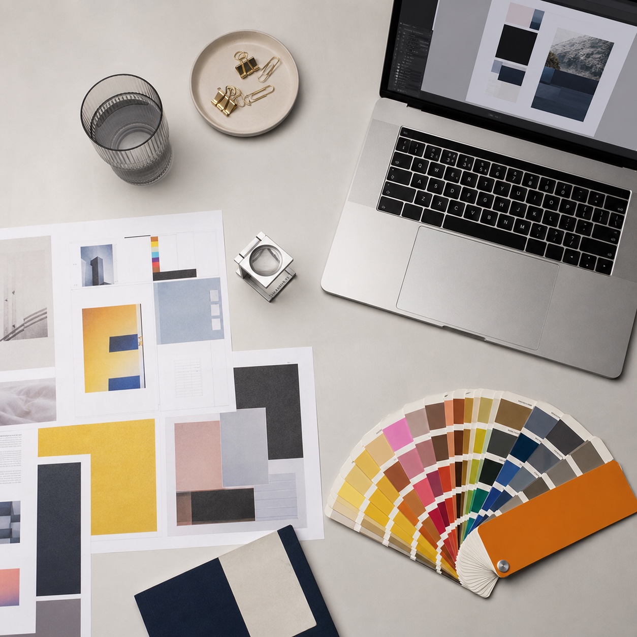
I have handed off everything from jewelry catalogs to automotive brochures to print over the years, and the failures usually trace back to one small set of habits, not a lack of talent. Once you build those habits into your workflow, a proof stops being something to dread and starts being a formality you already expect to pass.
Why print design behaves differently from screen design
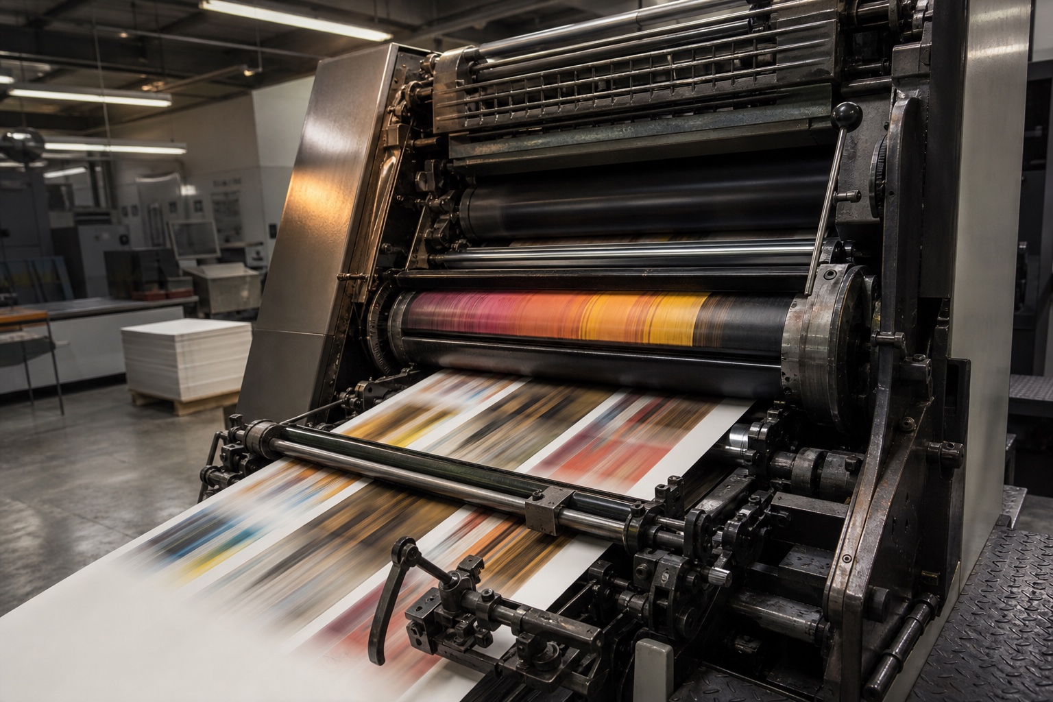
RGB light vs CMYK ink
A screen makes color by firing light straight at your eyes. Paper makes color by absorbing some wavelengths and bouncing the rest back at you. Two different physical events, and the bright file on your monitor was tuned for the first one.
Screens run on RGB, adding red, green and blue light together, which lets them hit colors that have no ink equivalent at all. Presses run on CMYK: dots of cyan, magenta, yellow and black. Anything glowing on your monitor, especially electric blues and hot pinks, usually lives outside what four inks can physically mix. Send that file off and the software quietly drags those colors back to the nearest printable match, which is how a punchy blue turns into flat navy.
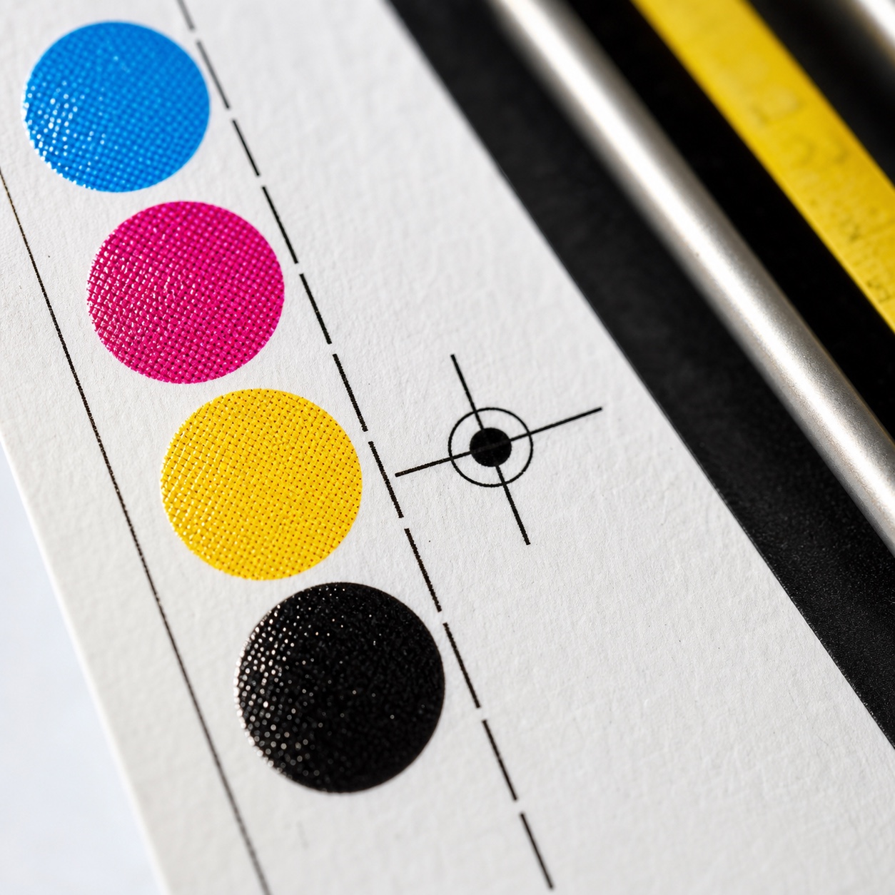
Why bright screen colors flatten on paper
Switch the document to CMYK before you start designing, not after. Colors look duller on screen right away, and that dullness is the truth arriving early instead of on press day, which is a trade worth making every time. If the shift still throws you off, I have rounded up a few tools for keeping color accurate when converting between modes that make the jump less of a guessing game.
Where this guide differs from digital poster printing
I have covered the fundamentals of turning a file into print-ready output in my beginner-friendly guide to prepping a digital file for printing, so consider this the layer above that: the decisions a working studio makes before a job even reaches layout, not the basics of resolution and color mode.
Set up the file before you start designing
Document size, trim size and units
Build the document at final trim size, in millimeters or inches depending on your printer’s preference, not in pixels. Setting this up first means every element you place afterward already sits in the right physical space, instead of getting rescaled at the end and quietly losing sharpness. If you are still settling on a layout at this stage, a browse through poster design layout inspiration is a better use of ten minutes than starting from a blank page.
CMYK profile and printer specs
Ask your printer which CMYK profile they work from before you start; a coated-stock profile and an uncoated one shift color noticeably, and matching the profile up front avoids surprises at proof stage. This single question, asked in a two-line email, prevents most of the color drift I see in prepress checklist reviews.
When to ask the printer before layout begins
If the job involves a spot color, an unusual paper stock, or a die-cut shape, call the printer before you open a blank document. Printers have opinions about what their equipment can and cannot do cleanly, and hearing those opinions before layout saves a full rebuild later.
I once designed a folded piece around a die-cut window that looked clean in the mockup, then found out the printer’s cutter had a minimum bridge width I had ignored by two millimeters. A five-minute call would have caught it before I had built the whole layout around that shape.
Keep logos, icons and type clean
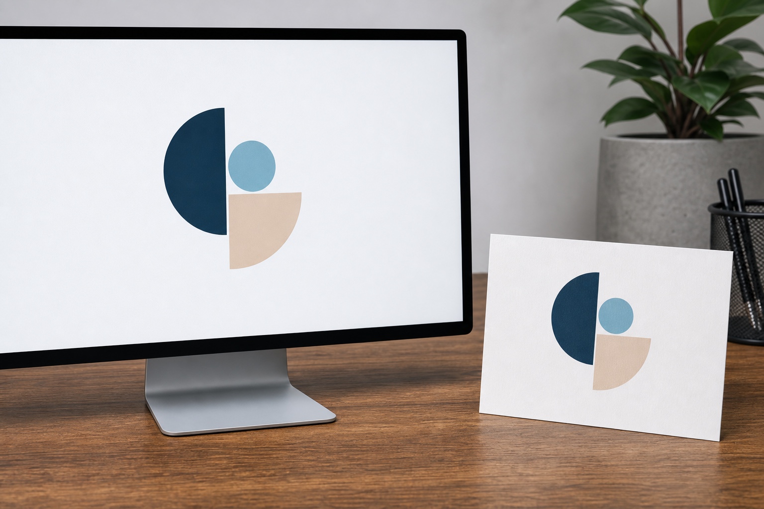
Vector artwork vs raster artwork
Photos have no choice but to exist as pixels. Logos, icons and headline type do have a choice, and forgetting that is behind a lot of fuzzy print work. Vector artwork is stored as math, a set of instructions for redrawing shapes at any scale, so it stays sharp whether it sits on a business card or wraps across a van.
Why small JPEG logos fail in print
The classic trap is a logo that only exists as a small JPEG someone pulled off a website years ago. You cannot rescue that by exporting it bigger, because the detail was never captured to begin with. Track down the original artwork instead, usually an AI, EPS or SVG file, and treat a low-res raster logo as a red flag the moment you see it in a client’s brand folder.
Ask the client directly: “Who designed your logo, and do you have the original vector file?” Half the time nobody remembers, and you end up rebuilding the mark from scratch in vector form, tracing over the cleanest raster version you can find. It is tedious, but it only has to happen once, and after that the client has a usable asset for every job going forward.
When to outline fonts and when to keep them live
Keep your text as live, editable type well into the layout, since live text is easier to fix, translate or resize. Outline the fonts only at the very last step, right before export, so the printer never runs into a missing typeface. If you are combining several typefaces on one piece, my notes on combining fonts cover the pairing logic before you even get to the outlining step.
Resolution at final print size
Why 300 DPI only matters relative to size
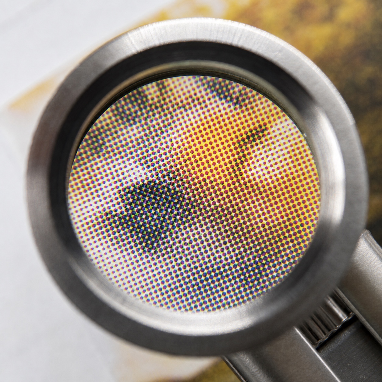
“It is 300 DPI, so it is fine” barely means anything on its own. What counts is how many pixels an image holds relative to the size you are about to print it at. A photo that looks crisp at ten centimeters wide goes soft and stepped when you blow it up to fill an A2 poster, because you have not added a single pixel; you have just spread the ones you had thinner.
Flyers, menus and business cards vs large posters and banners
For anything read up close, like a flyer, menu or business card, aim for roughly 300 pixels per inch at final size. Big, distant work like a pull-up banner can sit well below that, since nobody inspects a banner from thirty centimeters away. Matching resolution to viewing distance, not chasing one number for every job, is the real skill here. For the production methods behind large-format posters specifically, I go deeper on that in my piece on poster printing production.
How to spot images that will print soft
Zoom a placed image to 100 percent inside your layout software before you send the file anywhere. If it looks soft or pixelated at that zoom level, it will print that way too, no matter what the file properties claim. Grab the largest original you can every time; shrinking a big image costs nothing, and enlarging a small one is the software guessing at detail that was never there.
Bleed, trim and safe zone
What bleed does
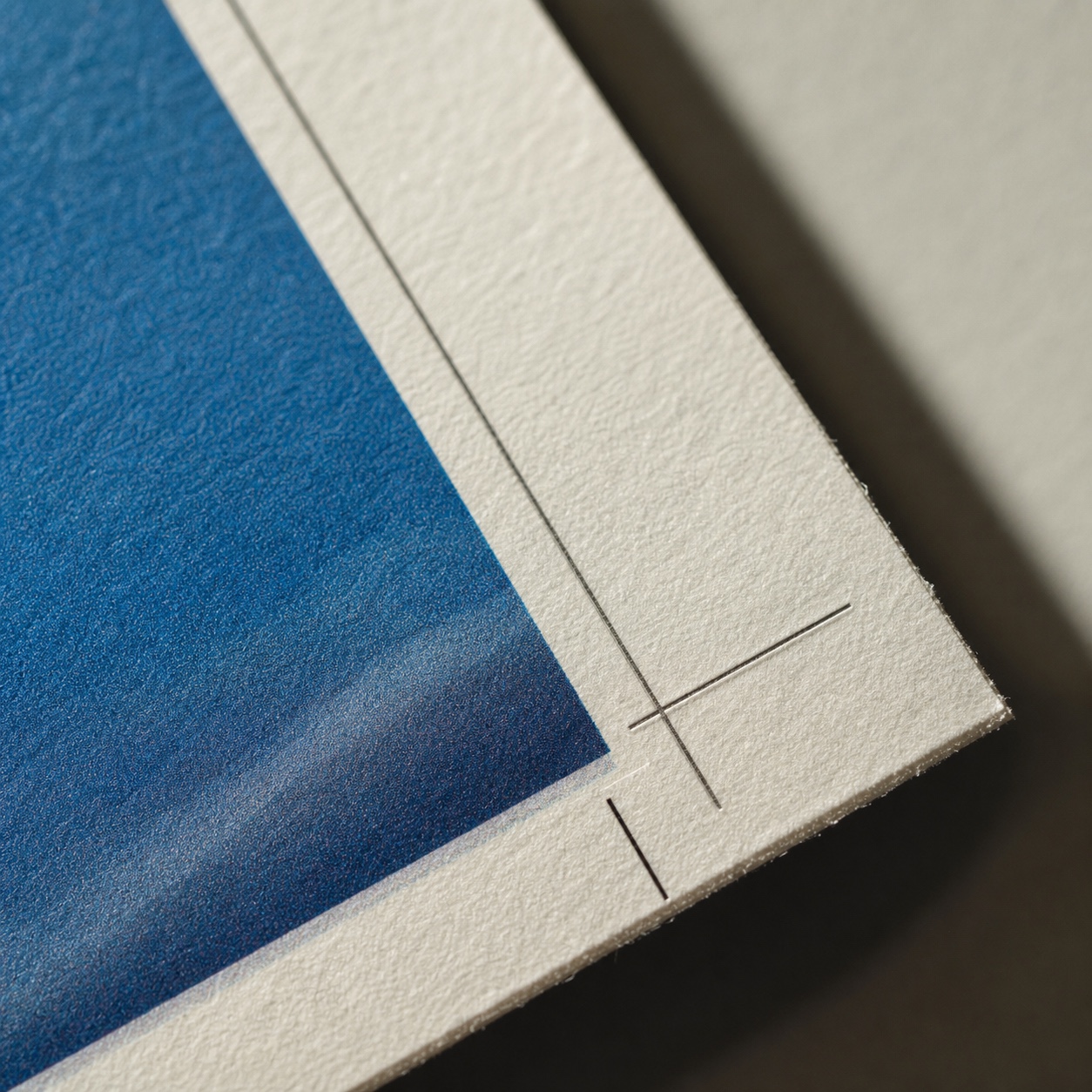
Printers rarely cut one sheet at a time. They print many copies onto a large sheet and slice through the stack at once, and that blade can drift by a fraction of a millimeter from one pass to the next. Bleed is your background color or image extended past the final trim line, typically by three millimeters, so a slightly off cut still lands on color instead of a thin white gap.
Why important text needs safe margins
The safe zone is the mirror of that same idea. Keep logos, text and anything else that matters at least three to five millimeters inside the trim line, so an early cut never clips it. Build bleed and safe margins into the document before you place a single element, not once the layout already feels finished.
Common edge mistakes that make good layouts look amateur
A faint white sliver down one side of a flyer, or a headline squashed awkwardly against the edge: both read as printing faults, but they almost always started in the file. I check this on every layout the same way I would check a panel gap on a car body, running the eye along every edge before calling anything final.
Color proofs, paper stock and brand accuracy
Rich black vs pure black
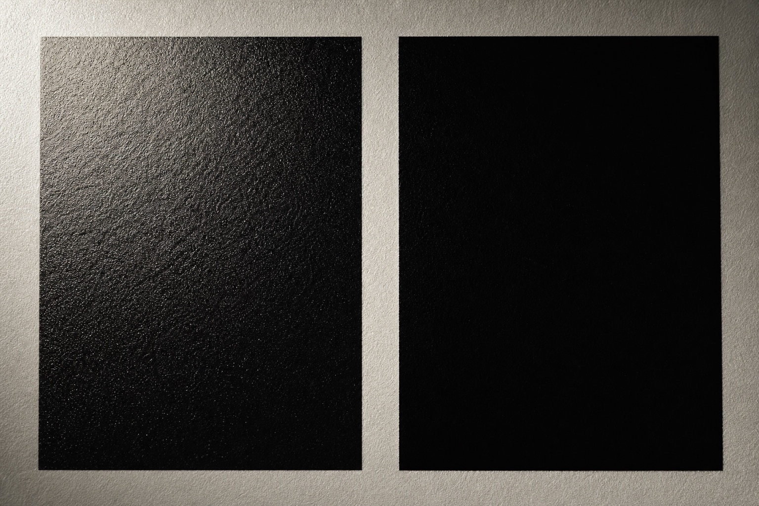
Even with a clean CMYK file, color can still catch you out. A black mixed from all four inks, often called rich black, prints differently from pure black built from the K channel alone, and often turns muddy where you wanted something deep. Ask your printer which build they recommend for large dark areas versus body text.
A common starting recipe for rich black is roughly 60 percent cyan, 40 percent magenta, 40 percent yellow and 100 percent black, though the exact numbers shift by press and stock. Body copy, on the other hand, should almost always stay pure K black; rich black under small type tends to blur at the edges from tiny registration shifts between the four plates.
Coated vs uncoated paper
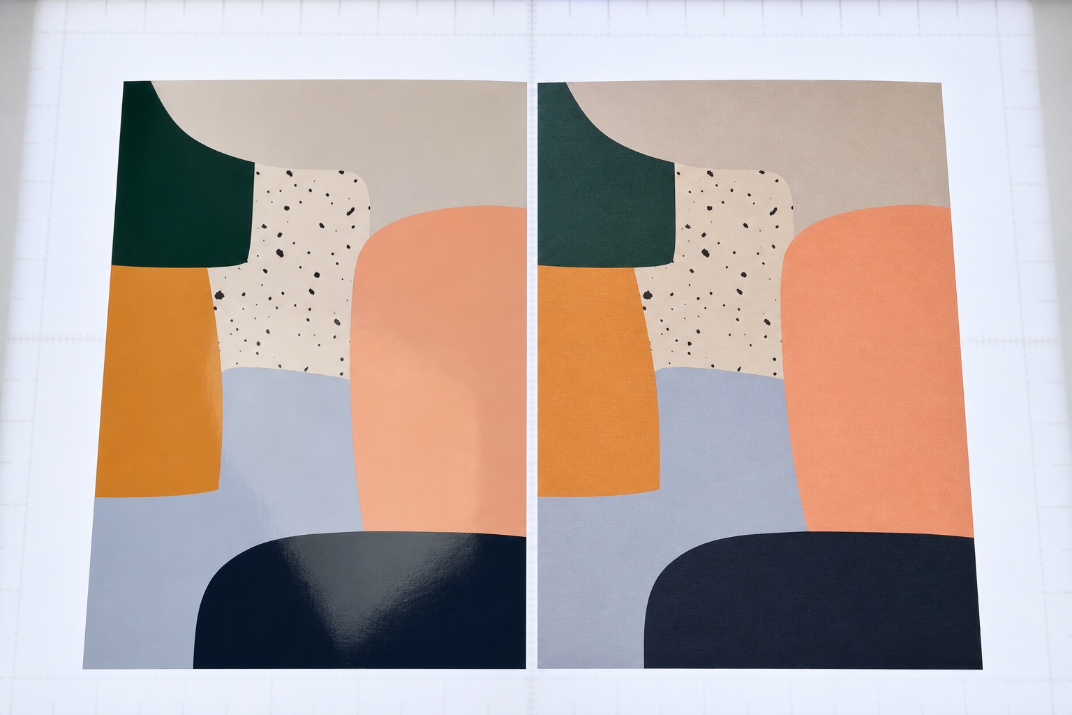
Uncoated stock drinks in ink and mutes everything a shade, while a gloss coating lifts the same colors and makes them sing. One file, two papers, and it genuinely looks like two different designs. If your color palette leans on subtle mid-tones, this difference alone can justify a stock change.
When Pantone spot color is worth it
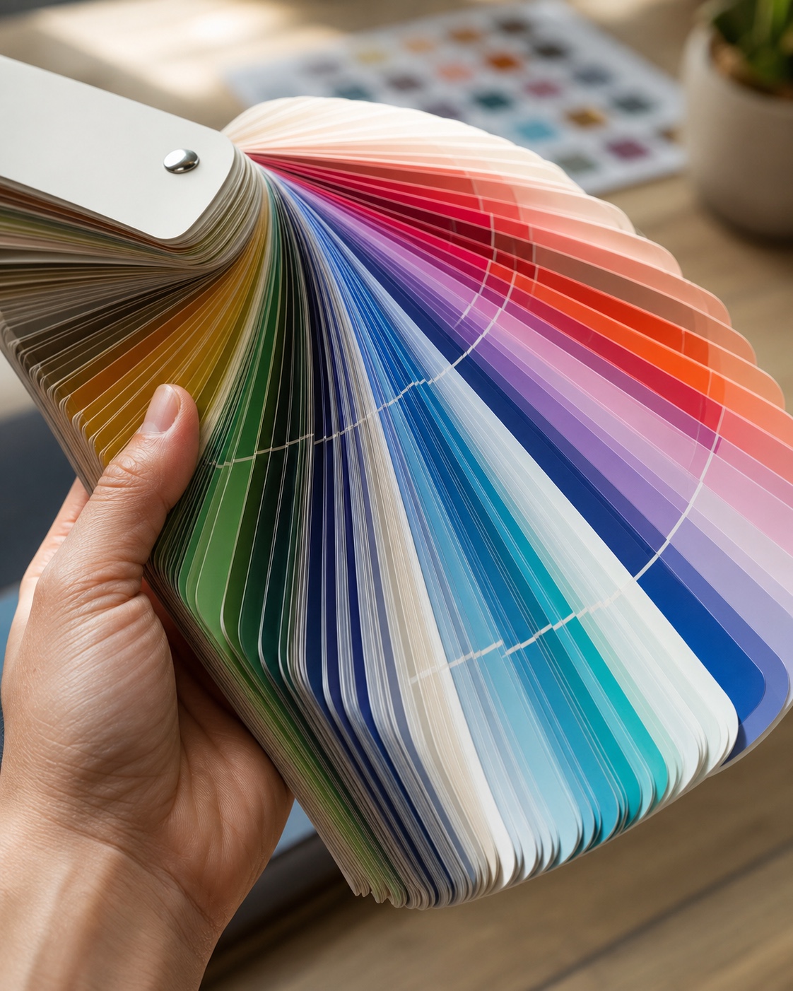
When a brand color has to land exactly the same every single time, ask about printing it as a Pantone spot color instead of a CMYK build. It costs a little more per job. For a logo that cannot afford to wobble from one print run to the next, that is usually money well spent.
Why a proof is not optional for brand-critical work
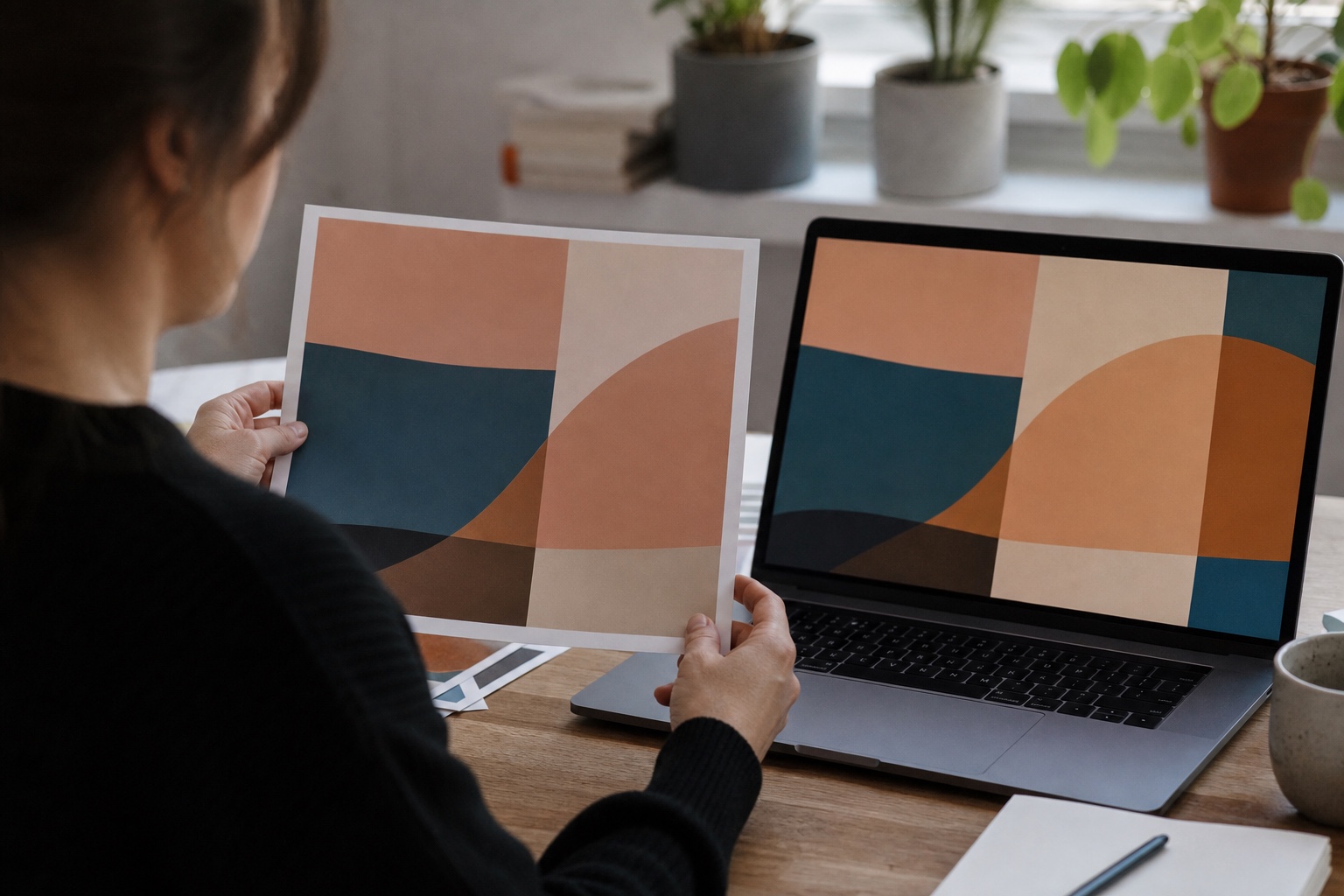
A proof is a test print on the actual stock you have chosen, and it is the only dependable way to see the color you are getting before you commit to a full run. A screen preview cannot show you this, and neither can your desktop inkjet, since it is not using the same inks or paper. I have watched a soft grey background come back as a half-dozen slightly different greys across a single job, purely because it was built as a four-color mix instead of a single flat ink.
Export a print-ready PDF
PDF/X presets
Export using a PDF/X preset where your software offers one. It bakes in your bleed and color settings so they cannot get lost between your machine and the printer’s. This single export choice fixes more prepress problems than any other step in the checklist.
Embedded fonts, outlined fonts and linked images
Embed or outline your fonts before sending the file out, otherwise the printer’s software may be missing a typeface and will quietly swap in something close but wrong. Check that every linked image is genuinely high resolution and actually packaged with the file, rather than sitting in a folder back on your laptop.
Transparency, overprint and final preflight checks
Flatten transparency if your design software flags it, and run a preflight check before export if your layout tool has one built in. A five-minute preflight pass catches missing fonts, low-res images and RGB elements that slipped in by accident, all before they become someone else’s problem at the press.
Overprint settings deserve a specific look too. A black element set to overprint sits on top of whatever is beneath it instead of knocking it out, which is exactly what you want for small black text over a colored background, and exactly what you do not want for a solid black shape that is meant to fully cover the layer underneath it. Getting this backwards shows up as a faint colored ghost around edges that should read as clean black.
Print design handoff checklist
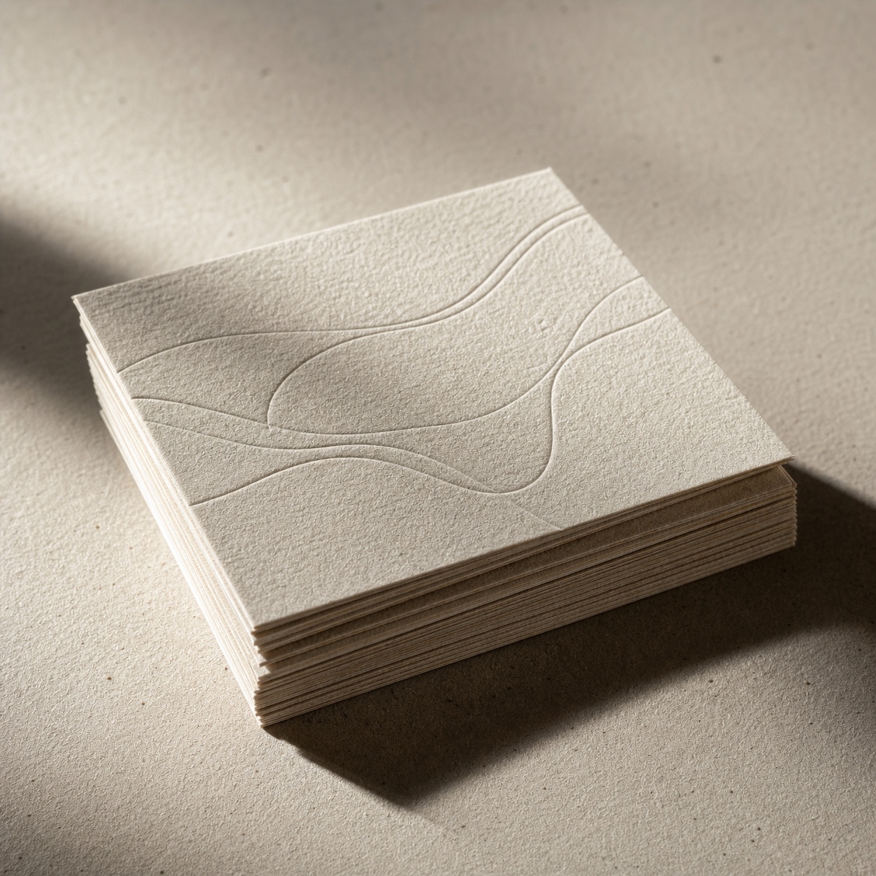
What to send to the printer
Send the print-ready PDF, the original fonts if the printer requests them separately, and a short note on paper stock, quantity and any spot color instructions. A one-page cover note prevents most of the back-and-forth email chains I have seen on rushed jobs.
I keep a simple template for that note: job name, trim size, stock, quantity, color mode, and any special finishing like foil or spot UV. Filling it out takes two minutes and it answers almost every question a press operator would otherwise have to email back and ask.
What to ask before approving the proof

Ask to see a physical proof on your chosen stock before signing off, not a digital preview. Confirm the trim size matches your file, check that no text sits inside the bleed area, and hold the proof next to your screen in natural light before saying yes. A quick visit to a local printing centre for a same-day proof beats waiting on a mailed sample when a launch date is close.
What to keep in the project archive
Archive the final packaged file, the signed-off proof, and the printer’s specs for that job. A quick photo of the proof is usually enough. Six months later, when the client wants a reprint, that archive saves you from rebuilding the prepress checklist from scratch.
Print files expose every weak edge, so it is worth comparing them with ink illustration and marker detail where line weight, contrast, and texture carry most of the visual impact.
Graphic design for print FAQ
Q: What is graphic design for print?
A: Graphic design for print is the practice of designing layouts that will be reproduced on a physical press rather than displayed on a screen. That means accounting for CMYK color, resolution at final size, bleed, trim, and paper stock from the start of the project.
Q: Should I design in CMYK or RGB for print?
A: Design in CMYK from the beginning of a print project. Starting in RGB and converting at the end often produces color shifts you will not catch until the proof stage, when fixing them costs more time and sometimes a reprint.
Q: What does bleed mean in printing?
A: Bleed is extra background color or image extended past the final trim line, usually by three millimeters. It gives the cutting blade a tiny margin of error, so a small shift does not leave a thin white gap along the finished edge.
Q: What resolution should images be for print?
A: Aim for roughly 300 pixels per inch at the final size the image will print for anything viewed up close, like a flyer or business card. Large-format work viewed from a distance, such as banners, can often use a lower resolution without looking soft.
Q: What is a print-ready PDF?
A: A print-ready PDF is a packaged file, often exported with a PDF/X preset, that includes embedded or outlined fonts, correctly linked high-resolution images, the right CMYK color profile, and built-in bleed and trim marks.
Q: Do I need a proof before printing?
A: Yes, for anything brand-critical or produced in a large quantity. A proof on the actual paper stock is the only reliable way to see real color and catch layout issues before committing to a full print run.
Bring the checklist together

None of this is complicated once it is a habit rather than a chore bolted onto the end of a project. Graphic design for print rewards exactly the same care you already put into layout and typography. Set the document up in CMYK from the start, keep logos and type as vectors, respect bleed and safe zone, and always ask for a proof before the full run.
I still keep a printed proof pinned above my desk from an early jewelry catalog job, mostly as a reminder of how far off a screen preview can be from the real thing. Get the file right before it leaves your hands, and picking up the finished piece feels the way it should: exactly like what you designed.
Build the checklist into your own templates once, and you stop thinking about it project to project. That is really the goal here: not memorizing numbers like three millimeters of bleed or three hundred pixels per inch, but reaching a point where the file is simply built right the first time, out of habit rather than effort.
- 27shares
- Facebook0
- Pinterest27
- Twitter0
- Reddit0