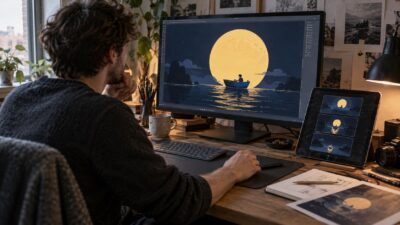
Illustration design inspiration is most useful when you look past the wow factor and ask how the image is built. These detailed marker illustrations by Stephen Ward are packed with ink lines, small textures, surreal objects, and bold color choices, but the best lesson is simpler: the big shape has to read before the tiny marks matter.
I would study this set with a sketchbook open. Pick one artwork, squint at the value pattern, mark the focal point, then notice where the line weight gets heavier or lighter. That little audit teaches more than scrolling through twenty images at full speed.

What makes a detailed illustration work?
A detailed illustration works when the main idea stays readable after all the line work, texture, and color are added. The strongest pieces usually have a clear silhouette, one dominant focal point, controlled value contrast, and repeated small marks that support the subject. Detail should feel intentional. In marker and ink work, that often means using heavier outlines near the focal area, lighter texture in secondary zones, and enough quiet space so the viewer has somewhere to rest. If every corner is equally busy, the drawing becomes tiring. If the large shapes are clean, the small marks feel rich instead of noisy.
| Element | What to study | Why it matters |
| Silhouette | Can the subject read in one glance? | A clear outline keeps complex illustration designs from feeling messy. |
| Line weight | Where do thick and thin lines change? | Line weight guides the eye through detailed illustrations. |
| Texture | Which marks repeat, and where do they stop? | Controlled texture creates depth without visual clutter. |
| Color | Is the palette limited or chaotic? | Marker illustration needs color hierarchy to stay readable. |
| Focal point | Where do you look first? | A focal point keeps surreal illustration from becoming random. |

Illustration design inspiration from marker and ink work
Marker illustration has a particular energy because the medium does not let you fuss forever. A stroke lands, dries, and becomes part of the drawing. That pressure can be useful. It pushes the artist to plan the structure first, then use color as a decisive layer rather than a rescue mission.
In these artworks, the most interesting moments are not only the strange subjects. Look for the practical craft: black edges that hold the composition together, colored areas that sit inside the line work, and tiny marks that make surfaces feel worn, shiny, soft, or mechanical. Those are the pieces worth borrowing for your own illustration ideas.
For a broader visual reference, compare these 18 illustration inspiration examples and note how different artists control silhouette, contrast, and texture.
Study the line work before the color
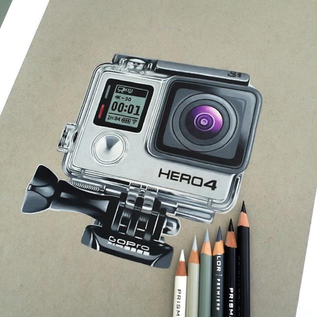
Before you judge the palette, follow the black line. Notice how the artist separates overlapping shapes, where outlines become heavier, and how small marks create rhythm. This is where academic drawing habits help: compare angles, check proportions, and ask whether the line is describing form or just decorating the surface.
- Use heavier lines where the object overlaps another form.
- Use thinner lines inside the form so the drawing does not become too dark.
- Let repeated marks follow the surface direction, not a random pattern.
- Leave a few quiet areas so dense ink texture has contrast.
- Save the smallest details for the focal area.

For outside study, compare this set with RMCAD illustration overview, 99designs detailed illustration examples, and Creative Bloq Procreate illustration tutorial. For deeper detail and style references, Big Red Illustration detail article, 21 Draw illustration styles guide, and Stephen Travers detail drawing video are useful without needing to copy their approach.
How to use these detailed illustrations in your sketchbook
Do not try to recreate the whole artwork first. That usually turns into copying fatigue. Instead, isolate one design decision at a time. Spend ten minutes copying the silhouette, ten minutes studying the texture, and ten minutes testing the color palette as small swatches. This gives your hand a clear job and keeps the practice honest.
If you work digitally, use the same process in layers: rough thumbnail, clean line, flat color, shadow, texture, and highlights. If you work traditionally, keep the pencil stage light and test markers on scrap paper before touching the final drawing. Alcohol markers can shift darker after drying, and paper choice changes the edge quality a lot.

Marker illustration practice plan
| Practice step | Time | What to do |
| Thumbnail | 5 minutes | Block the composition in three or four shapes. |
| Line study | 10 minutes | Copy only the major outlines and line-weight changes. |
| Texture strip | 10 minutes | Test hatching, dots, scratches, and marker layers. |
| Color swatches | 5 minutes | Choose three to five colors before the full drawing. |
| Final mini study | 20 minutes | Redraw the idea at postcard size with fewer details. |

Common mistakes in detailed illustration
The most common mistake is adding detail everywhere. Beginners often think more marks automatically mean more skill, but detail only works when it has hierarchy. A face, hand, vehicle, creature, or object can handle dense texture if the background is calmer. When the background is just as loud, the focal point disappears.
- Starting with texture before the large shapes are correct.
- Using the same line thickness across the whole image.
- Letting marker colors fight the drawing instead of clarifying it.
- Adding tiny objects that do not support the main idea.
- Forgetting that white space is part of the composition.
Color, texture, and focal point notes
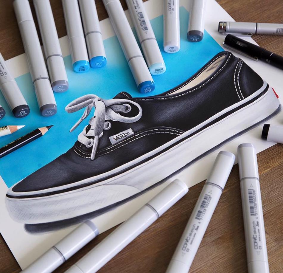
A good color plan does not need many colors. It needs separation. Warm against cool, light against dark, saturated against muted, or smooth marker fill against scratchy ink texture can all create contrast. If you are unsure, reduce the palette to one dark, one mid-tone, one light, and one accent color.
Texture should also change by surface. Metal might need clean hard reflections. Fabric can use softer broken lines. Skin or organic shapes need gentler transitions. Wood, stone, and mechanical parts can hold more repeated marks. When every surface has the same texture, the illustration loses material character.


Related design and drawing practice
To keep building this cluster, move from this page into digital art ideas, colored pencil drawing guide, and pencil drawing for beginners if you want more hands-on art practice. For design context, compare graphic design portfolio examples, digital poster printing, and brand video design. The broader drawing hub is the best next stop when you want more sketchbook exercises.
Detailed illustration FAQ

What is illustration design?
Illustration design is the use of drawing, composition, color, and visual storytelling to explain an idea or create a mood. It can be made with pencil, ink, marker, watercolor, digital brushes, or mixed media. The strongest work has a clear focal point first, then detail that supports the story instead of hiding it.
What makes a detailed illustration work?
A detailed illustration works when the big shapes still read before the small marks. Start with silhouette, value, and focal point. Then add texture, pattern, cross-hatching, marker layers, or background objects only where they guide the eye. If every inch has equal detail, the drawing feels noisy instead of rich.
How do you start a marker illustration?
Start with a light pencil thumbnail, then block the main shapes before touching the markers. Test the marker colors on scrap paper, choose a limited palette, and save the darkest accents for the final pass. Marker illustration is hard to undo, so a careful pencil structure keeps the finished work cleaner.
What are the main types of illustration?
Common types include editorial illustration, book illustration, concept art, fashion illustration, technical illustration, advertising illustration, character art, and surface pattern illustration. Many pieces mix categories. A detailed marker drawing can feel editorial, surreal, decorative, or concept-driven depending on its subject and composition.
What tools are good for detailed illustration?
A sharp HB or 2B pencil, kneaded eraser, fineliners, brush pens, alcohol markers, colored pencils, and smooth marker paper are enough for detailed illustration practice. Digital artists can use the same thinking with layers: rough sketch, clean line, flat color, shadow, texture, and final highlights.
How much detail should an illustration have?
Use enough detail to make the idea feel specific, but not so much that the viewer loses the focal point. A good test is to squint at the drawing or shrink it on screen. If the main subject disappears, simplify the background, darken the focal outline, or reduce repeated textures.
More detailed illustration works to study
To round the visual set out to twenty works, here are six additional illustration design studies focused on marker layering, ink line hierarchy, paper texture, and clear focal shapes. Treat them as extra prompts for studying how dense detail can stay readable.
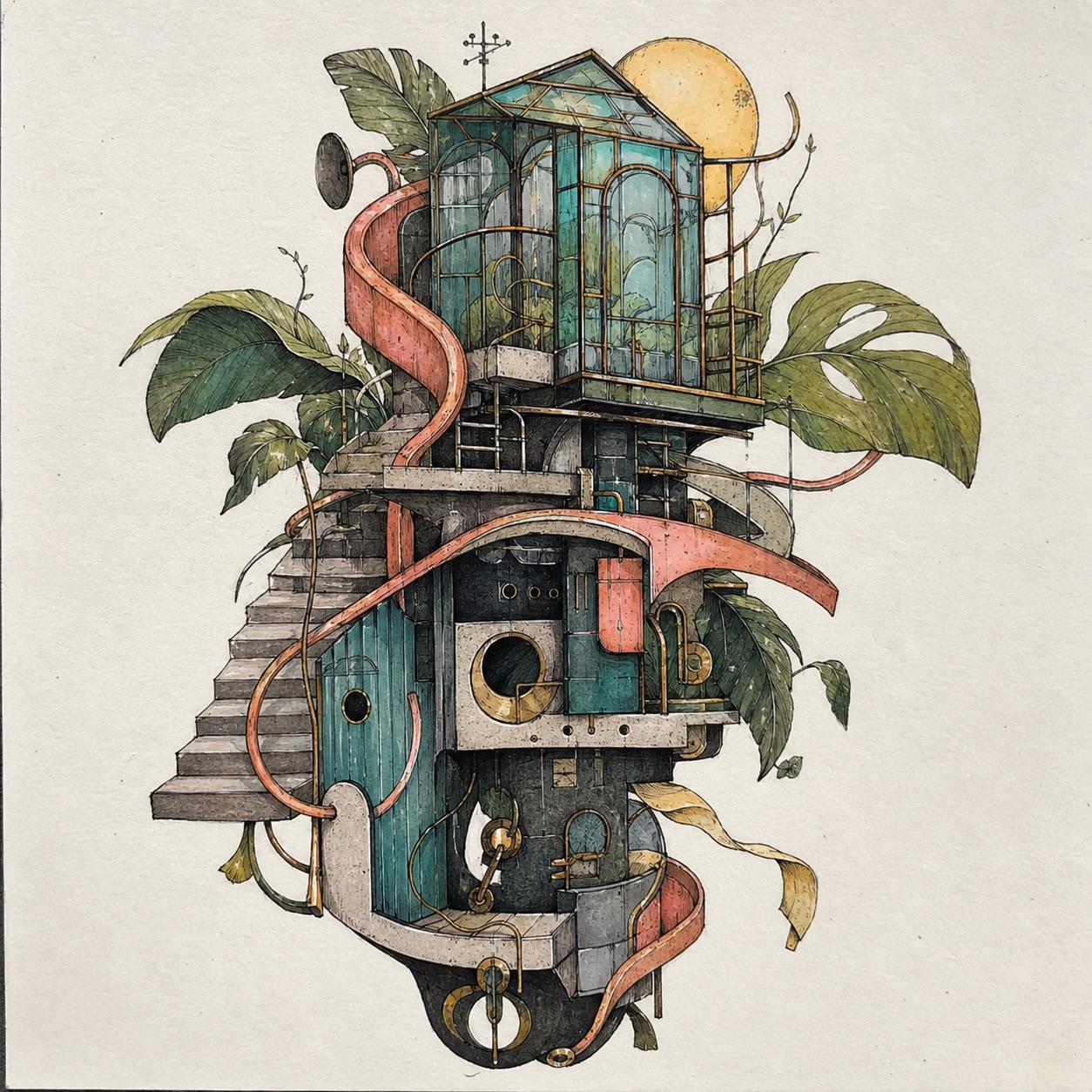
Detailed illustration design work with layered marker color, glasshouse forms, and controlled ink texture.
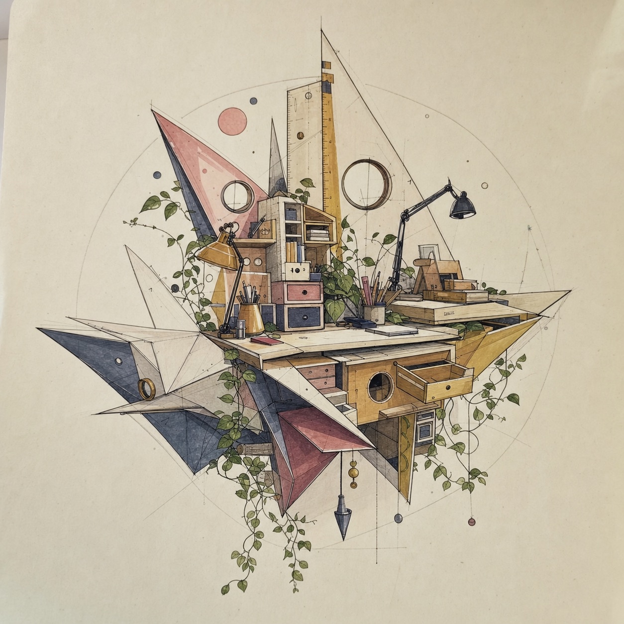
Illustration design inspiration study with a floating studio desk, geometric shapes, and fine marker detail.
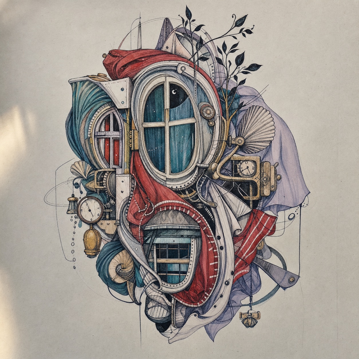
Surreal ink illustration study built from windows, folded forms, shell details, and muted marker layers.
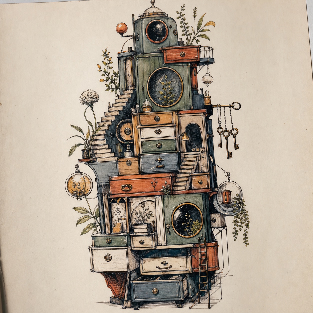
Hand drawn marker illustration reference with a vertical cabinet tower, small stairs, and botanical texture.
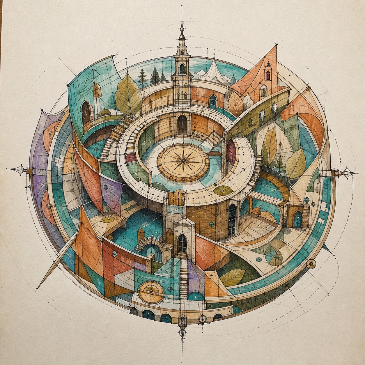
Detailed marker illustration using a circular map-machine composition, transparent panels, and clean line hierarchy.
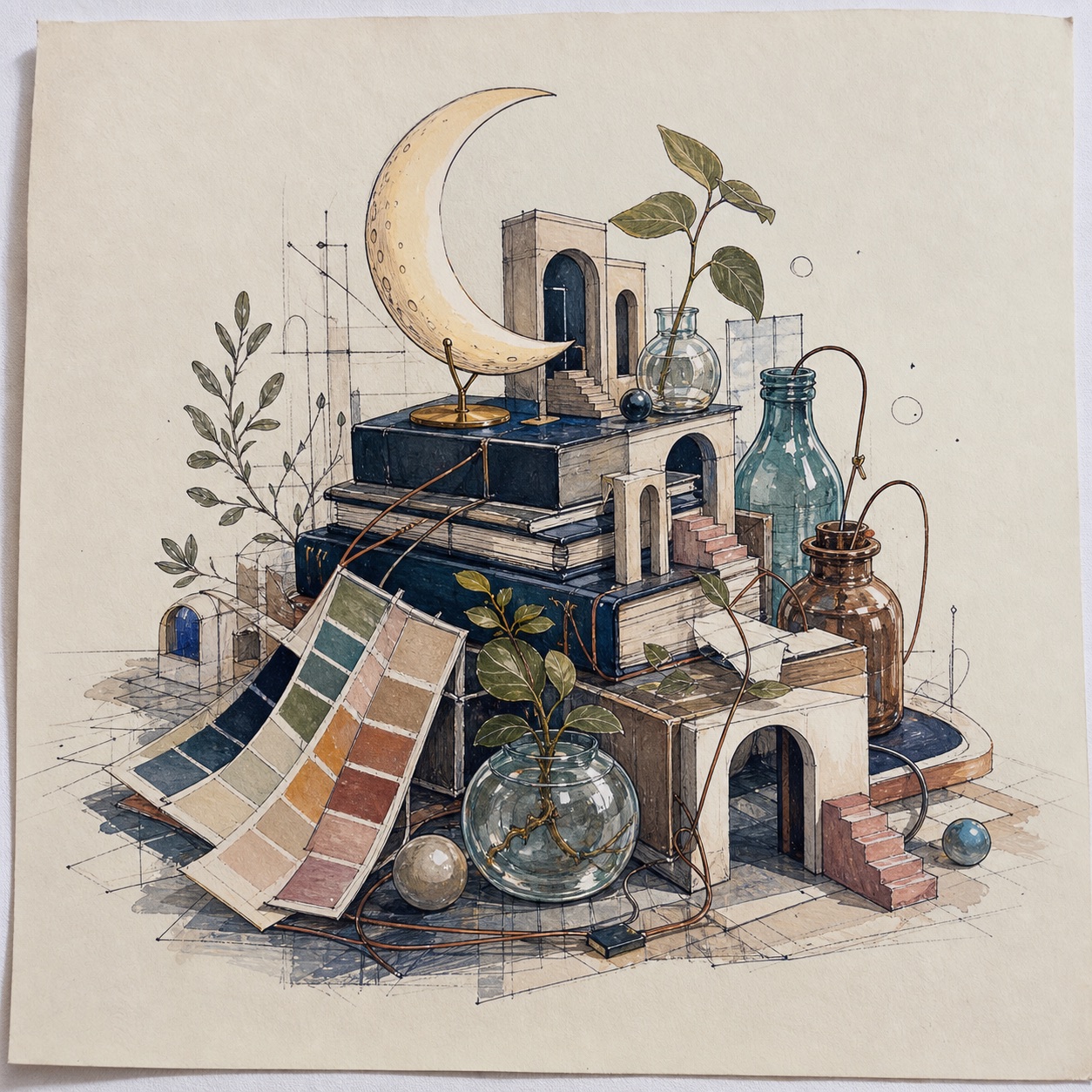
Ink and marker illustration idea with stacked books, glass bottles, color swatches, and small architectural arches.
Final thoughts
Use these images as a study set, not just a mood board. Pick one drawing, simplify it into three shapes, then rebuild a small part of it with your own line work. If the large shape reads, the texture will feel deliberate. If the large shape fails, no amount of tiny marker detail will save it.


- 980shares
- Facebook0
- Pinterest980
- Twitter0
- Reddit0