Looking for illustration inspiration? This gallery revisits 18 works first collected in 2015, spanning editorial, cinematic, surreal, and painterly styles.
Study silhouette, focal contrast, value grouping, color restraint, texture, and how each image communicates its idea.
Illustration inspiration gallery

A restrained blue palette turns the open book into a pool: the small white swimmer and elongated shadow create an immediate scale shift and a quiet, uneasy focal point.
Memoirs by Karolis Strautniekas
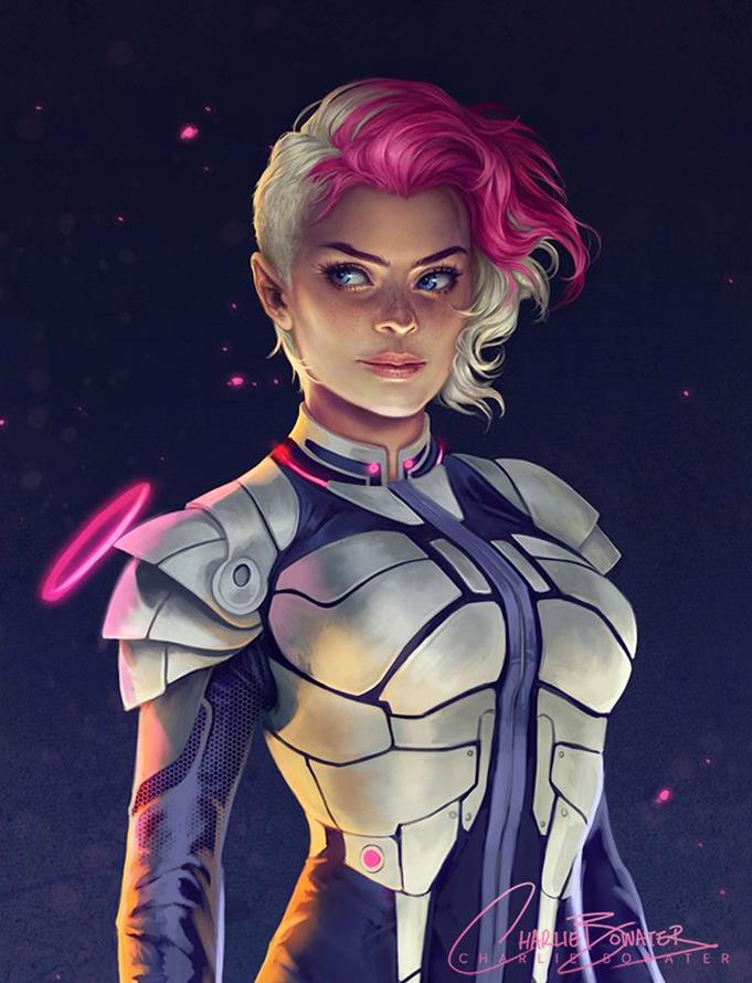
The portrait holds attention with a dark ground, cool metallic armour, and sharp magenta hair; the asymmetrical crop keeps the character poised rather than static.
Low Gravity 2.0 by Charlie

Each cover reduces its story to a limited palette and one symbolic silhouette, proving that clear shape language can carry atmosphere without crowded detail.
Harry Potter Book Covers by Olly Moss

The side profile is built from a clean outer contour, while coloured-pencil texture and concentrated tattoo detail keep the pale negative space from feeling empty.

A tight cinematic crop sets the face against oversized red lettering; the milkshake and strong diagonal gaze give the otherwise still portrait a sly sense of action.
Pulp Fiction by Flore Maquin

The cockpit window forms a circular frame around the bright horizon, while the seated figures and dark foreground guide the eye towards the looming planet.
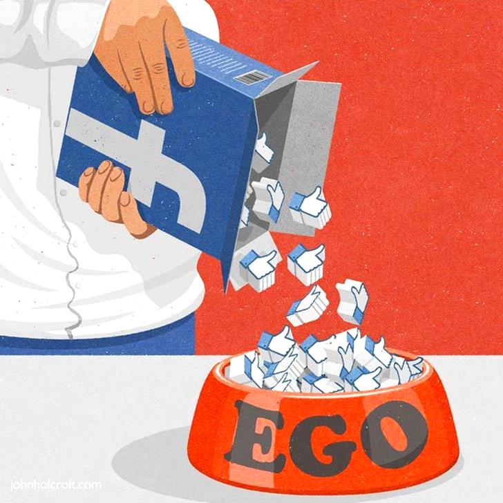
The hand, Facebook mark, and jar create a simple vertical reading path; flat colour and exaggerated scale make the critique legible before the smaller details register.
Facebook – Feeding your ego… By John Holcroft

The face emerges through scratched metal panels, using symmetry and narrow eye openings to build tension; the distressed surface makes the barrier feel handled and real.
SAME OLD FEARS by Sven Sauer

The orange field isolates the head, while the red cap and repeated beard curves control the rhythm; subtle warm and cool shifts keep the dark mass dimensional.

The owl is suggested with only eyes, a beak, and pencil tips; leaving most of the page untouched lets the viewer complete the silhouette.
Mythical eyes by lilz_art

Soft charcoal modelling gives the face volume without a hard outline, and the narrow blue border adds a cool counterpoint to the warm skin tones.
Pigeon Plumtree III by Shana Levenson

The pale face and shoulder sit against a blurred teal ground, while the red hair sweeps diagonally across the frame and keeps the portrait from feeling posed.

The steep upward perspective bends the corner building into a dramatic wedge; repeated windows reinforce depth while the white margins stop the architectural detail from becoming heavy.
New York – Delmonicos by Aise Baki

Three riders are separated across a coral field, but the repeated circular wake connects them; monochrome figures keep the movement readable against the saturated background.

A single red profile dominates the square, with cream smoke and black wave shapes crossing the face; the limited palette turns the portrait into a bold graphic emblem.
Milan Kundera by Boris Pelcer

The cyclists form a rising diagonal that leads directly into the headline, while muted cream, teal, and orange preserve the worn poster character without sacrificing hierarchy.

The bird silhouette contains an industrial landscape, so the eye reads wildlife and infrastructure at once; ink texture and empty paper keep the metaphor clear.
Great Lakes Tar Sands Resistance by Pat Perry
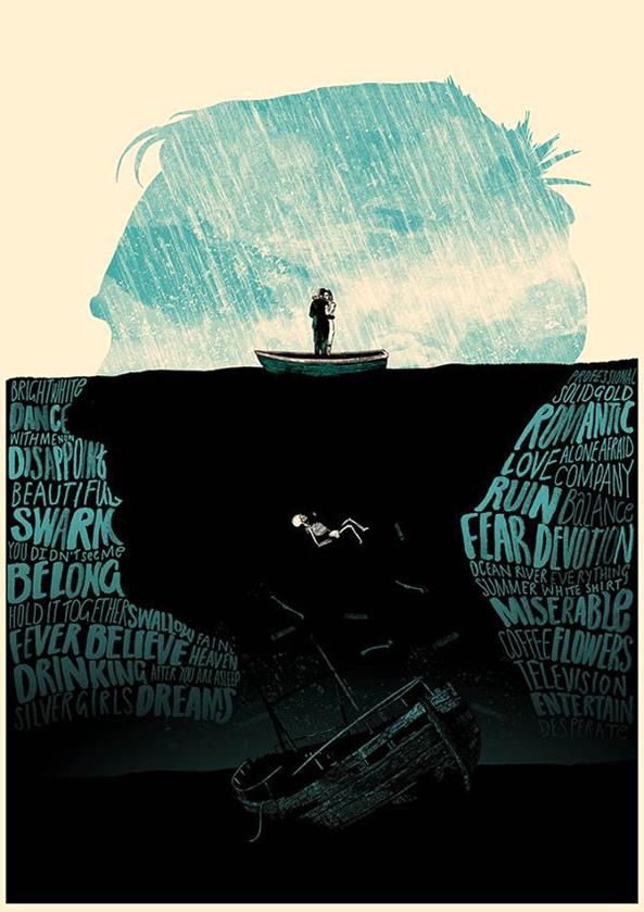
A thin waterline divides the calm cream-and-blue surface from the black depths below; hand-lettered profiles and the sinking boat turn the lower half into a psychological map.
Next, compare popular illustration styles and digital light and shadow.
- 1.5Kshares
- Facebook0
- Pinterest1.5K
- Twitter0
- Reddit0