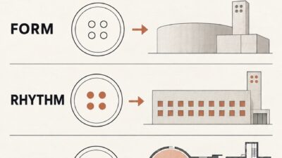
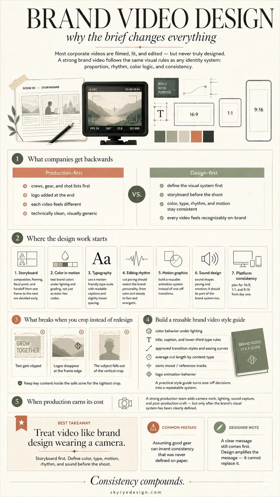
Most corporate videos fail for a reason nobody puts in the brief: nobody actually designed them. They were filmed, lit, and edited — sometimes beautifully — but the visual thinking that makes a brand recognizable across ten seconds of footage never happened. I’ve spent years working across brand identity, product design, and visual communication, and the pattern repeats everywhere: teams treat a brand video as a production problem when it’s a design problem wearing a camera.
Visual storytelling in a 90-second brand video runs on the same rules as a logo system or a packaging line: proportion, rhythm, color logic, a consistent hand behind every decision. Skip that thinking and you get a technically clean video that still feels like it belongs to nobody — the kind of footage that could carry any company’s name on the end card without anyone noticing the swap.
- Why a brand video is a design problem before it’s a production problem
- Storyboard design: where the visual system starts
- Building a visual brand system for video: color and typography in motion
- Editing rhythm as a design decision
- Motion graphics as brand identity in motion
- Sound design: the layer nobody storyboards
- Consistency across platforms: one brand system, many aspect ratios
- Building a brand video style guide you can reuse
- When a corporate video production agency actually earns its cost
- Conclusion
This piece looks at brand video the way a designer would, through storyboard structure, color and typography carried into motion, editing rhythm, motion graphics, sound, and consistency across every platform a video ends up on. None of it requires a bigger budget. Most of it just requires deciding things earlier than most teams are used to deciding them.
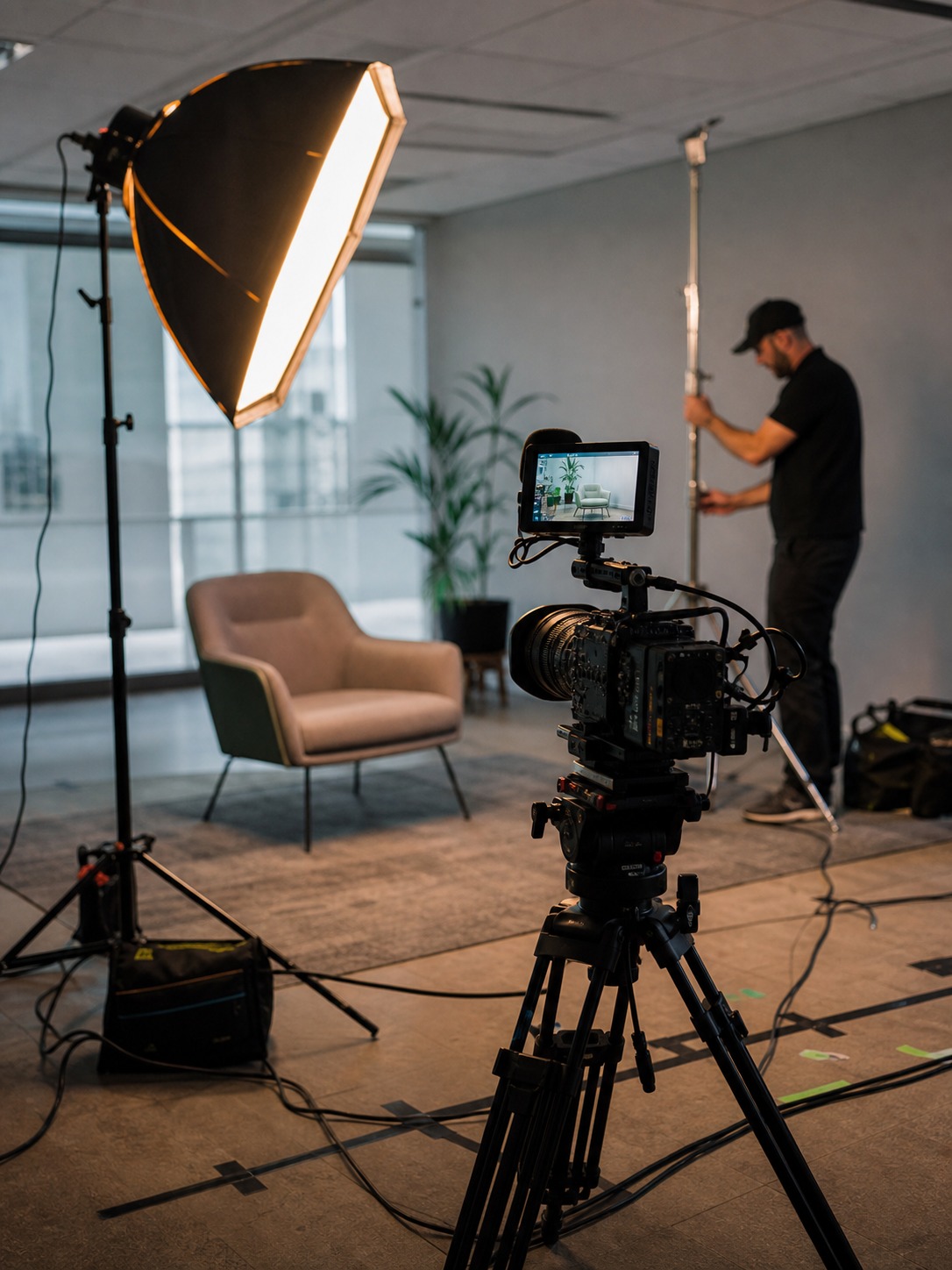
Design decisions only carry a brand video so far without the technical execution to back them up: camera work, lighting, sound recording, and a post-production pipeline that can deliver a consistent motion system across every format. That’s where a dedicated corporate video production agency earns its place — translating the visual system into footage that holds up across formats, rather than just capturing whatever’s in front of the camera.
Why a brand video is a design problem before it’s a production problem
What most companies get backwards
Ask most marketing teams to describe their brand video process and you’ll hear about crews, gear, and shot lists before anyone mentions the brand’s visual system. That order is backwards. A camera can’t invent consistency that doesn’t exist on paper first, no matter how good the lens is.
I’ve sat in kickoff calls where the creative brief covers talking points and runtime but never mentions the brand’s color palette, its typographic voice, or how its logo behaves in motion. The video gets shot anyway. It just ends up looking like generic footage with a logo pasted over the end card — competent but forgettable, the visual equivalent of stock photography with the serial numbers filed off.
The cost of skipping this shows up later, not on set. A brand runs three or four videos over a year, each shot by a different crew or agency, and none of them look like they belong to the same company. Fixing that after the fact means reshooting. Fixing it before means one afternoon spent defining a visual system.
Where the visual thinking actually needs to start
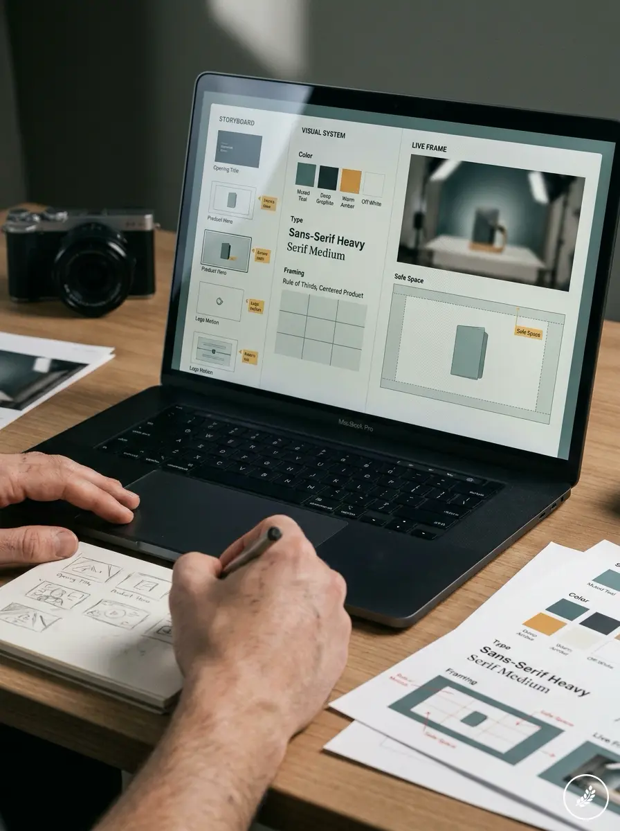
Brand video design starts the same place any visual identity work starts: with the existing system. What’s the brand’s color logic? Does its typography have a rhythm — tight and geometric, or loose and hand-drawn? Does the logo have an established way of animating, or does someone need to invent one on the spot? Answer those before a single frame gets shot, and video art direction stops being guesswork.
I treat this stage the same way I’d approach a product’s surfacing language before sketching a single panel line. You don’t start drawing until you know what the proportions are supposed to communicate. A brand video is no different. Decide what the visual voice is doing before anyone picks up a camera.
Storyboard design: where the visual system starts
What a storyboard is actually deciding
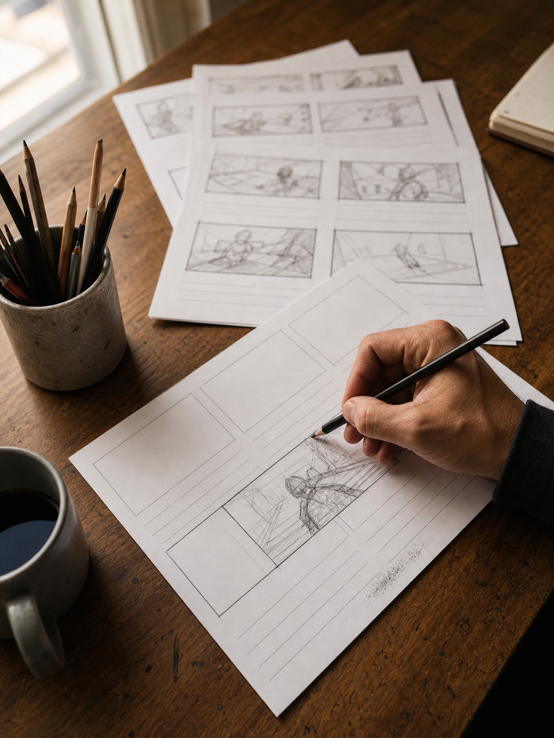
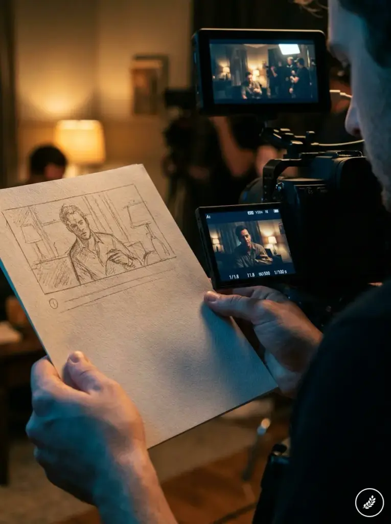
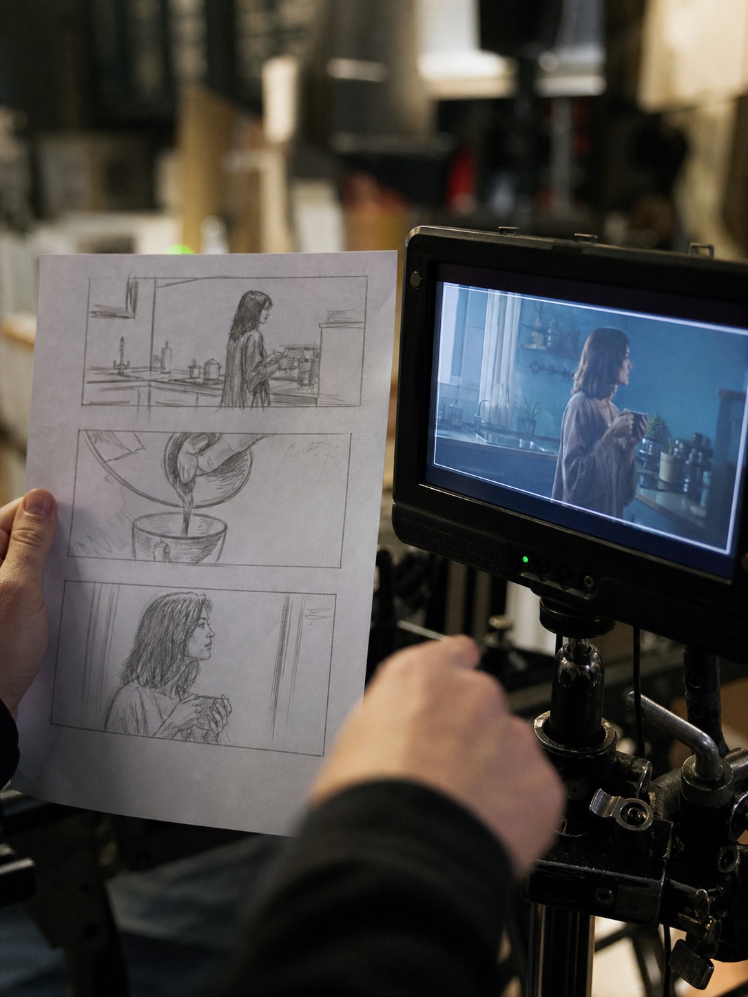
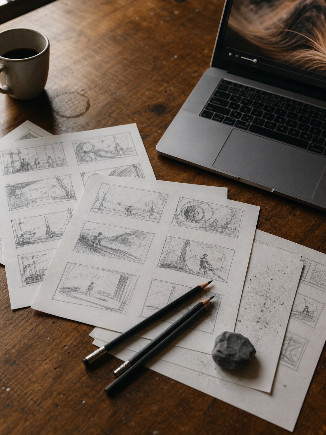
A storyboard isn’t a rough draft of the shot list. It’s where brand storytelling actually gets designed — composition, framing, where the eye lands first, how one frame hands off to the next. Skip this step and you’re designing on set, under time pressure, with a crew waiting and a client watching the clock.
I still build every storyboard as thumbnails first — small, fast, disposable sketches — before touching a script line. It forces a decision on composition before the words get in the way. A thumbnail the size of a postage stamp still has to read clearly: where’s the subject, where’s the negative space, where does the eye travel first. If a two-inch sketch doesn’t communicate the shot, a full production budget won’t fix it either.
A personal design habit — thumbnail first, script second
This runs against how most teams work: script first, visuals bolted on after. I do it backwards on purpose. A strong visual sequence can carry a mediocre script. A strong script can’t save a visually flat sequence, no matter how good the voiceover sounds. Composition rules that apply to a printed layout — rule of thirds, leading lines, deliberate negative space — apply exactly the same way to a single storyboard frame.
None of this is theoretical for me. I still catch myself doing the same proportion check on a storyboard frame that I’d run on a car’s side profile before committing to a surface line: does the weight sit where it should, does the eye travel where it’s supposed to, is there one dominant shape or three competing ones fighting for attention. A storyboard frame with three equally weighted focal points reads as cluttered no matter how good the individual elements are on their own. The fix is almost always subtraction, not addition — cutting a competing element rather than trying to balance three things that were never going to sit comfortably in the same frame.
That discipline applies to how a brand’s product actually gets framed on camera too. A product shot from a flattering three-quarter angle under soft, diffused light reads as considered and intentional. The same product shot straight-on under harsh overhead fluorescent light reads as an afterthought, even if it’s technically in focus. Framing decisions like this belong in the storyboard stage, worked out on paper, not discovered on set when the light’s already wrong and the schedule’s already tight.
Building a visual brand system for video: color and typography in motion
Carrying brand color into moving image
A static logo and a moving one behave differently. Color that reads clean on a business card can shift under studio lighting, LED panels, or a color grade pass. Brand identity in video means defining not just the hex codes but how those colors hold up on screen — under warm tungsten light, under a cooler grade, against skin tones in an interview setup.
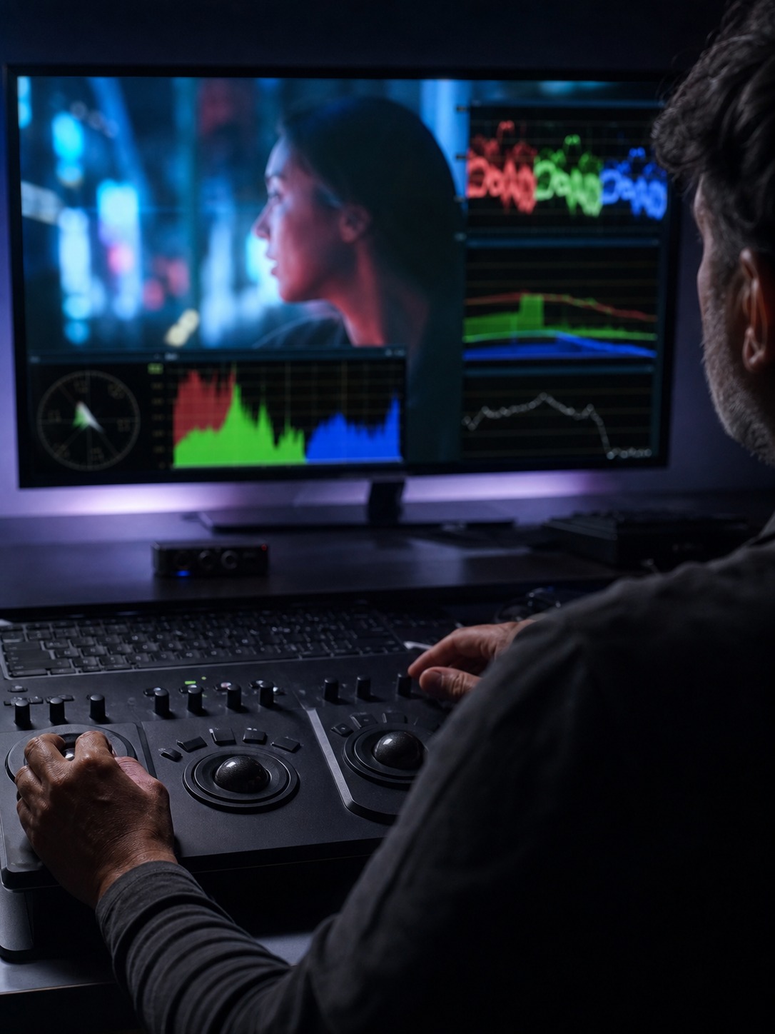
I’ve watched brand blues turn slightly teal under the wrong white balance more times than I can count. Lock your color reference on a calibrated monitor before the shoot, not after, and build a simple LUT or grading reference that every editor on the project uses. Otherwise every video in the series drifts a little further from the last one.
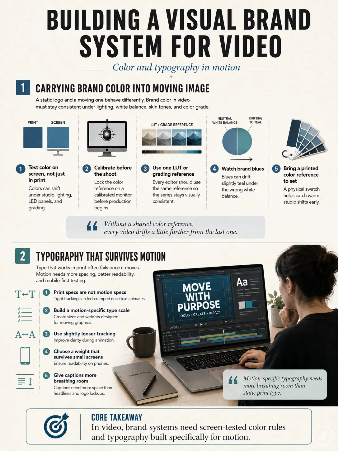
There’s a version of this that shows up constantly in interview-style corporate videos specifically. A subject sits against a background that technically matches the brand’s color palette on paper, but the studio lighting pulls everything a few degrees warmer than the reference swatch, and nobody catches it until the video’s already cut, graded, and approved. The fix is almost embarrassingly simple: bring a printed color reference to set, not just a digital file on someone’s laptop that nobody opens once the cameras start rolling.
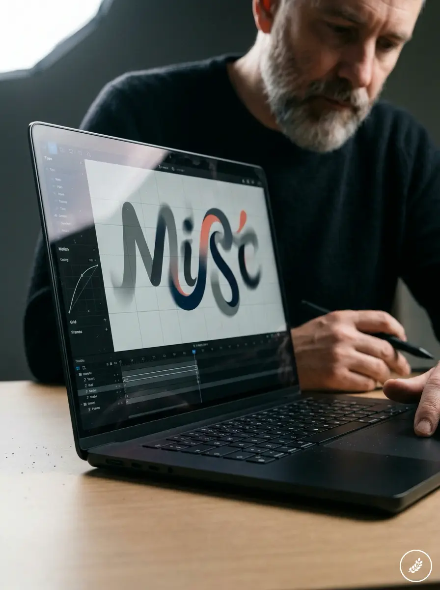
Typography that survives motion
Typography that works in print often falls apart the moment it moves. A tight tracking value that reads fine static can feel cramped once it’s animating across the screen at speed. Build a motion-specific type scale — slightly looser tracking, a weight that holds up at small sizes on a phone screen — rather than reusing print specs as-is. Captions in particular need more breathing room than a headline ever does; a font weight that looks confident in a logo lockup can turn nearly unreadable at caption size on a six-inch screen.
Editing rhythm as a design decision
Cut pacing tells a story on its own
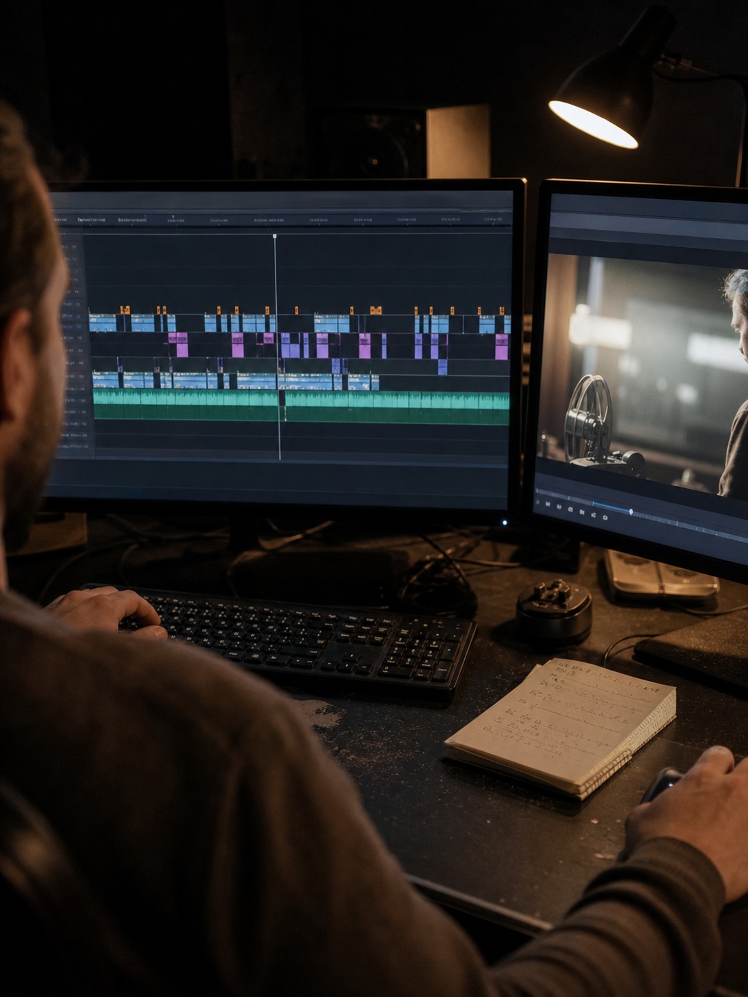
Editing rhythm is composition happening in time instead of space. A fast, punchy cut pattern says something different about a brand than a slow, held-shot pace, regardless of what the voiceover says. Cut too fast for a brand that wants to feel deliberate and craftsmanlike, and the video works against its own message no matter how well the script is written.
Matching rhythm to brand personality
I usually map cut length against brand personality early, before editing starts. A financial services brand built on trust and steadiness rarely benefits from fast montage cutting, even if it looks energetic in isolation — average shot length under a second or two starts to feel anxious rather than confident. A youth apparel brand often needs exactly that energy. The rhythm is a design decision, not a post-production afterthought, and it’s worth naming explicitly in the creative brief rather than leaving it to whoever’s cutting the timeline that week.
Motion graphics as brand identity in motion
Motion graphics design isn’t decoration
Lower thirds, animated logos, transition graphics: treated as decoration, they read as decoration. Treated as an extension of the brand’s visual system, motion graphics design becomes one of the strongest consistency tools a brand has, because it’s the one element that repeats identically across every video regardless of who shot the footage.
Building a reusable motion system, not one-off graphics
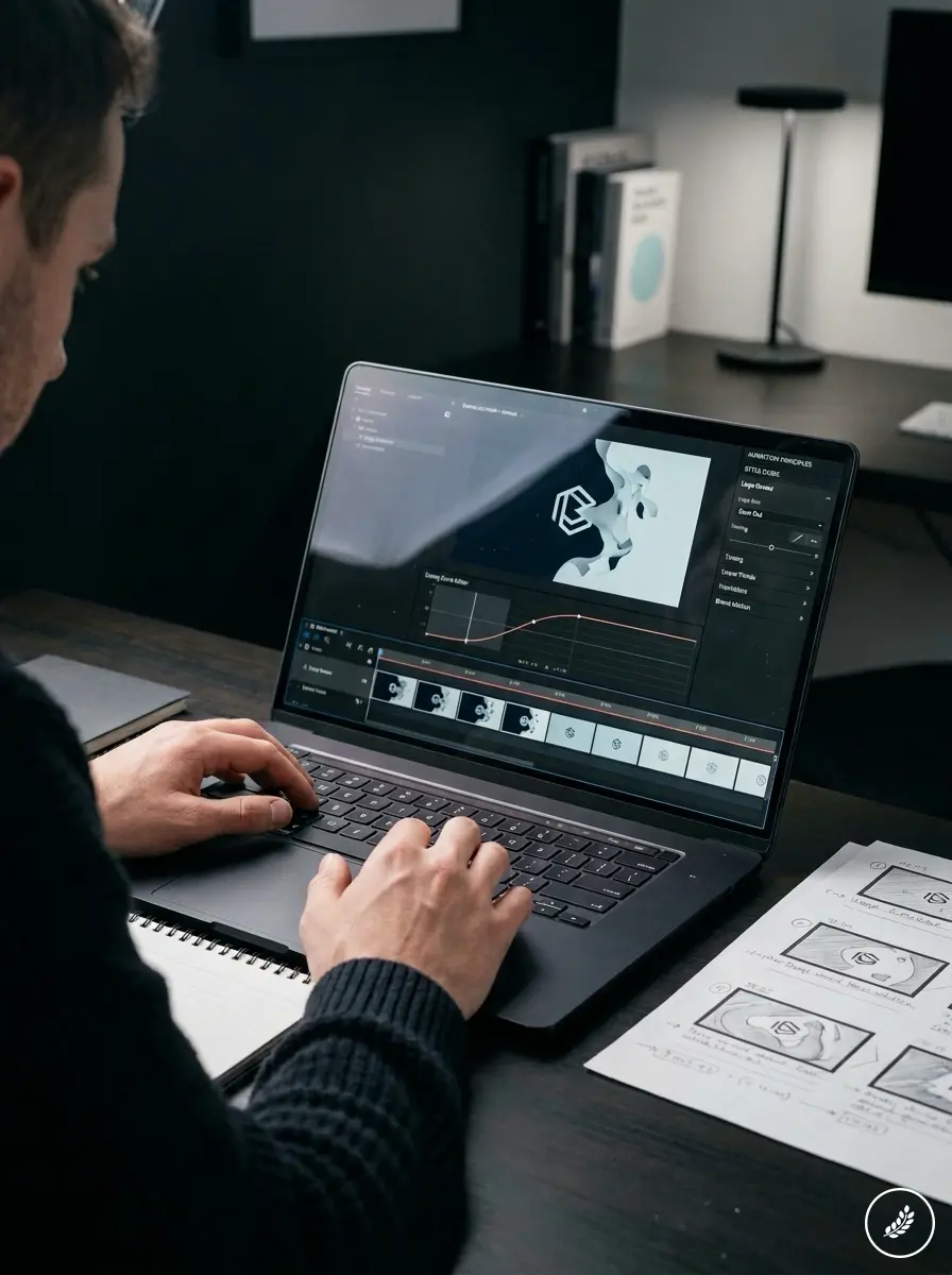
Design the motion graphics package once, properly, as a system — easing curves, timing, a consistent animation logic for how elements enter and exit — and every future video inherits it instead of reinventing transitions from scratch. I build these as a small internal style guide: three or four animation principles, documented, reused everywhere. Something as simple as always using the same ease-out curve on a logo reveal, instead of a different animator picking a different curve each time, does more for brand recognition than most people expect from something that small.
Motion graphics timing deserves one more note. Ease-in-out curves read as considered and deliberate. Linear motion, where an element moves at a constant speed with no acceleration or deceleration, reads as mechanical and slightly cheap, even when the graphic itself is well designed. It’s a half-second difference in a timeline that most viewers will never consciously notice, but it’s exactly the kind of detail that separates a brand video that feels crafted from one that feels assembled from a template library.
That instinct extends to how a brand’s logo behaves once it starts moving. A logo that’s been carefully balanced as a static mark can suddenly feel lopsided the moment it animates in from one side of the frame rather than scaling in from center. Small directional choices like this rarely get flagged in a review because they’re subtle, but they accumulate. A brand that animates its logo the same inconsistent way across a dozen videos ends up with a mark that never quite feels settled, even though each individual video looks fine in isolation.
I’d rather see a brand ship one well-considered fifteen-second sting, reused consistently across every video for a year, than a new logo animation invented from scratch for each project. Consistency compounds. A viewer who’s seen the same considered motion mark across five different videos starts recognizing it before the video even gets to its message — the same way a familiar packaging silhouette gets recognized on a shelf from ten feet away before anyone reads the label.
Sound design: the layer nobody storyboards
Why silence in a rough cut is misleading
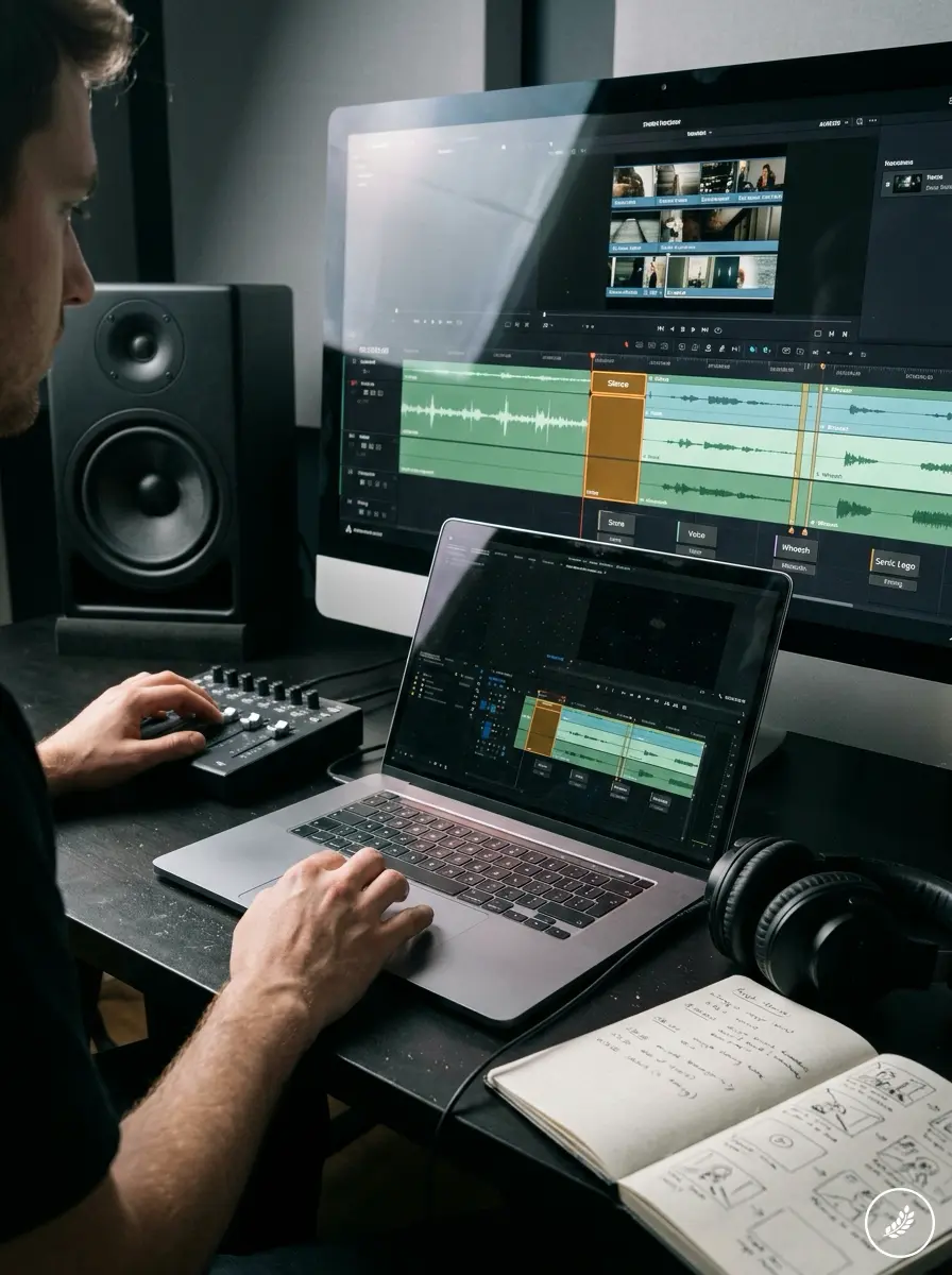
A rough cut in silence can look finished and still feel hollow once sound gets added, or feel unfinished and suddenly click the moment a score comes in. Sound design isn’t a polish pass at the end. It shapes pacing, emotional weight, and how a cut actually lands, and treating it as an afterthought is one of the most common mistakes I see in otherwise well-shot brand videos.
Sound as brand consistency, not an afterthought
The same brand consistency logic that applies to color and typography applies to sound. A consistent sonic signature, the same style of transition whoosh, the same tonal register in the score, does for the ear what a consistent color palette does for the eye. I’ve sat through final reviews where a client approved the visuals in silence and then flagged the whole video as feeling off once the temp music went in — not because the edit changed, but because nobody had defined the sound identity alongside the visual one.
Sound deserves a similar level of intentionality around silence itself, not just music and voiceover. A brief pause before a key statement lands does more for emphasis than any visual effect layered on top of it. I’ve watched clients ask for a graphic flourish to punctuate a moment that actually just needed a half-second of quiet before the next line of dialogue. Restraint is a design choice too, and it’s often the cheapest one available.
Consistency across platforms: one brand system, many aspect ratios
Designing for 16:9, 9:16, and 1:1 from day one
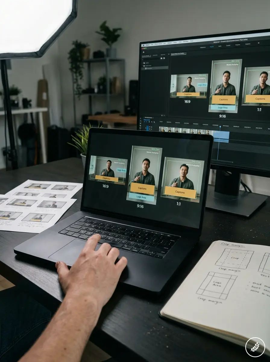
A brand video rarely lives in one place anymore. It gets cropped for Instagram, reformatted for LinkedIn, cut down for a pitch deck. Design the original shoot and storyboard with every aspect ratio in mind from the start, leaving safe margins for a vertical crop, and the video survives reformatting instead of losing its subject halfway through a face in the 9:16 version.
What breaks when you crop instead of redesign
Text that reads fine in 16:9 often gets clipped in a 1:1 crop. Logos placed at the frame edge disappear in vertical formats. I plan every brand video’s key visual information inside the safe zone for the tightest crop it’ll ever need, even when the primary edit is landscape, which usually means keeping subjects centered rather than following the rule of thirds too literally when a vertical crop is coming later.
Platforms don’t just crop differently, they play differently. LinkedIn’s native player autoplays muted, so a video that depends entirely on a voiceover to make its point loses most of its message before anyone taps for sound. Design captions and on-screen text as a first-class part of the visual system, not a subtitle afterthought bolted on for accessibility compliance.
Building a brand video style guide you can reuse
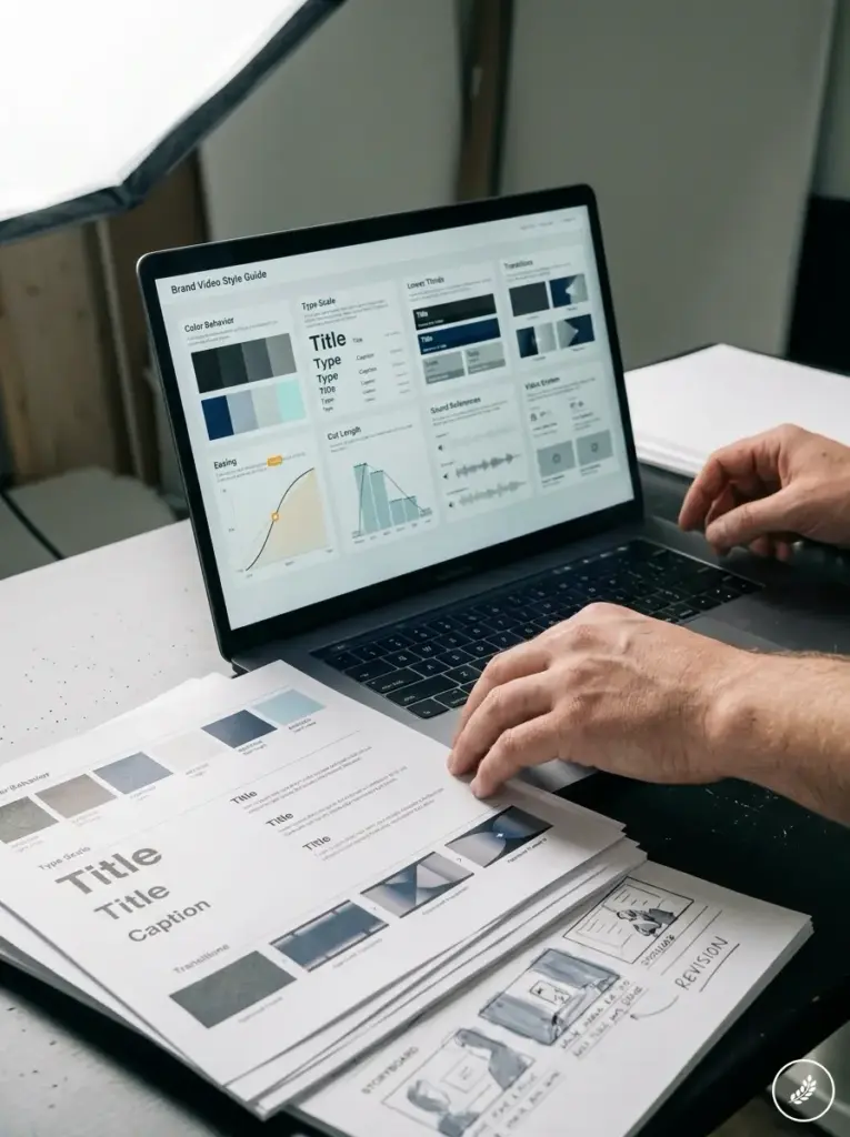
A brand video style guide is the deliverable that actually makes all of this repeatable. Most brands have a logo guide and a color palette sitting in a shared drive somewhere, but almost none of them have the video equivalent — the document that tells any editor, any motion designer, any production partner exactly how this brand moves, sounds, and cuts.
I build these as short, practical references rather than dense brand books nobody opens twice. A page on color behavior under different lighting conditions. A page on the type scale for titles versus captions versus lower thirds. A short reel of approved transition styles and easing curves. A note on average cut length by content type — a 30-second social cutdown paced differently than a three-minute company overview. Two or three reference tracks that define the sonic register the brand should sit in.
Handing that to a new production partner changes the entire working relationship. Instead of a crew guessing at what “on-brand” means from a logo file and a mood board, they’re working from decisions that have already been made. It also means every video in a brand’s library, no matter which agency or freelancer shot it, still reads as coming from the same place. That consistency is the actual output of design-led brand video work, more than any single hero video ever is.
It also saves time in a way that rarely gets mentioned upfront. A production team quoting from a defined style guide spends less time in revision rounds guessing at brand fit, and less time redoing graphics that didn’t match an unwritten expectation. The style guide isn’t overhead. It’s the thing that keeps every future video from starting over from zero.
When a corporate video production agency actually earns its cost
What good production adds on top of good design
I still bring the storyboard and brand system into that conversation first, though. Production execution can only be as strong as the design thinking behind it, and a production team working from a defined visual system delivers something closer to what the brand actually needs than one starting from a blank page and a call sheet.
Brand video work also benefits from graphic design portfolio examples for storytelling, especially when the project needs to explain sequence, mood, and decision-making instead of only showing the finished frame.
When a storyboard frame needs more craft, looking at illustration design examples can sharpen decisions about line hierarchy, texture, focal points, and how much detail a viewer can read at speed.
Conclusion
A brand video succeeds or fails on the same principles as any other piece of visual identity work: proportion, rhythm, consistency, a clear hand behind every decision. Storyboard first, carry the brand’s color and typography into motion deliberately, treat editing rhythm and sound as design choices rather than post-production afterthoughts, and build a motion system that survives every aspect ratio it’ll ever need to fit.
Worth naming directly before closing: none of this replaces a clear message. A beautifully designed brand video built around a vague or confused core idea is still a video nobody remembers a week later. Visual storytelling amplifies a clear message. It doesn’t manufacture one out of nothing. Get the message right first, then let the design work make it stick.
Try mapping your next brand video against your existing visual identity system before a single frame gets shot. The gap between the two is usually where the video’s problems actually start.
- 281shares
- Facebook0
- Pinterest281
- Twitter0
- Reddit0