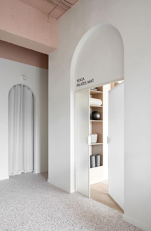
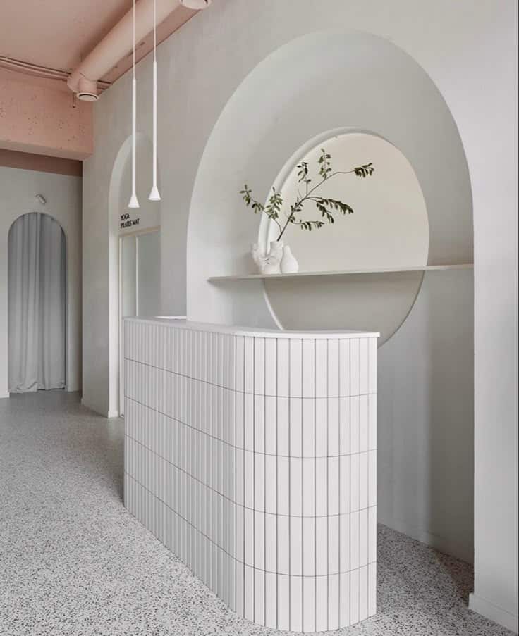
In the world of design, the principle of “less is more” holds significant weight. White space enhances the visual appeal of a design while aiding in the organization of content. It allows essential elements to shine and creates a comfortable viewing experience for users. Designers often underestimate the value of this negative space, but it plays a crucial role in guiding attention and reducing cognitive overload.
By strategically incorporating white space, designers can craft a clear visual hierarchy that naturally directs users to important information. This clarity not only improves readability but also fosters a clean, balanced look that is pleasing to the eye. Emphasizing simplicity in design can lead to more effective communication and stronger connections with the audience.
As the digital landscape continues to evolve, understanding the importance of white space becomes even more critical. It empowers designers to create spaces that are not just functional, but also engaging and aesthetically pleasing. Exploring this topic reveals why embracing white space can transform the overall design experience.
Defining White Space
White space, also known as negative space, is the area in a design that is left unmarked. It plays a crucial role in enhancing readability, guiding user focus, and providing balance to visual elements. Understanding its types and applications across different media helps designers utilize it effectively.
Types of White Space


There are several types of white space, each serving a distinct purpose in design. Active white space is deliberately used to separate elements, guiding a viewer’s attention. It forms an integral part of the layout, creating an engaging user experience.
Passive white space, on the other hand, is the empty space that exists naturally in a design. It helps in breathing room between elements, enhancing clarity and focus.
Another type, structured white space, helps organize content systematically. This can be seen in grids or layouts that compartmentalize information, giving users a clear path to follow.
White Space in Different Medias


The application of white space varies across different media, adapting to the specific needs of each. In print design, such as brochures or magazines, white space can improve readability and engagement. Text and images need adequate breathing room to maintain clarity.
In digital design, websites and applications thrive on effective use of white space. It aids in navigation and creates a more comfortable user experience. Designers often use it to highlight calls to action, ensuring users don’t miss important elements.
Mobile design also benefits from white space, as screens are smaller. Here, the strategic use of negative space directs attention to buttons or interactive elements, enhancing usability. By recognizing these differences, designers can tailor their approach to maximize effectiveness across platforms.
Benefits of White Space
White space plays a crucial role in design by facilitating clarity, enhancing focus, and elevating overall aesthetics. By intentionally utilizing space, designers can create more engaging and effective visual experiences.
Improves Readability and Comprehension


Effective use of white space can significantly improve readability. When text is surrounded by adequate spacing, it becomes easier for the reader to engage with the content.
A cluttered layout can overwhelm users, making it difficult to absorb information. In contrast, increased white space helps isolate paragraphs and sections, guiding readers’ eyes smoothly through the text.
A study has shown that well-spaced content can increase comprehension rates by up to 20%. This emphasizes the importance of going beyond mere aesthetics and focusing on functionality in design.
Increases Attention and Focus


White space is essential for directing user attention where it matters most. By minimizing distractions, designers can lead users to key elements within a layout, such as calls to action or important messages.
For example, an advertisement that uses white space appropriately can drive focus towards the main product rather than the surrounding clutter. This creates a more serene viewing experience, which can reduce cognitive load.
Incorporating white space can also encourage users to spend more time on a page, as they feel less overwhelmed and more at ease while navigating through the content.
Enhances Design Aesthetics


A well-balanced design relies on white space to convey a sense of professionalism and elegance. Strategic use of space can elevate a design from ordinary to striking.
For instance, websites that incorporate ample white space often have a modern and clean appearance. This not only attracts users but also can instill trust, as a polished look often reflects quality.
Users are drawn to designs that feel open and inviting. When elements are breathing freely rather than cramped together, the overall visual experience improves. This can result in increased engagement and a better overall impression of the brand.
Applying White Space Effectively
Effective application of white space enhances design clarity and improves user engagement. It plays a crucial role in balancing elements, establishing hierarchy, and enhancing the user experience.
Balance and Harmony


Achieving balance in design is essential for creating visual appeal. White space helps to evenly distribute elements across the layout, preventing overcrowding. By strategically placing negative space around content, designers can create a sense of harmony.
Key Considerations:
- Symmetry vs. Asymmetry: Both approaches can be effective. Symmetrical designs provide a sense of stability, while asymmetrical ones often feel more dynamic.
- Consistent Margins: Keeping margins uniform helps maintain a clean look. It directs focus to the central content.
A balanced design can lead to a more enjoyable visual experience.
Hierarchy and Organization


White space is instrumental in establishing a clear hierarchy. Effective use of negative space can guide the viewer’s eye through a design, highlighting the most important elements.
Techniques for Hierarchy:
- Contrasting Sizes: Larger elements surrounded by white space draw attention. Smaller components can be grouped together in less spacious areas.
- Usage of Headings: Headings with ample white space above and below can signify importance. This differentiation aids comprehension.
Organized designs lead to improved readability and user interaction.
User Interface and User Experience

In digital design, white space significantly enhances user interface (UI) and user experience (UX). Thoughtful incorporation of negative space can make interfaces more intuitive.
Benefits of White Space in UI/UX:
- Easier Navigation: Clear spaces between links or buttons can minimize user confusion, making navigation more fluid.
- Increased Readability: Generous line spacing and padding around text blocks contribute to better on-screen readability.
A well-designed UI leverages white space to facilitate user engagement and satisfaction.
- 0shares
- Facebook0
- Pinterest0
- Twitter0
- Reddit0


