Typography plays a crucial role in how users interact with content online. The right choice and combination of fonts can significantly enhance readability and user experience. Whether you’re designing a blog, a website, or an app, understanding the principles of web typography is essential for effective communication.
Selecting fonts involves consideration of both aesthetics and functionality. You must balance style with legibility to ensure that your message is delivered clearly. By mastering the art of font pairing, you can create visually appealing designs that keep your audience engaged.
Styling text appropriately not only improves the look of your site but also influences how information is perceived. Understanding these elements can elevate your design from ordinary to exceptional, ultimately leaving a lasting impression on your readers.

Key Takeaways
- Good typography enhances user experience and readability.
- Selecting and pairing fonts requires a blend of style and function.
- Proper text styling effectively communicates your message.
Understanding Web Typography
Web typography plays a crucial role in defining the user experience on a website. By selecting appropriate typefaces and effectively combining them, you enhance readability and establish a clear visual hierarchy that reflects your brand identity.
The Role of Typography in Web Design
Typography influences the overall aesthetic appeal of a website and impacts user engagement. It helps to convey meaning and emotion, guiding users through content seamlessly. You should focus on ensuring legibility, which involves choosing typefaces that are easy to read and establishing a visual hierarchy through size, weight, and color.
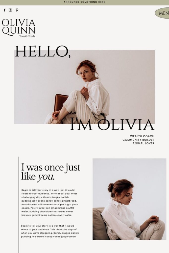
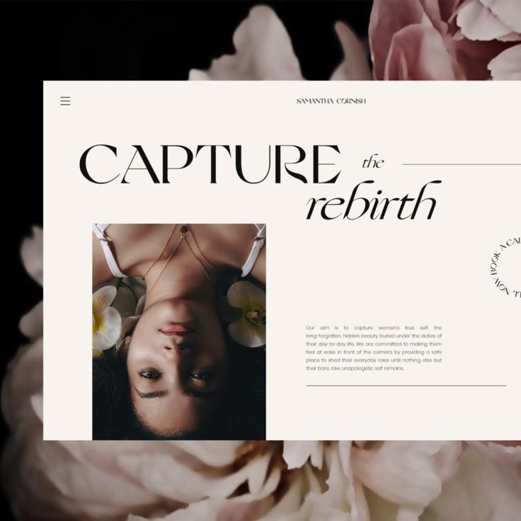
Effective typography enhances brand identity. For instance, a tech company might opt for modern sans-serif fonts to reflect innovation, while a luxury brand may choose elegant serif typefaces for sophistication. The balance of these elements is vital for a successful web design.
Elements of Typography
Key elements of typography include size, weight, color, spacing, and contrast. Size dictates how readable text is across devices, while weight can emphasize important information or create a sense of hierarchy.
Color is essential in achieving aesthetics and ensuring sufficient contrast between text and background. Proper spacing (both letter and line spacing) prevents text from feeling cramped, enhancing readability. Strong contrast not only improves legibility but also draws attention to specific sections, improving user engagement.
Typeface Classification
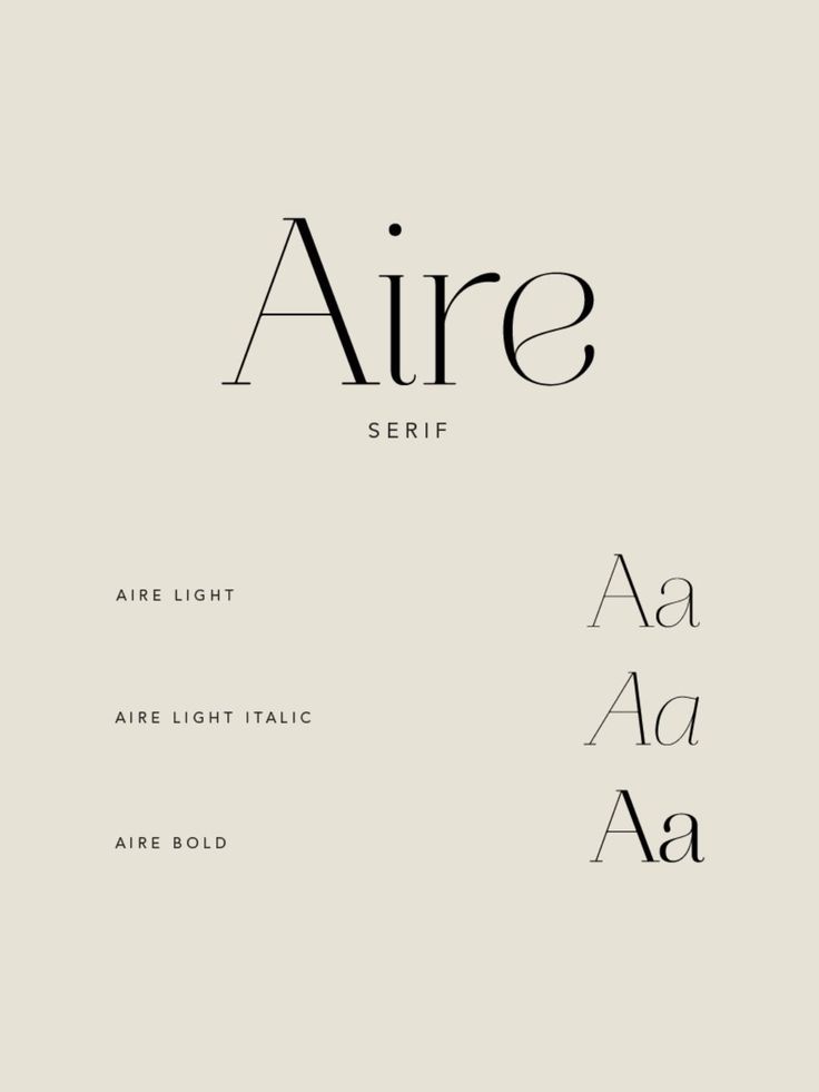
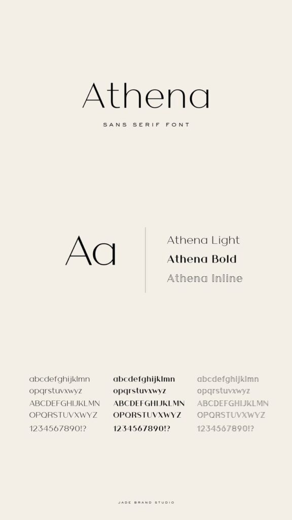
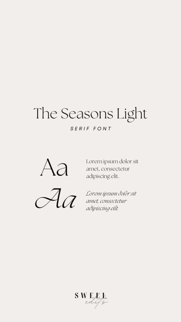
Typefaces can be categorized into several classifications, primarily serif, sans-serif, script, and monospace fonts. Serif fonts have small decorative strokes at the ends of letters, promoting tradition and reliability. Sans-serif fonts are clean and modern, often chosen for their minimalistic nature.
Script fonts mimic handwriting and add a personal touch, best suited for invitations or informal settings. Monospace fonts, where each character occupies the same width, are often used for coding or technical content. Selecting the right typeface classification is essential for maintaining consistency and aligning with your brand’s voice.

Font Selection and Pairing
Choosing the right typefaces is essential for effective design. The process involves understanding your branding needs, ensuring visual appeal, and establishing a clear hierarchy. Effective font pairing enhances readability and strengthens the overall message.
Choosing the Right Typefaces
When selecting typefaces, consider your brand identity. Serif fonts often convey tradition and respectability, making them suitable for formal contexts. In contrast, sans-serif fonts offer a modern and clean feel, ideal for digital environments.
- Examples of serif fonts: Times New Roman, Georgia
- Examples of sans-serif fonts: Arial, Helvetica
Choose a typeface that aligns with the emotion you wish to evoke in your audience. Ensure that readability remains a priority by avoiding overly ornate fonts. Test your selections across various devices to ensure consistency in appearance.
Combining Fonts for Maximum Impact
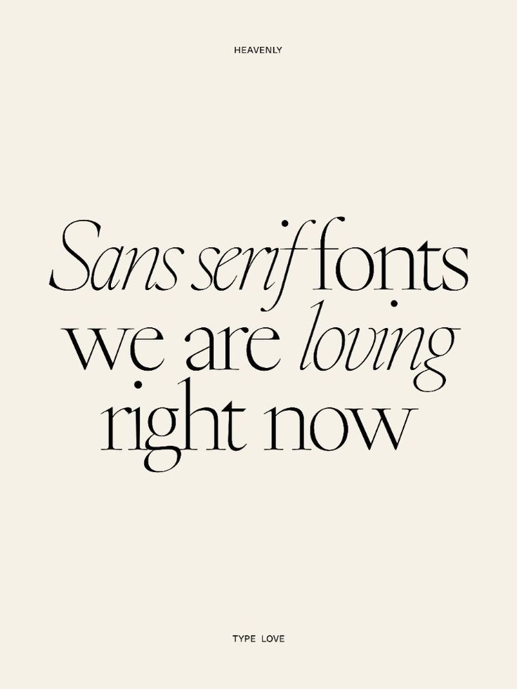
Font pairing requires a thoughtful approach to create contrast while maintaining harmony. Mix fonts with different styles, such as combining a serif with a sans-serif for a clear distinction. This juxtaposition can enhance the visual appeal of your design.
Guidelines for effective font pairing:
- Contrast: Use different weights or sizes to establish hierarchy.
- Complement: Choose fonts that share similar characteristics, like x-height or stroke width.
- Limit: Use no more than three fonts to avoid clutter.
By strategically combining contrasting and complementary fonts, you can capture attention and guide the reader’s eye through your content effectively.
Technical Considerations for Typography on the Web
When choosing typography for the web, it’s essential to focus on responsiveness, accessibility, and the available font technologies. Each aspect plays a vital role in ensuring that your text is not only visually appealing but also functional across various devices.
Responsiveness and Adaptability
Responsive typography adjusts to different screen sizes and devices, enhancing usability. Key factors include scale, x-height, leading, and tracking. Choose a base font size that scales well on tablets and desktops.
For instance, larger body text (around 16px) can improve readability on smaller screens. Utilize CSS media queries to adjust font sizes based on screen dimensions, ensuring text remains legible.
Here’s a simple example:
| Screen Size | Font Size |
|---|---|
| Mobile (up to 600px) | 14px |
| Tablet (601-900px) | 16px |
| Desktop (900px and above) | 18px |
Consider line length and height as well. A good rule of thumb is to keep line lengths between 50-75 characters, enhancing readability.
Accessibility and Readability
Web typography must cater to all users, including those with visual impairments. This involves selecting fonts that support accessibility.
Use high contrast between text and background color. For body text, consider using sans-serif fonts, which are generally more readable on screens.
Maintain adequate line height (1.5x font size) for better readability. Adjustable font sizes can help users who require larger text without compromising layout.
Tools such as Google Fonts, Typekit, and Font Squirrel offer a range of accessible typefaces. Prioritize legible typefaces with clear characters.
Always test your typography against common accessibility standards, such as WCAG (Web Content Accessibility Guidelines).
Font Technologies and Resources
Understanding font technologies is crucial for effective web typography. Use web fonts from Google Fonts or Typekit for easy integration and performance optimization.
Custom fonts can enhance brand identity, but ensure they are optimized for web use. Font formats like WOFF and WOFF2 are commonly preferred due to their lightweight nature.
To implement good font practices, consider:
- Preloading critical font styles.
- Using
font-display: swapto minimize loading times. - Regularly checking load performance through tools like Google PageSpeed Insights.
By leveraging these resources, you can create a visually engaging typographic experience that maintains performance across devices.
Styling Text for Effective Communication
Effective communication through web typography involves creating a clear visual hierarchy and using color and contrast effectively. By applying these principles, you can enhance readability and guide your audience through your content.
Hierarchy and Spatial Organization
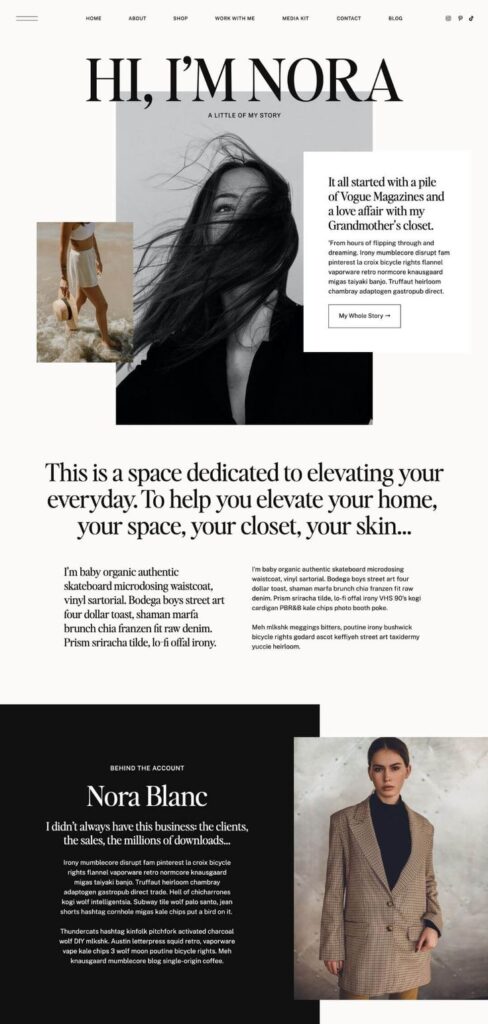
Establishing a visual hierarchy is crucial for directing attention and conveying the structure of your content. Use headings and subheadings to break up text and indicate the importance of different sections.
Utilize font weight variations, such as bold for headings and regular for body text. This differentiation makes it easier for readers to navigate your content.
Incorporate whitespace strategically to improve focus. Ample spacing around text elements allows for better comprehension. Aim for defined groupings by adjusting layout elements, using consistent spacing to enhance the overall reading experience.
Enhancing Readability Through Contrast and Color
Contrast ratio plays a pivotal role in typography. Ensure that your text stands out against the background color. Aim for a contrast ratio of at least 4.5:1 for standard text to maintain legibility.
Using web-safe fonts enhances accessibility across various devices. Combine fonts judiciously to maintain cohesiveness while also considering color contrast. For example, use dark text on a light background and vice versa.
Avoid all-caps for body text to enhance readability, but it can be effective for emphasis in headings. Adjust your color palette to include complementary shades that draw attention but remain comfortable to read.
- 2.3Kshares
- Facebook0
- Pinterest2.3K
- Twitter0
- Reddit0


