Logo design ideas are useful when they help you see a real decision: should the mark be a wordmark, a monogram, a symbol, an outline icon, a gradient shape, or a stripped-back minimal logo? This collection is best used as a reference board, not a template sheet.
When I judge a logo concept, I look at the silhouette first. If the shape is weak, color and texture will only decorate the problem. Use these examples to compare proportion, line weight, negative space, type pairing, and how much detail survives when the logo is reduced to a small social icon.
How to use these logo design ideas
Start by saving the logos that solve the same kind of problem as your brand. A bakery, a software tool, a fashion label, and a local construction company do not need the same visual language. Then sketch the idea in black and white, test it at tiny size, and only after that think about color, gradients, or mockups.
| Logo direction | Best for | What to check first |
|---|---|---|
| Wordmark | Distinctive names, studios, fashion labels | Letter spacing, type personality, small-size readability. |
| Monogram | Long names, initials, luxury or personal brands | Whether the initials are still clear after stylizing. |
| Symbol | Apps, products, packaging, social avatars | Silhouette, negative space, and one-color performance. |
| Gradient mark | Tech, creative, digital-first brands | Whether the logo still works in flat color. |
| Outline mark | Editorial, handmade, boutique, lifestyle brands | Line weight, contrast, and print visibility. |
| Minimal logo | Modern brands that need quiet recognition | Proportion, spacing, and whether the concept feels too generic. |
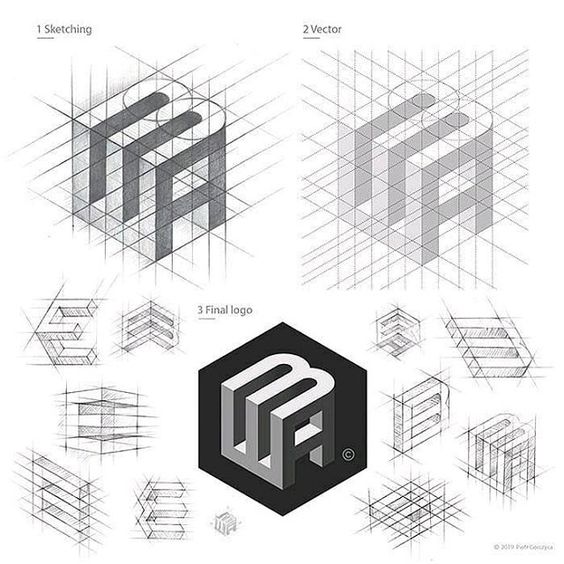
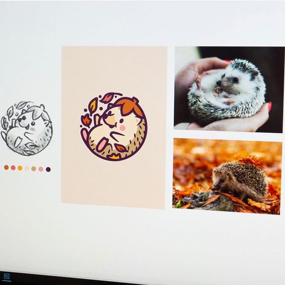
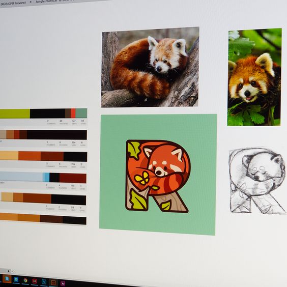
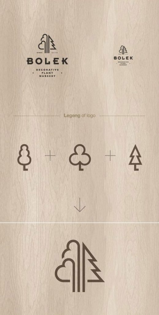
Logo sketch and concept ideas




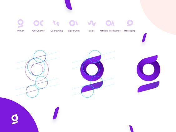
Gradient logo design ideas





Logo design reference sources worth checking
If you are using this page for a real project, compare the examples with a few outside reference libraries too. Dribbble logo inspiration is good for current visual trends, Canva’s logo design gallery is useful for quick layout categories, CorelDRAW’s logo design guide covers practical production basics, and Looka’s logo ideas library makes it easy to compare ideas by industry.
Use these sources as comparison points, not as a reason to copy. The better question is: what is the repeated design move? Is it a hidden letter, a strong silhouette, a clever symbol, a restrained palette, or typography doing most of the work?
Outline logo design ideas




Minimal logo design ideas




Logo design cluster next steps
To narrow this reference board into a real direction, move next into logo design ideas for business, logo design principles, logo ideas for beginners, logo and branding guide, and brand mark ideas. Those guides help you decide whether the idea should be a practical business mark, a beginner-friendly sketch, or a fuller brand identity system.
If the mark is already close, refine the supporting design around it with minimalist logo design, font pairing basics, design principles in graphic design, business card design, and creative business card designs. A logo rarely works alone; it has to sit comfortably with type, color, layout, cards, packaging, and the rest of the brand’s visual touchpoints.
Logo design ideas FAQ
Q: What are the best logo design ideas for beginners?
A: Start with simple logo design ideas: wordmarks, initials, geometric symbols, line icons, and one-color marks. Beginners often jump into gradients or effects too early. I would sketch ten tiny black-and-white thumbnails first, then choose the two or three ideas that still read clearly when they are small.
Q: How do I create my own logo design idea?
A: Write down the brand name, category, audience, and one personality word, then sketch symbols connected to those notes. Try a wordmark, a monogram, a simple icon, and an abstract shape before choosing. A good logo design idea usually becomes clearer after you remove details, not after you add more.
Q: What are the main types of logo design?
A: Common logo types include wordmarks, lettermarks or monograms, pictorial marks, abstract symbols, mascots, combination marks, emblems, and responsive logo systems. This post leans into visual inspiration, but the practical choice depends on where the logo will appear: website header, packaging, app icon, signage, or social avatar.
Q: What makes a logo design idea look professional?
A: A professional logo has a clear silhouette, controlled spacing, readable type, and a concept that fits the brand. The small details matter: optical alignment, line weight, corner radius, and how the mark works in one color. If the logo falls apart in black and white, the idea is probably not ready.
Q: Should I start a logo with color or shape?
A: Start with shape first. Color can add emotion, but shape does the heavy lifting for recognition. I usually test a logo in black, white, and one flat color before thinking about gradients. If the mark works without color, the palette becomes a refinement instead of a rescue mission.
Q: How many logo concepts should I sketch before choosing one?
A: Sketch at least 20 small concepts before committing, even if most are rough. The first few usually repeat obvious ideas. The useful work often happens around sketch 12 or 15, when you start combining initials, symbols, negative space, and proportions in less predictable ways.
Q: What mistakes make logo design ideas weaker?
A: The most common mistakes are too many details, trendy effects, weak typography, unclear symbolism, and poor small-size readability. Another quiet mistake is using a symbol that looks good in isolation but says nothing about the brand. A logo should be memorable, but it also needs to feel appropriate.
Q: Should a business use a wordmark, symbol, or monogram?
A: Use a wordmark when the name is distinctive and needs recognition. Use a symbol when the brand needs a compact mark for icons, packaging, or merchandise. Use a monogram when the name is long or initials are already memorable. Many businesses eventually need a small logo system, not only one lockup.
- 36.1Kshares
- Facebook0
- Pinterest36.1K
- Twitter0
- Reddit0