Disney drawing style looks simple until the construction is off. The real system starts with shape language: circles for softness, squares for strength, and triangles for sharper or more dangerous characters. Before the eyes, hair, costume, or color, a Disney character needs a readable silhouette, a head-and-body construction, and a facial guideline cross that keeps the features sitting on the same turned plane.
- Disney Drawing Style: Shape Language and Construction
- How to Draw Disney Characters Step by Step
- Disney Character Sketches: What to Study First
- Disney Character Design Principles
- Four Disney Art Style Eras and What Changed
- The 12 Principles of Animation Applied to Disney Drawing
- Seven Disney Characters: Construction Guides
- Practical Drawing Techniques: From Construction to Finished Character
- Materials: What You Need to Draw Disney Characters
- Common Disney Drawing Mistakes
- FAQ About Disney Drawing Style
- What defines the Disney drawing style?
- How do you draw Disney characters step by step?
- What should beginners study in Disney character sketches?
- How does shape language work in Disney character design?
- Why do Disney eyes look different from realistic eyes?
- Which Disney character is easiest to draw first?
- How do you make a Disney-style drawing look less stiff?
- What is the difference between classic and modern Disney art style?
- Next Disney drawing practice
If you want to draw Disney characters, study the sketch underneath the polish first. A clean Disney-style drawing usually comes from three decisions: what shape family the character belongs to, how the face turns in space, and which feature carries the emotion. Once those choices are clear, the drawing starts to feel intentional instead of copied.
Disney Drawing Style: Shape Language and Construction
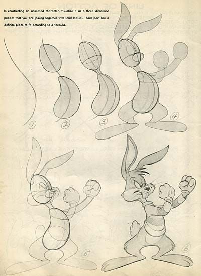
The Disney drawing style is a construction system before it is a finish. Start with the silhouette, then choose the dominant shape family: round for soft and friendly characters, square for sturdy characters, triangular for sharper villains or comic tension. After that, block the head and body with simple forms, place a facial guideline cross, and only then draw the eyes, nose, mouth, hair, and costume.
When I thumbnail a character, I check the outline first: Mickey should read as three circles, Stitch as a squat body with huge ears, and Simba as a big cub head on a small body. If the silhouette is weak, clean linework will not save it. This is also why Disney character sketches are useful to study: the rough drawing shows the design decision before the polish hides it.
| Stage | What to draw | What to check |
|---|---|---|
| 1 | Big silhouette | Can you recognize the character as a tiny thumbnail? |
| 2 | Head and body shapes | Are the circles, ovals, squares, or triangles matching the character’s personality? |
| 3 | Facial guideline cross | Do the eyes, nose, and mouth sit on the same turned plane? |
| 4 | Expression and pose | Does the face stretch, squash, or tilt with the emotion? |
| 5 | Line weight and cleanup | Are the outer lines stronger than the inside details? |
That word — appeal — is the twelfth and arguably most important of Disney’s 12 Principles of Animation, codified by animators Ollie Johnston and Frank Thomas in their 1981 book The Illusion of Life: Disney Animation, still considered the definitive text on animated character drawing. Appeal doesn’t mean cute.
Cruella de Vil has appeal. Ursula has appeal. Scar has appeal. It means that the character has a quality that makes you want to watch them — a clarity of design, a personality readable in a single pose, a silhouette that is instantly recognisable. Getting that quality into a drawing requires understanding why Disney characters look the way they do, not just what they look like.
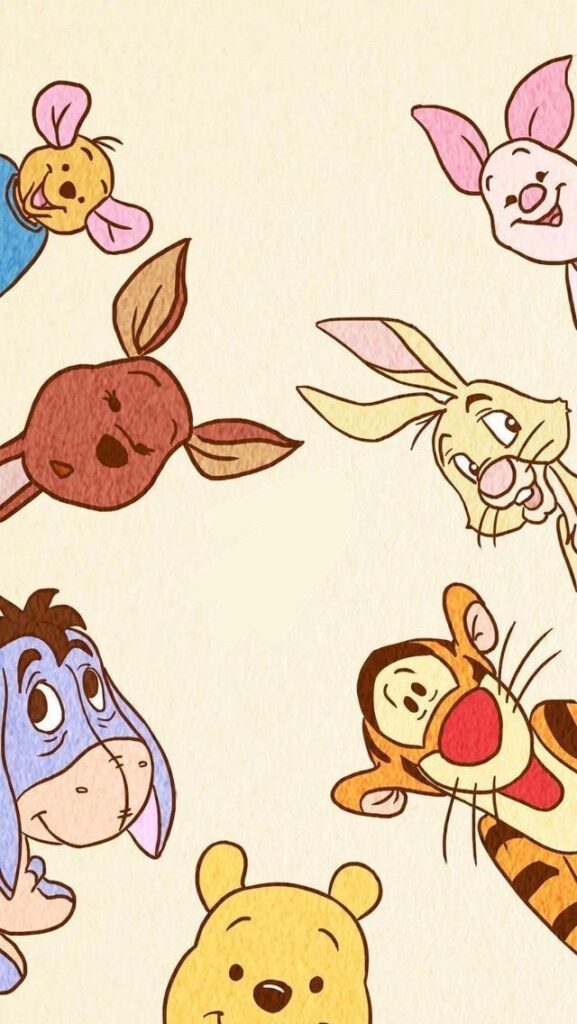
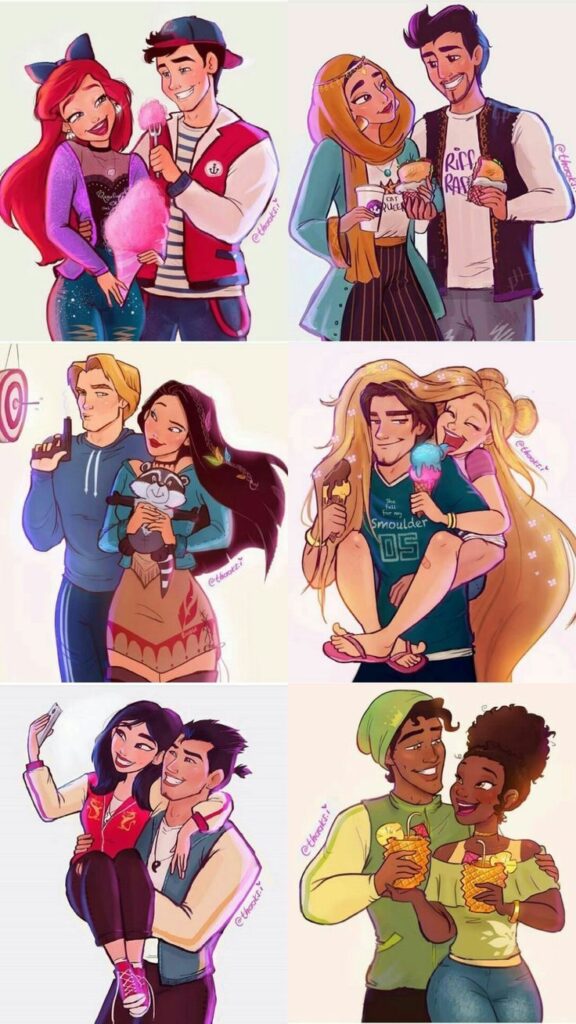
This guide covers the complete picture: the design logic behind Disney’s visual language, how that language evolved across four distinct eras, the construction method that professional animators use to build characters from basic shapes outward, the specific proportions and features of seven classic and contemporary characters, and the 12 Animation Principles applied to drawing rather than animation. Whether you’re starting with Mickey Mouse or attempting Mirabel from Encanto, the same underlying design system applies.
How to Draw Disney Characters Step by Step
Use the style system as a repeatable drawing process: thumbnail the silhouette, build the head and body from simple shapes, place the facial cross, then push the expression. Do not start with eyelashes, costume details, or color. Those details only work when the construction underneath already feels like the character.
- Sketch the pose as a tiny silhouette first.
- Choose the main shape language: circle, square, triangle, or a mix.
- Build the head and body with light circles, ovals, blocks, and wedges.
- Add the facial guideline cross so the eyes, nose, and mouth share the same head turn.
- Push one expressive feature, usually the brows, eyes, mouth, or pose rhythm.
- Clean the outer contour last, using stronger line weight around the silhouette.
Disney Character Sketches: What to Study First
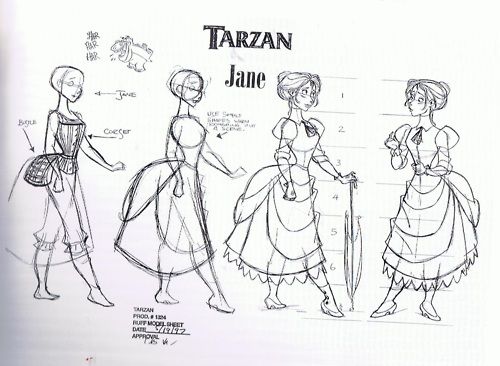
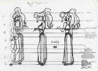
Disney character sketches are more useful when you know what to look for. Study the tiny thumbnails first, not the finished poster art. Look for the biggest silhouette, the head-to-body ratio, the direction of the eye line, and how the expression changes the face without breaking the character’s volume.
Model sheets are especially good practice because they show the same character from several angles. Copy one front view, one three-quarter view, and one expression sheet before trying a finished pose. That sequence trains you to see construction instead of only copying surface details.
Disney Character Design Principles
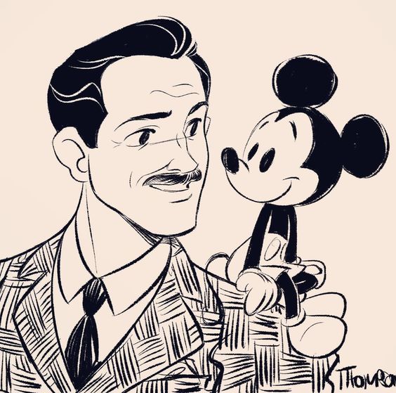
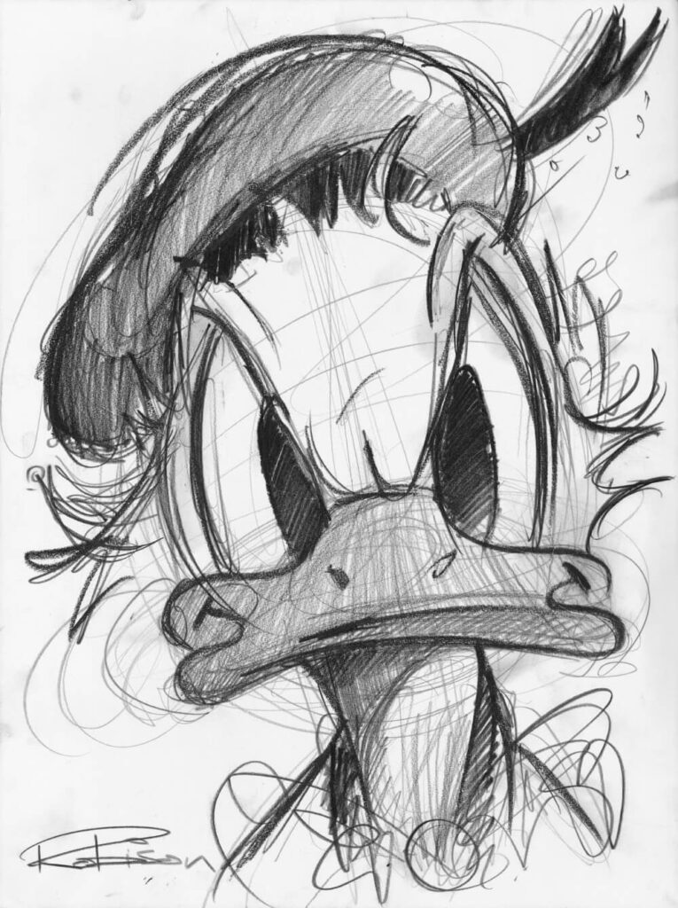
Disney characters are not drawn from observation. They’re designed from principles — and the most fundamental of those principles is shape language: the idea that the basic geometric form of a character communicates their personality before any detail is added. This is not a vague aesthetic preference; it’s a deliberate design system that has governed character creation at Disney since the 1930s.
Shape Language: The Grammar of Disney Design
The three primary shapes carry specific emotional associations that Disney has exploited consistently across 90 years of character design. Circles suggest approachability, softness, and innocence — Mickey Mouse, Winnie the Pooh, Dumbo, Wall-E, Baymax. Squares suggest strength, reliability, and solidity — Gaston’s chest, the Beast’s broad head, Hercules’s jaw. Triangles suggest danger, cunning, and menace — Maleficent’s horns and collar, Ursula’s inverted triangle silhouette (wide at the top, narrowing at the waist), Jafar’s elongated angular face.
This shape grammar operates at every scale of the design. It’s in the overall body silhouette (Pooh’s circular body vs Gaston’s triangular torso). It’s in the head construction (Snow White’s soft oval face vs the Evil Queen’s angular jaw and pointed crown). It’s in the character’s costume and accessories. When you draw a Disney character, you’re drawing in a visual language where the shapes themselves are already saying something — and if your shapes don’t match the character’s intended personality, the drawing will feel subtly wrong even when every individual feature is accurately placed.
The Construction Method: Shapes Before Details
Professional Disney animators build every character from basic shapes outward — never starting with facial features. The sequence: (1) establish the primary shape of the head, (2) place the facial guideline cross, (3) add the body in its primary shape, (4) place limbs as simplified forms, (5) add features in the correct positions based on the guidelines, (6) add detail and character last. This sequence prevents the most common Disney drawing error: features that are correctly drawn but incorrectly positioned because the guidelines weren’t established first.
The facial guideline cross is the most useful single tool in Disney drawing: a horizontal line indicating eye level and a vertical line indicating the nose/mouth axis. On a front-facing character, both lines pass through the centre of the head. For a three-quarter view, the vertical line shifts toward the near side of the face, curving slightly with the head volume — this is what gives the three-quarter view its sense of three-dimensional rotation rather than a flat oval with features relocated.
✏ Drawing note: Before drawing any facial feature on a Disney character, place the construction cross lightly with an HB pencil. Check that the eyes will sit on the horizontal guideline, that the nose and mouth will sit on the vertical guideline, and that the proportions feel right for the character. If the cross isn’t placed correctly, no amount of care with individual features will produce a convincing result. The construction cross is erased last — everything else is built relative to it.
Once the Disney shape language makes sense, compare it with broader character design ideas so you can invent your own cast instead of only copying existing characters.
Four Disney Art Style Eras and What Changed
Disney’s visual style has not been static. The design language has evolved through four distinct eras, each shaped by different animators, different technologies, and different cultural contexts. Understanding these eras helps you identify which style you’re attempting to draw in — and what specific characteristics define it.
The Golden Age — 1937–1942
Key films: Snow White and the Seven Dwarfs (1937), Pinocchio (1940), Fantasia (1940), Bambi (1942)
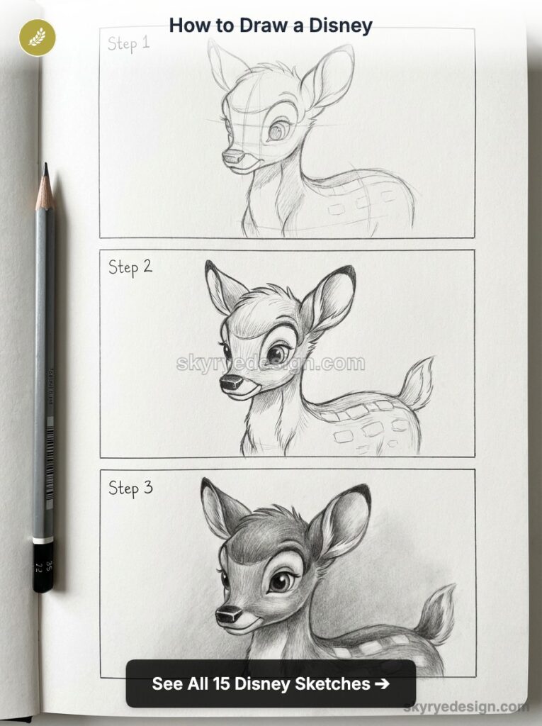
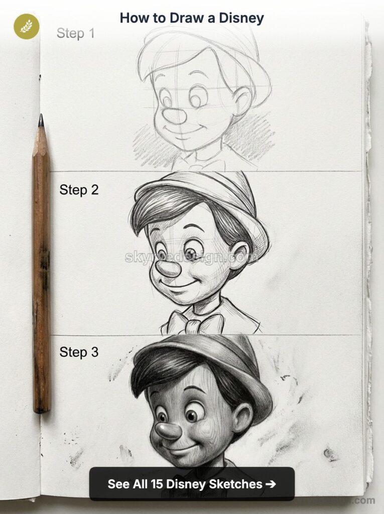
Design principle: Organic, painterly, influenced by European illustration and Art Nouveau. Characters have soft, rounded forms with a quality of weight and warmth. Backgrounds are richly detailed watercolour paintings. The character design is more realistic in proportion than later eras — Snow White herself has relatively naturalistic proportions compared to later princesses.
To draw this era: Focus on soft, rounded head shapes with small, simplified noses and large expressive eyes set relatively close together. Clothing has the soft drape and weight of fabric rather than the graphic flatness of later styles. Use 2B pencil for gentle shading rather than hard outlines — the Golden Age look is painterly, not graphic.
The Silver Age — 1950–1977
Key films: Cinderella (1950), Alice in Wonderland (1951), Sleeping Beauty (1959), The Jungle Book (1967)
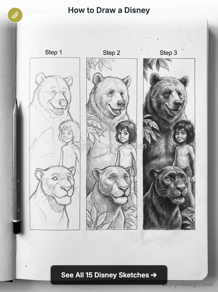
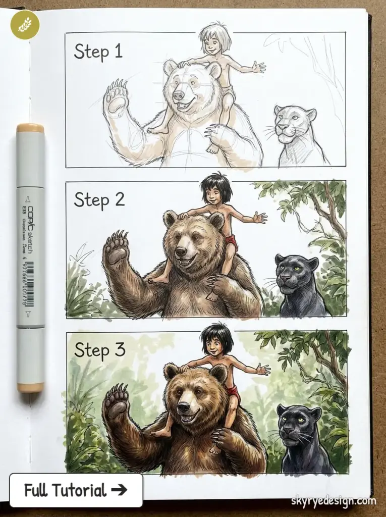
Design principle: More stylised and graphic than the Golden Age, influenced by mid-century modern illustration. Mary Blair’s work on Alice in Wonderland and Peter Pan defined a flat, bold colour aesthetic. Sleeping Beauty shows the influence of medieval tapestries in its angular, stylised character design — Princess Aurora and Maleficent are the most geometric Disney characters of any era.
To draw this era: More angular line quality than the Golden Age. Characters have a mid-century poster quality — bold outlines, flat colour areas, deliberate graphic shapes. Maleficent, in particular, is built entirely from sharp angles and pointed forms. Practice confident, flowing line work rather than tentative hatching — Silver Age Disney is drawn with commitment.
The Disney Renaissance — 1989–1999
Key films: The Little Mermaid (1989), Beauty and the Beast (1991), Aladdin (1992), The Lion King (1994), Mulan (1998), Tarzan (1999)
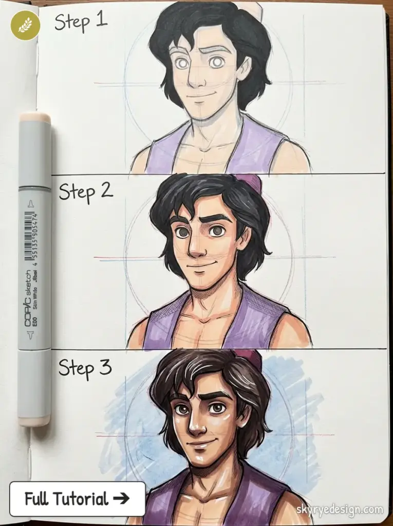
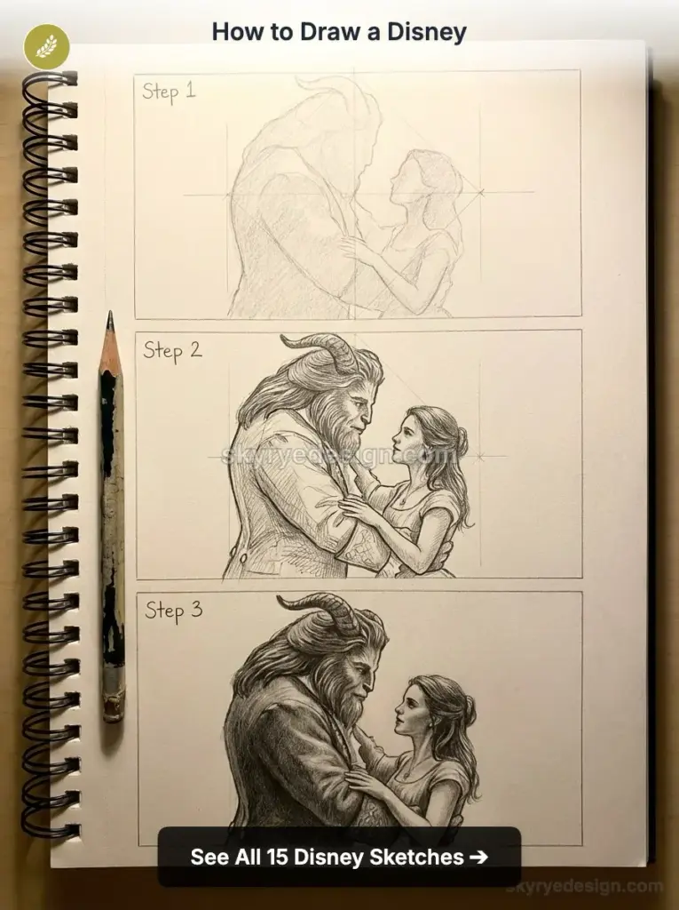
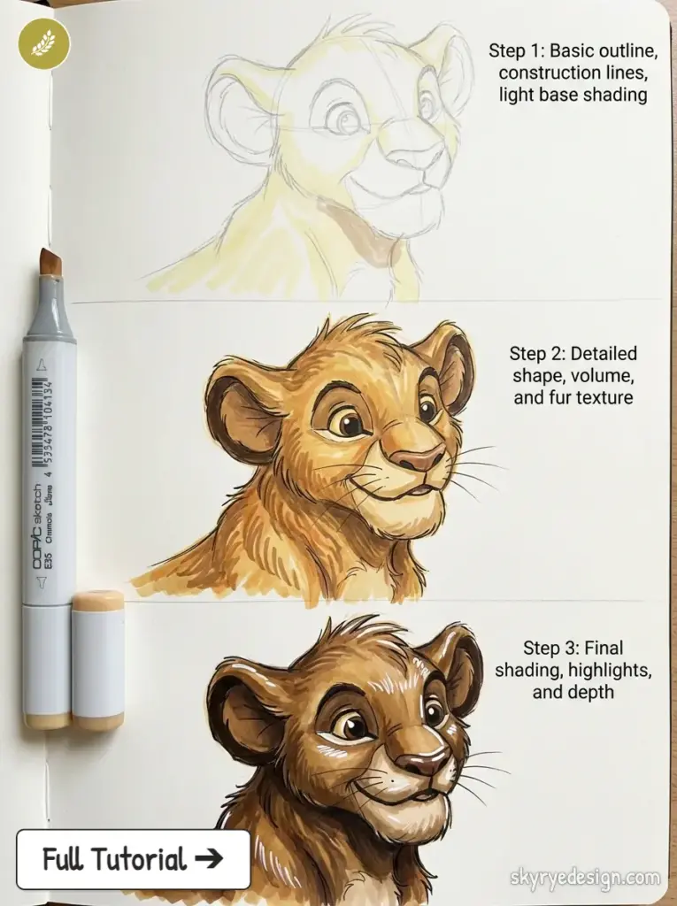
Design principle: Return to expressive, character-driven animation with a new confidence in emotional range. Characters have more dynamic, varied proportions — Simba’s cub proportions (enormous head, tiny body) versus his adult proportions are the most dramatic example. The Renaissance introduced more culturally specific character designs: Mulan’s East Asian-influenced features, Aladdin’s Al Hirschfeld caricature influence.
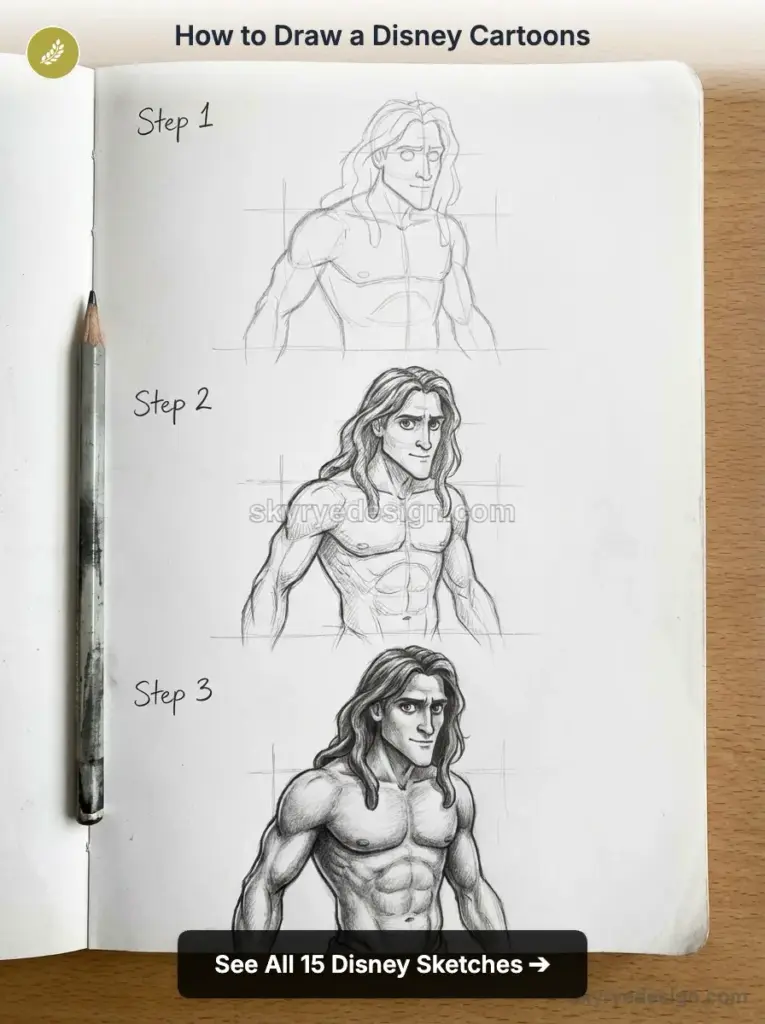
To draw this era: High contrast between feature areas — eyes are very large and expressive, noses are small or absent (Ariel has almost no nose in profile), mouths are wide and mobile. The emotional range of renaissance characters requires more dynamic expression in drawings. Practice the difference between a character’s ‘resting’ design and their emotional extreme — the squash and stretch of their expressions.
The Modern Era — 2009–Present
Key films: Tangled (2010), Frozen (2013), Zootopia (2016), Moana (2016), Encanto (2021), Wish (2023)
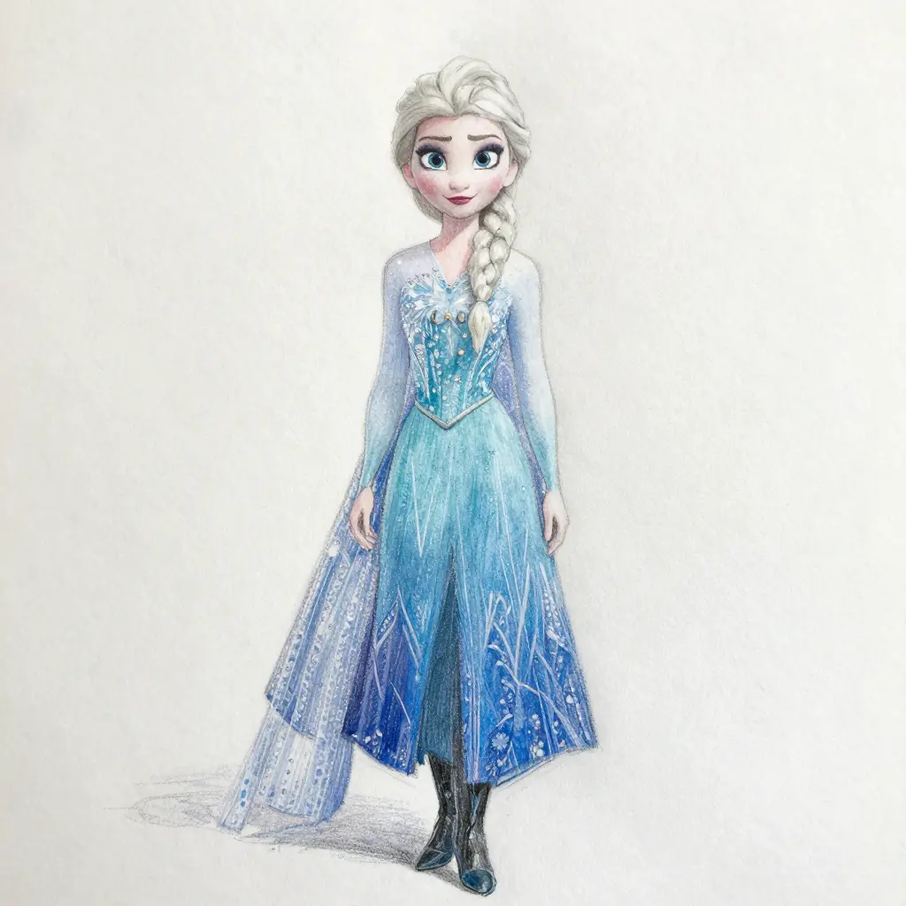
Design principle: Hybrid digital-hand-drawn aesthetic. Characters have the large eyes and simplified features of classic Disney, but rendered with CGI volume and texture. The modern era also shows significantly more diverse character representation: Moana’s Polynesian features, Mirabel’s Colombian-influenced design, and Tiana as Disney’s first Black princess. The design challenge: maintaining the Disney visual DNA while accurately representing diverse human features.
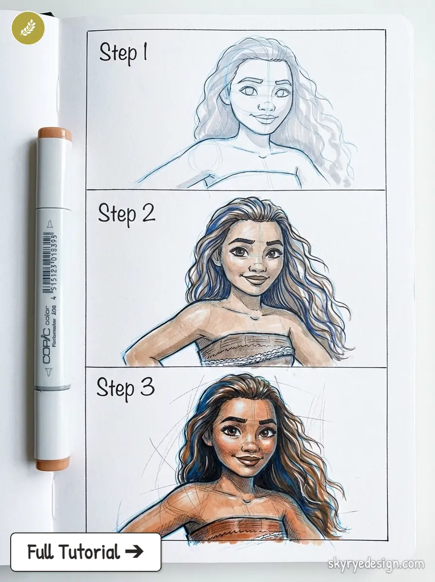
To draw this era: Modern Disney characters have a quality of three-dimensional volume even in 2D sketch form — the face reads as having a front, sides, and depth rather than being a flat oval with applied features. Practice drawing modern Disney characters in three-quarter view before attempting front-on, as the three-quarter view reveals the volume quality that makes them feel contemporary rather than flat.
The 12 Principles of Animation Applied to Disney Drawing
Ollie Johnston and Frank Thomas published ‘The Illusion of Life: Disney Animation’ in 1981, codifying the 12 Principles of Animation that Disney’s Nine Old Men had been applying since the 1930s. These principles were developed for animation — for creating the illusion of movement across frames — but seven of them apply directly to single-image character drawing. Understanding them explains why Disney character drawings have the quality they do.
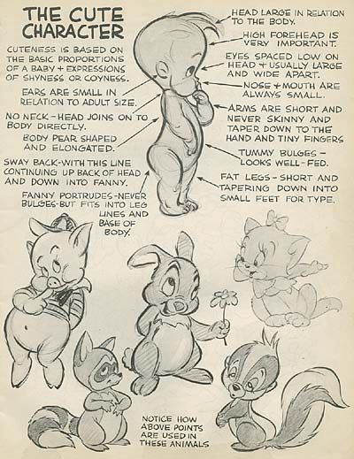
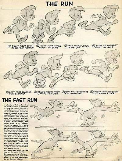
1. Squash and Stretch — Applied to Expressions
In animation, squash and stretch gives objects the illusion of weight and flexibility — a ball squashes flat on impact and stretches tall on the bounce. In character drawing, squash and stretch governs facial expressions. A joyful expression stretches the face vertically: eyes widen upward, cheeks rise, the smile opens. A frightened expression squashes the face horizontally: eyes widen sideways, the head seems to shrink into the shoulders. Apply these directional distortions to expressions — not as cartoon exaggeration, but as the specific direction that the face moves in each emotional state.
2. Anticipation — Applied to Poses
Anticipation is the setup before the main action — a character bends back before jumping, winds up before throwing. In a static drawing, anticipation is expressed in the pose’s implied motion: which direction is the character about to move? A character leaning into the frame rather than standing neutrally in it creates the sense that something is about to happen. The best Disney character poses capture a moment of anticipation — the character is always about to do something, not standing passively.
3. Staging — Applied to Composition
Staging is about directing the viewer’s attention to what matters. The silhouette test: if you fill the character’s entire form with solid black, can you still read the pose and expression? Disney characters are designed so that their silhouette is immediately recognisable and readable — which is why complex, overlapping poses that create confusing silhouettes are avoided. When drawing a Disney character, check the silhouette after completing the outline. If the silhouette is ambiguous, the pose needs adjustment.
4. Exaggeration — Applied to Features and Proportions
The classical Disney definition of exaggeration: remain true to reality, but present it in a wilder, more extreme form. Disney princess eyes are not realistic but they are consistent with the character’s design logic — they’re human eyes pushed to their emotional extreme. Gaston’s jaw is not anatomically possible, but it’s the most extreme version of masculine jawline confidence imaginable. When drawing Disney characters, embrace the exaggeration rather than moderating it toward realism. The exaggerated feature is the one that communicates most clearly.
5. Appeal — The Quality That Makes You Want to Look
Appeal is the most important and least technical of the principles. It’s the quality that makes a character interesting to look at — a clarity of design, a readable personality, a silhouette that is immediately recognisable. Appeal is not the same as likability. Scar, Cruella, Ursula, and Hades all have enormous appeal — they’re fascinating to watch and draw precisely because their design so completely expresses their personality. In drawing, appeal comes from committing to the character’s design logic rather than hedging it: the villain’s angular forms must be fully angular, the hero’s rounded forms fully rounded.
6. Solid Drawing — Three-Dimensionality in a Flat Image
Solid drawing is the principle of understanding characters as three-dimensional objects existing in space — even when drawn in 2D. A solid drawing has volume, weight, and balance. The character’s hands are in front of or behind the body, not floating at the same plane. The head turns in space rather than rotating on a flat surface. In practice: draw characters in three-quarter view before attempting front-on — the three-quarter view forces you to think about the character as an object with depth rather than as a flat face with features. Test your drawings by attempting to draw the same pose from a slightly different angle — if you can’t, the drawing isn’t solid.
Seven Disney Characters: Construction Guides
Mickey Mouse — Steamboat Willie (1928) — present
Head-to-body ratio: Classic proportions: head is 1/3 of total height. Body is roughly circular. Limbs are simplified cylinders.
Key shapes: Three circles: the head circle (primary), two ear circles positioned at approximately 10 o’clock and 2 o’clock relative to the head, touching but not overlapping the head outline. The ears are always perfect circles regardless of the head’s viewing angle — they don’t foreshorten in three-quarter view. The face occupies the lower two-thirds of the head circle, with the eyes sitting on the horizontal guideline at the upper third of the face area.
Expression tip: Mickey’s eyebrows are the primary expression vehicle — they’re thick, expressive arcs that can angle in any direction. A single brow angle change shifts the entire emotional read of the face. Practice the brow first, then confirm the expression in the eyes and mouth.
Winnie the Pooh — Winnie the Pooh and the Honey Tree (1966) — present
Head-to-body ratio: Very exaggerated: enormous circular body, small circular head. Head is approximately 1/5 of total height — much smaller relative to body than most Disney characters.
Key shapes: Primary shape: a large circle for the body, a smaller circle for the head positioned at the upper right of the body circle and overlapping it slightly. The nose is a prominent oval sitting at the face centre — larger than most Disney character noses. Eyes are small, round, and close-set, sitting relatively low on the face. The red shirt ends just above the belly, which is always showing — this exposed belly is a deliberate proportional choice that emphasises the roundness of the body.
Stylized characters still depend on clear weight and balance, so sketch a body base for character drawing before you polish the eyes, costume, or expression.
Expression tip: Pooh’s expressions are gentle and limited in range compared to more dynamic Disney characters. His emotional register runs from content to mildly worried to gently happy — not to extremes. The subtlety of his expressions is part of his appeal. Don’t push Pooh’s expressions too far — it reads as out of character.
Simba (Cub) — The Lion King (1994)
Head-to-body ratio: Extreme exaggeration: head is approximately 1/2 of total body height in cub form — larger relative to body than almost any Disney character.
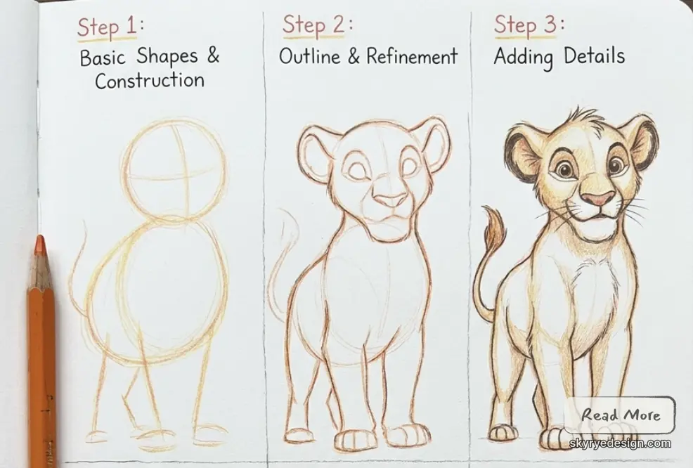
Key shapes: The head is a large circle. The jaw extends outward from the lower half of the circle, widening to a broad flat muzzle. The mane fringe (small tuft on the forehead) sits at the top of the circle. The body is a very small oval positioned below and slightly behind the head. The legs are short stubs. The tail is a thin line ending in a small tuft. All four paws are round circles — no individual toe or claw detail in the cub design.
For a slower walkthrough of this character, use this how to draw Simba guide after you understand the head-to-body ratio.
Expression tip: Simba’s expressions are read primarily through his large eyes and brow, not his muzzle. The muzzle’s flat structure limits its mobility. Focus expression effort on the eye area — the pupil size (small in fear, large in wonder) and brow angle communicate most of his emotional range.
Stitch (Experiment 626) — Lilo & Stitch (2002)
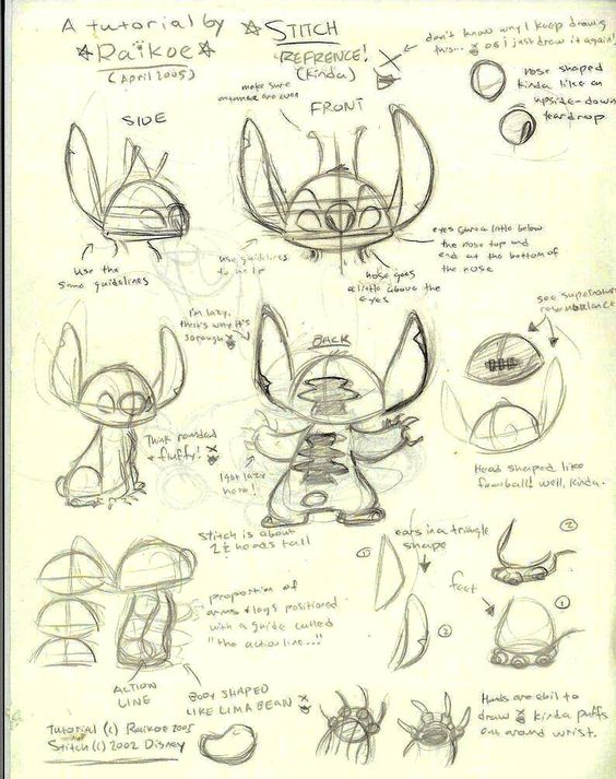
Head-to-body ratio: Very low stance: head and body are approximately equal in height, giving Stitch a wide, grounded proportion unlike any other Disney character.
Key shapes: The primary shape is a wide horizontal oval for the body, with the head as a smaller circle on top. The ears are large and bat-like, positioned at the top sides of the head and angled outward. The four arms (two primary, two smaller) attach to the upper sides of the body. The legs are very short and wide, creating the characteristic wide-stance crouch. Six small oval spots sit on the back.
Expression tip: Stitch’s dual nature — destructive alien versus loving family member — is read entirely through eye and brow expression. Narrowed eyes with a scowl read as ‘Experiment 626 mode’; wide, open eyes with soft brows read as ‘Stitch mode’. The physical form barely changes — only the face.
Ariel — The Little Mermaid (1989)
Head-to-body ratio: Renaissance princess proportions: head is approximately 1/8 of total height (far smaller than Golden Age characters, more fashion-illustration-influenced).
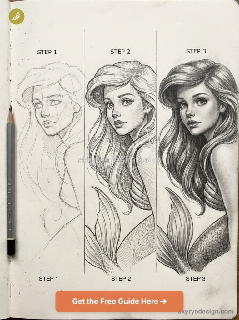
Key shapes: The head is a wide oval with the widest point at the forehead, narrowing to a small chin. The eyes are very large and set wide apart — each eye is approximately 1/5 of the face width. The nose is minimal in profile (a small upturned suggestion) and barely visible from the front. The mouth is wide and full. The signature red hair is a major shape element — it has volume and movement that must be blocked in as a separate shape before individual hair lines are drawn.
Expression tip: Ariel’s eyes have the characteristic Renaissance Disney sparkle — multiple small highlight dots at different positions within the iris. The largest highlight is in the upper-right of the iris; a smaller secondary highlight sits below and to the left. These two highlights create the luminous quality specific to this era’s character eyes.
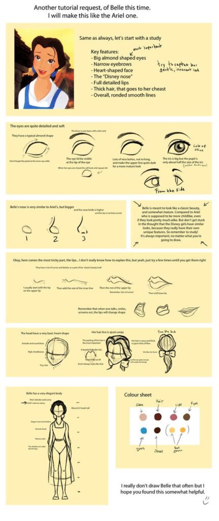
Belle — Beauty and the Beast (1991)
Head-to-body ratio: Similar to Ariel — 1/8 head-to-body. Belle was specifically designed to look different from Ariel and other contemporaneous Disney princesses.
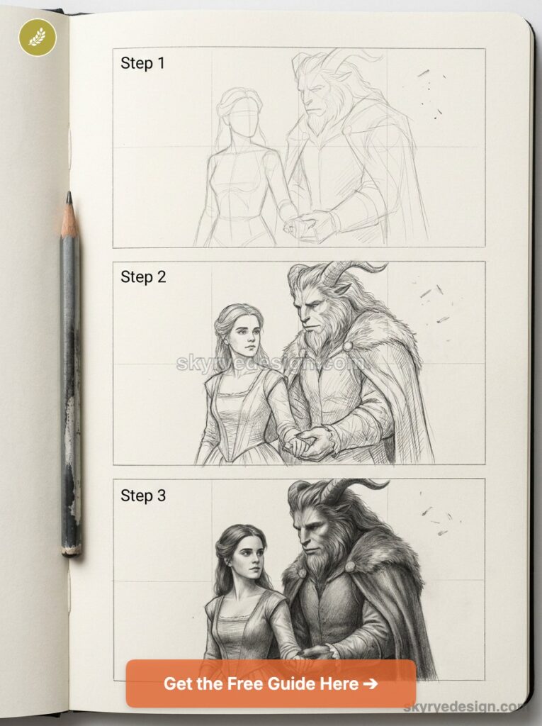
Key shapes: The head has a rounder, more symmetrical oval than Ariel’s wider forehead. The eyes are slightly closer together and the brow is more prominent and expressive. The nose is slightly more defined (a small diagonal line visible from three-quarter view). The signature centre-parted hair with bun is a key design element — block the hair shape before drawing the face. Belle’s library-blue dress in the first act and gold ball gown in the second act have very different silhouette shapes that affect how the character reads.
If princess proportions are your main goal, the Cinderella drawing tutorial is a useful companion because the gown, hair, and face construction are slower and more beginner-friendly.
Expression tip: Belle was animated by Glen Keane partly with reference to live-action footage — she has a slightly more naturalistic movement quality than Ariel. Her expressions include more subtle, intellectual registrations (curiosity, quiet determination) alongside the larger emotional expressions. Don’t limit Belle’s expression range to broad emotions — her subtler expressions are equally characteristic.
Mirabel Madrigal — Encanto (2021)
Head-to-body ratio: Contemporary Disney proportions — slightly less exaggerated than Renaissance era, with more culturally specific features representing Colombian heritage.
Key shapes: The head is a circle with a prominent round chin. The eyes are very large with thick dark lashes and circular glasses that overlap the upper eye area — the glasses are a construction element, not an afterthought, and must be placed in the construction phase.
The nose is more defined than most Disney princesses — a specific upturned shape with visible nostrils that was deliberately designed to reflect Colombian features. The hair is very full — a large mass of curly dark hair that extends significantly beyond the head circle.
Expression tip: Mirabel’s glasses are the single most distinctive design element and the most difficult to draw correctly. The frames are round, sit relatively low on the face, and intersect with the upper portion of the eye circles. If the glasses don’t sit at the correct position and angle, the character’s entire read shifts. Draw the face construction, then the glasses, then fill in the eyes within the glasses frame.
Practical Drawing Techniques: From Construction to Finished Character
The Six-Stage Construction Process
- Primary shape: Establish the head shape — circle, oval, or character-specific form. Draw it lightly with HB pencil. This shape determines everything that follows.
- Facial guidelines: Add the horizontal and vertical construction cross. For three-quarter views, the vertical line curves toward the near side of the face. Check that the proportions look right before proceeding.
- Secondary shapes: Add the body in its primary shape, then limbs as simplified cylinders or rectangles. Confirm the overall pose and proportions at this stage — before any features are placed.
- Feature placement: Place eyes on the horizontal guideline, nose and mouth on the vertical line, in the correct proportions for the specific character. Don’t draw the features in detail yet — just their position and rough scale.
- Detail and character: Refine all features to their final form. Add costume elements, hair shape, and character-specific details. Use 2B for the confirmed outline lines.
- Ink and clean: Ink confirmed lines with a 0.5mm liner for primary outlines and 0.3mm for interior details. Erase all construction lines. The line weight hierarchy — heavier outline, lighter interior — gives the Disney graphic quality.
Drawing Disney Eyes: The Most Important Skill
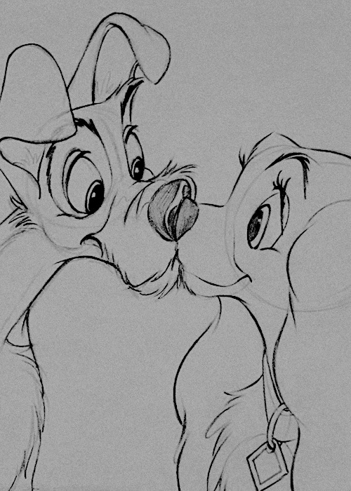
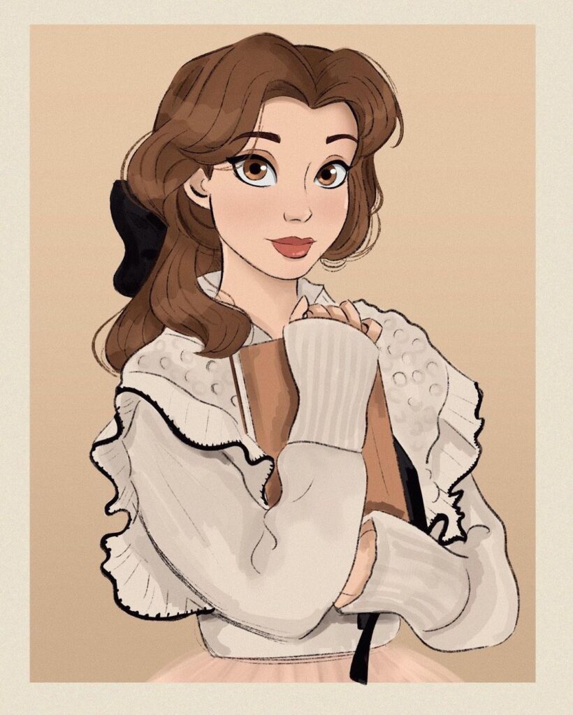
Disney eyes are the character’s primary communication tool and the most technically demanding element of the drawing. The construction sequence for classic Disney eyes: (1) draw the iris as a circle or oval, (2) add the filled pupil circle within the iris, (3) draw the upper eyelid line as a curve that cuts off approximately 15% of the top of the iris, (4) add the lower lid as a gentler curve, (5) add the highlight: one larger circle in the upper-right of the iris, one smaller circle in the lower-left.
The two-highlight system — also called the ‘Disney sparkle’ — creates the characteristic luminous quality of Disney characters’ eyes and is the single detail that most reliably signals ‘Disney’ to the viewer.
Disney Hair: Volume Before Line
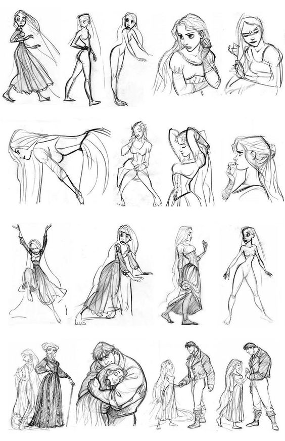
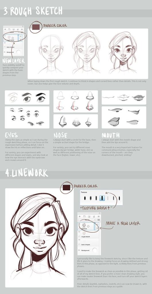
Disney hair is always drawn in two stages: volume first, individual strands second. Block in the overall hair shape as a solid mass before drawing any individual hair lines — the mass determines the silhouette and the sense of weight. Individual hair lines flow from the parting or root point outward, following the surface of the hair mass.
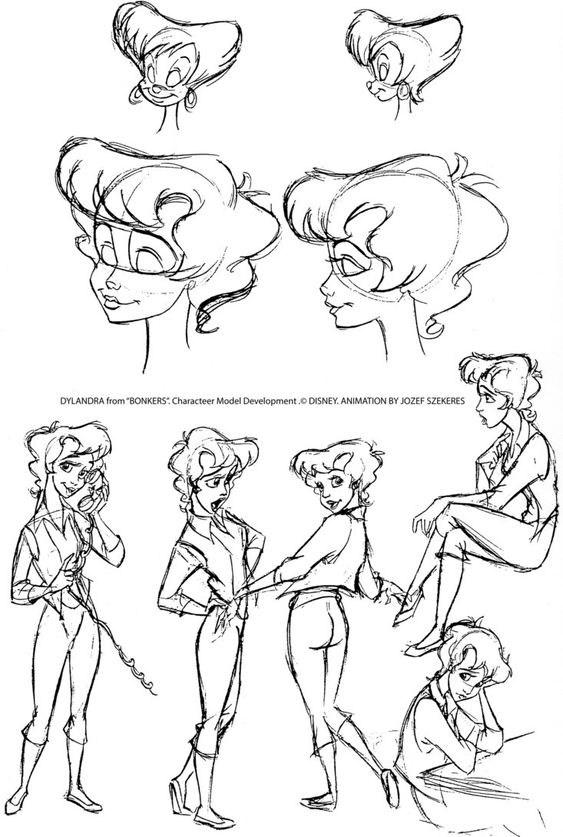
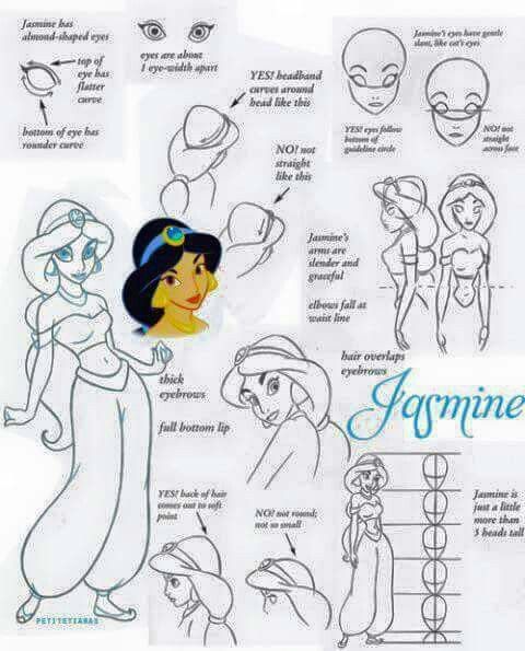
Never draw individual hair lines first and try to build volume from them — this produces a flat, stringy result. The hair mass should feel like it has the same volume and weight as the head it sits on.
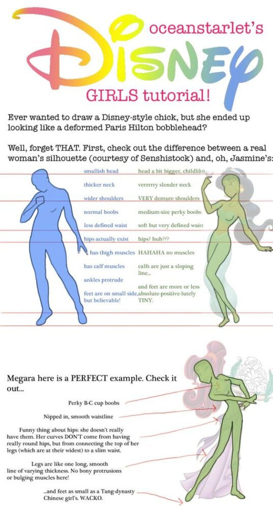
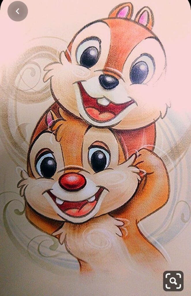
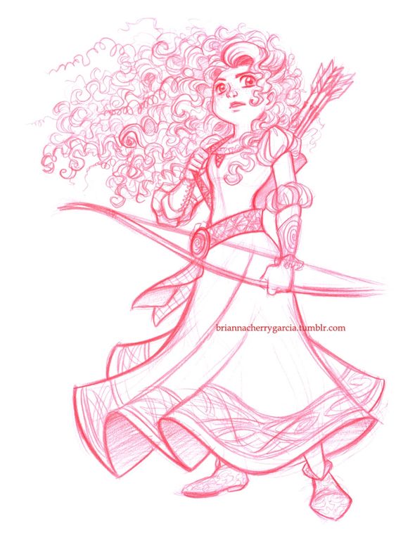
✏ Drawing note: The fastest way to improve Disney character drawings is to draw each character from their most recognisable three-quarter view angle, not from straight front-on. The three-quarter view forces you to understand the head as a volume, confirms that the facial guidelines are working correctly, and is the view in which most
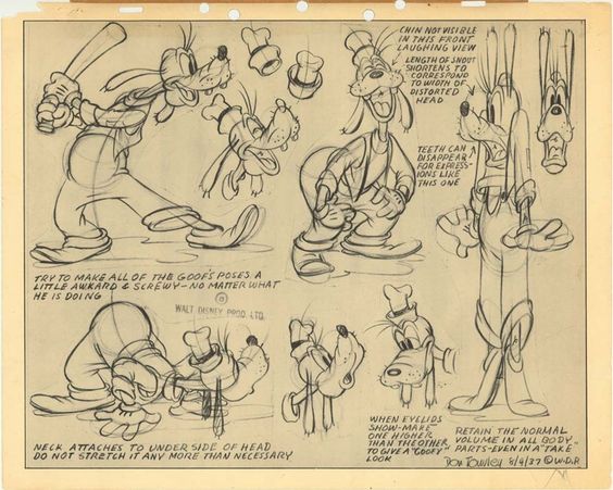
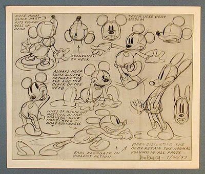
Disney characters are the most expressive. Once the three-quarter view is confident, the front-on and profile views are significantly easier because you understand the three-dimensional structure you’re projecting onto a flat surface.
Materials: What You Need to Draw Disney Characters
Disclosure: This post contains affiliate links. As an Amazon Associate I earn from qualifying purchases. If you buy through links in this post, we may earn a small commission at no extra cost to you.
- Pencils: Faber-Castell 9000 in HB (construction lines), 2B (confirmed outlines), 4B (darkest shadows and deep feature definition). The HB/2B/4B trio covers every value range needed for Disney character drawing.
- Paper: Strathmore 300 Bristol smooth pad (~$18, 9×12 inch). The smooth surface supports clean ink lines without feathering, and handles erasing of construction lines without surface damage.
- Kneaded eraser: Faber-Castell kneaded eraser (~$3). Essential for removing construction lines without disrupting the confirmed 2B outlines. Shape it to a point for precise erasure in the interior of small features.
- Ink liners: Sakura Micron 05 (0.45mm) for primary character outlines. Micron 01 (0.25mm) for interior detail lines, eyelid curves, and small feature details. This line weight difference — heavier outline, lighter interior — is the defining graphic quality of Disney character drawings.
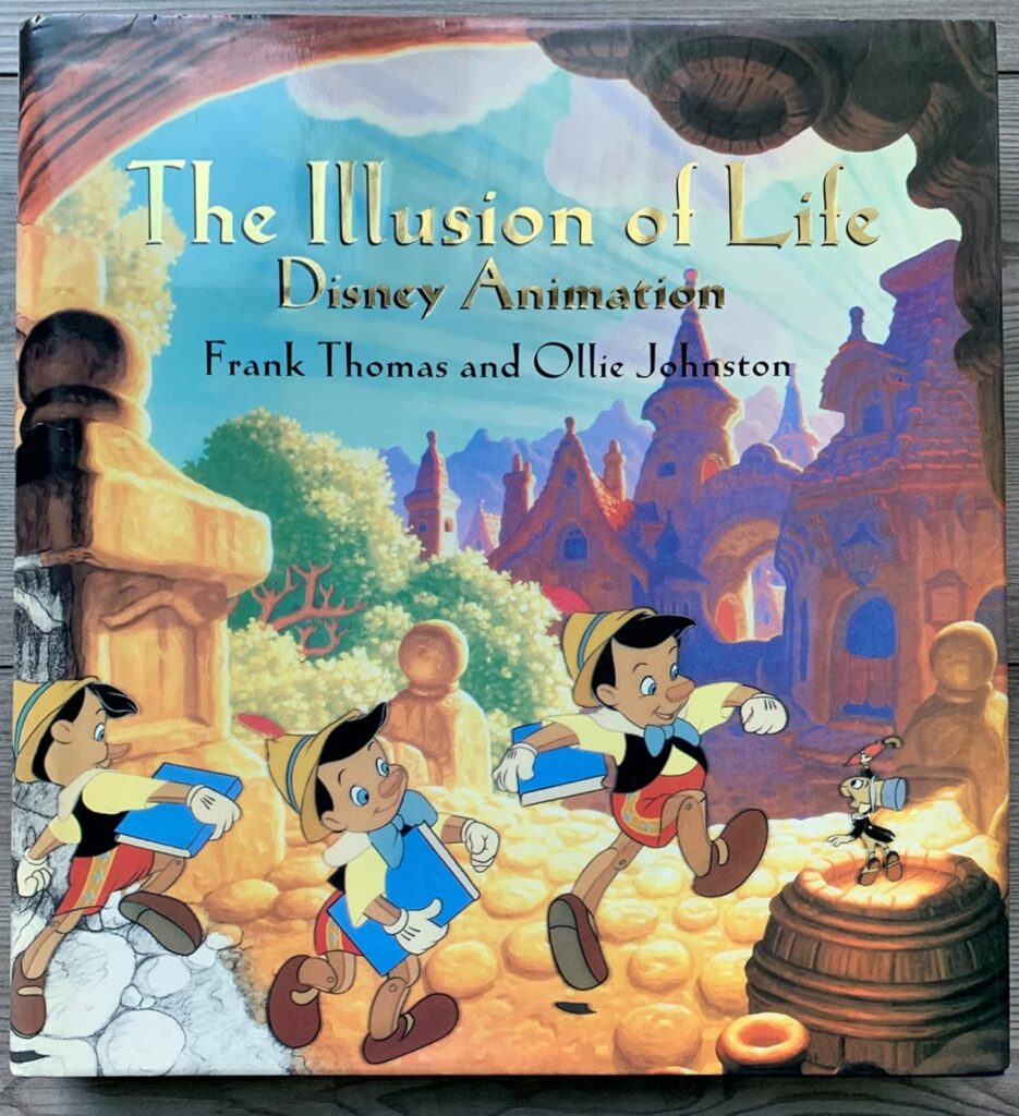
- Reference book: ‘The Illusion of Life: Disney Animation‘ by Ollie Johnston and Frank Thomas (1981, out of print but available secondhand from approximately $40-80) — the original source for the 12 Principles and the most comprehensive technical and historical reference on Disney character drawing available.
- Digital option: Procreate on iPad with an Apple Pencil — the most widely used digital tool for Disney-style character drawing, with pressure sensitivity that replicates the line weight variation of traditional inking. The ‘Inking’ brush set in Procreate is closest to the Micron liner quality. Clip Studio Paint is the preferred option for animators transitioning from traditional drawing.
Common Disney Drawing Mistakes
Most Disney-style drawings fail before the details begin. The ears float, the eyes sit on different planes, or the body shape fights the character’s personality. Before you erase everything, check these fixes:
- Decorating before construction: place the head, body, and facial cross first.
- Weak silhouette: fill the character shape in black mentally; if the pose is unclear, redraw it.
- Over-realistic eyes: Disney eyes are designed for emotion, so the eyelid, iris, and highlight need a clear expression job.
- Mismatched shape language: a soft, friendly character should not suddenly be built from harsh triangles unless the story needs that contrast.
- Flat head turns: curve the facial guideline cross around the head so the features sit on a believable plane.
For a softer character study, this Winnie the Pooh drawing guide breaks the bear into simple shapes before moving into the face, shirt, and honey-pot details.
FAQ About Disney Drawing Style
What defines the Disney drawing style?
Disney drawing style is defined by clear shape language, readable silhouettes, expressive exaggeration, and solid construction. Round shapes usually feel friendly, square shapes feel sturdy, and triangular shapes feel sharper or more dangerous. The style looks polished on screen, but the drawing underneath is practical: simple forms, a facial guideline cross, strong expression, and clean line weight.
How do you draw Disney characters step by step?
Start with a tiny silhouette, then build the head and body from simple shapes. Add the facial guideline cross before drawing the eyes, nose, and mouth. Once the construction works, push the expression, clean the outer contour, and add costume or hair details last. This keeps the character from becoming a decorated flat face.
What should beginners study in Disney character sketches?
Beginners should study thumbnails, model sheets, expression sheets, and rough construction sketches before finished artwork. Look for the head-to-body ratio, the eye line, the major shape family, and the silhouette. A rough Disney character sketch often teaches more than polished art because you can still see the decisions underneath.
How does shape language work in Disney character design?
Shape language connects geometry with personality. Circles suggest softness and approachability, squares suggest strength and reliability, and triangles suggest danger, speed, or tension. Disney character design often mixes these shapes, but one family usually dominates. If the shapes do not match the character, the drawing can feel wrong even when the features are accurate.
Why do Disney eyes look different from realistic eyes?
Disney eyes are built for emotion and readability, not realism. They are usually larger, clearer, and more graphic than real eyes, with simplified eyelids, strong brows, and clean highlights. The important part is that both eyes still follow the facial guideline cross. Big eyes will look strange if they ignore the head turn.
Which Disney character is easiest to draw first?
Mickey Mouse is usually the easiest first Disney character because the design is built from simple circles and clear spacing. Stitch is a good next step because his oversized ears, squat body, and expressive eyes teach exaggeration. Simba is useful after that because the cub proportions force you to control head size, muzzle placement, and brow expression.
How do you make a Disney-style drawing look less stiff?
Give the pose a clear line of action, tilt the head, and avoid making both sides of the body mirror each other. Check the silhouette at thumbnail size before polishing. I usually redraw the pose smaller when it feels stiff, because a tiny sketch makes the movement problem obvious before I waste time cleaning the line art.
What is the difference between classic and modern Disney art style?
Classic Disney art style often has softer hand-drawn edges, painterly warmth, and simple rounded construction. Modern Disney art style keeps the big eyes and expressive appeal, but the characters often feel more three-dimensional because of CGI influence. When sketching modern characters, three-quarter views and facial volume matter more than a flat front-facing outline.
Next Disney drawing practice
For a focused character exercise, try the Disney Stitch drawing guide; it is useful for oversized ears, rounded shapes, and expressive cartoon features.
If you want an animal character next, practice Simba’s big-head cub proportions, muzzle placement, and brow expression before moving into the next Disney prompt.
For a broader warm-up list, open the cartoon character drawing practice guide and compare silhouettes before you start polishing details.
For a simpler template-based practice session, use a gacha art base to test big-head proportions, poses, and outfit shapes.
For Disney-style faces, a side profile drawing tutorial is useful for simplifying the forehead, nose, lips, chin, and expressive hair shape without losing structure.
The same big-shape-first thinking works for character faces too; this anime eyes step-by-step guide is a good practice stop before adding a finished expression.
For adjacent character-driven practice, try these Harry Potter drawing ideas and compare how the silhouettes stay readable before the story details appear.
If you want a different stylized face system, this anime character canvas guide gives you another way to think about big eyes, hair shapes, and expressive features.
For a simple fantasy prompt after Disney character drawing, use the princess and knight drawing guide to practice costume shapes and storytelling poses.
- 3.6Kshares
- Facebook0
- Pinterest3.6K
- Twitter3
- Reddit0