Some cartoon characters are just satisfying to draw. Partly it’s the silhouettes — you can recognize SpongeBob or Goofy from a thumbnail. Partly it’s the exaggeration: cartoon anatomy doesn’t have to be right, it has to read. That’s a different skill than realism, and honestly a more forgiving one to start with.
Here are ten characters worth practicing. I picked these because they each teach you something specific — not just because they’re popular.
Use this as a cartoon character drawing practice list: start with the simple shapes, copy the silhouette, then push the expression until the character reads from across the room. If you want a broader warm-up first, try this guide to draw cartoon characters; if your sketches feel stiff, revisit these essential drawing techniques before adding costume details.
How to practice cartoon character drawing
To practice cartoon character drawing, choose one recognizable character and break it into three layers: the silhouette, the construction shapes, and the expression. Sketch the big shape first, then place the eyes, mouth, hands, and costume details only after the pose feels readable. I usually ask one question before cleaning up the linework: would I still know who this is if the drawing were only a black shape? If the answer is yes, the details have something solid to sit on.
Easy cartoon character drawing step by step
For an easy cartoon character drawing, keep the first pass almost too simple: one big shape for the head, one shape for the body, and a loose line for the pose. Add the eyes and mouth only after the silhouette reads clearly. This makes beginner sketches cleaner because you are solving the character before you decorate it.
| Step | What to draw | Quick check |
|---|---|---|
| 1 | Block in the head and body with circles, boxes, or bean shapes. | The character should read as a tiny silhouette. |
| 2 | Add the eye line, mouth line, and main pose angle. | The expression should be clear before details. |
| 3 | Place hands, feet, ears, hair, or costume shapes. | Use only the features that identify the character. |
| 4 | Clean the outline with confident curves and corners. | Keep the biggest shape stronger than the small lines. |
| 5 | Add color, shadows, or texture last. | Color should support the shape, not hide weak construction. |
| Character | What to study | Best beginner focus |
|---|---|---|
| Bugs Bunny | Long ears, relaxed pose, muzzle shape | Silhouette and facial expression |
| Mickey Mouse | Circle construction and clean proportions | Simple shapes |
| SpongeBob | Boxy body, big face, tiny limbs | Shape language |
| Bart Simpson | Spiky hair and compact body rhythm | Recognizable outline |
| Popeye | Forearms, chin, squint, pipe | Caricature exaggeration |
If you want more pop-culture practice after cartoon characters, these Harry Potter drawing ideas for beginners are good for training readable icons, props, and simple character-adjacent shapes.
1) Bugs Bunny


Bugs Bunny is a classic cartoon character created by Warner Bros. He first appeared in the 1940 cartoon “A Wild Hare.” Since then, he has become an iconic figure in animation.
Known for his laid-back attitude and clever wit, Bugs is often seen outsmarting his foes. His catchphrase, “What’s up, Doc?” highlights his casual demeanor.
Bugs Bunny’s design features long ears, a gray and white color palette, and a memorable smile. Artists appreciate the character’s expressive features, which allow for a range of emotions.

Drawing Bugs requires attention to his distinctive proportions and facial expressions. Observing his poses in various cartoons can aid in capturing his personality.
In addition to his cartoon appearances, Bugs has starred in feature films and video games. He remains a beloved character, representing the golden age of animation.
2) Mickey Mouse


Mickey first appeared in Steamboat Willie in 1928 — one of the earliest synchronized sound cartoons, which is most of why it was a big deal at the time. Walt Disney gets most of the credit in the official story, but Ub Iwerks did the actual drawing. The original Mickey design was largely Iwerks’ work, built to be animated consistently across thousands of frames by a team. That constraint shaped everything about how he looks.
The construction is almost purely geometric. Circle for the head, two circles for the ears, oval eyes, rounded snout. It breaks down into basic shapes faster than almost any other major cartoon character, which is why he shows up in so many drawing tutorials for beginners. Easy to construct, hard to make look exactly right — there’s a difference.
Ear placement is the thing that trips people up. Mickey’s ears always appear as two full circles regardless of his head angle. They don’t foreshorten, they don’t rotate, they just stay round. It’s a deliberate stylistic lock-in from the early years and it looks immediately wrong when someone breaks it, even if they can’t say why.

The face is where the actual drawing challenge lives. His standard smiling pose is easy. But shift the brow angle slightly, change the curve of the mouth, move the pupils — suddenly it’s a completely different emotion. Disney animators spent decades developing that vocabulary. If you’re drawing Mickey for anything beyond a basic reference sketch, that’s the part worth spending time on.
Artists can find drawing Mickey Mouse approachable due to his geometric shapes. This simplicity allows for creativity while maintaining the character’s essence.
3) SpongeBob SquarePants


SpongeBob was created by Stephen Hillenburg, who had a background in marine biology before animation. That’s not trivia — it explains why Bikini Bottom feels like an actual place rather than a random cartoon setting. The creatures behave strangely but consistently, like someone who knew real ocean biology decided to break the rules on purpose.
Drawing him is mostly about ratios. He’s close to a square but not quite — slightly taller than wide, with a gentle taper toward the bottom. His eyes are enormous relative to his face, sitting high and close together. If the eyes are too small or too far apart he stops reading as SpongeBob immediately. That’s the one proportion worth getting right before anything else.

The specific details: gap between the front teeth, small round nose, pants that sit almost at his armpits, short legs, shoes that are wider than his body. None of it is complicated to draw — these are basic shapes. But they’re exact. Change the shoe size or drop the pants lower and something feels off even if you can’t name why.
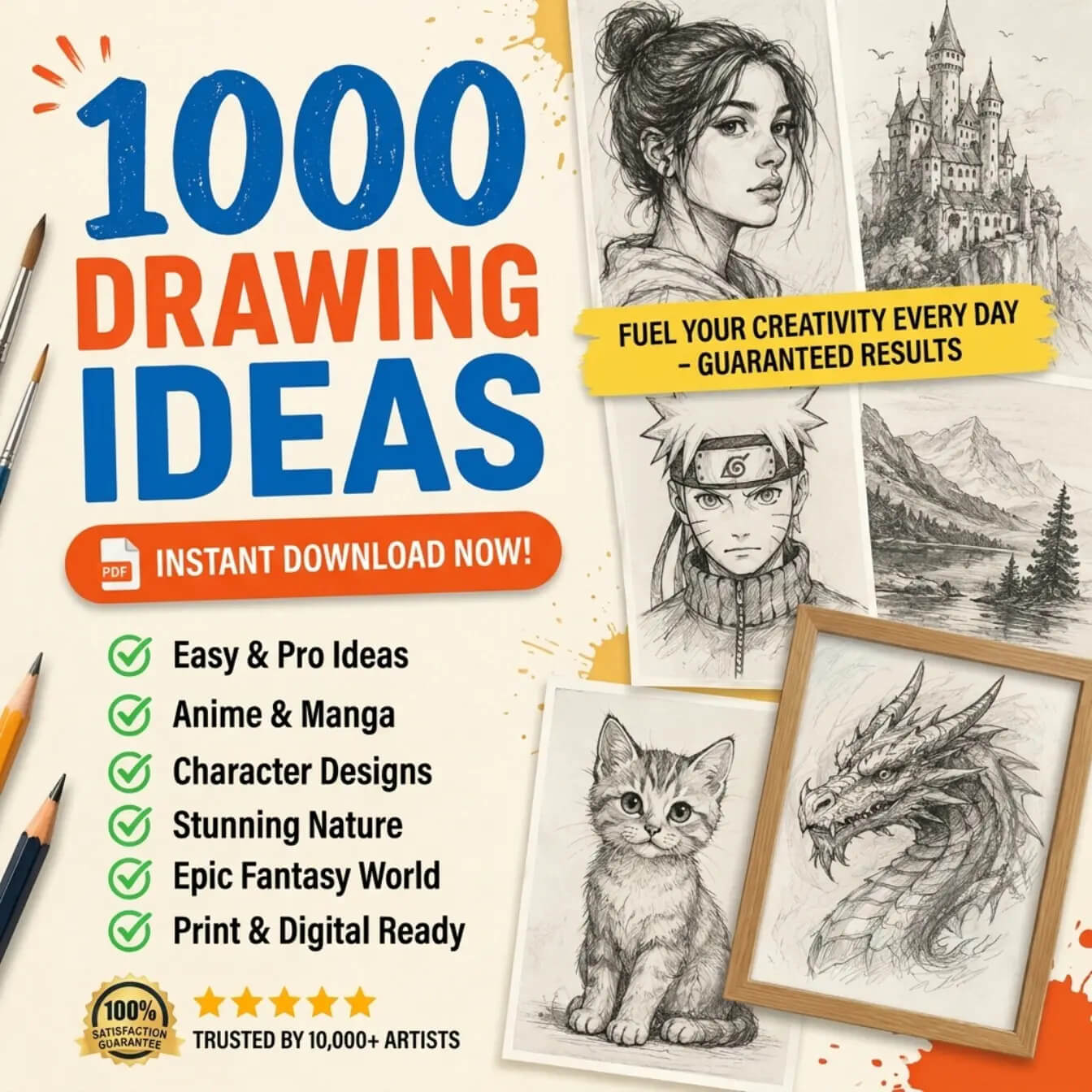
1000 Drawing Ideas for Artists
Get a free PDF packed with easy drawing ideas, anime prompts, character concepts, nature inspiration, and fantasy sketchbook challenges.
Download Free PDFFor background elements, jellyfish are the easiest addition — simple bell shape, a few trailing lines. Bubbles fill space without competing with the figure. If you want to go further, the Krusty Krab has a very specific look: the lobster trap shape, the anchor sign. Those details reward people who actually know the show.
4) Scooby-Doo


Scooby-Doo debuted in 1969, created by Joe Ruby and Ken Spears for Hanna-Barbera. The origin story is worth knowing: CBS executives thought Saturday morning cartoons were too violent, so the mandate came down to make something gentler. Ruby and Ken Spears landed on a cowardly Great Dane solving mysteries with a group of teenagers. It shouldn’t have had the staying power it did. Fifty-plus years later it’s still running in some form.
Drawing him starts with understanding what he actually is versus what he looks like. Great Danes are lean, elegant dogs — long legs, deep narrow chest, smooth coat. Scooby takes that silhouette and loosens everything. Bigger head, rounder body, hunched posture, those characteristic spots. He reads as a Great Dane if you squint, which is probably intentional. Close enough to be recognizable, exaggerated enough to be expressive.
The face does most of the work. Wide snout, droopy ears, eyes that can go from relaxed to full panic in one frame. That panic expression — pupils shrunk, ears flat, mouth open — is probably the most drawn version of him for good reason. Scooby scared is funnier and more specific than Scooby happy. It’s also harder to get right without the expression reading as generic cartoon fear rather than specifically Scooby fear. The snout shape and the ear angle are what make the difference.
When drawing Scooby-Doo, it’s important to capture his expressive eyes and floppy ears. His iconic collar with a dog tag adds a recognizable touch. Emphasizing his clumsy, lovable nature can bring the character to life on the page.
Artists can experiment with different poses, showcasing Scooby-Doo’s playful side. His interactions with other characters, like Shaggy, often highlight his humorous and loyal personality. This adds depth to the illustrations and makes them relatable for fans.
5) Bart Simpson


Bart Simpson is one of those characters where the silhouette alone is enough. Spiky yellow hair, red shirt, blue shorts. You know who it is before the face shows up.
I always start with the head. It’s rounder than people expect, and those spikes — they look random but they’re not. They’re evenly distributed, and if you mess up the count or the spacing, he stops looking like Bart and starts looking like a generic cartoon kid. The eyes are wide-set. The smirk is massive. That smirk does most of the work.
The proportions are what sell the character. His head is huge. Way bigger than it would be on a real kid. That’s the whole point — it’s what makes him read young instead of just short.
Pick an active pose if you can. Skateboard lean is my go-to because the body angle gives you something to work with compositionally. The couch slouch works too, but it’s harder to make interesting. Bart’s laziness has to look like a choice, not a default.
Lines: bold, deliberate, no second-guessing. The Simpsons style doesn’t leave room for sketchy strokes — everything is a clean outline with flat fills inside. Yellow first, then drop in the red shirt against it. The contrast does the heavy lifting. Nothing to render, nothing to blend. Just commit to the shapes.
6) Fred Flintstone


Fred Flintstone has been around since 1960. The show was basically The Honeymooners set in a cartoon Stone Age — Fred is Ralph Kramden with a flat-top and a dinosaur for a lawnmower. It shouldn’t work as well as it does.
The design is minimal. Orange tunic with the jagged hem, blue tie, and that flat-top hair with just a slight wave at the front. Hanna-Barbera was drawing for tiny 1960s TV screens, so everything had to read fast and clear. No fine detail, no gradients. Just shapes and contrast.

Fred’s jaw is what you have to get right first. It’s massive — wide and square, almost as wide as his shoulders. I’ve redrawn it more times than I’d like to admit on my first few attempts. Too narrow and he looks like a generic caveman. Too low and he looks like a bulldog. There’s a specific proportion where it clicks, and once you find it, everything else — the small nose, the close-set eyes, the flat brow — snaps into place around it.
Stance: chest out, feet planted, no hesitation. Fred is always about to do something with full commitment, even when that something is going to go completely wrong in about four seconds. That pre-disaster confidence is his whole deal. Draw him mid-“Yabba-Dabba-Doo” if you want to capture it — arms up, mouth wide open, whole body leaning into whatever just made him happy. A neutral standing pose is fine for practice, but it doesn’t really look like Fred.
7) Popeye


Popeye started in someone else’s comic strip. “Thimble Theatre” had been running for a decade when E.C. Segar brought in a sailor as a throwaway character in 1929. That throwaway character eventually ate the whole strip.
The design is pure caricature, and it’s aggressive about it. One eye clamped shut. The other wide open. A chin that doesn’t just stick out — it leads the whole face forward, like his jaw is always arriving somewhere first. Forearms bigger than his head. A pipe that never leaves his mouth even when he’s talking, which, if you’ve ever tried to draw that, is its own puzzle.

I start with the chin and the forearms every time. Those two things set the proportions for everything else. The chin goes forward, not down — that’s the mistake I kept making early on. And the forearms have to be genuinely absurd. If they look slightly big, you’ve drawn a sailor. If they look cartoonishly huge, you’ve drawn Popeye.
The squint is harder to get right than it looks. It’s not a wink. It’s not pain. It’s just permanent — like he’s been looking into the sun for thirty years and stopped noticing. All the expression lives in the one open eye. Add the pipe at the corner of the mouth and you’re most of the way there.
The spinach thing took on a life of its own. There’s a story that canned spinach sales jumped because of the cartoons. Probably exaggerated. But the idea that a cartoon sailor genuinely changed what kids ate is too good to fact-check too hard.
8) Betty Boop


Betty Boop showed up in 1930 in a Fleischer Studios short called “Dizzy Dishes” — and she wasn’t even the main character. She was a background singer. By the next few cartoons she had her own series.
The design pulls straight from the Jazz Age. Short black bob, huge eyes with heavy lashes, a dress that sits off the shoulders and ends well above the knee. In 1930, that was genuinely provocative. The Hays Code came along a few years later and toned her down considerably — longer skirts, less flirting, more wholesome storylines. The pre-Code Betty is a different character than the one most people grew up with.
When I draw Betty, the head shape comes first. It’s almost a perfect circle, which sounds simple until you try to fit the features into it correctly. The eyes are enormous — they take up a third of the face easily. The nose is tiny, just a small curve. The mouth is a cupid’s bow with a dot at each corner. Everything is compressed into the bottom half of that circle, which gives her that wide-eyed, slightly surprised look even when she’s just standing still.

The bob is structural, not decorative. It frames the face and adds width at the jaw line, which balances the giant eyes up top. Get the hair wrong and the proportions fall apart.
“Boop-Oop-a-Doop” is hard to draw, but the moment right before it — mouth open, shoulders up, one hand raised — that’s the pose.
9) Tom (from Tom and Jerry)


Tom is a classic animated character from the series “Tom and Jerry,” created by William Hanna and Joseph Barbera. He is depicted as a blue-gray domestic cat who endlessly chases the clever mouse, Jerry.
Known for his expressive features, Tom’s design includes large ears, a rounded body, and a distinctive facial expression that conveys a range of emotions. His character often blends humor with frustration as he tries to catch Jerry but fails repeatedly.

In terms of drawing Tom, focus on his simple shapes and dynamic poses. Capturing his movement is key, as he often exhibits exaggerated actions when pursuing Jerry.
Tom’s character showcases a blend of slyness and determination. He can be both a comical villain and a sympathetic figure, adding depth to his role in the series.
Artists can experiment with various styles, from classic animation to more modern interpretations. Attention to detail, especially in his eyes and facial expressions, can enhance the portrayal of his character’s personality.
10) Jerry (from Tom and Jerry)


Jerry is a classic character from the beloved animated series “Tom and Jerry.” He is depicted as a clever and resourceful mouse who often outsmarts Tom, the cat.
His design features large expressive eyes, a simple round body, and a distinctively small nose. These traits make him instantly recognizable to audiences.
When drawing Jerry, focus on his round features and playful posture. His facial expressions are key to conveying his mischievous personality. Highlighting his quick movements can enhance the sense of his cunning nature.
His relationships with other characters often showcase his wit and charm. Jerry displays a wide range of emotions, from confidence to surprise, which adds depth to his character.
Using a variety of poses can help capture Jerry’s adventurous spirit. Whether he is sneaking around or celebrating a small victory, each pose tells a part of his story.
Incorporating vibrant colors can further bring Jerry to life. His light brown fur contrasts nicely with backgrounds, emphasizing his animated movements.
Basic Techniques for Drawing Cartoon Characters


Drawing cartoon characters requires a solid foundation in certain techniques. Understanding proportions, using basic shapes, and adding details are key to creating appealing designs.
Understanding Proportions
Proportions are critical when drawing cartoon characters. Characters often have exaggerated features, which can include oversized heads and small bodies.
A common approach is the “head as a unit” method. For example, if the character’s head is about one-third of the total height, the body will follow suit.
Using simple measurements helps maintain consistency across character designs. For instance, ensuring that the eyes sit below the halfway mark of the head creates a natural look. This foundational knowledge allows for more creative freedom while keeping designs coherent.
Drawing Basic Shapes
Most cartoon characters can be broken down into basic geometric shapes. This method simplifies the drawing process and makes it easier to achieve correct proportions.
Start with circles for heads and ovals for bodies. Use rectangles and triangles for limbs and accessories.
Rough sketches help establish the overall pose. For instance, a character with a large circular head and triangular body projects playfulness, while a rectangular head with a tapered bottom conveys seriousness.
Cartoon characters look more confident when the pose is clear first, so use a loose figure drawing base before exaggerating the face, hands, or silhouette.
Using shapes as building blocks helps artists focus on form before adding intricate details.
Adding Details
Once the basic shapes are in place, details bring the character to life. Facial features such as eyes, mouths, and expressions significantly affect personality.
Eye shape can drastically change a character’s emotion. For example, large, round eyes might convey innocence, while narrow, slanted eyes can suggest mischief.
Clothing and accessories also define a character’s identity. They can symbolize traits like heroism or quirky personality.
Adding texture and small details like wrinkles, shadows, or highlights provides depth. It enhances the character’s visual appeal without overwhelming the overall design.
Common Mistakes to Avoid
When drawing cartoon characters, certain missteps commonly occur. Avoiding these mistakes can significantly enhance the quality of the artwork. Attention to detail in proportions, simplicity, and character consistency will lead to better results.
Incorrect Proportions
Many artists struggle with getting proportions right. Cartoon characters often have exaggerated features, but this does not mean that proportions can be neglected entirely.
For instance, if the head is too large or small compared to the body, the character may look unbalanced. It is useful to study the character’s reference images to identify appropriate proportions.
Using a grid or guidelines can help maintain these proportions. Consider creating rough sketches to establish how various body parts relate in size. This preparatory work can save time in the final drawing.
Overcomplicating the Drawing
Most beginners over-draw. I did it too. More detail feels like more work, and more work feels like progress. In cartoon art, it usually isn’t.
The whole premise of a cartoon character is that you recognize them immediately. Bart, Fred, Popeye — you know who they are before you consciously process what you’re looking at. That only works because someone, at some point, made hard decisions about what to cut. Detailed clothing, busy backgrounds, realistic shading — all of it pulls attention away from the thing that matters, which is the character reading clearly and fast.
I rough out basic shapes before I draw anything else. Circle for the head, simple cylinder for the body, rough ovals for the limbs. No details at that stage, nothing. Just the structure. If it doesn’t look like the character yet, that’s fine — but if it looks completely wrong, I need to fix it now, not after I’ve spent an hour on the costume.
Each character has maybe three things that make them recognizable. Betty Boop: circle head, giant eyes, the bob. Fred: that jaw, the flat-top. Popeye: the chin, the forearms, one eye shut. Find those things first. Draw those things well. The rest — the tie, the shoes, the background — figures itself out or gets left out entirely. Both are usually fine.
Ignoring Character Consistency
Keeping a character consistent across drawings is harder than it looks. Even when you’re paying attention, stuff drifts — the nose shifts, the eyes move a little, the hair changes shape between panels. You don’t notice until you line up the pages side by side.
Most people end up making a character sheet. Front view, side view, maybe a few expressions. Colors swatched. I keep mine open in a second window while I draw. It’s not a perfect system — sometimes I still have to go back and fix things — but it cuts down on the backtracking.
Drawing the character repeatedly helps more than any reference, though. After enough sketches it stops being something you think about. The proportions are just there. Changing core features mid-project is usually a mistake unless the story actually needs it. Otherwise you’re just creating work for yourself.
For a cute character study with big shapes and clear facial expression, this Stitch drawing tutorial is a good next practice piece.
Simple cartoon character drawing ideas for beginners
If famous characters feel too exact, warm up with simpler cartoon character drawing ideas first. Try a sleepy cat with a round head, a square robot, a tiny superhero, a nervous dog, a round ghost, a cheerful mushroom, a grumpy cloud, or a one-eyed alien. Give each one one strong silhouette, one expression, and one prop. That is enough for a readable cartoon sketch.
For more practice paths in the same cluster, browse the Character & Cartooning drawing hub after you finish this list.
What to practice next
If this list gave you the main shapes, keep the drawing cluster moving with a few focused drills: use character design drawing ideas when you want original prompts, study base drawing when the construction feels weak, try a stylized Gacha art base for pose practice, or follow the Simba drawing tutorial for a single character study.
When the hairstyle needs to show direction instead of just decoration, use this character ponytail drawing guide to study the tie point, tail weight, and silhouette before adding strand texture.
Cartoon character drawing FAQ
What is cartoon character drawing?
A: Cartoon character drawing is the practice of building a character from simplified shapes, clear silhouettes, and exaggerated expressions. The goal is not perfect anatomy. The goal is a drawing that reads quickly. Bugs Bunny’s ears, Mickey’s round head, SpongeBob’s square body, and Popeye’s forearms all work because the main shape is obvious before the details arrive.
How do you start a cartoon character drawing?
A: Start with the biggest shapes first: head, body, limbs, and the overall pose. Keep the first sketch loose, then check the silhouette before adding eyes, clothing, or texture. If the character is not recognizable as a simple shape sketch, more detail usually will not fix it. Adjust the proportions early while the drawing is still easy to change.
Which cartoon character is easiest to draw first?
A: SpongeBob is usually one of the easiest classic characters to start with because the body is a box, the face is large, and the costume details are simple. Mickey Mouse is also approachable if you think in circles. Pick the character whose main shape is easiest for you to repeat, then practice the same pose three or four times.
How do you make cartoon characters look consistent?
A: Use a small character sheet. Draw the front view, side view, a few expressions, and the key proportions you keep missing. I like to mark the eye line, head size, and biggest silhouette points before redrawing a character. Consistency gets much easier when you compare sketches side by side instead of relying on memory.
Why do cartoon proportions look wrong at first?
A: Cartoon proportions often look wrong because beginners exaggerate every feature at once. Pick one or two features to push, such as a huge head, tiny legs, or oversized hands. Then keep the rest simple. If everything is exaggerated equally, the design becomes noisy and the viewer cannot tell what matters.
What should beginners practice after copying famous characters?
A: After copying famous characters, make a small original character using the same design rules. Choose one strong silhouette, one expression, and one costume detail. Then draw the character in three poses. This helps you move from copying toward actual character design without losing the structure that made the classic examples work.
Related face expression practice
For cartoon characters, clear emotion matters more than tiny detail. Use this cartoon face expressions practice to push brows, eyes, mouths, and silhouettes.
- 2.1Kshares
- Facebook0
- Pinterest2.1K
- Twitter0
- Reddit0


 for drawing head anatomy reference. | Sky Rye Design")