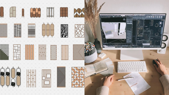
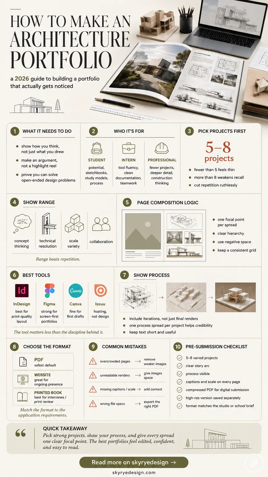
An architecture portfolio is a curated sequence of your best design work, built to show how you think, not just what you’ve drawn. It’s the difference between a folder of pretty renders and a document that makes an admissions committee or a hiring architect stop scrolling.
I’ve sat on both sides of this — building portfolios for my own automotive and product work, and later reviewing them from junior designers applying to studios I worked with.
- What an architecture portfolio actually needs to do
- Pick your projects before you pick your layout
- Structure the story: page-by-page composition logic
- Choose your software: InDesign, Figma, Canva, and Issuu
- Show process, not just final renders
- Format choices: PDF, website, or printed book
- Common mistakes that sink strong portfolios
- Architecture portfolio checklist before you submit
- FAQ
- How do I start an architecture portfolio?
- What should be in an architecture portfolio?
- How long should an architecture portfolio be?
- What software should I use to make an architecture portfolio?
- How do I make an architecture portfolio with limited project experience?
- Should an architecture portfolio be a PDF or a website?
The good ones all did the same handful of things right, and the weak ones all made the same handful of mistakes. This is the version of that advice I wish someone had given me before my first portfolio review.
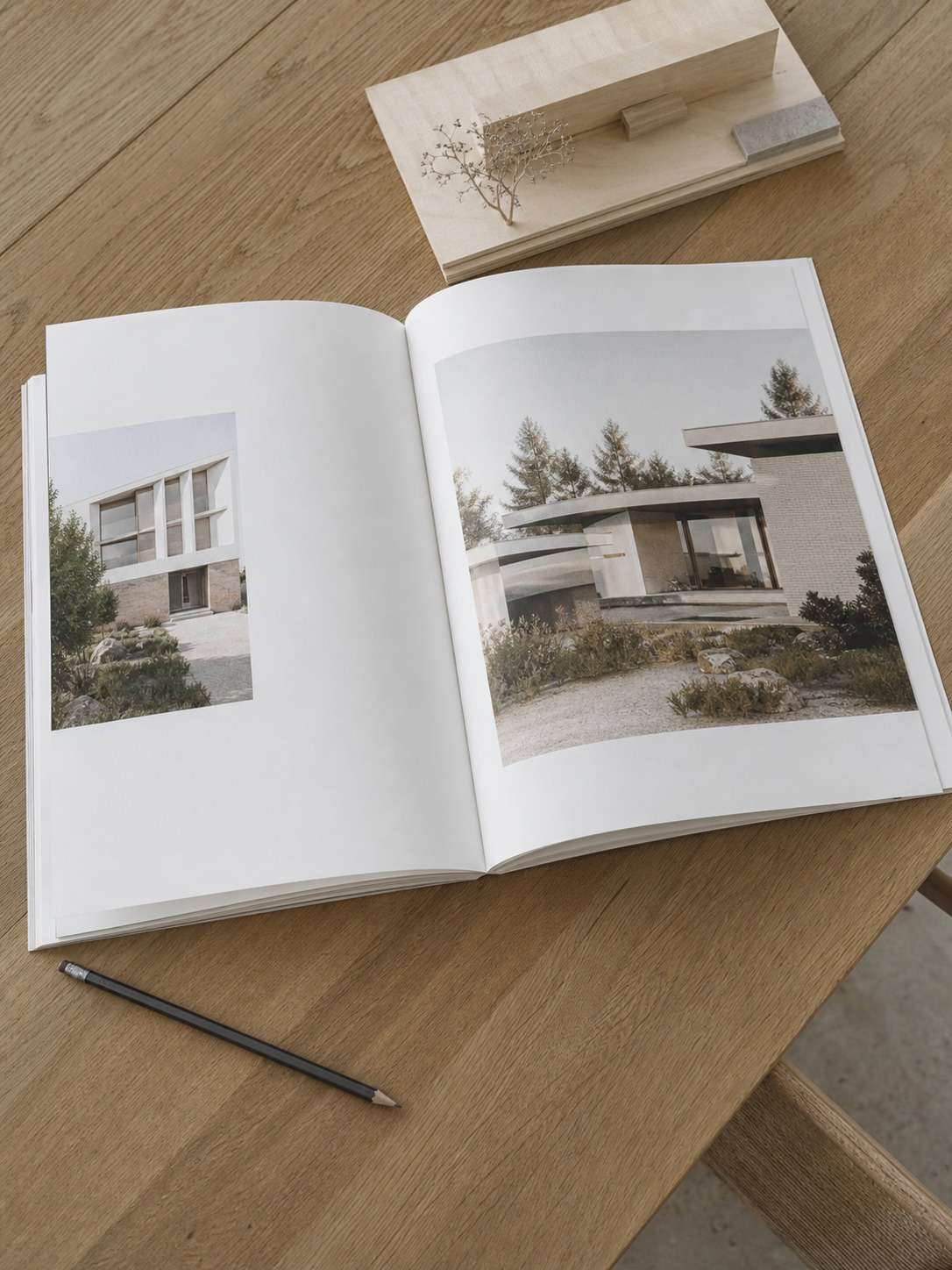
The mistakes rarely come from a lack of talent. They come from treating the portfolio as an afterthought — something assembled the weekend before a deadline, after the actual design work is done.
A portfolio deserves its own design process, with the same iteration and editing you’d give any project. Everything below comes from watching that process succeed and fail across a lot of submissions, my own included.
What an architecture portfolio actually needs to do
It’s not a highlight reel, it’s an argument
A portfolio that just stacks your prettiest renders in chronological order reads like a highlight reel. A portfolio that opens with a question, works through how you solved it, and closes with the result reads like an argument — and arguments are what get remembered in a stack of forty submissions.
Every project you include should earn its page by showing a different piece of how you think: how you handle a tight site, how you resolve a program conflict, how you push a concept through three iterations instead of presenting the first idea as final.
I think about this the same way I think about a design brief for a product or an automotive surface: the client, or the reviewer in this case, isn’t just buying the final shape. They’re buying confidence that you can work through an open-ended problem and land somewhere defensible. A portfolio that only shows destinations, never the route there, makes that confidence harder to earn.

What changes between student, intern, and professional portfolios
A student portfolio for university applications leans on raw potential — sketchbooks, study models, and process work matter more than polish, because reviewers are looking for how you think under a pencil, not how well you render. An internship portfolio needs to prove you can execute inside someone else’s process, so tool fluency and clean documentation carry more weight.
A professional portfolio applying for studio work needs the opposite balance from the student version: fewer projects, deeper documentation, and evidence you can carry a concept all the way to construction detail. Same document type, three different arguments.
Career-switchers land in an odd middle ground worth naming separately. If you’re coming from a related field (interior design, industrial design, even fine art with strong spatial thinking), lean into that background rather than hiding it. A portfolio that shows how your prior discipline sharpened your eye for proportion or material honesty reads as an asset, not a gap you need to apologize for. I’ve watched this work in the other direction too, reviewing dashboard and UI/UX portfolios from designers with architecture backgrounds — the spatial reasoning transferred in ways that made their layouts noticeably stronger than peers who’d only ever designed screens.
Pick your projects before you pick your layout
How many projects is enough
Five to eight projects is the range that works for almost every stage. Fewer than five and reviewers wonder if you’re hiding weak work. More than eight and even strong projects start diluting each other — nobody remembers project six by the time they’ve reached page forty. Cut ruthlessly. I’ve watched designers protect a beautifully rendered but conceptually thin project simply because it took a long time to make, and it always weakens the portfolio around it.
Time invested and quality of outcome are two different measurements, and it’s easy to confuse them when you’re the one who spent three weekends on a render. Ask a classmate or colleague to rank your projects blind, without knowing how long each one took, and compare their ranking to your gut instinct. The gap between the two is usually exactly where you need to cut.

Range over repetition: showing different design muscles
Pick projects that each demonstrate something different: one that shows strong conceptual thinking, one that shows technical resolution and detailing, one that shows how you handle scale (a single room versus a masterplan), one that shows collaboration if you’ve worked in a team.
A portfolio full of five similar mid-rise residential studies tells a reviewer less than three genuinely different projects, even if the residential studies are individually stronger. I apply the same logic reviewing automotive concept sketches — five variations on one theme say less about a designer’s range than two or three genuinely different directions.
Jewelry design taught me a smaller-scale version of the same lesson. A single ring design can demonstrate material honesty, proportion, and setting logic all at once, in a way that ten similar rings never could, because the repetition stops adding new information after the second piece. Scale up or down, the principle holds: range beats volume every time a reviewer is deciding what to remember.
Structure the story: page-by-page composition logic
Proportion and hierarchy from academic drawing training, applied to spreads
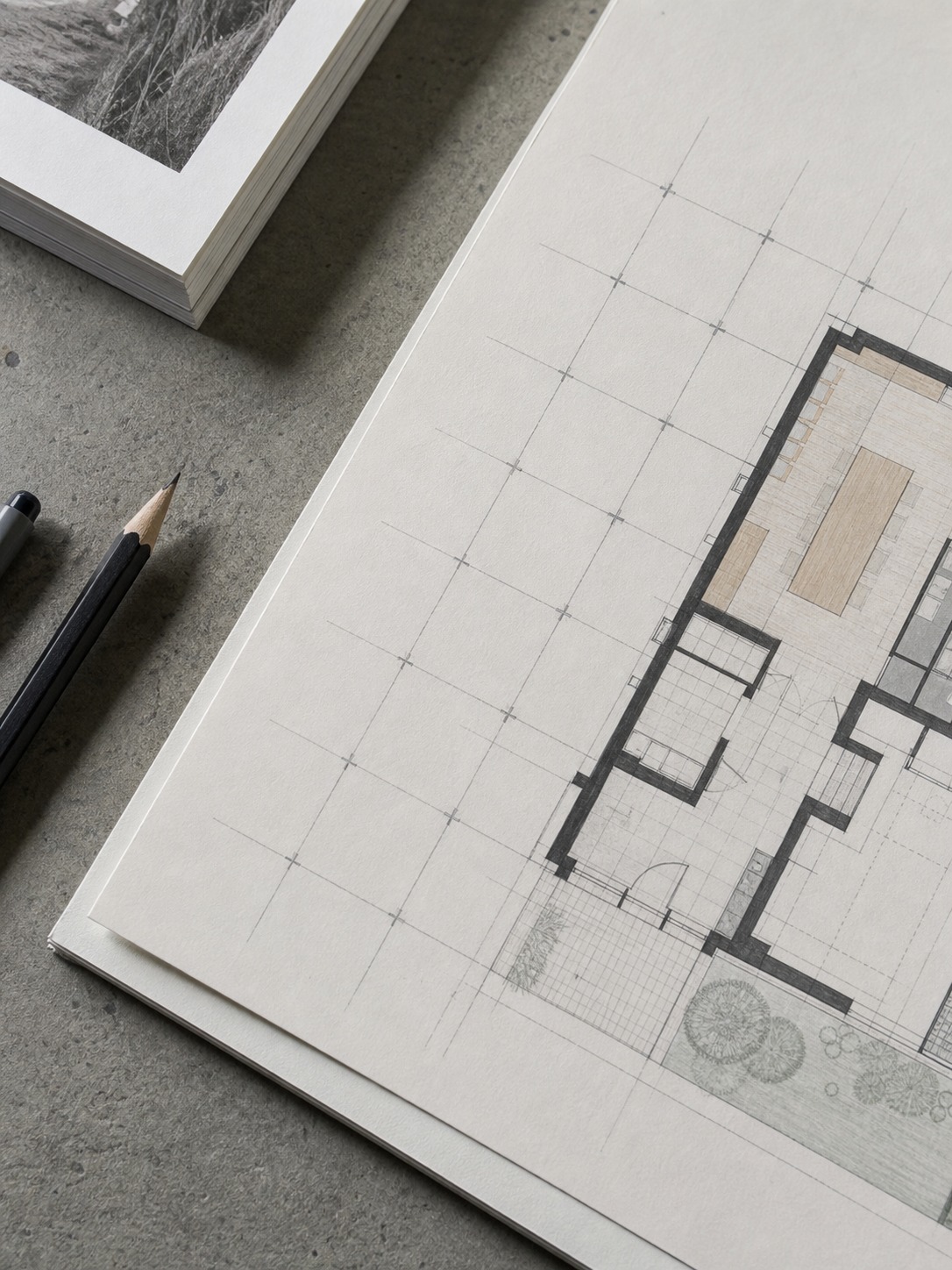
Academic drawing training teaches you to see a composition before you see the details in it — where the eye lands first, what’s foreground and what recedes, how negative space carries as much weight as filled space. That training applies directly to laying out a portfolio spread.
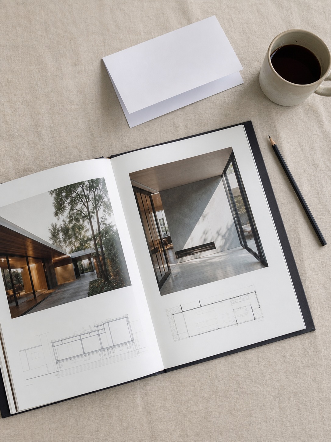
A page with one dominant image and two or three supporting details reads faster and hits harder than a page with six equally sized images competing for attention. Treat each spread the way you’d treat a still life composition: one clear focal point, a deliberate hierarchy, and enough negative space that nothing feels cramped.
This is the single skill I see missing most often in strong architects with weak portfolios. They can design a building with genuine spatial sophistication (the same geometric logic that shapes the structure itself) and then lay out the page presenting it with none of that same sensitivity — dense grids, uniform image sizes, no visual rest. The building deserved better editing than the page gave it.

Cover page, process pages, and final presentation balance
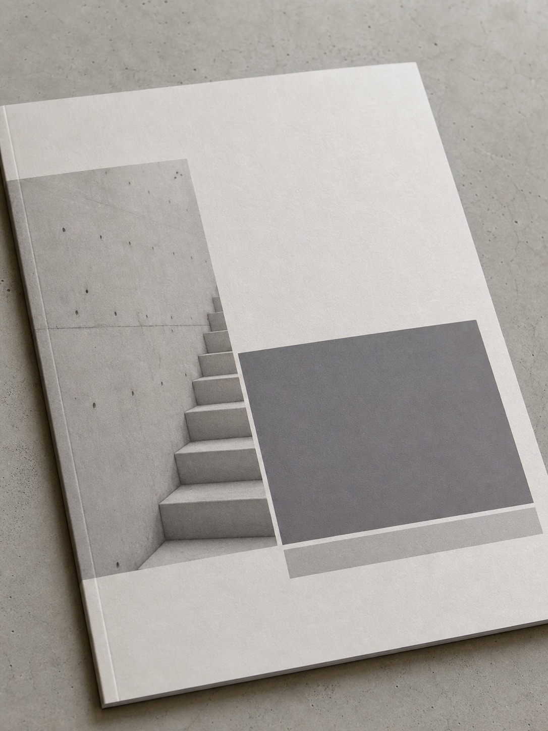
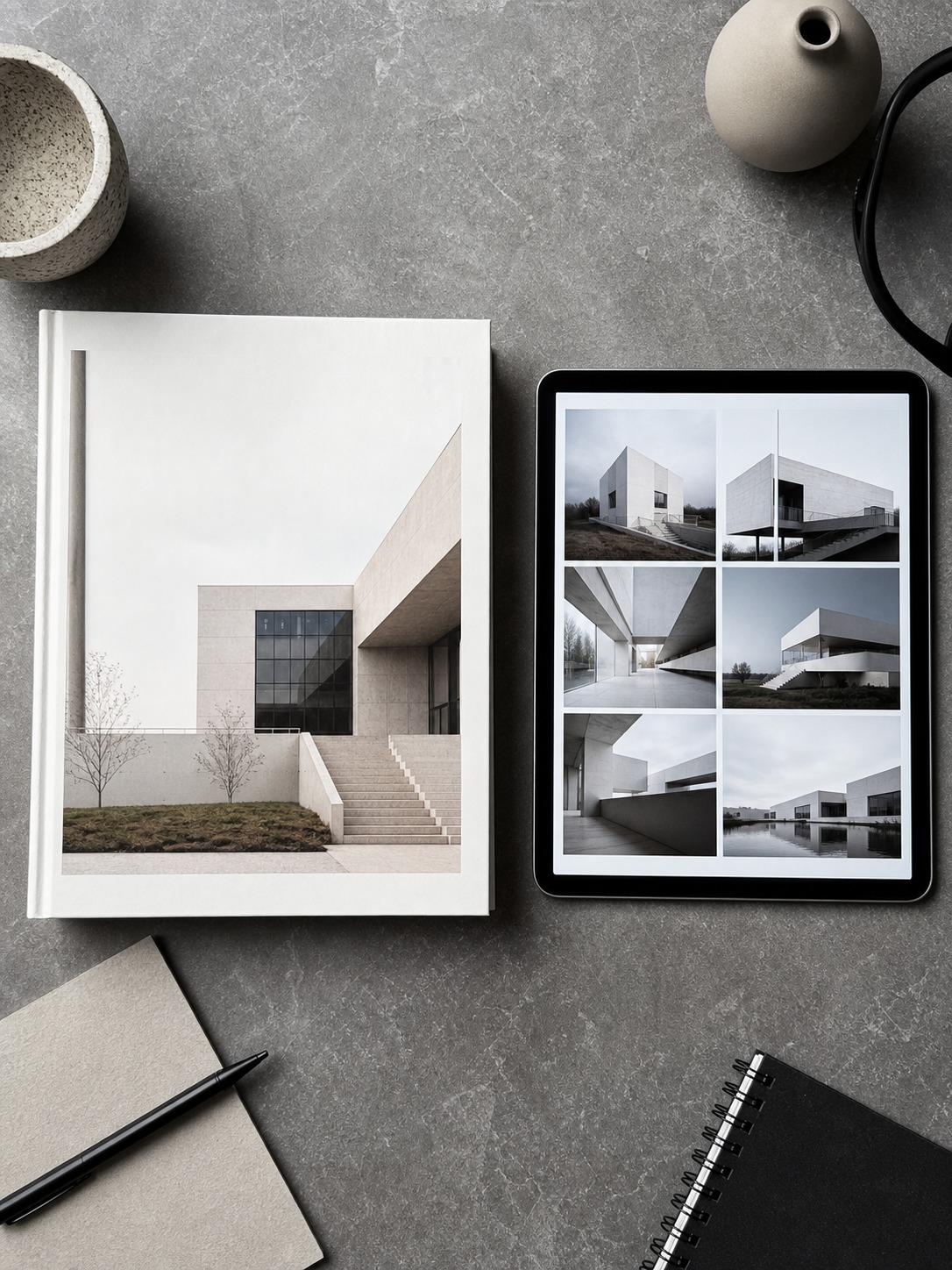
The cover page sets tone before a reviewer reads a single word, so keep it to your name, a project title or two, and enough white space to signal confidence rather than clutter. Process pages should feel rougher than final presentation pages on purpose — sketches, study models, and iteration diagrams read as more credible when they look like working documents, not polished graphics. Save your cleanest, most resolved layouts for final presentation spreads, where the contrast between rough process and polished outcome does real narrative work.
A consistent grid across every page matters more than most designers expect going in. Pick a column structure and margin system in your first hour of layout work, then hold it for the entire document. Nothing undercuts a portfolio’s sense of control faster than a grid that quietly shifts halfway through, even if no single page looks wrong on its own.
Choose your software: InDesign, Figma, Canva, and Issuu
When each tool actually makes sense
Adobe InDesign remains the strongest choice for print-quality layout control and precise typography, and it’s what I’d recommend for anyone applying to a studio that still reviews printed portfolios. Figma has become a genuinely solid option for architecture portfolios built primarily for screen viewing, especially if you’re already using it for other design work and want consistent tooling across your files.
Canva works fine for a fast first draft or a student building their very first portfolio, but its layout flexibility runs out quickly once you need precise grid control across dozens of pages. Issuu isn’t a design tool at all — it’s a hosting and viewing platform, useful once your PDF is finished and you need a clean, embeddable way to share it online. None of these touch the renders themselves, so pair your layout software with whatever 3D modeling tool you already know well rather than learning a new one mid-portfolio.
I’ve built layout files in all four at different points, and the honest answer is that the tool matters less than the discipline behind it. A well-composed Canva portfolio beats a cluttered InDesign one every time.
Pick whichever tool you’ll actually finish the document in, then apply the same composition principles regardless of which software is open. Switching tools mid-project rarely saves time either — the hours lost rebuilding a grid system in new software usually outweigh whatever features drew you to switch in the first place.
File size, PDF export, and portfolio hosting considerations
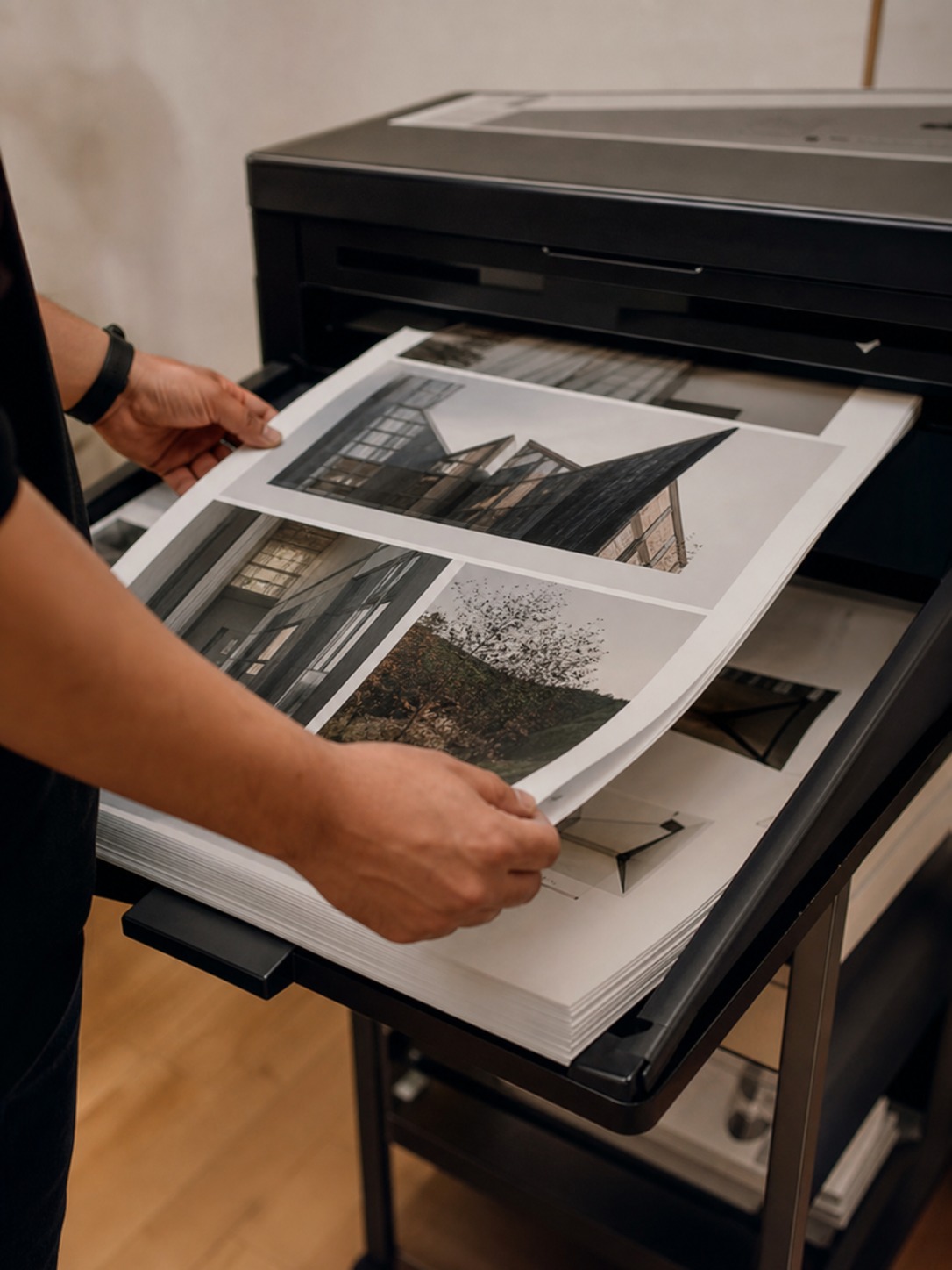
Export a compressed, web-optimized PDF for email submissions and online applications, and keep a separate high-resolution version for print or in-person interviews. A 200MB portfolio PDF gets bounced by more application portals than it gets opened. I flatten transparency and downsample images to 150-200 DPI for the digital version specifically because I’ve had submissions rejected on file size alone, which is a genuinely painful way to lose a shot at a program you actually wanted.
Name your file clearly, too — LastName_FirstName_Portfolio.pdf, not Portfolio_FINAL_v3.pdf. It sounds like a small detail until you picture a reviewer’s downloads folder with forty identically named “final” files in it, and yours is the one that’s easy to find again.

Show process, not just final renders
Sketches, iterations, and study models as credibility signals
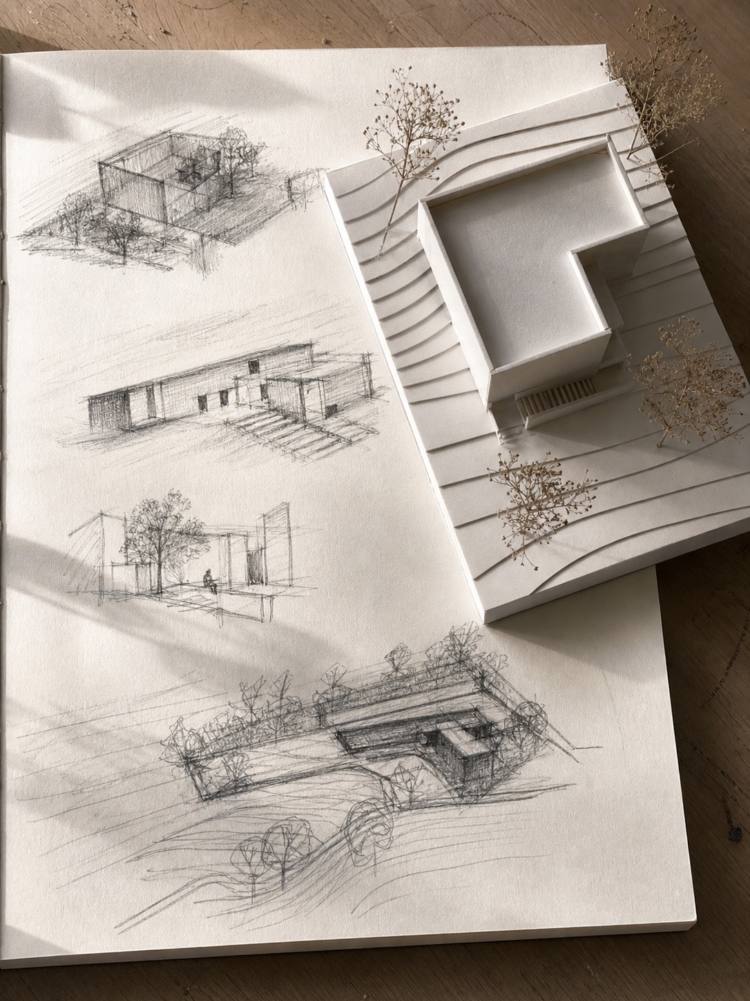
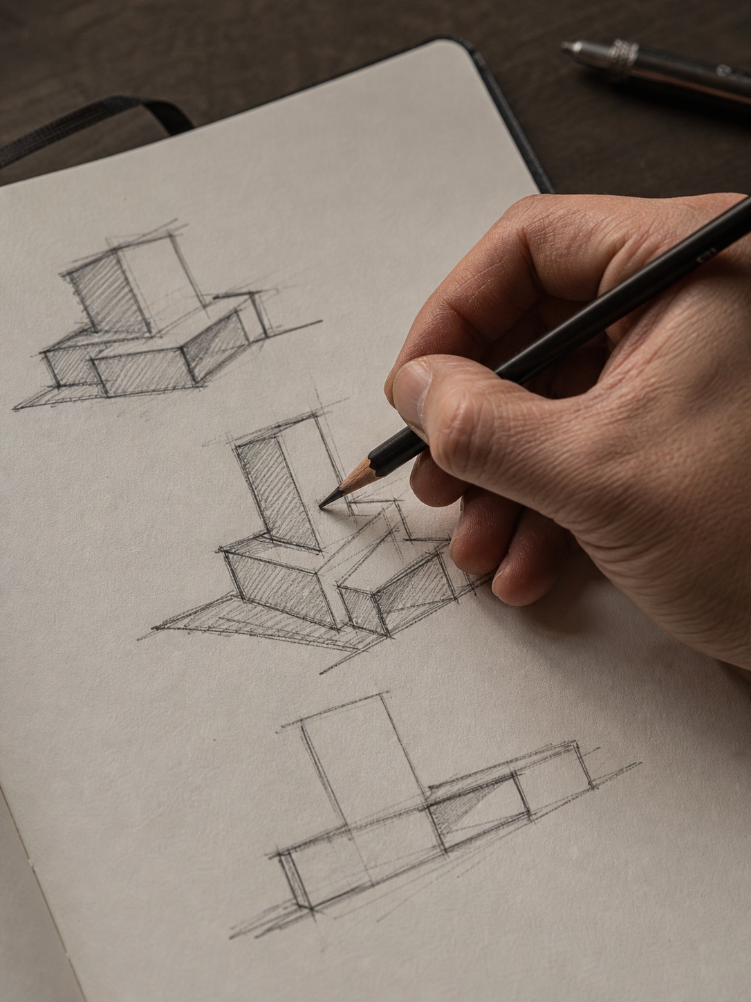
A finished render tells a reviewer what you landed on. A sketch sequence tells them how you got there, and that second thing is usually what they’re actually evaluating. Include at least one spread per project showing early study sketches, massing iterations, or physical study models next to the final result. I still keep the ugly first-pass sketches from projects I’m proud of, specifically because the contrast between that first pass and the resolved concept is more convincing than the final render alone.
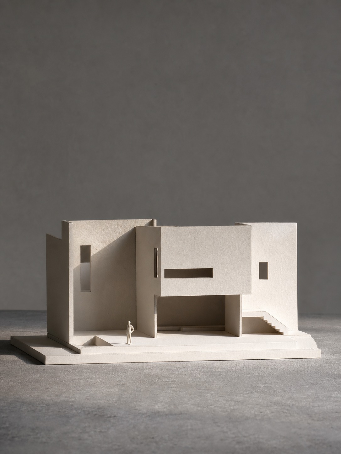
Photograph physical models properly if you build them (our architectural photography guide covers the raking-light setup in more depth) — a clean background, a scale figure or reference object in frame. A poorly lit phone photo of a genuinely good study model undersells work that deserved better documentation, and it’s one of the easiest fixes in the entire portfolio process.

How much text is too much text
Keep project text to a short framing paragraph and a handful of labeled callouts, not a full essay a reviewer has to read to understand the drawings. If a floor plan needs three paragraphs of explanation to make sense, the plan isn’t doing its job yet. Aim for text that a reviewer could skip entirely and still understand the project from the images alone, then use the text to add the one or two things the images can’t show.
Read your project text out loud before finalizing it. Anything that sounds like it’s performing expertise rather than explaining a decision gets cut. The strongest project descriptions I’ve read are almost conversational — a sentence on the problem, a sentence on the move that solved it, done.
Format choices: PDF, website, or printed book
Trade-offs for university applications vs job applications
University applications almost always specify a PDF format with strict page or file-size limits, so check the program’s actual requirements before you design a single spread — formatting to the wrong spec is a fast way to get flagged before anyone looks at your work. Job applications are more flexible: a PDF works everywhere, but a portfolio website gives a hiring architect a reason to spend more time with your work between the first email and an actual interview, since it’s easier to browse casually than to download an attachment.
Double-check page count limits specifically, since they’re the requirement designers miss most often. A program that caps submissions at 20 pages will often reject or penalize a 24-page file outright, no matter how strong the extra four pages are. Build to the limit, not past it, and treat the constraint as part of the design problem rather than an annoyance to work around.

Building an online portfolio that doubles as a website
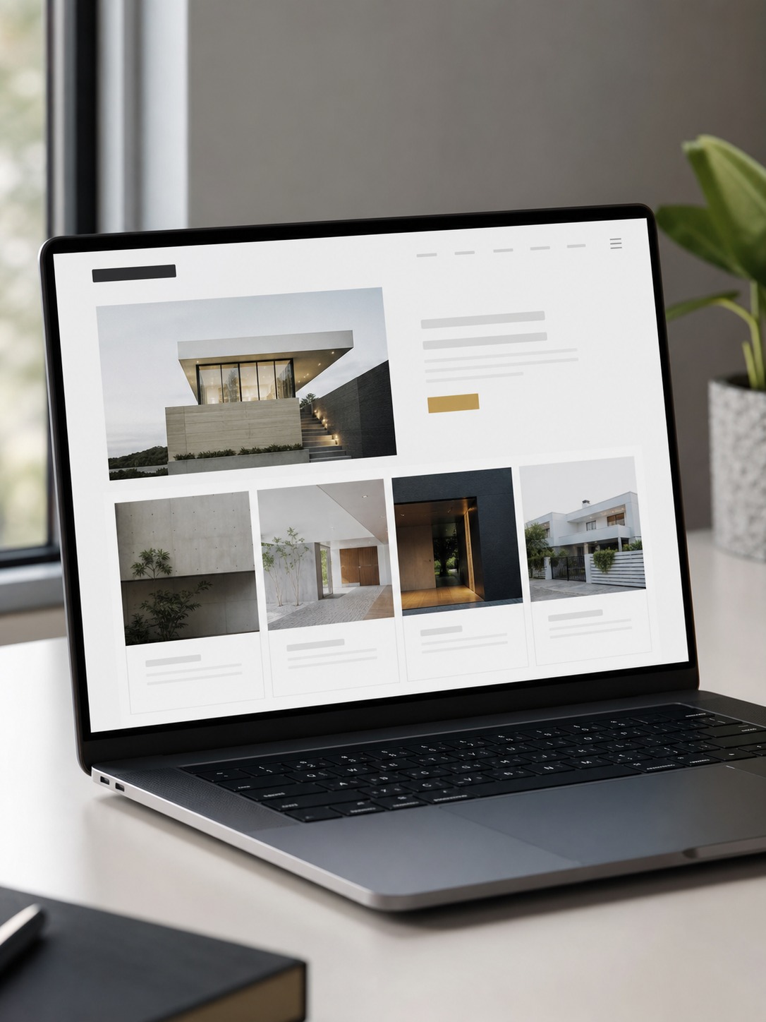
A simple portfolio website (Format, Cargo, or a lightweight custom build) does double duty as both your submission tool and your ongoing professional presence, updated as you produce new work instead of rebuilt from scratch for every application cycle. Keep the site structure mirroring your PDF logic: five to eight strong projects, each with the same process-to-resolution arc, rather than dumping every render you’ve ever made into an endless scroll.
Set a recurring reminder to revisit the site every few months, even when you’re not actively applying anywhere. A portfolio website that hasn’t changed in two years reads as stalled, and updating it in small increments is far less painful than facing a full rebuild the week before you need it for something urgent.

Common mistakes that sink strong portfolios
Overloading pages and unreadable renders
The single most common mistake I see is cramming too much onto one spread: a floor plan, three sections, a render, and a materials board all fighting for space on one page. Every element shrinks until none of it reads clearly, even on a large screen. Give your strongest images room to breathe, even if that means more pages with fewer things on each one.
If you’re staring at a spread that feels crowded, the fix is almost never a smarter layout trick — it’s removing an image. I go through this exact exercise on my own project decks: pick the single weakest element on an overcrowded page and cut it entirely before trying to rearrange what’s left. The page almost always improves immediately.
Missing captions, scale, and context
A render without a scale reference, a north arrow, or a one-line caption forces the reviewer to guess what they’re looking at, and reviewers moving through dozens of submissions won’t stop to guess. Every drawing needs just enough context (project name, scale, what the image is actually showing) that it stands on its own if a reviewer flips straight to that page without reading anything before it.
Test this directly: open your portfolio to a random middle page without looking at what came before it, and see if you can tell what the project is and what you’re looking at within five seconds. If you can’t, and you designed the page, a reviewer definitely can’t.
Architecture portfolio checklist before you submit
Run through this before sending any version out:
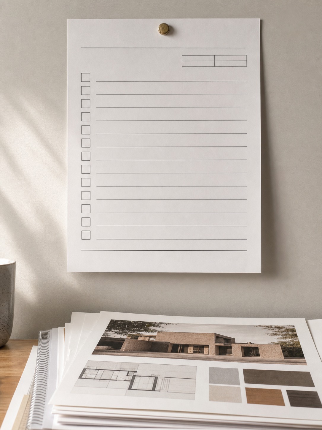
- Project count: Five to eight projects, each showing a genuinely different design skill.
- Story arc: Each project moves from question to process to resolution, not just a final render.
- Composition: Every spread has one clear focal point and enough negative space to breathe.
- Process visibility: At least one sketch, study model, or iteration view per project.
- Text discipline: Captions and short framing text only, nothing that requires a full read to understand the work.
- File specs: PDF compressed for digital submission, high-resolution version kept separately for print.
- Context on every page: Scale references, north arrows, and one-line captions throughout.
- Format match: Submission format matches exactly what the program or studio actually requested.

I run this list against my own project decks before any client presentation, not just portfolios built for applications. The habit transfers cleanly either way — the questions a hiring committee asks of a portfolio aren’t so different from the questions a client asks of a proposal deck, and the same editing discipline serves both.

FAQ
How do I start an architecture portfolio?
Start by selecting five to eight of your strongest, most varied projects before you touch layout software. Sort them roughly by the story you want to tell, then build a rough page count per project before designing a single spread. Starting with software instead of project selection is the most common reason portfolios stall halfway through, because the layout decisions have nothing solid to organize yet.
What should be in an architecture portfolio?
Include a mix of finished presentation work and process material: sketches, diagrams, study models, and iteration views alongside final renders and plans. Each project should show a clear arc from initial question to resolved design, with enough captions and scale references that a reviewer understands what they’re seeing without extra explanation.
How long should an architecture portfolio be?
Most strong portfolios run 20-40 pages for five to eight projects, roughly three to five spreads per project depending on complexity. Length matters less than density — a tight 24-page portfolio with clear composition beats a bloated 60-page one where every project gets diluted by the sheer volume around it.
What software should I use to make an architecture portfolio?
Adobe InDesign gives the most control for print-quality layout and is the safest default for university and studio applications. Figma works well if your portfolio lives primarily online and you want one tool across your design and portfolio work. Canva is fine for a fast first draft but struggles with precise grid control at scale once a project runs past a handful of pages.
How do I make an architecture portfolio with limited project experience?
Lean harder on process: sketches, study models, and even unbuilt conceptual work can carry a portfolio when you don’t have professional projects yet. Academic studio projects are completely acceptable and expected for student and internship portfolios — reviewers are evaluating how you think, not whether you’ve already worked on a built building.
Should an architecture portfolio be a PDF or a website?
Use whichever format the program or employer actually requests, and default to PDF when instructions are unclear since it works everywhere without dependency on a live site. A portfolio website is a strong addition alongside a PDF for job applications, giving a hiring architect an easy way to browse your ongoing work beyond the initial submission.
Building an architecture portfolio comes down to the same discipline as building any strong composition: pick what matters, cut what doesn’t, and give the reader a clear path through what’s left. Start with five to eight projects that each show something different, structure every spread around one clear focal point, and let your process work carry as much weight as your final renders. The portfolios that get remembered aren’t the ones with the most polished software skills — they’re the ones that make a genuinely confident argument for how their designer thinks.
Give yourself more time for editing than you think you need. The design work is rarely what runs out of runway near a deadline — it’s the ruthless cutting, the caption-writing, the file-size compression at eleven at night. Start that part earlier than feels necessary, and the whole document will read calmer for it.
- 371shares
- Facebook0
- Pinterest371
- Twitter0
- Reddit0