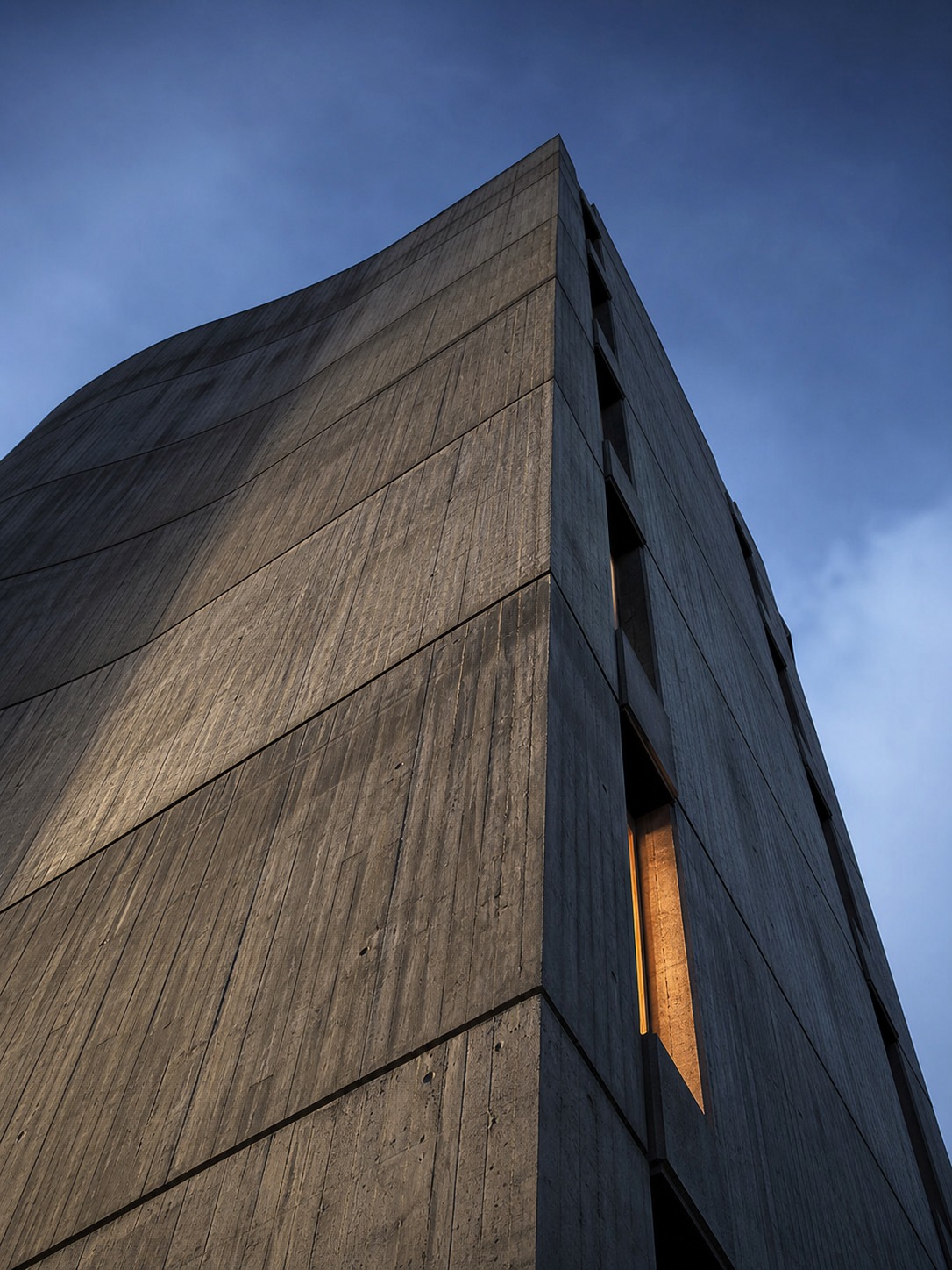
I keep a folder of concrete on my hard drive. Not literal concrete — photos of it. Board-formed walls in Kyiv courtyards, a Barbican stairwell someone shot in fog, the underside of a parking structure in Tbilisi. Most of it dates from a ten-year stretch: roughly 1960 to 1970. I didn’t set out to collect a decade. It just kept winning.
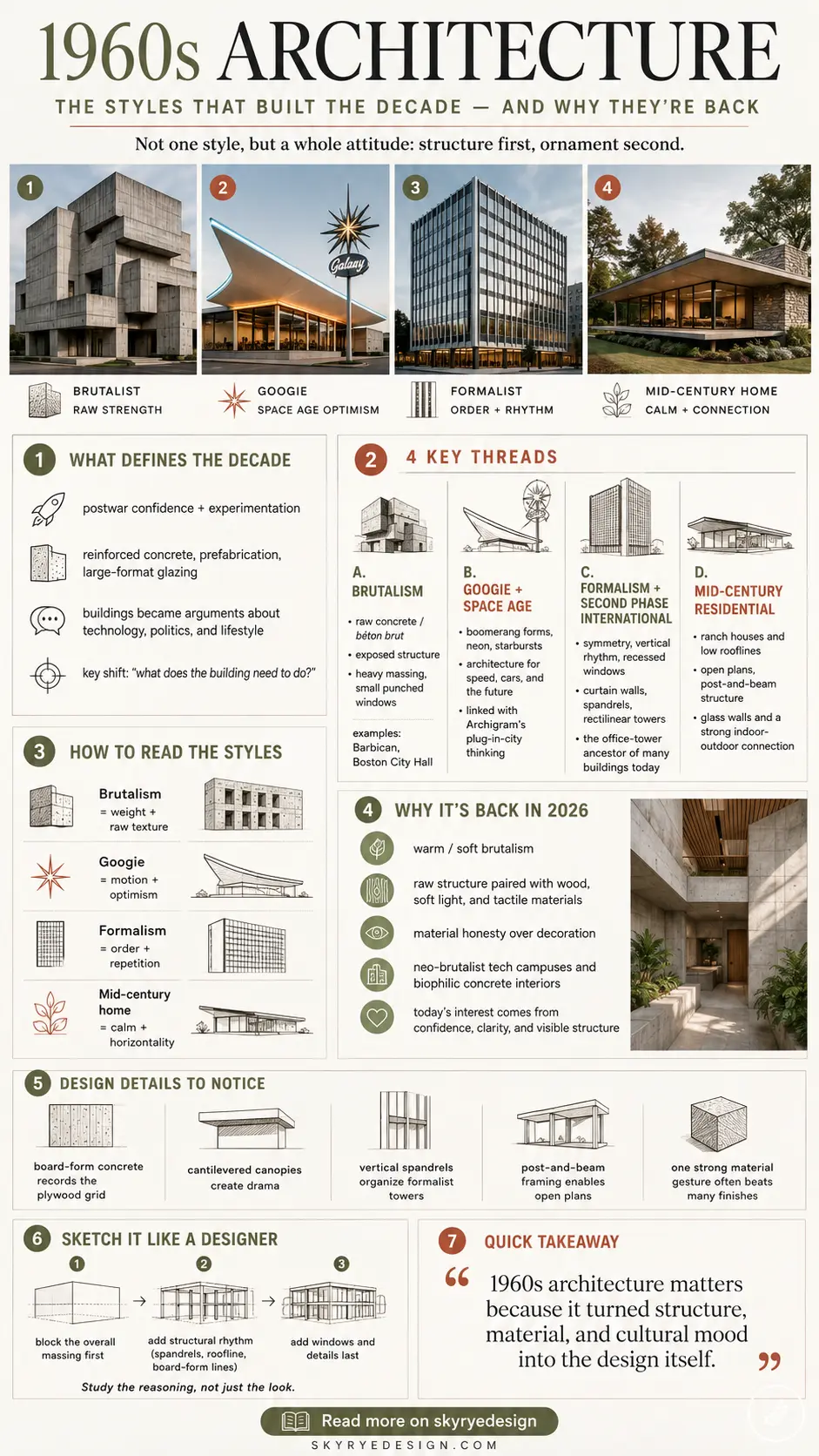
1960s architecture doesn’t behave like a single style, and that’s exactly what makes it worth understanding properly instead of skimming a listicle. In one decade you get raw concrete brutalism sitting next to glass curtain-wall towers, space-age fantasy structures next to symmetrical formalist office blocks, and low, spreading ranch houses next to houses that look like they landed from another planet. What ties it together isn’t a look. It’s an attitude: architects stopped asking “how do we decorate this” and started asking “what does this building actually need to do, and what does that require it to look like.” Everything downstream — the raw materials, the odd angles, the confidence — comes from that one shift.
- The blueprint for a decade in revolt
- Brutalism: concrete as manifesto
- Googie, Archigram, and the space-age fantasy
- Formalism and the Second Phase International look
- Ranch houses and the mid-century modern home
- Why 2026 keeps circling back to 1960s concrete
- Sketching 1960s buildings like a designer, not a tourist
- Where this leaves you
- FAQ
- What defines 1960s architecture?
- What’s the difference between brutalism and mid-century modern?
- Why is brutalist architecture controversial?
- What is Googie architecture?
- Is brutalism making a comeback in 2026?
- What is Second Phase International Style?
- Who were the most influential 1960s architects?
- How do I study 1960s architecture as a designer, not just a historian?
This is a style guide, but not the kind that stops at a glossary. I’ll walk through the movements that actually mattered — brutalism, Googie and the space-age fringe, formalism, mid-century residential — and then get into the part most guides skip: why this decade’s architecture is showing up again in 2026, and how to actually look at a 1960s building the way a designer looks at it, not the way a tourist photographs it.
The blueprint for a decade in revolt
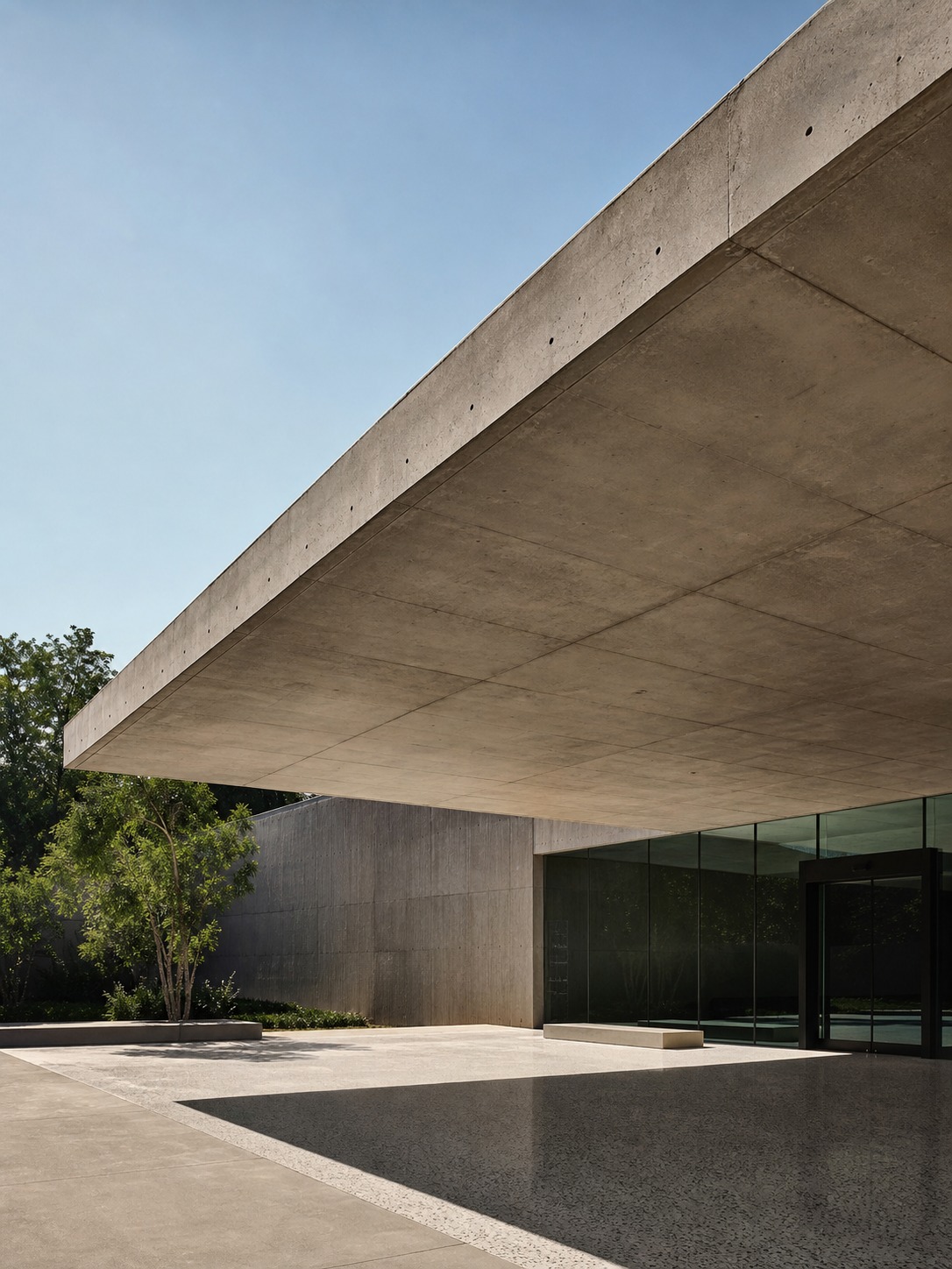
Architecture in the 1960s inherited a lot from the postwar 1950s, but it pushed harder. The International Style had already proven that steel, glass, and reinforced concrete could replace stone and ornament. What the 1960s added was confidence bordering on defiance. Architects weren’t just building efficient boxes anymore. They were using the building itself to make an argument — about technology, about politics, about what a city or a home should feel like in a world that had just watched a rocket leave the atmosphere.
Three forces pushed this along. First, materials: reinforced concrete, prefabricated panels, and large-format glazing let architects do things that would’ve been structurally impossible twenty years earlier. Second, culture: the space race, pop art, and a counterculture questioning every institution gave architects permission to get strange. Third, money: postwar rebuilding across Europe and a construction boom in the US and Latin America meant governments and universities were commissioning at a scale that let experimental firms actually get built, not just published in magazines.
That combination produced four distinct threads worth knowing by name, because they still get confused with each other constantly: brutalism, the space-age/Googie fringe, formalism, and the softer residential mid-century modern look. Each answers a different question. Brutalism asks what a building looks like when it stops hiding its structure. Googie asks what a building looks like if it’s trying to sell you the future. Formalism asks what happens if modernism borrows classicism’s discipline. And mid-century residential asks how you bring all of that into a house without scaring off the people who have to live in it.
Brutalism: concrete as manifesto
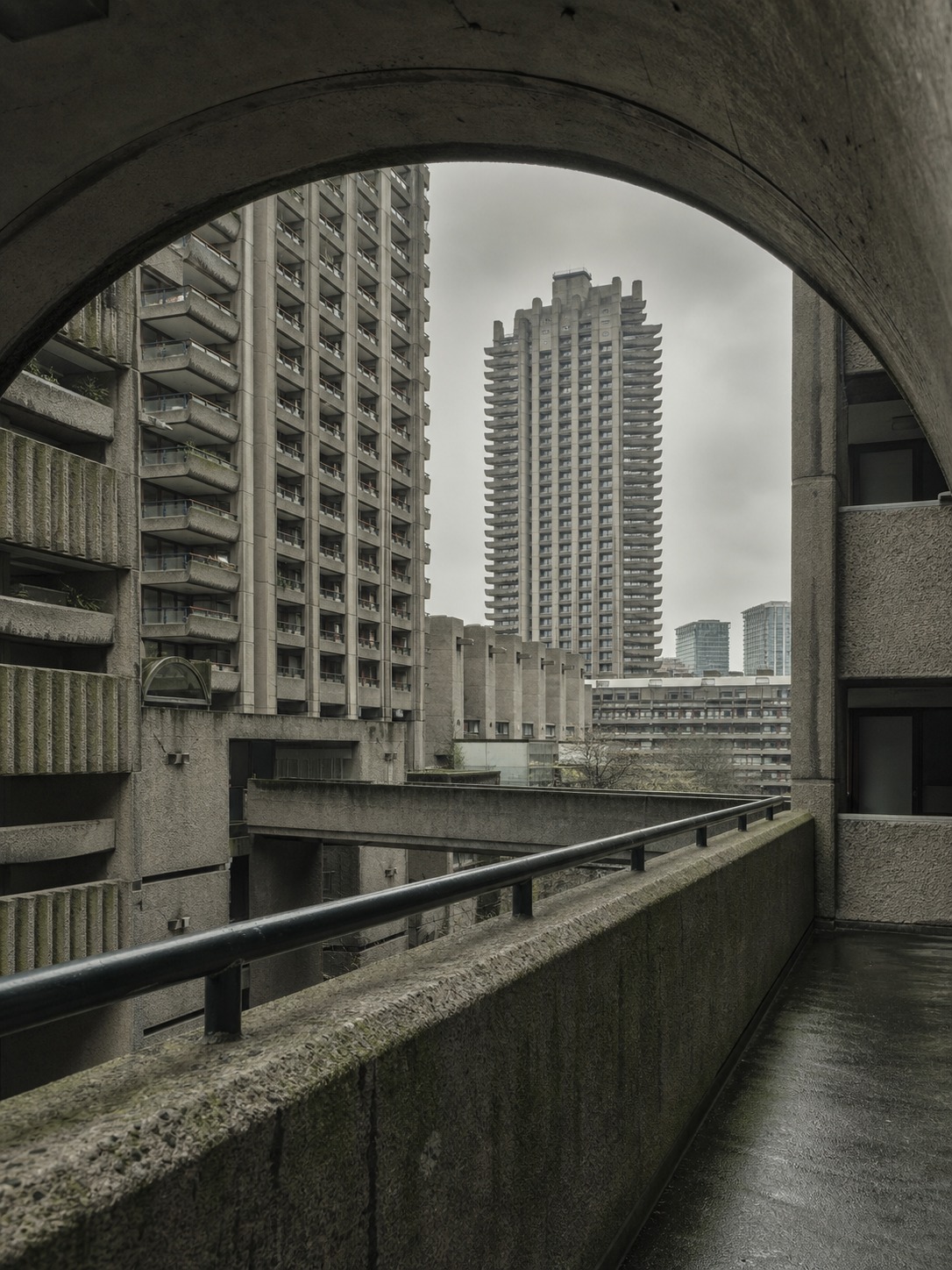
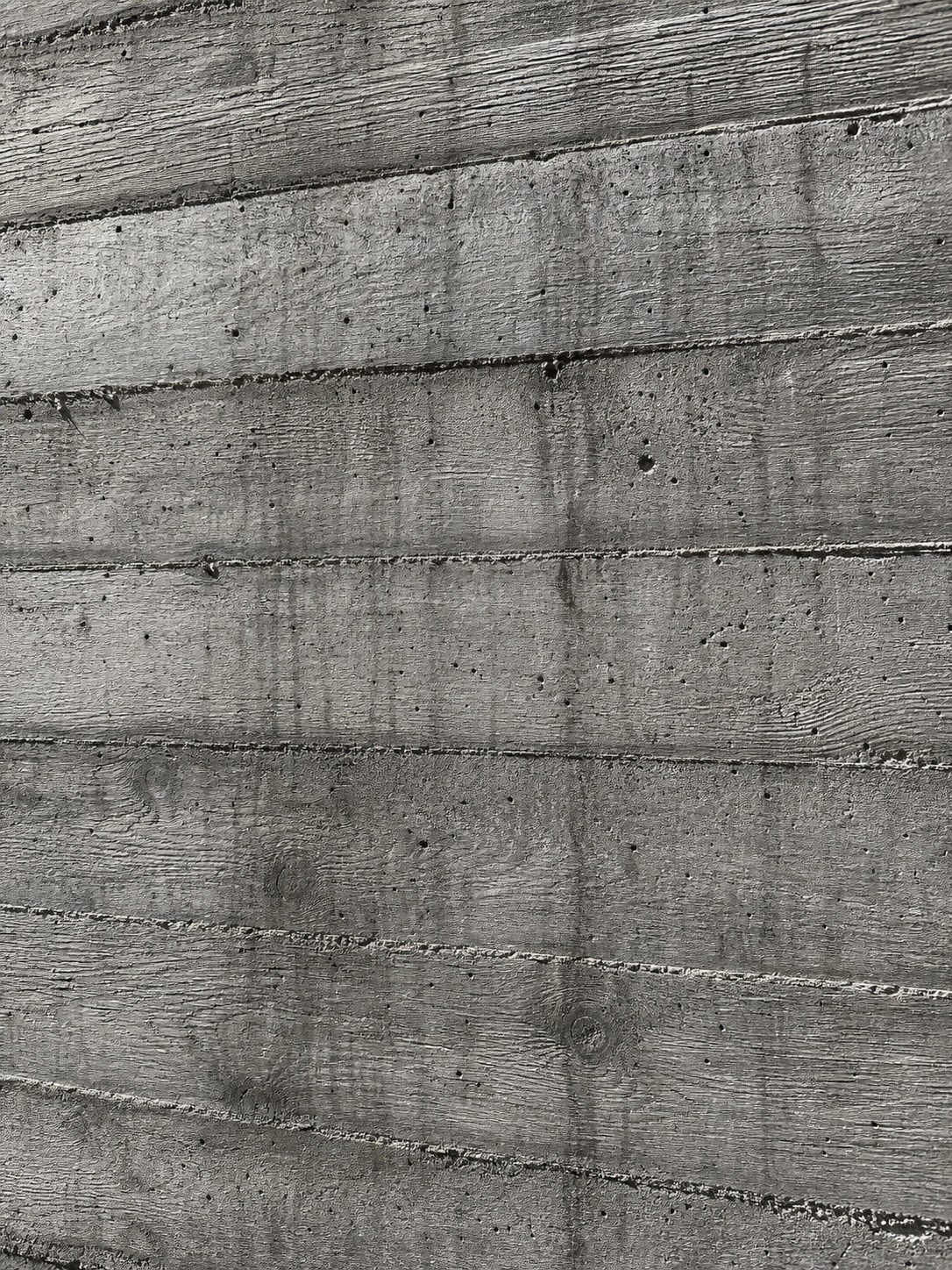
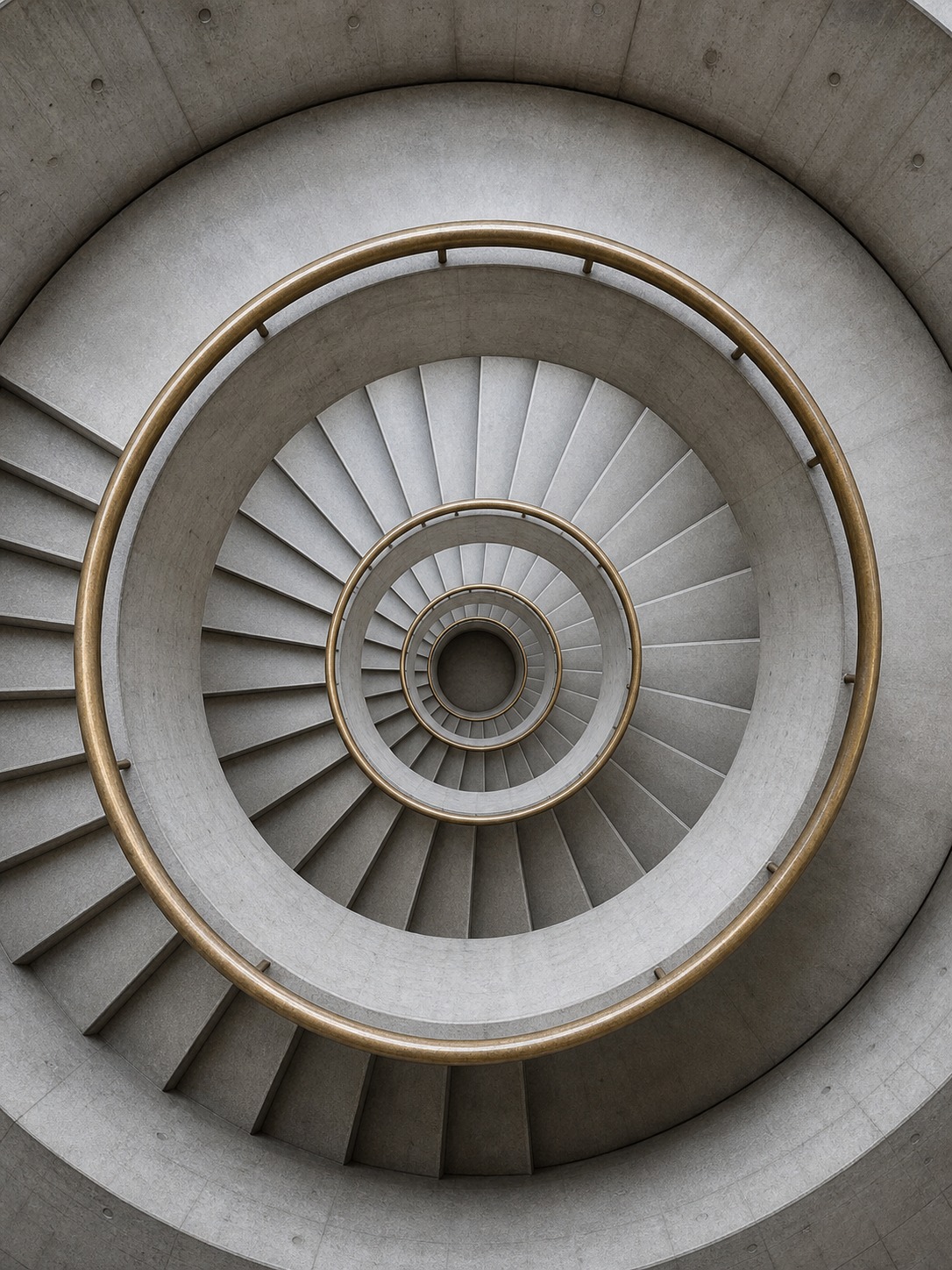
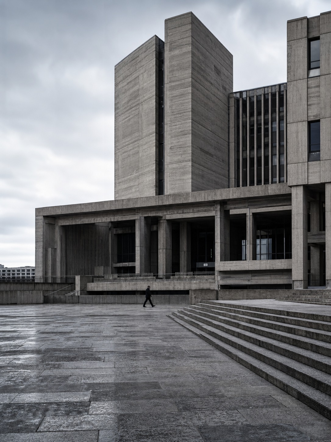
Brutalism is the 1960s style people recognize on sight and can rarely name correctly. The term comes from the French béton brut — raw concrete — a phrase Le Corbusier used to describe leaving concrete exactly as it comes out of the formwork: no cladding, no paint, board marks and all. British critics picked up the term in the mid-1950s, and by the 1960s it had become the dominant language for government buildings, universities, and social housing across Britain, Eastern Europe, Brazil, and Japan.
What makes a building brutalist isn’t just grey concrete. It’s structural honesty pushed to the point of aggression: exposed ceiling services instead of drop panels, heavy geometric massing instead of slender proportions, small punched windows instead of expansive glazing, and a refusal to soften any of it with ornament. London’s Barbican Estate is the reference project most designers eventually stumble onto — a residential and cultural complex so dense with raised walkways and concrete towers that Londoners still get lost inside it fifty years later. Boston City Hall does the same thing at government scale: a building that looks less like it was designed and more like it was quarried.
Brutalism split opinion immediately, and that split is part of the story. Critics called it cold, oppressive, inhuman at street level. Supporters called it the most honest architecture built since the war — a style that refused to lie about what it was made of or how much it cost. Both readings are still argued today, which is unusual for a fifty-plus-year-old movement. Most architectural styles get settled into either “classic” or “dated.” Brutalism never fully landed on either, and that unresolved tension is exactly why it keeps resurfacing in design conversations instead of staying in a textbook.
Outside the English-speaking world, brutalism took on political weight it rarely carried in Britain. In Brazil under military rule, the raw concrete language of architects working in the Corbusian tradition got used to project national strength and modernity simultaneously — a style doing ideological work, not just architectural work. That’s worth remembering the next time someone dismisses brutalism as “just a look.” In the 1960s, concrete was rarely neutral.
Japan ran its own parallel experiment under the banner of Metabolism, led by architects like Kenzo Tange. The idea borrowed brutalism’s raw materials but pushed the logic further: buildings as living organisms, designed with capsule units meant to be replaced or expanded over time rather than fixed forever. Nakagin Capsule Tower — a stack of prefabricated pods clipped onto a central concrete core — is the most literal expression of that thinking, and it makes an interesting companion piece to Archigram’s plug-in city sketches happening in London at almost exactly the same moment, even though the two groups had no direct connection.
Design note
Board-form concrete gets its texture from the plywood formwork it was poured against. Look closely at any brutalist wall in a reference photo and you can usually count the plank widths — that grid is real construction information, not a filter.
Googie, Archigram, and the space-age fantasy


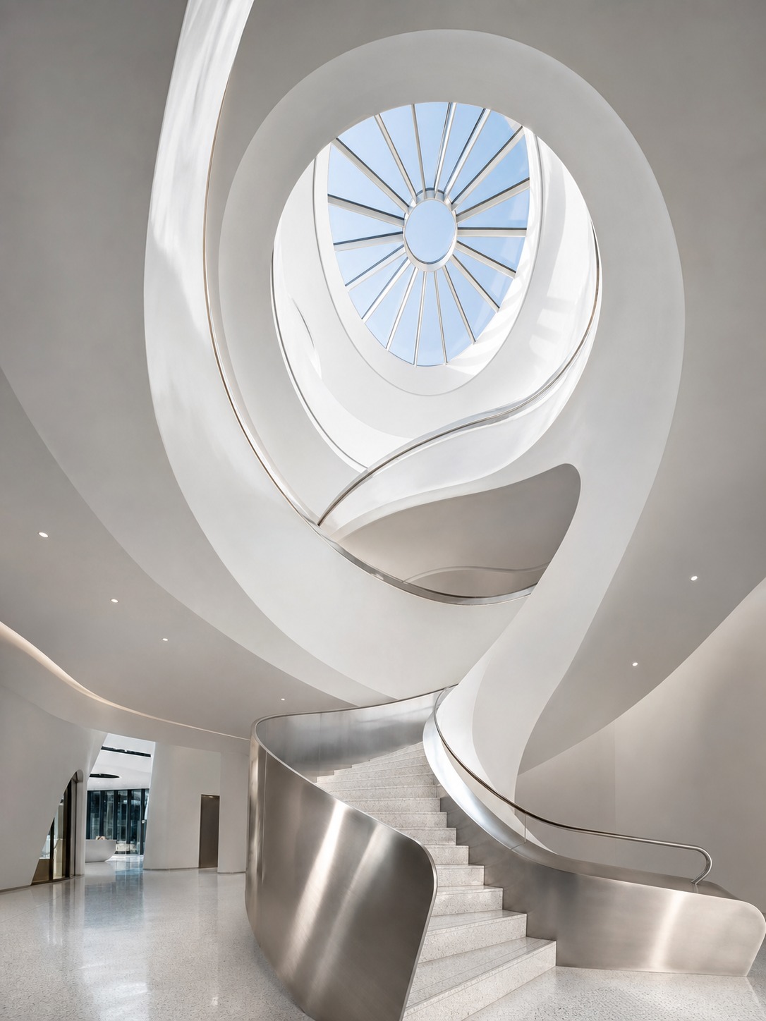

If brutalism is the 1960s taking itself seriously, this next thread is the decade having fun with the future. Googie architecture — named after a now-demolished Los Angeles coffee shop called Googies — is the diner-and-motel style you picture when someone says “atomic age”: upswept rooflines, boomerang shapes, starburst signage, cantilevered canopies that seem to defy gravity on purpose. It was commercial architecture built to be seen at forty miles an hour from a car window, and it borrowed its visual vocabulary directly from space-age imagery: satellites, rockets, atomic diagrams.
Run parallel to Googie’s populist optimism was something far stranger coming out of the UK: Archigram. This experimental collective never built most of what they designed, and that’s not a failure — it was the point. Archigram published concepts for inflatable villages, plug-in cities assembled from interchangeable capsules, and portable dwellings that treated a building less like a permanent structure and more like a piece of infrastructure you could reconfigure on demand. Their drawings borrowed heavily from comic books and advertising, which was deliberate provocation aimed at an architecture establishment that took itself far too seriously.
Italy contributed its own strain through groups like Archizoom Associati, who leaned into kitsch and satire rather than sincerity, using bright color and sculptural excess to critique consumer culture rather than celebrate it. San Francisco’s Ant Farm pushed a similarly countercultural line, treating lightweight, flexible structures as a rejection of the heavy institutional buildings brutalism was producing at the same moment.
None of these movements built cities the way brutalism did. What they did instead was expand what “architecture” was allowed to mean — a building didn’t have to be permanent, monumental, or even fully functional to count. That idea alone is still doing work in contemporary pavilion design, pop-up retail, and exhibition architecture, even when nobody credits Archigram by name.
Formalism and the Second Phase International look
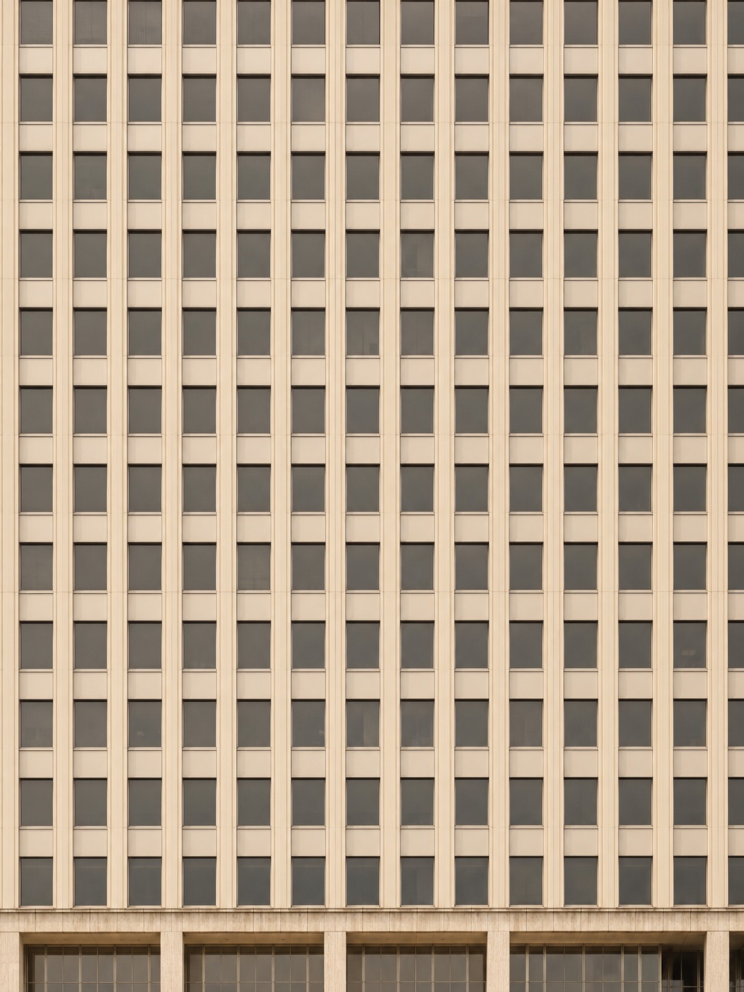
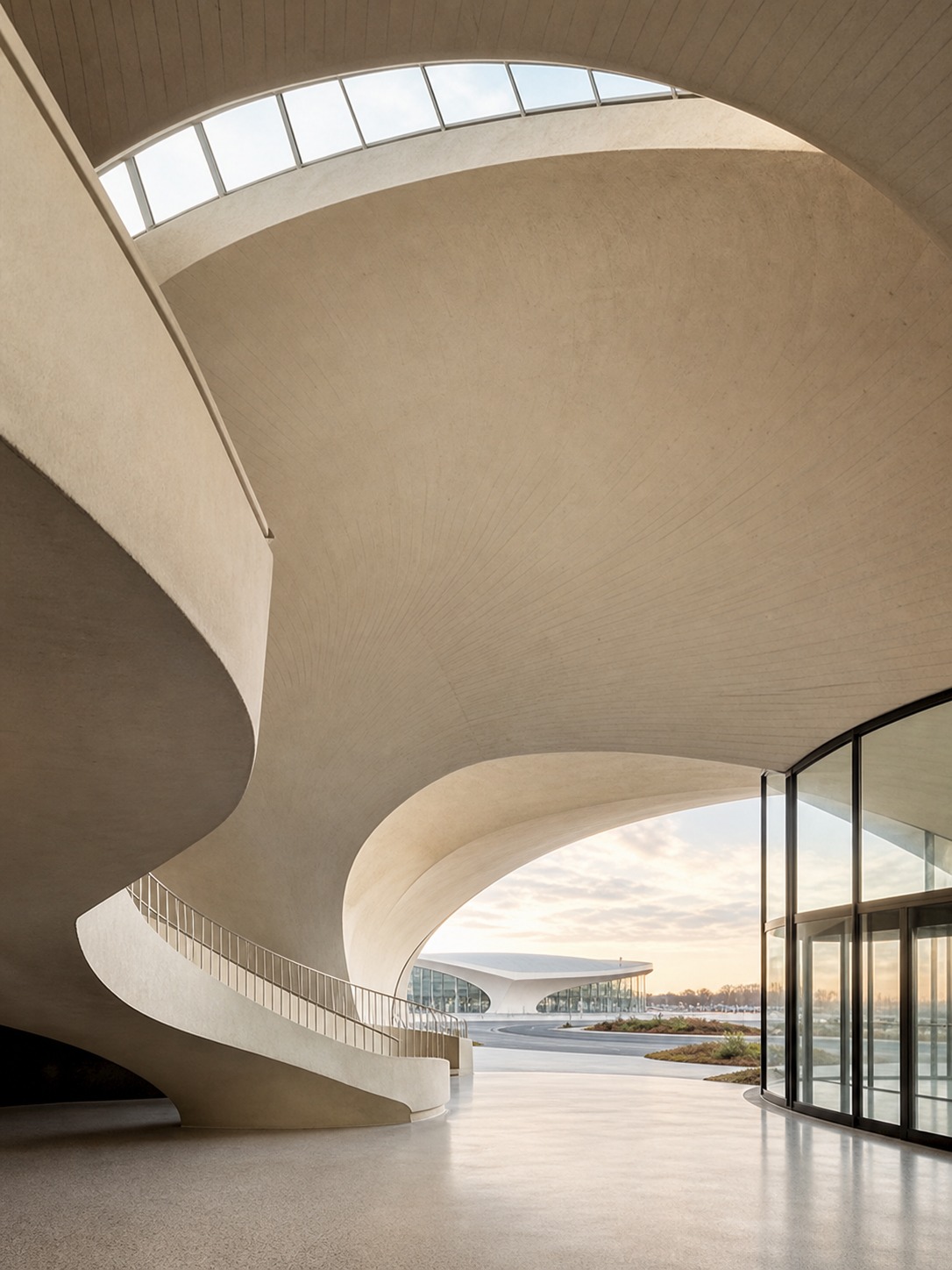
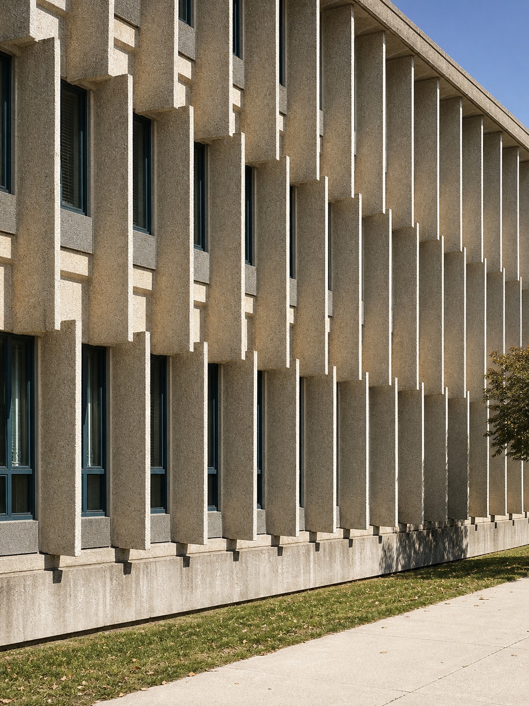

Formalism is the 1960s style with the worst name recognition and, ironically, the biggest footprint in American downtowns. Where brutalism went heavy and rough, formalism reintroduced classical discipline to modern architecture — symmetry, vertical rhythm, and a controlled, almost ceremonial massing that had been largely absent from the asymmetrical, irregular forms of the earlier International Style.
You’ll recognize formalist buildings by a specific set of moves: strong vertical orientation, spandrels linking windows into continuous vertical bands, recessed window openings, flat roofs, and decorative sun-screens or planters used as the only ornament permitted. It’s modernism that put its shirt back on. This style dominated a huge share of American corporate headquarters, government buildings, and university campuses built between roughly 1960 and 1975, precisely because it read as serious and institutional without resorting to historical pastiche.
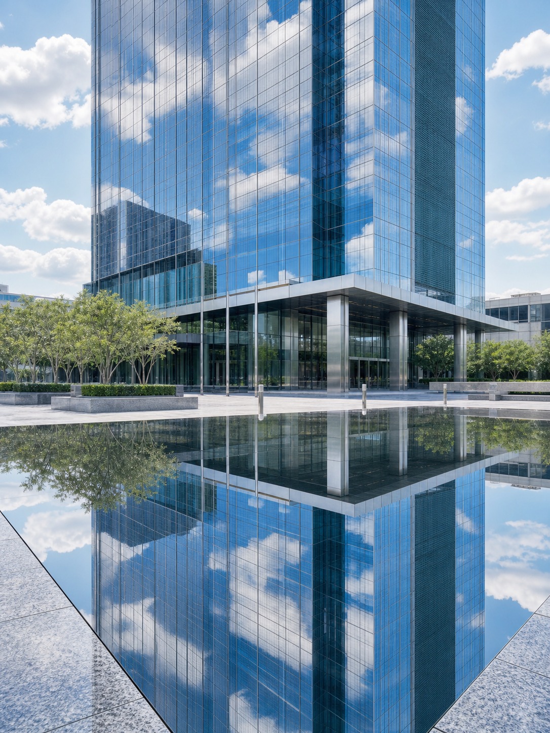
Running alongside formalism was what architectural historians sometimes call the “Second Phase International Style” — a harder, more rectilinear evolution of the original glass-box modernism. Think large sections of clear or tinted glazing, glass or metal curtain walls stretched across a strict rectilinear frame, cantilevered floor plates, and a near-total rejection of ornament. It’s the look most people mean when they picture a generic 1960s office tower, and it’s the direct ancestor of the glass towers still going up in 2026 — the DNA just got refined, not replaced.
Both formalism and Second Phase International matter because they represent modernism’s institutional, buttoned-up face — the version corporations and governments trusted enough to build with. Brutalism got the cultural buildings and the housing blocks. Formalism got the banks.
Ranch houses and the mid-century modern home
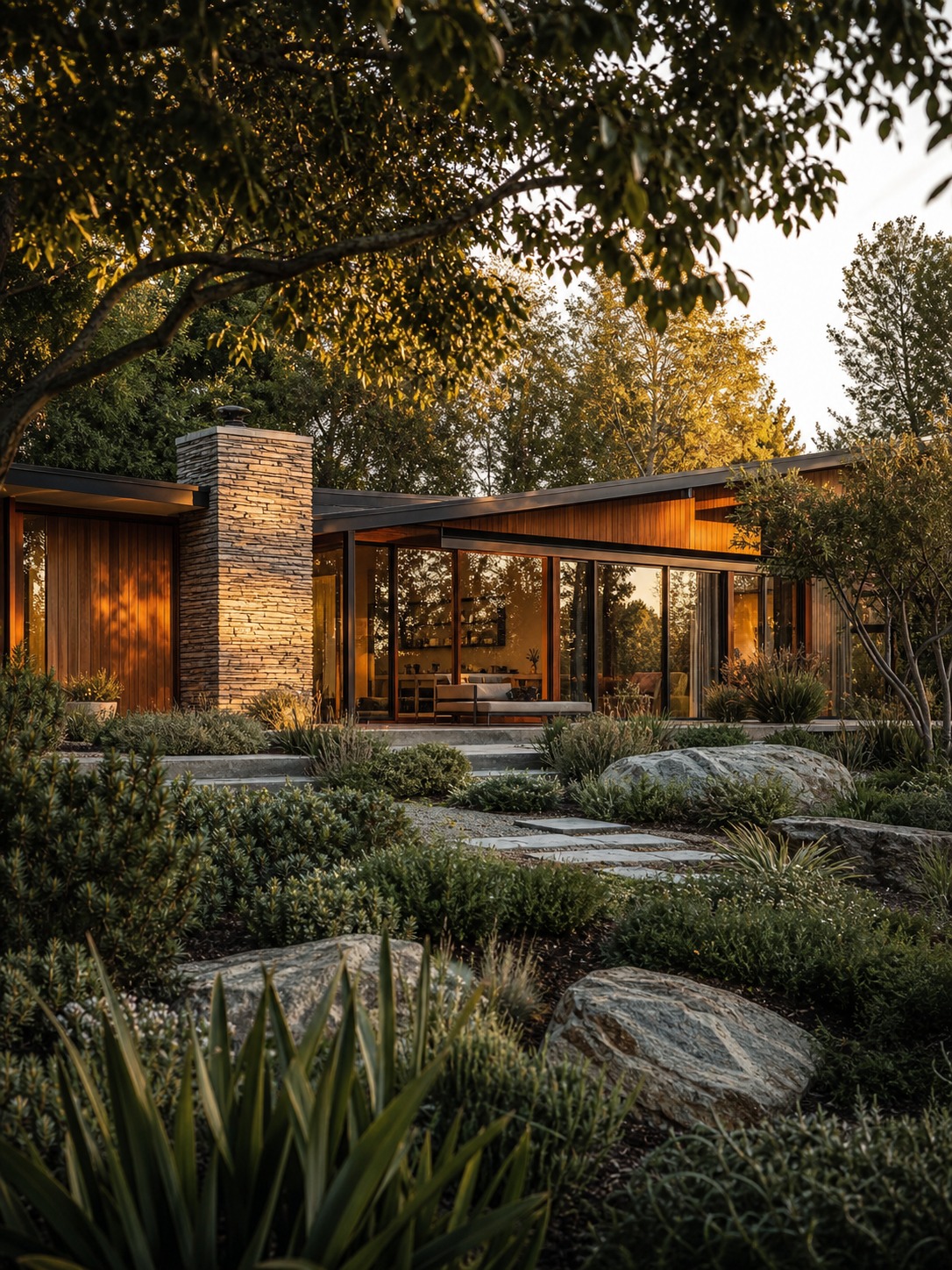
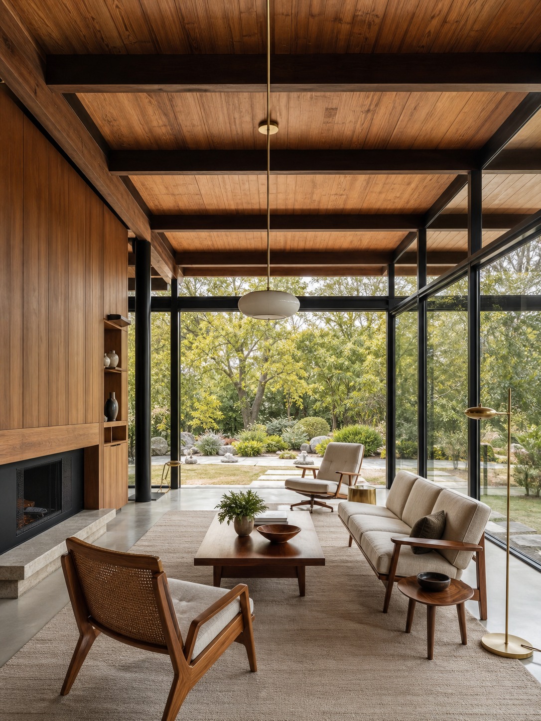
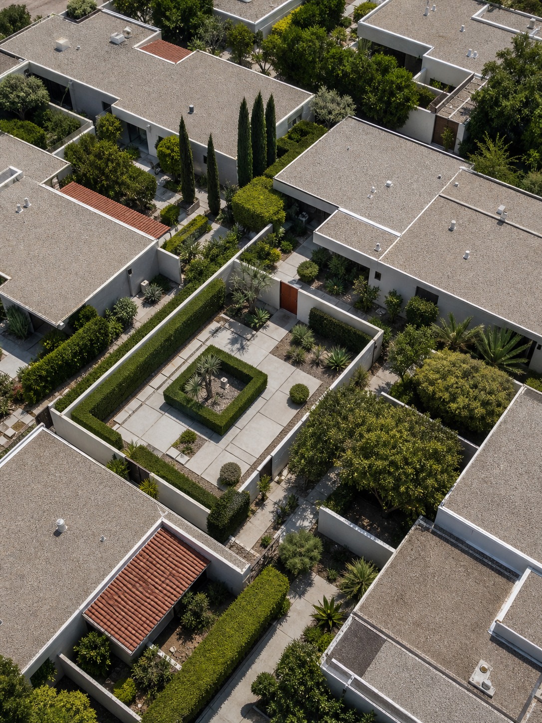
Step away from the monuments and the 1960s residential story looks completely different, and honestly more relevant if you’re designing anything domestic today. The ranch house hit its absolute peak in this decade, especially on the American West Coast: single-story, asymmetrical, low-pitched or nearly flat roofs, broad rambling footprints, and eaves either boxed tight or left open with exposed rafters.
The bigger idea underneath the ranch house — and the one that’s aged the best — is what most people now call mid-century modern: walls of glass replacing solid exterior walls, an open floor plan with almost no interior partitions, and a deliberate blur between inside and outside. Post-and-beam construction let architects pull load-bearing walls out of the way entirely, which is the structural trick that makes those huge glazed walls possible in the first place. It’s also the reason mid-century homes still photograph so well: nothing interrupts the sightline from the kitchen to the backyard.
What made this residential language stick wasn’t nostalgia. It was function. Bringing daylight and landscape into every room genuinely changes how a house feels to live in, and that’s a harder thing to fake than a Pinterest board of walnut furniture. When people say a mid-century modern house “feels calm,” they’re describing an actual architectural mechanism — continuous glazing plus an open plan plus a low, horizontal roofline — not just a vibe.
Materials mattered just as much as the plan. Cedar and redwood siding, exposed brick chimneys, and stone accent walls kept these houses from feeling as clinical as their commercial cousins — the same “honest materials” instinct driving brutalism, applied at a domestic scale where warmth actually needed to win. A lot of the decade’s most photographed houses pair a flat or low-pitched roof with a single strong material gesture, one stone wall or one board-and-batten face, rather than mixing five finishes at once. That restraint is worth studying on its own: it’s the same discipline formalism applied to office towers, just translated into wood and stone instead of concrete and glass.
Why 2026 keeps circling back to 1960s concrete
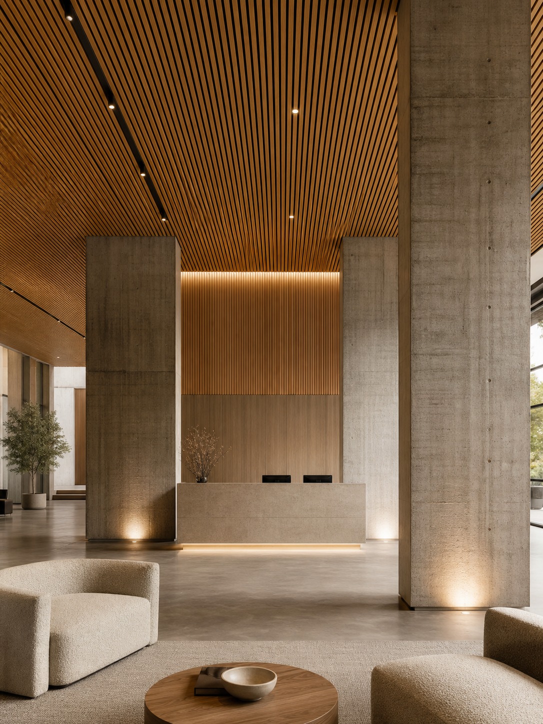
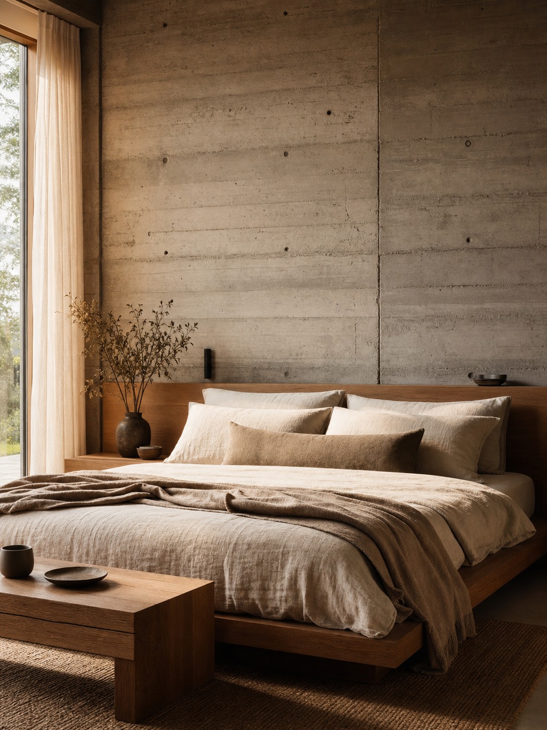
Here’s the part almost nobody writing about 1960s architecture connects to the present, and it’s the reason this decade is worth studying right now instead of filing under “history.”
Design media has spent the past year running a very specific story: brutalism is back, but softened. Interior and architecture outlets are calling it “warm brutalism,” “soft brutalism,” or “biophilic brutalism” depending on which publication you read — the raw concrete, heavy massing, and monolithic forms of the 1960s original, paired with wood, low-temperature lighting, and tactile textiles to make it livable instead of institutional. Tech campuses have been adopting the same visual language for an entirely different reason: exposed structure and honest materials read as engineering credibility in a way that a glass-and-drywall office never quite manages. Even Pantone’s Cloud Dancer pick for 2026 — a warm off-white, the first white the program has chosen in twenty-seven years — sits comfortably inside that same palette shift toward material honesty over decoration.
None of this is coincidence, and none of it is really new. It’s the same argument 1960s architects were having with themselves: does a building have to hide how it’s made to be beautiful, or is the structure itself the design? Every “neo-brutalist” tech HQ built in 2026 is answering a question the Barbican answered in 1965. The materials got better. The circular-economy concrete mixes and automated solar louvers showing up in current biophilic-brutalism projects would’ve been science fiction to the original movement. But the underlying instinct — build honestly, let the structure show — is identical.
If you design anything today, that’s not a trivia point. It’s a usable reference library. The geometry that reads as “confident” or “grounded” in 2026 branding, product design, or interior work has a direct ancestor you can study, and studying the original almost always produces better instincts than studying whatever’s trending on a mood board this month.
There’s a second, quieter connection worth naming: the 1960s is also where postmodernism’s first cracks appear, years before the style got a name. Formalism’s return to symmetry and classical discipline was already a mild rebellion against pure modernist orthodoxy, and Archizoom’s satirical, colorful excess pushed even further in the opposite direction from brutalism’s seriousness. Both were early signs that architects were getting restless with “form follows function” as the only acceptable rule — a restlessness that fully broke open in the 1970s and 80s once postmodernism had a manifesto to rally around. Understanding that lineage makes the 1960s read less like an isolated decade and more like the hinge between modernism’s peak confidence and everything that came after it, including the eclectic, historically-referential design language having its own moment in 2026 alongside soft brutalism.
Sketching 1960s buildings like a designer, not a tourist
I’ve spent fifteen years moving between industrial design, automotive work, and architectural projects, and the habit that transfers best across all of them is the same one: draw the building before you photograph it. A photo flattens a structure into a single frozen angle. A sketch forces you to actually decide what the massing is doing — where the weight sits, where the cantilever wants to break, how the vertical rhythm of a formalist facade resolves at the corner.
Try this with any 1960s building you’re studying, in person or from a good reference photo. Start with three or four heavy lines that describe the overall mass — not windows, not detail, just the block. A Barbican tower and a ranch house will produce almost opposite gesture drawings: one stacked and vertical, one long and horizontal. That first pass tells you more about the building’s intent than any caption ever will. Then add the structural rhythm — the spandrels on a formalist tower, the board-form lines on raw concrete, the roofline break on a ranch house — before you touch a single window or door. Detail comes last, and by the time you get there, you already understand why the building looks the way it does instead of just copying what it looks like.
This is the same process I use pulling reference for product or automotive work, and it’s why 1960s buildings are such good training material regardless of what you actually design. Saarinen’s curved concrete shells teach you something about how a single sweeping surface can replace a dozen structural elements. Formalist verticality teaches you rhythm and repetition without monotony. Googie’s cantilevered canopies teach you how far you can push a projection before it stops reading as confident and starts reading as unstable. None of that knowledge stays locked inside architecture. It shows up the next time you’re proportioning a dashboard, a product enclosure, or a logo mark that needs to feel solid without feeling heavy.
The mistake most people make studying this decade is treating it as a costume — borrow the concrete texture, borrow the starburst pattern, call it done. The architects who defined the 1960s weren’t reaching for a look. They were solving for structure, budget, and cultural moment simultaneously, and the look was what fell out the other end. Study the reasoning, not just the result, and the reference material lasts a lot longer than one trend cycle.
I do the same pass with photographs when I can’t get to a building in person, and the habit holds up fine on a screen. Pull three or four reference photos of the same structure from different angles, sketch the mass from each one, and compare. If your gesture drawings agree with each other across angles, you’ve actually understood the volume. If they don’t, you were guessing on at least one of them — and that’s useful information before you ever borrow the reference for your own work. It’s a five-minute check that saves you from lifting a proportion that only looked right from the one angle the original photographer chose.
Design note
Three or four lines for the mass, structural rhythm second, windows and doors last. That order works on any reference photo, not just architecture — try it the next time you’re blocking out a car silhouette or a product enclosure.
Where this leaves you
1960s architecture never resolved into one style, and that’s the actual takeaway, not a loose end to tidy up. Brutalism, Googie, formalism, and mid-century residential design were four different answers to the same postwar question about honesty, technology, and confidence, built by architects who mostly weren’t talking to each other. What connects them is a decade willing to let structure do the talking instead of ornament — and that instinct is exactly what’s resurfacing in 2026’s concrete revival, whether the people building it know they’re quoting the Barbican or not.
If you take one thing from this into your own work, make it the sketching habit, not the reference photos. Draw the mass before the detail, on any building from any decade, and you’ll start seeing structural decisions instead of surface decoration everywhere you look — which is the entire point of studying architecture as a designer instead of as a tourist.
FAQ
What defines 1960s architecture?
No single feature does — that’s what separates it from earlier decades. 1960s architecture is best defined by intent: architects let structure and material drive the design instead of applying ornament afterward. That produced four distinct threads at once — raw-concrete brutalism, space-age Googie and Archigram fantasy, disciplined formalism, and open-plan mid-century residential design — all running in parallel rather than one style replacing another.
What’s the difference between brutalism and mid-century modern?
Brutalism is heavy, institutional, and built almost exclusively from raw, unclad concrete — think government buildings, universities, and social housing. Mid-century modern is residential and lighter: glass walls, open floor plans, post-and-beam construction, and a deliberate connection to landscape. They’re both 1960s, but they were solving completely different problems for completely different clients.
Why is brutalist architecture controversial?
Because it refuses to soften itself. Critics call it cold, oppressive, and hostile at street level, since small windows and heavy concrete massing weren’t designed with pedestrian comfort as the priority. Supporters call it the most honest style built since the war, arguing that hiding a building’s true materials behind decorative cladding is the actual dishonesty. Both arguments still get made today, which is unusual for a movement this old.
What is Googie architecture?
A commercial style named after a 1949 Los Angeles coffee shop, defined by upswept rooflines, boomerang shapes, cantilevered canopies, and starburst signage borrowed from space-age and atomic imagery. It was built to grab attention from a moving car — think diners, motels, and gas stations — and it’s the most overtly playful branch of 1960s architecture.
Is brutalism making a comeback in 2026?
Yes, though design media is calling it “soft brutalism” or “biophilic brutalism” rather than a straight revival. The concrete, heavy massing, and structural honesty of the original 1960s movement are back, but paired with wood, warm lighting, and tactile textiles to keep interiors livable rather than institutional. Tech campuses have adopted a similar concrete-forward language for a different reason: it reads as engineering credibility.
What is Second Phase International Style?
A harder, more rectilinear evolution of the original glass-box modernism that dominated 1960s office towers. It’s defined by extensive glass or metal curtain walls, cantilevered floor plates, a strict rectilinear frame, and almost total rejection of ornament. It’s the direct architectural ancestor of most glass office towers still built today.
Who were the most influential 1960s architects?
Le Corbusier’s earlier béton brut work set the material language brutalism ran with. Eero Saarinen pushed sweeping, curved concrete shells that stood apart from both brutalism and formalism. Groups rather than individuals defined the experimental fringe — Archigram in the UK, Archizoom Associati in Italy, and Ant Farm in San Francisco — none of whom built at the scale of the era’s institutional architects, but all of whom expanded what the profession considered possible.
How do I study 1960s architecture as a designer, not just a historian?
Sketch the mass before you photograph the detail. Three or four lines describing the overall block will tell you more about a building’s structural intent than a photo ever will. Add the structural rhythm next — spandrels, board-form lines, roofline breaks — and leave windows and doors for last. That sequence works whether you’re studying a Barbican tower or a ranch house, and it’s the same process worth applying to any reference material outside architecture, from product design to automotive proportioning.
- 100shares
- Facebook0
- Pinterest100
- Twitter0
- Reddit0