I once spent an afternoon in Turin sketching the facade of a parking garage instead of the museum next door, and my professor didn’t stop me. That’s the thing about industrial design training: it doesn’t care whether the object in front of you is a car door or a building entrance, it trains the same eye. Commercial architecture design works on that same eye, just at a much bigger scale.
Most people picture it as one nice-looking office building and stop there. It isn’t. Commercial architecture design is the set of decisions that make a retail store guide foot traffic, an office building support daylight and flexible floorplates, and a mixed-use development stack public and private space without the seams showing.
- What commercial architecture design actually means
- Commercial vs residential architecture: how the brief changes everything
- Design by building type: retail, office, hospitality, mixed-use
- Core design principles commercial architects actually work with
- What the 2026 trends actually change on the ground
- Where small commercial projects go wrong
- Conclusion
- FAQ
- What is the difference between commercial and residential architecture?
- What are the main types of commercial architecture?
- How long does commercial architecture design take?
- What building codes matter most in commercial design?
- Is biophilic design actually worth it in commercial buildings?
- What's the biggest mistake in small commercial building design?
Budget, zoning, and business goals all pull on the same drawing at once, and somehow the building still has to work.
I’ve worked across automotive, jewelry, and architectural projects out of a studio in Kyiv, and the pattern repeats everywhere: constraints make the design, not the other way around.
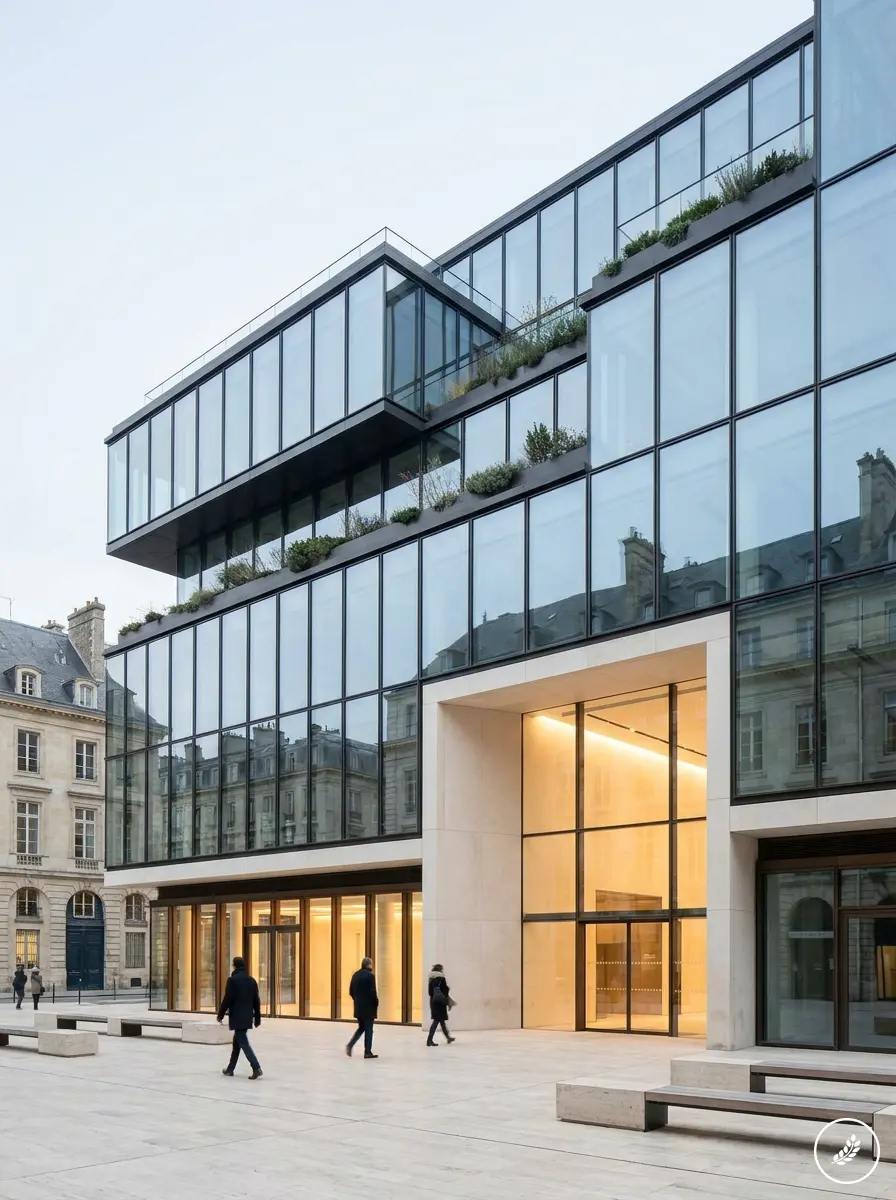
I’ll walk through how commercial architecture differs from residential, how the brief changes by building type, the principles that actually hold up on a job site, where 2026 trends are heading, and the mistakes that quietly sink small commercial projects.
What commercial architecture design actually means
Ask people to define commercial architecture and most say office building. That is one category out of at least five, and honestly the smallest slice of what a working architect handles in a given year.
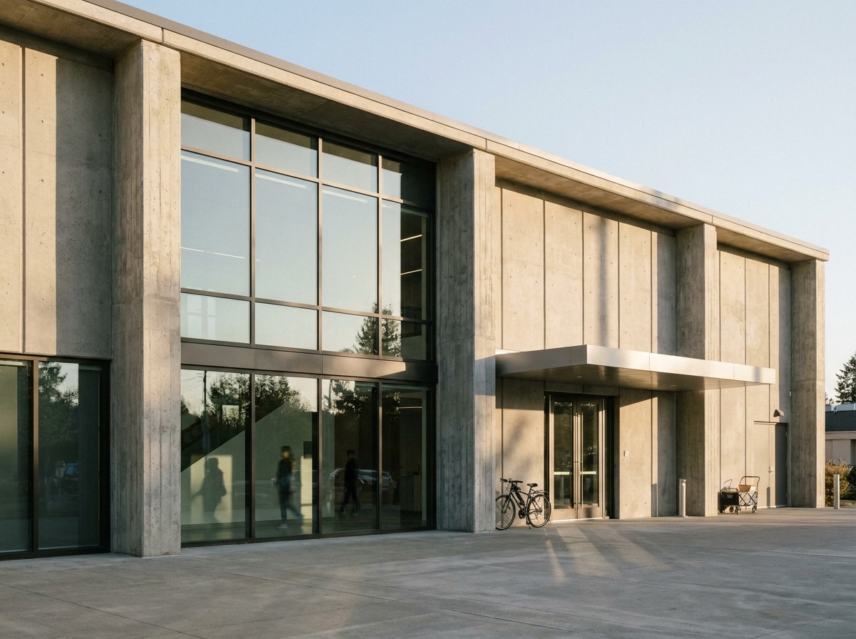
The scope runs wider than that: retail (a boutique storefront on a high street), hospitality (a hotel lobby built to slow you down), institutional (a public library or courthouse), mixed-use (apartments stacked over ground-floor retail), and industrial or logistics space (a distribution warehouse with an office wedge bolted on).
Each one answers a completely different question. Selfridges Birmingham, designed by Future Systems and finished in 2003, exists to make you stop walking and look up. Google’s Bay View campus in Mountain View, completed in 2022, exists to keep roughly 4,000 people comfortable, productive, and net-zero on energy for the next decade. Same discipline, opposite briefs.
Who actually decides what the building looks like
This is where commercial architecture design splits hard from anything personal. On a house, the client’s taste usually wins the argument. On a commercial project, taste is maybe 20 percent of the decision. The rest gets set by zoning setbacks, occupancy load, ADA clearances, a leasing agent’s opinion on street visibility, and a budget someone in finance locked before the architect ever got the call.
I’ve sat in enough of these meetings to notice a pattern: the buildings that age well are the ones where the architect treated all of that as material to design with, not obstacles to work around. A tight budget forced honesty in the material palette on one retail project I consulted on; a strict setback on another created the courtyard that ended up as the building’s best feature.
One habit worth stealing even for a small storefront: map every non-negotiable constraint — zoning, budget, code — on paper before sketching a single elevation. It sounds backward. It is actually faster than redesigning after the fact.
Commercial vs residential architecture: how the brief changes everything
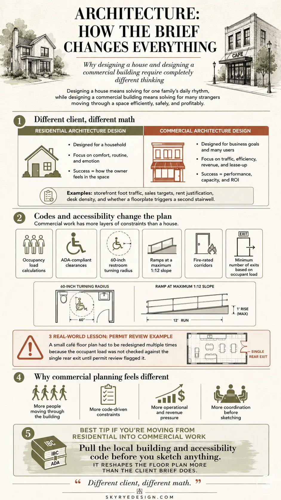
Design a house and you’re solving for one family’s daily rhythm: where the morning light hits the kitchen, how the hallway feels at 11pm. Design a commercial building and the math flips entirely. You’re solving for hundreds of strangers moving through a space you’ll never watch them use.
Different client, different math
Residential architecture design answers to a household. Commercial architecture design answers to a spreadsheet. A retail tenant signing a triple-net lease at, say, 38 dollars per square foot cares about one number above all: does the storefront pull enough foot traffic to hit sales targets that justify the rent. An office developer cares about lease-up speed and how many desks fit per floorplate without triggering a second stairwell. None of that has an equivalent in a single-family home, where the only return that matters is how the owner feels walking in the door after work.
Codes and accessibility requirements that don’t exist in a house
This is the part that surprises architects moving from residential into commercial work for the first time. A house has a building code. A commercial building has that code plus occupancy load calculations, ADA-compliant clearances (a 60-inch turning radius at every restroom, ramps at a 1:12 slope maximum), fire-rated corridors, and a minimum number of exits based on how many people the space is rated to hold. I once watched a residential-trained colleague redesign a small cafe’s floor plan three times because nobody had checked the occupant load against the single rear exit until the permit review flagged it.
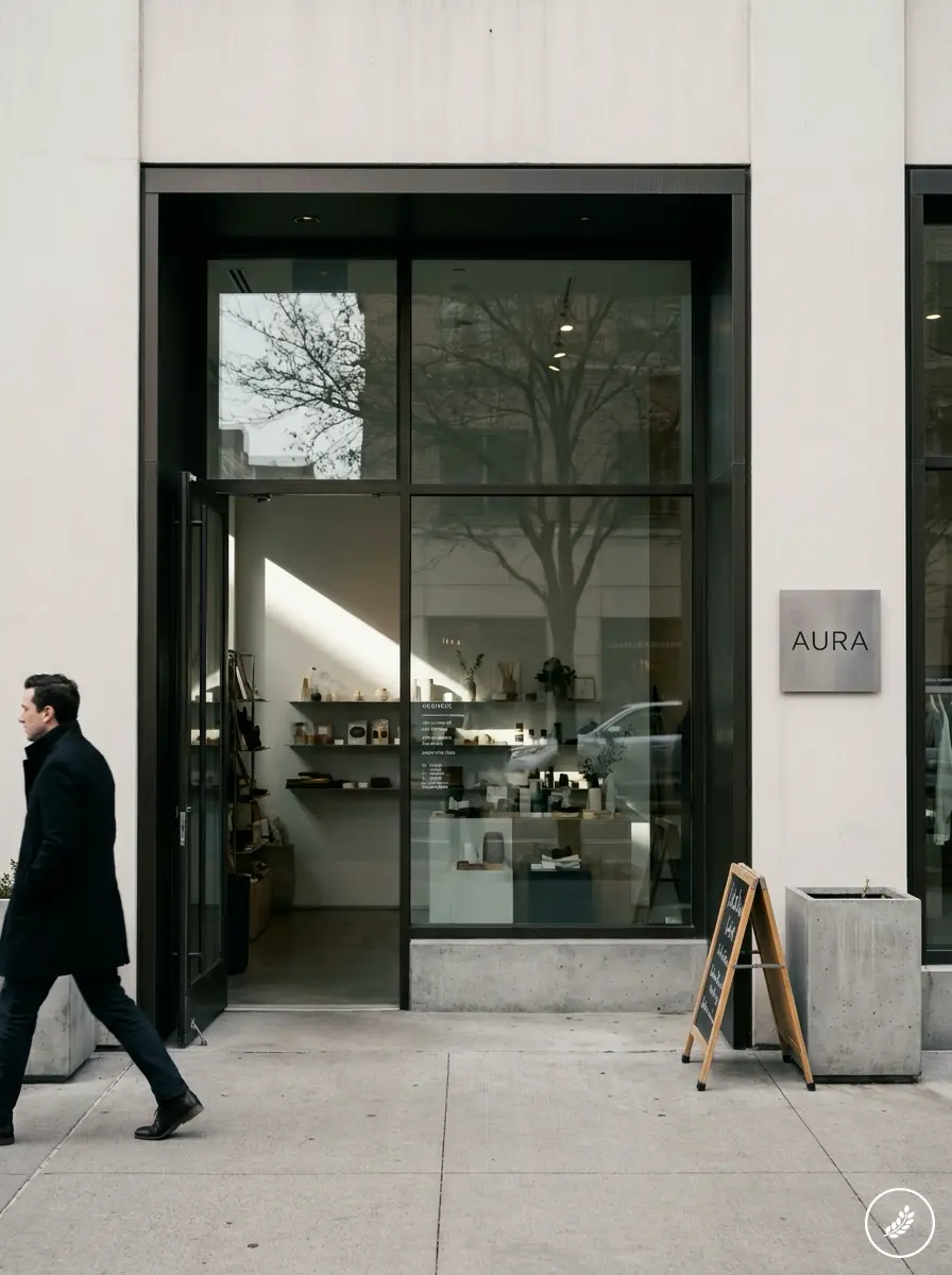
One tip if you’re moving from house projects into commercial work: pull the local building and accessibility code before you sketch anything. It reshapes the floor plan more than the client brief does.
Design by building type: retail, office, hospitality, mixed-use
Same discipline, four completely different rulebooks. Once you’ve sat through a few of each, you start recognizing the tells within seconds of walking into any commercial space.
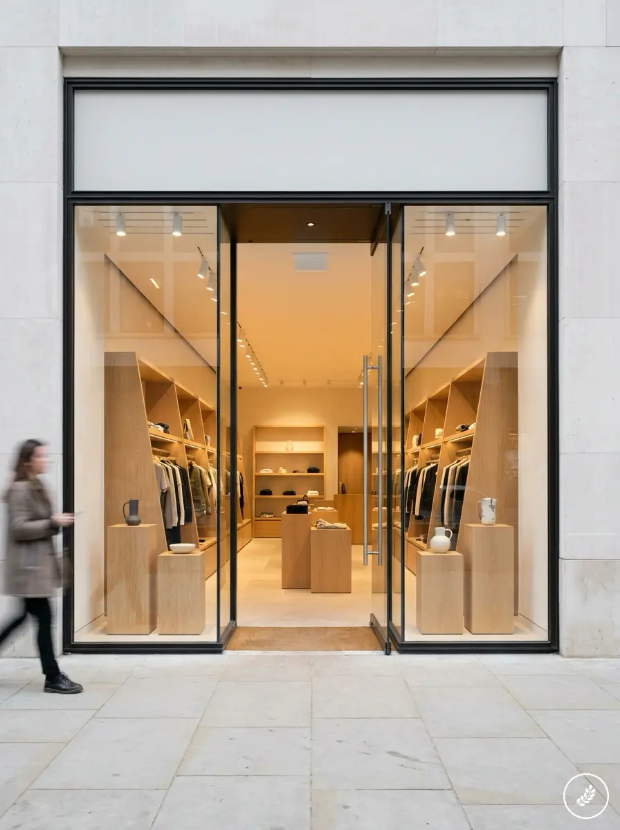
Retail: sightlines, signage, and getting people through the door
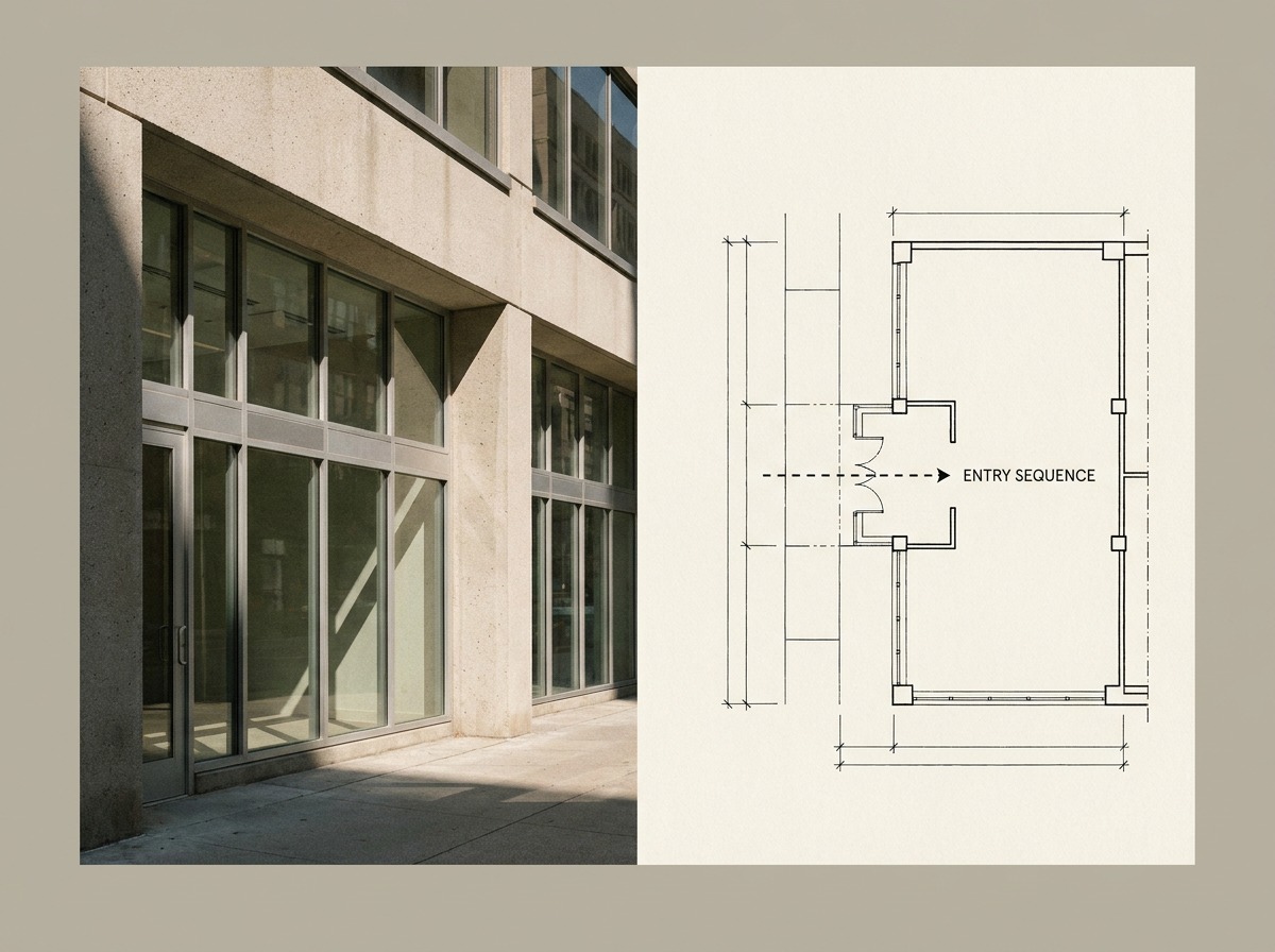
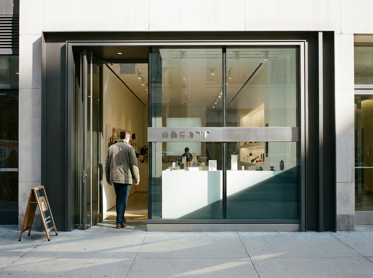
Retail design solves one problem above all others: get a stranger off the sidewalk and into the store within about three seconds of eye contact. Apple’s Fifth Avenue store, the glass cube redesigned by Bohlin Cywinski Jackson in 2019, does this almost aggressively — there’s nothing between the sidewalk and the product but glass. Smaller storefronts fake the same effect with a recessed entry that widens the sightline into the space, angled shelving near the door, and signage set at eye height rather than above the transom where nobody actually looks.
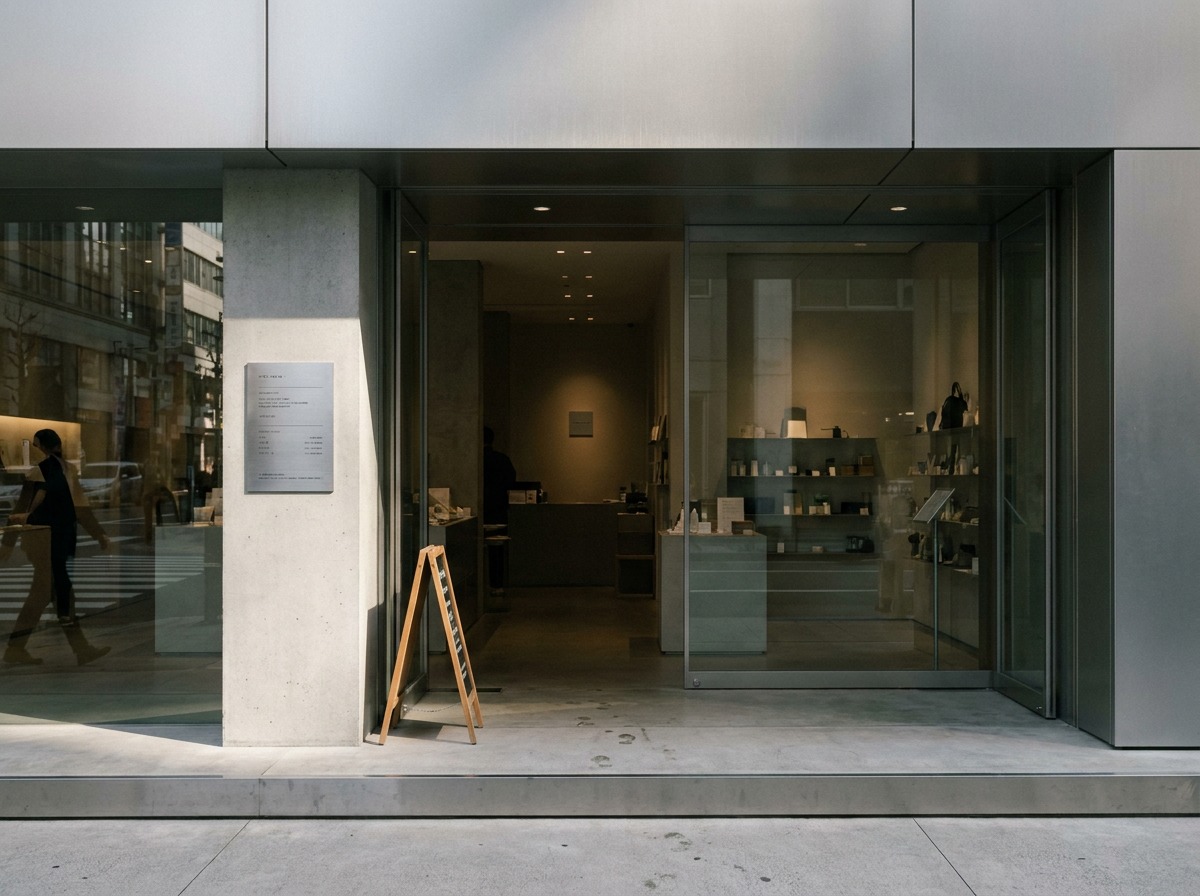
Office: daylight, flexible floorplates, and the wellness math
Office design in 2026 answers to a different question: will this floorplate still work in five years when the tenant’s headcount doubles or the layout goes fully hybrid. Bloomberg’s European headquarters in London, completed in 2017 and BREEAM-rated Outstanding, pushed this by running a natural-ventilation petal ceiling system through the whole floorplate instead of fixed HVAC zones, which sounds excessive until you realize it let them reconfigure desks freely for a decade without touching mechanical systems.

Hospitality: the arrival sequence and material warmth
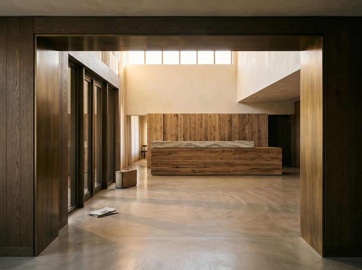
Hospitality design is the one typology where emotion is explicitly the brief. The Ace Hotel Brooklyn, opened in 2020, leans on reclaimed timber, warm brass, and a lobby that deliberately slows your walking pace before you reach the front desk. I’ve noticed the same trick works at a fraction of the budget: a change in flooring material at the threshold does almost the same psychological job as a full lobby redesign.
Mixed-use: stacking public and private without the seams showing
Mixed-use is the hardest brief on this list because it’s really three or four briefs stacked on top of each other. Ponce City Market in Atlanta, an adaptive reuse of a 1926 Sears distribution building completed in 2016, stacks retail, office, and residential into one structure by keeping circulation cores and the structural grid consistent across every floor, so the transition from a public food hall to private office lobbies feels like one building, not three bolted together.
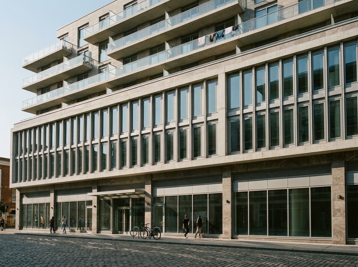
One rule holds across all four typologies: the entry sequence is never neutral. Whatever a visitor sees in their first ten feet sets the pace for how they’ll use the entire building.
Core design principles commercial architects actually work with
Strip away the typology-specific details from the last section and a handful of principles repeat on every commercial job, regardless of budget.
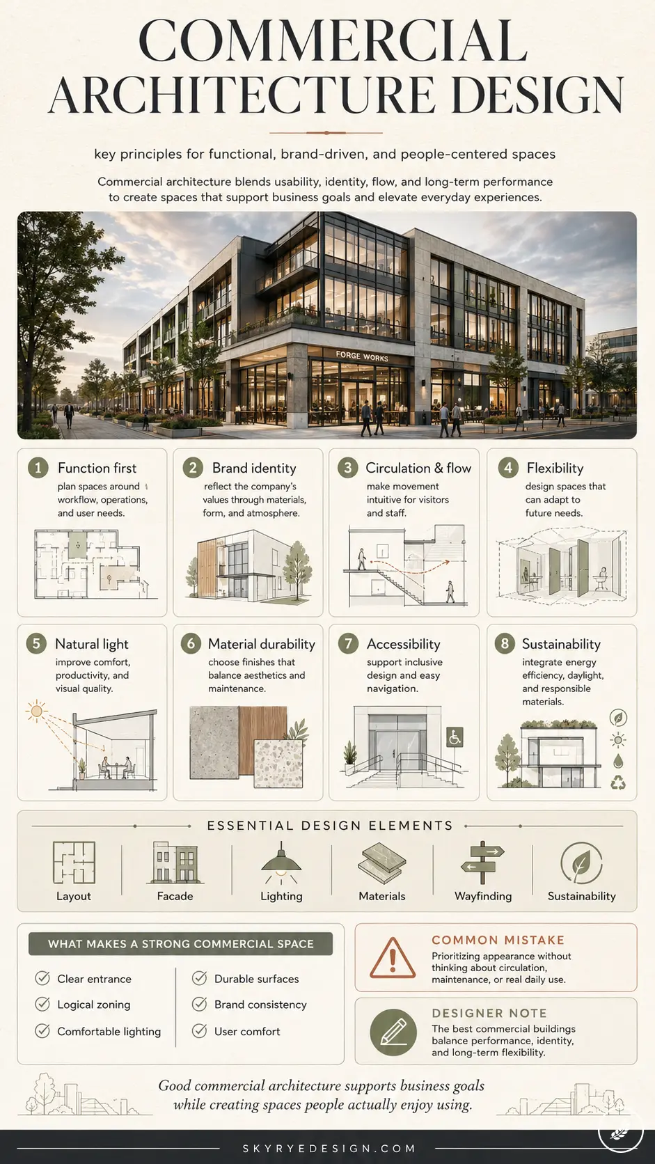
Proportion and facade rhythm
Facade proportion works on commercial buildings almost exactly the way it works in a living room, just at street scale instead of sofa scale. I wrote about the golden-ratio logic behind furniture pairings in my interior proportion guide, and the same instinct applies to a storefront: a glazing bay that’s roughly 60 to 65 percent of the total facade width reads as generous without looking like all-glass. Column spacing matters just as much. A structural bay locked to a repeating module, say 24 or 30 feet, keeps the rhythm readable even when three different tenants eventually build out three different storefronts behind it. Break that rhythm with columns spaced unevenly, or windows that ignore the floor-to-floor height, and the building reads as off even to someone who can’t say why.

Zoning and site constraints as design drivers, not obstacles
A required 15-foot setback or a 45-foot height cap feels like a limitation until you treat it as the brief. Floor area ratio, the maximum buildable square footage relative to the lot, quietly decides the massing of a building before a single elevation gets drawn. The Ponce City Market renovation mentioned earlier kept its original steel structure specifically because the site’s zoning made new construction at that footprint nearly impossible to permit within budget, so the constraint became the design strategy rather than something worked around.
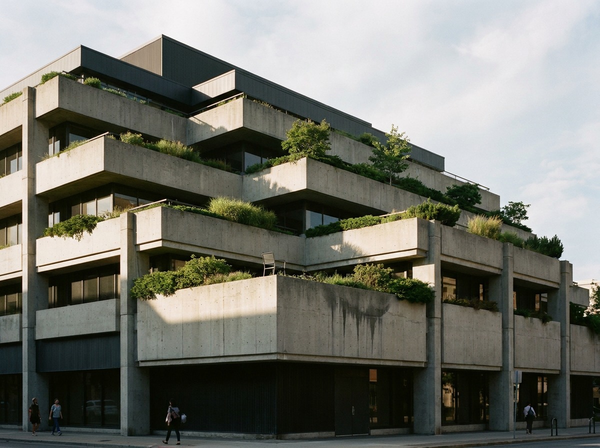
Material choice under commercial-grade durability requirements
Materials on a commercial building take abuse a house never sees: foot traffic in the thousands per day, delivery trucks scraping loading docks, decades of freeze-thaw on an exposed facade. That’s why you see so much brick, precast concrete, and anodized aluminum on storefronts instead of the wood siding common on houses — those materials hold a finish through 20-plus years of commercial-grade wear with minimal maintenance, even though the upfront cost can run 15 to 20 percent higher than residential-grade equivalents. On one small retail buildout, I specced a porcelain tile base instead of painted drywall for exactly this reason, and it still looked new after three years of shopping carts scraping past it daily.
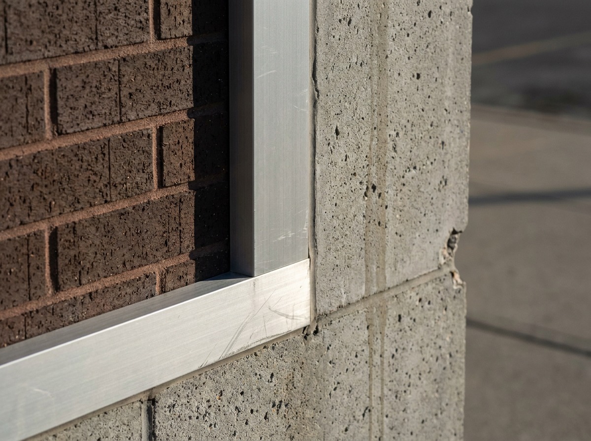
One habit worth keeping: whenever a constraint (setback, budget, material code) shows up, ask what it’s forcing you toward before treating it as something to fight.
What the 2026 trends actually change on the ground
Trend lists in architecture blogs tend to read like fortune cookies — biophilic design, net-zero, adaptive reuse, nod along, forget it by lunch. Here’s what each one actually forces you to change on a real drawing set.
Biophilic and wellness-centric layouts
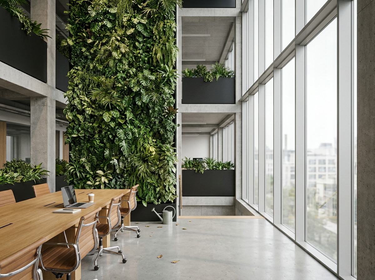
This one isn’t a green wall bolted onto an existing floorplan anymore. It gets decided at the massing stage. Amazon’s Spheres in Seattle, opened in 2018, built three glass domes housing over 40,000 plants specifically because internal research tied daylight and plant density to measurable gains in employee focus and retention. You don’t need a billion-dollar campus to borrow the logic: a floorplate reoriented so most desks sit within 30 feet of a window does more for a tenant’s retention numbers than almost any interior finish choice.
Net-zero and performance-driven design over statement architecture
The industry is visibly tired of buildings designed to win photography awards and then bleed energy costs for 40 years. The Bullitt Center in Seattle, completed in 2013 and still cited as a benchmark, generates all its own power through rooftop solar and treats every window as a performance decision, not a view decision. In 2026, expect more commercial clients to ask what the energy model looks like before asking whether the facade can be more dramatic, and that shift is a healthy one.

Adaptive reuse instead of demolition
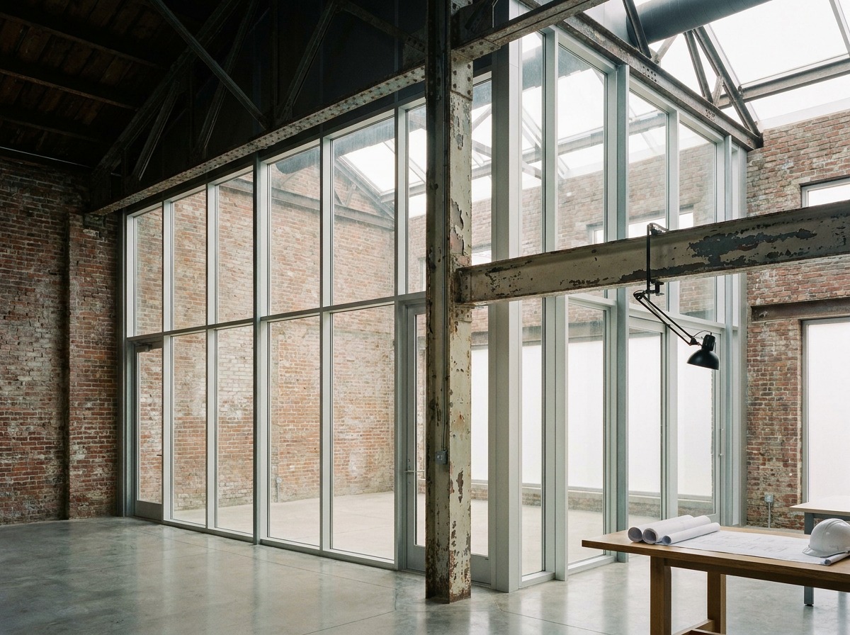
Battersea Power Station in London, reopened in 2022 after a renovation that kept its four iconic chimneys, converted a 1930s coal plant into offices, retail, and apartments instead of tearing it down. Beyond the sustainability case, reuse projects like this one keep a building’s structural bones, which is often the single biggest cost line on new commercial construction.
One practical takeaway: whenever a client mentions sustainability as a buzzword, ask them to name a specific metric — energy use intensity, embodied carbon, whatever it is — before design starts. It changes the entire conversation.
Where small commercial projects go wrong
The failures in this section aren’t glamorous. They’re the small commercial storefronts and single-tenant buildings that never make it onto an architecture blog, and the same three mistakes repeat across a dozen different small projects I’ve seen.
Undersized signage and entry zones that kill foot traffic
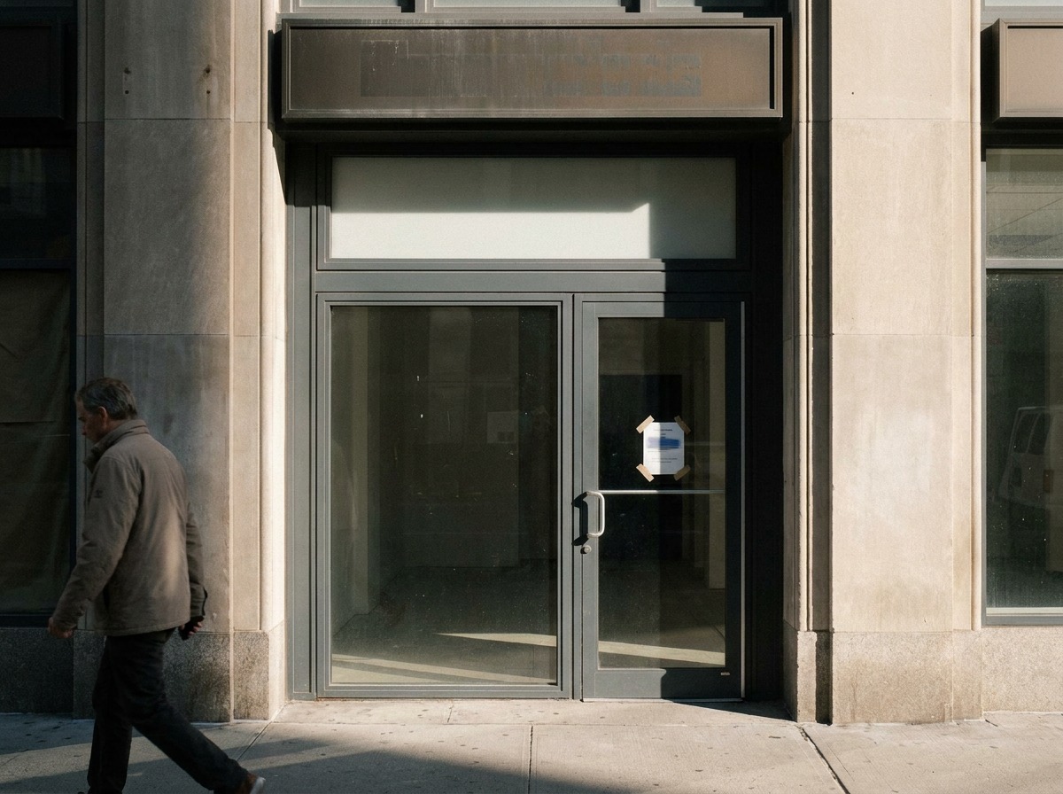
A retail storefront with a recessed entry under six feet wide reads as closed even when it isn’t — peripheral vision just doesn’t register it as an opening worth walking toward. I once watched a client cut an entry width from 10 feet to 6 feet late in a budget review to save on glazing costs, and foot traffic dropped noticeably within the first quarter after opening. Signage mounted above eye level does the same quiet damage: nobody looks up while walking, people look straight ahead at roughly 5 to 6 feet off the ground.
Ignoring ADA and egress until permitting
This is the most expensive mistake on the list because it surfaces after the design is already finished. A restroom turning radius that’s two inches short of the 60-inch ADA minimum, or an occupant load calculation that assumes fewer people than the space is actually rated for, both come up during permit review, and both mean redrawing plans that were supposedly done. Building this into the schematic phase instead of treating it as a permitting checklist item costs nothing extra and saves weeks.
Treating the exterior as decoration instead of the first functional layer
The facade isn’t the last thing you add once the floor plan works. It’s doing functional work: shading angles that cut cooling loads, entry sequencing that manages foot traffic, material choices that hold up to the specific climate. Small commercial projects often treat exterior design as a final coat of paint applied after the real decisions are made, and it shows in how quickly those buildings start looking tired.
A realistic process, roughly
For a small commercial buildout, expect concept design to run four to eight weeks, permitting three to six months depending on the jurisdiction, and construction another four to nine months after that. Budgeting extra time into the permitting phase specifically, rather than assuming it’ll move as fast as the design phase, is the single easiest way to avoid a client’s opening-day panic.
Conclusion
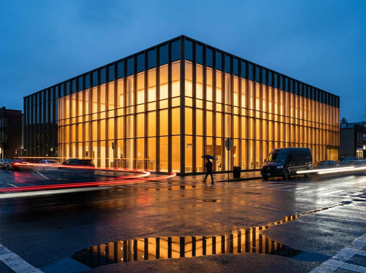
Design a car door or a store entrance and the same rule holds: the shape has to earn its place inside every constraint stacked against it (budget, code, structure) before it earns the right to look good. That’s the thing nobody tells you walking into commercial architecture design for the first time. It isn’t a style exercise. It’s a constraint-solving discipline that happens to produce buildings.
If you’re starting a small commercial project, do one thing before sketching anything: write down every non-negotiable — zoning, budget, ADA, structural grid — on a single page. The building that respects all of it from day one will always look more resolved than the one styled first and justified later. If proportion is the part you want to sharpen next, my guide on proportion in interior design walks through the same logic at a smaller scale.
For interiors that expect people to sit for long sessions, furniture selection belongs in the planning conversation too. This refurbished office seating guide explains a budget-aware route to ergonomic chairs.
FAQ
What is the difference between commercial and residential architecture?
Residential architecture solves for one household’s daily rhythm. Commercial architecture solves for hundreds of strangers moving through a space, with the brief driven by ROI, foot traffic, and lease terms instead of personal taste. Commercial projects also carry code requirements a house never sees: occupancy load calculations, ADA-compliant clearances, fire-rated corridors, and a minimum number of exits based on how many people the space is rated to hold.
What are the main types of commercial architecture?
Five broad categories cover most of it: retail (storefronts, malls), office (headquarters, coworking), hospitality (hotels, restaurants), institutional (libraries, courthouses), and mixed-use (residential stacked over retail or office). Industrial and logistics buildings, like a distribution warehouse with an office wedge, often get grouped in too. Each type answers a different functional question, so the design principles that work for a boutique storefront rarely transfer directly to an office tower.
How long does commercial architecture design take?
For a small commercial buildout, concept design usually runs four to eight weeks, permitting takes three to six months depending on the jurisdiction, and construction adds another four to nine months after that. Larger projects, like a mixed-use development, can stretch permitting alone past a year once environmental review and community input get involved. Budgeting extra time into permitting specifically avoids most opening-day scheduling panics.
What building codes matter most in commercial design?
ADA accessibility (60-inch turning radii, ramp slopes capped at 1:12), occupancy load calculations, fire-rated egress corridors, and zoning rules like setbacks and floor area ratio all shape a commercial project before a single elevation gets drawn. Local jurisdictions layer their own amendments on top of the International Building Code, so pulling the exact local code early saves a redesign later.
Is biophilic design actually worth it in commercial buildings?
Yes, and it’s increasingly backed by retention data rather than aesthetics alone. Amazon’s Spheres in Seattle built the case at a multi-billion-dollar scale, but the underlying logic scales down easily: a floorplate reoriented so most desks sit within 30 feet of a window measurably improves tenant satisfaction and lease renewal rates, often for less cost than a full interior finish upgrade.
What’s the biggest mistake in small commercial building design?
Treating the entry and signage as an afterthought. A recessed entry under six feet wide or signage mounted above eye level quietly kills foot traffic, since peripheral vision won’t register a narrow opening as worth walking toward. The second most common mistake: not checking ADA and occupant load requirements until permit review, which forces expensive redesigns on plans that were supposedly finished.
Related commercial space planning note
For interior decisions that sit between architecture and daily operations, this commercial interior design planning guide is a useful companion to the broader building strategy.
- 75shares
- Facebook0
- Pinterest75
- Twitter0
- Reddit0