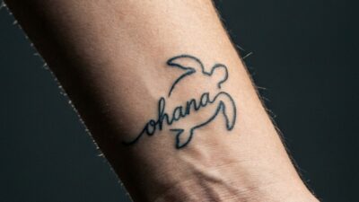
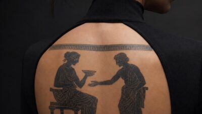
Most “Harry Potter tattoo ideas” lists are just inventories: here’s a lightning bolt, here’s a wand, here’s a house crest, pick one. What they skip is the part that actually determines whether a wizarding-world tattoo looks intentional five years from now or reads as a rushed fandom impulse: line weight, scale, and where on the body a given symbol’s shape actually belongs.
I’ve written before about reading the body as a composition surface rather than a flat canvas, and that framework applies directly here. A minimalist symbol wants a different placement than a detailed character portrait. A single word wants different letterform choices than a full quote. This piece groups Harry Potter tattoo ideas by category the way most lists do, but every entry also covers the design decision that separates a version that ages well from one that doesn’t.
- What makes a wizarding-world tattoo actually work
- Wizarding symbols and icons
- House-inspired designs
- Color and style choices for a wizarding-world tattoo
- Character and creature tributes
- Quotes and short phrases
- Combining elements without overcrowding the design
- FAQ
- What's the most popular Harry Potter tattoo idea?
- Where should a small wizarding-world symbol tattoo go?
- Are character portrait tattoos a good idea for this theme?
- How do I make a Harry Potter tattoo look less like generic fan art?
- Do house-themed tattoos need to include the exact crest?
- What style holds up best for a larger wizarding-world tattoo?
- Should a Harry Potter tattoo include color?
- Final thoughts
What makes a wizarding-world tattoo actually work
Three factors matter more than which specific symbol or character you pick.
Line weight has to match the design’s complexity. A simple geometric symbol, a single small icon, a short word, can carry a thin, delicate fine-line treatment and still read clearly for years. A detailed character portrait or a busy scene needs bolder linework and some shading depth, or it risks blurring into an unreadable smudge as skin ages. Matching weight to complexity, not personal preference alone, is what keeps a design legible long-term.
Scale has to match the symbol’s shape. A minimalist geometric mark can work small, on a wrist or behind an ear. A detailed magical creature or a full scene needs enough real estate, typically a forearm, calf, or upper arm, to hold its detail without every element collapsing into a single dark shape once the linework ages.
Placement should follow the design’s own geometry, not just where it feels meaningful. A vertical symbol suits the spine, forearm, or shin. A small circular or radial mark suits a wrist, behind the ear, or the back of the neck. A design meant to wrap suits a bicep or ankle. This is the same anatomy-first thinking that applies to any tattoo, wizarding-themed or not.
These three factors interact more than people expect. A symbol that’s the right scale but placed on a joint that flexes constantly will distort faster than the same symbol placed on a flatter, more stable area. A quote with the right letterform but crammed into too small a space loses its typography’s character the moment it needs to shrink slightly to fit. Treat scale, placement, and line weight as one decision, not three separate ones made in sequence.
Wizarding symbols and icons
Small, recognizable symbols are the most requested category, and they’re also the category most likely to be ruined by poor line weight or the wrong scale.
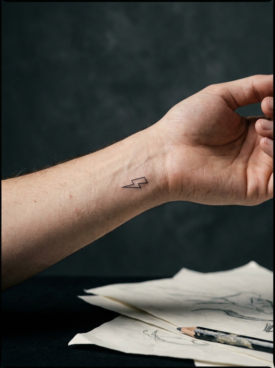
A lightning-bolt-style mark works best small and clean, since its power comes from instant recognition, not detail. Keep it under an inch or two and place it somewhere the simple shape reads at a glance: wrist, behind the ear, or ankle.
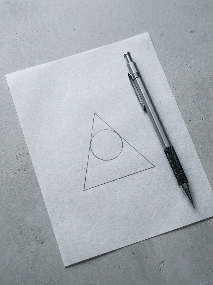
A minimalist geometric symbol built from a triangle, a circle, and a single line, the kind of design fans associate with the series’ themes of mortality and magical objects, works well as a small, single-line fine-line piece. Its whole appeal is restraint; adding shading or extra ornamentation defeats the point of a symbol whose meaning comes from simplicity.
A small flying ball with wings, associated with the sport at the heart of the wizarding world, reads best with a bit more detail than the geometric symbols above, since the wing texture needs some linework to avoid looking like a plain circle with two triangles attached. Keep it to wrist or forearm scale where the wing detail has room to hold up.
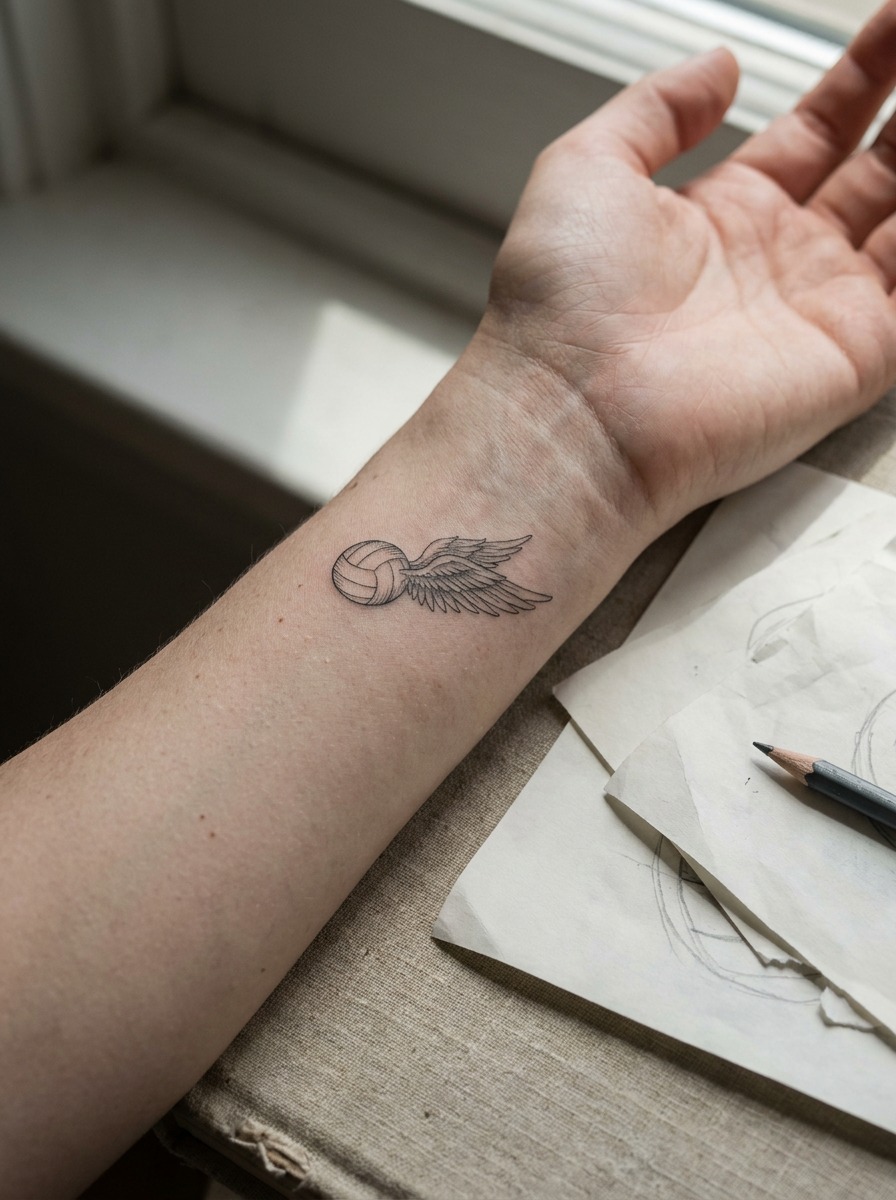
A simple key or skeleton-key motif, another object with strong associations in the series’ visual language, works nicely as a vertical fine-line piece down the inner forearm or along the spine, letting the key’s natural vertical shape do the composition work for you.
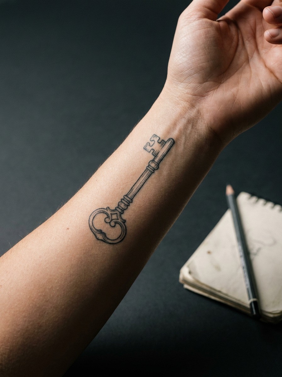
A minimalist wand illustration, rendered as a single clean line rather than an ornately carved replica, suits a diagonal placement across the forearm or ribs, following the natural angle a wand would sit at if actually held. Overcomplicating the carving detail is the most common mistake here; a wand tattoo reads more clearly at a glance when it’s reduced to its essential silhouette rather than an attempt at photorealistic wood grain.
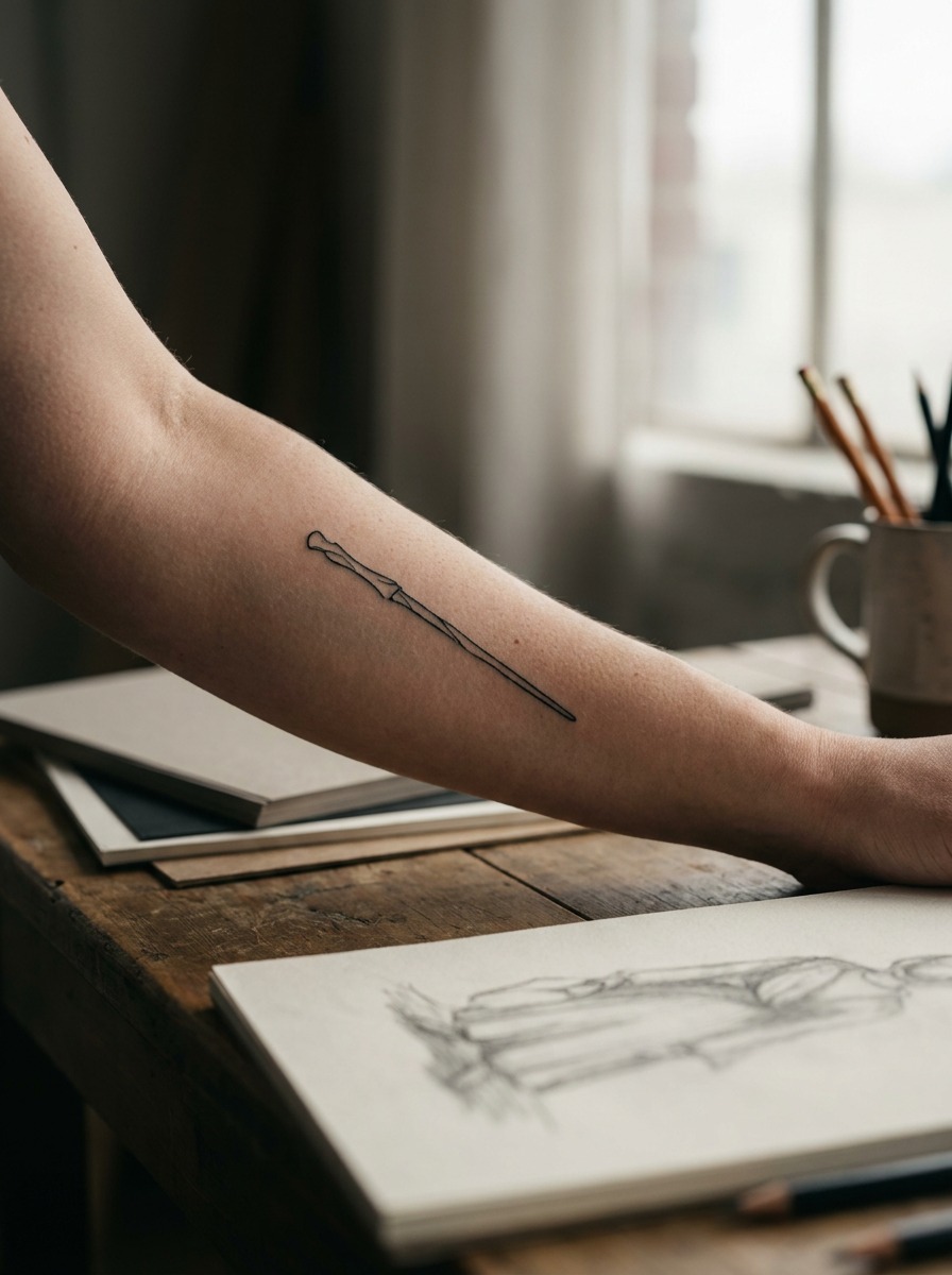
A small crescent moon paired with a scattering of stars, associated with the more mystical, astronomy-adjacent corners of the wizarding world, works well as a shoulder or collarbone piece, since the asymmetric scatter of stars naturally follows a curved surface better than a rigid geometric symbol would.
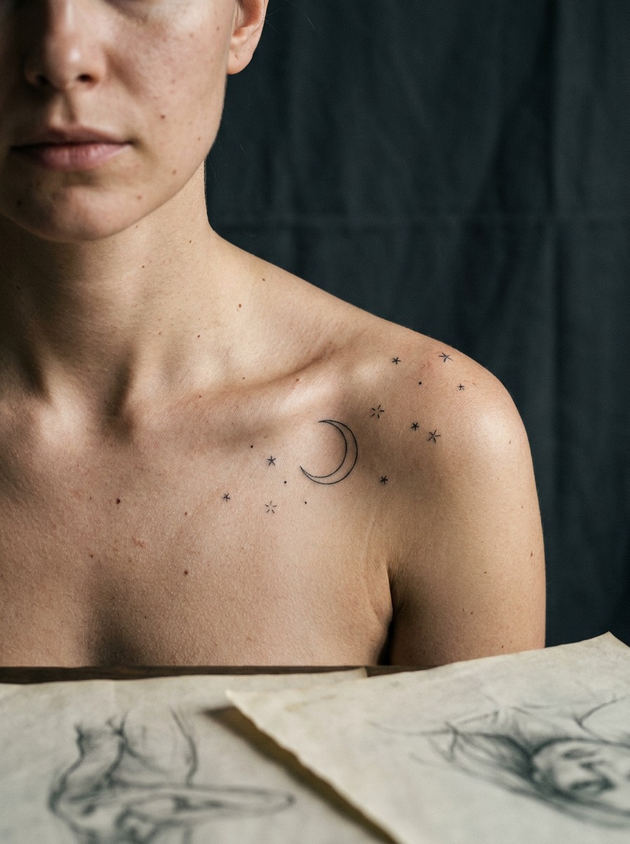
House-inspired designs
Rather than reproducing an exact crest, which tends to age into a blurry patch of tiny detail faster than almost any other tattoo style, most house-inspired tattoos work better built around the house’s associated animal and color palette instead.
A lion motif, associated with courage and one of the four houses, works well as a bold but not overly detailed linework piece, since a lion’s mane and face carry enough natural visual weight without needing full realism. A serpent motif, associated with ambition and cunning, suits a wrapping composition around a wrist or bicep, letting the snake’s natural sinuous shape follow the limb’s curve. An eagle or raven, associated with wisdom, works well as a wing-spread silhouette on the upper back or shoulder blade, where there’s room for the wingspan without cramming it into too small a space. A badger, associated with loyalty and hard work, reads as a friendly, approachable design even at a smaller scale, since its blocky proportions hold up better than more delicate animal shapes when shrunk down.
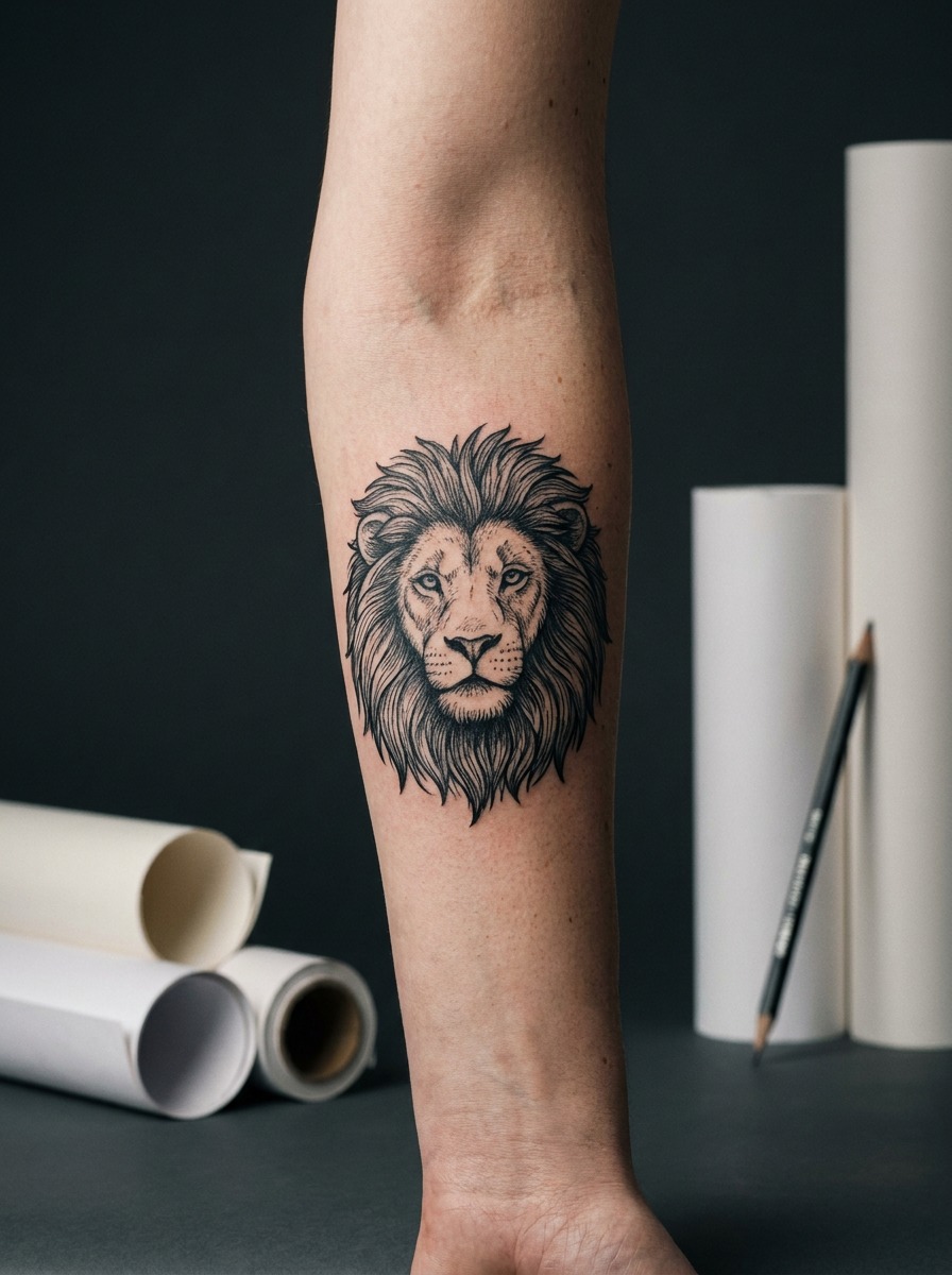

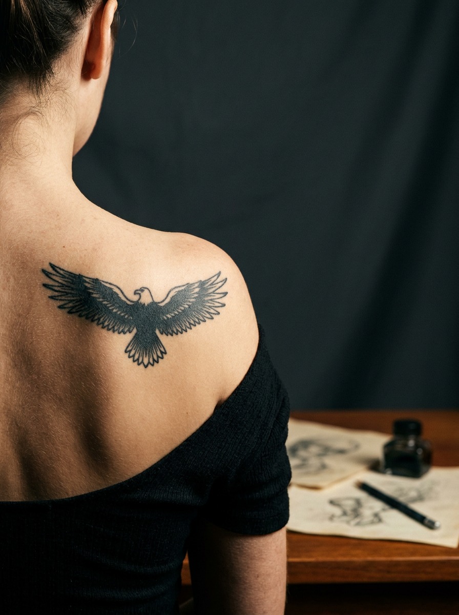
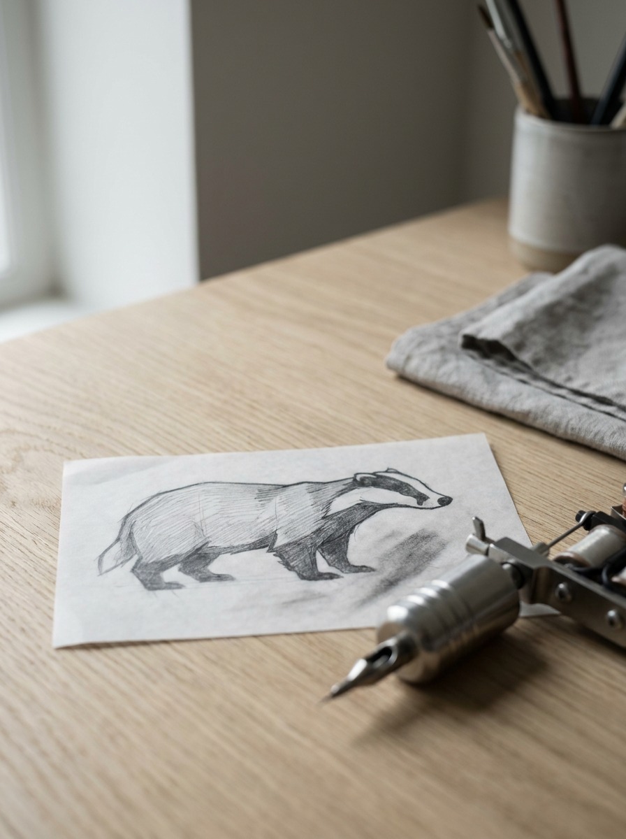
For any of these, color is doing as much work as shape. A single accent color, deep red, emerald green, bronze, or deep yellow, layered into an otherwise black linework piece signals the house association without needing an exact crest reproduction.
Placement matters here too, following the same logic as the symbols above. The lion and badger, being more compact, blocky shapes, hold up well at smaller scales on the forearm or calf. The eagle and serpent, with their more elongated silhouettes, benefit from a longer canvas, a full forearm, the side of the ribs, or a wrap around the bicep, where their natural shape has room to stretch out instead of being compressed into an awkward square footprint.
Color and style choices for a wizarding-world tattoo
Beyond the symbol or subject itself, the overall style you pick, fine line, blackwork, or watercolor-adjacent color work, changes how well a design ages and how it should be placed.
Fine line suits the small symbols and geometric marks covered above almost by default, since their whole appeal is restraint. Push a fine-line style past a certain size, though, and the thin lines start looking sparse rather than delicate; know roughly where that size ceiling sits for your specific design before committing to a larger version of what should stay a small, quiet piece.
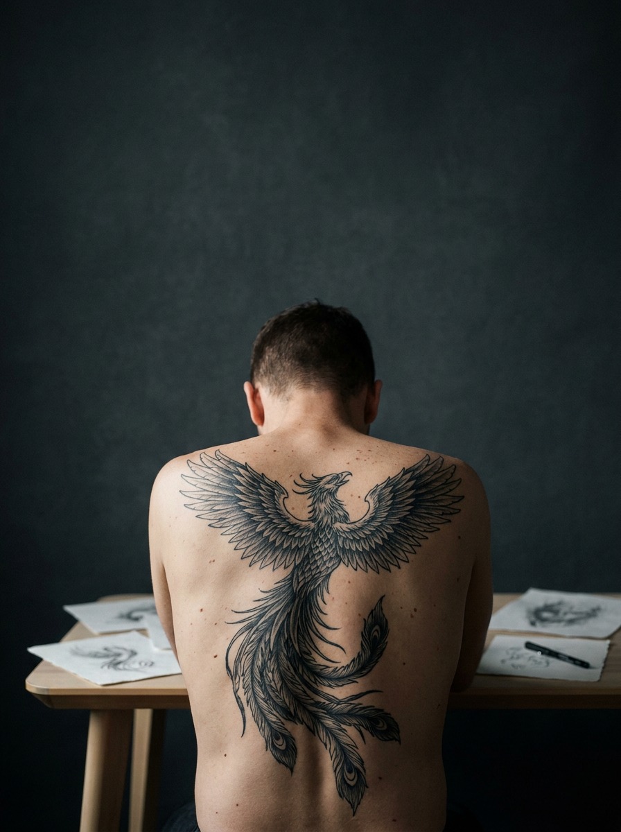
Blackwork, with its solid fills and bolder linework, suits the creature and character-silhouette ideas better, since it holds up at larger scales and ages more gracefully than fine line does on complex shapes. A blackwork phoenix or serpent can carry real visual weight on a back piece or full sleeve in a way a fine-line version of the same subject would struggle to sustain.
Color work, whether a single accent tone or a fuller palette, adds vibrancy but also adds long-term maintenance considerations, since color fades faster and less predictably than black ink does. If house colors or a phoenix’s fiery palette are central to the design’s appeal, budget for touch-ups down the line rather than assuming the color will hold at full saturation indefinitely.
Character and creature tributes
Portrait-style tattoos of specific characters are popular, but they’re also the category with the highest bar for execution, since a portrait that ages poorly reads as a mistake in a way an abstract symbol never will. Realistic portrait work demands a specific skill set from the artist, fine gradient shading, precise proportion, and even then, skin’s natural aging process is harder on realistic faces than on almost any other tattoo style, since the eye is extremely sensitive to small distortions in a familiar face.
If a character tribute is the goal, consider a silhouette or a single defining object associated with that character rather than a full facial portrait. A silhouette carrying a wand in a specific stance, a pair of round glasses paired with a small scar mark, or a signature accessory reads as a tribute without demanding photorealistic linework that’s much harder to keep crisp over time.
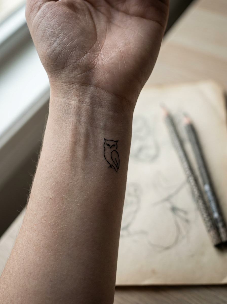
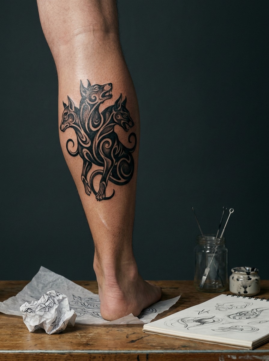
Magical creatures translate more reliably into tattoos than character portraits do. A phoenix rising with detailed feather layering makes a strong back-piece or shoulder tattoo, since the bird’s natural silhouette already carries visual drama without needing a specific character’s face attached to it. A small owl, associated with the series’ postal system and often a personal familiar for fans, works at almost any scale, from a delicate wrist piece to a larger, more detailed forearm design. A three-headed dog or other distinctive magical beast makes a striking larger piece for anyone wanting a more unusual creature tattoo than the more common phoenix or owl options.
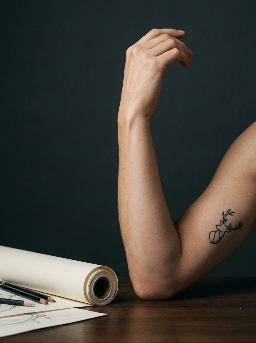
A stag silhouette, associated with a particular character’s protective magic, translates well into a clean, minimal outline suited to the upper back or outer forearm, where its antlers can spread naturally without being cramped by the edges of a smaller canvas.
DESIGN TIP: Pick one primary subject and let everything else stay secondary. A single well-placed symbol outlasts five references crammed into one small tattoo.
Quotes and short phrases
Text tattoos live or die on typography choice, more than any other factor. A single word in a clean, slightly whimsical serif reads as intentional; the same word in a generic tattoo-shop script font reads as an afterthought.
A single word like the one fans associate with the series’ most quoted line about enduring love reads best in a moderate-size script along the forearm, ribs, or collarbone, somewhere with enough length for the word to breathe without cramping. A short phrase associated with mischief and the map used to sneak around the school works well in a slightly playful, uneven hand-lettered style rather than a rigid uniform font, since the phrase’s tone is informal, not solemn. A short incantation-style phrase, the kind used for a spell of protection or a spell of illumination, reads well in a simple, elegant single-line font, since these short magical phrases carry their own rhythm without needing decoration.
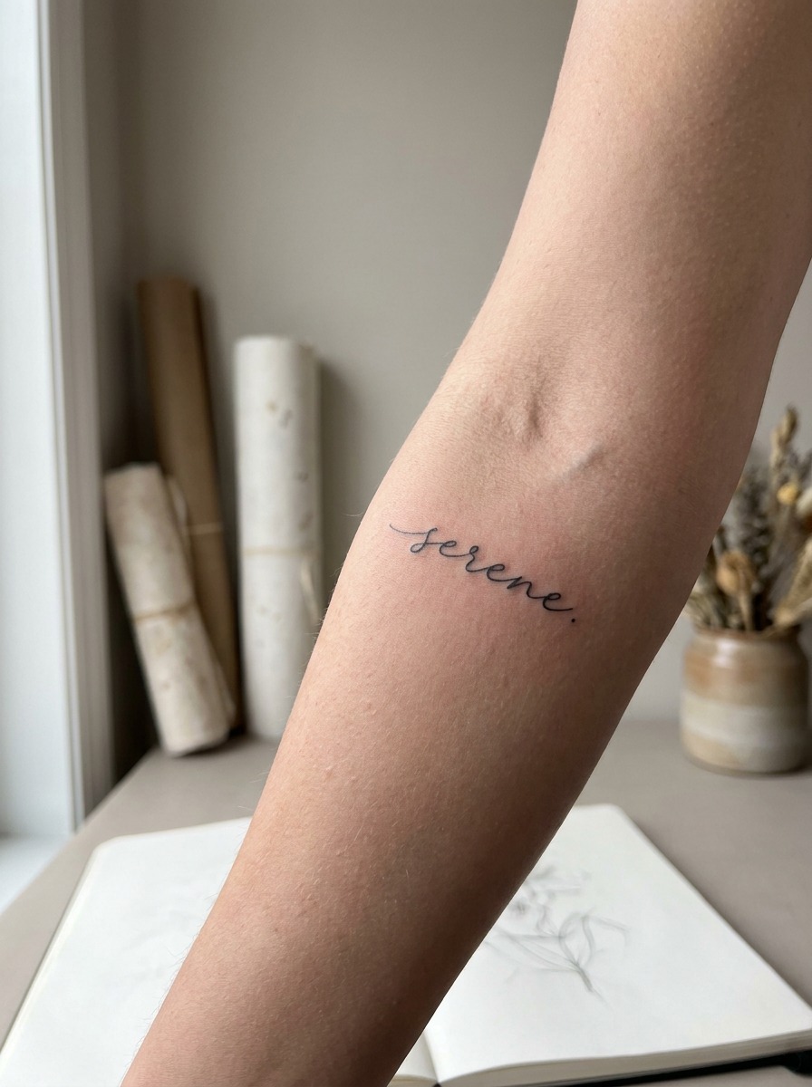
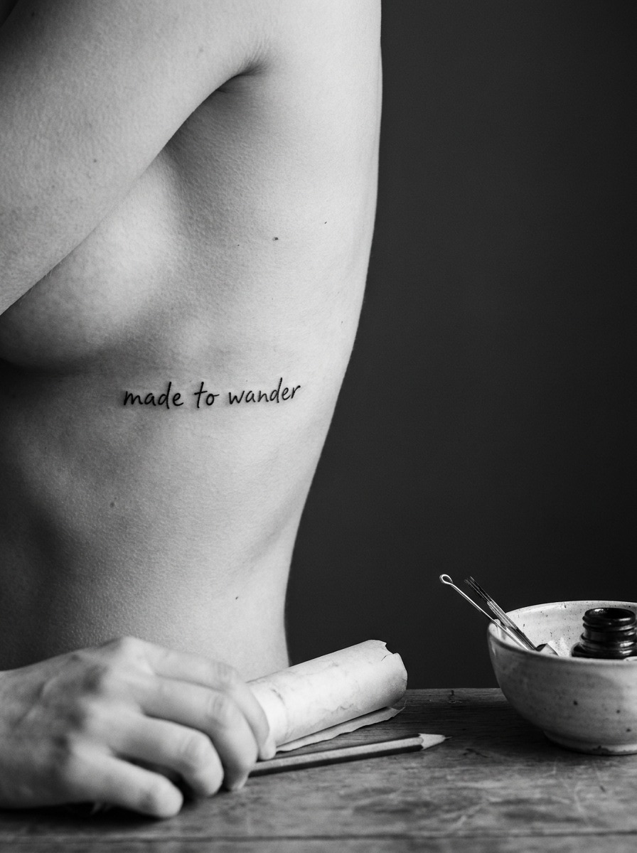
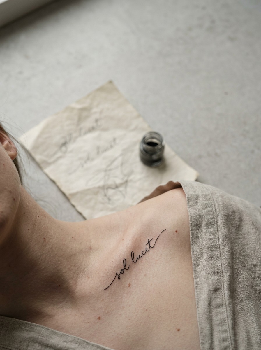
Keep any text tattoo to a length you’re confident will still be legible at a smaller scale after years of natural skin change; a phrase that barely fits at its original size leaves no room for the softening that happens to every tattoo over time.
Placement for text follows a different logic than symbols do. A word or short phrase reads best along a naturally elongated body line, the forearm, the ribs, the collarbone, rather than curled around a joint or squeezed into a small circular space, since text needs a straight or gently curved baseline to stay legible as it ages. Resist the temptation to wrap a longer quote around a wrist or ankle purely because that’s a popular placement for other tattoo styles; text specifically needs room to breathe in a way symbols don’t.
Combining elements without overcrowding the design
The biggest mistake in this entire category is trying to fit too many wizarding-world references into a single tattoo: a wand, a symbol, a quote, and a house color all crammed into one small forearm piece. Each individual element might be well executed, but the combination reads as cluttered rather than personal.
Pick one primary element as the tattoo’s actual subject, and let anything else stay small and secondary, a tiny icon tucked near a larger main design, rather than treated as equally important. This is the same restraint principle that applies to any tattoo composition: one clear idea, well executed, outlasts five references crammed into the same six square inches.
A useful test before committing to a combined design: cover every element except the one you consider most important, and ask whether the tattoo still feels complete and meaningful on its own. If the answer is no, and the design only works with all five references present, that’s usually a sign the composition needs simplifying rather than a sign you’ve found the right amount of detail. A single owl silhouette says as much about a fan’s connection to the series as an owl, a wand, a snitch, and a quote crammed together, and it will still look considered a decade from now.

FAQ
What’s the most popular Harry Potter tattoo idea?
Small geometric symbols and single-word quote tattoos tend to be the most requested, mainly because they scale down well and stay legible for years, unlike detailed character portraits or full scene recreations, which demand more space and more precise linework to hold up over time.
Where should a small wizarding-world symbol tattoo go?
Wrist, behind the ear, ankle, or collarbone all suit a small, simple symbol well, since these spots give a compact design enough visibility without forcing it to compete with joint movement or heavy curvature that can distort fine linework over time.
Are character portrait tattoos a good idea for this theme?
They can work, but they carry more long-term risk than symbols or creature designs, since a portrait needs precise, detailed linework to stay recognizable as skin ages. A silhouette or a signature object associated with a character is often a more durable choice than a full facial portrait.
How do I make a Harry Potter tattoo look less like generic fan art?
Choose one primary element instead of combining several references, and match the linework style, delicate fine line for symbols, bolder linework for creatures or portraits, to that element’s actual complexity rather than defaulting to whatever style is trending.
Do house-themed tattoos need to include the exact crest?
No. A house’s associated animal and color palette communicate the same idea and tend to age better than a detailed crest, which packs a lot of small elements into limited space and can blur together faster than a simpler animal-and-color design.
What style holds up best for a larger wizarding-world tattoo?
Blackwork generally ages better than fine line at larger scales, since its bolder linework and solid fills hold their shape longer than delicate thin lines do. Fine line still suits small symbols well; it’s specifically larger, more detailed subjects like creatures or scenes where blackwork tends to outlast fine line.
Should a Harry Potter tattoo include color?
Only if you’re prepared for some maintenance down the line, since color ink fades faster and less evenly than black ink. A single accent color layered into black linework is usually a safer long-term choice than a fully colored design if longevity matters more to you than initial vibrancy.
Final thoughts
A Harry Potter tattoo works the same way any good tattoo does: one clear idea, matched to the right scale and placement, executed with line weight suited to its actual complexity. The wizarding-world theme gives you the subject matter; the same design principles that apply to any tattoo still decide whether it looks intentional or accidental years down the line.
Before finalizing any design from this list, run it through the same three questions: does the line weight match the complexity, does the scale suit the shape, and does the placement follow the design’s own geometry rather than just where it feels meaningful. A design that answers all three well will still look considered a decade from now, long after the specific reference photo that inspired it has been forgotten.
For a deeper look at how anatomy, scale, and body flow shape any fine line design, not just this theme, see my tattoo placement chart. If you’re still deciding on a design rather than a tattoo specifically, my Harry Potter drawing ideas covers similar subject matter built for paper first. And for literary tattoo ideas beyond this one series, book tattoo ideas covers that broader ground.
For more starting points, browse the Sky Rye Design tattoo ideas hub.
- 23shares
- Facebook0
- Pinterest23
- Twitter0
- Reddit0