Static brand boards lie. A poster can look perfectly balanced until the title starts moving, the logo arrives half a second too early, and the carefully chosen red turns orange against phone footage. Motion exposes weak hierarchy fast.
I have spent more than 15 years moving between automotive concepts, jewelry, architecture, interfaces, and graphic design. That background makes me judge creative software by one standard: does it preserve the system behind the image? This Filmora review looks at the editor through that lens. The question is not simply whether a beginner can cut video. It is whether a graphic designer can carry type, color, proportion, and brand character into motion without fighting the tool.
- The quick Filmora review verdict for designers
- From static layout to a working timeline
- Typography in motion without losing hierarchy
- Color tools for a consistent brand video
- Keyframes, masks, and tracking for branded motion
- Templates: useful scaffolding or a generic look?
- A 15-second test before you commit to Filmora
- Where Filmora stops being enough
- Final verdict
- FAQ
- Is Filmora good for graphic designers with no video experience?
- Can Filmora animate logos and typography?
- Can Filmora use custom fonts and brand colors?
- Is Filmora suitable for professional brand videos?
- Is Filmora easier than After Effects or DaVinci Resolve?
- How does Filmora synchronize separately recorded audio?
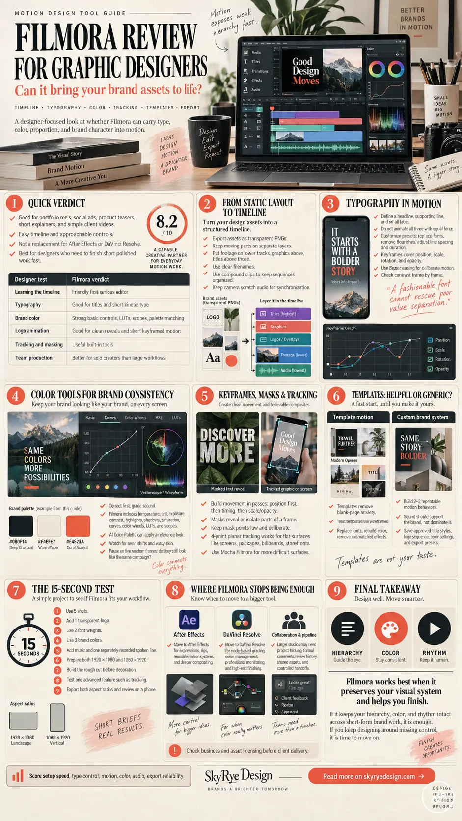
Filmora 15 is far more capable than its beginner reputation suggests. It has multi-track editing, compound clips, Bezier-based keyframe controls, masks, planar tracking, color scopes, LUT support, and an AI-assisted color-matching tool. Those features cover a surprising amount of short-form brand work. The limits appear when a project needs a deep motion system, exact compositing, formal review controls, or a color-managed finishing process.
The quick Filmora review verdict for designers
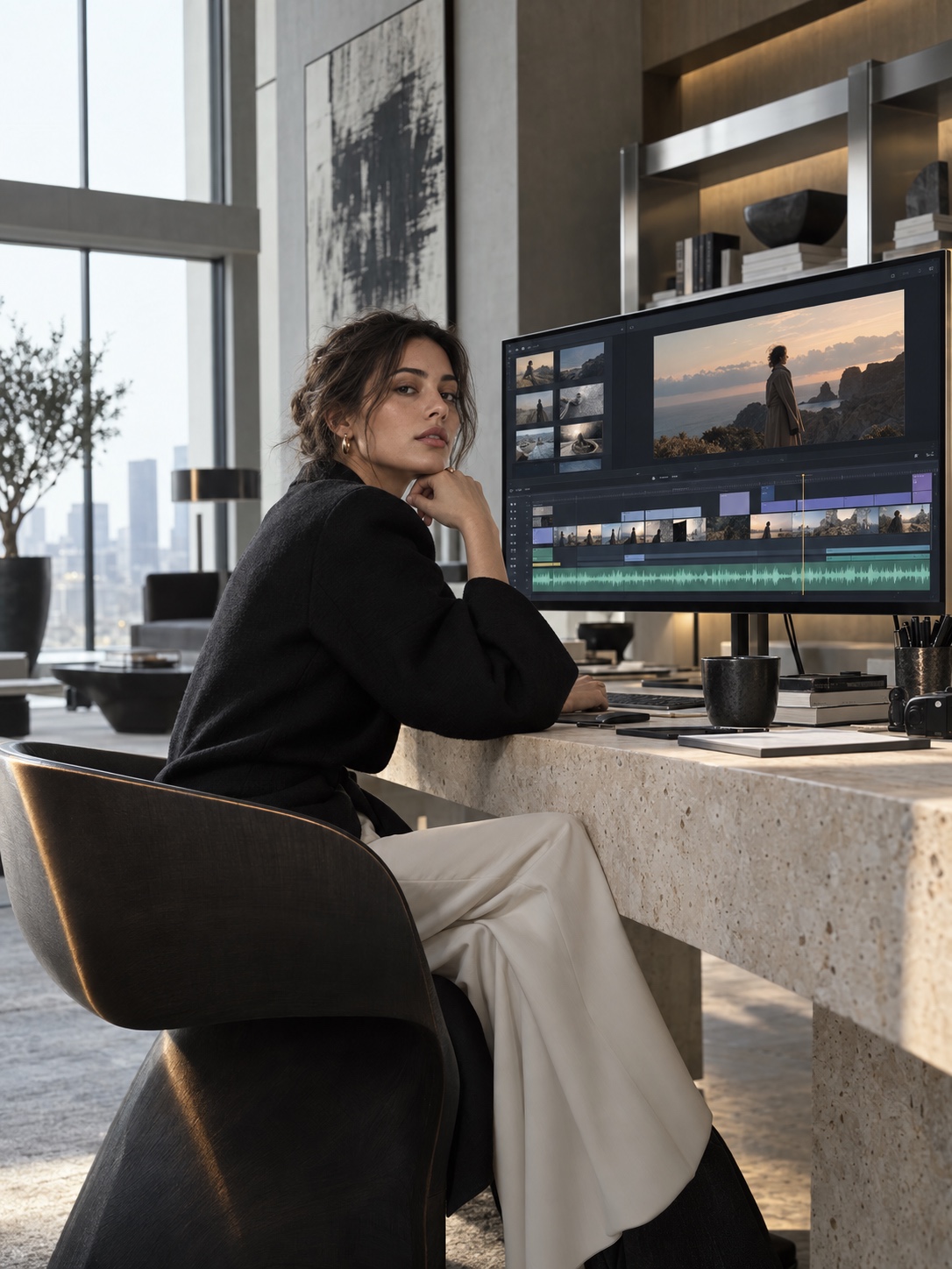
Filmora makes sense for a graphic designer producing portfolio reels, social ads, product teasers, short explainers, or simple client videos. Its timeline is easier to read than a dense professional interface, and the common controls sit close to the selected clip. If timelines are completely new to you, start by learning the basic editing language: tracks, cuts, trimming, and export settings.
The speed comes with a tradeoff. Templates, presets, and one-click AI actions can make unrelated brands look strangely similar. A designer still has to control timing, scale, type, color, and spacing.
| Designer test | Filmora verdict |
|---|---|
| Learning the timeline | Friendly enough for a first serious editor |
| Typography | Good for titles, lower thirds, and short kinetic type; less suited to complex type systems |
| Brand color | Strong basic controls, LUTs, scopes, and reference-based palette matching |
| Logo animation | Capable for clean reveals and short keyframed moves |
| Tracking and masking | Useful built-in tools, with Mocha Filmora for harder shots |
| Reusable systems | Adequate for small projects; limited beside After Effects templates and expressions |
| Team production | Better for solo creators than large review and versioning workflows |
My short verdict: Filmora is a convincing bridge from static graphic design to everyday motion. It is not a replacement for After Effects, DaVinci Resolve, or a full studio pipeline. Nor does it need to be. For a designer making short, polished pieces, finishing the work matters more than owning the deepest tool in the room.
From static layout to a working timeline
A graphic designer already understands layers. The timeline asks you to add one new variable: time. Filmora represents clips, still images, titles, effects, and audio as blocks arranged across tracks. The visual logic is familiar enough if you have worked in Figma, Photoshop, Illustrator, or any interface tool with a layers panel.
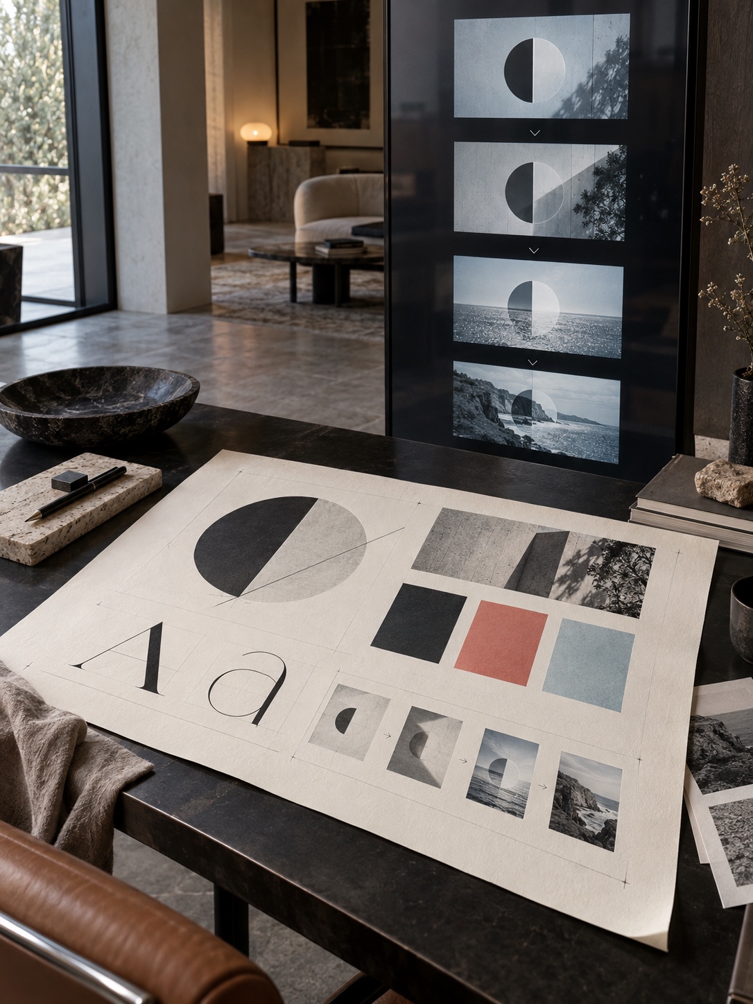
The cleanest handoff starts before you open the editor. Export Illustrator or Figma assets as transparent PNG files at a generous resolution. Prepare horizontal and vertical logo variants, and keep any parts you plan to animate on separate layers. A flattened poster gives you almost nothing to move.
Use simple names such as logo-white.png, product-front.png, and music-rough.wav. Put footage on the lower tracks, graphics above it, titles above those, and audio in a clearly named area. This prevents the familiar 1 a.m. hunt for the correct logo.
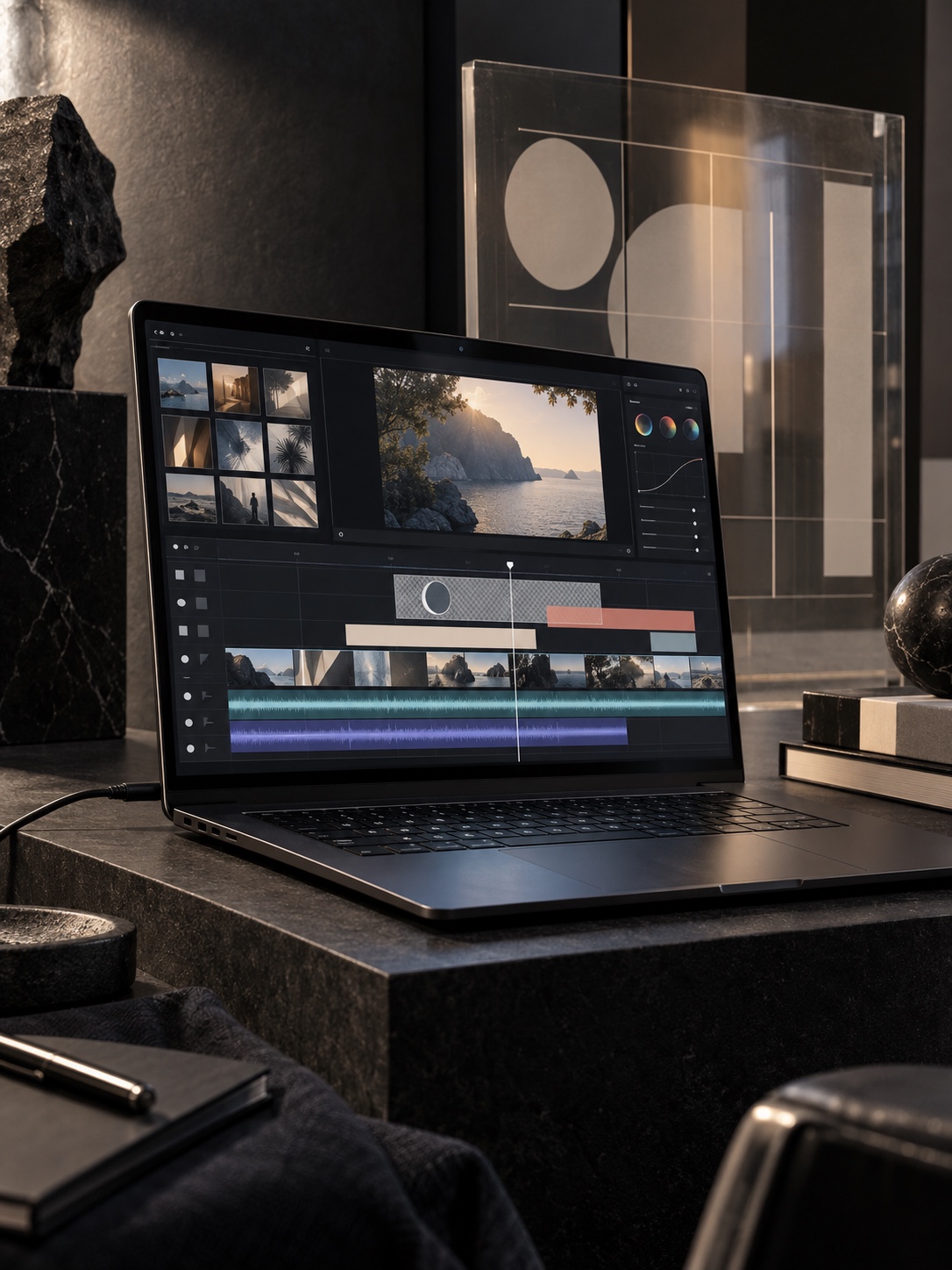
Compound clips help when a branded sequence contains several layers. Grouping a background shape, wordmark, texture, and sound hit keeps the main timeline readable. Think of it as a lightweight Figma component for a short sequence.
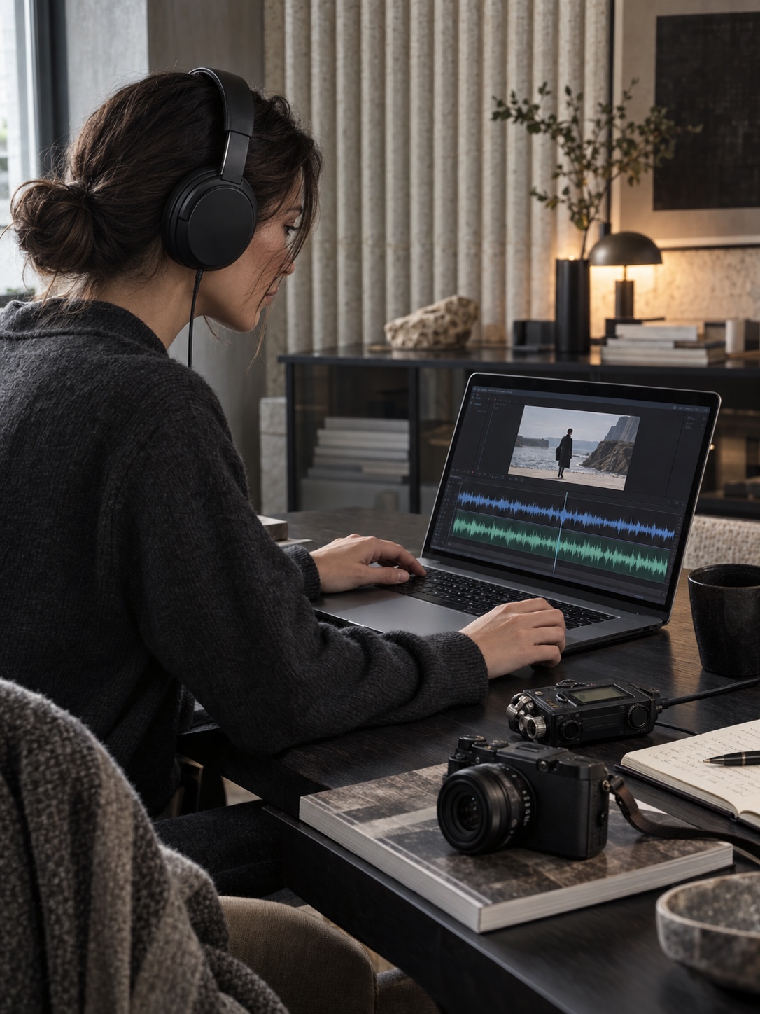
Audio belongs in the structure from the beginning. If a phone records the image while a small recorder captures clean speech, Filmora’s audio synchronization feature can compare the waveforms and align the tracks. Keep the scratch audio from the camera until synchronization is complete. That rough track is the reference the software needs.
Large interface projects taught me that a beautiful screen becomes expensive once nobody knows which component is current. Video files multiply even faster. Organize first.
Typography in motion without losing hierarchy
Typography is where many template-led videos fall apart. A title may use the correct font and still feel wrong because it accelerates too quickly, sits too close to the edge, or competes with a face in the shot. Motion adds rhythm to the same choices you already make in a poster: scale, weight, spacing, contrast, and position.
Start with one clear hierarchy. For a 1080 × 1920 vertical reel, define a headline, a supporting line, and a small label. Do not animate all three with equal force. Let the headline carry the main movement, bring the supporting line in more quietly, and keep the label stable unless it needs to communicate a state change.
Filmora’s title presets save setup time, but the preset should not make the final decision. Replace the font, remove decorative flourishes, check line spacing, and adjust the duration. A two-word title may need less than two seconds; a twelve-word sentence needs longer. Export a five-second test and watch it on an actual phone.
Keyframes let you animate position, scale, rotation, and opacity. That is enough for a restrained title system. A headline can rise 40 pixels while fading from 0 to 100 percent opacity, then settle before the next cut. The Keyframe Graph Editor adds Bezier curves, so movement does not have to run at one mechanical speed from start to finish.
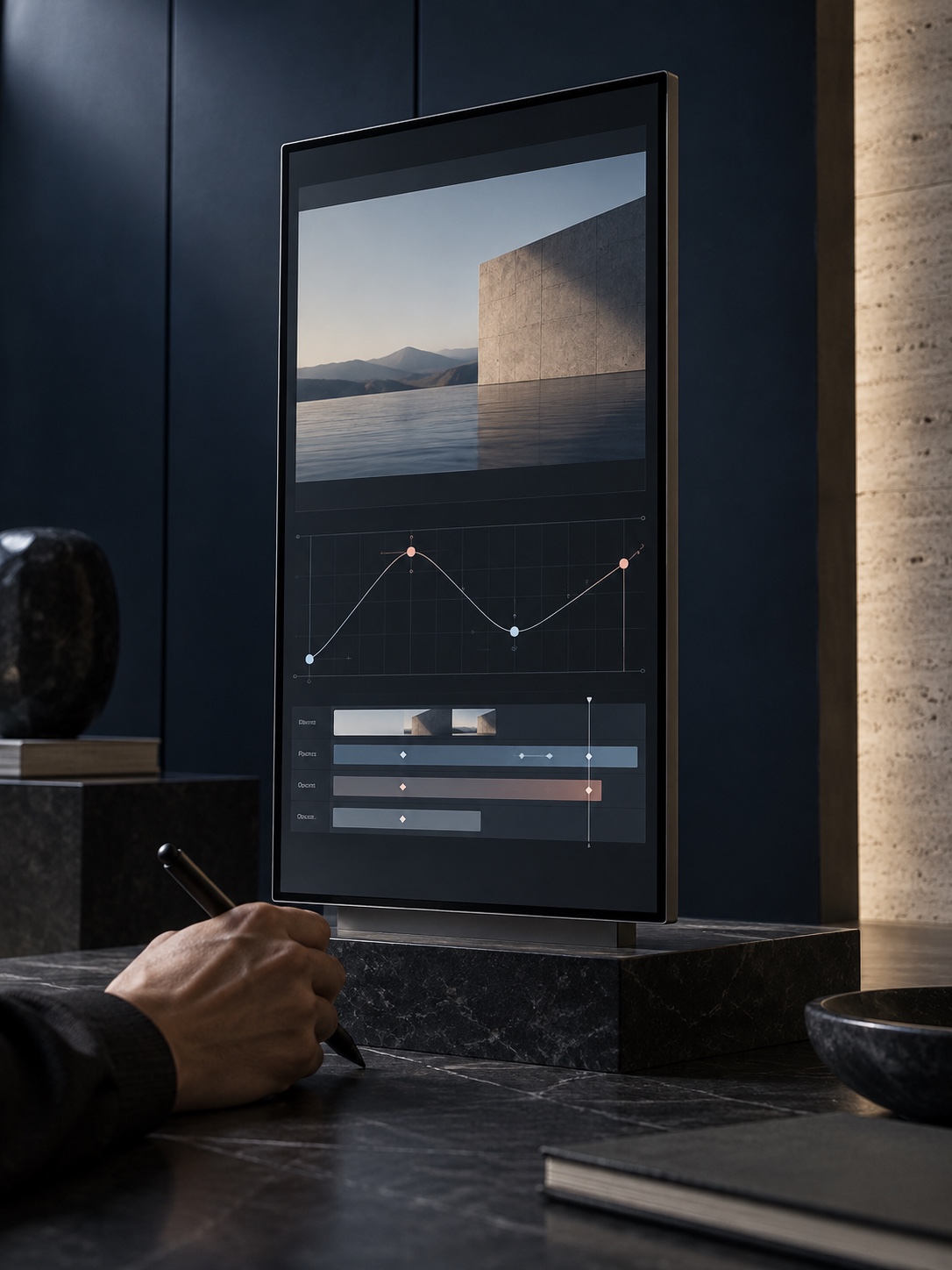
Good easing has weight. While developing the first Ukrainian electric car concept, I learned that a line needs controlled tension from the front volume to the rear. Motion behaves similarly: a title that stops without intent can spoil an otherwise refined frame. Pull the curve handles until the arrival feels deliberate.
Check contrast frame by frame. My academic drawing and life-painting training made me sensitive to value before color. White type over a bright window may look fine in one frame and disappear in the next. A soft dark plate, a subtle shadow, or a different crop can solve the problem. A fashionable font cannot rescue poor value separation.
Color tools for a consistent brand video
Color correction and color grading solve different problems. Correction makes shots agree on exposure, white balance, and neutral color. Grading gives the finished piece a particular mood. Designers often jump to the mood first because a LUT produces an immediate change. Fix the footage before you style it.
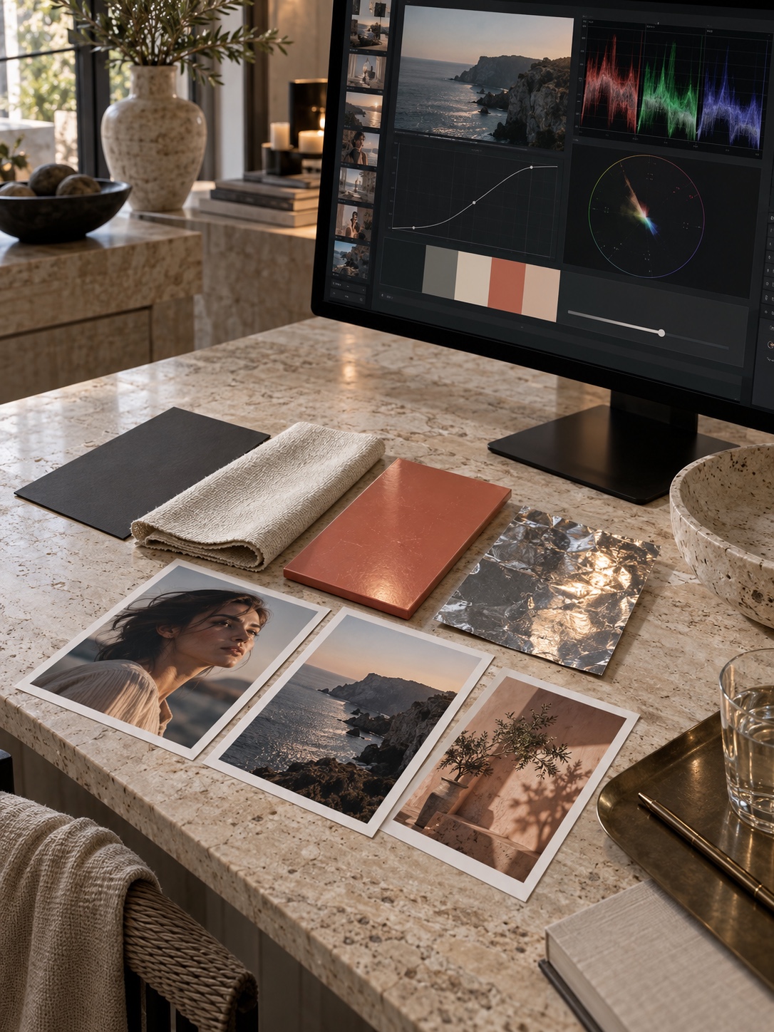
Filmora includes temperature, tint, exposure, contrast, highlights, shadows, saturation, curves, color wheels, LUT controls, and video scopes. The scopes matter. A monitor can be too warm, too bright, or simply inaccurate, while a waveform and vectorscope give you a steadier reference. You do not need to become a colorist to notice crushed shadows or skin tones pushed toward orange.
AI Color Palette can take a frame or still image as a reference and apply its color relationships to other clips. The strength slider runs from 0 to 100, and the tool can protect skin tones when people appear in the footage. For brand work, use a campaign image as the reference rather than a random film still. The goal is continuity with the identity, not borrowed drama.
Try a controlled palette test. Build a board with deep charcoal #0B0F14, warm paper #F4EFE7, and a coral accent such as #E4523A. Choose one hero frame that already balances those colors. Apply the reference palette to three clips at moderate strength, then compare them side by side. If the coral shifts toward neon red or skin looks waxy, reduce the effect and correct manually.
Filmora can import LUTs, save custom color settings, and export a selected grade as a standard .cube LUT. Still, a LUT cannot decide whether a warm background weakens the logo or whether dark values survive Instagram compression.
My rule is simple: turn the sound off and pause on five random frames. Do they still look like the same campaign? If not, fix the color relationships before adding another effect.
Keyframes, masks, and tracking for branded motion
The jump from graphic design to motion becomes interesting when static layers start reacting to footage. Filmora’s keyframes cover the basic properties a designer uses most: position, scale, rotation, and opacity. With a clear idea and restrained timing, that is enough for logo reveals, product callouts, animated posters, lower thirds, and simple interface demonstrations.
Build movement in short passes. First animate position only. Then refine the timing curve. Add scale or opacity after the path feels right. Changing four properties at once makes it hard to see why the motion feels cheap. This is the same reason I separate proportion, surface, and detail during concept work. Solve the large decision first.
Masks isolate part of a frame. You can use one to reveal a word behind a building edge, place a color field inside a window, or let a model pass in front of a graphic. The Pen Tool gives you custom paths for shapes that a rectangle or ellipse cannot describe. Keep the number of points low. A path with twelve deliberate points usually behaves better than one with sixty nervous corrections.
Planar tracking follows a flat surface across a shot. Filmora’s built-in tracker uses four points, making it practical for a phone screen, billboard, package face, laptop display, storefront sign, or vehicle door. After the track, you can bind an image, video, text block, or mosaic to that plane and adjust scale, position, rotation, and flip.
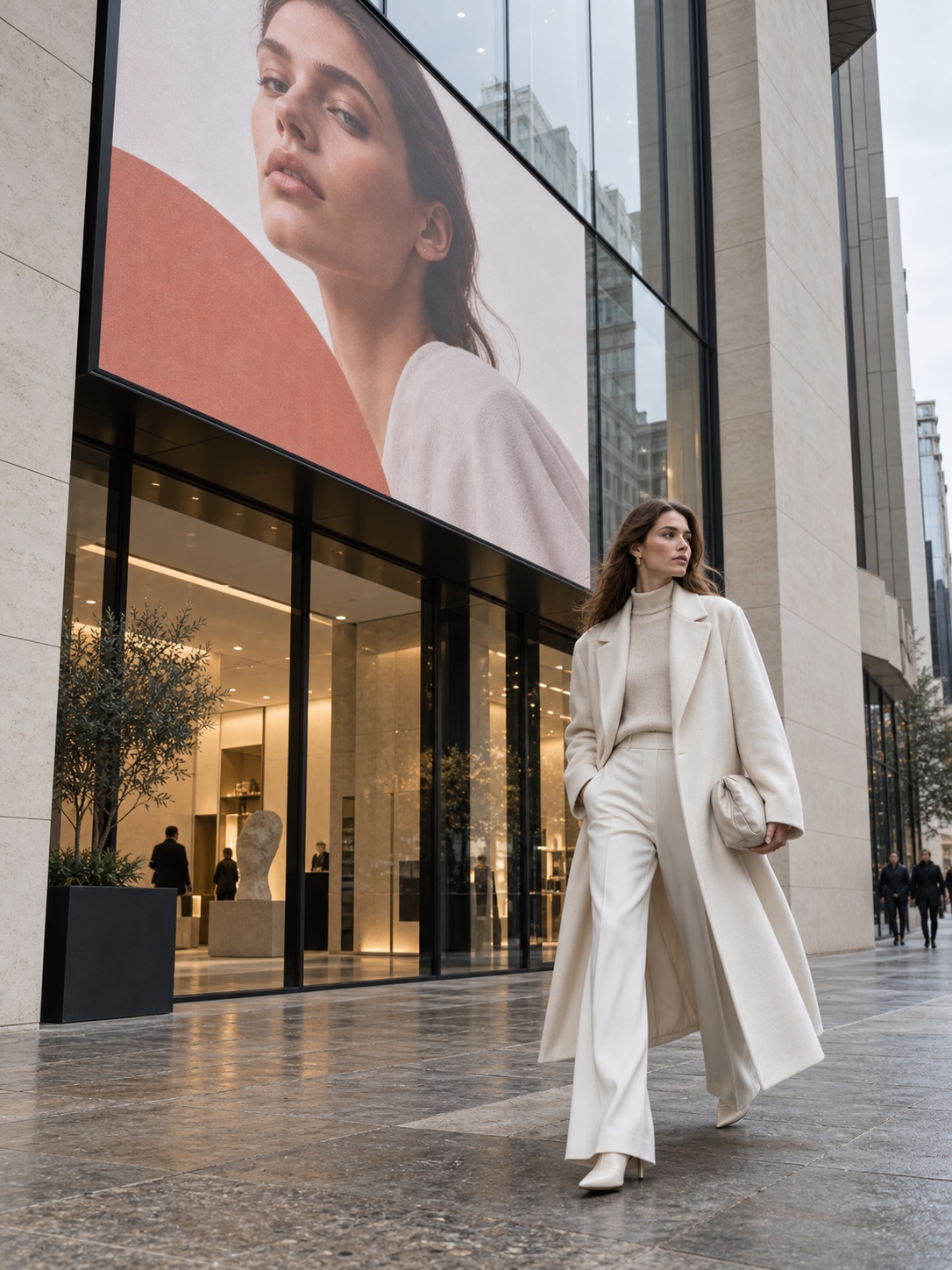
This opens useful designer-led shots: a camera move past a digital sign carrying the campaign title, or a turning package with graphics attached to its label. The effect works only while perspective and movement agree.
Mocha Filmora adds spline-based masking, PowerMesh, and grid warping for harder surfaces. Use the built-in tracker for a rigid screen or sign. Reach for Mocha when fabric, skin, or a curved object refuses to hold the track.
Templates: useful scaffolding or a generic look?
Templates are good at removing blank-page anxiety. They provide timing, transitions, title placement, and sometimes a complete shot order. For a first project, that structure can teach more than an empty timeline. The problem begins when every decision survives unchanged.
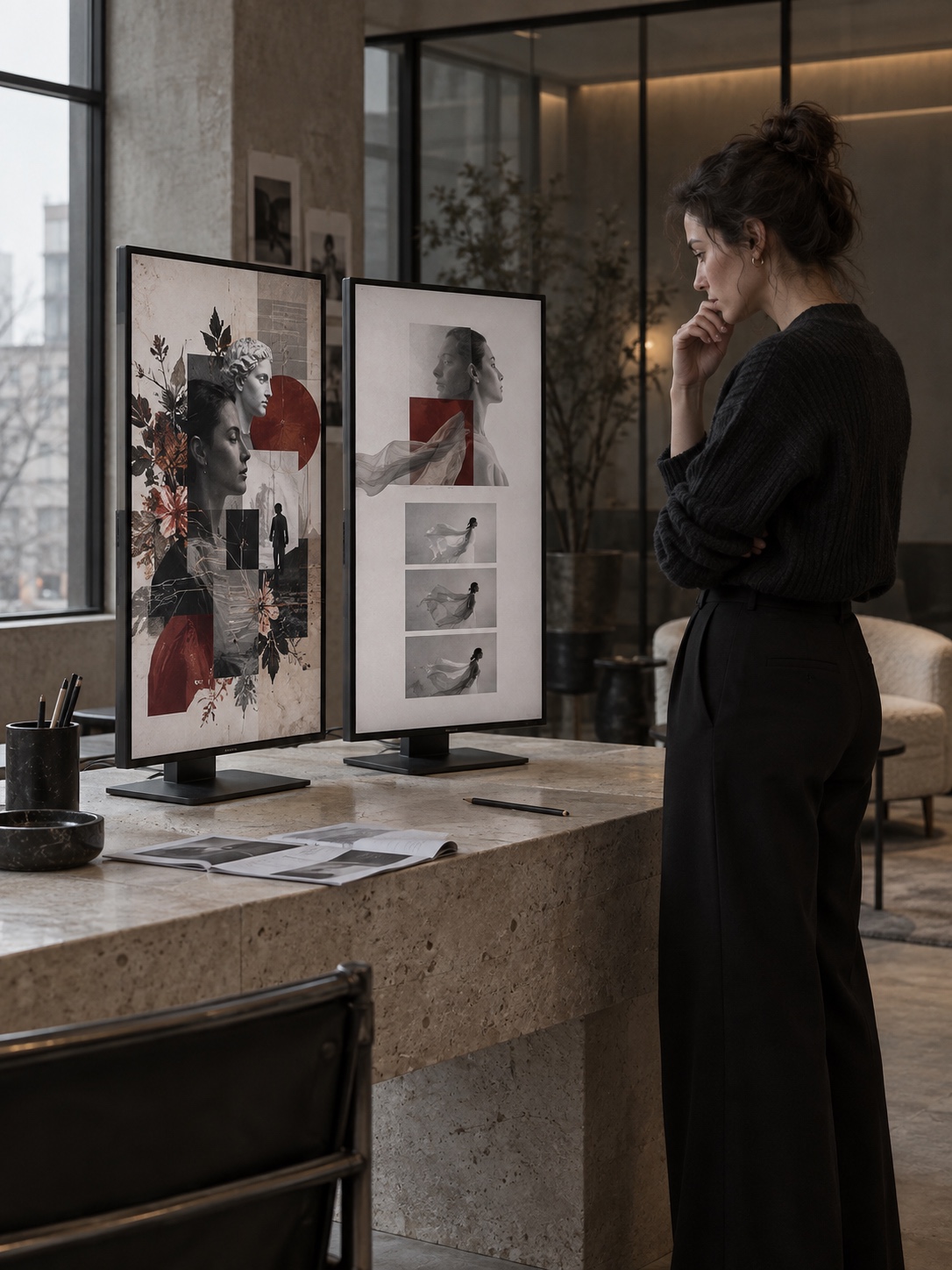
A stock template carries someone else’s assumptions about pace, type, color, and audience. A beauty reel may use soft dissolves and thin serif titles. A sports promo may use hard zooms, condensed type, and rapid cuts. Dropping a quiet architecture brand into the sports template does not create energy. It creates a mismatch.
Treat the template like a wireframe. Keep its useful sequence, remove effects that do not support the message, swap the fonts, rebuild the color, and replace generic motion with two or three repeatable behaviors. A slow rise for headlines, a short fade for labels, and one masked logo reveal already form a system.
Sound needs the same discipline. Template music often dictates edits through obvious beats, yet a premium brand may need pauses and softer cues. Move the cut if the image needs another half-second. Silence can be more expensive-looking than a constant barrage of whooshes.
Save those choices in a clean project containing the approved title styles, logo sequence, color settings, and export presets. Compound clips and saved presets support the same practical discipline described in our guide to making video editing faster.
A 15-second test before you commit to Filmora
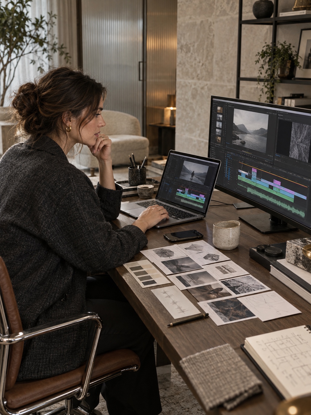
Do not evaluate an editor with sample footage and a premade intro. Use one small project that resembles paid work. A 15-second campaign is long enough to expose weak organization, text control, color drift, tracking errors, audio problems, and slow exports.
Start with five shots: a two-second opening detail, three product or process clips, and a final logo frame. Add one transparent logo, two font weights, three brand colors, music, and a short spoken line recorded separately. Prepare versions for 1920 × 1080 and 1080 × 1920. If tracks and rough cuts still feel unfamiliar, use our video editing for beginners guide as the setup pass before this test.
Build the rough cut before adding decoration. Trim each shot to its useful action, arrange the sequence, and listen for rhythm. Then place the headline and supporting copy. Animate only the headline at first. Add the logo reveal after the pacing works.
Next, sync the clean recording to the camera track. Select both clips and use Auto Synchronization. The Filmora audio sync guide shows three routes to the command. Check hard consonants such as “p” and “t”; they expose bad alignment quickly.
Now test one advanced feature. Track the campaign artwork onto a phone screen or shop sign. If the target leaves frame, changes perspective sharply, or becomes blurred, inspect the track one frame at a time. A clean three-second track tells you more about practical control than fifty effect thumbnails.
Apply the reference color palette, then open the scopes and check the darkest and brightest shots. Export both aspect ratios. Watch the vertical version on a phone with the sound on, then again with the sound muted. Check four things: can you read the title, does the logo remain secondary until the end, do the colors feel related, and does every movement support the message?
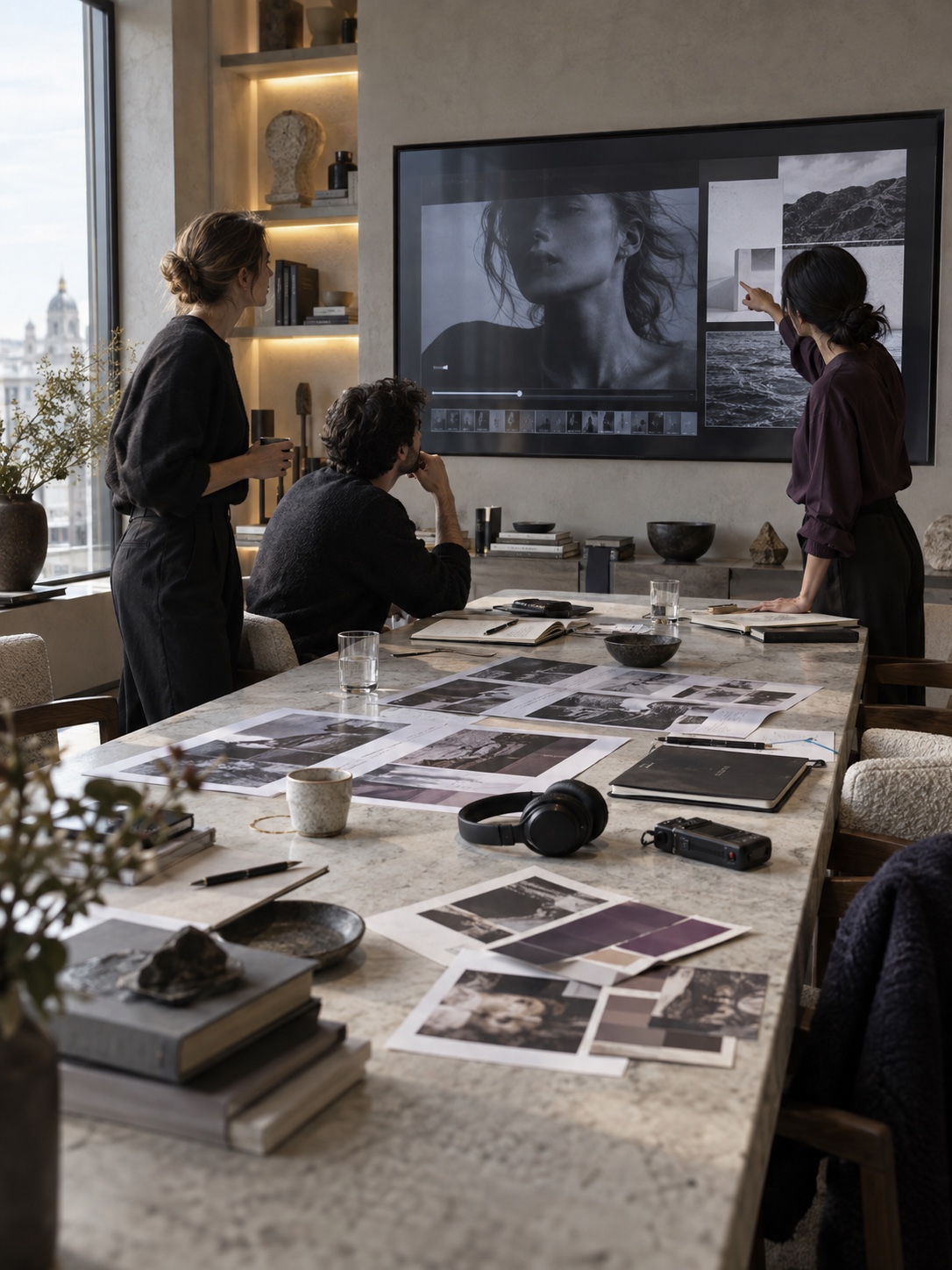
Score setup speed, type control, motion, color, audio, and export reliability from one to five. Do not average the numbers blindly. If type scores two and your work depends on kinetic typography, that matters more than easy export.
This test also separates your skill gap from the software’s limit. If the result feels rough because the timing is weak, practice will help. If the control you need does not exist, choose a different tool.
Where Filmora stops being enough
Filmora can produce polished short-form work, but some jobs demand a different class of editor. The first warning sign is a motion system that needs relationships between layers. After Effects supports expressions, parented rigs, reusable Motion Graphics templates, and detailed compositing. Filmora can animate individual elements, yet maintaining a large connected system becomes harder.
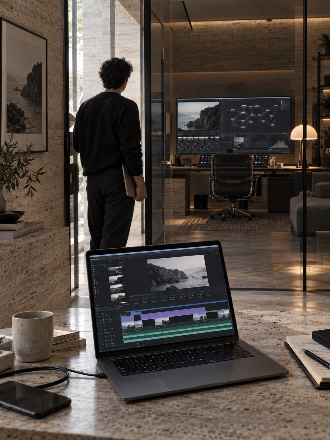
Color is another boundary. Filmora’s curves, wheels, LUTs, palette matching, and scopes suit everyday brand content. DaVinci Resolve adds node-based grading, advanced tracking, color management, and professional monitoring. Use it when exact product color or broadcast delivery sits in the contract.
Collaboration matters too. A studio may need project locking, formal comments, review history, shared assets, and controlled handoffs between editor, colorist, sound designer, and producer. Filmora is more comfortable at a single workstation.
Licensing deserves a check before client delivery. Wondershare offers personal and business options, and some music, sound effects, stock media, AI actions, or premium assets may carry plan-specific rules or credits. Do not assume that an effect visible in the library is cleared for every corporate use. Check the current plan and asset license for the exact project.
The upgrade point is practical. Stay with Filmora while it lets you finish good work without hiding your design decisions. Move to After Effects when motion logic and compositing become central. Move to DaVinci Resolve when color, finishing, and complex post-production dominate. Premiere Pro becomes useful when editorial depth and Adobe handoff matter more than speed of entry.
Final verdict
Filmora is a good first video editor for brand reels, social ads, portfolio pieces, event visuals, and short product stories. Its keyframes, masks, planar tracking, color tools, and compound clips leave room to grow beyond simple cuts. For deeper art direction, pair the workflow with the principles in our article on brand video design and visual storytelling.
Its best quality is momentum. You can bring a static campaign into a timeline, build a readable sequence, add restrained motion, match color, synchronize external audio, and export two social formats without turning the software itself into a new career.
But the presets are not your taste. The AI tools are not your art direction. And a large effects library cannot decide which element deserves attention. Filmora works best when a designer brings a firm visual system and uses the software to express it over time.
Run the 15-second test. If the tool preserves your hierarchy, color, and rhythm while helping you finish, it is enough. If you keep designing around missing control, you have already found the reason to move on.
FAQ
Is Filmora good for graphic designers with no video experience?
Yes. Its track-based timeline, drag-and-drop controls, title tools, presets, and direct property panels make the first project easier to understand than many professional packages. Graphic designers already know layers, hierarchy, color, and composition, so the main new skill is timing. Start with a 15-second brand reel rather than a long video. That small format gives you enough room to practice cuts, type, audio, and export without losing control of the project.
Can Filmora animate logos and typography?
Filmora can animate position, scale, rotation, and opacity with keyframes, and its graph editor uses Bezier curves to refine speed. That covers logo reveals, lower thirds, animated posters, callouts, and short kinetic titles. Export logos with transparent backgrounds and keep graphic elements on separate layers. After Effects remains stronger for expressions, rigs, and large reusable motion systems, but Filmora can handle restrained brand animation well.
Can Filmora use custom fonts and brand colors?
You can style titles with chosen fonts, sizes, colors, spacing, and animation, then build color consistency with manual controls, LUTs, scopes, and AI Color Palette. Confirm that the required typeface appears correctly on the editing computer before the project begins. Save a short style test containing your title hierarchy and palette. This catches missing fonts, poor contrast, and unexpected color shifts before they spread across every scene.
Is Filmora suitable for professional brand videos?
It can be suitable for short professional deliverables made by a solo designer or small team: social campaigns, product clips, internal explainers, portfolio reels, and event displays. The decision depends on the production requirements, not the word “professional.” Complex compositing, strict broadcast specifications, high-end grading, formal collaboration, or reusable motion packages may justify After Effects, Premiere Pro, or DaVinci Resolve. Check the current business and asset licenses before publishing client work.
Is Filmora easier than After Effects or DaVinci Resolve?
Filmora is easier to approach because its main editing, title, effect, color, and audio controls share one direct timeline workflow. After Effects offers deeper motion graphics and compositing, while DaVinci Resolve offers a broader professional editing, color, effects, and audio environment. Those tools demand more learning. Choose Filmora when you need to finish short design-led videos soon; choose the larger package when its extra control solves a real project requirement.
How does Filmora synchronize separately recorded audio?
Place the camera clip and the clean audio recording on separate tracks, select both, and run Auto Synchronization. Filmora analyzes their shared waveform and aligns them. Keep the camera’s scratch audio until the match is complete, even if it sounds poor. After syncing, listen around sharp consonants and hand claps, then mute or remove the unwanted camera track. Always review the exported file outside the editor before delivery.
- 10shares
- Facebook0
- Pinterest10
- Twitter0
- Reddit0