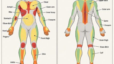
A tattoo placement chart helps you match a design to the surface it will sit on: its curve, movement, visible width and available space. For fine line designs, start with the motif’s main direction. A narrow stem can follow a forearm; a circular flower can sit across a shoulder cap; a vine can turn around an ankle. Then test the actual-size stencil on the body.
The same drawing can look quite different on paper and on skin. Product designers face a similar problem when a line drawn in a side view wraps around a curved object: the surface changes how much of the line is visible. On a body, posture and movement add another variable.
- How to read a tattoo placement chart
- Use anatomy as a composition grid
- Match the shape of the design to the body
- Fine line tattoo placement chart by body area
- Fine line design: scale, line weight and negative space
- Test the composition before tattooing
- Common placement and composition mistakes
- FAQ
- Bring the chart to your consultation
This guide looks at composition rather than ranking tattoo spots. The body-area chart below pairs common placements with motif shapes, directions and spacing considerations. Use it to narrow down a design before discussing the final placement with your artist.
The examples focus on fine line work, but the geometry applies to other styles too. A placement should make sense at normal viewing distance, with the body relaxed, as well as in a carefully posed close-up. All images here are AI-generated placement studies, not photographs of healed tattoos or evidence of an artist’s work.
How to read a tattoo placement chart
Read the chart from left to right: choose a body area, compare possible motif shapes, then check direction, scale and movement. These are design starting points. A chart cannot predict healing, pain or how a particular tattoo will look years later.
Curvature, movement, visibility and long-term readability
Curvature describes how the surface turns across the design’s footprint. The sides of a wide image may disappear around an arm even when its center faces you. Movement describes what changes when a joint bends or a limb rotates. Check both: a calf has a curved surface, while the nearby knee adds a different kind of movement.
Visibility is about who sees the design and from which angle. An inner-forearm tattoo may be easy for its wearer to see, but its orientation changes when the palm turns. Long-term readability is a separate conversation about detail, spacing, execution and changes to skin. A body-area label alone cannot tell you which tattoo will stay clearest.
Decide which view matters most. You might want a motif that reads in a mirror, a piece that faces outward when your arm rests by your side, or a wrap that reveals itself gradually. There is no need for every part of a wrapping design to be visible at once. Its focal point should be placed deliberately, though.

Why a body is not a flat canvas
Many reference designs begin on a flat page or screen. Transfer a wide circle onto a rounded upper arm and its edges can look compressed from the front; turn the arm and a different section comes into view. You can explore the effect by wrapping a paper drawing around a bottle. The drawing has not changed, but your view of it has.
Curved areas give a tattoo a three-dimensional setting. A branch can turn with the arm, while a long stem can emphasize the length of a leg. The adjustment may involve narrowing a motif, moving its center or changing the space between elements. Simply reducing the entire drawing is not always enough.
Bring both a flat reference and a clear idea of the intended view to your consultation. Ask which parts need to remain visible together. A face or a short word may need a more contained viewing area than a chain of leaves, where each section can be read separately.

Use anatomy as a composition grid
Think of the body as overlapping surface types rather than a collection of isolated spots. Broad areas, rounded limbs and joints each suggest different compositions. These are approximate design categories, not rigid anatomical divisions; one tattoo can cross several of them.
Broader zones: upper back, chest and thigh
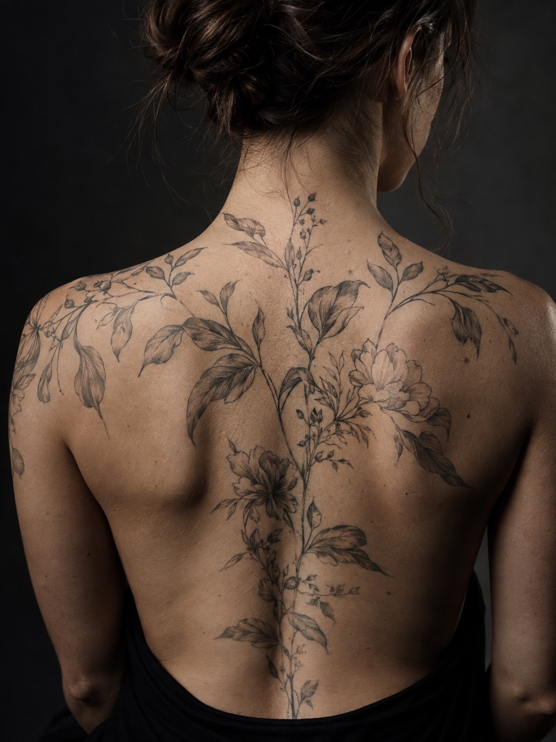
The upper back and front or outer thigh can offer a relatively broad viewing area for a larger composition. That extra width gives flowers, paired elements and open linework room to spread. Neither area is truly flat. On the back, check the shoulder blades and spine; on the thigh, notice where the surface turns away from the main view.
The chest varies considerably between bodies. Centering a drawing on the sternum is only a starting point: look at the collarbones, chest contour and resting posture too. Breathing and raising the arms can change the appearance of the design. A broad area allows more options, but it does not guarantee predictable aging.
Rounded zones: forearm, upper arm, calf and ribs
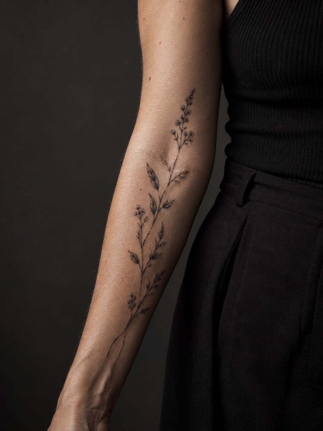
An arm or lower leg is roughly tapered and rounded, not a perfect cylinder. For a design intended to read in one glance, keep its essential details within the main viewing face. For a wrap, distribute the elements around the limb so the transitions remain interesting as the viewer moves. Neither approach is inherently better.
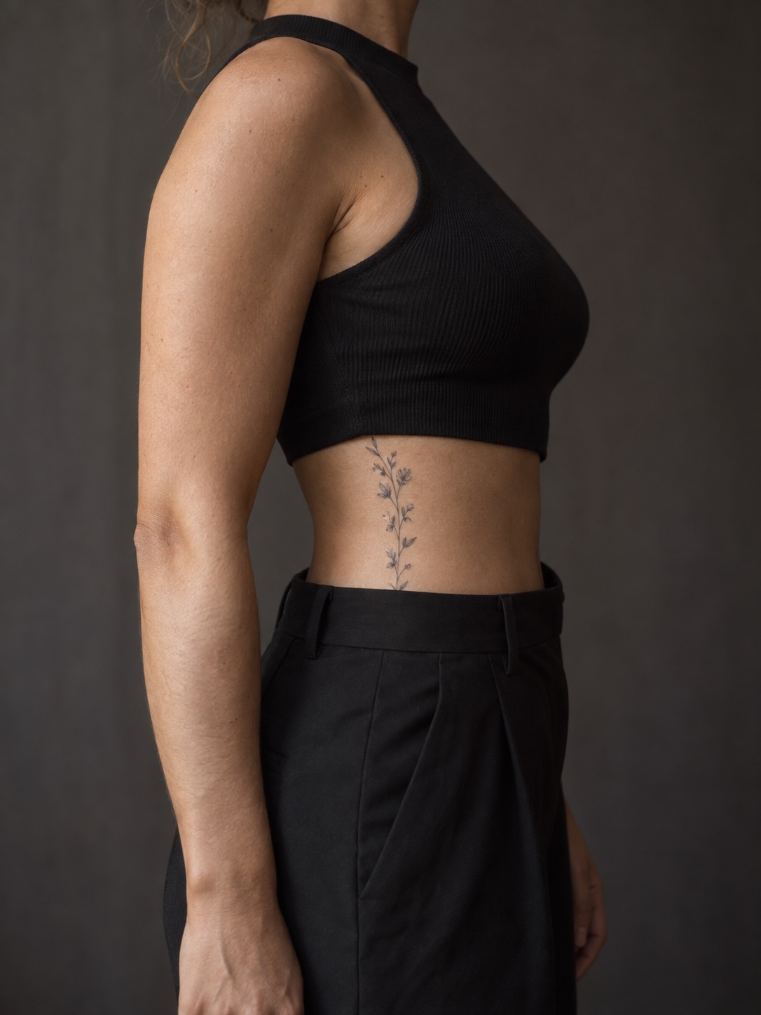
The rib area has compound curves rather than a simple cylindrical shape. A narrow vertical motif can fit along the side of the torso, while a wider piece may turn toward the back or abdomen. Check it with the arm down as well as raised; the pose used during stencil placement may not be the pose in which it is usually seen.
On the calf, look at the fullest part of the muscle and the taper toward the ankle. A botanical branch can follow that narrowing shape. A wrap may use a larger focal element on the calf and lighter connecting lines below, rather than repeating the same width all the way down.
Moving zones: wrist, elbow, knee, ankle and shoulder
A design near a joint needs more than one test pose. A wrist tattoo that looks evenly spaced with the hand straight may compress at the crease when the wrist bends. An elbow motif changes as the arm folds. The aim is not to prevent all change, which is impossible, but to decide whether the change suits the design.
Pay particular attention to lettering, tiny enclosed shapes and tightly packed parallel lines near creases. Ask the artist to show how the stencil behaves in motion and discuss examples of their healed work in comparable placements. Do not treat a photograph taken immediately after tattooing as a preview of the healed result.
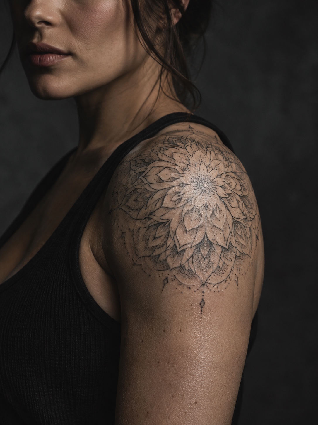
The shoulder cap combines a rounded surface with a wide range of arm movement. A radial motif can emphasize its curve, while a branch can travel onto the upper arm or back. Check the transition across those areas with the arm resting naturally and then lifted. What looks centered in one pose may shift in another.
Match the shape of the design to the body
Start by identifying the design’s dominant shape: long and narrow, centered and radial, or extended into a wrap. Then compare it with the body area’s main direction. Matching those directions can make the placement feel settled; crossing them can create deliberate contrast.
Vertical motifs for the spine, forearm, shin and ribs
Elongated, vertically oriented designs, a single flower stem, a line of small symbols, a narrow botanical branch, follow the body’s own long axis in these areas, which keeps the composition reading as intentional rather than arbitrarily placed. The spine is the clearest example: a vertical design here follows an anatomical line that’s already doing compositional work for you.

Radial motifs for the shoulder, elbow and knee
A flower, mandala or sunburst can use the rounded shoulder cap as a visual center. Similar motifs can sit around an elbow or knee, but those joints need careful movement checks. Treat symmetry as a design choice, not an anatomical fact. A circle on a moving surface will not look perfectly circular from every angle.
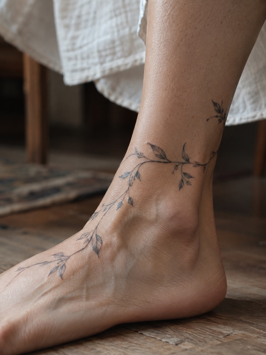
Wrapping compositions for the wrist, bicep, ankle and torso
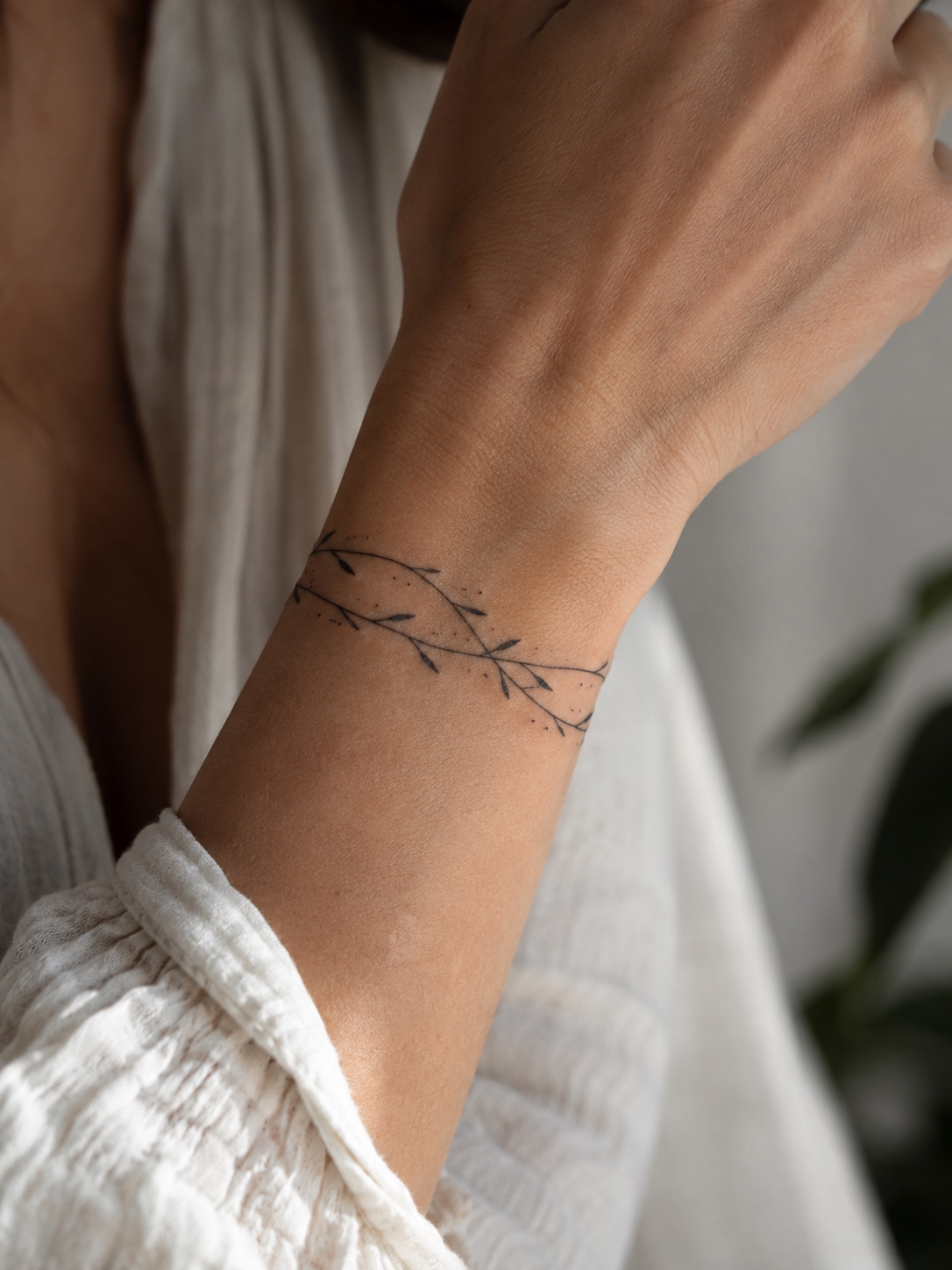
A vine around the wrist, a band around the upper arm or a branch turning around the ankle can follow the body’s curvature. Decide where the focal point belongs before arranging the connecting elements. Also check the join: a continuous band needs an intentional meeting point, while an open wrap can use a clear gap as part of the composition.
Fine line tattoo placement chart by body area
| Body area | Motif to consider | Main direction | Relative scale | Movement or curve to check | Spacing priority |
|---|---|---|---|---|---|
| Upper back | Open botanical or balanced composition | Spine or shoulder line | Medium to large | Shoulder blades; arms lifted | Leave room around focal elements |
| Chest | Centered or paired elements | Sternum or collarbone line | Usually medium or larger | Breathing; arms raised | Check the center gap on the body |
| Forearm | Narrow motif or partial wrap | Along the limb | Small to medium | Palm rotation; taper toward wrist | Keep key details on the main viewing face |
| Upper arm | Wrap or radial composition | Around or along the arm | Usually medium | Surface turning away; arm rotation | Separate focal points from connectors |
| Ribs | Elongated branch or narrow motif | Along the side torso | Small to medium | Breathing; arm down versus raised | Avoid crowding where the surface turns |
| Wrist | Simple symbol or open band | Along or around the wrist | Small and simplified | Wrist crease; bending | Keep clear gaps between small elements |
| Shoulder | Flower, mandala or branching motif | Radial or onto the upper arm | Small to medium | Rounded cap; arm lifted | Give the center and outer edges room |
| Ankle | Small motif or partial vine wrap | Around or up the ankle | Small and simplified | Ankle bones; foot flexion | Leave clear gaps; simplify dense detail |
| Thigh | Broad or elongated composition | Along or across the thigh | Medium to large | Sitting; rounded side surface | Use available space rather than crowding |
Use this tattoo placement chart as a consultation reference. Scale labels describe relative room, not fixed measurements. The movement column flags what to inspect, not a medical risk score. Individual proportions and the complexity of the drawing should guide the final size.
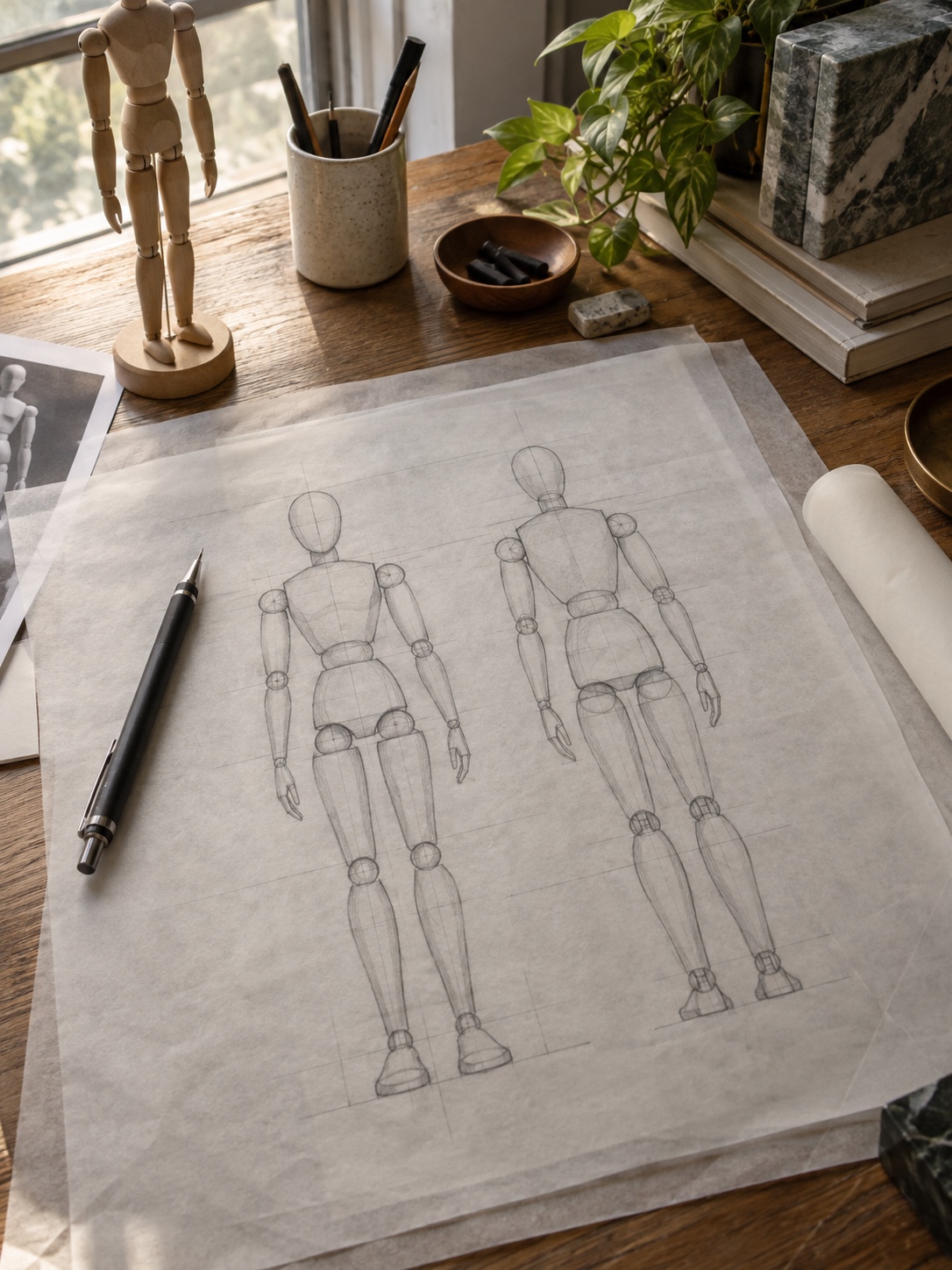
Fine line design: scale, line weight and negative space
Fine line describes the character of the linework, not a requirement to make the whole tattoo tiny. Small leaves, petal folds or closely nested shapes can become hard to distinguish when a detailed drawing is reduced. Print a few sizes and compare them at actual scale. Ask the artist which details they would simplify, enlarge or remove.
Negative space is the visible skin between and around the marks. Leave enough room for separate elements to read as separate elements. There is no universal spacing formula that guarantees a tattoo’s longevity. Line weight can vary deliberately to establish a focal point; it does not have to be identical throughout the design.
Size, spacing and line weight need to be considered together. Enlarging a motif gives you more room to separate its details. Shrinking it may require fewer internal lines or a simpler outline, rather than a proportionally smaller copy. Evaluate the result from a normal conversational distance, not only as a zoomed-in phone image.
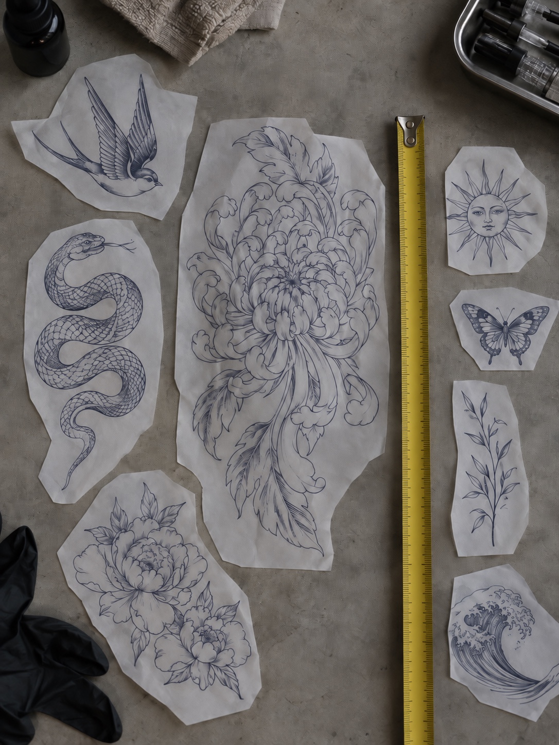
A practical starting point: choose the main viewing angle, establish the motif’s direction, then adjust its size and gaps on the actual body.
For long-term care, the American Academy of Dermatology notes that UV light can fade some tattoo inks. Placement planning cannot replace your artist’s aftercare instructions or appropriate sun protection for healed skin.
Test the composition before tattooing
Stencil size, orientation and alignment
Check the stencil on the actual body area before approving it. Compare its size with nearby landmarks such as the wrist crease, collarbone or shoulder blade. Check rotation, distance from existing tattoos and alignment in a relaxed stance. For lettering, explicitly agree on which direction it will face. Take front and side photos from a few steps back, with permission, to compare the overall balance.
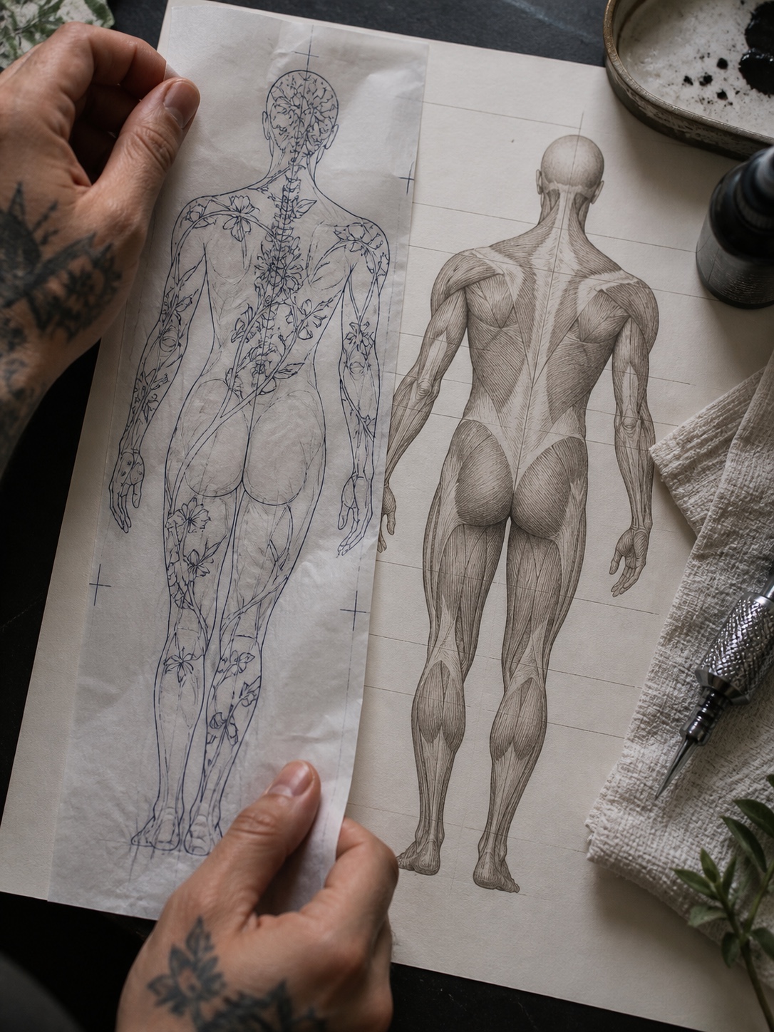
A five-position movement check
Use five simple checks where they apply: stand naturally, sit down, bend the nearest joint, rotate the limb and let the area relax. Watch whether the focal point disappears, important gaps close visually or the design crosses a crease awkwardly. Some distortion is normal. Choose a primary resting view, then decide with your artist which changes during movement you are comfortable with.
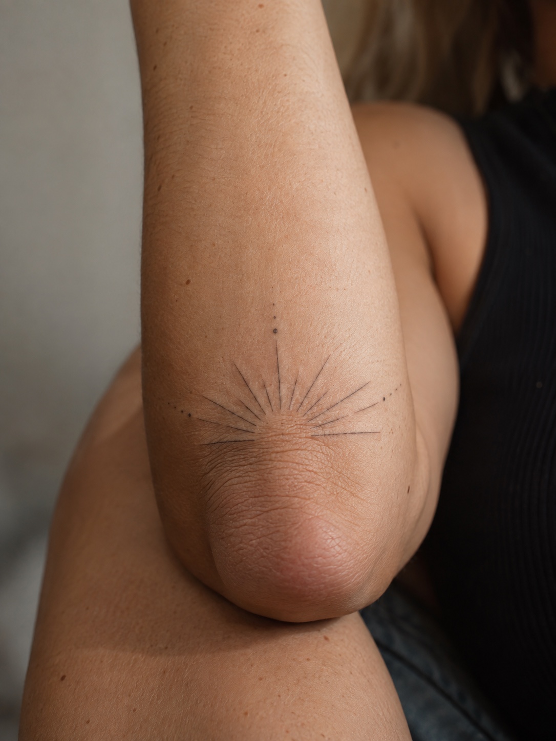
For readers training to tattoo, composition and safe technical execution are separate skills. This fine line tattoo course includes body contouring and mapping alongside technical topics. The YouTube beginner tattoo linework tutorial is a supplementary reference. Online examples are not a substitute for supervised practical training, hygiene instruction or local professional requirements.
Common placement and composition mistakes
Forcing a flat composition onto a curved area
A reference designed for a flat mockup may need more than a size adjustment. If a face or flower becomes crowded at the side of an arm, try narrowing the composition or moving the focal point toward the main viewing face. Leave time for these revisions before approving the stencil.

Too much detail for the available scale
A densely detailed drawing can look clear on a large screen and crowded at tattoo size. Compare a simplified version alongside the original. Keep the marks that identify the subject first: a flower’s silhouette and main petals may matter more than every small vein. Your artist can advise what is realistic for their technique and the chosen location.
Ignoring joints, muscle direction and future additions
Check where the composition ends as carefully as where it begins. A stem stopping at a crease can feel different from one stopping well above it. If you may add more tattoos later, discuss the available gaps and possible connecting directions now. You do not need a complete sleeve plan, but leaving options can prevent awkward leftover spaces.
FAQ
Does tattoo placement affect how fine lines age?
Placement can influence sun exposure and how a design moves or stretches, but it does not determine aging on its own. Technique, detail, skin changes and care also matter. UV light can fade some tattoo inks. Discuss placement with your artist and compare their healed work instead of relying on a fixed body-area longevity ranking.
Which body areas suit vertical fine line designs?
The spine, forearm, shin and side of the ribs can provide a long direction for stems, branches or a line of symbols. Check the individual body’s contours and the stencil in a relaxed pose. A vertical design may still need adjustments to its width, spacing or angle.
How large should a fine line tattoo be for clear detail?
There is no universal minimum size or line-spacing formula. Print the design at its proposed size and check whether its separate elements remain clear. Ask the artist which details need more space, simplification or a larger overall scale, using healed examples to inform the discussion.
How do you test tattoo placement before committing?
Check an actual-size stencil while standing, sitting, bending the nearest joint, rotating the limb where relevant and relaxing. Compare the main view with side views. Agree on the focal point and orientation, and ask for adjustments before tattooing if the placement does not feel right.
Bring the chart to your consultation
A useful placement decision connects the drawing to a real body: how the surface curves, which view matters, where it moves and how much room the details need. The chart gives you a way to discuss those choices. The stencil is where you test them.
Before committing, ask your artist three concrete questions: what should change from the flat reference, which size best supports the details, and how will the design look with the body relaxed? Those answers are more useful than choosing a spot from a single posed photograph.
For style and care considerations, see our guide to fine line tattoo placement and aftercare.
For more locations to compare, explore Strategic Ink: 5 Thoughtful Tattoo Placement Ideas and Beyond the Obvious: Unique & Creative Tattoo Placement Spots.
Explore more styles and subjects in the Sky Rye Design tattoo ideas hub.
- 97shares
- Facebook0
- Pinterest97
- Twitter0
- Reddit0