The shoulder is the one spot on the body that was practically made for a tattoo. It rounds instead of flattens, it moves in almost every direction your arm does, and it sits at the exact height where people’s eyes land first. I’ve spent fifteen years thinking about how form wraps around three-dimensional surfaces — car fenders, jewelry settings, the curve of a dashboard — and the deltoid does something none of those materials can: it flexes.
That’s the part most “shoulder tattoo ideas” lists skip. They’ll show you fifty photos of roses and skulls and call it a day. What actually matters is understanding the shoulder as a shape first — where it caps, where it flattens into the blade, how it reads from the front versus the back — and then picking a design that respects that shape instead of fighting it.
- Reading the Shoulder as a Canvas: Cap, Blade, and the Curve Between
- Front-Facing vs. Back-Facing Shoulder Tattoos: How Visibility Changes the Design
- Shoulder Tattoo Ideas by Style: What Actually Reads Well on This Shape
- Sizing: Small Shoulder Cap vs. Full Shoulder Piece vs. Extending Into a Sleeve
- Ten Shoulder Tattoo Ideas Built Around Placement Logic
- Common Shoulder Tattoo Mistakes I See Design Enthusiasts Make
- Pain, Healing, and Movement: What's Different About This Joint
- FAQ
- Are shoulder tattoos a good first tattoo?
- How much do shoulder tattoos hurt compared to other placements?
- Do shoulder tattoos fade faster than other placements?
- Should I get a shoulder tattoo on my dominant or non-dominant side?
- What size works best for a first shoulder tattoo?
- Can a shoulder tattoo connect into a sleeve later?
- Why do geometric shoulder tattoos sometimes look uneven after healing?
If you want the broader version of this logic across the whole body, our tattoo placement chart walks through how curve, movement, and visible width shape a design everywhere from the wrist to the spine. Get the shoulder part right and almost any style works. Get it wrong and even a beautiful piece looks like it was printed on flat paper and slapped onto a curve that never asked for it.
Reading the Shoulder as a Canvas: Cap, Blade, and the Curve Between
Before picking a motif, it helps to actually look at the shoulder the way a designer looks at a surface before deciding what goes on it.
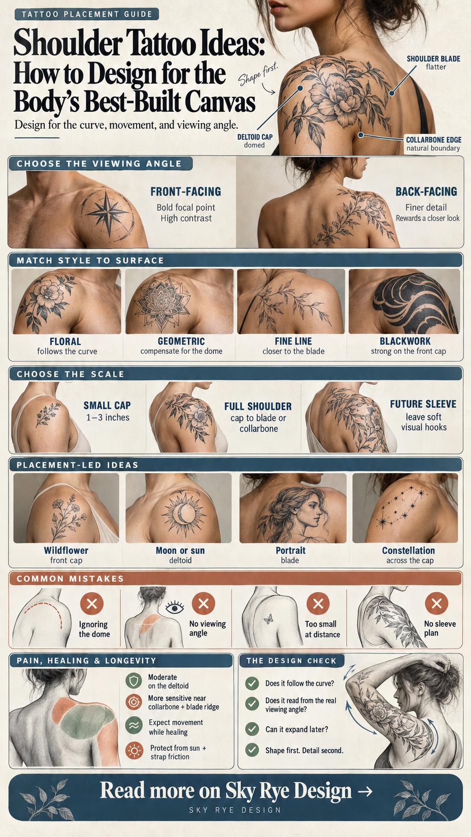
The deltoid cap is a dome, not a flat plate
The muscle sitting on top of the shoulder — the deltoid — is domed in three directions at once. A design that reads as a circle on paper will look slightly egg-shaped once it’s wrapped over that dome, and a straight line will bow. I’ve watched this happen with car door panels that had similar compound curvature: what looks correct on a flat rendering distorts the moment you wrap it onto the actual surface. Tattoo artists who work a lot in this zone compensate by drawing the initial line work with a slight curve built in, so it reads straight once it’s sitting on the muscle.
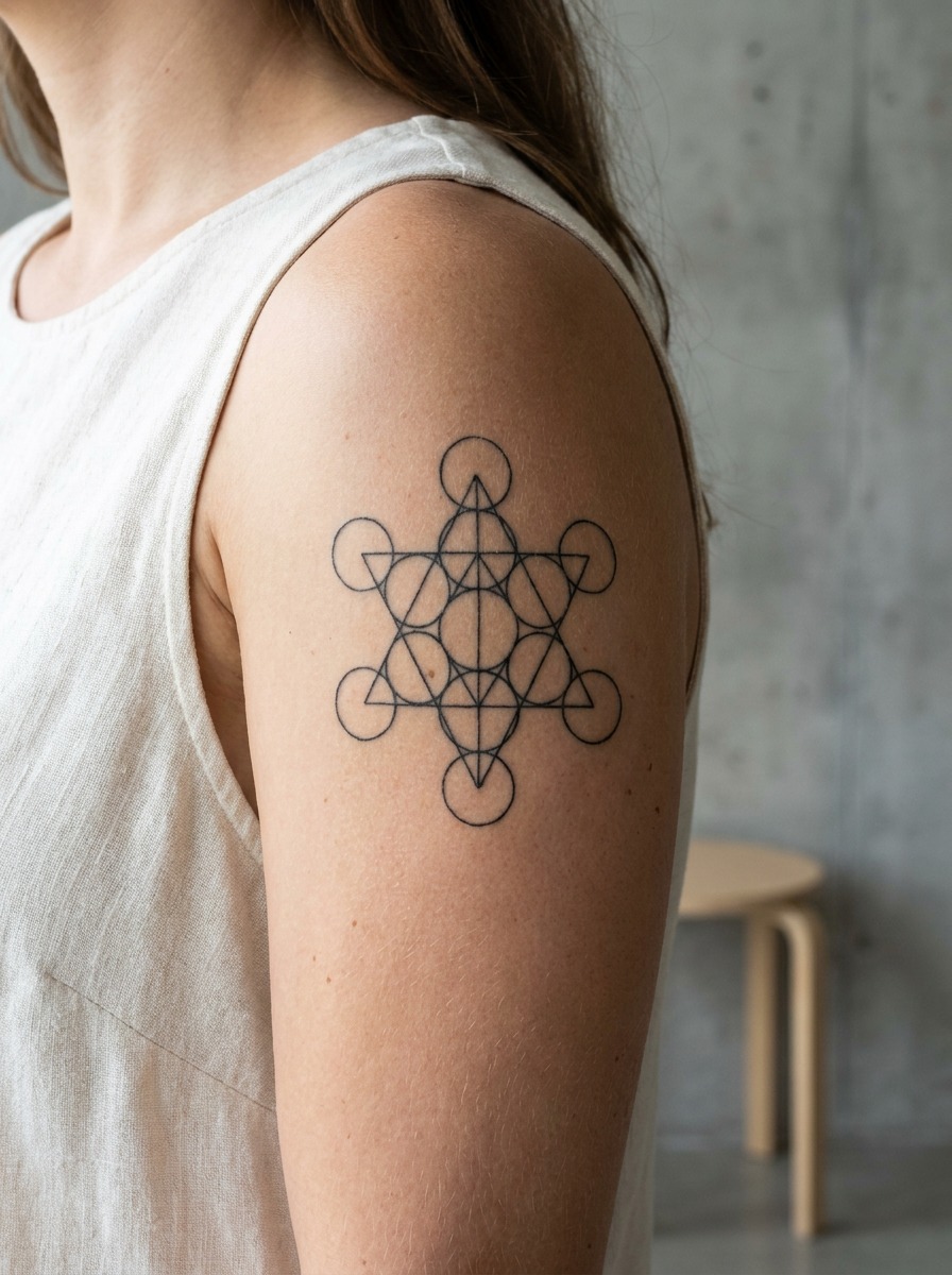
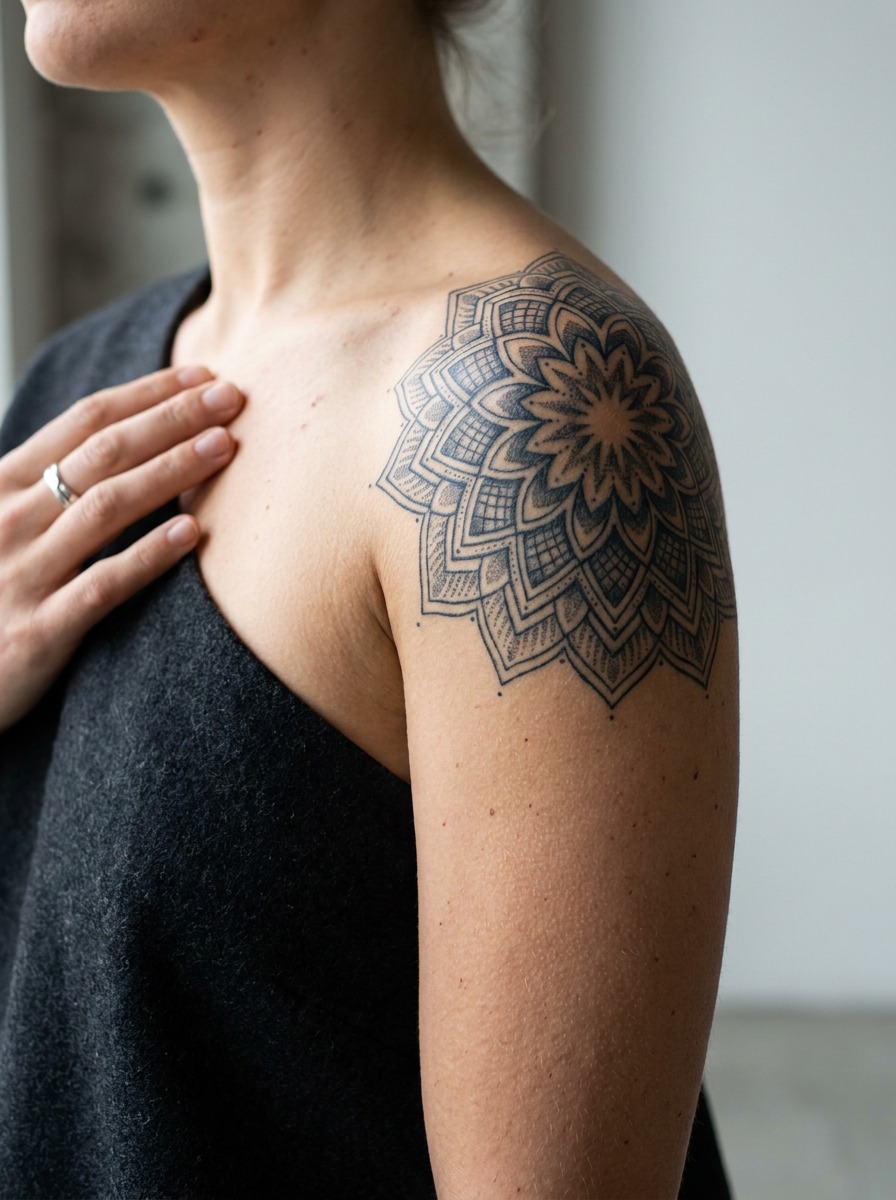
This is why a symmetrical mandala or geometric piece is one of the hardest things to put on a shoulder cap and get looking crisp — the artist has to distort the grid slightly to counteract the dome, the same way a wrap on a curved car hood needs pre-stretched printing to avoid warping the graphic.
The blade behind it is nearly flat
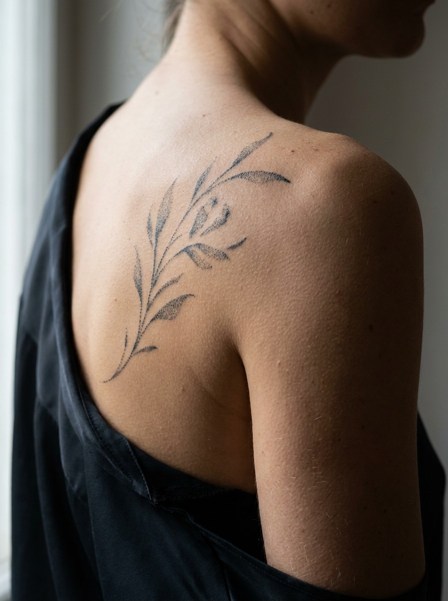
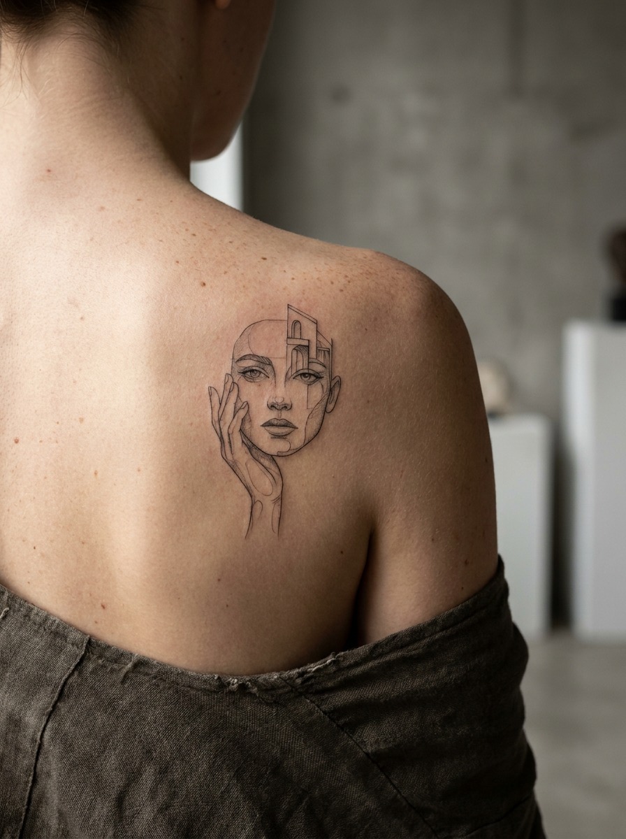
Move an inch or two back and the surface changes completely. The scapula sits closer to flat, especially when the arm is relaxed, which is why detailed illustrative work — portraits, fine line botanicals, anything with real tonal range — tends to look sharper on the back of the shoulder than on the cap itself. Less curvature means less optical distortion, so intricate shading holds up.
The seam between them is where good placement decisions get made
Most “shoulder tattoos” actually span both zones without anyone naming that transition. A piece that flows from the blade up and over the cap needs to account for the fact that it’s crossing from a flat plane onto a dome partway through — the composition has to bend with the anatomy, not just get copied across it. This is the same design logic that applies to wrapping graphics around an automotive B-pillar: the visual has to acknowledge where the surface changes angle, or it looks like two unrelated pieces stitched together.
Front-Facing vs. Back-Facing Shoulder Tattoos: How Visibility Changes the Design
One decision that gets skipped in most generic roundups: does the design sit on the front of the shoulder (visible when you’re facing someone, in a T-shirt, in a photo looking forward) or the back (visible from behind, or when the arm is raised)?
Front-facing pieces get seen in motion
A design on the front deltoid is what people see when you reach for something, shake a hand, or just stand normally in short sleeves. These pieces tend to work best with a clear focal point near the top of the design — something that reads instantly even at a glance, since most people are seeing it for two or three seconds, not studying it. Bold linework, a single strong subject (an animal, a symbol, a portrait), and higher contrast between positive and negative space all hold up better here than dense, busy compositions.
Back-facing and cap-to-blade pieces reward more detail
A tattoo that runs from the back of the shoulder down toward the blade is seen less often and, when it is, usually for longer — someone’s looking at your back in a tank top, or the piece shows in a photo where you’re turned away. That’s the spot where I’d push a client toward finer detail: fine-line florals, dotwork shading, a small scene rather than a single icon. It rewards a second look instead of needing to land in the first one.
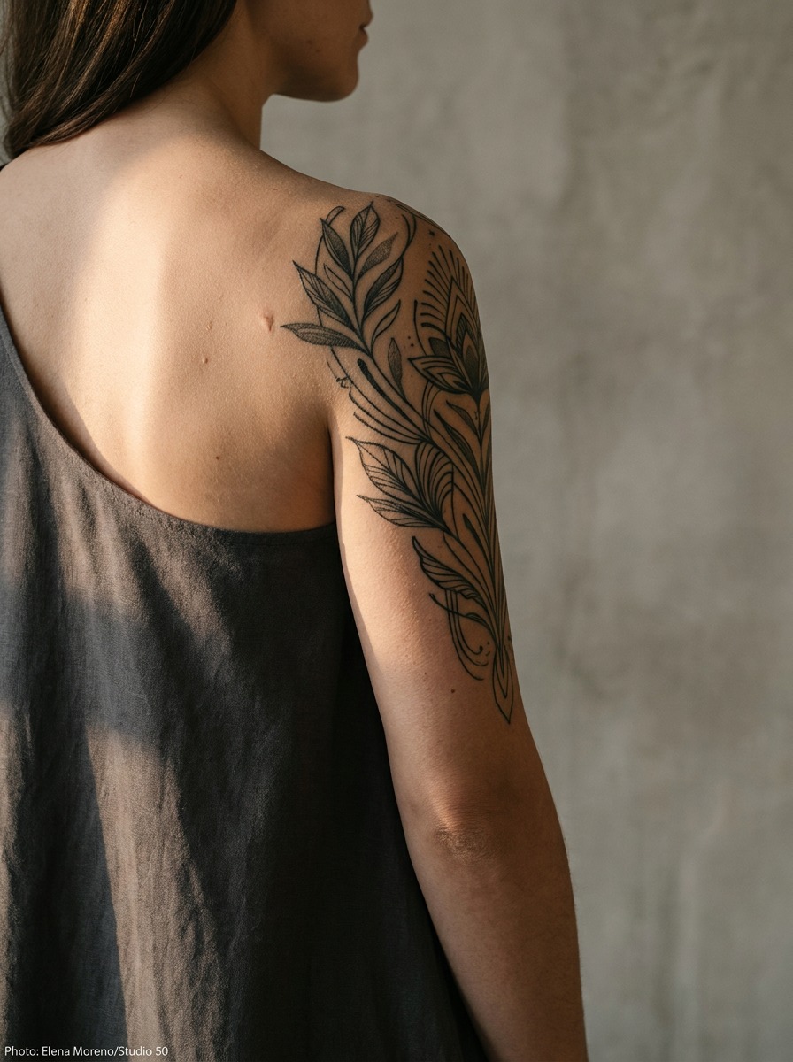
Thinking about sightlines the way a product designer does
When I worked on jewelry pieces meant to sit near the collarbone and shoulder, the brief was never just “make it pretty” — it was about which angle the piece would actually be seen from most often, since a necklace pendant reads completely differently from three feet away in conversation than it does in a close-up photo. Shoulder tattoos have the exact same problem hiding in plain sight. A design planned only from the flat reference photo an artist draws up can look perfect on paper and then feel oddly placed in real life, because nobody actually looks at a shoulder tattoo head-on and up close very often. Stand in front of a mirror at a normal conversational distance, in the kind of shirt you’d actually wear, before finalizing anything ambitious.
Wraparound designs need a decision about the collarbone edge
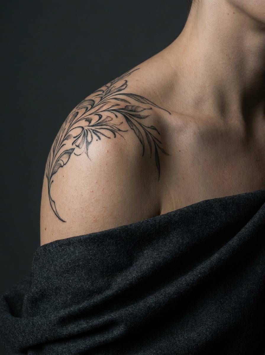
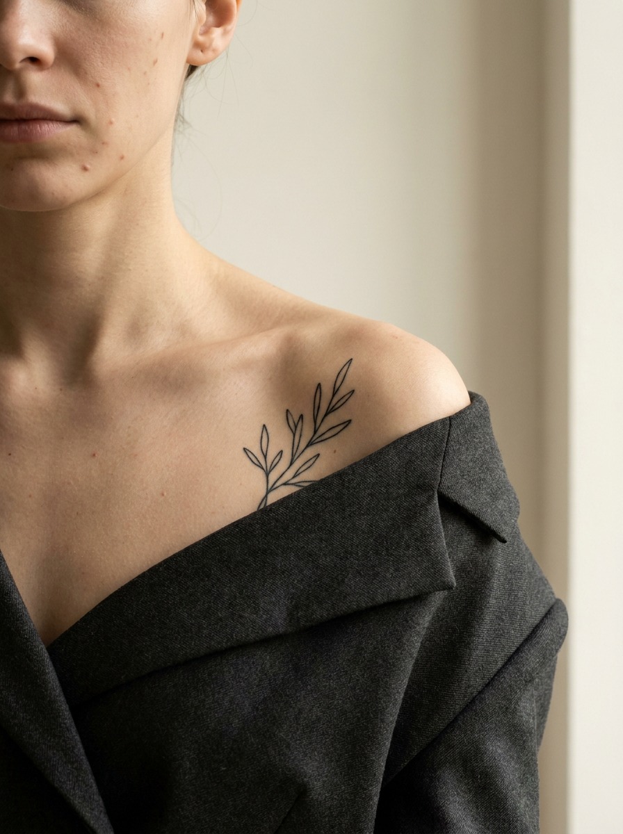
Pieces that wrap from the front cap around toward the back have to reckon with the collarbone and the front edge of the shoulder as a visual boundary. Some designs use that edge deliberately — a floral piece that “grows” from the collarbone up and over the cap reads as intentional. Others ignore it, and the tattoo ends up looking like it was placed without considering where the body’s own lines already are. I always tell people planning something large here: look at your own collarbone and the ridge where your deltoid meets your chest before finalizing the design. Those lines are already doing composition work for you.
Shoulder Tattoo Ideas by Style: What Actually Reads Well on This Shape
Once you understand the surface, style choice gets easier — some styles simply work with the shoulder’s geometry better than others.
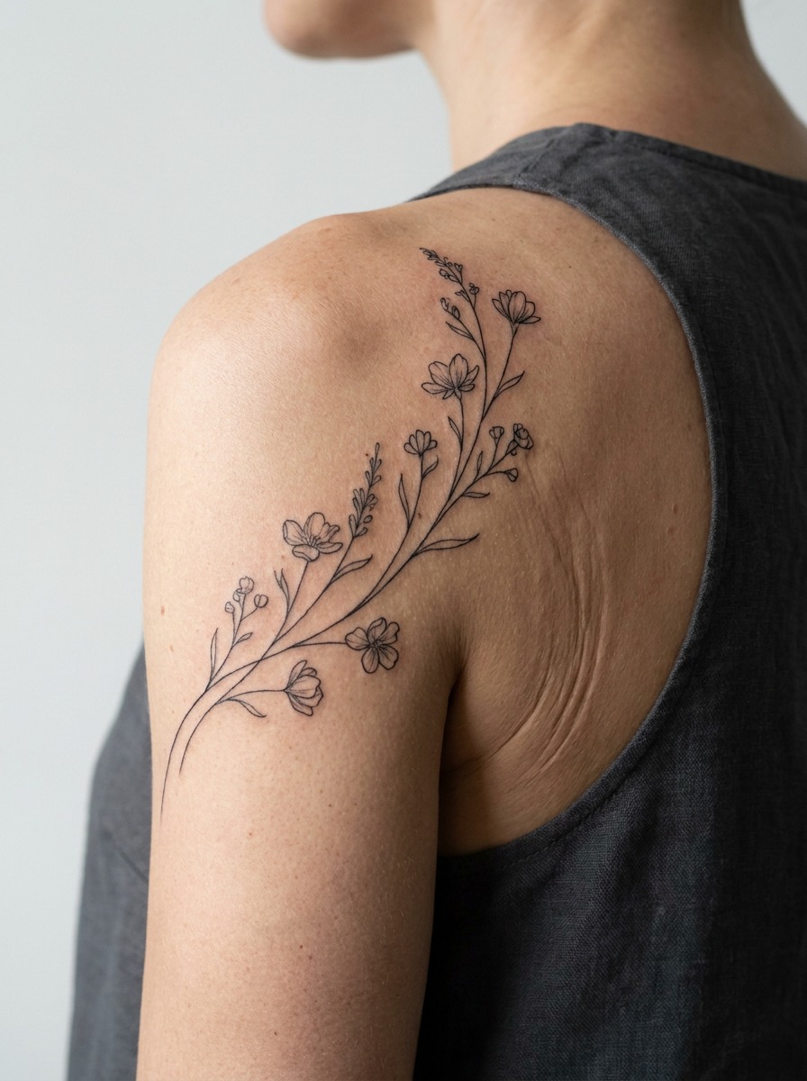
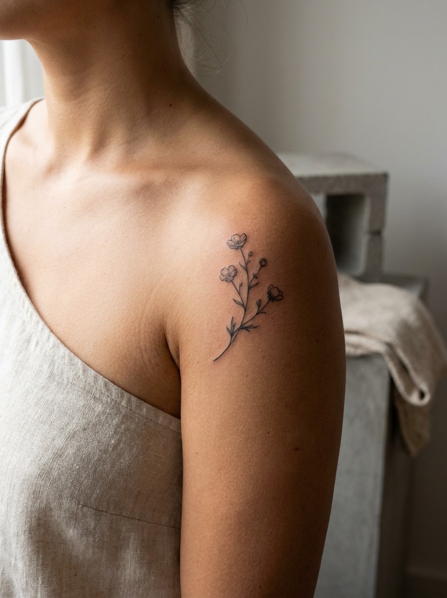
Botanical and floral work follows the curve naturally
Flowers, vines, and branch work have organic, irregular lines to begin with, so the dome of the deltoid barely distorts them — if anything, the curve gives a floral piece a slight three-dimensional lift that a flat surface wouldn’t. This is consistently one of the more forgiving styles for first-time shoulder placement, and it scales from a small single-flower cap piece up to something that wraps the full joint. If you’re thinking about eventually taking a floral shoulder piece further down the arm, our guide to floral sleeve tattoo ideas covers how to plan that whole composition as one continuous piece instead of a stack of separate flowers.

Geometric and mandala designs need a skilled hand and honest sizing
I mentioned this above, but it’s worth repeating as a style note: symmetrical geometric work is unforgiving on a curved dome. If you want this look, ask to see the artist’s specific shoulder-piece portfolio, not just their general geometric work — drawing a perfect radial pattern on paper and drawing one that reads as perfect once it’s wrapped over a muscle are two different skills.
Illustrative and fine-line portraits belong closer to the blade
Anything with real tonal detail — a realistic portrait, a detailed animal study, fine crosshatching — holds its clarity best on the flatter blade-side real estate. Push that same level of detail onto the cap itself and the highlights and shadows will warp slightly as the skin moves, which softens the crispness over the following months.
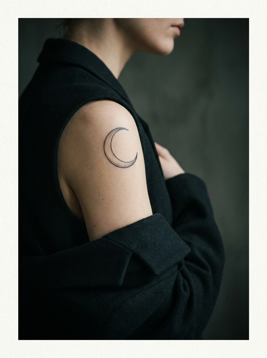
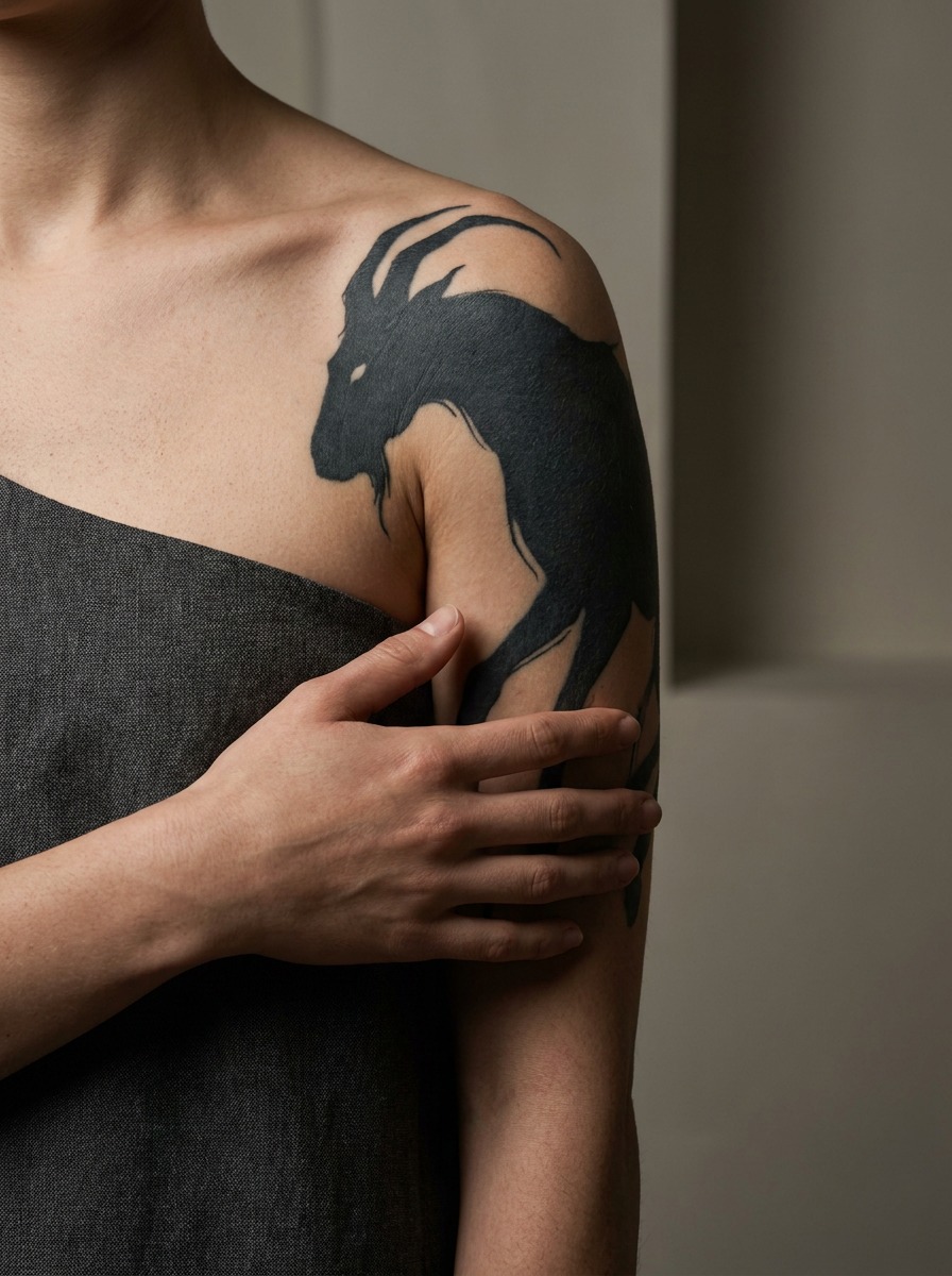
Bold blackwork and single-line icons suit the front cap
Simple, high-contrast designs — a single animal silhouette, a small sun, an anchor, initials — are the most forgiving option for the front deltoid specifically because they don’t rely on subtle tonal transitions that curvature can disrupt. They also age the most gracefully of any style in this location, which matters given how much this joint moves.
Sizing: Small Shoulder Cap vs. Full Shoulder Piece vs. Extending Into a Sleeve
Shoulder tattoos aren’t one size. They’re really three different commitments.
A small cap piece (1-3 inches)
This is the low-commitment option — a single small symbol, word, or minimalist icon sitting on the front or top of the deltoid. It heals fast, costs less, and works well as a first tattoo because the deltoid, despite the muscle underneath, has more give in the skin than something like the ribs or the inner forearm.
A full shoulder piece (covering the cap, extending toward the blade or collarbone)
This is where the anatomy conversation really matters, because the design now has to account for both the domed and flat zones described above. Full shoulder pieces are also where I’d bring an actual reference photo of your own shoulder to the consultation — everyone’s deltoid curvature, freckle pattern, and existing scarring is different, and a good artist adjusts the composition to the individual surface rather than copying a reference piece verbatim.
Extending into a sleeve or chest piece
A shoulder tattoo can be the starting anchor for a full sleeve or a chest-and-shoulder combination piece. If that’s even a possibility down the line, say so at the first consultation — it changes how the artist composes the shoulder section now, leaving visual “hooks” (an unfinished vine, a soft-edged cloud, a directional line) that later work can connect into, rather than a self-contained piece that would look cramped once something is added around it.

Ten Shoulder Tattoo Ideas Built Around Placement Logic
Once the anatomy and visibility questions are settled, here are concrete directions that tend to hold up well on this particular shape, organized by where they sit best.
- A single wildflower or branch on the front cap. Small, asymmetrical, and forgiving of the dome’s curvature — one of the most reliable first-shoulder-tattoo choices.
- A crescent moon or sun icon centered on the deltoid. Bold, high-contrast, and legible at a glance, which matters for a front-facing spot people see in passing.
- A fine-line portrait or animal study on the blade. Takes advantage of the flatter surface behind the cap, where tonal detail holds its edge over time.
- A vine or floral piece that flows from the collarbone up and over the cap. Uses the body’s own lines as part of the composition instead of ignoring them.
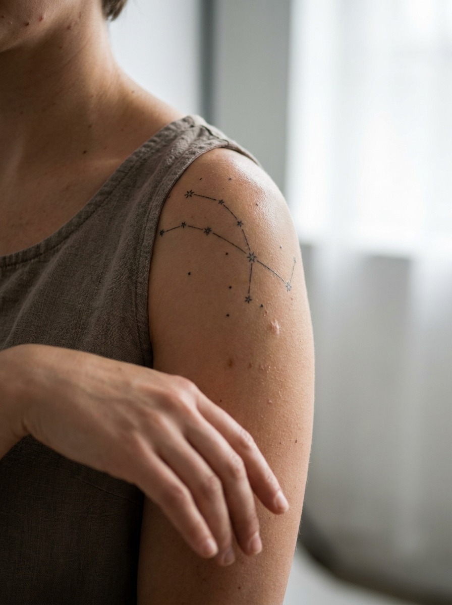
- A small constellation or star cluster scattered across the cap. Individual dots and simple linework barely register the curvature, so this ages cleanly.
- A geometric band or mandala, sized small and placed carefully by an artist experienced with curved surfaces. Ambitious on this canvas, but achievable with the right compensation in the line work.
- A wraparound botanical sleeve-starter. Composed with soft, unfinished edges from the beginning so it can extend down the arm later without looking retrofitted.
- A minimalist line-art animal on the front deltoid. Single continuous line work is about as forgiving of the dome as blackwork gets, and it reads instantly from across a room. The same “one continuous line, no distortion tolerance” logic is what makes a well-drawn infinity symbol work or fail on curved skin — small, clean, unbroken shapes are the most forgiving family of designs for a joint that never stops moving.
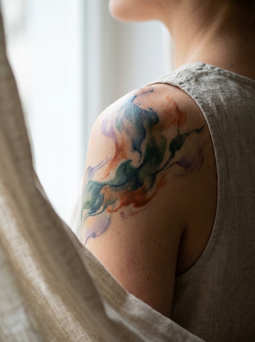
- A watercolor-style abstract wash toward the back of the shoulder. The softer edges of this style hide minor distortion better than hard-edged geometric work would in the same spot.
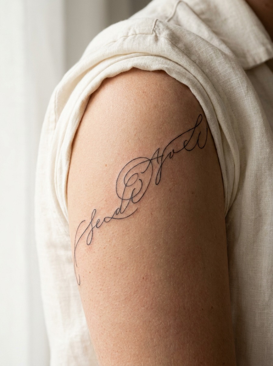
- Script or lettering following the natural curve of the cap. Lettering that’s drawn to follow the dome’s arc rather than run in a straight line reads far more naturally once healed — a straight line of text on a curved surface is one of the more common regrets I hear about.
I’ve noticed the ideas that age best over the years aren’t necessarily the most detailed ones — they’re the ones where the artist clearly thought about the muscle underneath before ever picking up the machine. A rougher parallel: I’ve drawn cars in academic life-drawing sessions where the temptation is always to add more surface detail before the underlying proportions are actually correct, and it never works. Same principle here. Get the shape right first.
Common Shoulder Tattoo Mistakes I See Design Enthusiasts Make
A few patterns come up again and again with this placement specifically.
- Ignoring the dome when picking a symmetrical design. Circular mandalas and radial geometric pieces are the design that suffers most from the deltoid’s curvature if the artist doesn’t compensate for it during line work.
- Not deciding between front-facing and back-facing before designing. Committing to a composition before figuring out which angle it needs to read from leads to pieces that look great in the reference photo and slightly off once they’re actually on the body in a T-shirt.
- Sizing too small for a spot meant to be seen from a distance. Because the shoulder is often viewed from a few feet away — across a room, in a photo — a design that’s beautifully detailed but tiny can lose all its impact at normal viewing distance. Fine detail belongs closer to the blade, where people look longer; bold, simple shapes belong on the cap, where people glance.
- Skipping the sleeve conversation. If there’s any chance of extending the piece later, not mentioning it up front is the single most common regret people bring back to a second consultation.
- Choosing a design without accounting for the collarbone or blade’s bony ridge. Both edges show through the skin more than people expect, and a design that runs directly over either one will distort slightly along that line.
- Copying a reference design meant for a different body type. A shoulder tattoo photo from a slimmer or more muscular build won’t wrap the same way on a different frame. Bring the reference as inspiration, not a template, and let the artist adjust the composition to your own shoulder’s actual proportions.
Pain, Healing, and Movement: What’s Different About This Joint
The shoulder isn’t the most painful spot on the body, but it isn’t the easiest either, and the reasons are mechanical.

It’s a high-movement joint, which affects both the session and the healing
Unlike a flat plane like the outer thigh or forearm, the deltoid is constantly shifting as your arm moves, even slightly, during a long session. Most artists will have you rest your arm on a support or in your lap to keep the skin as still as possible, especially for detailed cap work. During healing, the same movement — reaching overhead, sleeping on that side, pulling a shirt on — puts more flex stress on a fresh shoulder tattoo than on a lot of other placements, which is part of why aftercare instructions for this spot lean harder on keeping the area loose and not restricting motion with tight bandaging for longer than directed.
Pain level sits in the middle of the chart
Directly on the deltoid muscle, most people rate it moderate — there’s enough muscle and fat padding that it’s less sharp than bony areas like the collarbone or spine. Pain climbs noticeably if the design pushes toward the front of the shoulder near the collarbone, or back toward the scapula’s bony ridge, both areas with thinner tissue over bone.
Session length matters more here than people plan for
A full shoulder piece — cap to blade, or cap to collarbone — often runs longer than a same-sized piece on a flatter, more stationary area like the outer thigh, simply because the artist is working around a joint that shifts with every small adjustment of your seated position. I’d rather see someone budget for an extra session and get clean line work than rush a design that needed to slow down for the curvature. Ask your artist directly whether they expect one sitting or two for the size you’re planning, and build your schedule — and your pain tolerance for that day — around their honest answer rather than a guess.
Sun and strap exposure affect longevity more than people expect
The shoulder is one of the most sun-exposed spots on the body in warmer months — tank tops, swimwear straps, and direct exposure all hit this area constantly. UV fading happens faster here than on covered placements, so if you’re picking a shoulder tattoo specifically because you want it visible, plan on sunscreen being part of the maintenance, not an afterthought.

FAQ
Are shoulder tattoos a good first tattoo?
Yes, for most people. The muscle and fat over the deltoid provide more cushioning than bony areas like the ribs or spine, and a small cap piece heals relatively quickly since it isn’t in a high-friction zone like the hands or feet.
How much do shoulder tattoos hurt compared to other placements?
Moderate, on average. The deltoid itself is padded enough to keep the pain manageable, but it climbs if the design extends toward the collarbone or the bony ridge of the shoulder blade, where there’s less tissue between skin and bone.
Do shoulder tattoos fade faster than other placements?
They can, mainly because of sun exposure rather than skin type — tank tops, swimwear, and direct sunlight hit this area more than most covered placements. Regular sunscreen on the tattoo once it’s healed slows the fading noticeably.
Should I get a shoulder tattoo on my dominant or non-dominant side?
Either works fine mechanically, but consider visibility and comfort: your dominant shoulder gets more movement and occasional bag-strap or seatbelt friction, while your non-dominant side often stays slightly more protected day to day.
What size works best for a first shoulder tattoo?
A cap piece in the 2-4 inch range is a common, low-commitment starting point. It’s large enough to read clearly from a normal viewing distance but small enough to keep the session short and the healing simple.
Can a shoulder tattoo connect into a sleeve later?
Yes, and it’s worth mentioning at the very first consultation if it’s even a possibility. A shoulder piece designed with future extension in mind — soft edges, a directional flow, an unfinished element — connects far more naturally than one composed as a fully self-contained design.
Why do geometric shoulder tattoos sometimes look uneven after healing?
Usually because the original line work didn’t account for the deltoid’s dome. A perfectly symmetrical pattern drawn flat will read slightly distorted once it’s wrapped over curved muscle, so experienced artists build a small compensating curve into the design from the start.
For more placement and style directions, browse the broader tattoo ideas archive.
- 21shares
- Facebook0
- Pinterest21
- Twitter0
- Reddit0