Typography is the art of arranging text to make it visually appealing and easy to read. In UI design, typography plays a fundamental role in creating effective interfaces that communicate clearly with users. Well-executed typography enhances user experience by improving readability, establishing visual hierarchy, and reinforcing brand identity.
When designing interfaces, your typography choices directly impact how users interact with and perceive your product. Every font selection, spacing decision, and alignment choice contributes to the overall user experience. Typography isn’t just about aesthetics—it’s about functionality and ensuring that users can effectively navigate and consume information.
Good typography often goes unnoticed, but poor typography immediately stands out and frustrates users. By understanding typography principles, you can create interfaces that feel intuitive and professional while guiding users naturally through your content. This balance between form and function is what makes typography such a crucial element in successful UI design.
Key Takeaways
- Typography in UI design directly impacts usability by affecting readability, information hierarchy, and overall user experience.
- Strategic font selection, spacing, and alignment choices guide users through interfaces while reinforcing brand identity.
- Effective typography balances aesthetic appeal with functional requirements to create intuitive and professional interfaces.


Understanding Typography in UI
Typography serves as a fundamental element in UI design that shapes how users interact with and perceive digital interfaces. Effective typography establishes visual hierarchy, conveys brand identity, and significantly impacts both readability and the overall user experience.
Definition and Importance
Typography in UI design refers to the art and technique of arranging text to make content legible, readable, and visually appealing within digital interfaces. It goes beyond simply selecting fonts—it encompasses the strategic arrangement of text elements to guide users through an interface.
Typography directly influences how users process information and navigate your product. Well-executed typography creates clear communication pathways, reducing cognitive load and helping users quickly find what they need.
Research shows that good typography can increase reading speed by up to 50%, while poor typography choices can cause user frustration and abandonment. Typography also plays a crucial role in establishing brand identity and creating emotional connections with users.
Role in UI Design
Typography forms the backbone of information hierarchy in UI design. Through deliberate font choices, sizing, and spacing, you can guide users’ attention to the most important elements first.
Typography helps create consistent visual language across your interface. This consistency builds user trust and reduces the learning curve when navigating your product.
Effective typography supports accessibility needs. Proper contrast ratios, font sizes, and line spacing ensure your interface remains usable for people with visual impairments or reading difficulties.
Typography also contributes significantly to the overall aesthetic appeal of your design. The right typographic choices can evoke specific emotions and reinforce your brand personality through visual tone.
Key Terminology
Font vs. Typeface: A typeface is the design of lettering (like Helvetica), while a font is a specific size and style variation (like Helvetica Bold 12pt).
Leading: The vertical space between lines of text, critical for readability. Too little makes text feel cramped; too much disconnects related content.
Kerning and Tracking: Kerning adjusts spaces between specific letter pairs, while tracking modifies spacing across entire text blocks.
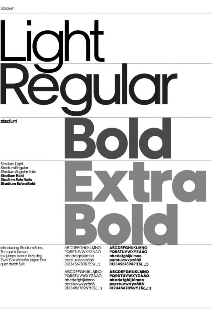
Font Weight: The thickness of characters in a typeface, ranging from thin to bold. Weight variations create emphasis and visual hierarchy within your content.
Serif vs. Sans-serif: Serif fonts have small decorative strokes at the ends of letters (like Times New Roman), while sans-serif fonts lack these features (like Arial). Each serves different purposes in UI design.
Core Elements of Typography
Typography is built on several foundational elements that work together to create effective communication in UI design. Understanding these components will help you create interfaces that are both functional and visually appealing.
Typeface and Fonts
A typeface is a specific design of letters and characters, while fonts are variations within that typeface family. When selecting typefaces for your UI, consider both aesthetic quality and practical functionality.
Most successful interfaces use a limited palette of 2-3 typefaces to maintain visual coherence. Your primary typeface should excel in readability at various sizes, especially for body text.
Each typeface communicates different personality traits. Geometric sans-serifs like Roboto convey modernity and clarity, while serifs like Georgia might suggest tradition or formality.
Consistency in typeface usage builds familiarity for users and strengthens your brand identity. Create clear rules for which typefaces serve specific functions in your interface.
Font Size and Sizing Systems
Appropriate font sizing ensures readability and establishes content hierarchy. Base font sizes typically range from 14px to 16px for body text on screens, though this varies based on the specific typeface.
Implement a sizing scale or type system rather than arbitrary sizes. Common approaches include:
- Modular scale: Using a ratio (like 1.2 or 1.5) to determine size progression
- 4pt or 8pt grid systems: Ensuring sizes are divisible by 4 or 8
Mobile interfaces generally require larger font sizes than desktop counterparts due to viewing distance and screen size differences.
Consider responsive typography that adjusts sizes based on viewport dimensions. This ensures optimal reading experiences across devices without manual adjustments.
Font Weight and Style
Font weight refers to the thickness of character strokes, ranging from light to bold. Strategic use of different weights creates contrast and hierarchy without requiring size changes.
Most interfaces benefit from using at least two weights:
- Regular (400): For body text and general content
- Bold (700): For headings and emphasis
Font styles include variations like italic, which can be used sparingly to create emphasis or differentiate specific content types. Overusing italics reduces readability, especially in UI contexts.
Combining weight and style thoughtfully guides users’ attention through your interface. Weight contrast works particularly well for navigation elements and interactive components.
Serif and Sans-Serif
Serif fonts have small decorative strokes (serifs) at the ends of characters. These typefaces often convey tradition, reliability, and formality. Examples include Times New Roman, Georgia, and Merriweather.
Sans-serif fonts lack these decorative strokes, creating a cleaner, more modern appearance. Popular UI sans-serifs include Helvetica, Roboto, and San Francisco.
Historically, sans-serif fonts were considered more screen-friendly, but modern high-resolution displays render both styles effectively. Your choice should align with brand personality and content needs.
Many successful interfaces pair serif and sans-serif fonts to create pleasing contrast. A common approach uses sans-serifs for UI elements and headings with serifs for body content, though the reverse can be equally effective.

Structural Principles of Typography in UI
Typography in UI design relies on fundamental structural principles that guide users through interfaces. Effective typographic structures create visual pathways that enhance readability, establish information importance, and improve overall user experience.
Hierarchy and Visual Hierarchy
Visual hierarchy determines what users notice first and how they process information. In UI design, typographic hierarchy uses size, weight, color, and spacing to guide attention to the most important elements first.
Primary elements like main headlines typically use larger font sizes (20-32px), bolder weights, and high contrast colors to immediately capture attention. Secondary information appears in slightly smaller sizes (16-20px) with medium weights.
Supporting content uses standard text sizes (14-16px) with regular weights. This tiered approach creates a natural flow through the interface.
Effective hierarchy reduces cognitive load by organizing content in a way that makes logical sense to users. You should maintain consistent hierarchical patterns throughout your UI to build user familiarity and improve navigation efficiency.
Headlines and Headings
Headlines and headings serve as signposts throughout your interface. The headline hierarchy typically follows H1 through H6 elements, each with decreasing visual prominence.
H1 headings function as page titles or main section identifiers, usually set at 24-32px with bold weight. H2 headings (20-24px) mark major section divisions, while H3 headings (18-20px) introduce subsections.
Your heading typography should:
- Maintain consistent styling for each heading level
- Use appropriate size reductions between levels (typically 2-4px)
- Employ adequate spacing above and below (often 0.8-1.5× the font size)
Headings should visually relate to your body text while standing apart from it. Many designers use the same typeface family but adjust weight, size, and sometimes case to create distinction without dissonance.
Paragraphs and Lists
Paragraph text forms the foundation of your content. Default font sizes typically range from 14-16px, with line heights (leading) of 1.4-1.6× the font size to ensure readability.
Optimal paragraph width is crucial for readability. Aim for 45-75 characters per line, which typically translates to 450-600px width in most interfaces.
Lists help break complex information into digestible chunks. When formatting lists:
- Use consistent indentation (typically 1.5-2× the font size)
- Add appropriate spacing between list items (0.5-0.8× the font size)
- Consider visual markers that align with your design system
Text elements in paragraphs should maintain sufficient contrast with backgrounds (WCAG recommends at least 4.5:1 for normal text). You can use subtle variations in text color to indicate links or interactive elements, but avoid excessive variation that disrupts the visual hierarchy.


Spacing, Alignment, and Typography
Typography spacing and alignment are fundamental elements that directly impact readability and visual hierarchy in UI design. Proper spacing creates breathing room between elements while thoughtful alignment establishes order and structure.
Line Height and Line Spacing
Line height (also called leading) refers to the vertical space between lines of text. For body text, aim for line height values between 1.4 and 1.6 times your font size to ensure proper readability.
Too little space makes text feel cramped and difficult to read, forcing users to concentrate harder. Too much space disconnects related lines of text, making content feel disjointed.
For headings, you can use tighter line spacing (1.1 to 1.3) since they typically contain fewer words and are meant to be read as distinct units.
When working with different text sizes on the same screen, maintain consistent vertical rhythm by using a baseline grid. This helps create a harmonious visual flow as users scan your interface.
Avoid orphans (single words on the last line of a paragraph) by adjusting line lengths or making minor text edits.
Letter Spacing, Tracking, and Kerning
Letter spacing (tracking) refers to the uniform adjustment of space between characters in a text block. Proper letter spacing improves readability and creates visual harmony.
For body text, maintain default or slightly increased letter spacing (0.15-0.5px) to improve legibility. Headings often benefit from slightly negative tracking to create a tighter, more cohesive look.
Small text (below 14px) typically needs increased letter spacing to remain legible. Very large text, like headlines, often looks better with tighter spacing.
Kerning refers to the adjustment of space between specific character pairs. While most fonts have built-in kerning tables, you may need to adjust problematic pairs manually in important UI elements like logos or headlines.
Different fonts require different spacing approaches – serif fonts often need more breathing room than sans-serif varieties.
Alignment and Consistency
Text alignment creates structure and affects how easily users can scan your content. Left-aligned text (ragged right) is the most readable option for most languages that read left to right.
For content that spans more than three lines, avoid centered text as it creates irregular starting points that slow reading. Reserve centered alignment for short headings or special elements.
Right-aligned text works well for specific data like numbers in tables or timestamps. Justified text should be used cautiously as it can create uneven spacing between words.
Maintain consistent alignment between related elements. If your headings are left-aligned, your body text should follow the same pattern to create visual continuity.
Use spacing to group related information and separate distinct sections. The 4-point (or 8-point) grid system can help you create consistent spacing throughout your interface.

Color, Contrast, and Readability
Color and typography work together to create interfaces that are both visually appealing and functionally effective. Good design choices in these areas directly impact how users interact with your product and whether they can access information efficiently.
Effective Use of Color
Color in typography serves multiple purposes beyond aesthetics. When selecting colors for text and UI elements, consider both their psychological impact and functional role.
Color creates visual hierarchy, guiding users through your interface by highlighting important elements. Blue text often signifies links, while red typically indicates errors or warnings.
Color psychology tips:
- Use blue for trust and reliability
- Apply green for success and progress
- Choose red sparingly for warnings or critical information
- Implement neutral colors for body text
Avoid using color as the only method of conveying information. This ensures users with color vision deficiencies can still understand your interface.
Color choices should align with your brand identity while maintaining functionality. Material Design guidelines recommend limiting your color palette to 2-3 primary colors plus neutrals for most interfaces.
Ensuring Contrast
Contrast directly affects how easily users can read and interact with your interface. Poor contrast can make content inaccessible, particularly for users with visual impairments.
Web Content Accessibility Guidelines (WCAG) require specific contrast ratios:
- 4.5:1 for normal text
- 3:1 for large text (18pt or 14pt bold)
- 3:1 for UI components and graphical objects
Tools for checking contrast:
- WebAIM Contrast Checker
- Stark plugin
- Chrome DevTools Accessibility Audit
Text over images presents special challenges. Consider adding a semi-transparent overlay or text shadow to maintain readability.
Test your contrast choices in different lighting conditions. What works in a controlled environment might fail in bright sunlight or low light.
Improving Readability and Legibility
Readability refers to how easily users can comprehend blocks of text, while legibility focuses on how quickly individual characters can be recognized.
Typography best practices:
- Use proper line height (1.5x font size for body text)
- Maintain adequate letter spacing
- Limit line length to 50-75 characters
- Break text into short paragraphs
Font choice significantly impacts legibility. Sans-serif fonts like Inter, Roboto, and SF Pro work well on screens, especially at smaller sizes.
Proper text sizing is crucial for readability. Use a minimum of 16px for body text and scale other text proportionally. Consider implementing responsive typography that adjusts based on screen size.
White space around text elements improves comprehension by giving the eye natural resting points. Don’t crowd components or text blocks together.


Best Practices and Advanced Considerations
Implementing effective typography in UI requires attention to detail and adherence to established principles. The following practices will help you create more readable, accessible, and visually appealing interfaces while maintaining brand consistency.
Guidelines and Standards
Limit your typeface selection to two or three fonts maximum. Using too many fonts creates visual chaos and hinders user experience. Instead, choose complementary typefaces that provide sufficient contrast while maintaining harmony.
Ensure high contrast between text and background colors. This improves readability for all users, especially those with visual impairments. WCAG guidelines recommend a minimum contrast ratio of 4.5:1 for normal text and 3:1 for large text.
Establish a clear typographic hierarchy using size, weight, and spacing. Users should immediately understand the relationship between different text elements on your interface.
Create a typography system with consistent spacing and sizing rules. Use relative units (em, rem) rather than fixed pixels to maintain proportional relationships between elements.
Test your typography across different devices and screen sizes before finalizing your design decisions.
Responsive Typography
Implement fluid typography that adapts seamlessly across device sizes. CSS features like clamp(), min(), and max() allow you to create text that scales proportionally with viewport dimensions.
h1 {
  font-size: clamp(1.5rem, 5vw, 3rem);
}
Consider different reading contexts when designing. Mobile users typically hold devices closer to their faces than desktop screens, affecting optimal font sizes and line heights.
Use appropriate line lengths to enhance readability. Aim for 45-75 characters per line across all devices. Too short makes reading choppy; too long makes tracking difficult.
Test your responsive typography in real-world conditions. Font rendering varies across operating systems and browsers, so verify your design works correctly everywhere.
Brand Recognition in Typography
Select typefaces that align with your brand personality. Serif fonts often convey tradition and reliability, while sans-serifs suggest modernity and simplicity.
Maintain consistency with your typography across all touchpoints. Users should experience the same typographic voice whether using your website, mobile app, or viewing printed materials.
Consider creating a custom font for distinctive brand identity. Many successful companies like Airbnb, Netflix, and Google have developed proprietary typefaces that enhance brand recognition.
Document your typography rules in a comprehensive style guide. This ensures all team members understand how to properly implement your typographic system in various contexts.
Collaboration and Tools
Utilize collaborative design tools like Figma or Adobe XD to create typography systems that designers and developers can easily reference and implement.
Build component libraries with predefined text styles. This promotes consistency and speeds up both design and development processes.
Share typography decisions with developers through clear specifications. Include information about font families, weights, sizes, and line heights for each text element.
Consider open-source typography tools like Type Scale or Modular Scale to create harmonious size relationships in your interfaces.
Implement a version control system for your typography guidelines. As your product evolves, documenting changes ensures everyone stays aligned with current standards.
- 1.3Kshares
- Facebook0
- Pinterest1.3K
- Twitter3
- Reddit0

