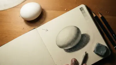
Black and white abstract drawings work when line, value, shape, and negative space support one clear visual idea. Start with a small thumbnail, choose one dominant type of mark, and reserve the darkest black for the area that should attract attention first. This guide covers practical materials, seven exercises, composition checks, common mistakes, and digital options for building a monochrome drawing from scratch.
My quickest composition test is simple: photograph the page and view it at phone-thumbnail size. If the main value pattern disappears, more detail will not fix it. Simplify the largest shapes first, then return to texture and line weight.
How to make a black and white abstract drawing
Build the drawing from large decisions to small marks. A limited palette does not mean every area needs maximum contrast; the useful contrast is the one that guides the eye.
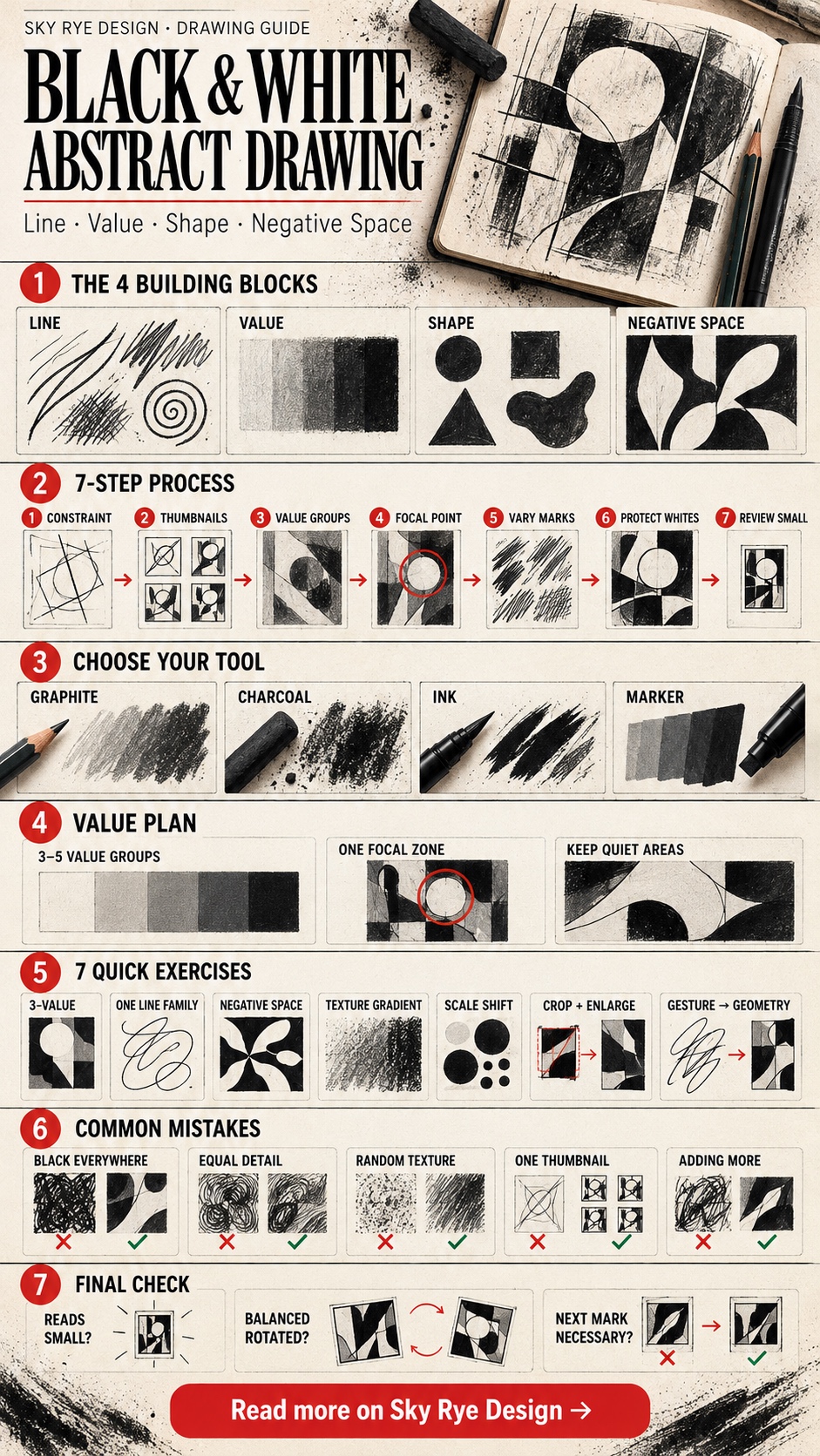
- Set one constraint. Choose geometric or organic shapes, a single source image, or one family of marks.
- Draw three thumbnails. Test different arrangements before working larger.
- Group the values. Reduce the image to white, middle grey, and black before adding subtle transitions.
- Choose a focal area. Put the sharpest edge, darkest dark, or densest texture there.
- Vary the marks. Change line weight or spacing, but keep the mark family consistent.
- Protect the quiet areas. Leave enough untouched paper to separate major shapes.
- Review at a distance. Rotate the page, squint, or view a small photo before making the final marks.
A quick plan for line, value, and negative space
| Decision | Useful starting point | What to avoid |
|---|---|---|
| Value structure | Three to five clear value groups | Dozens of similar greys with no hierarchy |
| Focal point | One area with the strongest edge or contrast | Making every part equally loud |
| Line language | One main line family with controlled variation | Unrelated marks added only for variety |
| Negative space | Quiet areas that separate and frame forms | Filling every open patch of paper |
| Texture | Texture that follows the form or rhythm | Even texture across the entire page |
The Enduring Allure of Monochromatic Expression


The power of black and white in art is undeniable. It’s a palette of stark simplicity, yet capable of profound complexity. In abstract drawing, this limited spectrum becomes a supercharger for creativity, pushing artists and viewers alike to engage with art on a deeper, more elemental level. By removing color, the artist forces the eye to focus on the structural integrity of the piece: the tension of a line, the weight of a shape, the rhythm of repetition, and the intricate play of positive and negative space.
Historically, black and white drawing has been a cornerstone of artistic practice, from master studies to preliminary sketches. Its roots in abstraction can be traced back to early 20th-century movements like Cubism and Futurism, which experimented with fragmenting reality and emphasizing form. Later, artists like Franz Kline, with his monumental black strokes against white canvases, epitomized the raw energy and emotional intensity achievable through this restricted palette. Willem de Kooning, too, often used black and white in his early abstract explorations to convey movement and emotion.
The monochromatic nature allows for a universal language, transcending cultural interpretations of color. A bold black line on white paper can convey dynamism, fragility, strength, or fluidity, without the added layer of chromatic associations. This makes black and white abstract drawings incredibly versatile, capable of fitting into diverse aesthetic environments, from minimalist apartments to industrial lofts. They serve as sophisticated focal points, drawing the eye and inviting prolonged contemplation.
Deconstructing Abstract Art: What Makes it Abstract?


Before diving deeper into the specifics of black and white, it’s crucial to understand the essence of abstract art itself. Abstraction, in its broadest sense, means to “draw away from” or “separate.” In art, this translates to works that do not attempt to represent external reality accurately. Instead, abstract artists use visual language of shape, form, color, and line to create a composition which may exist with a degree of independence from visual references in the world.
In black and white abstract drawings, this principle is intensified. The absence of color means the viewer is left solely with the interplay of value (lightness and darkness), line, and shape. This forces a direct confrontation with the artist’s formal choices.
Consider the fundamental elements of design:
- Line: Can be thick, thin, broken, continuous, straight, curved, jagged. It defines edges, creates movement, and builds structure.
- Shape: Geometric (squares, circles) or organic (free-form). Shapes create areas of interest and define positive and negative space.
- Form: Implies three-dimensionality, often created through shading or overlapping shapes.
- Space: The area an object occupies (positive space) and the area around it (negative space). In abstract work, negative space is as important as positive space.
- Value: The lightness or darkness of a tone. In black and white, this spectrum from pure white to pure black, including all shades of grey, is paramount for creating depth, contrast, and visual hierarchy.
- Texture: The perceived surface quality of a work. This can be actual (rough paper) or implied (through varied lines or marks).
When these elements are manipulated in black and white, the focus shifts entirely to their inherent qualities and relationships. A stark black shape against a white background becomes a powerful statement of presence and absence. A series of swirling grey lines evokes movement and fluidity without needing a specific object to represent. The viewer becomes an active participant, interpreting the visual cues based on their own experiences and perceptions, making each encounter with the art uniquely personal.
The Psychology of Contrast: Black, White, and the Human Mind


The pairing of black and white holds profound psychological and symbolic significance across cultures. Black is often associated with mystery, power, formality, elegance, and the unknown, while white symbolizes purity, innocence, clarity, simplicity, and new beginnings. When these two opposing forces meet in an abstract drawing, they create a dynamic tension that deeply resonates with the human psyche.
The high contrast intrinsic to black and white art immediately grabs attention. Our brains are wired to detect contrast as a fundamental aspect of visual information processing. This makes black and white abstract pieces incredibly impactful, often conveying a sense of drama, focus, and intensity that might be diluted by a multi-colored palette. The starkness can evoke feelings of minimalism and clarity, cutting through visual clutter to deliver a direct message.
Moreover, the absence of color can sometimes elicit a more introspective and analytical response. Without the emotional cues typically provided by color (e.g., warm reds, cool blues), the viewer is left to interpret the shapes and lines in a more primal way. This can lead to a deeper engagement, as the mind works to find patterns, meaning, or emotional resonance within the composition. The interplay of light and shadow, inherent in black and white drawing, mimics the fundamental conditions of our visual experience of the world, making these compositions feel both timeless and deeply familiar, even in their abstraction. The strategic use of white space, for instance, can evoke a sense of calm or expansive thought, highlighting the importance of what isn’t there. This concept is beautifully explored in the design principle of The Importance of White Space in Design: Less is More.
Black and white abstract drawing techniques
Creating compelling black and white abstract drawings requires a deep understanding of technique and an adventurous spirit for experimentation. The limited palette necessitates mastery of value, line, and texture to achieve complexity and visual interest.
Mediums of Choice


Artists employ various mediums, each offering unique qualities:
- Graphite Pencils: Ranging from hard (H) to soft (B), they offer incredible versatility for subtle shading, fine lines, and rich darks.
- Charcoal: Known for its deep black and ability to create velvety textures and broad strokes. It’s excellent for expressive, gestural work.
- Ink (Indian Ink, Sumi Ink): Provides the starkest contrast, from solid black to delicate washes when diluted. Pens (nib, brush, technical) offer precise control or expressive freedom.
- Markers: Offer consistent, opaque black lines and shapes, ideal for graphic, bold compositions.
- Pastels (Black and White): Provide soft, blendable qualities, good for atmospheric effects and subtle transitions.
Mastering Line Work


Line is perhaps the most fundamental element in black and white drawing. Its variations create character and emotion:
- Varying Thickness: From hair-thin to brush-thick, line weight dictates visual hierarchy and impact.
- Fluidity vs. Sharpness: Smooth, continuous lines convey grace; jagged, broken lines express tension or energy.
- Direction and Rhythm: Vertical lines suggest stability, horizontal lines peace, diagonal lines movement. Repetitive lines create rhythm and pattern.
Shading and Hatching Techniques


Since there’s no color, value becomes paramount for creating depth and form:
- Hatching: Parallel lines to create tone. Closer lines mean darker tone.
- Cross-hatching: Overlapping sets of parallel lines, creating richer, deeper values.
- Stippling: Using dots to create tone. Density of dots determines darkness.
- Scumbling: Circular or scribbled marks to build up tone and texture.
- Blending: Using a finger, tortillon, or cloth to smooth out graphite or charcoal, creating soft transitions.
- Eraser Work: Not just for mistakes, erasers can be tools for drawing, creating highlights and textures within dark areas.
Compositional Strategies


A strong composition is vital to prevent black and white abstract drawings from appearing flat or chaotic:
- Balance: Achieving visual equilibrium. This can be symmetrical (formal) or asymmetrical (dynamic).
- Focal Point: An area that draws the eye first. This can be created by high contrast, unique shape, or dense detail.
- Negative Space: The empty space around and between forms. Thoughtful use of negative space can define positive forms and add to the overall balance and tension of the composition.
- Repetition and Pattern: Repeating elements can create rhythm and unity.
- Movement: Guiding the viewer’s eye through the artwork, often with lines or progressive changes in value/shape.
Experimentation is key. Don’t be afraid to try different marks, combine techniques, and let intuition guide your hand. Many artists find inspiration in aesthetic drawing ideas to kickstart their abstract journey.
7 black and white abstract drawing exercises
Use small sheets or divide one sketchbook page into seven panels. Work for ten to fifteen minutes per study. The goal is to isolate one design problem at a time, then combine the strongest results in a larger composition.
| Exercise | Constraint | What to check |
|---|---|---|
| Three-value reduction | Use only white, grey, and black | Does the focal point read at thumbnail size? |
| One-line family | Use only straight, curved, or broken lines | Can spacing and weight create rhythm? |
| Negative-space cutout | Draw the empty shapes around the subject | Do the white areas feel deliberate? |
| Texture gradient | Move from sparse to dense marks | Is the transition controlled rather than muddy? |
| Scale shift | Repeat one shape at three very different sizes | Does scale create hierarchy? |
| Crop and enlarge | Enlarge a tiny section of a photograph | Does the source become a new composition? |
| Gesture to geometry | Translate a loose gesture into hard-edged shapes | Does the final design keep the original movement? |
If values keep collapsing, revisit the shading drawing guide. For sharper, more graphic marks, compare the ink drawing techniques before choosing a pen or brush.
Artists and movements to study


Black and white abstraction has been a powerful tool for numerous artists across various movements. Their contributions have shaped our understanding and appreciation of this art form.
Franz Kline (1910–1962): A leading figure in Abstract Expressionism, Kline is renowned for his large-scale, dynamic black brushstrokes on white canvases. His work often evokes industrial landscapes or calligraphic gestures, characterized by raw energy and intense emotional power. His process was spontaneous yet deliberate, stripping down form to its absolute essentials.
Sol LeWitt (1928–2007): A pioneer of Minimalism and Conceptual Art, LeWitt explored systematic, geometric abstraction. While he used color, his black and white wall drawings, created according to precise instructions, emphasize line, grid structures, and permutations of simple forms. His work challenged traditional notions of authorship and materiality, focusing on the idea behind the art.
Agnes Martin (1912–2004): Known for her minimalist paintings characterized by grids and subtle variations in line and wash. Her early work, often in black, white, and muted tones, meticulously explored the nuances of hand-drawn lines, evoking a sense of quiet contemplation, balance, and transcendental beauty. Her art is a testament to the profound impact of subtle, repetitive marks.
Piet Mondrian (1872–1944): While famous for his primary color grids, Mondrian’s early abstract work in black and white, particularly his “plus and minus” compositions, laid the groundwork for his Neoplasticism. These pieces, focusing on horizontal and vertical lines, demonstrate his rigorous pursuit of universal harmony through basic geometric forms and the interplay of opposites.
These artists, among many others, demonstrate the incredible range and depth achievable within the seemingly limited palette of black and white. They leveraged contrast, repetition, scale, and various mark-making techniques to convey complex ideas, emotions, and philosophical inquiries, proving that a lack of color can indeed lead to a richness of expression.
For museum references, compare the Museum of Modern Art overview of Abstract Expressionism with the National Gallery of Art teaching resource on art since 1950. Look at scale, edge quality, repeated marks, and the balance between gesture and planning rather than copying the surface style.
Find references and build a visual language
The journey into black and white abstract drawing is deeply personal. Finding inspiration is the first step, followed by the diligent practice of developing a visual language that is uniquely yours.
Sources of Inspiration


Inspiration can emerge from countless places:
- Nature: Observe the intricate patterns of tree bark, the flow of water, the jagged edges of mountains, or the delicate structure of a spiderweb. Even shadows cast by objects can spark ideas for abstract forms.
- Urban Landscapes: The geometry of buildings, the tangled lines of power cables, the textures of concrete and brick, and the movement of traffic can be powerful abstract generators.
- Music and Sound: Translate the rhythm, harmony, and dissonance of music into visual marks and compositions.
- Emotions and Inner States: Abstract art is a potent vehicle for expressing feelings. Let anger, joy, sorrow, or peace guide your hand without the need for literal representation.
- Everyday Objects: Look at familiar items from unusual angles. Deconstruct their forms and textures in your mind.
- Art History: Study the masters of abstraction. Analyze how they used line, shape, and value. Don’t copy, but learn from their approaches.
Developing Your Personal Visual Language


This is where practice, experimentation, and self-reflection come into play.
- Sketch and Doodle Constantly: Keep a sketchbook. Fill it with quick, uninhibited marks, lines, and shapes. Don’t aim for perfection; aim for exploration.
- Experiment with Mediums: Try graphite, charcoal, ink, markers. See how each feels and what kinds of marks it naturally produces for you.
- Focus on Mark-Making: Pay attention to the quality of your lines. Are they aggressive, delicate, hesitant, confident? How can you vary them?
- Play with Composition: Don’t be afraid to crop, rotate, or rearrange elements. Use thumbnail sketches to test different layouts.
- Embrace Accidents: Sometimes the most interesting results come from unexpected smudges or drips. Integrate them into your process.
- Seek Feedback (Selectively): Share your work with trusted peers or mentors. Constructive criticism can offer new perspectives.
- Reflect and Refine: Regularly review your work. What elements are recurring? What patterns are emerging? What feels authentic to you?
Developing a unique style is an ongoing process of discovery. It’s about finding your artistic voice through repeated exploration and a willingness to push boundaries. Just as one might create a personal aesthetic style in fashion, artists develop a distinct aesthetic through their work.
Integrating Black and White Abstract Drawings into Modern Spaces
Beyond their artistic merit, black and white abstract drawings are incredibly versatile pieces for interior design. Their timeless aesthetic and neutral palette make them ideal for enhancing a variety of modern spaces without clashing with existing decor.
Art as a Design Element


- Creates a Focal Point: A large-scale black and white abstract piece can instantly become the anchor of a room, drawing the eye and setting the tone. Its graphic nature commands attention without overwhelming the space with color.
- Complements Diverse Styles:
- Minimalist: The inherent simplicity and clean lines of black and white abstraction perfectly align with minimalist principles. They add depth and interest without introducing clutter.
- Industrial: The stark contrast and often raw energy of these drawings complement the exposed materials and utilitarian aesthetic of industrial design.
- Contemporary/Modern: They fit seamlessly into contemporary spaces, offering a sophisticated and intellectual touch.
- Bohemian/Eclectic: Even in more vibrant, eclectic settings, a black and white piece can provide a grounding element, a moment of visual calm amidst a riot of patterns and colors.
- Adds Sophistication and Depth: The intellectual and emotional depth inherent in abstract art elevates a space. Black and white pieces, in particular, often convey a sense of gravitas and refined taste.
- Enhances Texture: While lacking color, these drawings highlight textural elements in a room. A textured abstract drawing can play off a plush rug, a rough-hewn wooden table, or smooth metallic accents.
Considerations for Framing and Display


- Framing: Simple, clean frames (black, white, or natural wood) are generally best to let the artwork speak for itself. A wide white mat can create breathing room and draw the eye inward.
- Placement: Consider the scale of the artwork relative to the wall and furniture. A single large piece can make a dramatic statement, while a gallery wall of smaller, complementary abstracts can create a dynamic display.
- Lighting: Proper lighting can dramatically enhance a black and white drawing, highlighting its textures and contrasts. Spotlights or picture lights can create dramatic shadows and emphasize depth.
- Pairing with Color: While monochromatic, these drawings interact beautifully with pops of color in a room, making those colors appear more vibrant. They provide a calm backdrop that allows other elements to shine. For instance, a black and white abstract can be a stunning addition to a space designed for comfort and personality, as explored in articles like How to Make Room for Comfort Without Sacrificing Your Home’s Personality.
Beyond the Canvas: Digital Black and White Abstraction
The advent of digital tools has opened new frontiers for black and white abstract drawing, democratizing the art form and expanding its possibilities. Artists can now create intricate, dynamic, and endlessly editable compositions without traditional mediums.
Digital Tools and Software


Software like Adobe Photoshop, Illustrator, Procreate, Clip Studio Paint, and even simpler drawing apps on tablets provide a vast array of brushes, textures, and layers.
- Vector Graphics (Illustrator): Ideal for crisp, clean lines, geometric shapes, and scalable artwork that maintains resolution at any size.
- Raster Graphics (Photoshop, Procreate): Offers a more traditional drawing feel with digital brushes that mimic charcoal, graphite, and ink, allowing for organic textures and nuanced shading.
Advantages of Digital Abstraction


- Experimentation Without Waste: Artists can endlessly experiment with different compositions, marks, and values without consuming physical materials.
- Undo/Redo Functionality: The ability to instantly correct mistakes or revert to previous stages encourages bolder experimentation.
- Layering: Digital layers allow for complex compositions where elements can be independently manipulated, moved, or altered.
- Global Access and Distribution: Digital artwork can be easily shared, sold, and exhibited online, reaching a global audience.
- Dynamic Possibilities: Digital platforms allow for animated abstractions or interactive pieces that respond to user input, pushing the boundaries of what a “drawing” can be.
Traditional Principles in a Digital Realm


Despite the technological shift, the core principles of black and white abstract drawing remain paramount. Understanding value, line, shape, and composition is just as crucial in a digital environment. Artists still grapple with creating visual tension, guiding the viewer’s eye, and evoking emotion through a monochromatic palette. The tools change, but the artistic intent and fundamental principles endure. The digital space offers a new canvas, where the same deep appreciation for contrast and form can flourish, often with stunning and innovative results.
Use abstract drawing as a focused studio practice
A monochrome study can be useful as a focused studio exercise because it removes colour decisions. Set a timer, choose one visual problem, and judge the result by the page in front of you rather than by whether it looks expressive enough.
Work with one visual problem at a time
Limit the session to one decision, such as moving from sparse to dense marks or balancing one large shape against several small ones. This keeps the exercise observable: you can compare versions, identify which choice changed the composition, and repeat the useful part without pretending that every loose mark is automatically meaningful.


Use repetition as a pacing tool
Repetitive hatching, stippling, or brush marks create tempo on the page. Change the spacing slowly, then interrupt the pattern once to create emphasis. If you use the exercise as a quiet break, treat that as a personal studio routine rather than a medical result; the practical value here is close observation and controlled mark-making.
Express an idea without drawing it literally
One of the greatest freedoms of abstract art is the ability to express complex emotions or internal states without the need for literal depiction. An artist doesn’t need to “draw a sad person” to convey sadness; instead, they might use heavy, downward-pulling lines, dense black shapes, or fractured forms. This removes the pressure of technical accuracy, allowing for a more authentic and uninhibited expression of the self. The black and white palette, in particular, can amplify this, as it strips away the potential “distraction” of color, allowing the raw emotional force of the marks to come to the forefront.


Make and compare several visual solutions
Abstract work gives you room to compare several visual answers to the same brief. Make three versions with the same shapes but different scale, cropping, or value balance. Put them side by side and name the exact decision that makes one version clearer. That comparison is more useful than adding detail to the first idea until it feels finished.
For many, the act of putting pen to paper (or stylus to screen) in a black and white abstract manner is not just about producing a piece of art; it’s about connecting with an inner self, processing experiences, and finding a moment of peace and creative liberation.
Common mistakes in monochrome abstract drawings
| Problem | Why it weakens the page | Better move |
|---|---|---|
| Pure black everywhere | No single area earns attention | Reserve the darkest value for the focal zone |
| Equal detail in every corner | The eye has no path through the image | Let one area stay quiet and simplify another |
| Random texture | Marks feel decorative rather than structural | Align texture with a shape, direction, or rhythm |
| One thumbnail only | The first arrangement becomes difficult to question | Test three small compositions before scaling up |
| Fixing balance by adding more | The page becomes crowded | Cover a section temporarily and see whether less works better |
Build one strong monochrome study


A strong black and white abstract drawing is built, not discovered by accident. Start with large value groups, decide where the eye should land, and let line and texture support that path. Historical references can broaden your options, but the useful lesson is structural: bold gestures, quiet grids, and repeated marks all need deliberate spacing and scale.
Choose one of the seven exercises above and make it small enough to finish today. Use charcoal for broad value masses, ink for hard-edged contrast, or graphite for controlled transitions. Then photograph the page, reduce it to thumbnail size, and note the first area you see. If that is not the intended focal point, adjust the values before adding more texture.
Keep the finished study and its thumbnails together. On the next page, repeat the same constraint but change only one variable: scale, cropping, line weight, or value balance. That controlled repetition is how a loose experiment becomes a visual language you can recognize and improve.
Black and white abstract drawing FAQ
What is a black and white abstract drawing?
A black and white abstract drawing uses line, shape, value, texture, and negative space instead of realistic colour to organize the image. It may begin with a real subject, a photograph, or a gesture, but the final work does not need to describe that source literally. The composition still needs hierarchy, balance, and a clear focal area.
What materials work best for monochrome abstract art?
Graphite gives the widest range of soft grey values, charcoal makes deep blacks and broad textures, and ink creates crisp edges and decisive shapes. A black marker is useful for flat graphic areas. For a first study, combine only two tools, such as graphite plus a brush pen, so the surface does not become a catalogue of unrelated marks.
How do I start an abstract drawing when I have no idea?
Choose one constraint before you touch the paper. You might use only curved lines, divide the page into three unequal zones, or translate the shadows from a photograph into flat shapes. Make three thumbnail sketches, each no larger than a credit card, then enlarge the version with the clearest value pattern rather than the one with the most detail.
How do you create strong contrast in black and white art?
Reserve the darkest black and cleanest white for a small number of important areas. Build the rest of the drawing with middle values, broken lines, and quieter texture. If every edge is equally dark, nothing leads the eye. Squint at the work or view it as a small phone photo to check whether the focal point still reads.
How much white space should an abstract drawing have?
There is no fixed percentage. White space is useful when it separates shapes, gives a dense area room to breathe, or creates an intentional pause. Covering every gap usually weakens the hierarchy. Before adding another mark, ask whether it changes the balance or only fills an empty area. If it only fills space, leave the paper alone.
How do I know when an abstract drawing is finished?
Stop when the focal area is clear, the value pattern works at thumbnail size, and every repeated mark supports the same visual idea. Turn the paper upside down and check the balance without reading it as a subject. If the next mark would only add decoration, make a small note for the next study instead of forcing it into the current drawing.
Related drawing practice
Continue with charcoal drawing techniques, beginner drawing exercises, doodle patterns and prompts, and surreal drawing ideas. For surface studies, use the texture drawing guide; for a looser warm-up, try these creative drawing exercises. You can also browse the drawing archive for the next technique to practise.
- 614shares
- Facebook0
- Pinterest614
- Twitter0
- Reddit0