Poster designs serve as powerful visual communication tools that capture attention and convey messages effectively. From advertising events to decorating spaces, posters have evolved significantly in style and purpose throughout design history.
A well-designed poster can transform a simple message into a compelling visual story that resonates with viewers long after they’ve seen it. The interplay of typography, imagery, color, and composition creates unique artistic expressions that reflect both the designer’s creativity and the cultural context of their time.
1) Minimalist Movie Posters
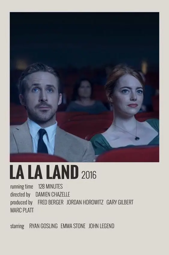

Minimalist movie posters have taken the design world by storm in recent years. These striking designs strip away unnecessary details to focus on iconic elements that instantly communicate the essence of a film.
The beauty of minimalist posters lies in their clever use of negative space and simplified imagery. Often featuring bold, limited color palettes, they communicate complex stories through just a few visual elements.
Some of the most recognizable minimalist movie posters include the red balloon for “IT” or the simple yellow and black patterns for “Kill Bill.” These designs rely on viewers’ familiarity with the films they represent.
Designers creating minimalist movie posters must identify the single most powerful symbol or moment from a film. This could be a character silhouette, a memorable prop, or an abstract representation of the film’s theme.
What makes these posters so effective is their ability to evoke emotion through simplicity. They challenge viewers to make connections and appreciate the artistry behind reduction.
Many film enthusiasts collect these artistic interpretations as alternatives to traditional promotional materials. The minimalist approach offers a fresh perspective on beloved films, making them popular choices for home decor.
2) Vintage Travel Posters


Vintage travel posters have a special charm that continues to captivate audiences today. Created primarily between the 1920s and 1960s, these artistic advertisements were designed to entice people to visit exotic destinations during the golden age of travel.
The bold colors and simplified imagery of vintage travel posters make them instantly recognizable. Artists often emphasized the most appealing aspects of each location, using striking visuals to create a sense of wanderlust and adventure.
Many vintage travel posters feature iconic landmarks alongside stylized typography. The combination of art deco influences and idealized landscapes creates a nostalgic aesthetic that remains popular in home decor and design studios.
Countries like France, Italy, and Switzerland were frequently showcased in these classic designs. Railway companies and airlines commissioned talented artists to create these promotional materials, resulting in what are now considered collectible pieces of art.
Modern designers often draw inspiration from vintage travel posters when creating contemporary work. The clean lines, limited color palettes, and focus on a central image continue to influence poster design across various industries today.
3) Classic Concert Posters


Classic concert posters from the 1960s and 1970s represent some of the most influential designs in music history. These vibrant works of art promoted legendary shows at venues like the Fillmore and Avalon Ballroom, becoming cultural artifacts that transcended their promotional purpose.
Artists like Wes Wilson, Victor Moscoso, and Stanley Mouse developed distinctive psychedelic styles that captured the spirit of the era. Their innovative typography often featured bubble letters and flowing text that seemed to move across the poster, mirroring the psychedelic experience.
Many classic concert posters used vibrant color combinations and optical illusions to catch the eye. The famous Grateful Dead and Jefferson Airplane posters exemplify this approach, with swirling patterns and high-contrast color schemes.
The imagery typically reflected the music itself, incorporating fantastical elements and cultural references. These posters weren’t just advertisements but artistic expressions that resonated with the counterculture movement.
Today, original concert posters from this golden era are highly collectible. Modern designers continue to draw inspiration from these classic styles, adapting their bold approaches for contemporary music events.
4) Inspirational Quote Posters


Inspirational quote posters have become a staple in offices, homes, and educational institutions around the world. These designs combine powerful words with striking visuals to motivate viewers and spark positive change in their lives.
The most effective quote posters feature concise text that can be read quickly while delivering maximum impact. Designers often pair these quotes with complementary imagery that enhances the message rather than distracting from it.
Typography plays a crucial role in these posters, with font selection reflecting the tone of the message. Bold, sans-serif fonts often convey strength and confidence, while script fonts might suggest elegance or creativity.
Color psychology is another important consideration. Blues and greens tend to evoke calmness and growth, while reds and oranges typically generate energy and passion.
Many designers now create customizable templates that allow users to insert their favorite quotes. This personalization has contributed to the enduring popularity of quote posters as meaningful gifts and decor items.
Social media has further amplified the reach of inspirational quote designs, with shareable formats designed specifically for platforms like Instagram and Pinterest.
5) Abstract Art Posters
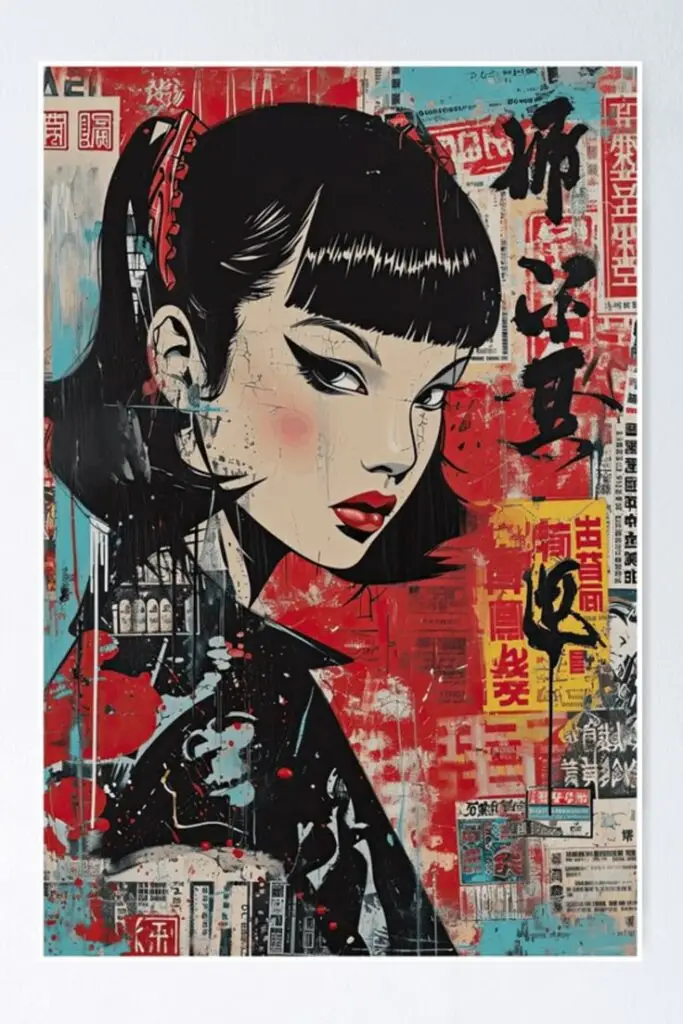

Abstract art posters bring a splash of creativity and emotion to any space. They utilize shapes, colors, and forms to create compositions that don’t necessarily represent visual reality. Instead, they focus on creating a feeling or mood through non-representational elements.
These posters can range from minimalist designs with simple geometric shapes to complex explosions of color and form. Artists like Kandinsky, Mondrian, and Rothko pioneered styles that continue to influence modern abstract poster design today.
Abstract posters work wonderfully in contemporary interiors, adding visual interest without dictating a specific theme. They allow viewers to form their own interpretations, making them highly personal additions to home or office decor.
The versatility of abstract designs means they can complement virtually any color scheme. Bold abstracts create focal points in neutral rooms, while subtle, monochromatic designs can add texture without overwhelming existing decor.
For businesses, abstract posters offer a professional yet creative aesthetic that doesn’t alienate clients. They can evoke specific emotions through color psychology while maintaining a sophisticated appearance.
6) Typography Posters


Typography posters elevate words into powerful visual elements. These designs focus on the creative arrangement of text, making the letters themselves the stars of the show. They often feature minimal imagery, allowing the typography to create both meaning and visual impact.
Designers play with font styles, sizes, and weights to establish hierarchy and guide viewers through the message. Some typography posters use a single word with dramatic styling, while others arrange entire phrases or quotes in creative layouts.
Color plays an important role in typography posters too. High contrast combinations ensure readability while adding visual interest. Many designers opt for bold combinations like black and yellow or white and red to make text pop.
Typography posters have become particularly popular in home décor. People enjoy displaying motivational quotes, song lyrics, or literary excerpts as art pieces in their living spaces.
Creating effective typography posters requires knowledge of font psychology. Different typefaces evoke specific emotions – serif fonts might convey tradition while sans-serif options feel more modern and clean.
Many designers experiment with hand-lettering for a more personal, authentic feel. This approach adds uniqueness that standard fonts cannot achieve.
7) Nature Photography Posters
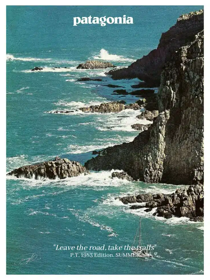

Nature photography posters bring the beauty of the outdoors into indoor spaces. These stunning visual pieces showcase everything from majestic mountains to delicate flowers, allowing viewers to connect with natural landscapes they might not otherwise experience regularly.
Professional nature photographers often capture moments in perfect lighting conditions, creating images with dramatic skies, fascinating wildlife, or serene landscapes. The best nature posters feature high-resolution photography with vibrant colors and sharp details that make viewers feel immersed in the scene.
These posters work wonderfully in home offices, living rooms, and even corporate environments seeking to create a calming atmosphere. They can reduce stress and create a sense of peace in busy spaces.
Nature photography posters are especially effective when they feature scenes from local environments that resonate with viewers. National parks, iconic landscapes, and seasonal changes are particularly popular subjects.
When selecting nature photography posters, consider the color palette of your existing décor. Many people choose images with blues and greens for their soothing qualities, while others prefer the warm tones of sunset landscapes.
8) Retro Pop Culture Posters


Retro pop culture posters bring a nostalgic touch to any space with their vibrant colors and iconic imagery from past decades. These designs often feature beloved movies, music, and TV shows from the 60s through the 90s that continue to resonate with fans today.
Many retro poster designs intentionally incorporate period-appropriate design elements like vintage typography, distressed textures, and color palettes typical of their era. This attention to detail helps create an authentic nostalgic experience that transports viewers back in time.
Popular subjects include classic rock bands, cult movies, vintage video games, and TV shows that have achieved legendary status over the years. The enduring appeal of these cultural touchstones makes them perfect for poster art that connects with multiple generations.
Artists creating retro pop culture posters often blend modern design techniques with vintage aesthetics to create pieces that feel both familiar and fresh. This fusion approach helps these posters appeal to both those who experienced the original era and younger audiences discovering these classics for the first time.
Collectors particularly value limited edition retro pop culture posters, especially those with special printing techniques or artist signatures. These pieces often become cherished decorative items that showcase personal interests and nostalgic connections.
Understanding Poster Design
Poster design combines artistry and communication to convey messages effectively through visual elements. The best designs balance aesthetics with clarity, ensuring information reaches the intended audience while creating visual impact.
Elements of a Great Poster
Typography plays a crucial role in poster design, with font selection directly affecting readability and tone. Choose 2-3 complementary fonts maximum to maintain visual harmony.
Color selection creates emotional connections with viewers and enhances brand recognition. A thoughtful color palette typically includes 3-5 colors that work together while providing sufficient contrast.
Imagery, whether photographs or illustrations, should be high-quality and relevant to the message. Visual elements need to reinforce rather than distract from the core communication goal.
White space (negative space) is equally important as the content itself. It provides visual breathing room and helps direct the viewer’s eye to important information.
Visual Hierarchy and Layout


Visual hierarchy determines how viewers process information on a poster. The most critical elements should be immediately noticeable through size, color, or positioning.
The “Z-pattern” and “F-pattern” are common layout approaches that follow natural eye movement. Z-patterns work well for posters with balanced elements, while F-patterns suit text-heavy designs.
Rule of thirds: Dividing the poster into a 3×3 grid and placing key elements along these lines creates natural visual interest and balance.
Proximity and alignment create relationships between elements. Related items should be grouped together, while proper alignment creates a clean, professional appearance.
Scale and contrast help emphasize important information. Varying the size of elements in relation to their importance guides viewers through the content logically.
Design Tips for Impactful Posters
Creating visually striking posters requires thoughtful application of design principles and keen attention to detail. The right combination of colors and typography can transform an ordinary poster into a compelling piece that captures attention.
Choosing the Right Color Palette

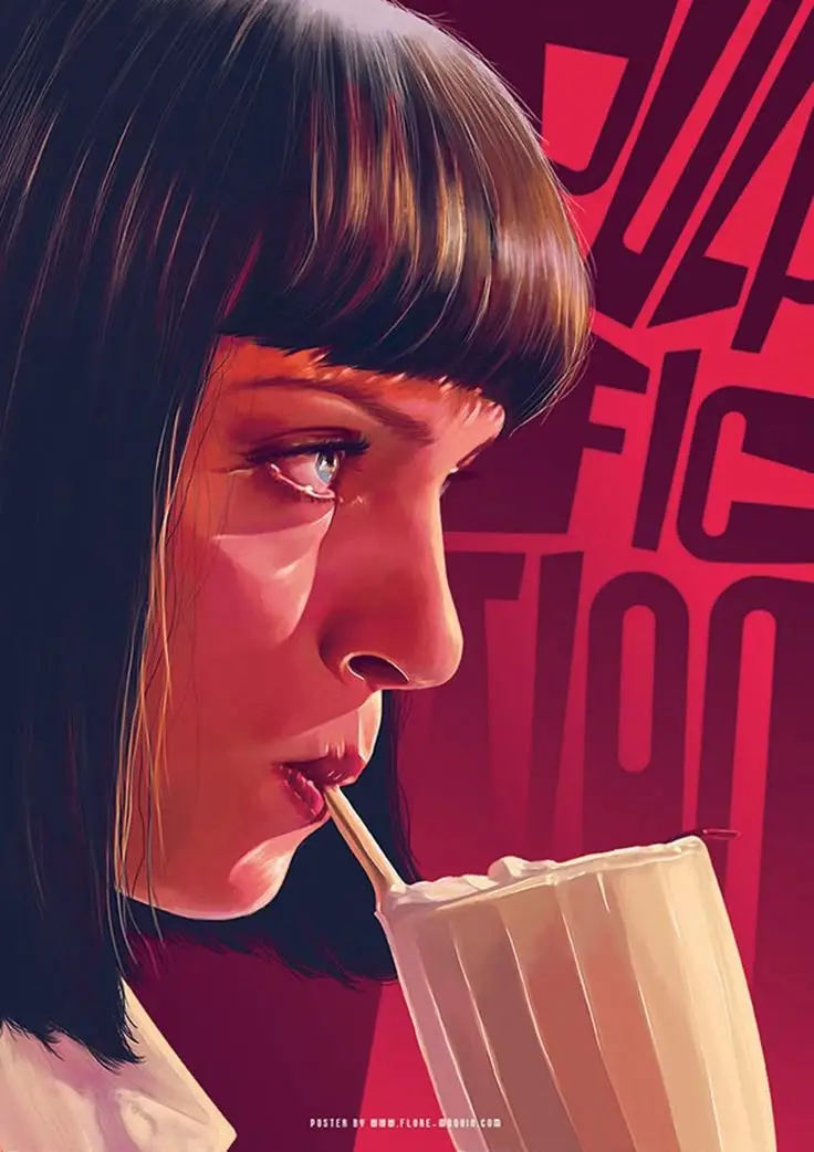
Color choices significantly influence how viewers perceive and interact with a poster. Limit your palette to 2-3 primary colors for maximum impact, with one dominant color to establish hierarchy.
Consider the psychological effects of colors – blue evokes trust, red creates urgency, and yellow grabs attention. Use contrast strategically to make text and important elements stand out against the background.
For professional events, subdued colors like navy, gray, and burgundy work well. Creative or youth-oriented events can experiment with vibrant hues and bold combinations.
Test your color choices in the actual viewing environment. Colors appear differently under natural light, fluorescent lighting, or on digital screens.
Typography and Font Selection
Effective posters typically use no more than 2-3 font families. Pair a distinctive display font for headings with a highly readable sans-serif font for body text.
Font hierarchy is essential:
- Headline: 72-125pt
- Subheadings: 36-54pt
- Body text: 24-36pt
Ensure adequate contrast between text and background. Black text on light backgrounds or white text on dark backgrounds typically offers the best readability.
Consider the viewing distance when selecting font sizes. Text should be readable from at least 6-10 feet away for standard posters displayed in public spaces.
Avoid decorative or script fonts for body text as they reduce legibility. Save these eye-catching options for headlines or special emphasis only.
- 1.8Kshares
- Facebook0
- Pinterest1.8K
- Twitter0
- Reddit0
