Exploring what makes an interface user-friendly can open up a universe of possibilities for enhancing your digital projects. A user-friendly interface is intuitive, easy to navigate, and enhances the overall user experience. Whether you’re developing a website, app, or software, understanding the components that contribute to usability is crucial.
Interfaces that are designed with the user in mind are more likely to engage and retain visitors. This involves balancing visually appealing elements with functional design principles. Fast loading times and minimalistic layouts are key aspects of creating an interface that users find satisfactory.
Constructing a user-centric design involves applying advanced techniques that prioritize the needs and wants of your audience. By placing emphasis on usability, you ensure that users can seamlessly interact with your platform, making navigation a breeze and tasks simple to complete.
Key Takeaways
- User-friendly interfaces enhance user experience and usability.
- Balancing aesthetics and function is key to successful UI design.
- Designing with the user in mind ensures seamless interaction.

Understanding User Interfaces
User interfaces play a crucial role in how individuals interact with devices, encompassing many elements from graphical components to usability features. By examining the history, types, and components of user interfaces, you gain insights into their complexity and functionality.
Evolution of User Interfaces
The journey of user interfaces highlights significant technological shifts. Initially, user interactions with computers involved text-based command-line interfaces. As technology progressed, the development of graphical user interfaces (GUIs) emerged, allowing more intuitive interaction using visual elements like icons and windows.
These interfaces transformed computing by making it accessible to non-experts. Touchscreens and voice-activated UIs are modern examples of this evolution, further simplifying and enhancing the user’s ability to communicate with technology. By learning about this progression, you understand the continuous innovation aimed at improving user experience.
GUI vs UI Design
While GUI and UI are sometimes used interchangeably, they represent distinct concepts. A graphical user interface (GUI) specifically refers to interfaces that use visual elements like icons, buttons, and menus to facilitate interaction. This approach focuses on visual aesthetics and ease of navigation, critical for user satisfaction.
On the other hand, UI design encompasses everything a user experiences as they interact with a product, including sound and tactile feedback. UI design takes a broader outlook, considering how various sensory inputs combine to create a cohesive user journey. Understanding these differences assists in knowing how to create compelling and user-centric designs.
Elements of a User Interface
Several key elements form the backbone of a user interface, each contributing to efficiency and ease of use. Visual elements like buttons, sliders, and menus are essential in GUI design, providing users straightforward control paths. Consistency in visual design helps in recognizing patterns and enabling smoother navigation.
Color schemes, typography, and layout further define the aesthetics and functionality, affecting how users perceive information. Intuitive feedback, such as notifications and error messages, plays a vital role in guiding users through processes. By recognizing these elements, you appreciate the complexity involved in crafting interfaces that enhance usability and satisfaction.
Principles of UI Design
Creating a user-friendly interface involves several key principles that guide effective design. Focus areas include aesthetics, simplicity, efficiency, and consistency, which enhance the overall user experience.
Aesthetics and Visual Design
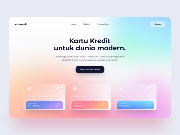
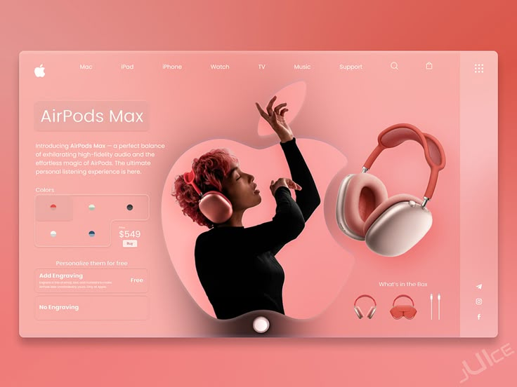
Visual elements play a crucial role in capturing user attention and promoting engagement. Prioritize a clean, modern visual design that aligns with your brand. An aesthetically pleasing interface often utilizes color schemes, typography, and spacing to make navigation intuitive.
Visual hierarchy, using size and color contrast, directs attention and highlights essential features. Ensure that design elements are consistent and harmonious to maintain balance and prevent clutter. This approach establishes a professional look and improves user interaction.
Usability and Simplicity
Simplicity in UI design is about removing unnecessary complexity. Prioritize essential functions and ensure they are easily accessible. Prioritize user tasks by creating straightforward paths to achieving goals. Factors like legibility, recognizable icons, and intuitive layouts contribute significantly to simplicity.
Make navigation intuitive with predictable elements. Visible prompts, clear instructions, and feedback for user actions can reinforce usability. This reduces learning curves and minimizes error rates, which enhances the overall experience.
Efficiency and User Engagement
Efficient UI design empowers users to complete tasks with minimal effort. Focus on reducing the number of steps required to achieve goals and streamline processes for efficiency. Features such as keyboard shortcuts and quick-access menus can enhance user experience by saving time and effort.
Interactive elements such as animations and micro-interactions boost engagement but should not overwhelm users. Balance these elements to ensure they are meaningful and purpose-driven, rather than distracting.
Consistency in Interface Design
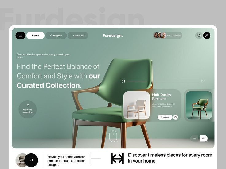
Consistency is fundamental in creating a reliable interface. A consistent design, featuring uniform layouts, color schemes, and button styles, assures users of predictable interactions. This reliability reinforces familiarity, allowing users to navigate seamlessly across different areas of the application.
Common patterns, such as navigation bars located in the same position throughout, simplify user experience. Establishing guidelines or design systems can ensure uniformity across various aspects, promoting efficiency and credibility in design.
Designing User-Centric Interfaces
User-centric interfaces prioritize user needs by emphasizing intuitive design, accessibility, and effective navigation. Explore these crucial elements to create streamlined, efficient interfaces.
Creating Wireframes and Prototypes
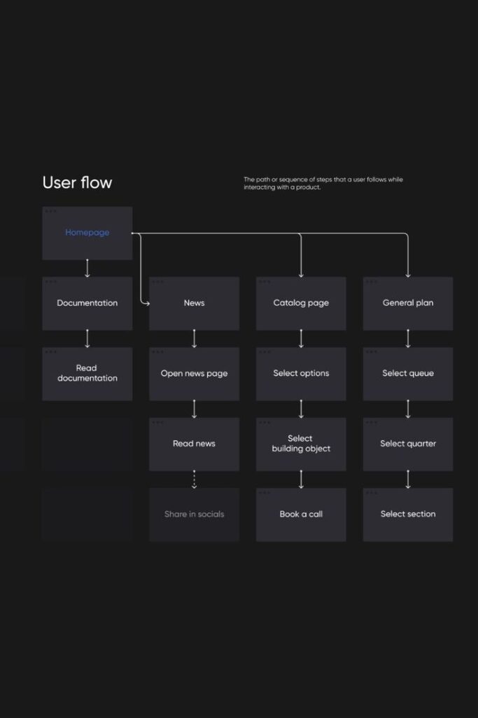
Wireframes and prototypes serve as essential tools in interface design. Wireframes offer a visual guide to design layout and core functionality, allowing you to focus on structure without distractions. Prototypes build on wireframes, adding interactivity and enabling the testing of user flows and engagement. Conduct iterative testing with users to gather insights and refine the design. By focusing on real-world scenarios, prototypes help simulate user experiences, making it easier to envision the final product.
Typography and Readability
Typography directly impacts readability and user engagement. Choose fonts that enhance clarity and maintain a professional appearance. There’s more to consider than just aesthetic appeal; readability is crucial. Consider the design principles that guide effective typography, such as size, spacing, and contrast. These factors ensure text is legible across various devices and supports an inclusive user experience. Testing font choices across multiple screen sizes helps maintain consistency and readability.
Navigation and User Journey
Navigation is key to guiding users smoothly through an interface. A well-designed navigation bar improves accessibility and efficiency, allowing users to find what they need with minimal effort. Map out the user journey to anticipate needs and potential roadblocks. This involves creating intuitive pathways that mirror user expectations and reduce complexity. Use a hierarchical structure for elements to create a logical flow and avoid overwhelming users.
Feedback Mechanisms
Incorporating feedback mechanisms enhances user interaction and satisfaction. Offering real-time responses, such as confirmations or error messages, helps direct users and resolve issues promptly. This feedback loop is critical in maintaining engagement and trust. Tools like progress indicators and alerts guide users through tasks seamlessly. Gathering user feedback post-interaction provides valuable insights into design effectiveness and areas for improvement, tailoring the interface to better suit user needs.
Optimizing the Interface Design
Optimizing interface design involves incorporating brand elements, testing for improvements, and ensuring accessibility and responsiveness. These elements work together to create a seamless, intuitive user experience.
Incorporating Brand Awareness
Incorporate brand elements that make your interface stand out while being user-friendly. Consistency in colors, fonts, and logos strengthens brand identity and recognition. Harmonize these elements across the interface to build a cohesive look and feel.
Adopt design patterns that reflect your brand’s core values. This not only helps to maintain a consistent user experience but also aligns the interface with your brand’s message. A clear brand presence aids users in identifying and trusting your platform.
A/B Testing for Continuous Improvement
Use A/B testing to make informed decisions about interface elements. By comparing variations of a design, you learn which version performs better with users. Focus on measurable metrics like click-through rates and conversion rates for insights into user behavior.
Implementing A/B tests regularly helps refine design elements over time. This iterative approach ensures your interface remains effective and meets evolving user needs. Small adjustments based on testing results can significantly enhance user satisfaction and engagement.
Accessibility and Responsiveness
Prioritize accessibility to make your interface usable for everyone, including those with disabilities. Follow accessibility standards like WCAG to ensure essential features are available to all users. This ensures a wider audience can interact with your interface without barriers.
Focus on responsiveness to adapt your design seamlessly to various devices and screen sizes. Implement fluid grids and flexible images to maintain a consistent experience across smartphones, tablets, and desktops. An interface that performs well on different devices can enhance user satisfaction and increase retention.
Advanced UI Techniques
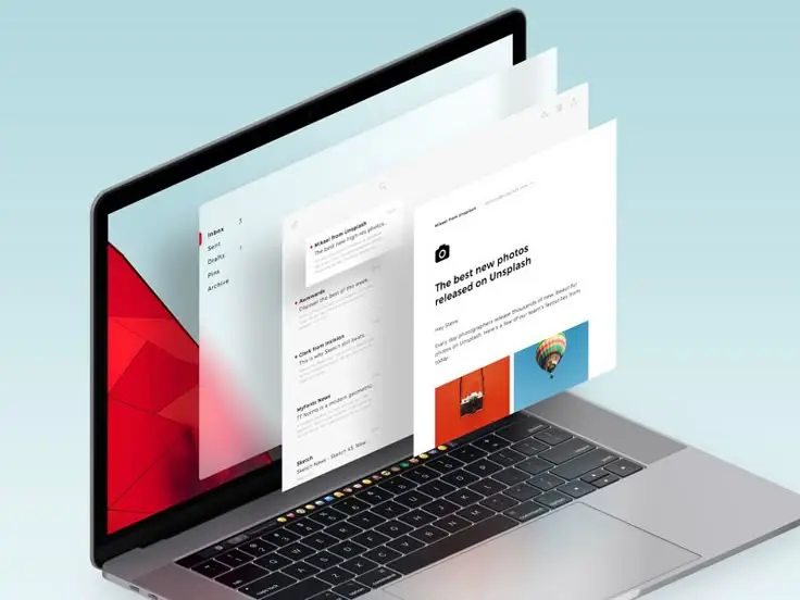
To craft a highly intuitive user interface, it’s crucial to delve into sophisticated techniques. These approaches enhance user engagement through dynamic interactions and visual cohesion. Key techniques include utilizing motion and animation for seamless transitions, applying advanced design patterns for consistency, and enhancing graphical elements to improve visual appeal.
Integrating Motion and Animation
Incorporating motion and animation into your app design can significantly enhance user experience. Motion aids in providing visual cues about how to navigate through the interface, offering subtle guidance. It adds an interactive layer that can make your interface more engaging.
Animations can be used to draw attention to important features or guide the user on what action to take next. Care should be taken to ensure animations are smooth and not overly complex, maintaining a balance between functionality and design aesthetics. Utilize animations to make transitions between sections fluid, thereby improving usability and keeping users engaged. Such techniques can be vital for creating user-friendly interfaces.
Applying Advanced Design Patterns
Advanced design patterns provide a framework for creating visually cohesive and functionally robust interfaces. Ensure consistency across different parts of the UI by using established patterns like the model-view-controller architecture or component-based structures.
Design patterns also make the user interface intuitive by building familiarity through repetitive visual cues and interaction methods. It’s essential to choose the right patterns that align with your app’s goals and the user demographics. Patterns should be tested and iterated upon to meet user expectations while maintaining simplicity and clarity.
Enhancing with Graphical Elements
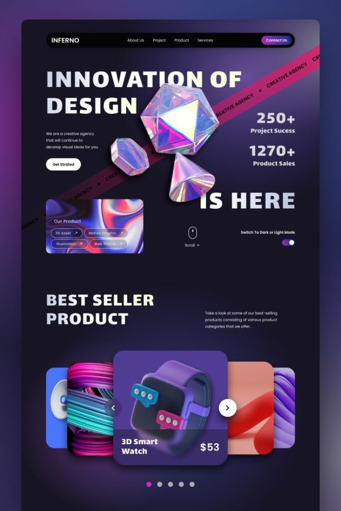
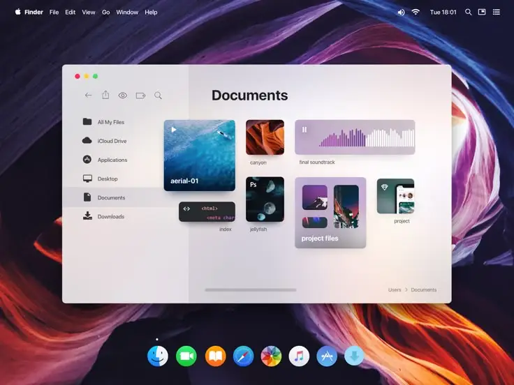
Graphical elements, as part of a graphical user interface, play a fundamental role in making the interface visually appealing. Utilize icons, colors, and typography strategically to guide the user’s attention and reinforce brand identity.
Icons should be intuitive, easily recognizable, and consistent throughout the app. Color schemes should be chosen to enhance readability and reflect the application’s mood or theme. Typography should be legible and fit the overall style, contributing to the aesthetic integrity of the UI. By focusing on these visual elements, you can create a harmonious and inviting user-friendly interface.
- 445shares
- Facebook0
- Pinterest444
- Twitter1
- Reddit0

