Female character design starts with one practical test: can someone understand who she is from the silhouette, pose, outfit, and expression before reading a single line of backstory? This guide is for artists who want stronger original characters, not just prettier drawings. We will build the design from role and gesture first, then move into body shape, costume, color, expressions, props, and reference sheets.

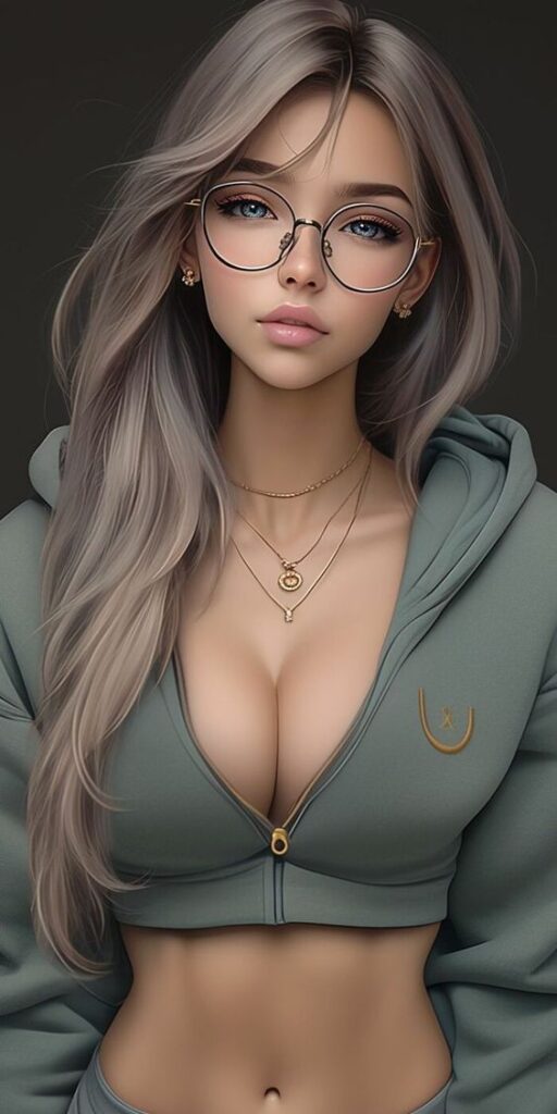
I like starting with thumbnails because they make weak ideas obvious. If the character only works after you explain the lore, the drawing probably needs a clearer shape, stronger posture, or a more specific costume decision. Details are useful, but they should arrive after the big read is working.
What is female character design?
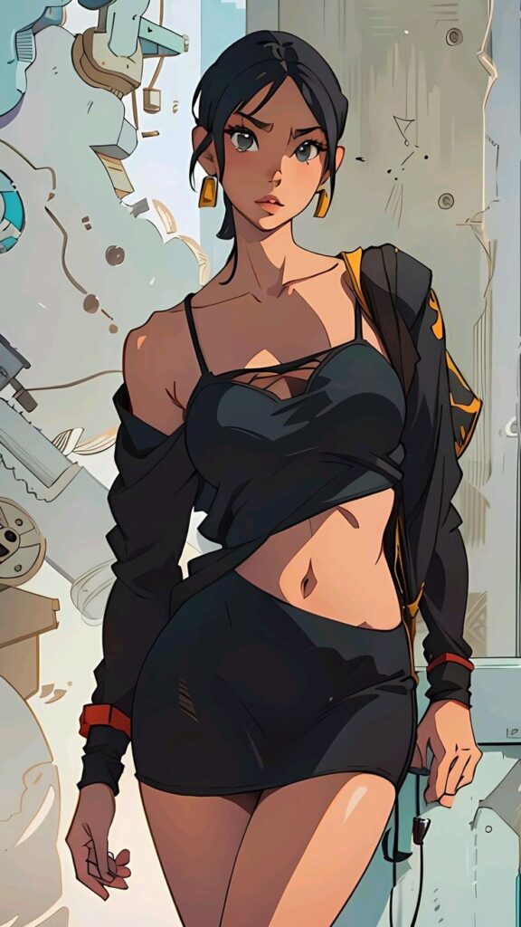
Female character design is the visual planning process behind a female character. It decides how her personality, role, world, movement, and story appear on the page or screen. A good design uses shape language, proportion, posture, face, clothing, color, props, and small habit details so the viewer can read the character quickly.
That does not mean every female character needs the same body type, beauty cue, or costume formula. In fact, repeating those shortcuts is one reason many designs feel forgettable. A useful design asks: what does this person do, what pressure is she under, how does she move, and what has her world done to her clothes, body language, and expression?
| Design decision | What it should tell the viewer | Quick check |
| Silhouette | Role, energy, and recognizability | Can you recognize her in shadow? |
| Pose | Confidence, tension, training, or mood | Does the body language match the story? |
| Outfit shape | Job, culture, era, climate, and status | Can you explain the big clothing choices? |
| Expression | Temperament and emotional range | Can she show more than one feeling? |
| Color palette | Mood, faction, contrast, or theme | Does it still work in grayscale? |
| Props | Skill, habit, work, or conflict | Would the prop matter if you removed it? |
How to create a female character design from scratch


Start with role, not decoration. A knight, hacker, dancer, mechanic, witch, courier, or student can all be drawn beautifully, but the design should show what she does before it shows how much detail you can render. Write one plain sentence about the character first. For example: “She is a tired courier who knows every rooftop shortcut in the city.” That sentence already suggests posture, shoes, bag shape, hair control, clothing wear, and a lean forward movement.
Next, draw five to ten tiny silhouettes. Keep them small enough that you cannot fuss over lashes, jewelry, or folds. Change the shoulder line, hair mass, coat length, skirt shape, boots, weapon, bag, or stance. When one silhouette starts reading clearly, enlarge it and test the pose.
- Role first: decide what the character does in the story.
- Gesture second: choose a pose that shows her energy before costume detail.
- Shape third: exaggerate the big silhouette enough to be readable.
- Costume fourth: add clothing that fits the role, climate, and movement.
- Details last: keep only the details that help the viewer understand her.
Build the silhouette before the outfit
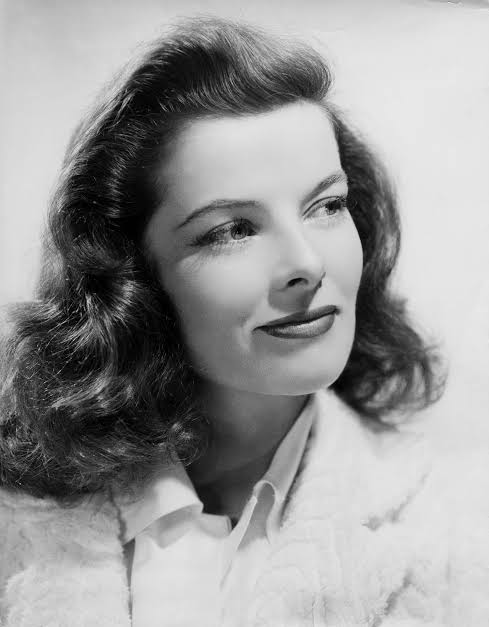
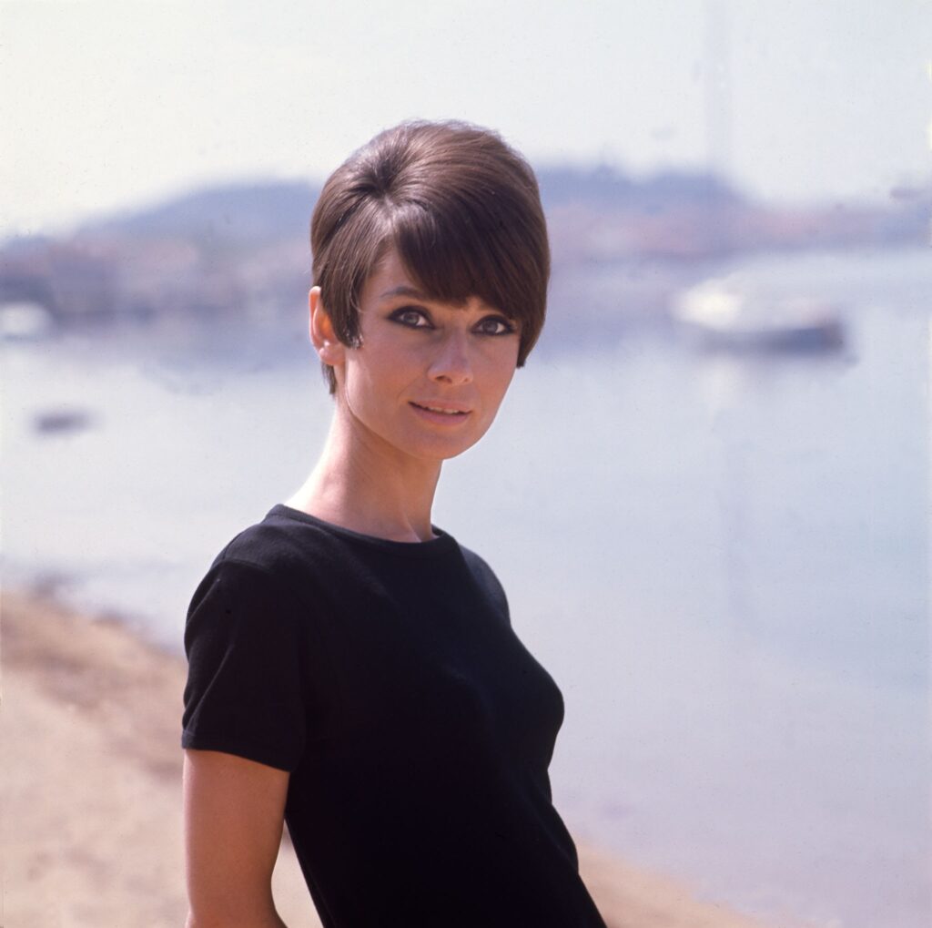
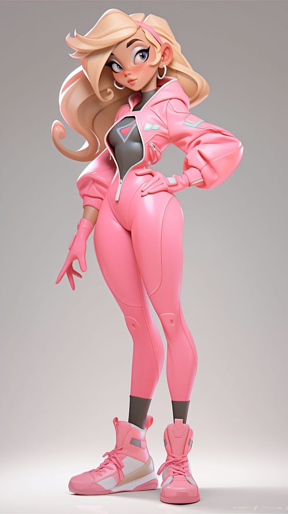
Silhouette is the fastest character test. Cover the interior detail and look only at the outer shape. Does the head shape, shoulder line, hair, coat, skirt, boots, weapon, or prop make a readable outline? If everything is the same width and rhythm, the design usually feels flat even when the rendering is polished.
A sharp silhouette does not always mean sharp angles. A gentle character may use round, soft shapes. A disciplined character may use straight verticals. A chaotic character may use uneven shapes and asymmetry. The point is to make the outline intentional, not noisy.
Use pose and body language as story tools
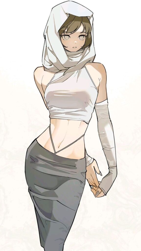
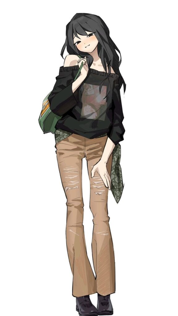
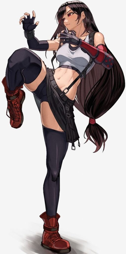
A pose should not be a mannequin stand. Before you draw the costume, ask how this character usually holds herself. Does she protect her torso? Lean forward? Keep her chin high? Plant her feet wide? Hide her hands? Body language often tells the viewer more than a label such as “brave” or “shy.”
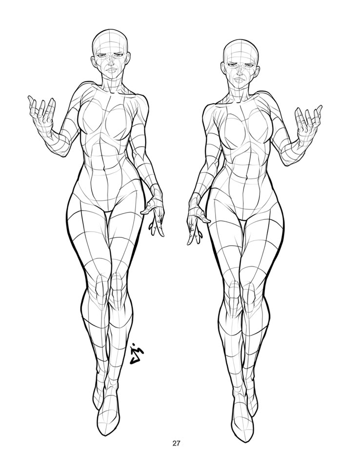
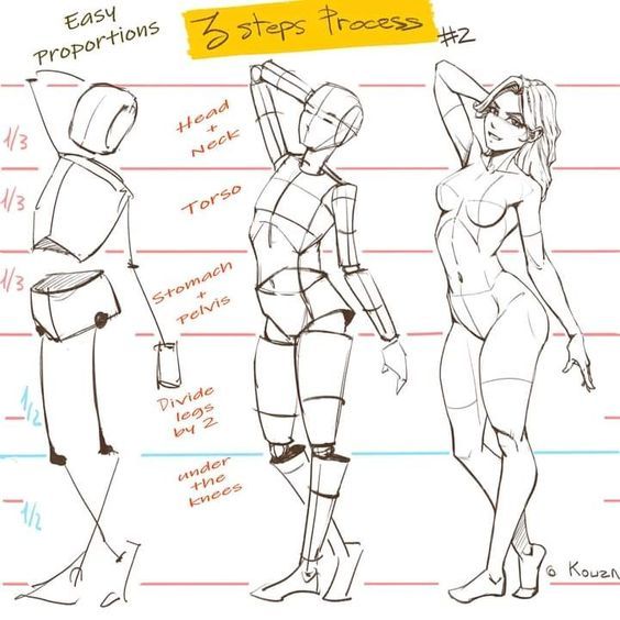
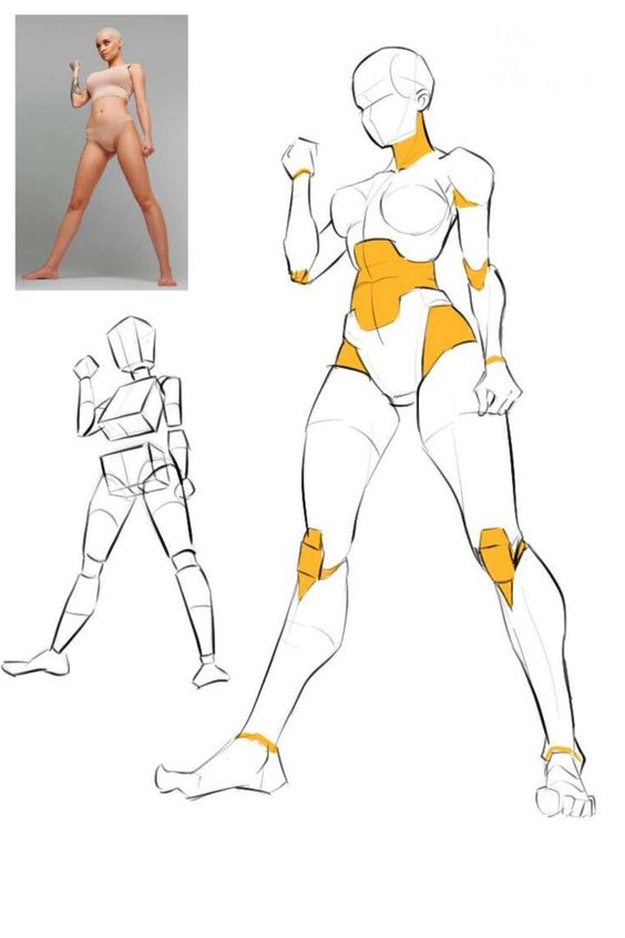
For drawing practice, I usually separate the gesture pass from the outfit pass. First, draw the movement with simple lines and masses. Then dress the figure. This keeps the clothing from controlling the anatomy too early and helps avoid stiff, fashion-doll poses.
Design outfits that explain the character

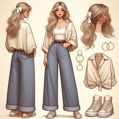
Costume is not just style. It tells the viewer what the character can do, what she values, where she lives, and how much control she has over her appearance. A polished jacket may show status. Scuffed boots may show travel. A loose sleeve may look elegant, but it might be dangerous for a blacksmith, archer, or mechanic. The best outfit choices are attractive and logical at the same time.
When clothing starts to feel generic, check three things: movement, weather, and maintenance. Can she run, sit, fight, climb, or work in this outfit? Does the fabric fit the climate? Would this character keep it clean, modify it, repair it, or wear it carelessly? Those small answers make a design feel lived-in.
Choose face, hair, and expression with restraint
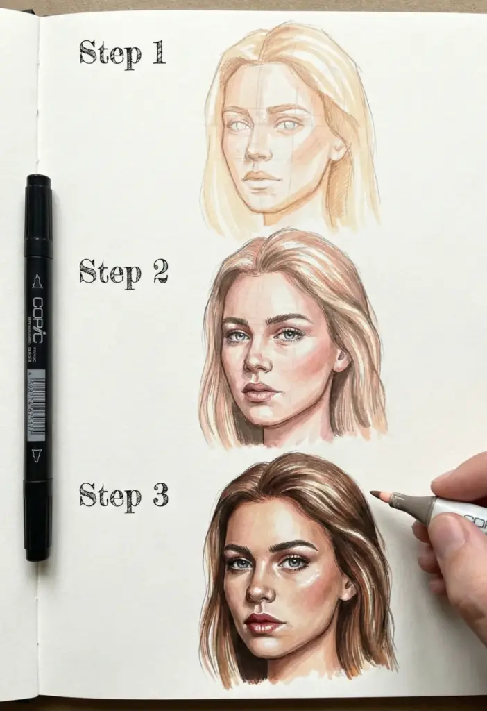
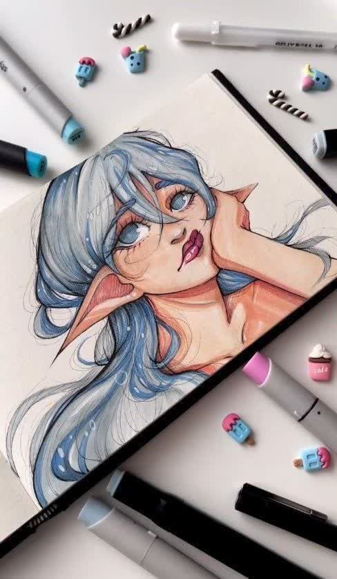
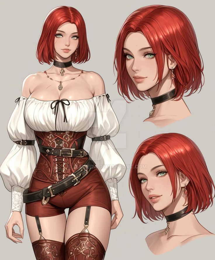
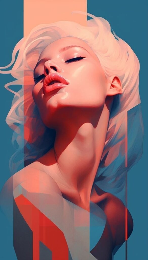
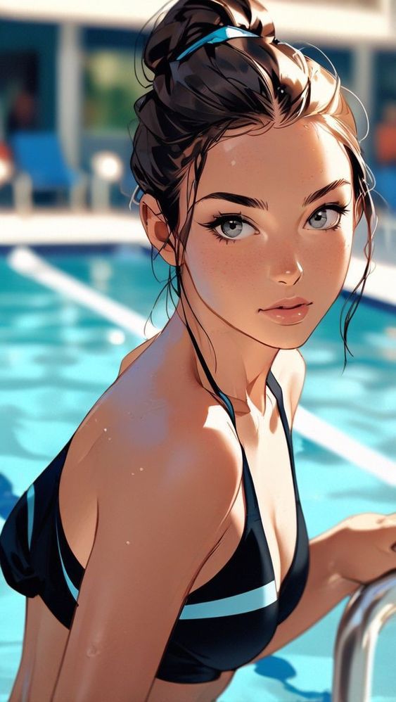
Faces carry a lot of pressure in female character art, so it is easy to make every design drift toward the same pretty mask. Push yourself to vary face shapes, noses, brows, mouths, age cues, hair volume, and expression rhythm. A character with a crooked smile, tired eyes, blunt haircut, or tense jaw can feel more memorable than one more perfectly symmetrical portrait.
Expression sheets are especially useful. Draw neutral, focused, amused, annoyed, afraid, and exhausted versions of the same character. If she only works in one glamorous pose, the design may be too narrow for comics, animation, or game scenes.
Color palette and value control
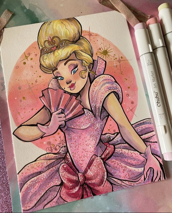
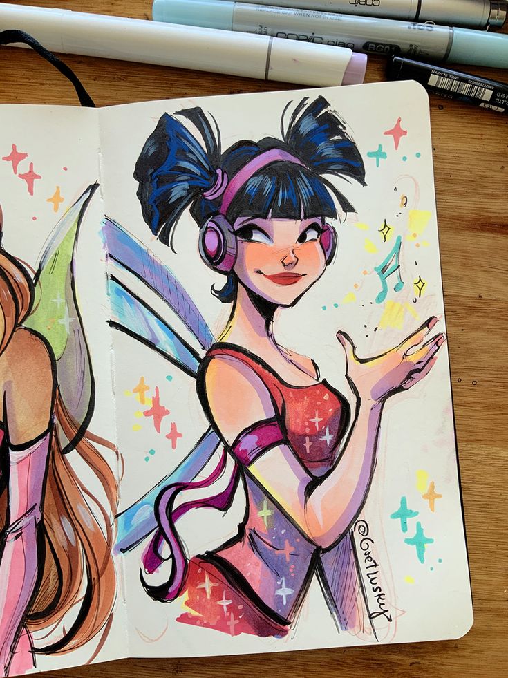
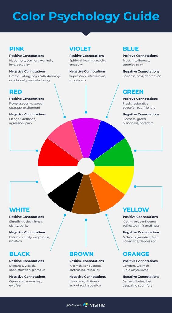
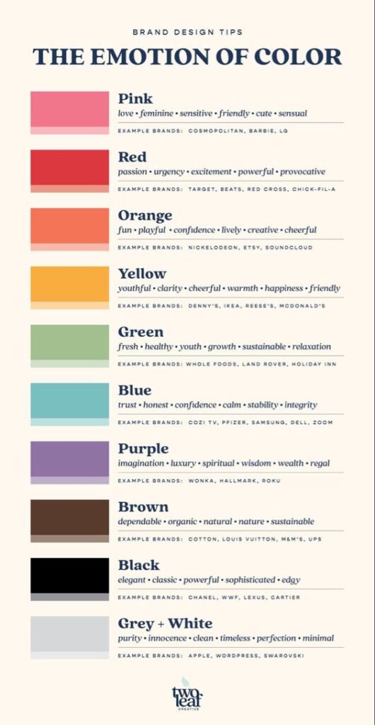
Color should support the read, not rescue the design. Before choosing a full palette, convert the sketch to grayscale or squint at it. If the head, torso, hands, and main prop all have the same value, the viewer will not know where to look. Strong value grouping makes color easier later.
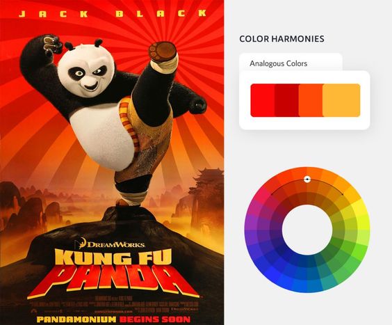
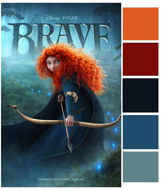
A limited palette often works better than a crowded one. Choose one dominant color family, one supporting color, and one accent. The accent should have a job: eye color, scarf, weapon glow, badge, ribbon, or small story object. If everything is an accent, nothing is.
Thumbnail drills for stronger character ideas
A thumbnail drill is the fastest way to find a stronger design without overworking one drawing. Make a row of tiny figures, each no bigger than a postage stamp. Give each one a different big decision: oversized jacket, narrow boots, heavy bag, tall hair shape, sloped shoulders, wide stance, compact pose, long skirt, cropped cape, or one bold prop. Do not shade them yet. You are testing the read, not making finished art.
After the first row, circle the two thumbnails that read best and redraw each one three ways. Change only one variable at a time. Try a different hair mass, a different coat length, or a different hand position. This keeps the design process honest. If every version depends on tiny decoration, the character probably needs a stronger silhouette. If one version still reads with almost no detail, that is usually the sketch worth developing.
If you want to explore a few visual directions before committing to the next drawing, an AI Character Generator can help you compare changes in clothing, mood, hairstyle, and color. Treat the results as rough reference material, then redraw the strongest idea in your own style.
| Thumbnail prompt | What to vary | What to watch |
| Quiet strategist | Closed posture, neat shapes, controlled props | Avoid making her look passive by accident |
| Rooftop courier | Lean, bag weight, shoe shape, wind direction | Keep the movement practical, not just dramatic |
| Village healer | Soft layers, tool pouch, calm hands | Make the role readable without fantasy clutter |
| Arena fighter | Wide stance, armor edges, damaged gear | Show function before decoration |
| Street magician | Sleeve shape, hidden pockets, playful gesture | Let one prop carry the trick clearly |
Female character design reference sheet
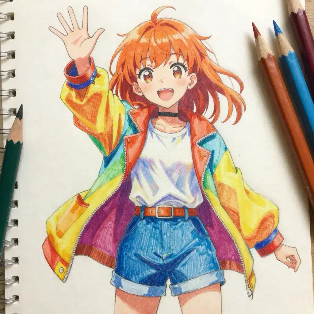
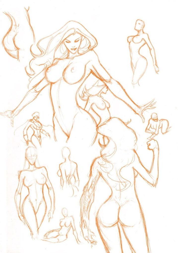
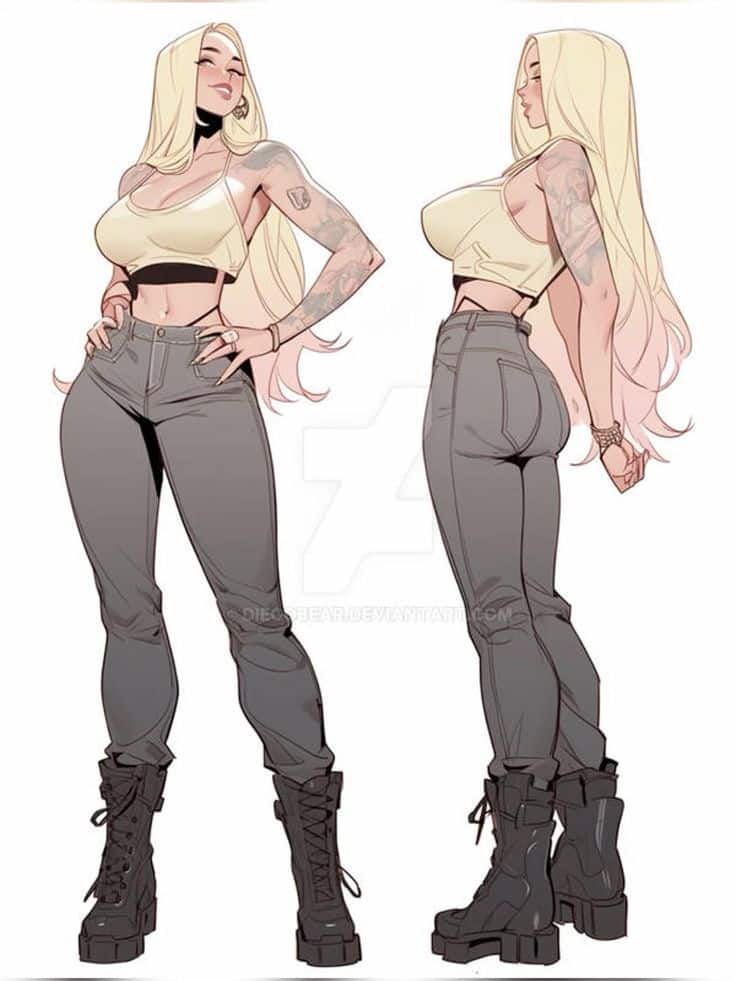
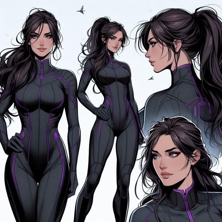
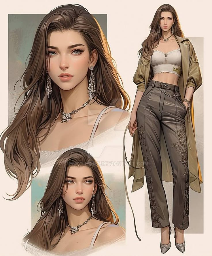
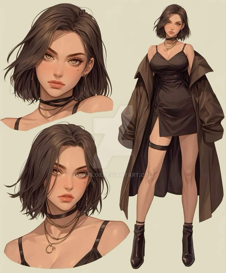
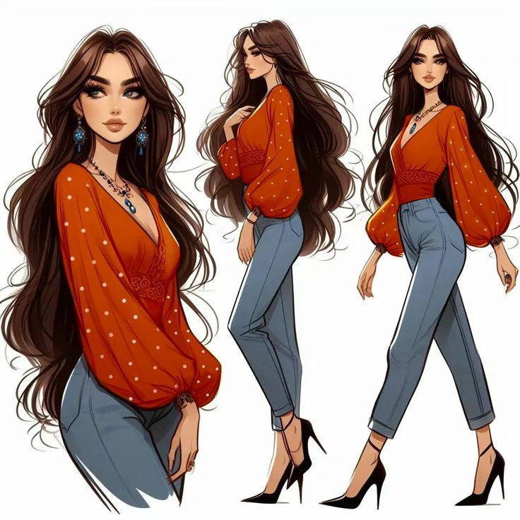
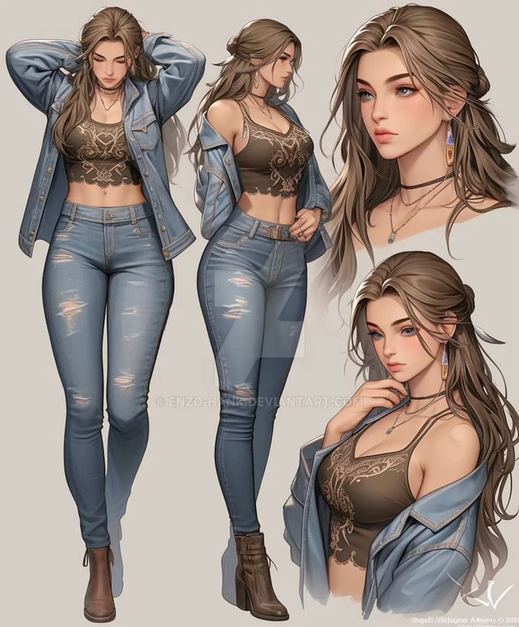
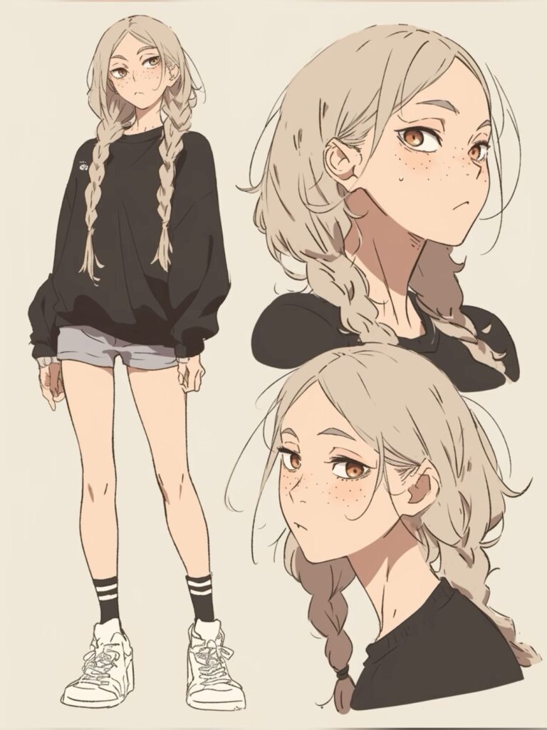
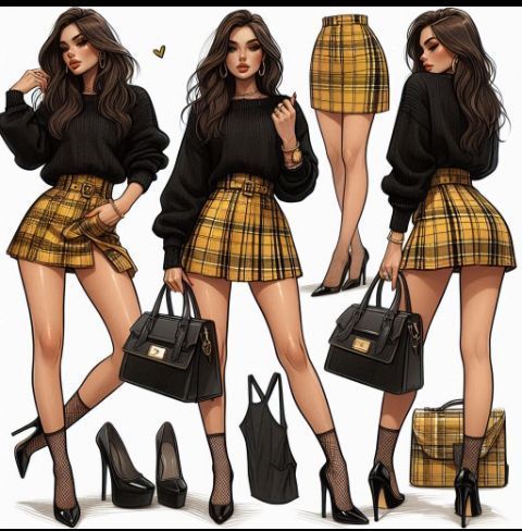
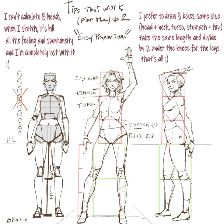
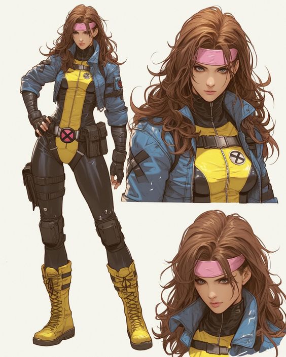
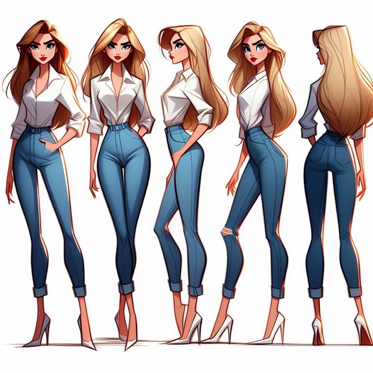
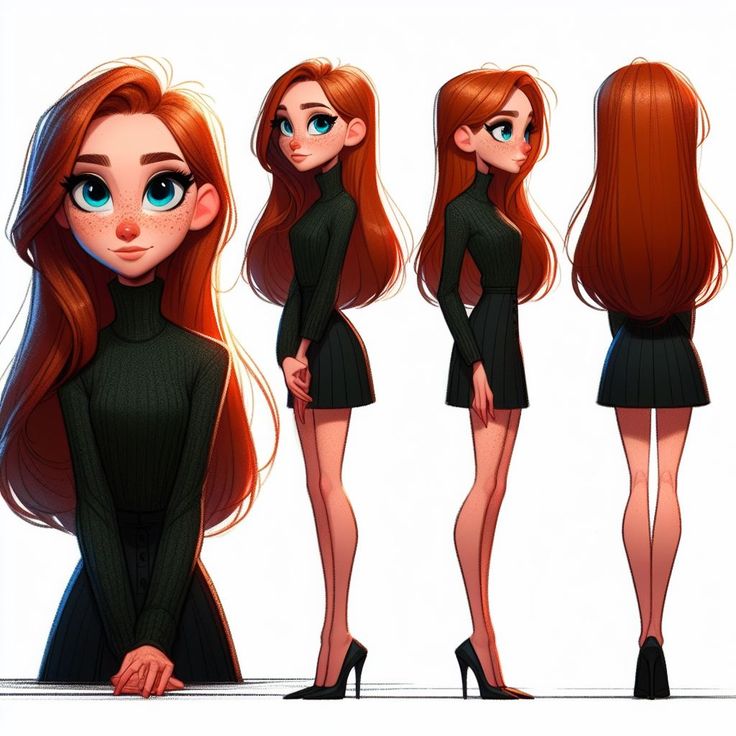
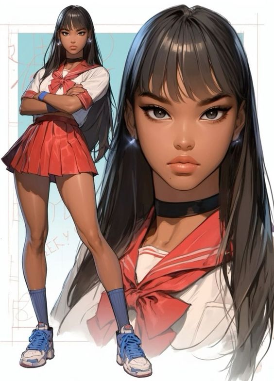
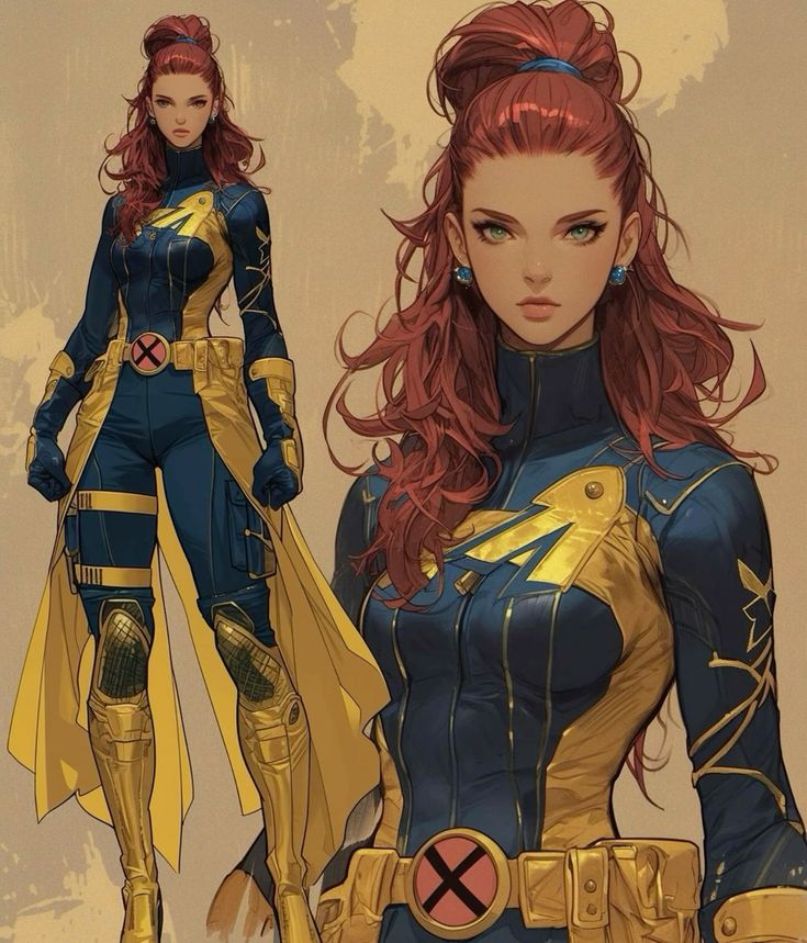
A reference sheet is where the design becomes usable. It should answer practical questions for future drawings: what does the character look like from the front, side, and three-quarter view? What are the main outfit shapes? What colors are fixed? Which details can simplify in small panels or animation frames?
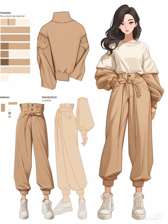
For a clean sheet, include a full-body front view, a side or three-quarter view, two to six expressions, close-ups of important props, a color palette, and short notes on materials. Keep the notes direct. “Soft worn leather bag with repaired strap” is more useful than “stylish accessory.”
| Reference sheet part | Why it matters |
| Front view | Locks the main silhouette, outfit, and proportions |
| Side or three-quarter view | Shows volume and how hair, coat, or props sit in space |
| Expression set | Tests whether the face can carry emotion |
| Color palette | Keeps future drawings consistent |
| Prop close-up | Clarifies story objects, weapons, bags, tools, or jewelry |
| Simplified version | Helps comics, animation, thumbnails, and small screens |
Common female character design mistakes
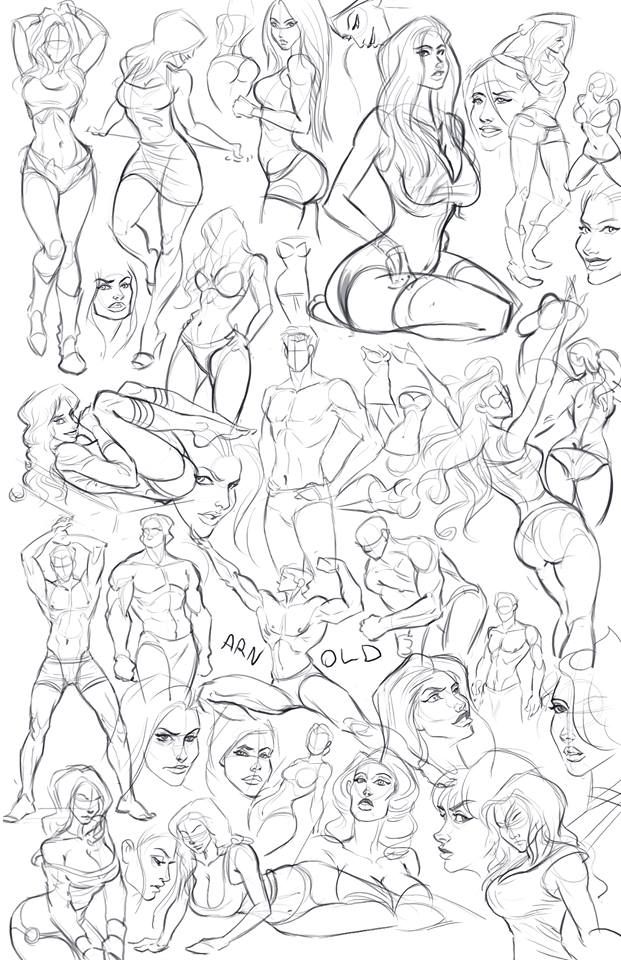

The most common mistake is designing from decoration instead of purpose. A cool outfit, beautiful hair, or dramatic weapon can help, but none of it replaces a clear role. If the character could swap outfits with three other designs and nothing changes, the core idea is probably too weak.
- Same-face design: every character has the same nose, lips, eyes, and age range.
- Costume without function: the clothing looks detailed but does not fit the job or setting.
- Unclear silhouette: the outline collapses into a plain vertical shape.
- Overloaded details: belts, straps, jewelry, and patterns compete for attention.
- One-note femininity: the design relies on a single beauty stereotype instead of personality.
- No expression range: the character only works in one polished mood.
One useful fix is to write a tiny design audit beside the drawing. Use plain language: “shape too similar,” “boots do not match job,” “face feels copied from last character,” or “prop has no purpose.” It sounds simple, but writing the problem down stops you from polishing around it. The correction usually becomes obvious: widen the stance, remove a repeated accessory, age the face slightly, simplify the belt shapes, or give the prop a clearer task.
Female OC ideas that feel specific
For original characters, specificity beats novelty. “Female warrior” is too broad. “Retired palace guard who now teaches children to climb city walls” immediately suggests age, posture, old uniform pieces, practical shoes, scratched gloves, and a protective expression. A clear character idea gives the drawing design pressure. It tells you what to keep and what to cut.
Try pairing a job with a contradiction. A cheerful ghost hunter who hates dark rooms. A royal tailor who secretly copies battlefield armor. A mechanic who dresses like a stage performer because she treats every repair like a public show. The contradiction should affect the pose, outfit, color, and props. That is where female OC ideas stop feeling like random Pinterest references and start feeling like characters.
- Give her one visible habit, such as tied-back sleeves, repaired boots, ink-stained fingers, or a charm she keeps touching.
- Choose one prop that changes the silhouette instead of adding five small accessories.
- Make the hairstyle respond to the job, climate, or personality rather than using the same glamour shape every time.
- Add one imperfection: scuffed knees, uneven gloves, sun-faded fabric, chipped nail polish, or a repaired strap.
- Test whether the same design works in a calm pose and an action pose.
Designing for games, comics, and animation

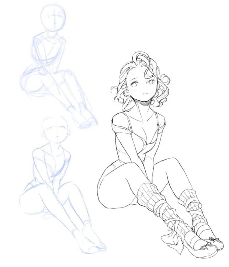
Different media change the design rules. A game character needs to read during movement and at different camera distances. A comic character must be redrawable from panel to panel. An animation design needs clean shapes that can move without becoming a nightmare. A splash illustration can hold more detail, but even there, the main read should be simple.
When a design is meant for repeated use, simplify the busy parts. Keep one or two signature details and let the rest support them quietly. A memorable hair shape, jacket edge, weapon silhouette, or color accent usually works better than twenty tiny details that disappear when the character moves.
Style choices: anime, cartoon, realistic, and semi-realistic
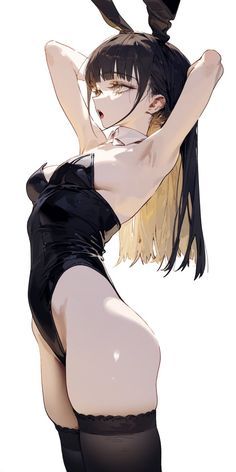
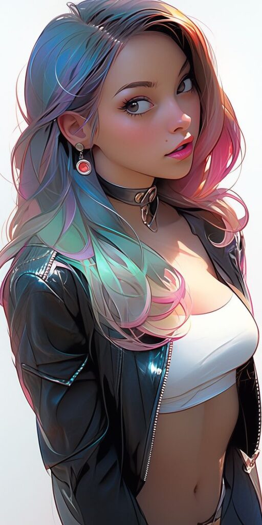
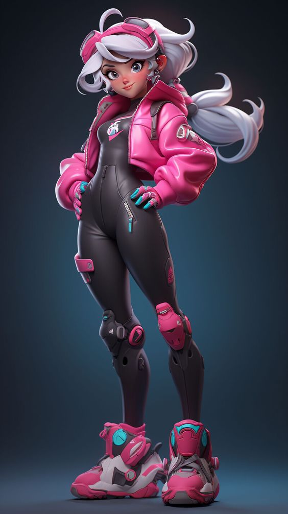
Style changes the surface, but the design logic stays the same. Anime female character design often pushes larger eyes, simplified noses, clear hair masses, and readable costume shapes. Cartoon design may exaggerate proportions even more. Semi-realistic art keeps more anatomy and material detail, while realistic character work needs stronger research into clothing construction, body mechanics, and lighting.
Do not let style become an excuse to skip structure. An anime girl still needs a readable pose. A realistic woman character still needs a memorable silhouette. A cartoon heroine still needs costume logic. If the design works only because of rendering style, it will fall apart when you redraw it from another angle.
A good test is to redraw the same character in two styles: one simplified and one more rendered. Keep the same hair mass, pose attitude, color accent, and main prop. If the character survives both versions, the design is probably strong. If she becomes unrecognizable, you may be relying on surface polish rather than visual identity.
Representation, agency, and research
Representation is not a checkbox at the end of the drawing. It affects body type, age, clothing, posture, cultural cues, tools, and story agency from the beginning. If you are drawing a character from a culture, profession, disability, body type, or era you do not know well, do research before polishing. Mood boards are a start, but they are not context.
The practical design question is simple: does this character feel like a person with her own goal, or does she exist only to decorate someone else’s story? Agency shows up visually. It appears in stance, eye direction, tool handling, costume practicality, and whether the design lets her act in the world.
Useful references for responsible design
For research-heavy projects, pair visual mood boards with real context. The Geena Davis Institute and UN Women report is a useful reminder that representation affects who appears on screen and how much agency they receive. The Geena Davis Institute research archive and the IGDA Developer Satisfaction Survey are also helpful when designing for media, games, and audience context.
Related character drawing practice
Use these next if you want to turn the design into stronger drawings. They are placed here near the working sections, not in the intro, so each link supports a specific next step.
- OC body base ideas
- anime pose reference
- female figure drawing guide
- drawing clothes for outfits
- character expression drawing
- anime girl drawing steps
- gacha art base poses
The strongest workflow is usually simple: build the body base, test the pose, design the outfit, then check the face and expression. If the character still reads in a tiny sketch, the polished version has something real to build on.
Female character design FAQ
Q: What is female character design?
Female character design is the process of shaping a character so her role, personality, story, and movement are visible before the viewer reads any explanation. It uses silhouette, pose, body language, face, outfit, color, props, and reference-sheet decisions. The goal is not to make a character simply look attractive; the goal is to make her readable, specific, and believable in her world.
Q: How do you create your own female character?
Start with role and personality, then sketch small thumbnails before adding details. Decide what she wants, how she moves, what setting she belongs to, and what the viewer should notice first. Build the silhouette, pose, outfit shape, facial expression, and props around those decisions. After that, refine colors and smaller costume details. If the design only works after a paragraph of backstory, simplify the visual idea.
Q: What makes a female character design memorable?
A memorable female character design has a clear silhouette, a strong pose, and visual choices that point in the same direction. Hair, clothing, color, facial expression, and props should all support the role or story. I usually test this by shrinking the sketch down. If the character still feels recognizable at thumbnail size, the design has a stronger chance of staying memorable.
Q: What makes a character design feminine?
Feminine character design can come from many cues, including posture, face shape, clothing, hair, color, gesture, and cultural context, but it should never rely on one stereotype. A soft silhouette can feel feminine, but so can elegance, precision, confidence, vulnerability, or power. The better question is: which visual choices fit this specific character, her world, and her agency?
Q: How do you avoid generic female character designs?
Avoid generic designs by giving every major choice a reason. Do not add accessories, exposed details, or costume shapes only because they look cool. Research the character’s job, climate, culture, body type, and daily habits. Then remove anything that does not support the story. Specificity is what separates a character from a mood-board collage.
Q: What should be on a female character design reference sheet?
A female character design reference sheet should include a front view, side or three-quarter view, expression set, color palette, outfit notes, key props, and a few material callouts. If the character is for comics, games, or animation, add simplified shapes that make her easier to redraw consistently. The sheet should answer practical questions, not just show one polished pose.
Q: How can beginners practice female character drawing?
Beginners should practice gesture, silhouette, outfits, expressions, and simple reference sheets separately before trying a polished full character. Draw small poses first, then test three outfit shapes on the same body base. Add two or three expressions and a limited color palette. Short repeatable studies teach more than one overworked illustration.
Final design check
Before you call the design finished, make one last small thumbnail. Remove the colors, shrink the image, and ask whether the silhouette, pose, and costume still tell the same story. If they do, the details are doing their job. If they do not, go back to the big shapes. That small correction is usually faster than polishing a weak idea for another hour.






- 17.7Kshares
- Facebook0
- Pinterest17.7K
- Twitter0
- Reddit0