The first pastel drawing I was proud of was a failure by any objective standard. The values were wrong, the paper was cheap, and I had blended everything into a grey-pink fog by pressing too hard with my finger. But the sky in the upper left corner — maybe 6 centimetres of it — was exactly right. The cobalt blue I’d laid down first, the titanium white I’d crossed over it lightly, the way the pigment sat on the paper tooth without being smeared: that small section looked like a painting. Not a drawing that was trying to look like a painting. An actual painting.
- What is pastel drawing?
- Soft pastels vs oil pastels: choose before you buy
- Pastel paper: the surface is half the drawing
- Pastel brands worth knowing
- Six core pastel drawing techniques
- Where pastel drawing works best
- Five mistakes that make pastel drawings look dull
- Five pastel artists worth studying
- Useful pastel drawing references
- More pastel drawing examples to study
- Related drawing practice
- Pastel drawing FAQ
What is pastel drawing?
Pastel drawing is a dry color technique that uses sticks or pencils made from powdered pigment and binder. The pigment catches on textured paper, so the surface can stay bright, soft, and painterly without drying time.
Soft pastels are powdery and luminous; oil pastels are waxier and more resistant; pastel pencils help with controlled edges and small details. For beginners, the safest setup is toned pastel paper, a limited set of soft pastels, a kneaded eraser, and light pressure in the first layers. Work from large value shapes to smaller marks.
Blend only where the edge needs to soften, because over-blending fills the paper tooth and turns clean color into dust. Frame finished soft pastel work behind glass rather than spraying the final layer heavily with fixative.
That is the quality that makes pastel drawing worth learning: light seems to sit inside the color instead of on top of it. Watercolor gives you transparency. Colored pencil gives you precision. Pastel gives you glow, but only if you protect the paper tooth and resist the urge to smear every edge smooth.
This guide covers the decisions that matter before you spend money: soft vs oil pastels, paper tooth, beginner-friendly brands, practical pastel drawing techniques, common mistakes, useful subjects, and a realistic way to protect the finished drawing.
Soft pastels vs oil pastels: choose before you buy
Most beginners treat this as a minor distinction and buy whichever set costs less or looks more appealing. It’s actually the most important material decision in pastel drawing, because soft and oil pastels are fundamentally different media that require different papers, different techniques, different fixative approaches, and produce different kinds of results.
Soft pastels: the classic powdery option
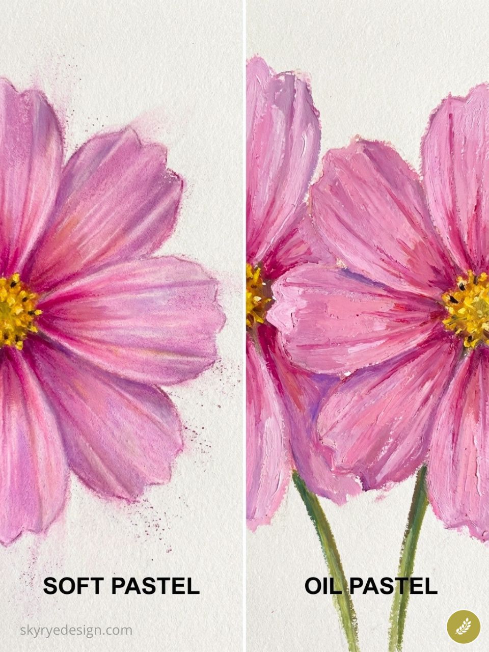
Soft pastels are made of pure pigment bound with a minimal amount of chalk or gum. The binder exists only to hold the stick together — as little as possible, so the pigment ratio is extremely high. When a soft pastel stick touches paper, the binder stays on the surface and the pigment is deposited into the paper tooth. The result is a luminous, velvety surface quality that comes directly from the high pigment concentration — more pigment per square centimetre than virtually any other art medium, including oil paint at normal application thickness.
Soft pastels blend with a finger, a blending stump, or a soft brush. They layer extensively — on the right paper (more on this later), you can build 6-8 distinct layers without the paper becoming saturated. They smudge easily when the work is in progress, which is both their greatest challenge and the source of their most distinctive effects. They require fixative between heavy layering sessions and should be stored and framed carefully to prevent smudging.
Oil pastels: waxier, bolder, and less fragile
Oil pastels use a wax-and-oil binder rather than chalk. The result is a creamier, more adhesive stick that handles more like a wax crayon than a chalk stick. Oil pastels don’t smudge as easily as soft pastels (the wax binder holds the pigment more firmly to the surface), they don’t require fixative, and they can be dissolved and manipulated with mineral spirits for painterly blended effects.
The trade-off: oil pastels don’t layer as transparently as soft pastels, the colour mixing is more limited, and the luminous velvety quality that defines the best soft pastel work is harder to achieve. Oil pastels are not a better or worse medium — they’re a different one, better suited to bold, graphic, textural work and less suited to the atmospheric colour effects that make soft pastel distinctive. If you’re drawn to pastel because of the luminosity, soft pastels are the right starting point.
✏ Artist note: If you’re not sure which to start with, buy a small set of soft pastels (Rembrandt 15-stick set, around $30) and one pack of Canson Mi-Teintes paper. Do five studies. If you find yourself fighting the smudging and wanting more control, try oil pastels. If you find yourself wanting more colour range and more layers, you’re a soft pastel person.
Pastel paper: the surface is half the drawing
The single most impactful material upgrade a pastel artist can make — more than buying better pastels — is switching to better paper. I spent a year working on the wrong surface and wondering why my layers kept becoming muddy after the second or third pass. The problem wasn’t technique. It was that cheap, smooth paper has almost no tooth. Once two or three layers of pastel fill the minimal texture, the paper is saturated, and any additional pastel sits on top of the existing layers and blends into them rather than depositing fresh pigment.
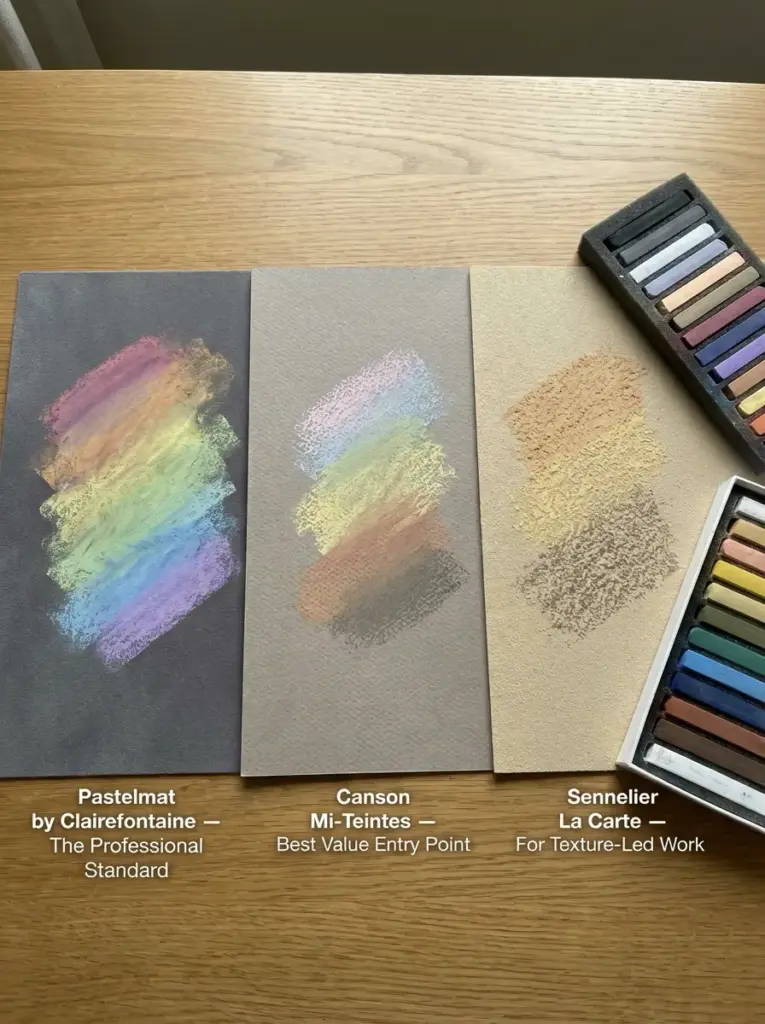
Pastelmat: best grip for layered work
Pastelmat is a velour-coated paper that holds more pastel layers than any other surface commonly available — typically 6-8 distinct layers versus 2-3 on standard paper. The surface is slightly textured but very even, which allows for both smooth blending and precise mark-making. It comes in 12 colours (warm greys, cool greys, mid-tone earth colours, and darker tones), and choosing a mid-tone surface colour is one of the key compositional advantages of working on Pastelmat — you establish your lights and darks relative to a pre-existing mid-tone rather than working up from white.
Price: around £8-12 for a single A3 sheet, £35-45 for a pad of 12 sheets at A4. Expensive, but the layer capacity fundamentally changes what the medium can do.
Canson Mi-Teintes: a good value starting point
Canson Mi-Teintes is the most widely available quality pastel paper and the right choice for students and regular practice work. At 160gsm with a consistent tooth, it holds 3-4 layers reliably and comes in over 50 colours. The mid-tone and darker colours are particularly useful — Moonstone (warm grey), Felt Grey (cool mid-grey), and Havana (warm brown) are all excellent surfaces that give you a built-in tonal starting point. Around £1-2 per A4 sheet.
Sennelier La Carte: for texture-led work
Sennelier La Carte is a card-backed paper with a more pronounced sandy texture than either Pastelmat or Mi-Teintes. It holds pastel well and produces a characteristic visible grain that some artists use deliberately as part of the surface quality of their work. Less suitable for smooth blended passages — very suited to broken colour, impressionist marks, and work where the texture of the surface is meant to show through. Around £3-5 per sheet.
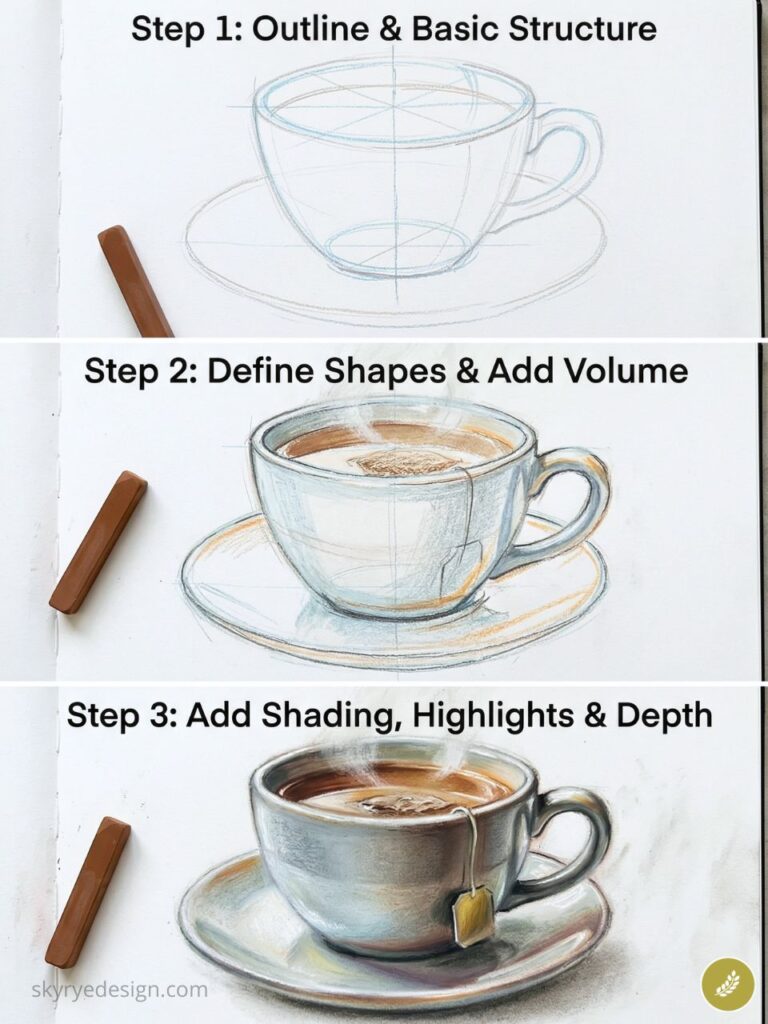
✏ Artist note: Always work on a mid-tone surface. Starting on white paper means you have to fill the entire surface with pastel before the values read correctly — you’re essentially covering the white rather than drawing on a surface. A mid-tone grey or warm brown gives you a head start: you add lights above it and darks below it, and the paper itself provides the mid-value. This is how Degas worked, and it’s still the most efficient approach to pastel composition.
Pastel brands worth knowing
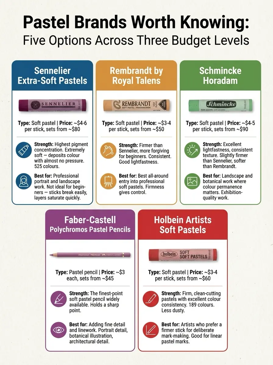
Sennelier Extra-Soft Pastels
Type: Soft pastel Price: ~$4-6 per stick, sets from ~$80
Strength: Highest pigment concentration of any widely available soft pastel. Extremely soft — deposits colour with almost no pressure. 525 colours.
Best for: Professional portrait and landscape work where maximum colour luminosity is the goal. Not ideal for beginners — the extreme softness means the sticks break easily and layer saturation happens quickly.
Rembrandt by Royal Talens
Type: Soft pastel Price: ~$3-4 per stick, sets from ~$50
Strength: Firmer than Sennelier, more forgiving for beginners. Consistent across the full 218-colour range. Good lightfastness.
Best for: Best all-around entry into professional soft pastels. The firmness gives more control during the early stages of a drawing before the paper tooth fills.
Schmincke Horadam
Type: Soft pastel Price: ~$4-5 per stick, sets from ~$90
Strength: Excellent lightfastness ratings, consistent texture across the range. Slightly firmer than Sennelier, softer than Rembrandt.
Best for: Landscape and botanical work where colour permanence matters. Popular choice for exhibition-quality work.
Faber-Castell Polychromos Pastel Pencils
Type: Pastel pencil Price: ~$3 each, sets from ~$45
Strength: The finest-point soft pastel pencil widely available. Holds a sharp point, compatible with soft pastel sticks for detail work.
Best for: Adding fine detail and linework on top of broad soft pastel passages. Portrait detail (eyes, hair), botanical illustration, architectural detail.
Holbein Artists Soft Pastels
Type: Soft pastel Price: ~$3-4 per stick, sets from ~$60
Strength: Firm, clean-cutting pastels with excellent colour consistency. 189 colours. Less dusty than Sennelier.
Best for: Artists who prefer a firmer stick for more deliberate mark-making. Good for work that involves a lot of linear pastel marks rather than broad blended passages.
Six core pastel drawing techniques
1. Side stroke: cover ground fast
The most fundamental pastel application: laying the stick on its side and drawing broad strokes across the paper surface. Side strokes cover large areas quickly, deposit an even layer of pigment, and preserve the paper tooth for subsequent layers. This is how most pastel drawings begin — establishing the broad colour masses of the composition before any detail work. The side stroke should be applied with light, consistent pressure — the goal is to cover the paper without filling the tooth. Think of it as the first word on the page rather than the final mark.
2. Layering: build depth without mud
Pastel colour is built through successive transparent layers rather than mixing colours before application. Layering a warm yellow-orange over a cool blue-violet in the shadow areas of a portrait produces a more complex, luminous shadow than mixing those colours together would. The key rule: work from dark to light in the early stages, building the darkest values first and adding the lightest passages last. The final light touches — the highlights — should be the last marks you make. Pressing them into already-worked areas reduces their luminosity; applying them fresh to a layer that hasn’t been over-blended preserves it.
3. Blending: use it with restraint
Blending is where most beginners damage their pastel drawings. The instinct is to blend everything smooth — to eliminate the visible grain of the paper tooth and make the surface look ‘finished.’ The result is a grey, muddy surface that has lost the luminosity of the raw pigment. Professional pastel artists blend selectively — only in areas where soft, gradual transitions serve the subject (skin in portrait work, sky gradations, soft backgrounds). Edges that define form — the boundary of a shadow, the edge of a leaf, the outline of a figure — are better left with some visible pastel texture rather than blended smooth.
Blending tools in order of softness: finger (warmest, most immediate), blending stump (cooler, more controlled), soft brush (lightest touch, good for large areas), clean chamois leather (for very large background passages). Never blend with a hard tool or heavy pressure — you’re moving pigment, not polishing it.
4. Scumbling: broken color and texture
Scumbling is a loose, irregular application of pastel over an existing layer, allowing the lower layer to show through the gaps. The result is a vibrant broken-colour effect similar to what Impressionist oil painters achieved with loaded brushstrokes. In pastel, scumbling works by holding the stick lightly and moving it across the surface in a slight zigzag or circular motion, depositing pigment on the raised tooth of the surface and leaving the recesses of the previous layer visible. It’s most useful in foliage, backgrounds, textured fabric, and any area where you want visual complexity without the flatness of smooth blending.
5. Hatching and cross-hatching for controlled tone
Hatching — parallel lines of pastel laid close together — creates tonal value without blending. It’s the approach used most naturally with pastel pencils but also achievable with the tip of a soft pastel stick. Cross-hatching (a second set of parallel lines at an angle to the first) deepens the value and creates a more complex surface. Hatching in pastel has a specific visual quality distinct from blended passages — the individual marks are visible, giving the surface energy and direction. Edgar Degas used hatching extensively in his pastel figure studies, often combining it with blended passages in the same work for deliberate contrast.
6. Sgraffito: reveal lower layers
Sgraffito involves scratching through the upper layers of pastel to reveal lower layers beneath. A palette knife, the back of a pastel pencil, or a toothpick can all be used. The technique is most effective when there’s a strong colour contrast between layers — scratching through a dark upper layer to reveal a bright yellow or red beneath creates an effect that no amount of layering or blending can replicate. In landscape work, sgraffito is useful for suggesting grass stems, branches, wire, or any thin light element within a darker area. Apply the dark layer firmly, then scratch through to the lower colour with a controlled, deliberate stroke.
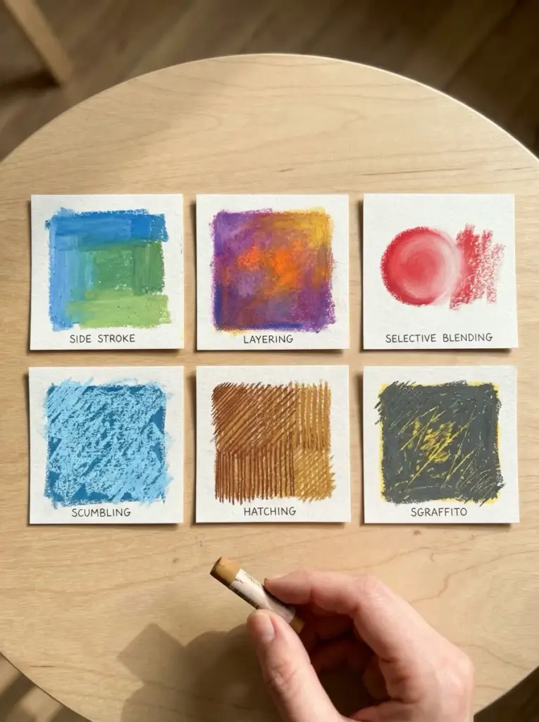
✏ Artist note: The technique most worth practising first is not blending — it’s layering without blending. Do a series of small colour studies where you build 4-5 layers through overlapping strokes, relying on the optical mixing of the paper tooth to create transitions rather than rubbing the colours together. The luminosity you achieve this way is what makes pastel different from every other medium. Once you’ve experienced it, you’ll understand what fixative and over-blending are actually destroying.
Where pastel drawing works best
Sky and atmospheric landscapes
The subject pastel was made for. No other dry medium handles sky colour and atmospheric gradation with the same immediacy and luminosity.
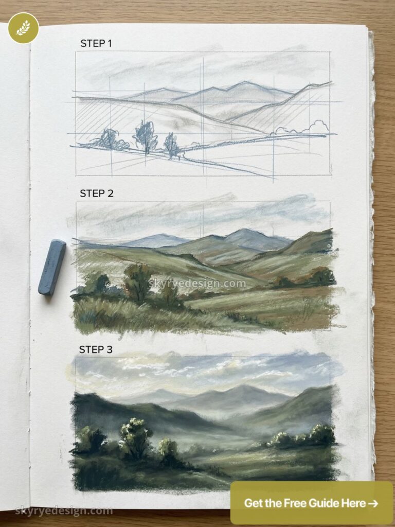
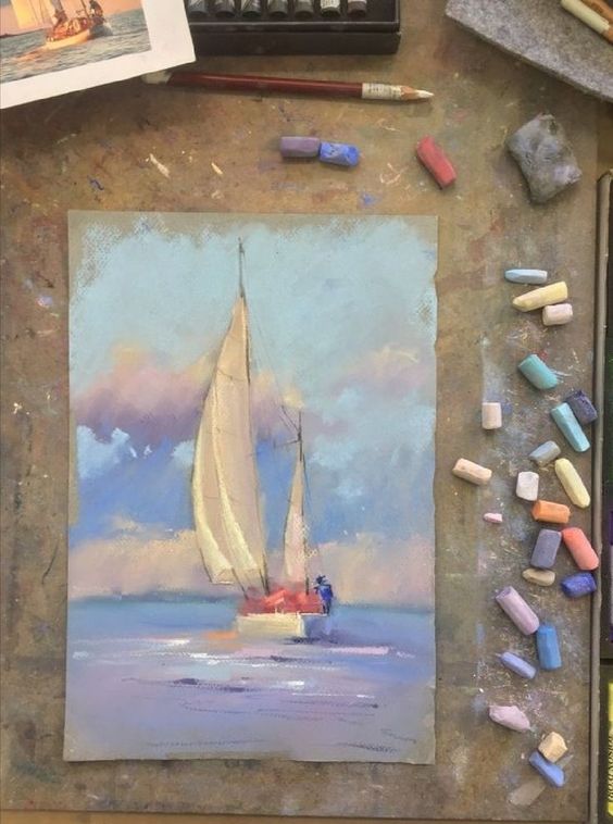
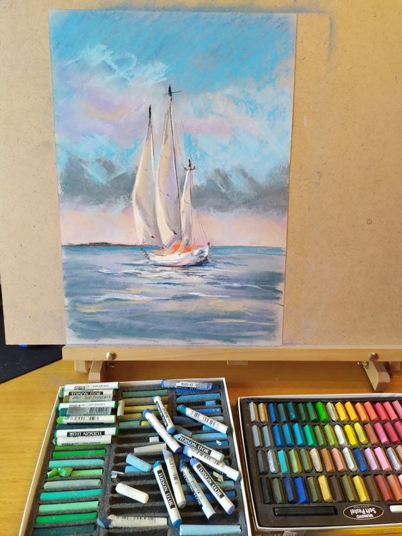
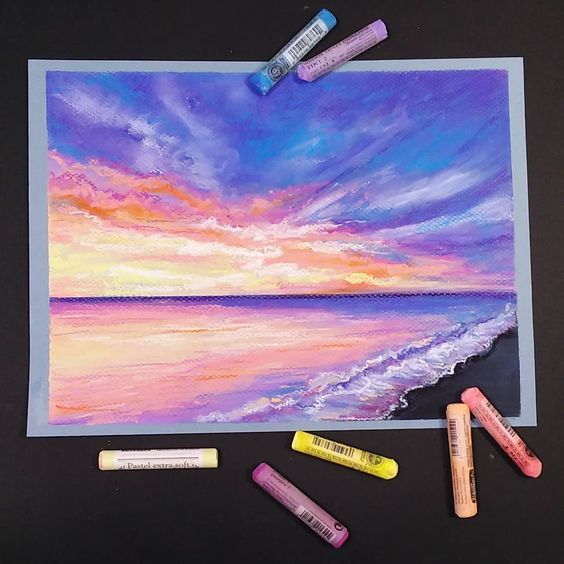
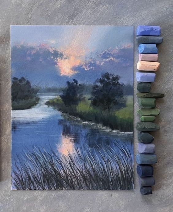
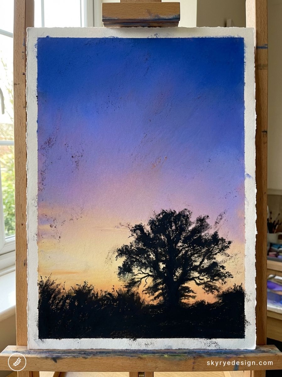
The way a soft pastel sky works — cobalt at the zenith, transitioning through warm violet to pale gold at the horizon — can be established in minutes with side strokes and light finger blending, producing a result that takes oil painters significantly longer and watercolourists enormous technical effort.
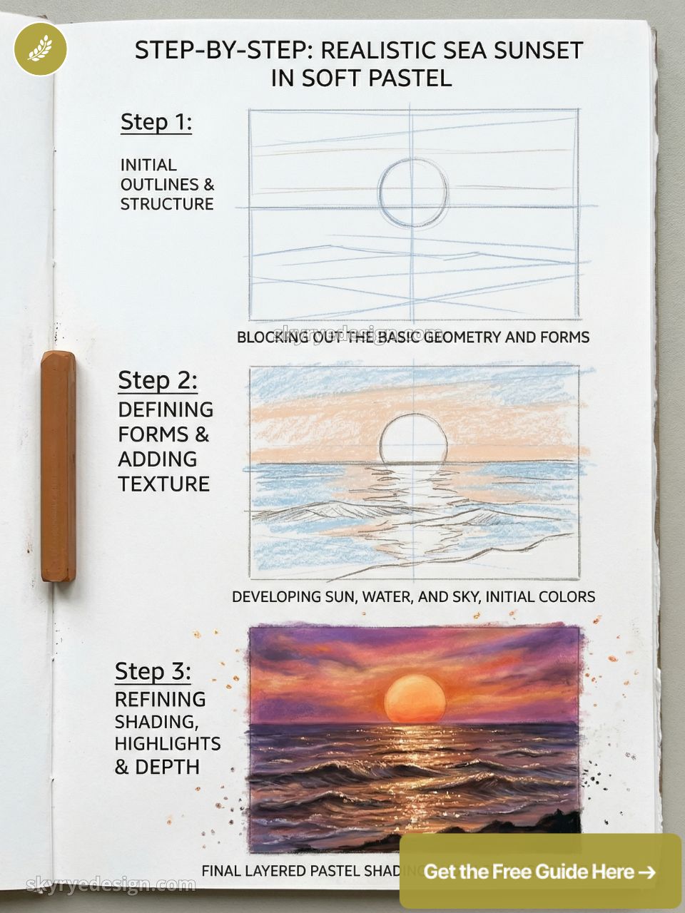
The key is working on a mid-tone surface: a warm grey or pale blue Canson Mi-Teintes already provides the mid-sky colour, reducing the amount of pastel needed and keeping the surface fresh.
Portraits and figure studies
Skin tones in soft pastel have a quality that oil painters spend careers trying to achieve.
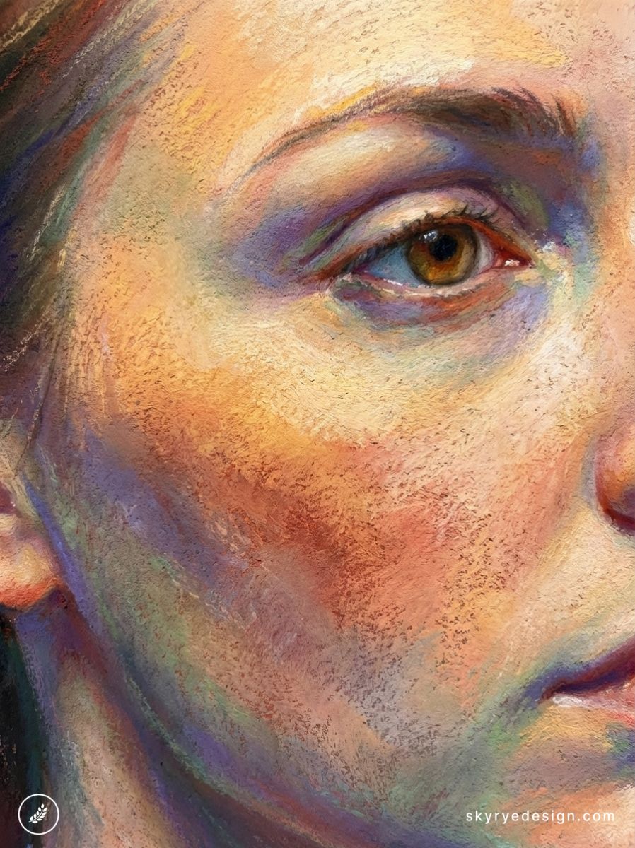
The layering of warm and cool tones across the skin surface — warm yellow-orange in the lights, cool violet-blue in the shadow transitions, warm red in the half-lights — produces the complex, living colour quality of real skin far more naturally in pastel than in any mixed medium.
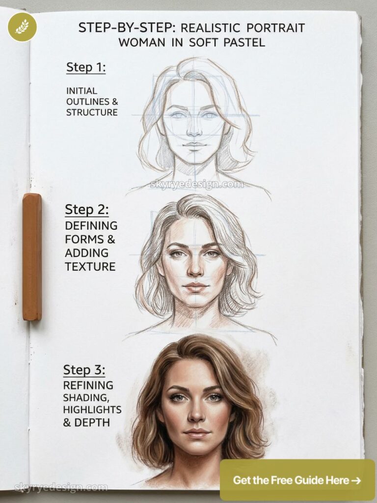
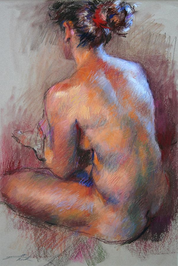
Edgar Degas’s pastel figure studies remain among the most technically accomplished skin-tone drawings ever made, and the specific techniques he used — hatching, selective blending, building colour through multiple directional stroke layers — are the foundation of the approach that still works today.
Floral and botanical subjects
The softness of blended pastel edges suits petals and botanical subjects naturally — the medium doesn’t require the edge control that watercolour or oil demands for flower work.
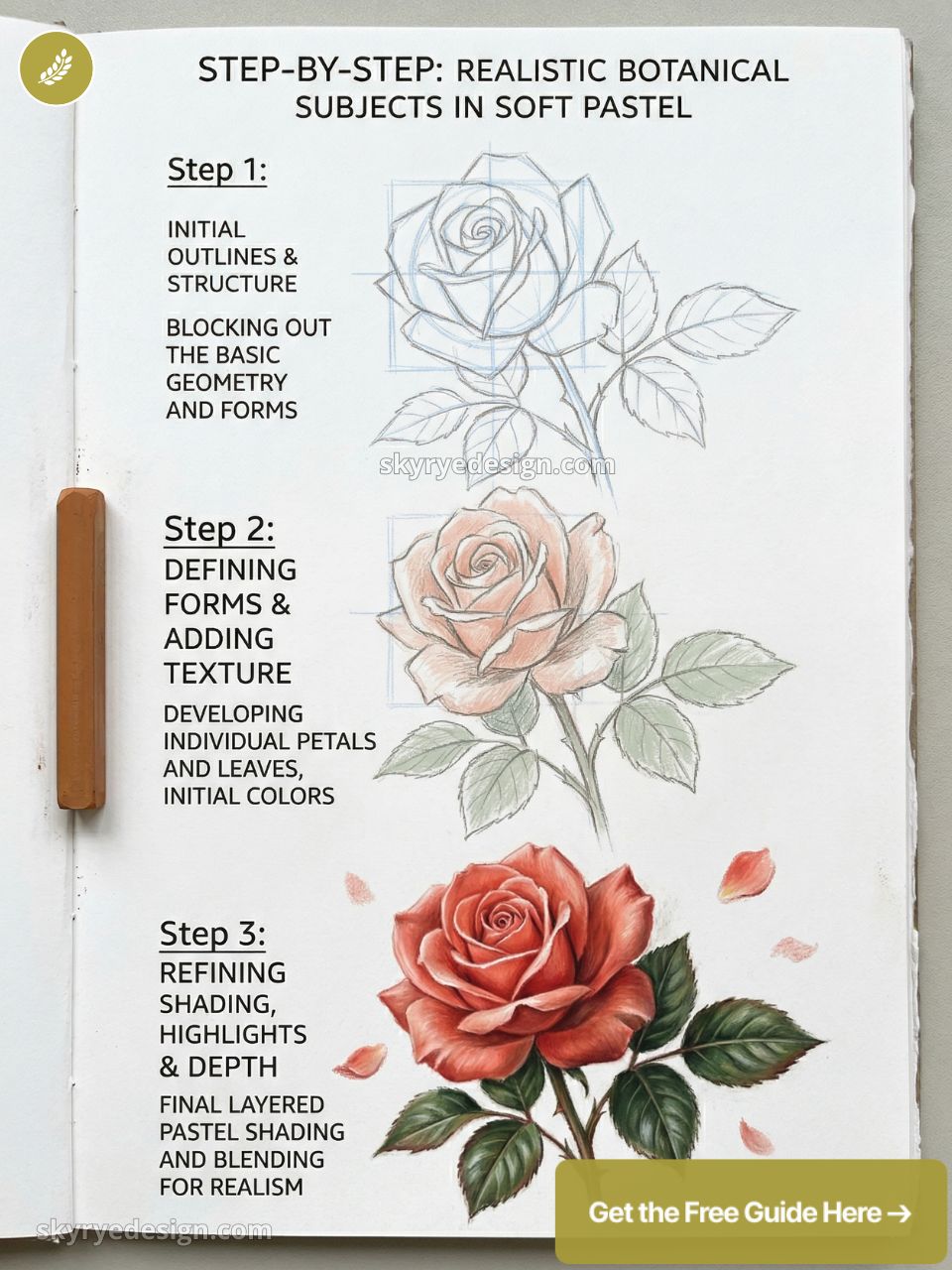
The colour range in professional soft pastels (Sennelier’s 525 colours include dozens of flower-specific pinks, roses, violets, and oranges) allows for the kind of specific colour matching that botanical illustration requires. Working on a dark or mid-tone surface with a light-coloured flower subject produces a dramatic luminosity that’s specific to pastel — the flower seems to glow against the dark background.
Five mistakes that make pastel drawings look dull
- Over-blending everything. Blending eliminates the air pockets between pigment particles that create the velvety light-scattering quality of pastel. Blend selectively — soft transitions in specific areas — and leave the rest as directional strokes.
- Using fixative on the final layer. Fixative darkens values and reduces luminosity noticeably. Apply it between sessions to consolidate lower layers, but leave the final surface layer unfixed. Frame behind glass instead.
- Wrong paper for the technique. Smooth cartridge paper fills with pastel after two layers and becomes unworkable. Invest in Pastelmat or Mi-Teintes before you decide the medium is frustrating.
- Starting with lights on white paper. Working on white forces you to cover the entire surface. Work on mid-tone paper — the surface is your mid-value and you build lights above and darks below it.
- Pressing too hard too early. Heavy pressure in the first layers compresses the paper tooth and prevents subsequent layers from adhering. Light pressure early, heavier only in the final stages for the most intense passages.
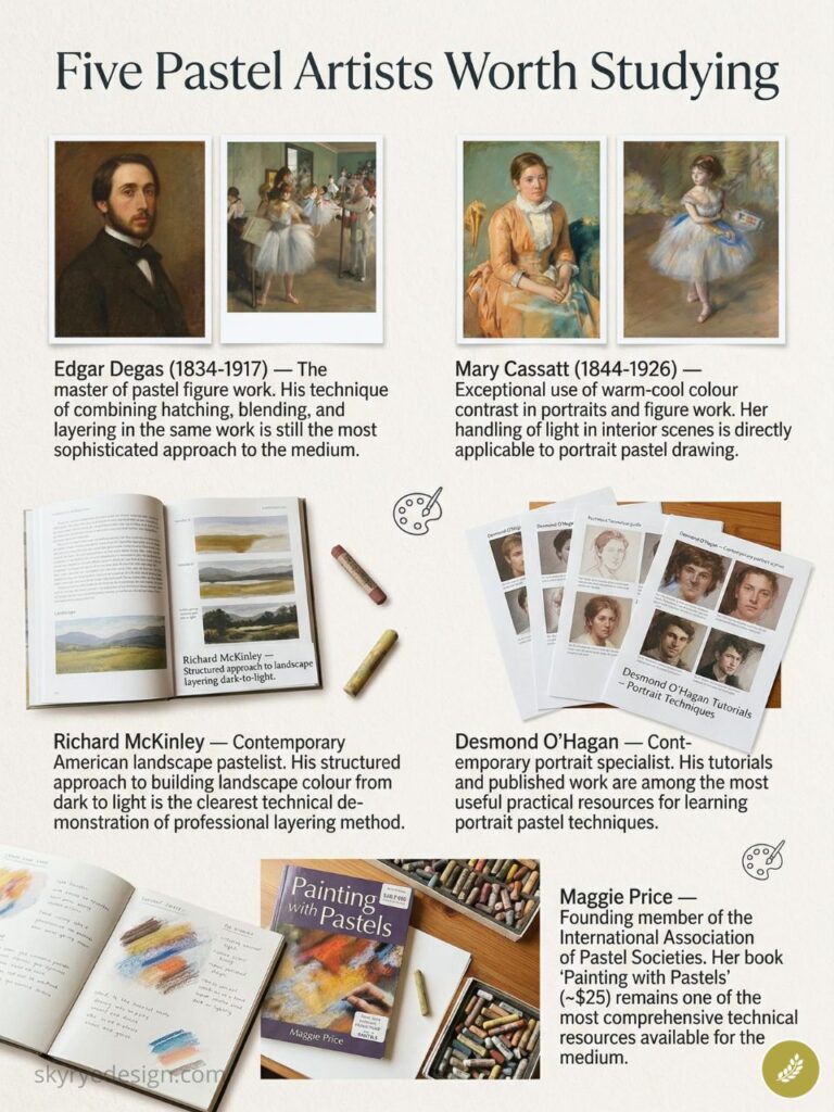
Five pastel artists worth studying
- Edgar Degas (1834-1917) — The master of pastel figure work. His technique of combining hatching, blending, and layering in the same work is still the most sophisticated approach to the medium.
- Mary Cassatt (1844-1926) — Exceptional use of warm-cool colour contrast in portraits and figure work. Her handling of light in interior scenes is directly applicable to portrait pastel drawing.
- Richard McKinley — Contemporary American landscape pastelist. His structured approach to building landscape colour from dark to light is the clearest technical demonstration of a professional layering method.
- Desmond O’Hagan — Contemporary portrait specialist. His tutorials and published work are among the most useful practical resources for learning portrait pastel techniques.
- Maggie Price — Founding member of the International Association of Pastel Societies. Her book ‘Painting with Pastels’ (~$25) remains one of the most comprehensive technical resources available for the medium.
Useful pastel drawing references
- Tate pastel glossary
- Met Museum pastel materials note
- Blick pastel buying guide
- Art is Fun pastel technique guide
- International Association of Pastel Societies
- Pastel Society of America
These are placed here as source and practice references, not shopping instructions. I use them mainly to cross-check terminology, paper behavior, and the way professional pastel groups describe the medium.
More pastel drawing examples to study
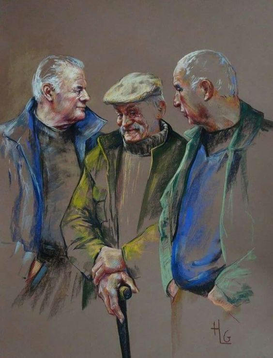
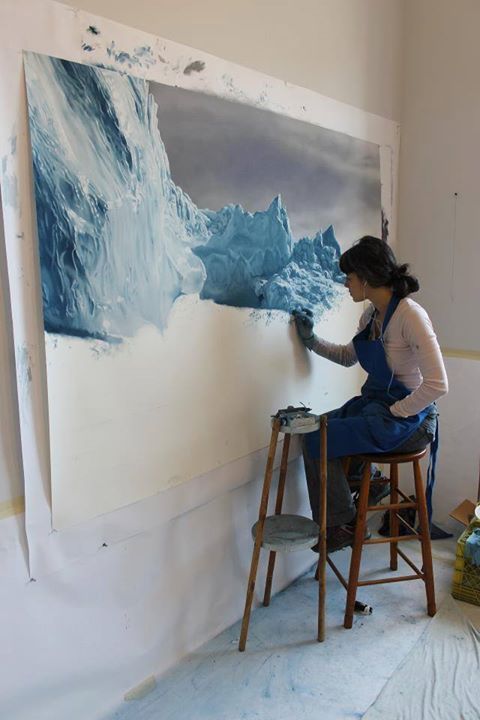
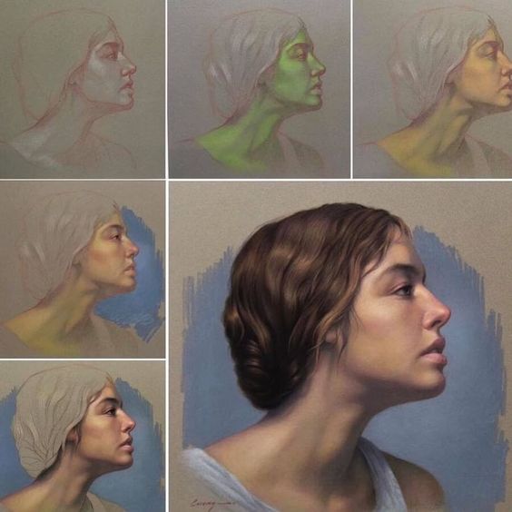
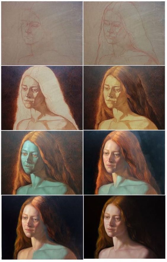
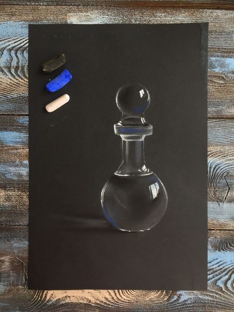
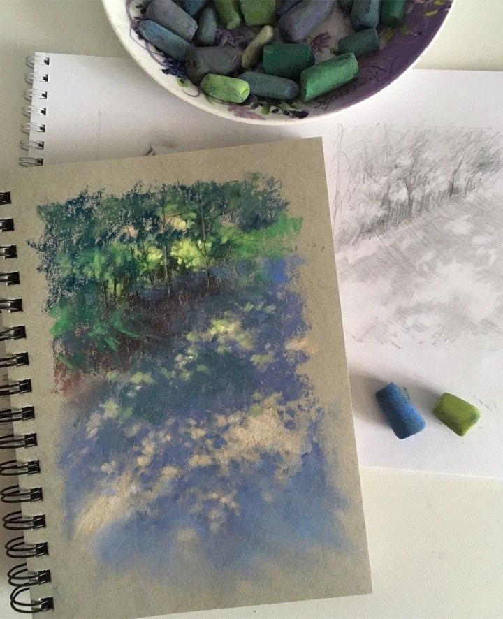
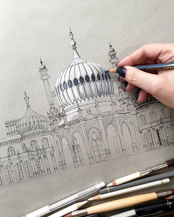
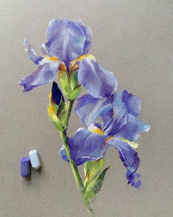
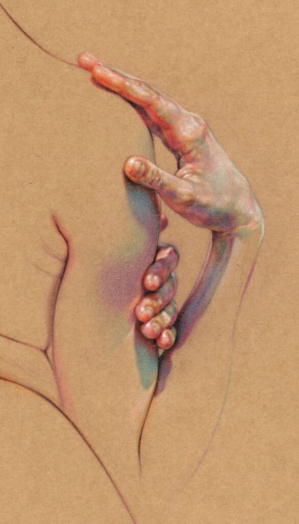
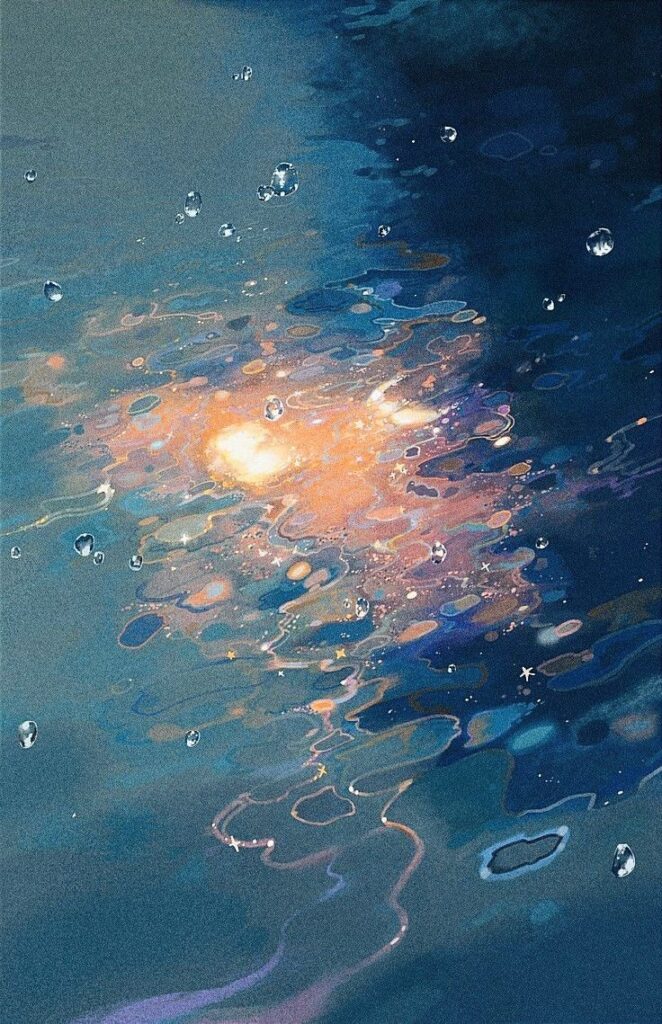
Use these examples as small studies rather than decoration. Each one highlights a practical pastel problem: fur, water, portraits, glass, flowers, architecture, hands, or atmospheric color.
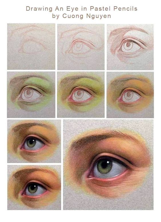
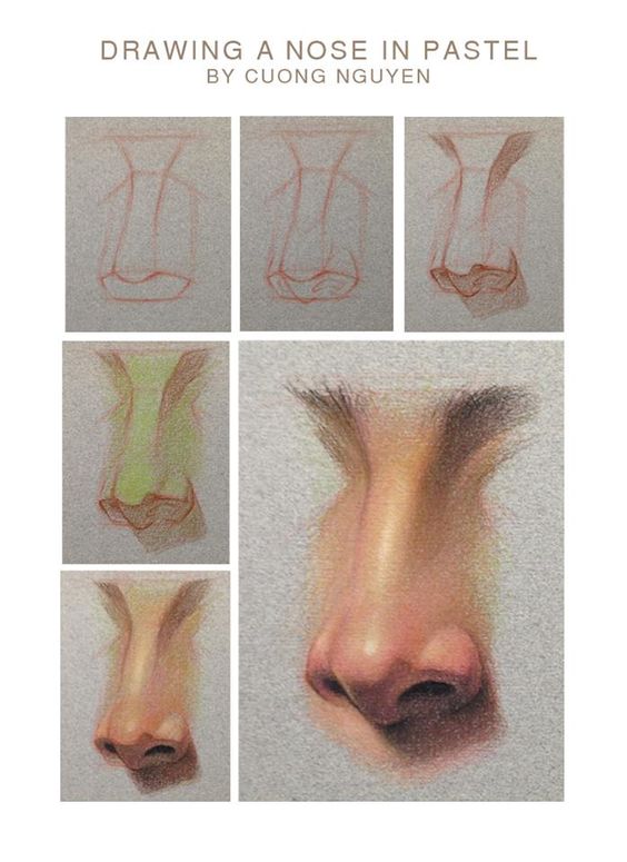
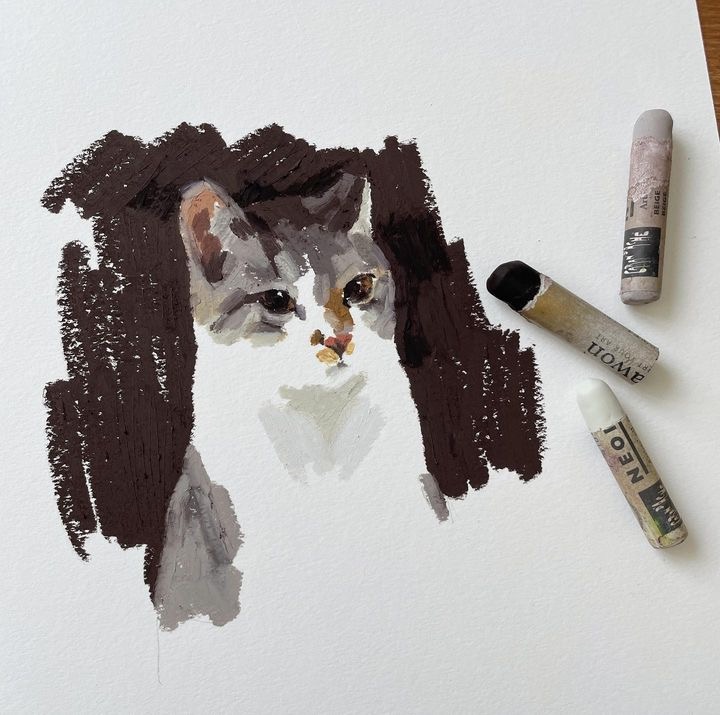
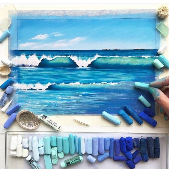
Related drawing practice
Pastel drawing improves faster when you keep the surrounding skills active. Use color blending in drawing, texture drawing guide, drawing hacks for cleaner sketches, cloud drawing for soft edges, how to draw water, beginner drawing exercises as supporting practice, especially if your pastel layers look flat or your values drift.
Pastel drawing FAQ
Q: What is pastel drawing?
A: Pastel drawing is a dry color method that uses compressed pigment on textured paper. The pigment catches in the paper tooth, so the surface can look bright and velvety without drying time. Soft pastels are powdery and easy to blend. Oil pastels are creamier and more waxy. Pastel pencils are useful for small details.
Q: How do beginners use pastels?
A: Beginners should start on toned pastel paper, block the big shapes lightly, then layer darks, mid-tones, and lights. Use the side of the stick for broad color and the edge for smaller marks. Blend only where the transition needs to soften. If you rub every area smooth, the drawing often turns flat and dusty.
Q: Are you supposed to use water with pastels?
A: Usually, no. Soft pastel drawing is normally dry. Some artists use water, alcohol, or mineral spirits to create an underpainting, but that is a separate technique and the paper must be able to handle it. Oil pastels can be moved with mineral spirits, not plain water. For beginners, dry layering is the safer place to start.
Q: What paper is best for pastel drawing?
A: The best paper for pastel drawing has enough tooth to hold several layers. Pastelmat, sanded pastel paper, and Canson Mi-Teintes are common choices. Smooth printer paper fills up too fast and makes the pastel slide around. A mid-tone surface is often easier than white because it already gives you a middle value.
Q: What are the three main types of pastels?
A: The three useful categories for beginners are soft pastels, oil pastels, and pastel pencils. Soft pastels give the classic powdery, luminous look. Oil pastels feel waxier and resist smudging. Pastel pencils are harder and better for edges, eyelashes, small highlights, and controlled line work. Many artists combine sticks and pencils in one drawing.
Q: Do pastel drawings need fixative?
A: Soft pastel drawings do not always need final fixative. Fixative can darken values and reduce the glow of the last layer. It is more useful between working stages, when the lower layers need to grip before more color goes on top. For finished work, frame the drawing behind glass with a spacer. Oil pastels usually do not need fixative.
Q: What are good pastel drawing subjects for beginners?
A: Good beginner subjects include clouds, simple landscapes, fruit, flowers, fabric folds, animal fur, and portrait studies with large shadow shapes. Pastels are strongest when the subject needs soft edges, broken color, and luminous light. Avoid tiny detail-heavy subjects at first; they are easier later with pastel pencils.
- 2.0Kshares
- Facebook0
- Pinterest2.0K
- Twitter3
- Reddit0