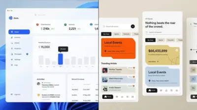
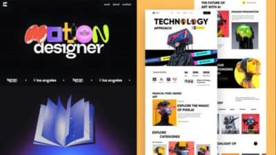
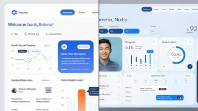
Finding fresh inspiration is essential for any UI/UX designer looking to create innovative, user-friendly digital experiences. The online landscape offers numerous platforms dedicated to showcasing exceptional design work that can spark creativity and provide solutions to design challenges. Websites like Dribbble, Mobbin, and Awwwards serve as invaluable resources for designers seeking high-quality UI/UX inspiration across mobile, web, and app interfaces.
These digital galleries feature thousands of carefully curated designs from talented professionals worldwide, allowing you to explore current trends and breakthrough concepts. Dribbble, for instance, hosts an extensive collection of UX images that can help you visualize solutions for your projects. Meanwhile, Mobbin provides access to over 400,000 screens from real-world applications, offering practical examples of successful design implementation.
Key Takeaways
- Dedicated inspiration platforms like Dribbble and Awwwards showcase exceptional UI/UX designs that can elevate your creative process.
- Regular exploration of design galleries exposes you to emerging trends and innovative solutions across different digital mediums.
- Building a diverse collection of inspiration sources helps you develop a unique design perspective while maintaining awareness of industry standards.


Understanding UI/UX Design
UI/UX design forms the backbone of all digital interactions, blending aesthetics with functionality to create meaningful user experiences. The field encompasses both visual elements and behavioral patterns, requiring designers to balance creative inspiration with technical constraints.
Principles of User Interface Design
UI design focuses on the visual aspects of digital products that users interact with directly. These include buttons, menus, typography, colors, and layout elements that guide user interactions.
Key principles include:
- Clarity: Design elements should be self-explanatory and intuitive
- Consistency: Similar functions should look and behave similarly
- Visual hierarchy: Important elements should stand out through size, color, or placement
- Feedback: Users should receive confirmation when actions are completed
When seeking inspiration for UI design, look beyond your industry. Explore award-winning websites like Awwwards that showcase exemplary visual interfaces across different sectors.
Remember that UI design isn’t just about aesthetics—it’s about creating visual cues that help users accomplish their goals efficiently.
Role of User Experience in Web Design
UX design encompasses the entire journey users take when interacting with your product. This includes not just what they see, but how they feel throughout the process.
Good UX anticipates user needs before they arise. You’ll want to consider:
- User research and persona development
- Information architecture and content strategy
- Wireframing and prototyping
- Usability testing and iteration
Your UX design determines whether users find value in your product. When building websites or apps, prioritize removing friction points that might frustrate users.
Finding UX inspiration often means studying successful user flows and interactions. Services like Page Flows provide searchable app screenshots specifically for this purpose, saving considerable research time.
Interplay Between UI and UX
While UI and UX are distinct disciplines, they’re deeply interconnected. A visually stunning interface with poor usability will fail, as will a highly functional site with unappealing visuals.
The relationship works like this:
- UX determines what functions are needed
- UI implements those functions in a visually pleasing way
- Together they create a cohesive product experience
Creative inspiration should fuel both aspects equally. When browsing design publications or websites for ideas, analyze both the visual appeal and the underlying user journey.
Remember that inspiration is, as Chee Seng Leong notes, “the process of being mentally stimulated to do something creative.” You should actively seek diverse influences rather than waiting passively for ideas to appear.


Top Inspirational Websites for Designers
Finding fresh design inspiration is essential for creating innovative UI/UX projects. These platforms showcase exceptional work from talented designers worldwide and offer valuable resources to enhance your creative process.
Behance: Showcasing Creative Portfolios
Behance stands out as Adobe’s professional platform for designers to showcase their portfolios and discover inspiring work. With millions of creative projects spanning UI/UX, website design, app design, and other disciplines, it offers a comprehensive resource for inspiration.
You can filter projects by creative fields, tools used, or color palettes to find precisely what you’re looking for. The quality control on Behance ensures you’ll encounter professional-level work, with featured projects curated by the platform’s team.
The platform also enables you to follow specific designers whose style resonates with you. This creates a personalized feed of new work from talents you admire. Behance’s project pages often include detailed descriptions of design processes, making it valuable for learning new approaches and techniques.
Dribbble: Connecting Design Talent
Dribbble functions as a social network for designers where they share small screenshots (“shots”) of their current projects. This visual-first approach makes it perfect for quick inspiration sessions when you need fresh UI/UX ideas.
You can browse by categories like web design, mobile app interfaces, or interaction design. The platform’s “Popular” section highlights trending work, keeping you informed about current design directions and emerging patterns.
Dribbble’s community features allow you to save designs to collections and follow designers whose work inspires you. Many designers share downloadable resources like UI kits and templates that you can use in your own projects.
The platform’s hiring section also connects designers with job opportunities, making it both an inspiration source and career development tool.


Awwwards: Recognizing Design Innovation
Awwwards focuses specifically on recognizing and promoting innovative website design. The platform evaluates sites based on design, usability, creativity, and content, providing a benchmark for excellence in web development.
You can filter websites by technologies used, styles, or industry categories. This makes it especially valuable when researching specific design approaches for particular sectors or technical requirements.
Awwwards showcases cutting-edge techniques in interactive design, animation, and user experience. The detailed breakdowns of award-winning sites offer insights into what makes a website truly exceptional.
Their “Site of the Day” and various awards highlight the very best in contemporary web design, giving you a daily dose of inspiration from the industry’s leading talents.
SiteInspire: Web Design Gallery
SiteInspire presents a carefully curated collection of visually exceptional websites. Unlike other platforms, every site featured has been manually selected for its design quality, ensuring a high standard of inspiration.
You can browse designs by style (minimal, colorful, typography-focused), type (portfolio, e-commerce, corporate), or subject (fashion, technology, food). This targeted filtering helps you find relevant examples for specific project requirements.
SiteInspire’s clean interface puts the spotlight entirely on the showcased websites without distractions. Each listing includes key information about the design agency, technologies used, and notable features.
The platform regularly updates with new additions, keeping you informed about emerging trends in website design without overwhelming you with quantity over quality.


Leveraging Visual Assets and Typography
Visual elements and typography form the backbone of effective UI/UX design. When properly implemented, these components create harmony, enhance usability, and establish brand identity across digital platforms.
The Importance of Choosing the Right Colors
Color selection impacts user perception and behavior more than most designers realize. When choosing a color palette, consider both aesthetic appeal and functional requirements.
Studies show that colors evoke specific emotions and can increase brand recognition by up to 80%. For example, blue conveys trust and reliability, while orange suggests energy and enthusiasm.
Tools like Adobe Color, Coolors, and Color Hunt provide inspiration for cohesive palettes. Many designers now examine color accessibility from the start, ensuring WCAG compliance with contrast ratios of at least 4.5:1 for normal text.
Remember that cultural differences influence color perception. A color that represents luxury in one region might signify mourning in another.
Crafting a Visual Language with Imagery
Imagery creates immediate visual impact and communicates complex ideas instantly. Your selection of photos, illustrations, and icons should align with your brand voice and enhance the user experience.
Key imagery considerations:
- Consistency in style across all visual assets
- Image optimization for performance
- Cultural relevance and inclusivity
- Proper alignment with text elements
Sites like Unsplash, Dribbble, and Behance offer vast libraries of design inspiration. For UI designers specifically, Mobbin and UI Movement showcase how top brands implement imagery in their interfaces.
Custom illustrations have become increasingly popular as they provide uniqueness while reinforcing brand identity. They also help overcome stock photo fatigue.
Typography as a Cornerstone of Design
Typography accounts for over 95% of web design, making font selection crucial to your interface’s success. Effective typography establishes hierarchy, improves readability, and conveys personality.
Fontshare, mentioned in the search results, provides high-quality fonts for designers. When selecting typography, limit your choices to 2-3 font families per project to maintain cohesion.
Font pairing principles to follow:
- Contrast styles (serif with sans-serif)
- Maintain consistent weights and proportions
- Ensure readability at various screen sizes
- Consider loading times and performance
Line height should typically be 1.5 times your font size for optimal readability. For mobile interfaces, a minimum font size of 16px prevents users from needing to zoom in to read content.
Test your typography choices with actual content rather than placeholder text to accurately assess readability and visual rhythm.


Practical Tools for UI/UX Design
Finding the right tools can dramatically improve your design workflow and output quality. These platforms offer specific functionality to help you develop wireframes and gather visual inspiration for your projects.
Wireframing with Wondershare Mockitt
Wondershare Mockitt stands out as a powerful wireframing tool that enables you to create interactive prototypes quickly. The platform offers an intuitive drag-and-drop interface that makes it accessible even for beginners.
You can use Mockitt to design responsive layouts for websites and mobile applications with its extensive component library. The tool supports real-time collaboration, allowing teams to work simultaneously on wireframes.
One of Mockitt’s strengths is its ability to create clickable prototypes that simulate the user experience before development begins. This helps identify usability issues early in the design process.
The platform also generates code snippets for developers, bridging the gap between design and implementation phases.
Building Engaging Content on Pinterest
Pinterest serves as more than just a social platform—it’s a valuable resource for UI/UX designers seeking inspiration and trends.
You can create dedicated boards to organize design ideas by category, project, or client. This visual bookmarking system helps you maintain a structured collection of design references.
The platform’s algorithm suggests related content, exposing you to diverse design approaches you might not discover otherwise. Many designers use Pinterest to track color schemes, typography pairings, and layout patterns.
By following design influencers and studios, you gain regular exposure to cutting-edge work. The “Try on” feature allows you to visualize how specific elements might look in your own projects.
Pinterest also excels at showcasing real-world implementations rather than just conceptual designs found on other platforms.


The Process of Website Redesign and Rejuvenation
Website redesign requires careful planning and execution to enhance both visual appeal and user experience. The process involves identifying problems with the current design and implementing strategic changes to create a more effective digital presence.
Analyzing the Need for Website Redesign
Start by conducting a thorough audit of your existing website. Examine analytics data to identify high bounce rates, low conversion areas, and pages with minimal engagement. These metrics often signal design or usability issues requiring attention.
Compare your site with competitors to spot industry trends you might be missing. Ask yourself: Does your website reflect your current brand identity? Is the navigation intuitive? Does it perform well on mobile devices?
User feedback is invaluable during this phase. Collect opinions through surveys, user testing, or direct conversations with customers. Document specific pain points they experience when interacting with your site.
Create a list of priority issues that need addressing, ranging from technical problems to outdated visuals or confusing user flows. This prioritized list will guide your redesign strategy.
Strategies for Refreshing Website Content
Begin your content refresh by updating outdated information and removing redundant pages. Quality trumps quantity—fewer, more engaging pages often outperform bloated sites with thin content.
Incorporate new visual elements that align with current design trends while maintaining brand consistency. Consider using:
- Custom illustrations or updated photography
- Video demonstrations of products or services
- Interactive elements like quizzes or calculators
- Simplified, scannable text blocks
Improve your information architecture by reorganizing content based on user needs rather than internal company structure. Create clear pathways for visitors to find what they’re looking for quickly.
Test different versions of key pages to determine which designs drive better engagement. Small tweaks to call-to-action buttons, headline phrasing, or image placement can significantly impact conversion rates.
- 2.1Kshares
- Facebook0
- Pinterest2.1K
- Twitter3
- Reddit0


