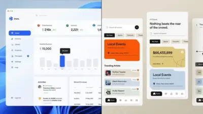
Mobile UI design has evolved into a critical aspect of app development in today’s digital landscape. With millions of apps competing for users’ attention, creating intuitive, visually appealing interfaces has become essential for success. Good mobile UI design offers a visually appealing and interactive environment that is both intuitive and enjoyable for users, directly impacting user retention and engagement.
The mobile experience demands special consideration of screen size, touch interactions, and user context. Designers must balance aesthetic appeal with functionality, ensuring that users can navigate interfaces effortlessly while enjoying the visual elements. This delicate balance requires understanding both design principles and user psychology.
As mobile devices continue to dominate digital interactions, UI designers must stay current with emerging trends and platform-specific guidelines. Whether you’re designing for iOS, Android, or creating a cross-platform experience, following established patterns while introducing innovative elements can help your app stand out in a crowded marketplace.
Key Takeaways
- Effective mobile UI design balances visual appeal with intuitive functionality to create enjoyable user experiences.
- Understanding platform-specific guidelines and user context is essential for creating interfaces that feel natural on different devices.
- Collaboration between designers and developers, coupled with iterative testing, leads to more successful and user-friendly mobile interfaces.
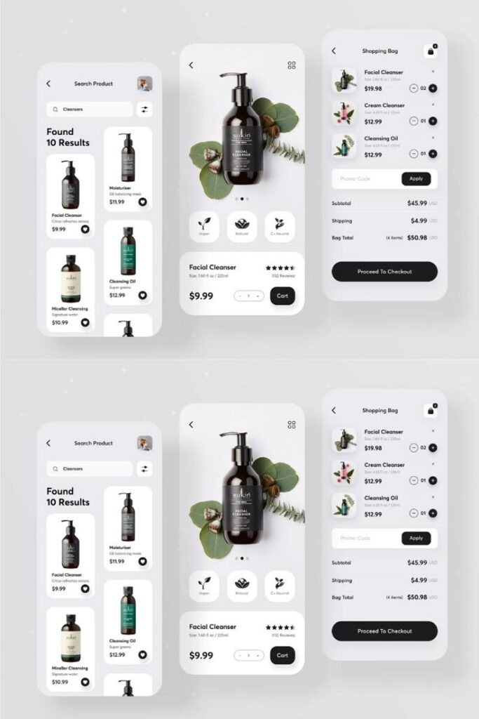
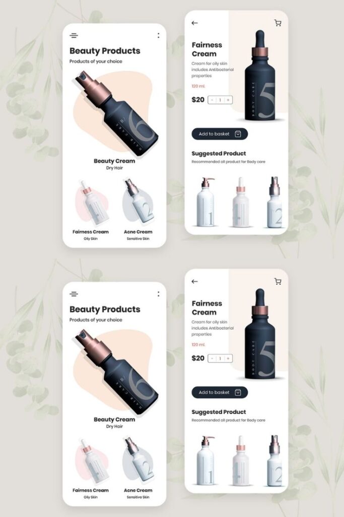
Fundamentals of Mobile UI Design
Mobile UI design requires a strategic approach that balances visual appeal with functionality. Creating intuitive interfaces hinges on understanding both technical constraints and user expectations in the mobile ecosystem.
Defining Mobile UI and UX
Mobile UI (User Interface) refers to the visual elements users interact with on mobile devices, including buttons, icons, navigation menus, and screens. UI design focuses on the look and feel of these elements, ensuring they’re visually appealing and easily recognizable.
Mobile UX (User Experience) encompasses the entire interaction between users and the mobile application, including usability, accessibility, and the emotional response triggered during use.
While UI deals with what users see, UX addresses how they feel when navigating your app. Both components must work harmoniously to create a successful mobile experience.
The distinction matters because beautiful interfaces (UI) can still fail if they’re difficult to use, while functional designs need visual polish to engage users effectively.
Key Principles of Effective UI Design
Simplicity stands as the cornerstone of mobile UI design. Mobile screens have limited space, so every element must serve a clear purpose. Remove clutter and focus on essential features that users actually need.
Consistency in design elements creates familiarity and reduces learning curves. Use similar button styles, color schemes, and interaction patterns throughout your app to build user confidence.
Visual hierarchy guides users through content by emphasizing important elements. Use size, color, and spacing to direct attention to primary actions.
Readability should never be compromised. Select appropriate font sizes (minimum 16px), maintain sufficient contrast, and ensure text remains legible across different lighting conditions.
Feedback confirms user actions through visual, tactile, or auditory responses. When users tap a button, they should know immediately that something happened.
Accessibility ensures your design works for everyone, including those with disabilities. Consider color blindness, motor limitations, and screen readers in your design decisions.
Understanding User Experience on Mobile
User context heavily influences mobile experiences. Users often interact with mobile apps while distracted, in motion, or with limited time. Your design must accommodate these constraints by being forgiving and straightforward.
One-handed operation remains crucial as most people use their phones with a single thumb. Place important interactive elements within easy reach of this “thumb zone” – typically the lower center and edges of the screen.
Touch targets should be sized appropriately (at least 44×44 pixels) with adequate spacing to prevent accidental taps. Consider that fingers are less precise than mouse pointers.
Performance impacts UX directly. Slow loading times and laggy interactions frustrate users regardless of visual quality. Optimize images, minimize animations, and streamline processes to maintain responsiveness.
Mental models matter – users bring expectations from other apps. Following platform-specific guidelines (iOS Human Interface Guidelines or Material Design for Android) helps create familiar experiences that require less cognitive effort.
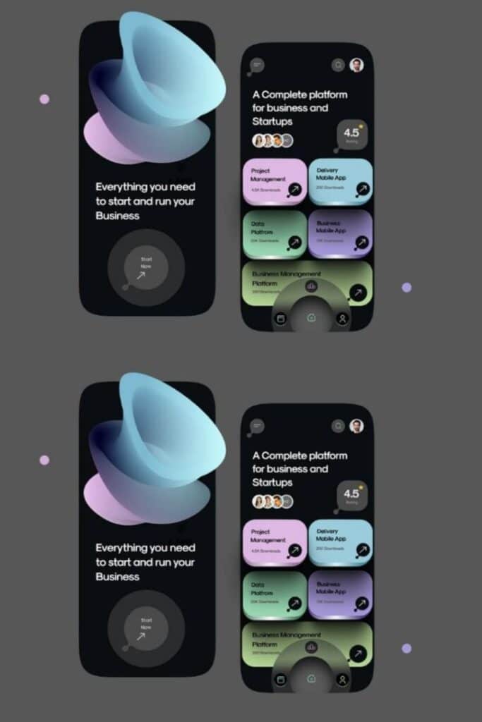
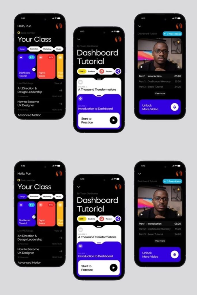
Design Process and Collaboration
Creating effective mobile UI designs requires a structured approach and seamless teamwork. The design process combines strategic planning, iterative development, and cross-functional collaboration to transform concepts into user-friendly mobile experiences.
Project Planning and Requirements Gathering
Start with a clear design brief that outlines project goals, target audience, and technical constraints. You should identify key user pain points and business objectives to ensure your design solves real problems.
Research your target users thoroughly by conducting interviews, surveys, or analyzing competitor apps. This groundwork helps you understand user behaviors and expectations specific to mobile interactions.
Create user personas and user journeys to visualize how different people will interact with your app. These artifacts serve as reference points throughout the design process and help team members maintain a user-centered focus.
Document technical requirements and platform-specific guidelines (iOS or Android) early. Knowing these constraints beforehand prevents costly redesigns later when developers implement your UI designs.
Wireframes and Prototypes for Mobile
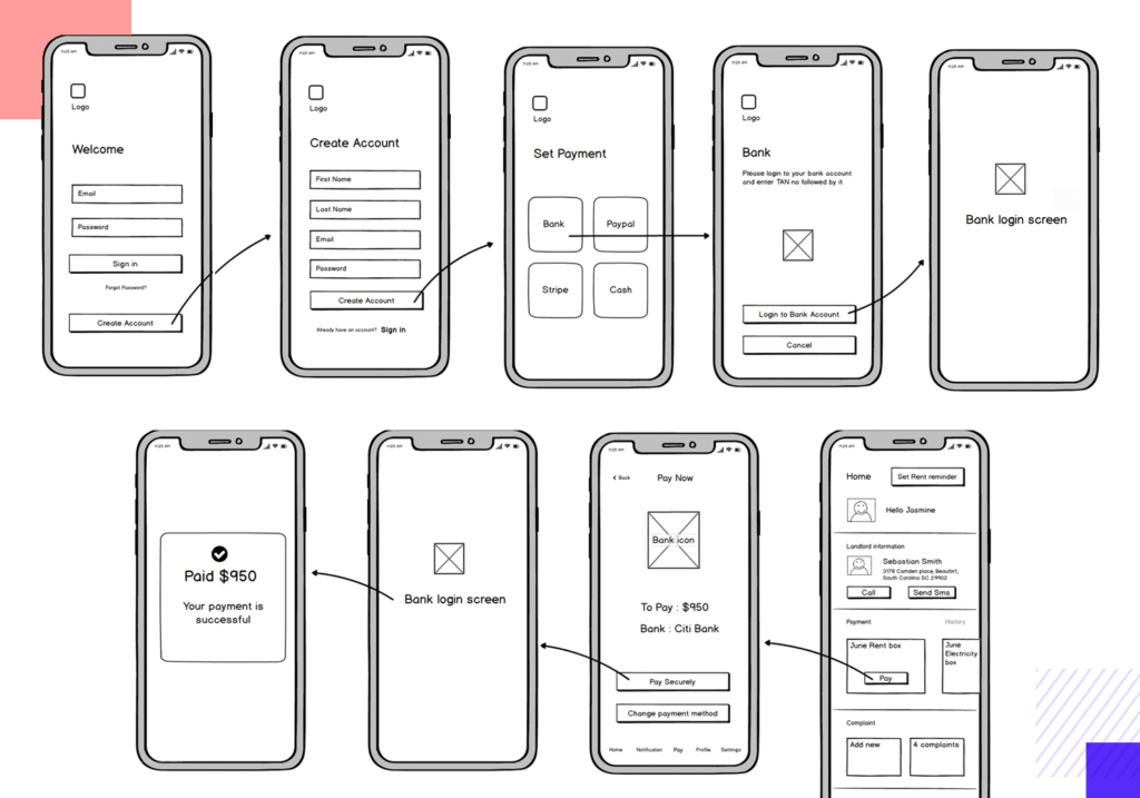
Begin with rough sketches to explore multiple design directions quickly. Low-fidelity wireframes help you experiment with information hierarchy and layout without getting distracted by visual details.
Create wireframes specifically optimized for mobile screen sizes and touch interactions. Consider thumb zones, portrait/landscape orientations, and how elements stack vertically on smaller screens.
| Prototype Fidelity | Best Used For | Tools |
|---|---|---|
| Low-fidelity | Early concept validation | Paper sketches, Balsamiq |
| Medium-fidelity | Testing user flows | Figma, Adobe XD |
| High-fidelity | Visual design validation | Figma, Principle, ProtoPie |
Transform wireframes into interactive prototypes to test user flows. Prototypes should simulate mobile gestures like tapping, swiping, and pinching to provide an authentic testing environment.
Gather feedback on your prototypes through usability testing with real users. This identifies usability issues before development begins, saving time and resources.
Effective Collaboration Between Designers and Developers
Establish a common language between designers and developers by creating a shared design system. This includes documented UI components, interaction patterns, and naming conventions.
Schedule regular design reviews where designers can explain their decisions and developers can highlight technical considerations. These discussions prevent misunderstandings and build mutual respect.
Use collaboration features in design tools like Figma or Adobe XD to provide developers with precise measurements, assets, and interaction specifications. This reduces back-and-forth questions during implementation.
Consider creating a design-to-development handoff document that explains complex animations or interactions that may not be obvious from static designs. Include edge cases and error states to ensure complete implementation.
Involve developers early in the design process to identify potential technical challenges. Their input can help shape designs that are both visually appealing and technically feasible.
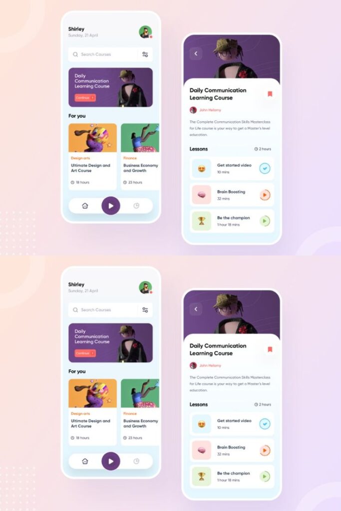
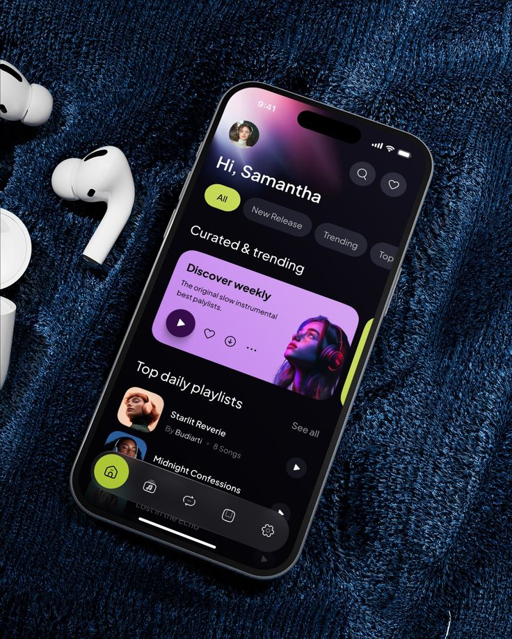
Tools and Methods for UI Design
Selecting the right tools for mobile UI design can significantly impact your workflow efficiency and creative output. Modern UI design platforms offer features that simplify the process from wireframing to creating interactive prototypes.
Popular UI Design Tools
Several powerful tools dominate the mobile UI design landscape today. Sketch remains a favorite among designers for its vector-based approach and extensive plugin ecosystem. Adobe XD offers seamless integration with other Adobe products, making it ideal if you’re already in that ecosystem.
Figma has gained tremendous popularity due to its collaborative features and browser-based accessibility. For those seeking AI assistance, tools like Uizard and Adobe Firefly can help generate design elements and speed up your workflow.
Marvel App excels at creating interactive prototypes without complex coding knowledge. If you’re looking for simplicity in wireframing, Balsamiq provides an intuitive interface that mimics hand-drawn sketches.
When selecting a tool, consider your team’s specific needs, budget constraints, and the complexity of your projects.
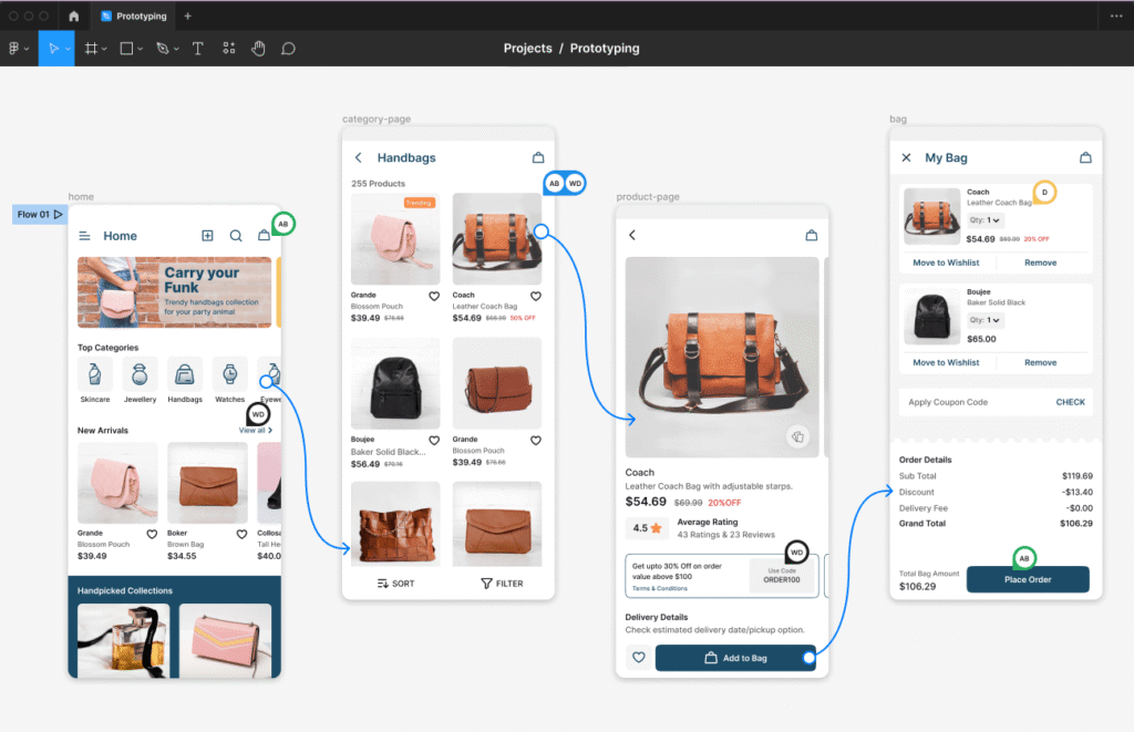
Working with Figma
Figma has revolutionized UI design through its real-time collaboration features. You can work simultaneously with team members on the same file, eliminating version control headaches.
Getting started with Figma is straightforward:
- Create components for reusable UI elements
- Utilize auto-layout for responsive designs
- Leverage the constraint system for different screen sizes
Figma’s prototype features allow you to create interactive mockups that simulate the final app experience. This helps stakeholders visualize the product before development begins.
The vast community-built plugin library extends Figma’s functionality. Tools like Autoflow help map user journeys, while UI Faces quickly adds realistic avatars to your designs.
Figma’s browser-based nature means you can access your designs from any computer without installation, making it particularly valuable for remote teams.
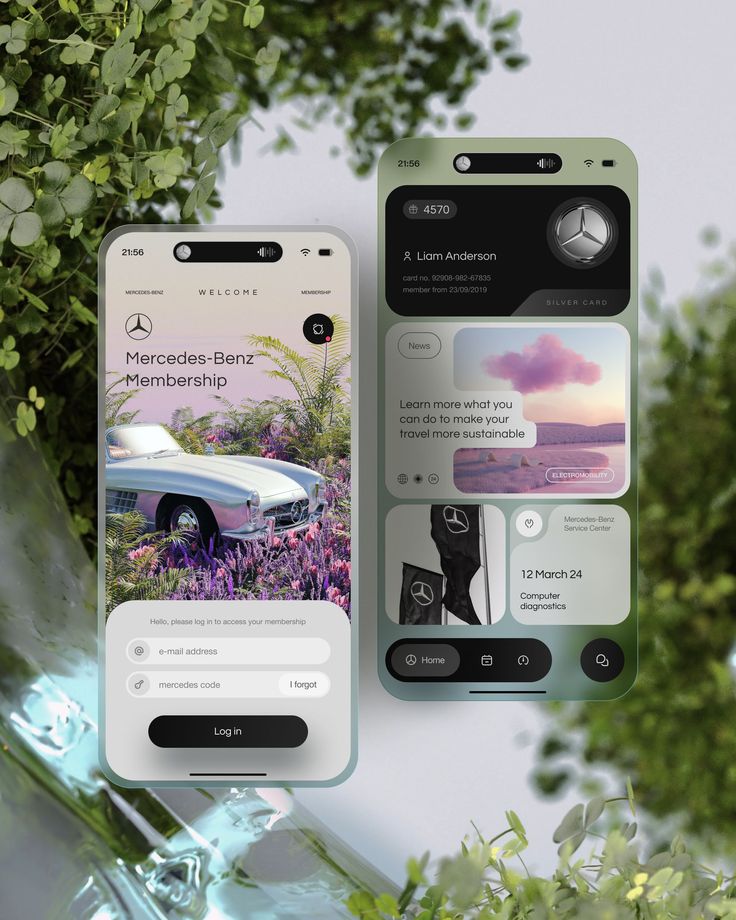
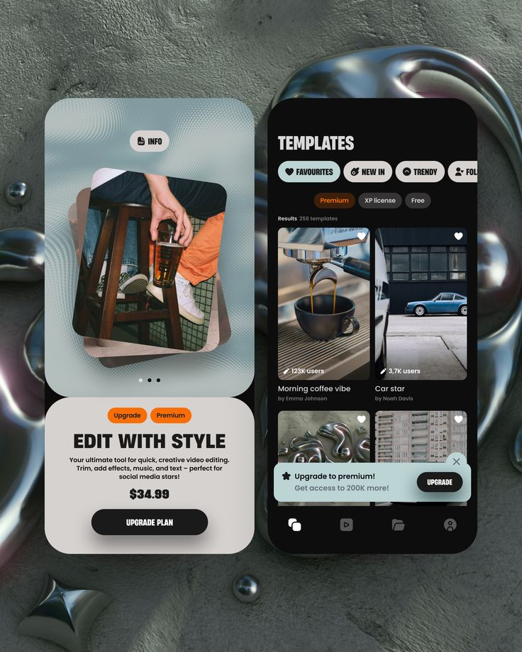
Best Practices and Patterns
Mobile UI design requires careful attention to established patterns and efficient implementation methods. Following proven practices can dramatically improve user experience while reducing development time.
Design Patterns for Mobile Interfaces
Navigation patterns form the foundation of mobile interfaces. The tab bar pattern places key functions at the bottom of the screen for easy thumb access, while hamburger menus hide secondary options to preserve screen space. Card layouts present information in digestible chunks that work well with touch interactions.
For data input, consider floating labels that minimize space while guiding users. Toggle switches provide clear binary choices, while segmented controls offer multiple options in a compact format.
Gesture patterns have become standard expectations. Users anticipate pull-to-refresh, pinch-to-zoom, and swipe actions. Implementing these familiar interactions reduces cognitive load and increases usability.
Key mobile-specific patterns include:
- Bottom sheets for contextual actions
- Skeleton screens during loading
- Floating action buttons for primary actions
Using Templates Effectively
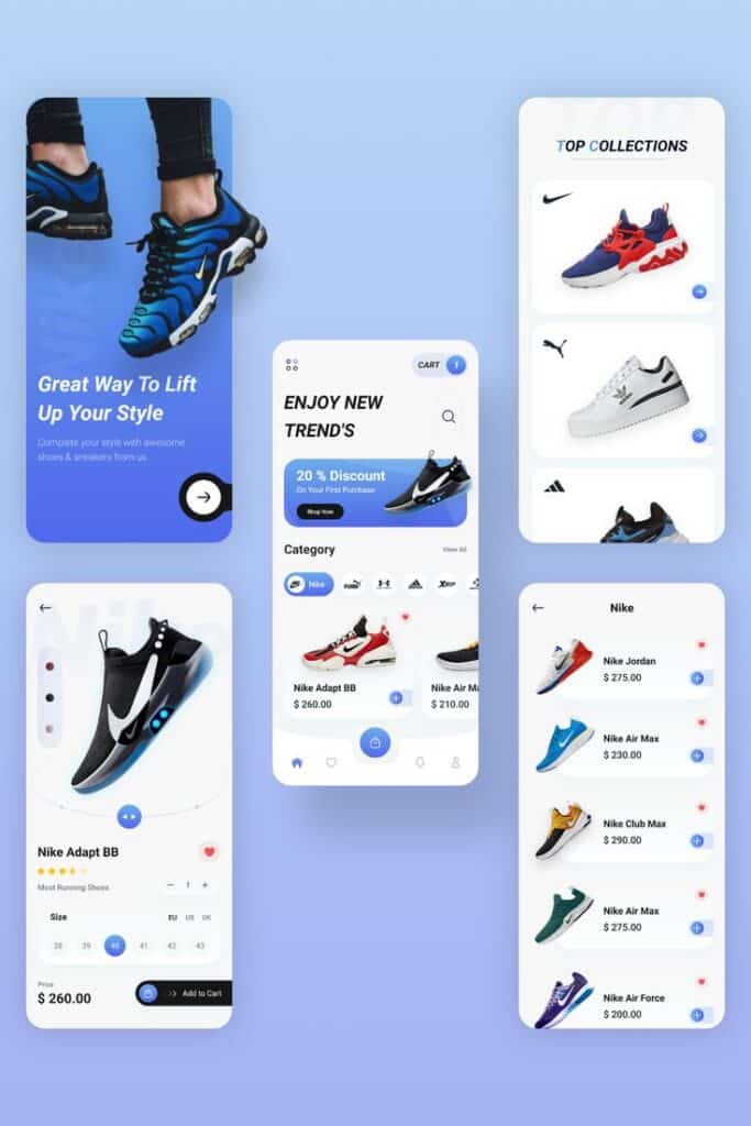
Templates accelerate the design process while ensuring consistency across your application. Pre-built UI kits provide component libraries that maintain visual coherence and follow platform conventions.
When selecting templates, prioritize those designed specifically for your target platform. iOS and Android have distinct design languages—Material Design for Android and Human Interface Guidelines for iOS.
You should customize templates to reflect your brand identity without sacrificing usability. Modify color schemes and typography while preserving established interaction patterns and component behaviors.
Many design tools offer responsive templates that automatically adapt to different screen sizes. This approach saves time when designing for both phones and tablets with the same visual language.
Remember to test template implementations with real users. Even well-designed templates may require adjustments based on your specific audience needs.
Advanced Considerations in Mobile UI Design
As mobile interfaces evolve, designers must look beyond basic functionality to create truly exceptional experiences. The following areas represent crucial advanced considerations that differentiate good mobile UI design from great design.
Accessibility and Inclusivity
Designing for all users is no longer optional but essential for mobile UI success. You should implement alternative text for images to support screen readers and ensure your app works for visually impaired users. Color contrast ratios must meet WCAG standards (minimum 4.5:1 for normal text) to accommodate color-blind users and various lighting conditions.
Voice control integration and keyboard navigation alternatives provide options for users with mobility limitations. Testing your design with assistive technologies before launch helps identify potential barriers.
Consider cultural inclusivity by avoiding potentially offensive symbols or color associations that vary across cultures. Typography should scale appropriately for users who need larger text sizes without breaking your layout.
User testing with diverse participants, including those with disabilities, provides invaluable insights you might otherwise miss.
Trends and Future Directions
Gesture-based navigation continues to replace traditional buttons, requiring you to design intuitive swipe patterns and provide clear visual feedback. Incorporate haptic feedback to enhance the physical dimension of digital interactions, creating a more satisfying user experience.
Dark mode implementation has moved from trend to expectation, requiring careful color palette planning for both light and dark versions of your UI. Adaptive designs that respond to user preferences and environmental conditions will become increasingly important.
Voice UI integration is growing rapidly—you should consider how voice commands can complement touch interactions in your designs. Augmented reality elements are becoming more mainstream in mobile applications, especially for shopping, navigation, and educational experiences.
Microinteractions that provide subtle feedback and animation add personality to your interface when used judiciously. Focus on creating moments of delight without compromising performance or accessibility.
- 1.6Kshares
- Facebook0
- Pinterest1.6K
- Twitter3
- Reddit0


