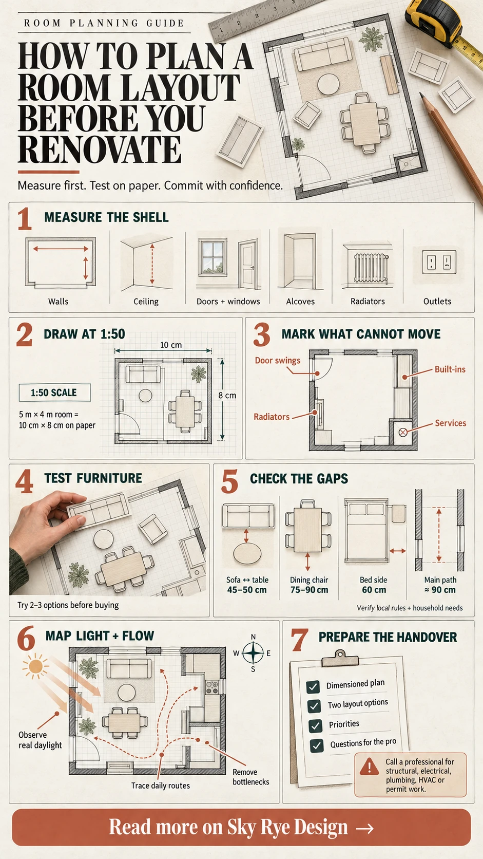
Here is how to plan a room layout before you renovate: measure the shell first, draw it at a consistent scale, mark every fixed constraint, and test furniture only after doors, windows, radiators, outlets, and circulation routes are visible. A simple sketch exposes layout conflicts while changes still cost only pencil marks—not new furniture, contractor time, or reordered materials.
This homeowner-focused method does not require polished architectural drawing. You need accurate dimensions, a ruler or grid paper, and two or three layout options that you can compare for fit, light, movement, and daily use. Use the floor plan to check what fits, then a quick perspective sketch to judge height, balance, and sight lines.
| Step | What to record | Decision it supports |
|---|---|---|
| 1. Measure the room | Walls, ceiling, openings, alcoves, and fixed services | Creates an accurate shell |
| 2. Draw to scale | Use one scale for the room and every object | Shows what genuinely fits |
| 3. Mark constraints | Door swings, radiators, outlets, and built-ins | Prevents blocked access |
| 4. Test furniture | Move scaled paper templates through several options | Compares layouts without redrawing |
| 5. Review movement and light | Trace daily routes and note sun direction | Checks comfort at different times |
| 6. Prepare the brief | Preferred option, alternatives, priorities, and questions | Gives a designer or contractor useful evidence |
- How to Plan a Room Layout Before You Renovate
- Drawing a Usable Floor Plan: Scale, Proportion, and What to Mark First
- Scale and Proportion: The Design Principles That Make Rooms Feel Right
- Light and Traffic Flow: The Two Invisible Constraints
- Moving to Three Dimensions: One-Point Perspective for Interior Spaces
- When Your Sketch Is Ready: Briefing a Designer With Your Drawings
- The Sketch Is the Beginning, Not the End
- Related room-planning and sketching guides
- Room Layout Planning FAQ
Architectural sketching for home planning is simply a way to move spatial decisions onto paper before committing to them in the room. It reveals the radiator behind a sofa, the door swing that clips a chair, or the route that becomes too narrow once storage is added. The drawing can be rough; the measurements and relationships need to be clear.
This guide covers the specific techniques that matter for interior planning: how to draw a usable floor plan, how to establish scale correctly, how to think about light and traffic flow before furniture placement, how to use perspective to visualise vertical space, and when your sketches are ready to hand over to a professional who can take them further than you can alone.
How to Plan a Room Layout Before You Renovate
Every renovation project has two phases: the phase where changes are free and the phase where they’re expensive. In the free phase — which is entirely on paper — you can move walls, relocate the sofa, rotate the dining table, and discover that the layout you were certain would work creates a traffic bottleneck between the kitchen and the back door. In the expensive phase — which is everything that happens after you’ve ordered materials, hired contractors, or bought furniture — the same changes cost money, time, and often significant disruption.
The sketch is the tool that keeps you in the free phase longer. Not because it prevents you from making decisions, but because it allows you to make more of them — quickly, reversibly, at zero cost — before the physical and financial commitments begin.
A homeowner who has sketched three different furniture arrangements for their living room and evaluated each one against the actual dimensions of the room has made a better decision than one who ordered the first arrangement that looked good on a showroom floor. The quality of the decision isn’t about talent. It’s about having externalised the problem onto paper, where it can be evaluated rather than imagined.
The other value of sketching is that it makes you a better client. Whether you are working with an architect, contractor, or interior designer, a rough dimensioned plan communicates spatial priorities more precisely than a list of style preferences. Compare your options with the practical sequence in our guide to arranging furniture in a new apartment, then use the sketch to show which routes, views, and daily activities must remain protected.
If a flat plan is hard to interpret, move from the sketch to a simple model or rendering. Our guide to taking a project from sketch to 3D space explains what a three-dimensional view can reveal before finishes and furniture are approved.
Planning note: Before drawing furniture, measure the walls, doorways, window openings and sill heights, alcoves, radiators, and electrical outlets. Write dimensions directly onto the plan. A sketch without dimensions is a picture; a sketch with dimensions is a planning document.
Drawing a Usable Floor Plan: Scale, Proportion, and What to Mark First
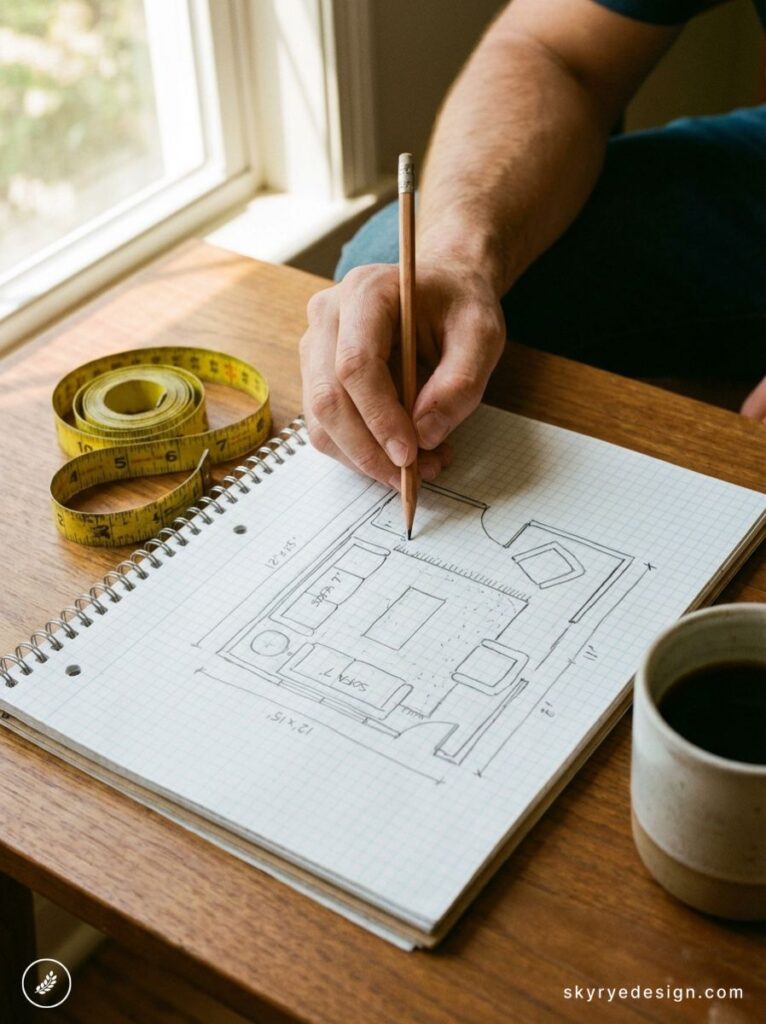
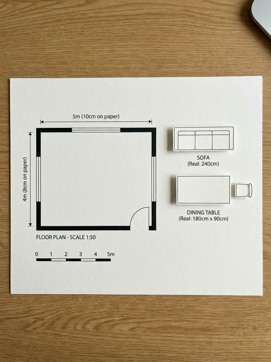
A floor plan is a top-down view of a room in which every element uses the same proportional relationship to its real dimensions. A practical scale for many residential-room sketches is 1:50, where 1 centimetre on paper represents 50 centimetres in reality. At that scale, a 5m × 4m living room becomes a 10cm × 8cm rectangle on A4 paper. For a simple measuring and drawing sequence, see the Center for Architecture’s floor-plan sketching guide.
The Correct Drawing Sequence
The most common floor plan mistake is drawing furniture before drawing constraints. The correct sequence: structure first, then fixed elements, then furniture last. Draw the walls first, including their thickness (typically 100-150mm for internal walls, 250-300mm for external walls). Mark windows as gaps in the wall with thin lines indicating the glass pane. Mark doors as gaps with a quarter-circle arc showing the swing direction — this arc defines the zone that must remain clear, which is one of the most frequently overlooked constraints in furniture planning.
Once structural walls are drawn, mark fixed elements that cannot move: the fireplace, any built-in shelving, the kitchen island if present, bathroom fixtures. Then mark services: electrical outlets (small squares on the wall), light switches, radiator positions. Only after all of these constraints are mapped should you begin testing furniture placement — because furniture placed before constraints are known will almost certainly need to move when the constraints become apparent.
Furniture as Paper Cutouts
The most practical technique for testing furniture placement in a scale floor plan: cut out paper rectangles at the same scale as your furniture and physically move them around on the plan rather than drawing and erasing. A three-seat sofa at 1:50 is a rectangle approximately 4.8cm × 1.8cm. A dining table for six is approximately 3.6cm × 1.8cm. This physical manipulation is faster than drawing, requires no erasing, and allows you to try ten arrangements in the time it would take to draw and erase three.
Use product measurements whenever possible rather than treating standard dimensions as universal. As rough placeholders, a three-seat sofa may be 220–240cm wide and about 90cm deep; a six-person dining table may be around 180cm × 90cm; and a queen bed is commonly 160cm × 200cm in many markets. Test a generous circulation zone first, then verify the final route against household needs, local rules, and the actual products. For accessible routes in covered U.S. facilities, the U.S. Access Board guide specifies 36 inches (915mm) of continuous clear width, with limited exceptions; this is an accessibility reference, not a universal residential-room rule.
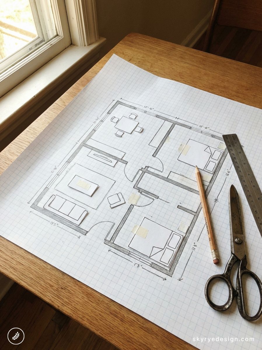
Planning note: Evaluate the layout against the people who will use it—not only the dimensions of the empty room. Include room to open drawers, pull out dining chairs, make the bed, carry laundry, and move through the space with shopping bags, mobility aids, or children.
Scale and Proportion: The Design Principles That Make Rooms Feel Right
A room can have excellent furniture, good materials, and interesting architectural features and still feel wrong. The problem is often relational: pieces work in isolation but not in proportion to one another, the ceiling height, or the available negative space. If you need a visual reference for line weight, scale, and spatial notation, browse these architecture sketch examples before refining your plan.
Room Proportions and the 60-30-10 Rule
The 60-30-10 rule is a useful colour-planning heuristic rather than a fixed formula: roughly 60% dominant colour, 30% secondary colour, and 10% accent. Apply it after the layout works. Use the largest surfaces for the dominant family, medium-scale furniture and textiles for the secondary family, and reserve accents for smaller pieces. Our interior design drawing guide shows how to develop the room visually, while this page stays focused on decisions that should be settled before renovation.
Ceiling Height and Vertical Proportion
Floor plan sketches show horizontal relationships but miss vertical ones. A room with a 2.4m ceiling requires different furniture and lighting choices than the same floor area with a 3m ceiling. Tall furniture in a low-ceilinged room makes the ceiling feel lower. Low furniture in a high-ceilinged room makes the room feel cavernous. Mark the ceiling height on your floor plan sketch as an annotation, and when you move to a perspective drawing, check that your furniture selections are proportionally appropriate to the ceiling height — not just to the floor area.
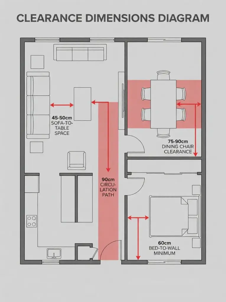
The Clearance Dimensions That Define Comfort
- Main circulation paths: Start with about 90cm where the room permits, then test the route against the people, objects, and mobility needs in your household. Confirm regulated projects against local requirements.
- Sofa to coffee table: 45-50cm — close enough to reach drinks and books without effort; far enough to cross comfortably.
- Dining chair clearance: 75-90cm from table edge to wall — enough space for a chair to be pushed out and for a person to walk behind a seated diner.
- Bed to wall or wardrobe: 60cm minimum on the non-primary side; 90cm on the primary side where you dress and make the bed.
- Kitchen work zones: Map the refrigerator, sink, hob, preparation surface, storage, and main route together. Use our kitchen floor-plan guide to compare zone-based layouts instead of forcing every kitchen into one triangle formula.
Light and Traffic Flow: The Two Invisible Constraints
Mapping Natural Light
On the plan, mark north, south, east, and west, then note which windows receive direct sun at the times the room is normally used. Orientation matters, but nearby buildings, trees, overhangs, latitude, and season can change the result, so observe the real room instead of relying on a compass alone. Position work surfaces to control glare, protect light-sensitive artwork, and test seating views in daylight. For the decorative layer that comes after the layout, see our living-room decor guide.
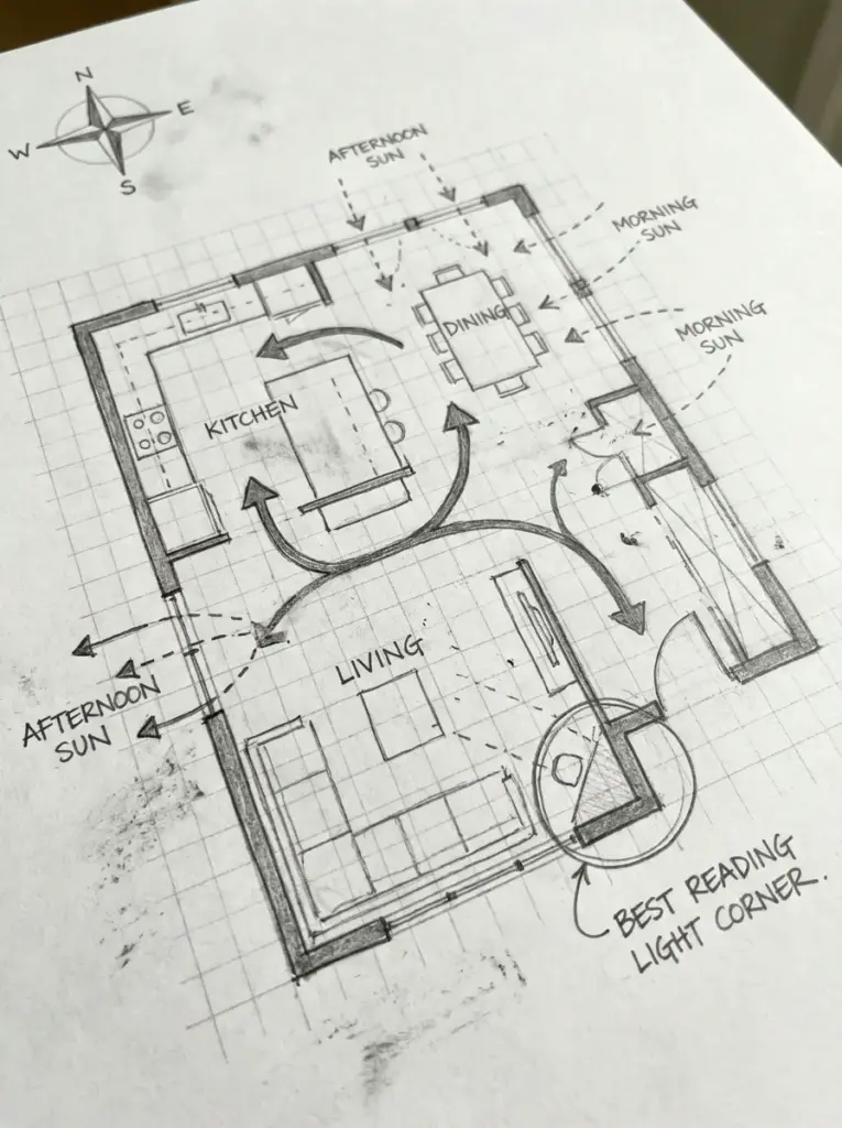
Mark how light moves across the room at different times of day with simple arrows and time annotations on your floor plan. A room that receives direct sun from 8am to noon across its east wall will have very different light conditions at midday than at 4pm. This seasonal and diurnal variation should influence both furniture placement and material selection — highly polished surfaces that look beautiful in morning light may create uncomfortable glare in afternoon sun.
Traffic Flow as a Design Constraint
Traffic flow — the paths people naturally take through a space — is the most frequently violated constraint in residential interior planning. Draw arrows on your floor plan showing the routes between: the main entrance and the kitchen; the kitchen and the dining area; the living area and the access to bedrooms or bathrooms; any secondary access points. Every furniture arrangement should be tested against these routes before it’s considered viable. An arrangement that creates a 60cm bottleneck on the route between the kitchen and the dining table is not a comfortable arrangement, regardless of how well the individual pieces are proportioned to each other.
Moving to Three Dimensions: One-Point Perspective for Interior Spaces
The floor plan shows you what fits. The perspective drawing shows you what it feels like. The two drawings together give you a complete picture of a space that neither can provide alone — the floor plan shows spatial relationships and dimensions; the perspective shows vertical relationships, light quality, and the visual experience of moving through the room.
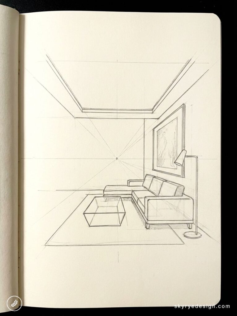
How to Draw a Room in One-Point Perspective
- Draw a rectangle representing the back wall of the room in its correct proportions (width to height ratio). For a room 4m wide with 2.6m ceilings, the rectangle’s width should be approximately 1.5× its height.
- Place a single dot — the vanishing point — near the centre of the back wall rectangle. This represents the viewer’s eye level, typically 1.5-1.6m above the floor.
- Draw lines from each corner of the back wall rectangle to the vanishing point. These four lines become the ceiling plane (top two lines), floor plane (bottom two lines), and side walls (the lines themselves).
- Establish the room’s depth by drawing a vertical line across the converging lines — this line defines where the side walls end and the viewer’s position begins.
- Add furniture as boxes — all horizontal edges of furniture run parallel to the vanishing point lines, all vertical edges remain vertical. A sofa is a low wide box; a dining table is a slightly taller narrower box with thinner legs.
- Add windows and doors on the back wall as rectangles, and on the side walls as trapezoids whose sides follow the vanishing point lines.
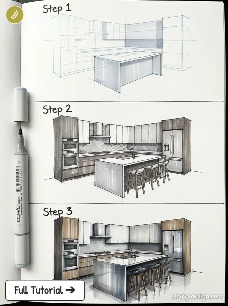
One-point perspective is usually enough for a quick interior-planning view because it uses one fixed viewpoint and one vanishing point. It helps compare vertical relationships that the floor plan cannot show, although objects near the edges may appear distorted. Adobe’s official explanation of one-, two-, and three-point perspective is a useful reference; our step-by-step perspective drawing tutorial provides a longer practical exercise.
Planning note: The most common one-point perspective mistake: placing the vanishing point too high or too low on the back wall. The vanishing point represents the viewer’s eye level — for a standing adult, that’s approximately 1.6m; for a seated adult, approximately 1.1m. In a room with 2.6m ceilings, a standing-viewer vanishing point should sit about 60% of the way up the back wall rectangle. A vanishing point at the centre (50%) produces a slightly bird’s-eye view; too high produces a worm’s-eye view. Match the vanishing point height to the viewing experience you want to evaluate.
When Your Sketch Is Ready: Briefing a Designer With Your Drawings

There’s a specific point in the planning process where a homeowner’s sketch has done everything it can do and professional expertise becomes the faster and more economical path forward. That point is not the beginning of the process — arriving at a designer’s studio with no sketch and no spatial thinking transfers all the discovery work to the professional’s fee. But it’s also not the end — carrying a sketch to completion without professional input misses the expertise in specification, spatial optimisation, and supplier relationships that designers bring to a project.
The sketch’s job is to communicate lifestyle priorities and spatial preferences clearly enough that a professional can test them. A dimensioned floor plan with two furniture options, light notes, circulation routes, and a short priority list gives the designer a brief they can challenge and develop. It should not prescribe structural, electrical, plumbing, or code-sensitive work.
What to Include in a Sketch Handover
- Dimensioned floor plan: All walls, doorways, windows, and fixed elements with measurements marked.
- Furniture placement options: At least two tested arrangements with clearance dimensions checked. Notes on which you prefer and why.
- Light annotations: Window orientations, times of peak sun, any problematic glare conditions you’ve observed.
- Traffic flow: The key routes through the space, any bottlenecks identified.
- Priority zones: Mark which area matters most—the dining table, reading corner, work zone, play area, or accessible route—so the designer knows which function should lead the plan.
- Reference images: Not as mandates, but as indicators of aesthetic direction. A few images showing materials, colours, or spatial atmospheres you’re drawn to.
The designer’s job is not to execute your sketch. It’s to take the spatial intentions your sketch communicates and translate them into specific products, materials, spatial adjustments, and technical decisions that your sketch couldn’t have reached alone. The better your sketch, the faster and more precisely that translation happens — and the more the result reflects the home you were imagining when you first picked up the pencil.
The Sketch Is the Beginning, Not the End
A useful room plan does not need to look presentation-ready. Its job is to show the room accurately, keep constraints visible, and make alternatives easy to compare. Treat crossed-out arrangements as evidence that the sketch is doing its work before money is committed.
None of the techniques in this guide require art school. They require a tape measure, some grid paper, a pencil, and the discipline to measure before you commit. The floor plan before the showroom visit. The perspective sketch before the paint chip decision. The traffic flow arrows before the furniture placement. That sequence — drawing before doing — is the habit that prevents expensive mistakes and produces interiors that feel considered rather than assembled.
Start with one room. Measure it completely. Draw the walls. Mark the fixed elements. Cut out paper furniture. Move the furniture around until the clearances work and the light makes sense. Then — and only then — start looking at products.

Related room-planning and sketching guides
- Refine linework and depth with these interior sketching tips for perspective and detail.
- Compare the sketch with a finished visualization in our guide to moving from sketch to 3D space.
Room Layout Planning FAQ
Q: Do I need drawing skills to plan a room layout?
No. Interior sketching for planning is about spatial communication, not artistic quality. A rough floor plan drawn to approximate scale on grid paper is entirely sufficient for planning furniture placement, traffic flow, and zone relationships. Professional designers regularly work from rough client sketches — what matters is that the spatial intentions are clear, not that the drawing looks polished.
Q: What scale should I use for a floor plan sketch?
1:50 is the most practical scale for residential floor plans — 1cm on paper represents 50cm in reality. At this scale, a 5m × 4m living room fits as a 10cm × 8cm rectangle on A4 paper. Cut out paper furniture rectangles at the same scale and move them physically around the plan rather than drawing and erasing — this is significantly faster for testing multiple arrangements.
Q: What is one-point perspective for interior sketching?
One-point perspective is a drawing technique where all horizontal lines in the room converge to a single vanishing point on the horizon line. Draw the back wall as a rectangle, place the vanishing point near its centre, draw lines from each corner to the vanishing point — these become your ceiling, floor, and side walls. Add furniture as boxes whose horizontal edges follow the vanishing lines. It requires only a ruler and pencil and produces a credible three-dimensional interior view without specialist software.
Q: What should I mark on a floor plan before placing furniture?
Mark in order: (1) structural walls with thickness; (2) windows with sill height; (3) doors with swing arc; (4) fixed unmovable elements; (5) electrical outlets and radiators. Only after all constraints are mapped should furniture placement begin. Constraints placed after furniture placement almost always require rearrangement.
Q: When should I involve a professional designer?
When the renovation involves structural changes, plumbing or electrical reconfiguration, or when the budget is significant enough that specification errors would be costly. Your sketches remain valuable when working with a professional — they communicate spatial preferences and lifestyle priorities more precisely than verbal descriptions. A developed sketch brief produces a better first meeting and a faster, more accurate result.
- 341shares
- Facebook0
- Pinterest341
- Twitter0
- Reddit0