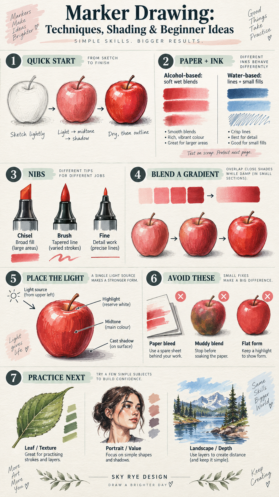
Marker drawing starts with a light sketch, a small set of colors, and paper that suits your ink. Lay in the lightest areas first, add midtones, then place shadows once the shape reads clearly. Alcohol markers make quick, soft transitions; water-based markers suit line work and smaller color areas. Test both on a scrap of the same paper before you commit to a drawing.
How to Draw With Markers: A Quick Start
Choose one simple subject—an apple, a leaf, or a mug—and decide where the light comes from. Sketch its outline lightly. Keep a white patch for the highlight, fill the largest shapes with your palest marker, and add a midtone on the side turned away from the light. Use a darker marker only for the cast shadow and deepest folds. Let the ink dry before adding crisp outlines.
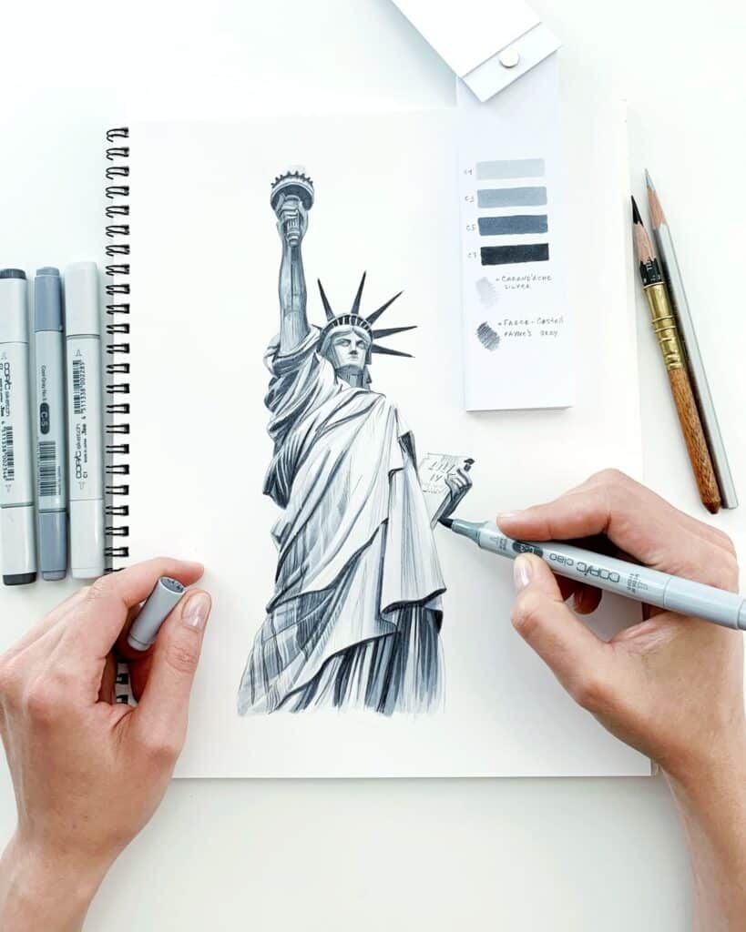
- Make three swatches from light to dark on the paper you will use.
- Color each shape in small sections, overlapping neighboring strokes while they are still wet if you want a softer edge.
- Step back and check the silhouette and value contrast before adding fine detail.
Marker Drawing Materials and First Steps
To draw effectively with markers, you need to choose the right tools, understand different types of markers, and master essential techniques. These elements work together to help you create clean, vibrant artwork with control and precision.
Essential Tools and Materials
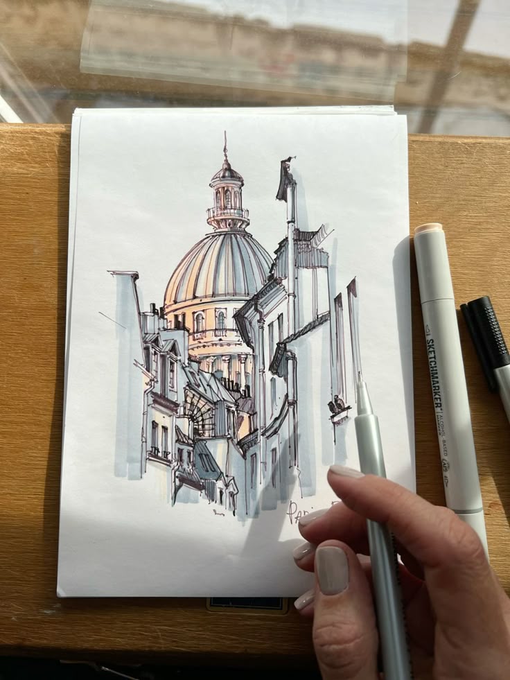
Start with a light pencil, a few drawing materials, and paper suited to your ink. Alcohol markers blend while wet, but even thick paper can let ink show through. Try smooth marker paper for controlled edges and place a spare sheet underneath your drawing.
Water-based markers are useful for small sketches and line work. Heavy layering may roughen ordinary paper, so test a light pass before filling a large area.
Keep scrap paper for swatches, and use a fineliner only after checking that its ink will not smear under your markers. A colorless blender can push alcohol ink and lift a small highlight; it does not automatically erase a hard edge.
Types of Markers
For this workflow, the main choice is alcohol-based or water-based ink. Alcohol markers can blend neighboring strokes before they dry. Smooth marker paper helps keep edges controlled, but use a protective sheet underneath.
Water-based markers vary by formula: some reactivate with water, while others are best for crisp lines or flat color. They may raise the paper fibers if you scrub one spot. Check the manufacturer’s handling guidance for either ink type.
A chisel nib covers broad shapes; a brush nib tapers from thick to thin; a fine nib handles small lines. For a closer look at solvent-based layers, see this guide to drawing with alcohol markers.
| Choice | Best starting use | Watch for |
|---|---|---|
| Alcohol marker + smooth marker paper | Soft gradients and large color areas | Show-through; protect the next page |
| Water-based marker + sturdy smooth paper | Lines, patterns, and small flat shapes | Paper pilling after repeated wet passes |
| Brush nib / chisel nib | Curved edges / broad even fills | Uneven edges if the nib lifts mid-stroke |
Key Marker Drawing Techniques
When drawing with markers, layering colors is the foundation. Start with light colors and gradually add darker tones to build depth and shadows. Use short, even strokes to avoid streaks and maintain consistency.
For alcohol markers, overlap two close shades while both areas are damp; a colorless blender is better for pushing or lifting ink than for making every transition seamless. Water-based markers behave differently, so test a damp brush only if that marker is designed to reactivate.
Textures can be created by varying stroke direction or using stippling techniques. Controlling ink flow avoids bleeding, especially when working near detailed line art. Allow layers to dry before applying more to prevent unwanted mixing.
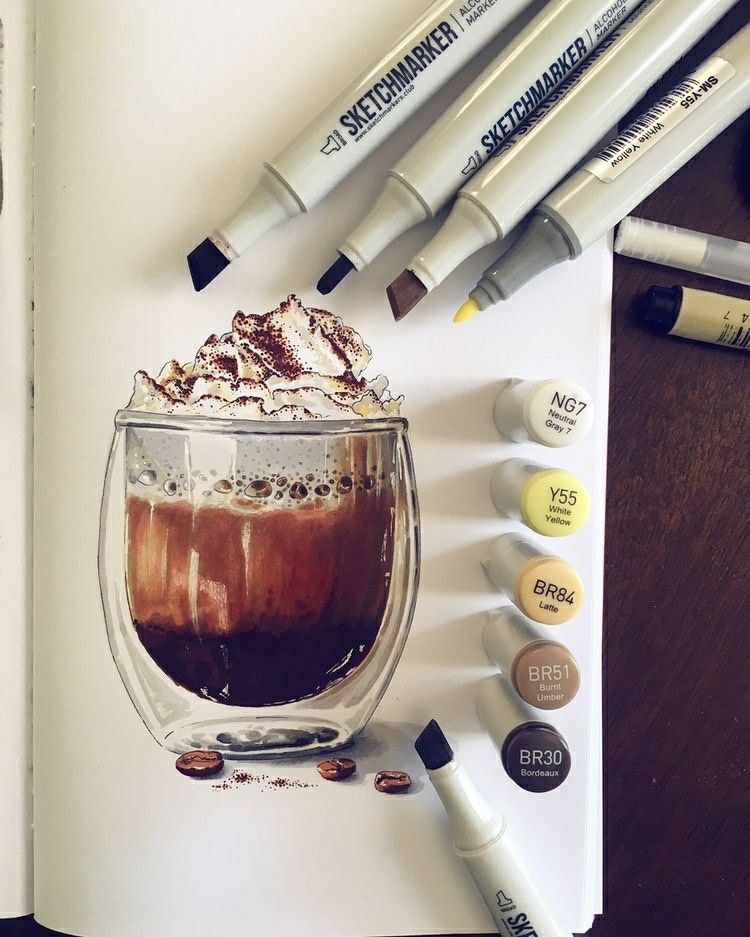
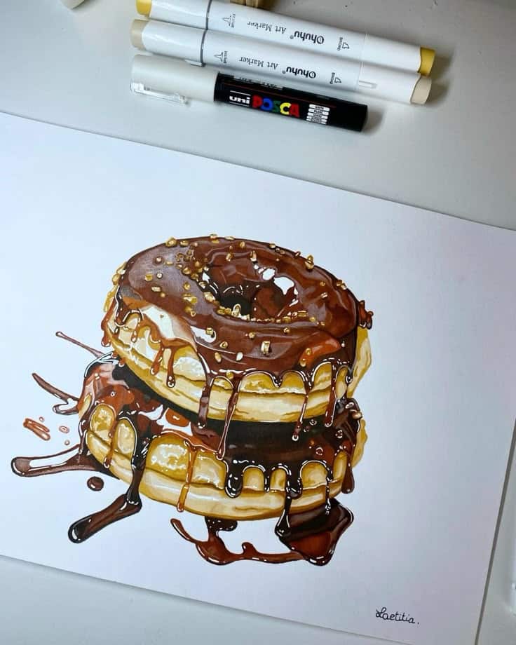
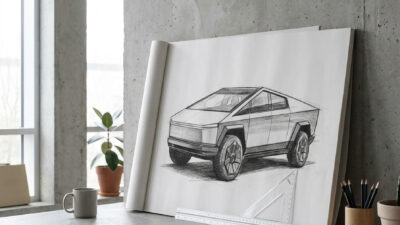
Automotive sketches are a strong test for marker control because the body panels need clean value transitions. If you want a focused practice subject, try to render Lexus car sketches with markers: keep the construction lines pale, then use warm and cool grays to separate glass, paint, grille mesh, and cast shadow.
Blending and Shading Methods
Mastering blending and shading is essential to enhance your marker drawings with smooth transitions and realistic depth. Using the right techniques helps you control color flow and layer tones effectively, creating vivid and dynamic images.
How to Blend Colors Effectively
For a soft alcohol-marker edge, choose two neighboring values. Put down the lighter one, touch in the darker one, then pass the lighter nib once over the join while the ink is damp. Work on a small patch so the edge does not dry before you reach it.
Test the blend on scrap first. A colorless blender can move color outward or make a lighter spot, but too many passes may leave a pale halo; overlapping close shades is usually easier to control.
Work quickly, as most markers dry fast. Blending works best on smooth, marker-friendly paper that allows the ink to move. Practice layering colors in small circles or feathered strokes for better control.
Techniques for Smooth Gradients
Creating smooth gradients involves gradual shifts from one color to another. Begin by laying down the lightest color, then add mid-tones and finally the darkest color towards the area where you want the depth.
Feather the lighter and midtone strokes across the join rather than repeatedly flooding the whole gradient with blender fluid.
Work in small sections while the alcohol ink is damp. To change value, switch to a lighter or darker marker or add a dry layer; pressing harder mostly risks wearing the nib and soaking the paper.
Adding Depth Through Shading
Shading adds volume and dimension to your drawings by emphasizing light and shadow. Identify your light source and apply darker markers where shadows would naturally fall.
Use layering to build darker shades by applying multiple passes, gradually increasing contrast. Flat shading with consistent color can work, but blending helps soften edges and creates a more lifelike effect.
Incorporate complementary color combinations for shadows instead of just grays or blacks. This gives your drawing richness and vibrancy, making your shading stand out.
Advanced Techniques and Effects
You can enhance your marker drawings by applying specific methods that build depth, texture, and dimension. These approaches involve careful line work, strategic layering, and controlled use of light and shadow.
Hatching and Crosshatching
Hatching involves drawing closely spaced parallel lines to represent shading or texture. You control darkness by adjusting line density and thickness. For softer shading, spread the lines farther apart; to darken an area, tighten the spacing or choose a darker nib rather than pressing hard.
Crosshatching uses overlapping sets of parallel lines in multiple directions, such as vertical and diagonal, to deepen shadows. This technique is effective for adding volume and detail without smudging.
Both methods rely on consistent line work. Practice on a simple sphere before moving to complex subjects; these basic drawing techniques and dynamic shading exercises give you a place to compare line spacing.
Layering and Textures
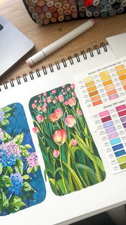
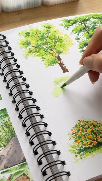
Layering colors allows you to blend shades and create richer tones. Start with light colors, then add darker shades gradually to build depth. Use markers with brush nibs for smoother transitions and blending.
Vary stroke direction and spacing to suggest texture. Short broken marks can describe bark or rough stone; longer strokes following the curve of a leaf or cup help the form read.
Experiment with combining markers and other media, like colored pencils, to enhance texture and detail. Layering also helps prevent streaking and adds dimension to your work.
Creating Highlights and Shadows
To depict realistic light and form, integrate highlights and shadows carefully. Preserve highlights by avoiding coloring over those areas or by using a white gel pen to add reflective spots after coloring.
Place the darkest marks on planes turned away from the light and in contact shadows. Build value with a second pass after testing it on scrap; pressure is a poor substitute for a darker ink.
Using gradients from dark to light creates a three-dimensional effect. Remember, the balance between highlights and shadows shapes the perception of volume in your drawing.
Creative Marker Drawing Ideas
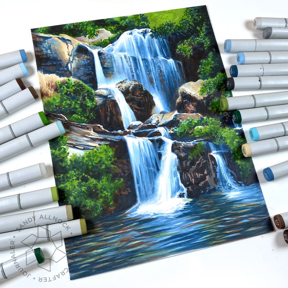
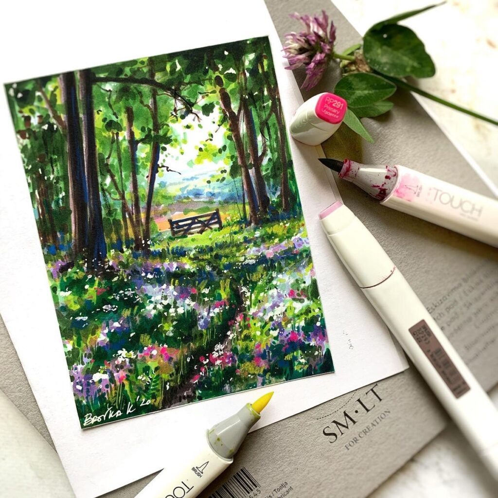
Try a small portrait, a leaf, or a landscape thumbnail. Each subject tests a different skill: skin-tone transitions, repeated texture, or separating near and far shapes by value.
Portraits and Figures
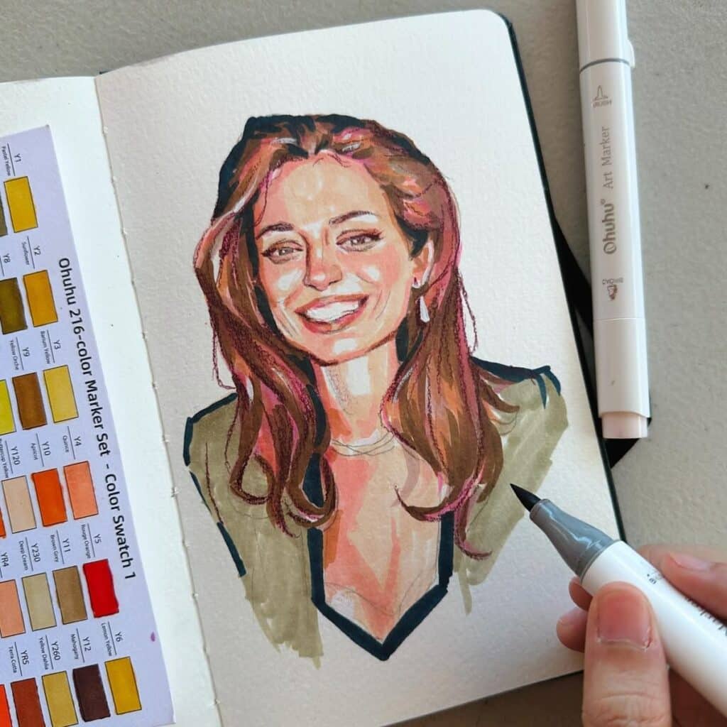
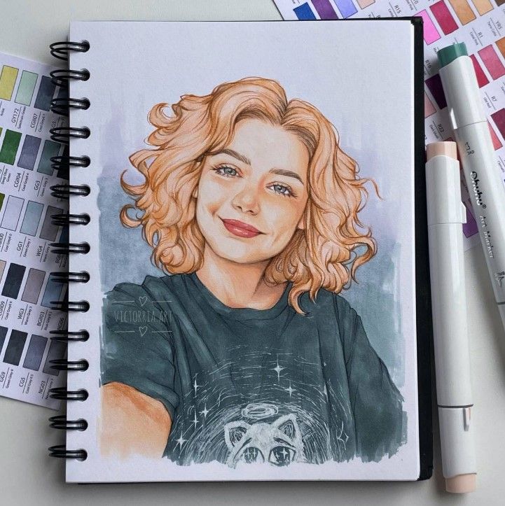
For a portrait, mark the brow, nose, and chin proportions in pencil before adding ink. Keep the brightest paper uncolored and build skin tones from a pale base toward a shadow color. Try a three-marker swatch first; faces show abrupt edges quickly.
Pay attention to details like hair texture and clothing folds. Using a marker with a fine tip can help outline features sharply, while broad tips fill larger areas smoothly. Try experimenting with limited color palettes to maintain balance and avoid overwhelming the portrait.
Landscapes and Nature Scenes
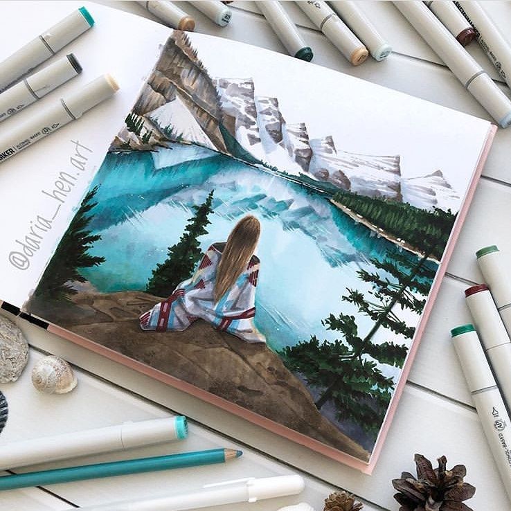
For a landscape, block in the horizon and large shapes before individual leaves. In mountain drawing, paler distant slopes and darker foreground trees help show depth. Save stippled grass and bark marks for the end.
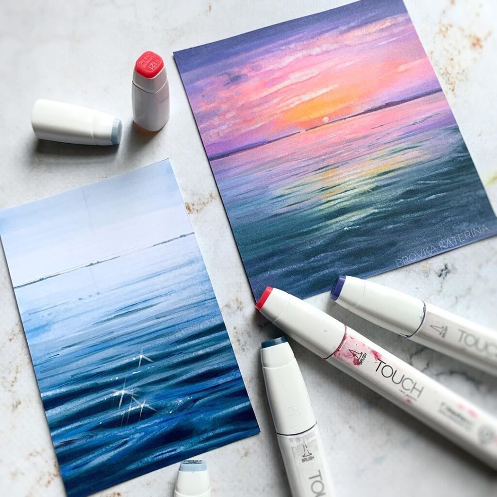
You can combine different markers for skies, foliage, and reflections. To simulate light and shadow, apply darker hues strategically. Experiment with blending between colors on the page or layer transparent colors for a richer effect. Keep your strokes consistent to reflect natural textures.
Pattern and Abstract Designs
Creating patterns and abstracts with markers lets you focus on repetition, symmetry, and color harmony. Use geometric shapes, lines, and dots to design visually appealing forms. Change marker tip sizes for varied line thickness, enhancing the dynamic feel of your work.
Try mixing complementary colors to generate contrast or selecting analogous colors for smoother transitions. With abstract art, layering markers at different opacities can build intricate depths. Repetitive motifs like circles, triangles, or waves work well to establish rhythm in your design.
Pop Art and Comic Inspirations
Markers are ideal for pop art and comic styles because of their bright, bold appearance. Use solid, vivid colors and thick outlines to achieve this look. Halftone dots and speech bubbles are common elements you can incorporate easily with markers.
Use one dark outline weight around the main figure and thinner marks inside it. Leave some paper quiet around a bold focal shape; adding equal detail everywhere can flatten the composition.
Common Marker Drawing Mistakes to Check
- Ink on the next page: Put a spare sheet under the drawing. Thick paper can still show or bleed through.
- Muddy blends: Make a light-to-dark swatch first. Use two close values, blend in a small area, and stop before the sheet becomes soaked.
- Flat forms: Name one light source and reserve clean paper for the brightest highlight. Darken the contact shadow beneath the object.
- Ragged edges: Fill larger shapes with steady overlapping strokes. Let them dry before adding a fine outline.
For a different exercise, use marker doodles to practice steady outlines, then compare sketching techniques and shading basics before tackling a larger composition. A page of quick studies teaches more about nib control than one overworked drawing.
Choosing and Combining Colors
Selecting and combining colors effectively impacts the depth and vibrancy of your marker drawings. Understanding foundational principles, creating palettes that work harmoniously, and using contrasts strategically will enhance your artwork with alcohol-based markers.
Understanding Color Theory
Color theory gives you a framework for mixing and pairing colors. You should familiarize yourself with key concepts like the color wheel, which organizes hues into primary, secondary, and tertiary groups. This structure helps you predict how colors will interact.
Learn about traditional color relationships such as:
- Monochromatic: Variations in lightness and saturation of one hue.
- Analogous: Colors next to each other on the wheel, creating smooth blends.
- Complementary: Colors opposite each other, offering high contrast.
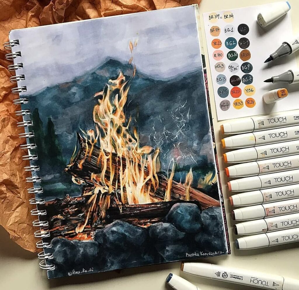
Use these relationships to decide where the eye should land. A single warm accent against cool surroundings can create visual contrast; warm and cool choices can also affect the mood of a palette.
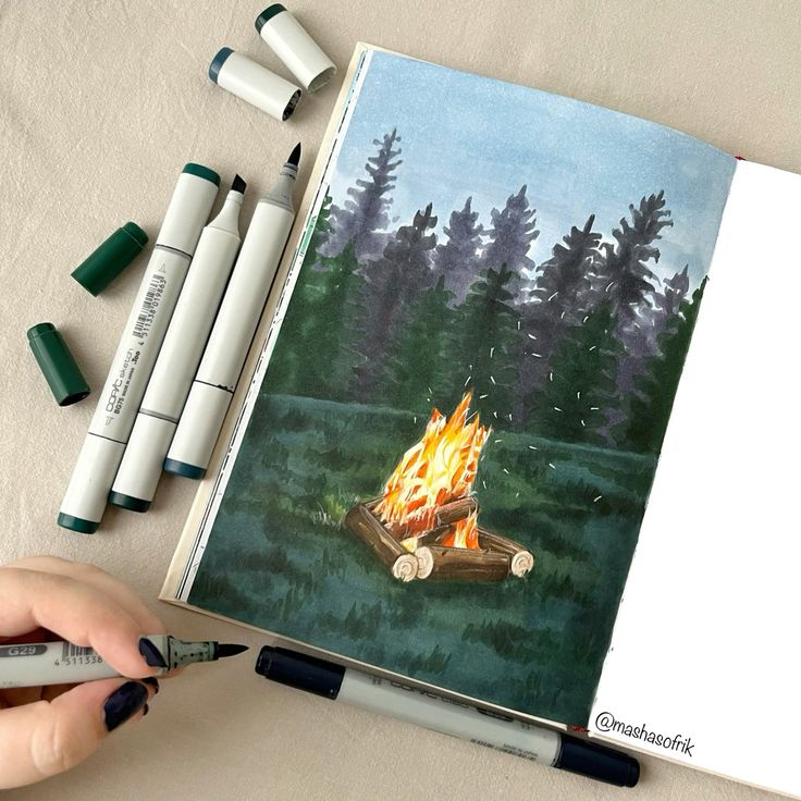
Building Harmonious Palettes
To build palettes that work well together, start by choosing a base color suited to your subject. Then, select additional colors based on the color relationships mentioned earlier. Harmonious palettes reduce visual conflict and make your artwork feel cohesive.
You can organize your palette using simple steps:
| Step | Action |
|---|---|
| 1 | Pick a dominant marker color |
| 2 | Add 1-2 analogous colors for shading or gradients |
| 3 | Include 1 complementary color for highlights or accents |
When working with alcohol-based markers, layering these colors will create smooth blends and texture variation. Limit your palette size to avoid clutter and maintain clarity.
Experimenting With Contrasts
Contrast introduces visual interest and guides the viewer’s eye. Beyond complementary colors, contrast can arise from differences in saturation, value (light vs. dark), and temperature (warm vs. cool).
To use contrasts effectively:
- Use darker marker tones to emphasize shadows or depth.
- Apply brighter, saturated colors for highlights or focal points.
- Mix warm and cool hues to create spatial separation or mood shifts.
Experiment with layering different marker intensities and combining them with colored pencils to add subtle texture. Contrast techniques will help your drawings appear more three-dimensional and vibrant without overwhelming the viewer.
- 648shares
- Facebook0
- Pinterest648
- Twitter0
- Reddit0