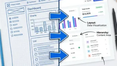
Figma has become the industry standard for UI/UX design, transforming how designers create and collaborate on digital products. This cloud-based design tool combines interface design, prototyping, and team collaboration into a single platform that works seamlessly across devices and operating systems.
Figma enables designers to create high-fidelity prototypes, maintain design consistency through reusable components, and collaborate in real-time with team members and stakeholders. Whether you’re designing mobile apps, websites, or desktop applications, Figma’s vector-based tools and intuitive interface make complex design workflows accessible to both beginners and experienced professionals.
You’ll discover how to leverage Figma’s core features to build professional design systems, create responsive layouts that adapt to different screen sizes, and streamline your design process from concept to handoff. The platform’s collaborative features allow you to gather feedback, iterate quickly, and maintain design consistency across entire product teams.
Key Takeaways
- Figma combines design, prototyping, and collaboration tools in one cloud-based platform for efficient UI/UX workflows
- Design systems and reusable components help maintain visual consistency while speeding up the design process
- Real-time collaboration features enable seamless teamwork and faster iteration cycles throughout the design process

Core Concepts in Figma UI/UX Design
Successful UI/UX design in Figma requires mastering fundamental concepts that bridge user interface creation with user experience strategy. These core principles guide design decisions from initial wireframes to final prototypes.
User Interface and User Experience Fundamentals
User interface design focuses on the visual and interactive elements users encounter when using digital products. You create buttons, menus, forms, and layouts that users directly interact with.
User experience encompasses the entire journey a user takes while interacting with your product. This includes their emotions, perceptions, and responses before, during, and after using your interface.
The distinction between UI and UX is crucial for effective design. UI addresses the surface-level presentation and functionality. UX considers the deeper user needs and behaviors that drive interaction patterns.
In Figma, you translate these concepts into tangible design elements. Your interface components must serve both aesthetic and functional purposes while supporting broader user goals.
Understanding UI/UX Principles
Typography principles form the foundation of readable and accessible interfaces. You must consider font hierarchy, spacing, and contrast to create clear communication pathways.
Visual hierarchy guides users through your interface by establishing importance levels. You achieve this through size variations, color contrast, and strategic placement of elements.
Consistency maintains user confidence by applying uniform patterns across your design. This includes consistent spacing, color usage, and interaction behaviors throughout your interface.
Accessibility ensures your designs work for users with diverse abilities. You implement proper color contrast ratios, keyboard navigation support, and screen reader compatibility.
White space creates breathing room and reduces cognitive load. You use strategic spacing to group related elements and separate distinct sections.
Importance of Usability in Design
Usability determines whether users can effectively accomplish their goals using your interface. You measure this through task completion rates, error frequency, and user satisfaction levels.
Intuitive navigation allows users to find information and complete tasks without confusion. You design clear pathways and logical information architecture to support user mental models.
Responsive design ensures your interface functions across different devices and screen sizes. You create flexible layouts that adapt to various contexts while maintaining usability.
Error prevention and recovery help users avoid mistakes and recover gracefully when problems occur. You implement clear validation messages and provide easy correction methods.
Testing validates your design decisions through real user feedback. You conduct usability tests to identify pain points and optimize your interface for better user outcomes.
Mastering Figma Essentials
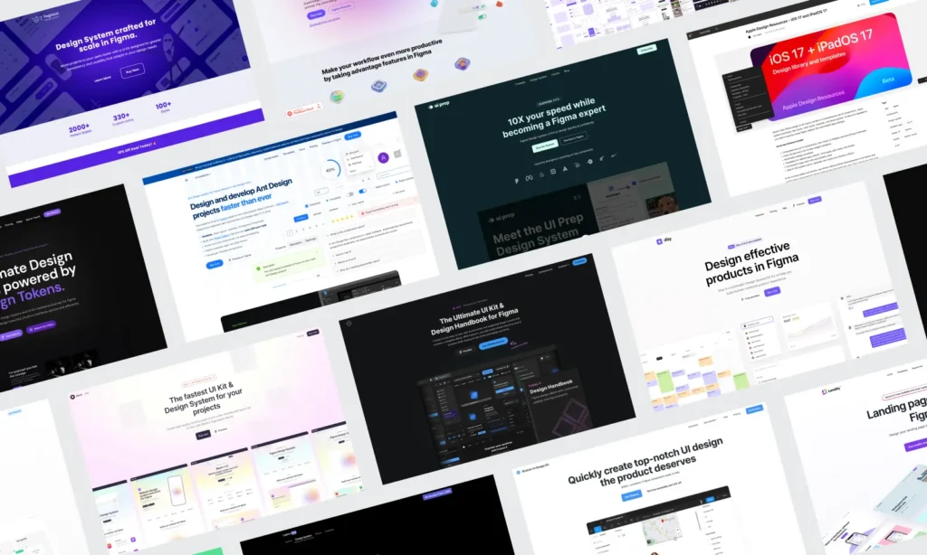
Understanding Figma’s core workspace elements and navigation tools forms the foundation for efficient UI/UX design work. The platform’s frame-based design system and layer management capabilities enable designers to create organized, scalable interface designs.
Figma Workspace Overview
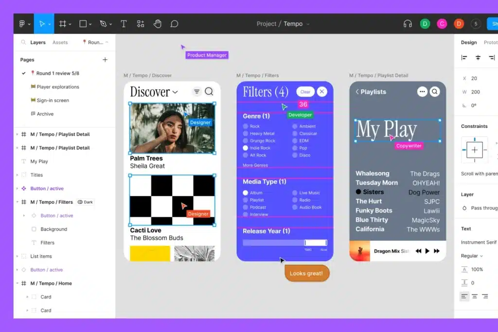
The Figma workspace consists of three main areas: the canvas, the left sidebar, and the right properties panel. The canvas serves as your primary design area where you create and arrange interface elements.
The left sidebar contains your layers panel and assets library. You can view your project structure, manage components, and access design tokens here. The layers panel displays all objects in hierarchical order.
The right properties panel shows settings for selected objects. This includes typography controls, color options, effects, and layout properties. The panel updates dynamically based on your current selection.
The toolbar sits at the top of the interface. It houses essential tools like the selection tool, frame tool, shape tools, and text tool. You can also access version history through the file menu to track changes and restore previous versions.
Navigating Tools and Layers
Figma’s tool selection works through keyboard shortcuts and mouse clicks. Press V for the selection tool, F for frames, T for text, and R for rectangles. These shortcuts speed up your workflow significantly.
The layers panel organizes elements hierarchically. Parent objects contain child elements, creating logical groupings. You can expand and collapse layer groups by clicking the arrow icons.
Renaming layers improves project organization. Double-click any layer name to edit it. Use descriptive names like “header-navigation” or “primary-button” rather than generic labels.
Layer visibility toggles through the eye icon. Lock layers using the padlock icon to prevent accidental modifications. You can also adjust layer opacity and blend modes through the properties panel.
Working with Frames and Artboards
Frames function as containers for your design elements in Figma. They define screen boundaries and enable responsive design behaviors. Create frames using the Frame tool or press F on your keyboard.
Figma offers preset frame sizes for common devices. Choose from iPhone, iPad, desktop, or custom dimensions. The frame picker appears in the right panel when you select the frame tool.
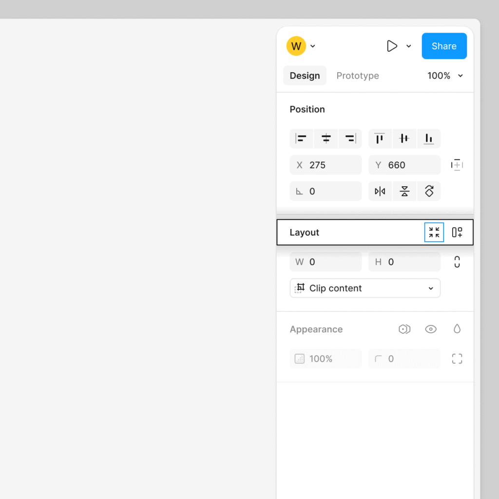
Auto Layout transforms static frames into responsive containers. Enable it through the properties panel to create flexible designs that adapt to content changes. Set spacing, padding, and alignment rules for consistent layouts.
Frames can contain other frames, creating nested structures. This approach works well for complex interface designs with multiple sections. Each frame maintains its own properties and constraints independently.
Building Consistency with Styles and Components
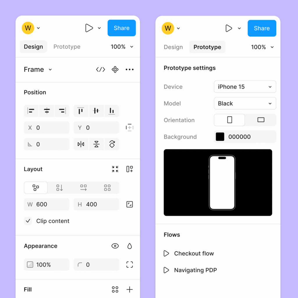
Figma’s styles and components system enables you to create standardized design elements that maintain visual consistency across your projects. These features allow you to define reusable properties and interface elements that automatically update throughout your design files.
Designing and Applying Styles
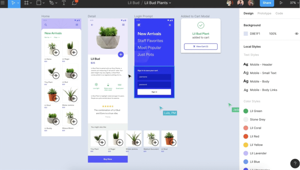
Styles in Figma control the visual properties of your design elements. You can create text styles, color styles, and effect styles that apply consistent formatting across multiple objects.
Create text styles by selecting text and clicking the four-dot icon in the Typography section. Define font family, size, weight, and spacing properties. Name your styles clearly using a hierarchical system like “Header/H1” or “Body/Large”.
Color styles work similarly through the color picker interface. Select any color and click the style icon to save it. Use descriptive names like “Primary Blue” or “Error Red” rather than generic terms.
Apply styles by selecting objects and choosing from the styles panel. When you modify a style, all instances update automatically across your design files. This ensures consistency and saves time during revisions.
Creating and Managing Components
Components are reusable design elements that maintain consistency across your user interface. They serve as master objects that can be duplicated and modified while preserving their core properties.
Create components by selecting design elements and pressing Ctrl+Alt+K (Windows) or Cmd+Option+K (Mac). You can also use the component icon in the toolbar. Name components using clear, descriptive labels.
Set up component variants for different states like hover, active, or disabled. Click the variant icon in the properties panel to create multiple versions within a single component. This approach keeps related elements organized.
Manage components through the Assets panel where you can view all components in your file. Components from your local file appear under “Local components” while shared library components appear separately.
Establishing a Design System
A design system in Figma combines styles and components into a cohesive framework. This system ensures your user interface maintains consistency while allowing for efficient scaling and collaboration.
Start by creating a dedicated design system file containing all your base components and styles. Include buttons, form elements, navigation items, and typography samples. Document usage guidelines within the file using text layers or comment annotations.
Publish your design system as a shared library through File > Publish styles and components. Team members can then access these assets across different projects. Enable notifications to alert users when updates are available.
Maintain your design system by regularly reviewing and updating components. Remove unused elements and consolidate similar components to prevent confusion. Use consistent naming conventions and organize components in logical groups.
Designing Responsive Layouts
Creating responsive layouts in Figma requires mastering layout grids for consistent structure and utilizing auto layout features for dynamic component behavior. These tools enable designers to build user interfaces that adapt seamlessly across different screen sizes and devices.
Implementing Layout Grids
Layout grids form the foundation of responsive design by establishing consistent spacing and alignment across your interface. In Figma, you can create responsive grid systems that automatically adjust to different screen sizes.
Set up column grids with flexible margins and gutters that scale proportionally. Use 12-column grids for desktop layouts and reduce to 4-6 columns for mobile screens. This approach ensures your content maintains proper proportions across devices.
Configure baseline grids to maintain consistent vertical rhythm throughout your design. Set the grid spacing to match your typography line heights, typically 8px or 16px increments.
Grid properties should include:
- Flexible column widths (percentages rather than fixed pixels)
- Adaptive margins (20-40px on mobile, 60-120px on desktop)
- Consistent gutter spacing across breakpoints
Create multiple frame sizes with corresponding grid configurations. This allows you to visualize how your layout adapts at different breakpoints before implementation.
Leveraging Auto Layout
Auto layout enables dynamic component behavior that responds to content changes and screen size variations. This feature automatically adjusts spacing, sizing, and positioning based on predefined rules.
Apply auto layout to containers that need flexible sizing. Set components to fill container width for full-width elements or hug contents for elements that should resize based on content.
Configure constraints to control how elements behave during resizing:
- Left and right constraints for elements that should stretch horizontally
- Top and bottom constraints for full-height components
- Center constraints for elements that should maintain central positioning
Use padding and spacing controls within auto layout to maintain consistent visual hierarchy. Set responsive padding values that scale appropriately for different screen sizes.
Combine auto layout with component variants to create truly adaptive components that change behavior based on screen size or content requirements.
Best Practices for Adaptive Design
Design with mobile-first principles by starting with the smallest screen size and progressively enhancing for larger displays. This approach ensures core functionality remains accessible across all devices.
Create consistent breakpoints that align with common device sizes: 320px (mobile), 768px (tablet), and 1200px (desktop). Test your layouts at these breakpoints to identify potential issues.
Maintain touch-friendly interactions by ensuring buttons and interactive elements meet minimum size requirements of 44px. This prevents usability issues on smaller screens.
Typography scaling should follow proportional ratios across breakpoints. Use Figma’s text styles with responsive sizing to maintain readability on all devices.
Organize your component library with responsive variants for different screen sizes. This streamlines the design process and ensures consistency across your user interface.
Test layouts frequently by resizing frames and previewing designs at various dimensions. This practice helps identify layout issues before development begins.
Enhancing Prototyping and Collaboration
Figma transforms design workflows through advanced prototyping capabilities and seamless multiplayer editing features. Version history tracking ensures teams maintain complete project oversight while building interactive experiences.
Interactive Prototyping Techniques
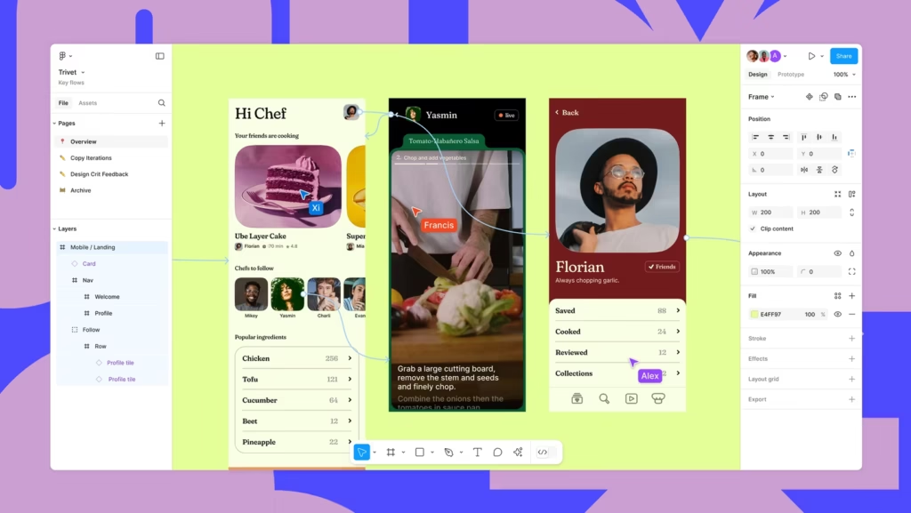
Figma’s prototyping tools enable you to create clickable, interactive designs that simulate real user experiences. You can link frames together using simple drag-and-drop connections between design elements.
The platform supports multiple interaction types including tap, hover, drag, and key press triggers. Each interaction can include custom animations with specific easing curves and duration settings.
Smart Animate automatically creates smooth transitions between frames when objects share the same name. This feature eliminates manual animation work for common interface changes like button states or content updates.
You can add overlays for modal dialogs, dropdown menus, and tooltips without creating separate frames. These overlays maintain proper layering and positioning across different screen sizes.
Component interactions allow you to build reusable interactive elements. Once created, these components maintain their functionality when copied across different pages or projects.
Utilizing Multiplayer Editing
Figma’s multiplayer editing allows multiple team members to work simultaneously on the same design file. You can see real-time cursors and selections from other collaborators as they make changes.
Comments and annotations enable direct feedback on specific design elements. Team members can tag others using @ mentions to ensure important feedback reaches the right people.
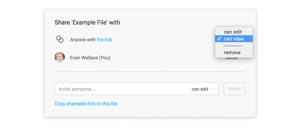
The platform provides granular permission controls for different collaboration levels:
- View only – Browse designs and leave comments
- Edit – Modify design elements and add content
- Admin – Manage file permissions and settings
Live cursors display each collaborator’s name and current activity. This visibility prevents conflicts when multiple people edit the same areas simultaneously.
FigJam integration extends collaboration beyond design files into brainstorming and planning sessions. Teams can seamlessly transition from ideation to actual design implementation.
Tracking Progress with Version History
Figma automatically saves every change made to your design files, creating a comprehensive version history. You can access previous versions through the file menu’s version history option.
Named versions allow you to mark important project milestones with custom labels and descriptions. These snapshots make it easy to return to specific design states or compare different iterations.
The version timeline shows detailed information including who made changes, when they occurred, and what elements were modified. This transparency helps teams understand project evolution and decision-making processes.
Version restoration enables you to revert entire files or copy specific elements from previous versions. You can selectively restore components without losing current work on other design areas.
Branching capabilities let you create experimental variations without affecting the main design file. These branches can be merged back or discarded based on team feedback and testing results.
- 9shares
- Facebook0
- Pinterest6
- Twitter3
- Reddit0

