
Figma UI UX design works best when the file tells the whole product story: the user goal, the rough flow, the screen structure, the reusable parts, and the handoff notes. The tool is powerful, but the file only stays useful when the thinking is visible.
A neat-looking screen is not enough. The interface has to explain where the user is, what they can do next, what happens when something goes wrong, and how the same pattern behaves on another device.
- Key takeaways
- What is Figma UI UX design?
- Figma UI UX design workflow
- Components, variants, and design systems
- Prototyping user flows in Figma
- Responsive layouts and accessibility checks
- Developer handoff in Figma
- Common Figma UI UX design mistakes
- Figma UI UX design FAQ
- What is Figma UI UX design?
- Is Figma used for UI or UX design?
- How do you start a UI UX design project in Figma?
- What should a Figma design system include?
- How do you make a Figma prototype useful?
- What is the difference between wireframes and UI mockups in Figma?
- How do you hand off Figma designs to developers?
- Final file cleanup checklist
This guide rewrites the workflow from the ground up: wireframes before polish, components before one-off pixels, prototypes before stakeholder guessing, and handoff notes before developers have to decode the file on their own.
Key takeaways
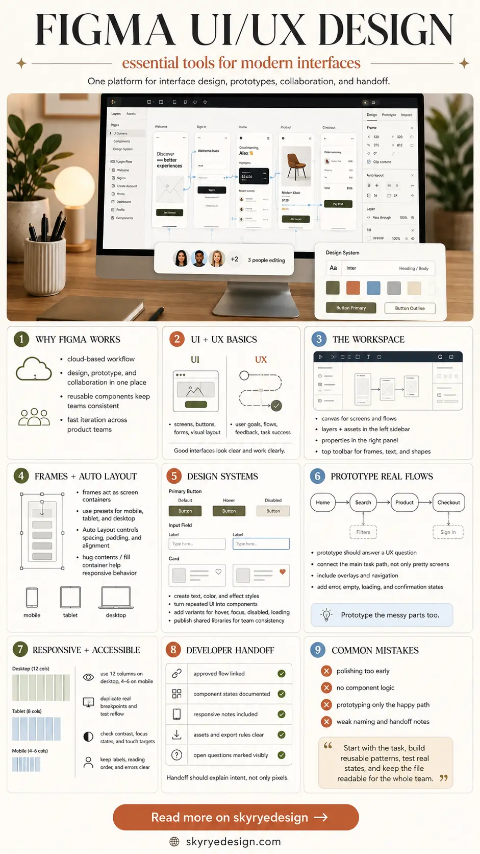
- Use Figma for both UX structure and UI polish: flows, wireframes, screens, components, prototypes, and specs can live in one organized workspace.
- Start with low-fidelity frames and user paths before committing to color, typography, imagery, or detailed interaction states.
- Treat components, variants, Auto Layout, and clear naming as part of the design work, not cleanup after the design is finished.
- Add captions, annotations, and FAQ-style answers when the page needs to rank for Figma interface and workspace image searches.

What is Figma UI UX design?
Figma UI UX design is the process of turning a product idea into usable digital screens inside Figma. UX work shapes the journey: user goals, information architecture, wireframes, flows, and prototype logic. UI work shapes the surface: layout, typography, color, components, responsive behavior, and visual detail. Figma is useful because those layers can stay connected in one collaborative file. A team can move from rough frames to polished screens, then add comments, prototype links, and developer specs without exporting the project into five disconnected documents.
| Design question | Figma artifact | What to check |
|---|---|---|
| What is the user trying to do? | Flow map or rough frames | The path has a clear start, middle, and finish. |
| Does the screen hierarchy make sense? | Wireframe | Primary action, content order, and navigation are obvious. |
| Does the interface feel consistent? | Components and variants | Buttons, inputs, cards, and states reuse the same logic. |
| Will the layout respond cleanly? | Frames, constraints, grids, Auto Layout | The design adapts instead of breaking at another width. |
| Can developers build it without guessing? | Dev Mode notes and named layers | Spacing, type, assets, states, and edge cases are documented. |
For the broader discipline, compare this page with Sky Rye Design’s UI/UX design guide. For a formal UX definition, the Nielsen Norman Group explanation of user experience is a useful reference point.
Figma UI UX design workflow
A good Figma workflow is not complicated, but it does need order. Jumping straight into polished UI often creates beautiful screens with weak logic. Start with the smallest usable path, then add detail only when the structure is holding.
- Define the product goal and the user task in one plain sentence.
- Sketch the core flow as low-fidelity frames before choosing a visual style.
- Turn repeated elements into components as soon as the pattern appears twice.
- Use variants for states such as default, hover, active, disabled, loading, error, and success.
- Connect a prototype that shows the real journey, including dead ends and recovery states.
- Prepare handoff with named layers, responsive notes, asset decisions, and developer comments.
Wireframes before visual UI
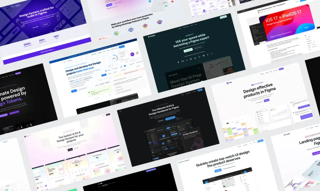
Wireframes are not a beginner step you graduate from. They are where the product logic gets cheaper to fix. Use grayscale frames to settle navigation, content hierarchy, form length, CTA placement, and the number of screens in the flow. If the wireframe is confusing, the polished mockup will only hide the problem for a little while. For web-specific planning, keep website UI design close while you compare navigation, sections, and responsive states.
Figma’s own UX design tool overview frames the platform around collaboration, prototyping, and shared access. That lines up with the page’s main job here: make the workflow readable enough for designers, clients, and developers to use together.
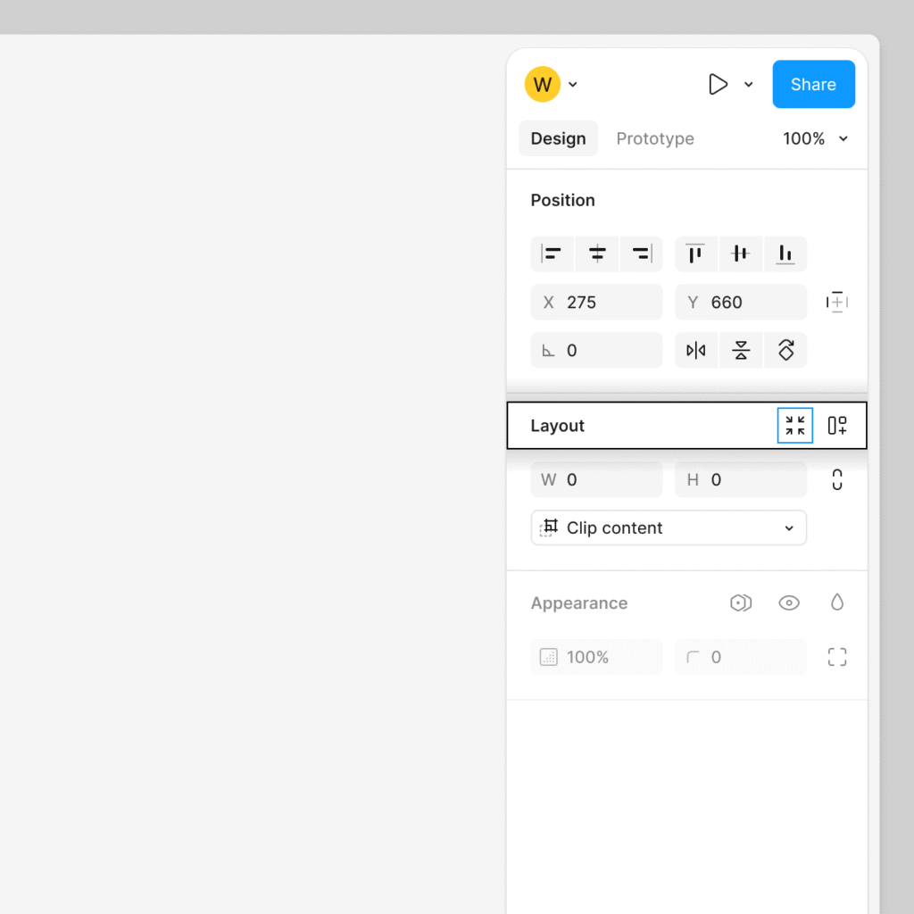
Build the workspace so people can read it
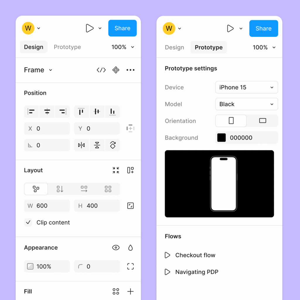
A Figma interface design workspace should feel legible before anyone zooms into the pixels. Name pages by phase or feature. Keep exploration away from approved screens. Add short labels above flows. Use sections for drafts, ready-for-review work, and handoff frames. This is boring in the best possible way: people stop asking where the latest version lives.
| Workspace area | Good habit | Why it helps |
|---|---|---|
| Pages | Separate discovery, wireframes, UI, prototype, and handoff | Reviewers do not mistake rough work for final UI. |
| Sections | Label flows by task or feature | Developers and stakeholders can find the right screen set quickly. |
| Layers | Name important frames, groups, and components | Specs and comments make sense outside the designer’s head. |
| Comments | Resolve old feedback and keep open questions visible | The file does not become a museum of outdated decisions. |
Components, variants, and design systems
A Figma design system does not need to become a giant internal product on day one. Start with the parts that appear constantly: buttons, inputs, labels, cards, modals, nav items, icons, and spacing rules. The goal is not to make the file impressive; the goal is to stop every new screen from reinventing the same decisions. For template-based projects, the Figma website design templates guide is a useful middle step, especially when a ready-made layout needs a stronger system underneath it.
Figma’s UI design tool overview is a good source for the official feature set, while the Auto Layout guide is worth keeping open when responsive behavior starts getting fragile.
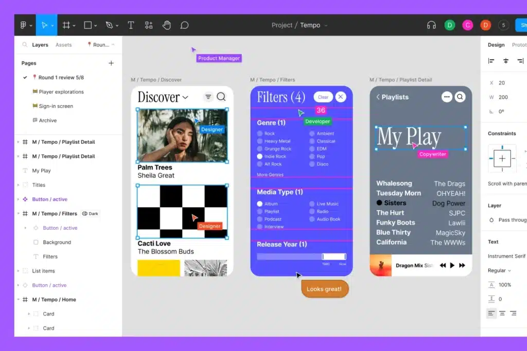
Make components answer real interface states
A button component that only has one perfect state is barely a component. Add states for hover, focus, active, disabled, loading, success, and error where the product needs them. Use variants for size and purpose, then keep the naming human enough that another designer can pick the right option quickly.
- Primary button: default, hover, pressed, disabled, loading.
- Input field: empty, focused, filled, error, success, disabled.
- Card: default, selected, loading, empty, unavailable.
- Navigation item: default, hover, current, collapsed, notification.
Prototyping user flows in Figma
A prototype should answer a question. Can a first-time user finish checkout? Does the onboarding sequence ask too much? Is the filter panel understandable on mobile? If the prototype is only a slideshow of perfect screens, it may look complete while avoiding the parts that need discussion.
Use the Figma prototyping guide for mechanics, then keep the UX question small enough to test. If the page is part of a larger website project, Sky Rye Design’s guide to website design with Figma gives the workflow a closer web-design context.
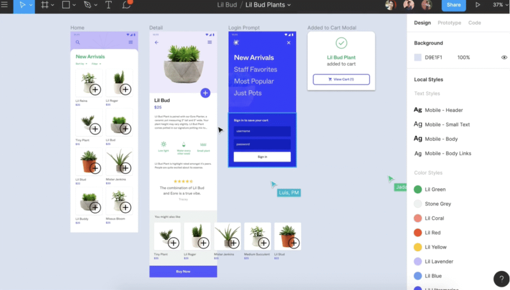
Prototype the messy parts too
The most useful prototype screens are often the least glamorous: empty results, bad passwords, missing permissions, form errors, payment failures, loading delays, and confirmation states. These moments decide whether the interface feels trustworthy. Add them before handoff, not after the first bug report.
Responsive layouts and accessibility checks
Responsive design in Figma is more than stretching a desktop frame. Decide which content reflows, which components stack, which navigation pattern changes, and where spacing compresses. Use constraints and Auto Layout, then duplicate the frame at a few real breakpoints instead of trusting one magic setting.
Accessibility belongs inside the same file. Check contrast, visible focus states, touch target size, reading order, form labels, and error messages. The WCAG quick reference is a practical source when accessibility decisions need something firmer than personal taste.
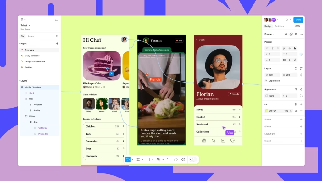
Use Auto Layout without making the file brittle
Auto Layout is powerful, but it can become fragile when every tiny object is nested without a reason. Use it for components, lists, cards, navigation, forms, and responsive sections. Avoid turning simple static decoration into a deep stack of frames that nobody wants to edit later.
Developer handoff in Figma
Handoff is where Figma UI UX design either becomes buildable or starts leaking questions. Developers need the final path, component states, spacing rules, assets, type choices, responsive behavior, and edge cases. They also need to know what is final and what is still exploratory. Figma’s Dev Mode guide is useful for the tool side, but clear organization is still the designer’s job.
For broader workflow context, the guide to Figma for website design pairs naturally with this handoff section, while how to learn UI UX is better for readers who need the design process before the tool details.
| Handoff item | What to include | Why it matters |
|---|---|---|
| Approved flow | Linked prototype and final frame set | Developers build the agreed journey, not an old exploration. |
| Component states | Default, hover, focus, active, disabled, loading, error | Interaction behavior is no longer implied. |
| Responsive notes | Desktop, tablet, mobile, and stacking rules | The layout survives real screen widths. |
| Assets | Export rules, icon handling, image notes | Production assets are not guessed from screenshots. |
| Open questions | Clearly marked comments or notes | Unresolved decisions stay visible instead of hidden. |
Common Figma UI UX design mistakes
| Mistake | Why it hurts the project | Better move |
|---|---|---|
| Polishing too early | The team falls in love with screens before the flow works. | Wireframe the task path first, then add visual detail. |
| No component logic | Buttons, cards, and inputs drift across screens. | Create reusable components and variants as patterns appear. |
| Ignoring image/search intent | Visual-heavy pages miss Figma interface and workspace queries. | Use specific alt text and captions tied to what the image shows. |
| Prototype only the happy path | Error and empty states get designed too late. | Add messy states before review and handoff. |
| Weak handoff notes | Developers must reverse-engineer spacing, states, and behavior. | Name layers, document states, and mark approved frames clearly. |
If your design system is already feeling scattered, continue with Sky Rye Design’s design system troubleshooting guide. It supports the same cluster without repeating the exact same anchor over and over.
Figma UI UX design FAQ
What is Figma UI UX design?
Figma UI UX design is the process of planning user flows, wireframes, interface screens, reusable components, prototypes, and developer handoff inside Figma. The UI side covers what the user sees and taps. The UX side covers whether the path, content, hierarchy, and feedback help the user finish the task.
Is Figma used for UI or UX design?
Figma is used for both UI and UX design. UX designers can map flows, sketch wireframes, test journeys, and collect feedback. UI designers can build polished screens, components, variants, layouts, and visual systems. The best Figma files usually combine both instead of treating UX and UI as separate documents.
How do you start a UI UX design project in Figma?
Start with the problem, user goal, and main screens before drawing high-fidelity UI. Create a simple frame set, map the core flow, add low-fidelity wireframes, and name the sections clearly. Once the structure works, turn repeated elements into components and move into visual design.
What should a Figma design system include?
A Figma design system should include color styles, typography styles, spacing rules, grid guidance, icons, reusable components, variants, interaction states, naming rules, and short usage notes. It does not need to be huge. It needs to be predictable enough that new screens look and behave like the existing product.
How do you make a Figma prototype useful?
Make a Figma prototype useful by connecting the real user path, not just the happy path. Include navigation, overlays, form states, error states, empty states, and important edge cases. Keep the prototype focused on decisions you need to test or explain, then add notes where motion or logic may be unclear.
What is the difference between wireframes and UI mockups in Figma?
Wireframes explain structure, priority, and flow with minimal styling. UI mockups show the final visual direction with color, type, imagery, spacing, and component states. In Figma, wireframes should answer whether the screen works; mockups should answer whether the screen feels polished and brand-ready.
How do you hand off Figma designs to developers?
Hand off Figma designs by organizing frames, naming components clearly, documenting states, checking responsive behavior, and linking the prototype or specs developers need. Use Dev Mode or clear annotations for spacing, type, colors, assets, and edge cases. A clean handoff explains intent, not only pixels.
Final file cleanup checklist
Before you send a Figma file for review or handoff, do one quiet cleanup pass. Delete abandoned frames or move them to an archive page. Rename the final flow. Resolve comments that no longer matter. Check component states. Make sure the prototype opens on the right starting screen. Confirm that mobile and desktop frames are not contradicting each other.
- The main user flow is visible without searching the whole file.
- Wireframes and polished UI are separated or clearly labeled.
- Repeated UI patterns are components, not copied loose layers.
- Alt text and captions describe the Figma interface, workspace, and UI UX workflow shown in each image.
- External references are placed in the middle or bottom of the article and marked nofollow.
- Developers can find states, responsive behavior, assets, and open questions without a meeting first.
- 42shares
- Facebook0
- Pinterest39
- Twitter3
- Reddit0