
A translation can be word-for-word correct and the page can still break the moment it goes live. The copy gets approved, then someone opens the German landing page and finds a two-line primary button covering the price below it.
Website localization testing often gets treated as a language task and handed entirely to translators or QA engineers checking for typos. Yet many failures are visual: line length, button width, image cropping, spacing rhythm, and local cues that feel trustworthy in one market and unfamiliar in another. Designers need a repeatable check alongside the language review.
- Why a Translated Website Can Still Fail Visually
- Build a Locale-by-Locale Design QA Matrix
- Check the Live Page From Each Target Region
- Run a Visual QA Pass on Desktop and Mobile
- Sign Off the Localized Design With a Repeatable Checklist
- FAQ
- What should designers check during website localization testing?
- How do you test what a website looks like in another country?
- Can a proxy browser replace language and device testing?
- How often should website localization testing be repeated?
- What's the most commonly missed defect in localization QA?
- Should localization QA happen before or after translation is finalized?
- Final Check Before Launch
Across automotive, jewelry, and web projects, the pattern is familiar: a layout that looks resolved in English is rarely re-tested once it carries a longer German string or a right-to-left Arabic one. This workflow covers the missing design pass: a locale matrix, a live-region check, a desktop and mobile review, and a sign-off checklist you can reuse for the next launch.
Why a Translated Website Can Still Fail Visually
Most localization QA checklists are built by and for translators, which means they check meaning and grammar and stop there. A design-led check starts from a different question: does this layout still hold together once the words, the currency, and the cultural expectations underneath it all change at once?
Text Expansion, Broken Hierarchy, Cropped Images and Misleading Local Cues
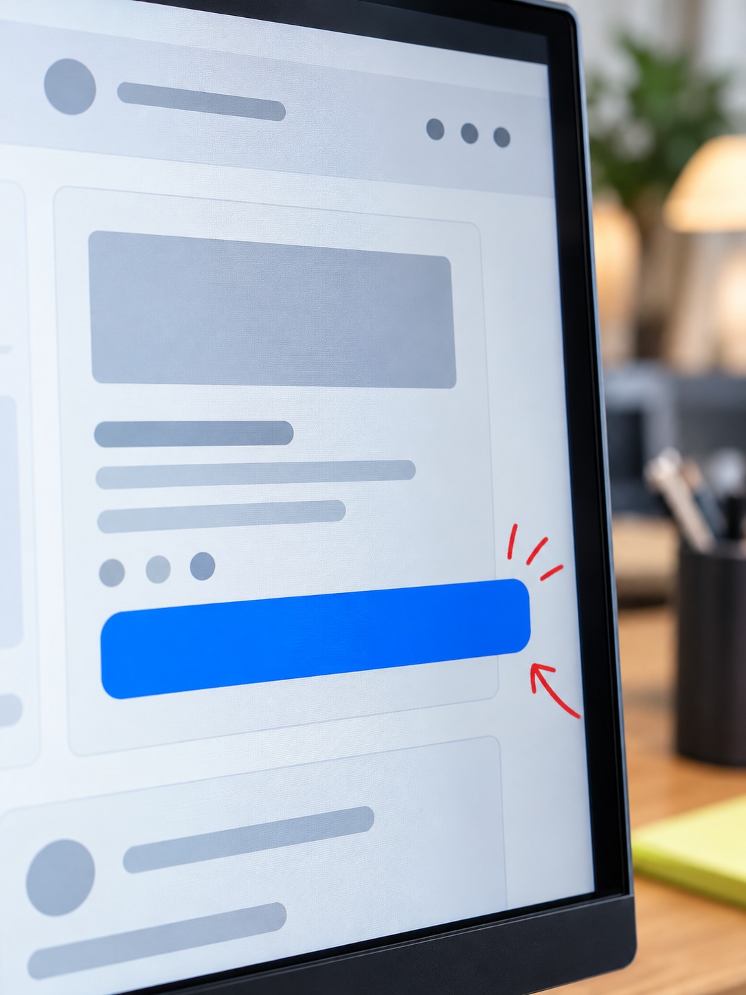
German and Finnish strings often need considerably more horizontal space than their English source. Japanese and Korean may use fewer characters but need a different line height depending on the font stack. A button that fits “Get Started” at 120 pixels wide can wrap after translation, changing the vertical rhythm of everything below it.
Hierarchy can break without an obvious overflow. A hero headline sized for a five-word English phrase may lose its dominance when the localized version runs to twelve words. A three-line H1 can push the product image below the fold even when every translated word is correct.
Images carry their own risk. A hero photo cropped tight around a person’s hand gesture can read fine in one market and read as rude or confusing in another; a background image with visible English signage or currency symbols undercuts the whole point of localizing in the first place. None of this shows up in a text-only proofread, which is exactly why it needs its own pass.
Colors, Icons and Formality Levels Carry Meaning Too
A few cues sit even further outside a translator’s job than layout does. Color association isn’t universal — white reads as clean and minimal in most Western markets and as a mourning color in parts of East Asia, which matters if your hero background leans heavily on white space as a design choice rather than a neutral default. Iconography has its own quiet traps: a checkmark, a thumbs-up, or an OK-hand gesture doesn’t carry the same meaning everywhere, and a UI kit built once for a US audience can carry a handful of these assumptions without anyone noticing until a market-specific review flags them.
Formality is a subtler one, and it’s genuinely a design decision as much as a copy one: German and Japanese both have grammatical registers for formal versus casual address, and a CTA that reads as friendly and direct in English (“Get started free”) can land as oddly casual once translated at the wrong register for a B2B audience in either market. This is usually caught by a native-speaking translator rather than a designer, but it’s worth flagging explicitly in your QA matrix as its own check, since it’s easy for it to fall between the design review and the copy review and get checked by neither.
Build a Locale-by-Locale Design QA Matrix
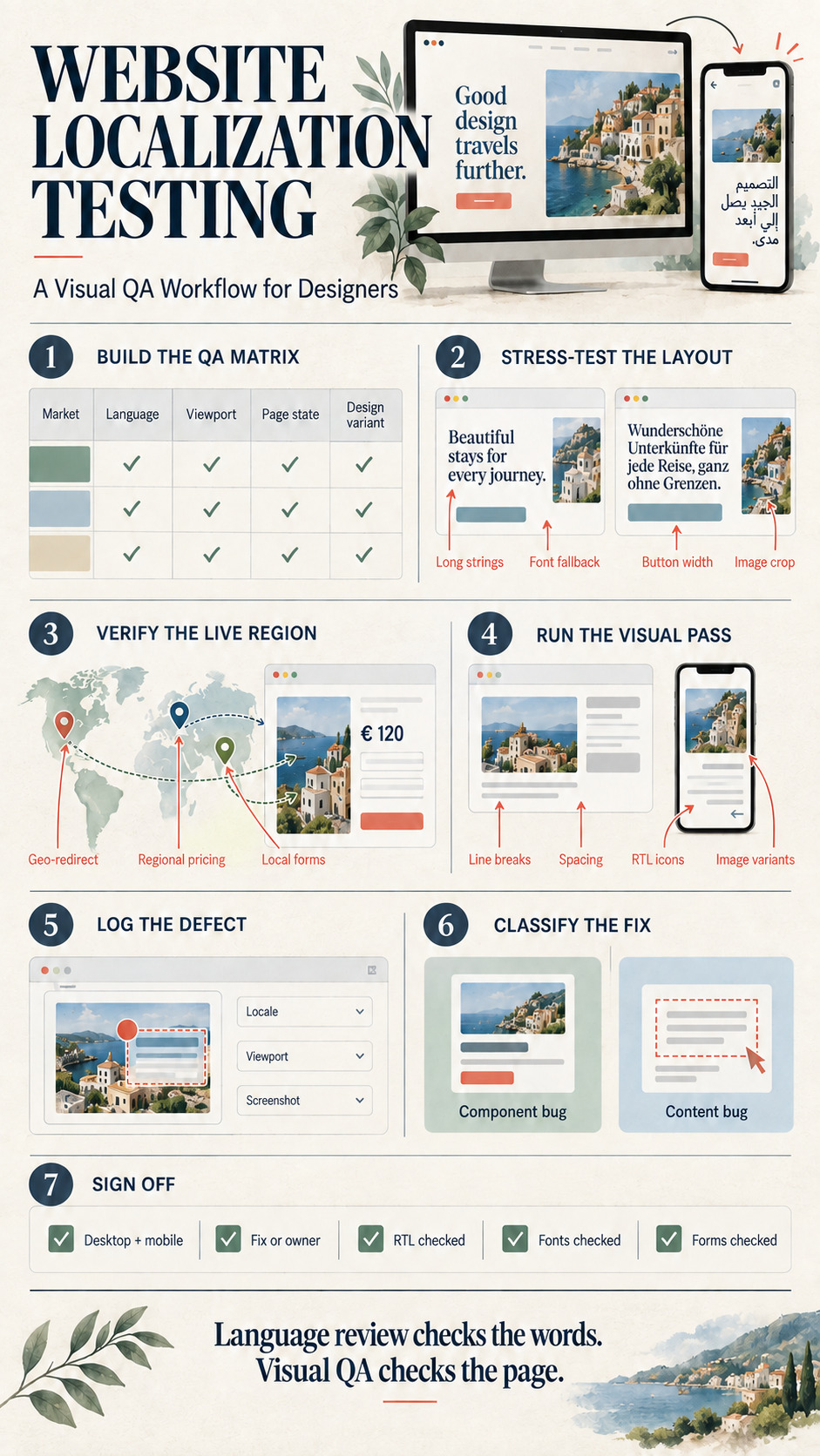
Before opening a single browser tab, build a simple matrix that defines exactly what “correct” looks like for each market, so you’re checking against a spec instead of a gut feeling.
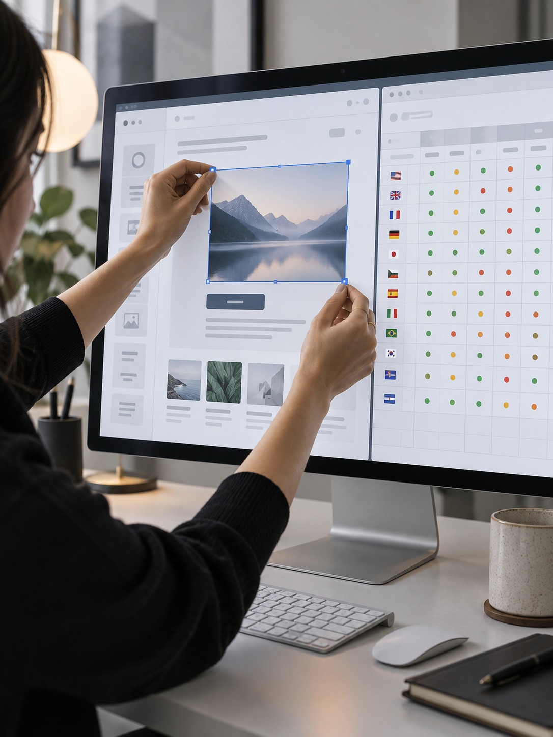
Market, Language, Viewport, Page State and Expected Design Variant
A working matrix needs five columns at minimum: the target market (not just the language, since Swiss German and German German can differ in currency and formality), the language and script direction, the viewport (desktop, tablet, and at least one common mobile breakpoint per market, since device mix varies more than most teams expect), the page state (logged out, logged in, empty cart, populated cart — whichever states carry meaningfully different layouts), and the expected design variant, meaning any layout change that’s intentional rather than a bug, like a different hero image for a market where the original photo doesn’t clear local content guidelines.
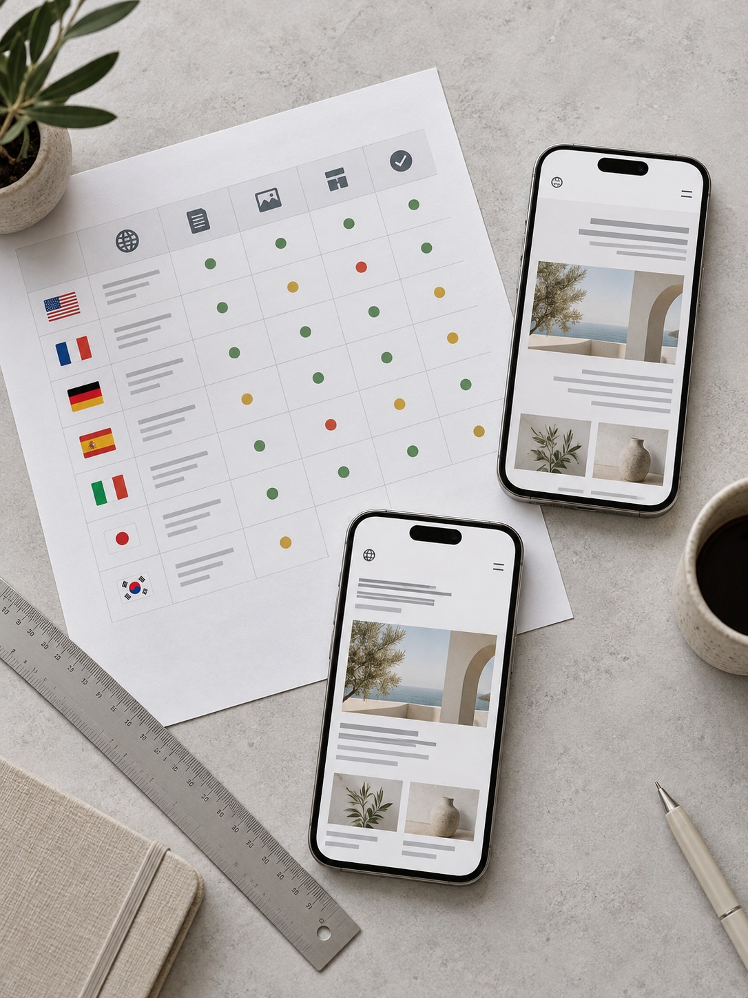
I keep this matrix in a shared spreadsheet next to the Figma file, not buried in a QA ticket, because the designer who built the original layout is usually the fastest person to tell whether an odd-looking result is a real defect or an intentional regional variant nobody documented.
Sizing the Matrix to the Launch, Not to Every Possible Market
A common mistake is building a matrix so exhaustive nobody actually runs it before a deadline. For a first localization pass, I’d rather cover three to five priority markets thoroughly (every state, every breakpoint, every form) than twelve markets shallowly. Pick the markets by actual launch priority, not by which languages happen to be easiest to translate, and treat the thorough three-to-five as your template: once that process is proven, extending it to a sixth or seventh market is mostly a matter of filling in the same matrix again, not redesigning the check from scratch.
Before/After Screenshots of One Landing Page in Three Markets
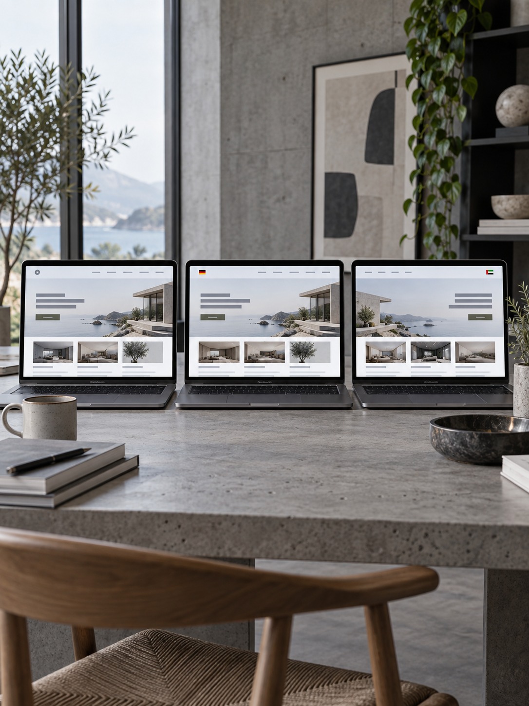
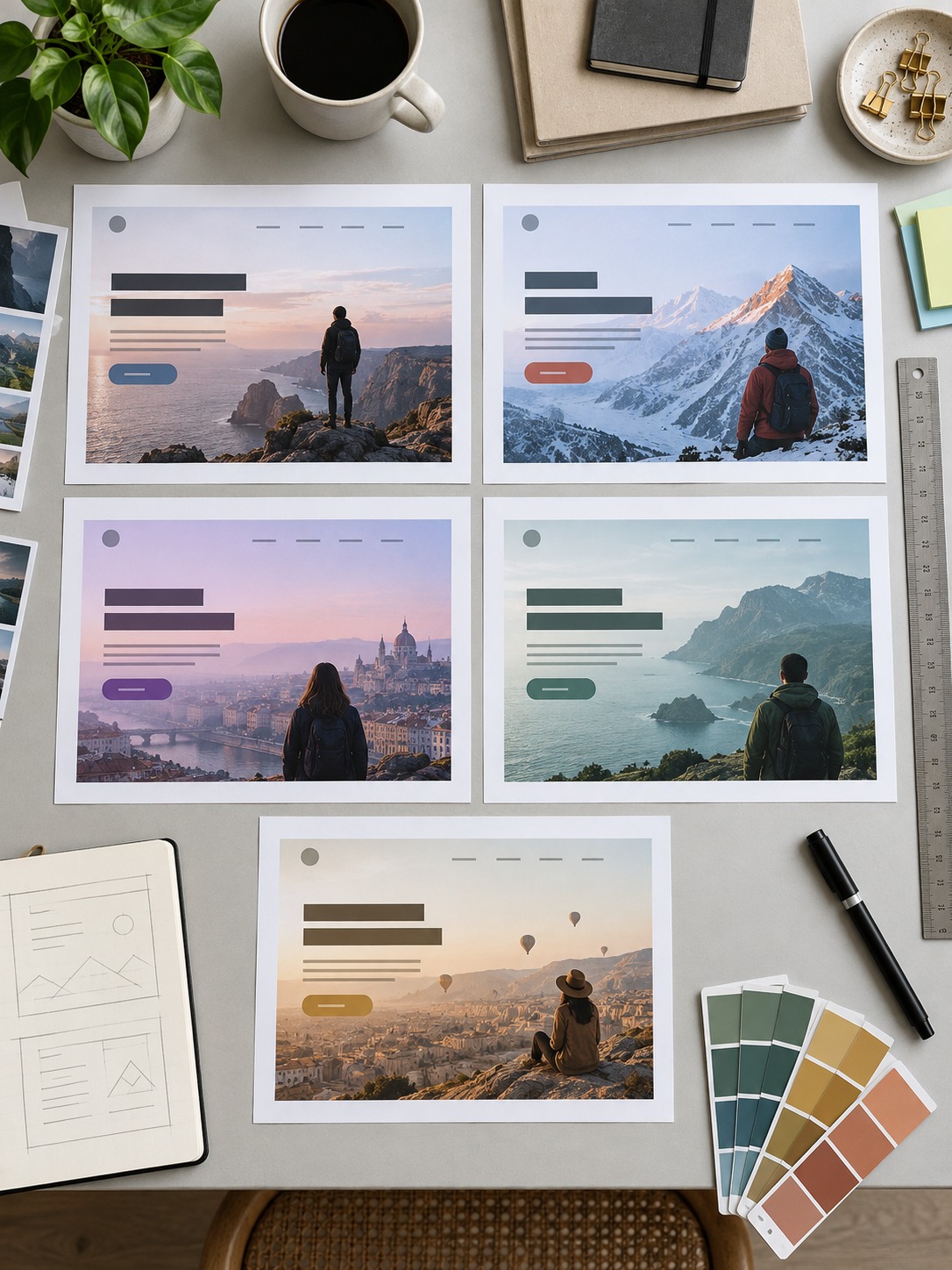
A useful stress test is to take one landing page and capture it in three markets at the same viewport width: the English source, a German version for long strings, and a Japanese or Arabic version for script and direction. Place the screenshots side by side.
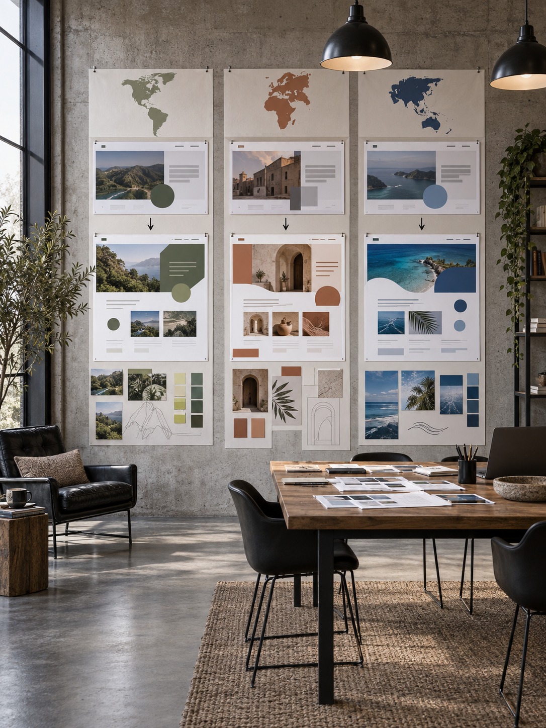
A German label can make a CTA overlap the secondary link below it because the component grows while the spacing token stays fixed. English and French may look fine, so the bug only appears under a specific string length. Side-by-side review makes that failure visible before launch.
Check the Live Page From Each Target Region
Testing the design in isolation only catches half the problem. You also need to see the page the way a real visitor in that market would receive it — after geo-redirects, region-specific pricing, and any server-side content swaps have already run.
Verify Geo-Redirects and Region-Specific Content, Then Inspect Typography, Hero Imagery, CTA and Forms
Start by confirming the geo-redirect actually lands where it should — a mistargeted redirect (a Swiss visitor landing on the German-market page instead of a Swiss-specific one) is a content bug that no visual QA pass on the wrong page will ever catch. Once you’re on the correct regional page, walk it the way you’d walk any design review: check that the typography still holds its intended hierarchy, that the hero imagery is the locally-appropriate version rather than a fallback, that the CTA reads clearly at its localized length, and that any form fields (address format, phone format, required fields) match what that market actually expects, not a rigid template built around a US address block.
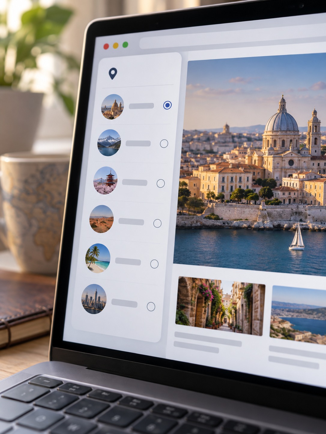
1 Browser is one practical way to see this live, region-specific version of a page repeatably — it’s a proxy browser with built-in proxies and antidetect-style browser profiles, so you can hold a consistent, separate profile per market and come back to the same simulated location each time you re-test, rather than fighting with a single browser’s cache and cookies every time you switch regions. It’s worth being precise about what that does and doesn’t solve: an IP-based location swap on its own doesn’t change your browser’s language setting, clear cookies from a previous session, or reset an account’s saved region, so pair it with an actual language-header change and a clean or incognito session if you want a fully accurate first-visit simulation.
Choosing a Regional-Check Tool Without Losing the Design Judgment
Plenty of proxy and antidetect tools exist for this kind of regional simulation, and picking between them comes down to how many persistent, separate profiles you need and how the tool documents what it actually provides versus what it doesn’t guarantee. If you want a side-by-side comparison of the current options rather than a single recommendation here, best proxy browsers in 2026 is a useful reference point — but treat it as a tool-shopping list, not a substitute for the visual judgment call that actually matters: whatever tool you land on, the region-check is only step one, and the design QA pass that follows is where the real defects get caught.
Run a Visual QA Pass on Desktop and Mobile
Once you’re looking at the correct regional page, the actual visual audit follows a repeatable checklist rather than an open-ended “does this look right” scan.
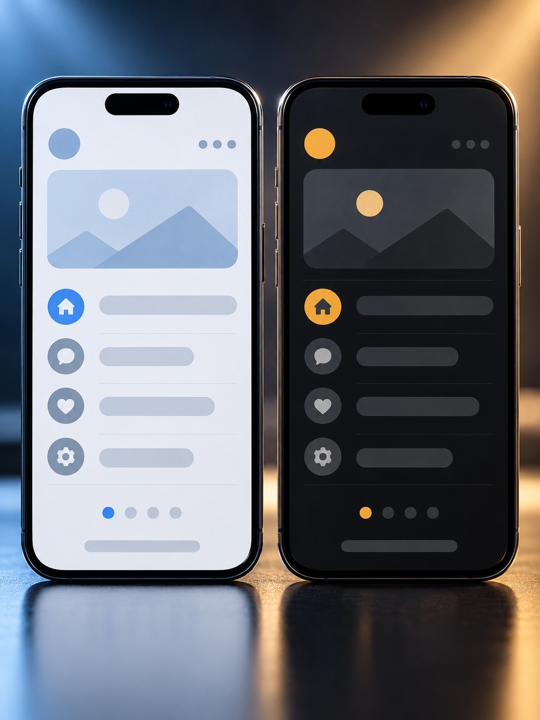
Line Breaks, Font Fallback, Button Width, Spacing, RTL Layouts and Image Variants
Check line breaks first. A headline that wraps mid-phrase looks careless even when the translation is accurate, and the fix is often small once it has been identified. Then confirm that the font stack supports the target script. Cyrillic and Thai can fall back to a generic system face when the primary webfont lacks those characters, undoing the intended type hierarchy.

Button width deserves its own check across every primary CTA on the page, not just the hero: a button sized comfortably for English can clip text or force an unintended line break in German or Finnish specifically. Spacing tokens that assume single-line text need re-checking once a string wraps to two lines, since a fixed margin below a button component often wasn’t designed to accommodate that taller state.
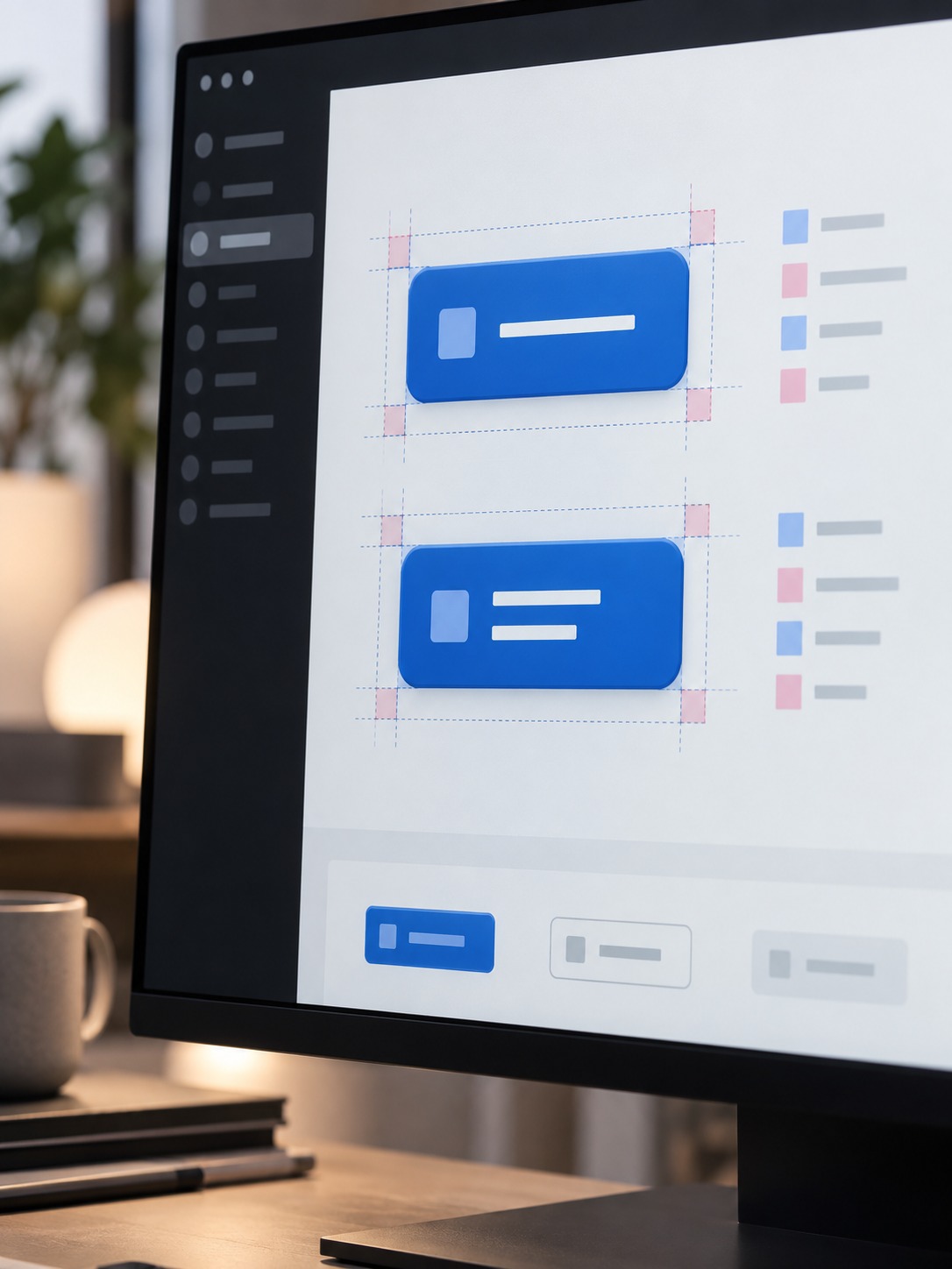
Right-to-left layouts need dedicated attention because RTL involves more than mirrored text. Directional icons, progress bars, field alignment, and the intended entry point into the hero all need to flip. A partial implementation with mirrored text and arrows pointing the wrong way looks unfinished. Also confirm that market-specific hero images, testimonials, and trust badges are actually replacing the English defaults.
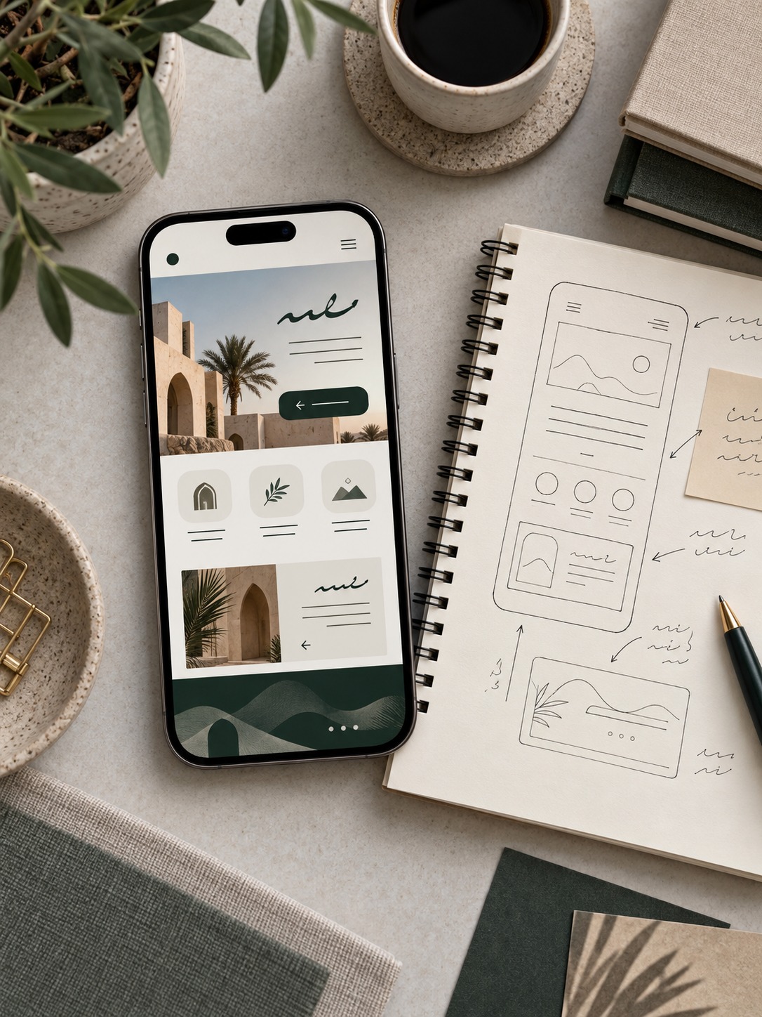
Record Defects Against the Relevant Figma Frame and Locale
Log every defect against the Figma frame and locale where it appears, not as a generic “button issue” ticket. The same component may work in French and fail in German because of string length. Tag each finding with the market and viewport, then pin a screenshot beside the intended frame so the person fixing it can reproduce the state without running the full audit again.

Separate component failures from content failures. A button that overflows whenever its label passes a certain length needs a design-system fix. One unusually long product description may only need a copy edit. Flag the category when you log the defect; otherwise the team either patches the same component repeatedly or redesigns a component to solve a one-off content problem.

Sign Off the Localized Design With a Repeatable Checklist
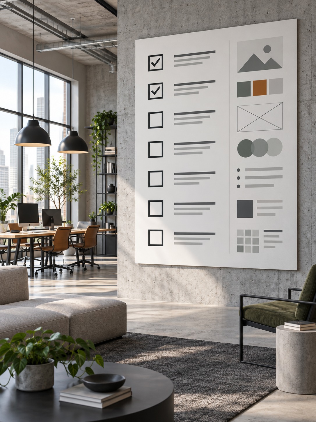
Once the matrix is complete, sign off with a checklist. Confirm that each locale has desktop and mobile screenshots, every defect is fixed or accepted with a named owner, RTL icons and alignment have been reviewed, non-Latin font fallbacks work, and forms match local address and phone conventions.

Keep this checklist itself locale-agnostic and reusable — the specific defects change from launch to launch, but the categories they fall into rarely do, which is what makes the next market launch faster than this one.

FAQ
What should designers check during website localization testing?
Typography and line-break behavior, button and component width under longer or shorter strings, image and hero-photo relevance per market, RTL layout direction for Arabic and Hebrew, font fallback for non-Latin scripts, and form-field conventions like address and phone formats.
How do you test what a website looks like in another country?
Combine a design-side check (full-page screenshots of the same page across your target locales at matched viewports) with a live-region check that confirms geo-redirects and region-specific content are actually serving the correct version before you audit typography, imagery, CTAs and forms.
Can a proxy browser replace language and device testing?
No. A proxy or antidetect browser changes what location a site believes you’re visiting from, which is useful for confirming geo-redirects and regional content, but it doesn’t change your browser’s language setting, clear existing cookies, or simulate a different device or viewport on its own, so those still need to be set deliberately alongside it.
How often should website localization testing be repeated?
At minimum, before every market launch and after any significant redesign of a shared component or template, since a single component change can silently break spacing or button width in every locale that reuses it, not just the one you were actively redesigning for.
What’s the most commonly missed defect in localization QA?
Partial RTL implementation: mirrored text with icons, arrows, or progress indicators that were never flipped to match. It’s more jarring to users than a straightforward untranslated page, because it looks like a deliberate design rather than an oversight.
Should localization QA happen before or after translation is finalized?
Run an early pass with placeholder or machine-translated strings at realistic lengths to catch layout issues before final copy is locked, then a second full pass once the real, approved translations are in place, since final copy can still differ in length from the placeholder text.
Final Check Before Launch
Language review catches the words; visual QA catches the page. Build the locale matrix before opening a stack of browser tabs, verify the regional page a visitor will actually receive, then apply the same desktop and mobile checklist every time. For related workflow tools, AI Figma Plugins can help with component work, while AI Website Builder Tools covers localization features in current site builders. The site’s proxy browser roundup is useful when you need a broader comparison of regional testing tools.

- 6shares
- Facebook0
- Pinterest6
- Twitter0
- Reddit0