Mobile users abandon apps within seconds if they encounter confusing interfaces or poor user experiences. Success in mobile app design requires mastering fundamental UI/UX principles that prioritize user needs, create intuitive navigation, and deliver seamless interactions across all devices. Your app’s visual elements, accessibility features, and overall design system directly impact user engagement and retention.
Understanding these core principles helps you build apps that users actually want to use and recommend. You’ll need to balance aesthetic appeal with functional design while ensuring your app remains accessible to all users. The right combination of visual hierarchy, responsive layouts, and user-centered design creates mobile experiences that stand out in competitive app markets.
This guide covers essential design principles, practical implementation strategies, and proven techniques for creating mobile apps that users love. You’ll discover how to design effective navigation systems, implement scalable design frameworks, and build future-ready mobile experiences that adapt to changing user expectations and technological advances.
Key Takeaways
- Effective mobile UI/UX design combines user-centered principles with intuitive navigation to create apps that users engage with consistently
- Successful mobile apps require accessible design systems, responsive layouts, and cohesive visual branding that works across all devices
- Future-ready mobile design involves scalable frameworks, proven prototyping methods, and adaptable interfaces that evolve with user needs
Core UI/UX Design Principles for Mobile Apps
Effective mobile app design relies on three fundamental principles that determine user satisfaction and engagement. These core elements shape how users interact with your digital products and directly impact the success of your app design.
Simplicity and Clarity
Simplicity forms the foundation of successful mobile app design. Your user interface should present information in the most straightforward way possible.
Remove unnecessary elements that don’t serve a clear purpose. Each screen should focus on one primary action or goal.
Use clear navigation patterns that users recognize instantly. Avoid complex menu structures that require multiple taps to reach important features.
Your visual design should prioritize scannable content. Users typically spend only seconds evaluating an app before deciding whether to continue using it.
Choose readable fonts and appropriate text sizes for mobile screens. Ensure adequate contrast between text and background colors.
Implement white space effectively to reduce visual clutter. This allows users to focus on essential content without feeling overwhelmed.
Consistency Across Screens
Consistent design patterns create predictable user experiences throughout your mobile app. Users should never feel confused about how to interact with different screens.
Maintain the same color schemes, typography, and button styles across all app screens. This builds user confidence and reduces the learning curve.
Use standardized interaction patterns for similar actions. If users swipe left to delete on one screen, this gesture should work the same way throughout your app.
Keep navigation elements in consistent positions. Users develop muscle memory for button locations and menu placements.
Apply uniform spacing and layout grids to create visual harmony. This professional approach enhances your app’s credibility and usability.
Visual Feedback and Interactivity
Immediate visual feedback confirms user actions and prevents confusion. Your app should respond to every tap, swipe, or gesture within milliseconds.
Implement loading indicators for processes that take longer than expected. Users need to know the app is working, not frozen.
Use micro-interactions to guide users through complex tasks. Subtle animations can indicate progress and next steps.
Provide clear error messages that explain what went wrong and how to fix it. Avoid technical jargon that confuses non-technical users.
Design interactive elements that look clickable or tappable. Buttons should have sufficient size and spacing for easy mobile interaction.
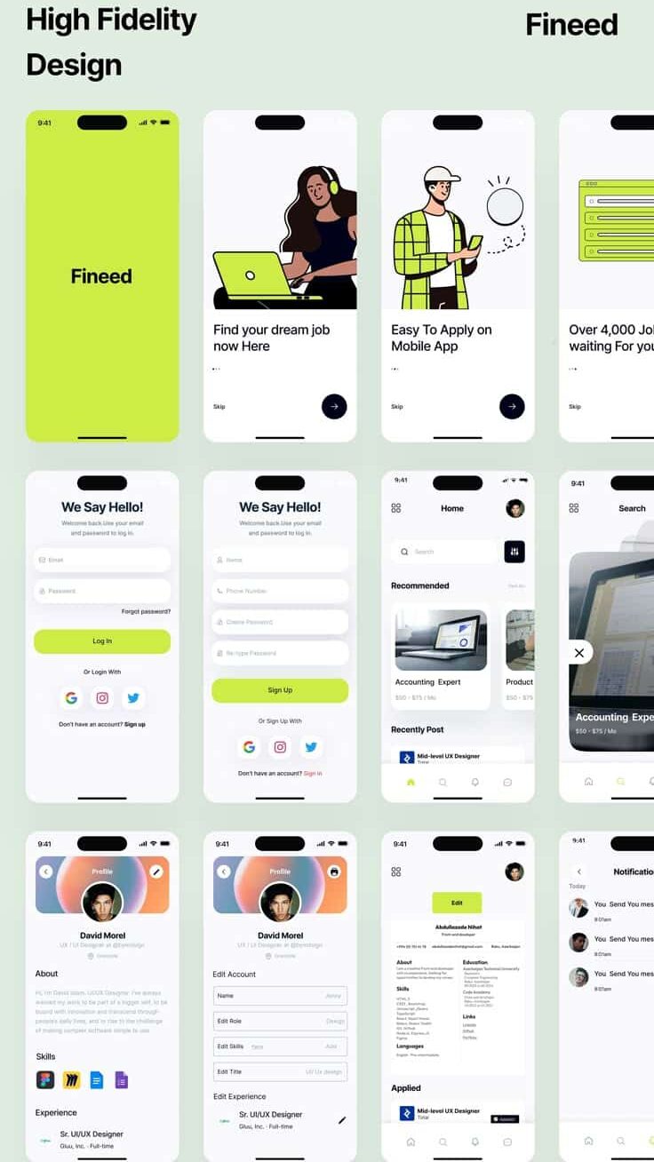
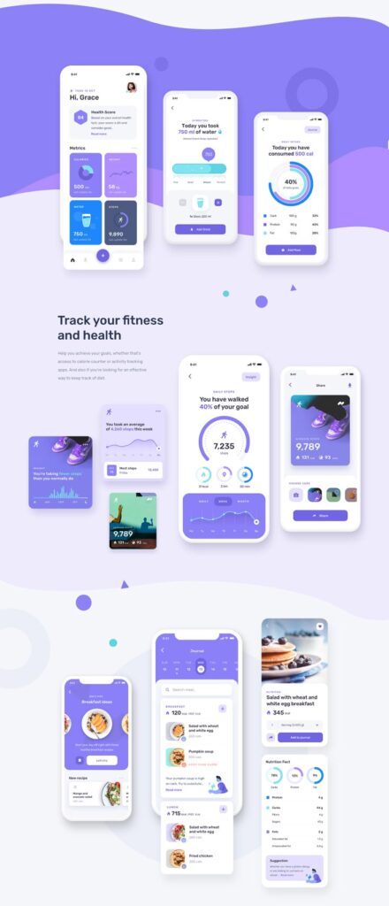
User-Centric and Accessible Mobile Design
User-centric design puts user needs and preferences at the center of mobile app development, ensuring apps work for diverse audiences including users with disabilities. This approach requires understanding your audience through research, implementing accessibility features, and continuously refining the experience based on user feedback.
User Research and Preferences
Understanding user needs forms the foundation of effective mobile design. You should conduct user interviews, surveys, and behavioral analysis to identify how your target audience actually uses mobile devices.
Focus on user preferences for navigation patterns, content consumption habits, and interaction methods. Different demographics prefer different approaches to mobile interfaces.
Key research areas include:
- Device usage patterns and contexts
- Preferred gesture controls and touch interactions
- Content prioritization and information hierarchy
- Pain points with existing mobile experiences
Analyze user behavior data to understand which features drive engagement. This data reveals gaps between what users say they want and how they actually behave.
Create user personas based on research findings to guide design decisions. These personas should include accessibility considerations and diverse user capabilities.
Accessibility and Inclusive Design
Accessible design ensures your mobile app works for users with varying abilities and disabilities. This includes visual, auditory, motor, and cognitive considerations.
Implement screen reader compatibility by adding proper semantic markup and descriptive labels. Screen readers help visually impaired users navigate mobile interfaces effectively.
Essential accessibility features:
- High contrast ratios (minimum 4.5:1 for normal text)
- Scalable text that works at 200% zoom
- Touch targets minimum 44px square
- Alternative text for images and icons
- Captions for video and audio content
Design for one-handed use since many users operate phones with a single hand. Place important controls within thumb reach zones.
Consider users with motor impairments by providing sufficient spacing between interactive elements. Avoid requiring precise gestures or complex multi-touch interactions for critical functions.
User Feedback Integration
Continuous user feedback helps refine your mobile user experience after launch. You should establish multiple feedback channels and systematic processes for implementing improvements.
Build feedback mechanisms directly into your app through rating prompts, feedback forms, and usage analytics. Time these requests appropriately to avoid interrupting critical user flows.
Effective feedback collection methods:
- In-app feedback widgets
- App store review monitoring
- User testing sessions
- Support ticket analysis
- Analytics and heat mapping
Analyze feedback patterns to identify recurring issues and feature requests. Prioritize changes that address the most common user pain points.
Create feedback loops by informing users when their suggestions are implemented. This builds trust and encourages continued engagement with your improvement process.
Test proposed changes with real users before full implementation to validate that solutions actually improve the experience.
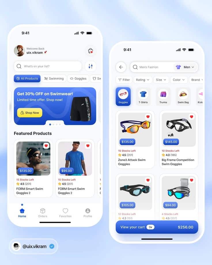
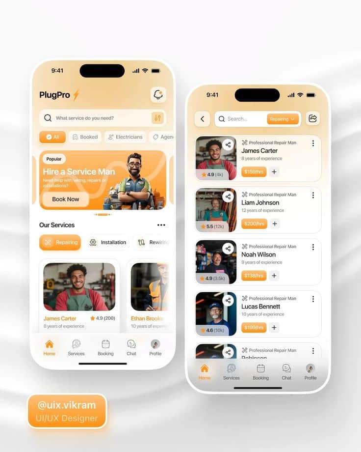
Effective Navigation and Flow
Mobile navigation determines how quickly users accomplish their goals within your app. The right navigation patterns, menu structures, and task flows create seamless experiences that keep users engaged and productive.
Intuitive Navigation Patterns
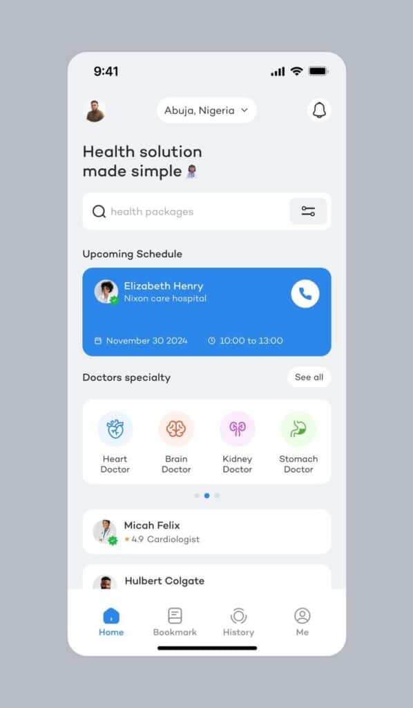
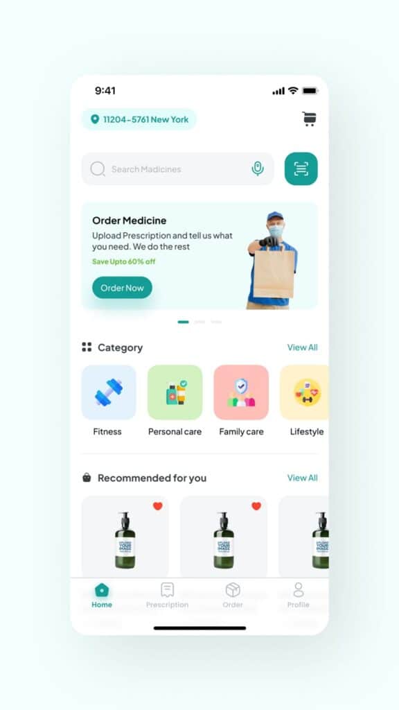
Bottom navigation works best for apps with 3-5 primary sections. Place frequently used features within the thumb zone – the area easily reached by a user’s thumb during one-handed use.
This pattern allows quick switching between main app sections. Users can access core functionality without stretching their fingers or adjusting their grip.
Hamburger menus suit apps with many features or complex hierarchies. Hide secondary options behind the three-line icon to maintain clean interfaces while preserving access to all functions.
Tab navigation provides immediate visibility of available sections. Users see all options at once, reducing cognitive load and decision-making time.
Gesture-based navigation like swipe actions can enhance efficiency for power users. Implement swipe-to-delete, pull-to-refresh, or horizontal scrolling for quick interactions.
Navigation Bars and Menus
Navigation bars should display clear, descriptive labels rather than ambiguous icons. Combine icons with text labels when space allows to improve recognition speed.
Keep navigation consistent across all screens. Users develop muscle memory for button locations and expect the same placement throughout your app.
Highlight the current section using visual indicators like different colors, underlines, or background fills. This orientation helps users understand their location within the app structure.
Primary navigation should include your app’s most important features. Secondary functions belong in overflow menus or deeper navigation levels to avoid overwhelming users.
Consider using badges or indicators for sections with new content or pending actions. These visual cues guide user attention without disrupting the overall interface design.
Designing for Task Completion
User flows should follow logical sequences that match user expectations. Break complex processes into smaller, manageable steps rather than overwhelming users with lengthy forms or decision points.
The checkout process exemplifies effective task completion design. Display progress indicators, minimize required fields, and provide clear next steps at each stage.
Efficiency improves when you reduce the number of taps required to complete common tasks. Analyze your app’s most frequent user actions and optimize their paths.
Provide clear feedback for user actions through loading states, success messages, and error notifications. Users need confirmation that their interactions registered successfully.
Task completion rates increase when you eliminate unnecessary steps and decision points. Remove optional fields, pre-fill known information, and use smart defaults to streamline processes.
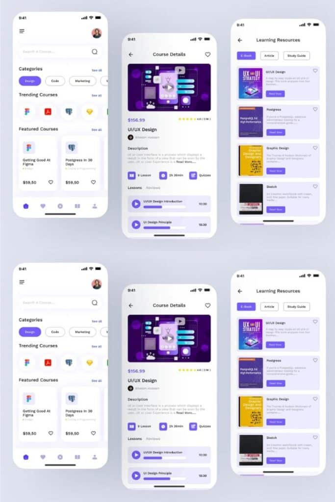
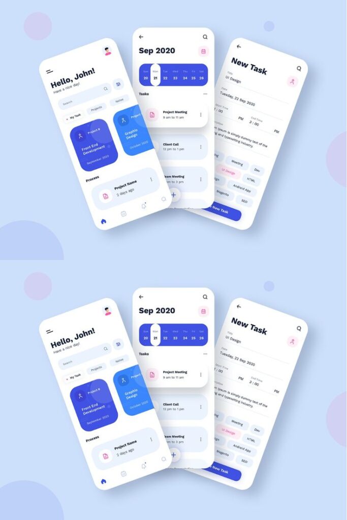
Visual Elements and Branding in Mobile UI/UX
Typography choices, color schemes, and micro-interactions form the foundation of effective mobile visual design. These elements work together to create cohesive brand experiences that enhance usability on mobile screens.
Typography and Readability
Typography directly impacts how users consume content on mobile screens. System fonts like San Francisco on iOS and Roboto on Android provide excellent readability and fast loading times.
Font sizes should follow platform guidelines with minimum 16px for body text. Larger text improves accessibility and reduces eye strain on smaller screens.
Font Weight Hierarchy:
- Bold: Headlines and primary actions
- Medium: Subheadings and important labels
- Regular: Body text and secondary information
- Light: Captions and metadata
Line spacing should be 1.4-1.6 times the font size for optimal readability. This prevents text from appearing cramped on mobile displays.
Limit your design to 2-3 font weights maximum. Too many variations create visual chaos and slow app performance.
Color Schemes and Branding
Color schemes establish brand identity while ensuring usability across different mobile devices. Primary colors should meet WCAG contrast ratios of 4.5:1 for normal text and 3:1 for large text.
Spotify uses its signature green (#1DB954) strategically for key actions like play buttons and premium features. This creates strong brand recognition without overwhelming the interface.
Color Application Guidelines:
- Primary color: 60% of interface elements
- Secondary color: 30% for accents and highlights
- Neutral colors: 10% for backgrounds and text
Dark mode support requires separate color palettes. Test your color schemes on various screen brightnesses and ambient lighting conditions.
Brand colors should remain consistent across all touchpoints. Create a documented color system with hex codes, RGB values, and usage guidelines.
Micro-interactions and Animations
Micro-interactions provide feedback and guide users through mobile interfaces. Button press animations, loading states, and swipe gestures create intuitive experiences.
Keep animations between 200-500 milliseconds for optimal perceived performance. Shorter animations feel abrupt while longer ones slow down user workflows.
Common Micro-interaction Types:
- Tap feedback with subtle scale or color changes
- Pull-to-refresh with loading indicators
- Swipe actions with visual confirmation
- Form validation with real-time feedback
Easing functions like cubic-bezier create natural motion that mimics physical interactions. Linear animations appear mechanical and jarring on mobile devices.
Reduce motion settings must be respected for accessibility. Provide alternative feedback methods like haptic responses or color changes for users with motion sensitivity.
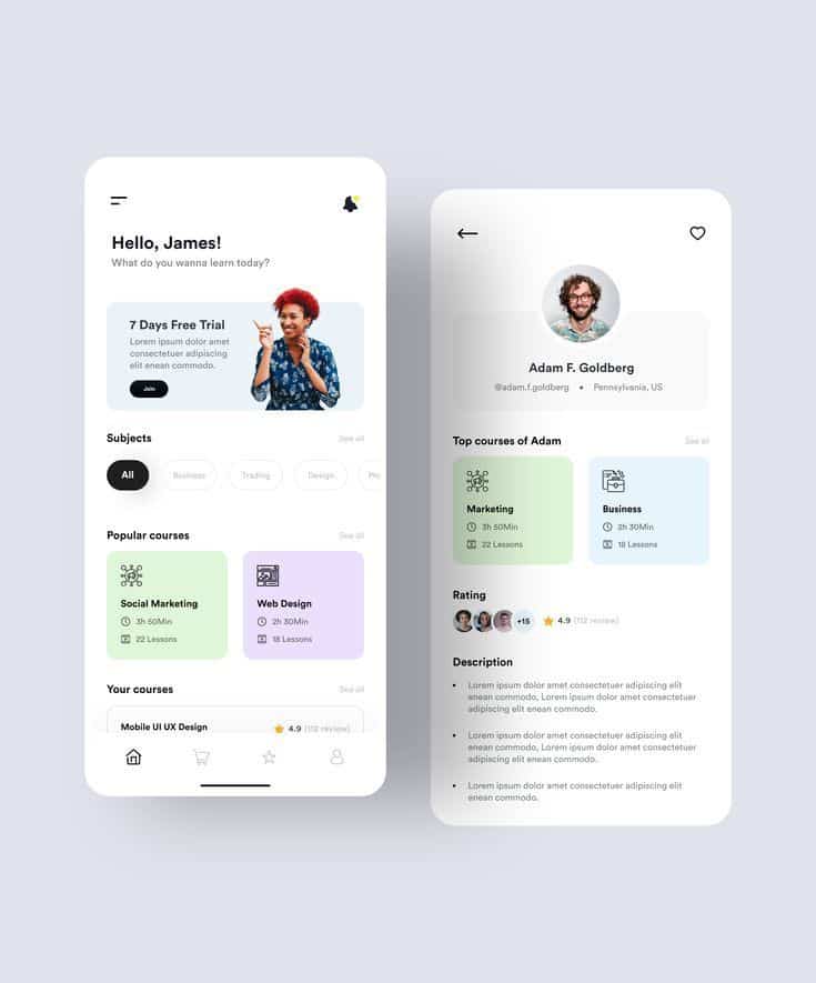
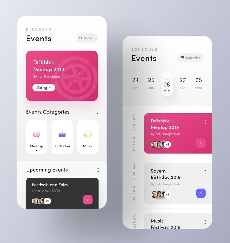
Design Systems, Tools, and Prototyping
Effective mobile app design requires a structured approach that combines design systems with the right tools and prototyping methods. These elements work together to create consistent, user-friendly interfaces that can be efficiently developed and maintained.
Building a Design System
A design system serves as the foundation for consistent mobile app design. It provides a centralized collection of reusable components, guidelines, and standards that ensure visual and functional consistency across your app.
Core Components of a Design System:
- UI components (buttons, forms, navigation)
- Color palettes and typography
- Spacing and grid systems
- Icon libraries
- Interaction patterns
Modular design principles guide effective design system creation. You break down complex interfaces into smaller, reusable components that can be combined in different ways.
This approach reduces development time and maintains consistency. Each component should have clear usage guidelines and variations for different contexts.
Documentation is crucial for design system success. Include code snippets, usage examples, and design specifications that developers can easily reference.
Regular updates keep your design system relevant. As your app evolves, new components and patterns should be added while outdated elements are removed or refined.
Wireframing and Interactive Prototypes
Wireframing establishes the structural foundation of your mobile app before visual design begins. Low-fidelity wireframes focus on layout, content hierarchy, and user flow without distracting visual elements.
Start with basic shapes and placeholder content. This approach helps you validate core functionality and navigation patterns early in the design process.
Interactive prototypes bring static wireframes to life through clickable elements and transitions. They simulate the actual user experience and reveal usability issues before development starts.
Key Prototyping Stages:
- Low-fidelity: Basic interactions and navigation
- Mid-fidelity: More detailed interactions with some visual elements
- High-fidelity: Near-final design with realistic content and animations
Iterative design improves prototypes through continuous testing and refinement. Each iteration should address specific user feedback and usability concerns.
Test prototypes with real users to validate design decisions. Their feedback helps identify pain points and areas for improvement before costly development begins.
Popular UI/UX Design Tools
Modern design tools streamline the mobile app design process from initial wireframes to final prototypes. Each tool offers unique strengths for different aspects of design work.
Figma leads the market with real-time collaboration features and browser-based accessibility. It excels at design systems management and team workflows.
Sketch remains popular among Mac users for its extensive plugin ecosystem and vector-based design capabilities. It integrates well with other design tools and has strong community support.
Adobe XD provides seamless integration with other Adobe Creative Suite applications. It offers robust prototyping features and voice interaction capabilities.
InVision specializes in interactive prototyping and design collaboration. It transforms static designs into clickable prototypes with transition animations.
| Tool | Best For | Platform | Key Feature |
|---|---|---|---|
| Figma | Team collaboration | Web/Desktop | Real-time editing |
| Sketch | Mac-based design | macOS | Plugin ecosystem |
| Adobe XD | Adobe workflow | Cross-platform | Voice prototyping |
| InVision | Prototyping | Web/Mobile | Interactive animations |
Choose tools based on your team’s workflow, platform preferences, and specific project requirements. Many mobile app designers use multiple tools throughout the design process to leverage each tool’s strengths.
Responsive, Scalable, and Future-Ready Mobile Design
Modern mobile apps must adapt seamlessly across devices while maintaining performance and preparing for emerging technologies. This requires strategic responsive design implementation, modular architecture planning, and integration of voice interfaces.
Responsive Design for Different Devices
Your mobile app must function consistently across smartphones, tablets, and various screen sizes. Responsive design ensures users receive the same quality experience regardless of their device.
Flexible Grid Systems form the foundation of responsive mobile design. Use percentage-based layouts instead of fixed pixel dimensions. This approach allows your interface elements to scale proportionally across different screen sizes.
Breakpoint Strategy requires defining specific screen width ranges where your layout adjusts. Common mobile breakpoints include 320px for small phones, 768px for tablets, and 1024px for larger tablets.
Touch targets need minimum 44px dimensions to ensure usability across devices. Buttons and interactive elements should maintain this size while adapting to different screen densities.
Typography scaling must remain readable on all devices. Use relative units like em or rem instead of fixed pixel sizes. This ensures text scales appropriately with system font size preferences.
Scalability and Modular Architecture
Scalable mobile app architecture supports growth without performance degradation. Your design system must accommodate new features and increased user loads efficiently.
Component-based design creates reusable UI elements that maintain consistency across your app. Build a library of buttons, forms, and navigation components that can be easily modified and updated.
Asset optimization ensures fast loading times as your app grows. Use SVG icons for scalability and implement lazy loading for images. Compress media files without sacrificing quality.
Performance monitoring becomes critical as your app scales. Implement analytics to track loading times, user interactions, and potential bottlenecks. This data guides optimization decisions.
Modular code structure allows development teams to work on different features simultaneously. Separate UI components from business logic to enable faster updates and easier maintenance.
Voice Commands and Emerging Trends
Voice interfaces are becoming standard in mobile app development. Your app should integrate voice commands to stay competitive and accessible.
Voice navigation allows users to perform actions without touching the screen. Implement voice commands for common tasks like searching, navigation, and basic interactions.
Accessibility improvements through voice commands benefit users with disabilities. Voice interfaces provide alternative interaction methods for users with motor impairments or visual limitations.
Natural language processing enables more intuitive voice interactions. Design voice commands that feel conversational rather than robotic or overly structured.
AR integration represents the next frontier in mobile design. Plan your architecture to support augmented reality features that overlay digital information onto real-world environments.
Gesture recognition complements voice commands for hands-free interaction. Implement swipe patterns and air gestures that work alongside voice controls for comprehensive accessibility.
- 2.0Kshares
- Facebook0
- Pinterest2.0K
- Twitter3
- Reddit0

