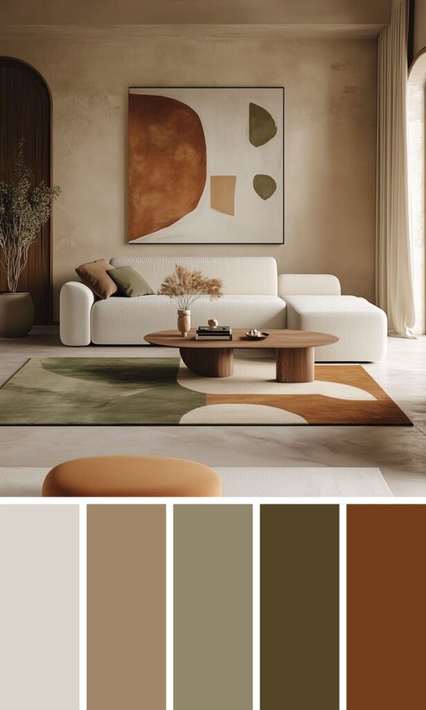
Interior designers use Pantone as a trusted system to select and communicate colors accurately. Pantone provides a universal color language that helps designers choose shades that work well in different lighting and materials. This makes it easier to create balanced and visually appealing spaces.
Designers often rely on Pantone’s Color of the Year and seasonal palettes to stay current with trends. Using these colors helps them bring fresh, relevant looks to homes and commercial spaces. Pantone also offers tools that aid in matching paint, fabrics, and finishes for a cohesive design.
By integrating Pantone colors, interior designers can avoid mistakes caused by color variations. It also helps clients better understand the final look. This system supports clear collaboration between designers, suppliers, and contractors.
Key Takeaways
- Pantone ensures accurate and consistent color choices in interior design.
- Designers use Pantone trends to keep interiors modern and appealing.
- Pantone improves communication between designers and clients.
Pantone and Its Role in Interior Design
Pantone helps interior designers pick exact colors for projects and shapes trends in the field. Its color system sets a standard that makes communication about color clear and consistent. Designers use Pantone to match colors, avoid mistakes, and keep up with popular choices.
Understanding Pantone Color Standards
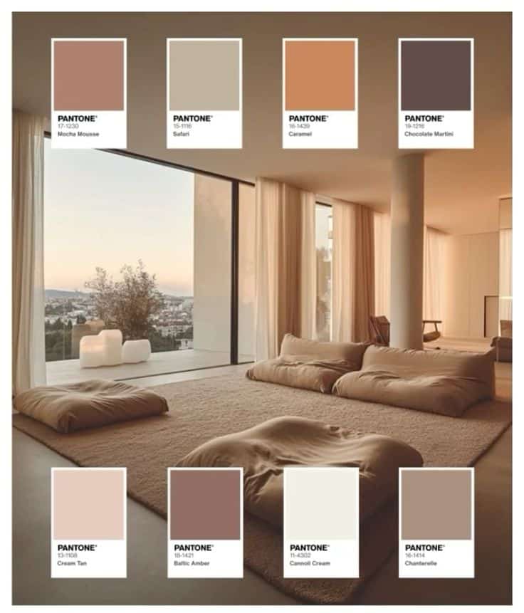
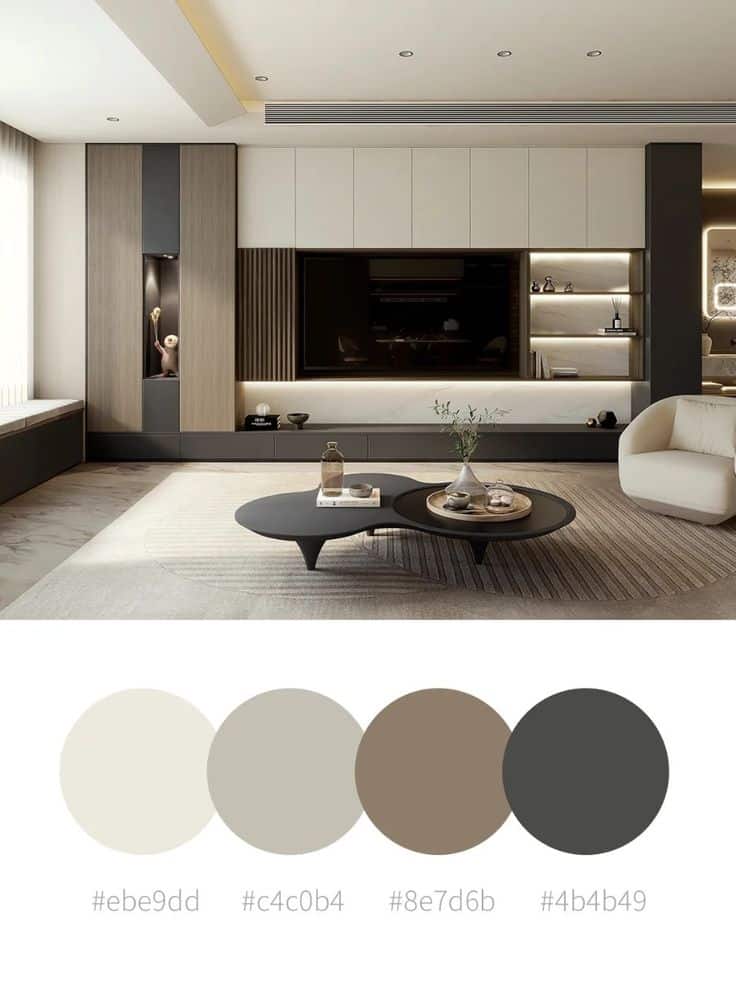
Pantone provides a universal language for color through its Pantone Matching System (PMS). This system assigns a unique code to every color, allowing designers to identify and reproduce colors precisely.
Pantone colors come with detailed guides and chips that show how colors look under different lights. This helps designers and clients see the true shade, which avoids confusion.
Because colors can look different on screens and printed materials, the Pantone system ensures that the color selected will match paint, fabric, or wallpaper exactly. This accuracy saves time and money during design.
Impact of Pantone on Modern Color Trends
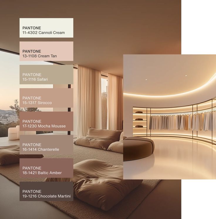
Pantone’s annual Color of the Year influences many industries, including interior design. When they pick a color, manufacturers and designers often incorporate it into their products and projects.
This yearly announcement drives what colors appear in paint collections, furniture, and home accessories. Designers use these trends to create fresh, modern spaces that appeal to buyers and clients.
Pantone’s influence also extends to palettes that mix colors, helping designers create balanced interior schemes that feel current and stylish without guessing.
Why Interior Designers Rely on Pantone
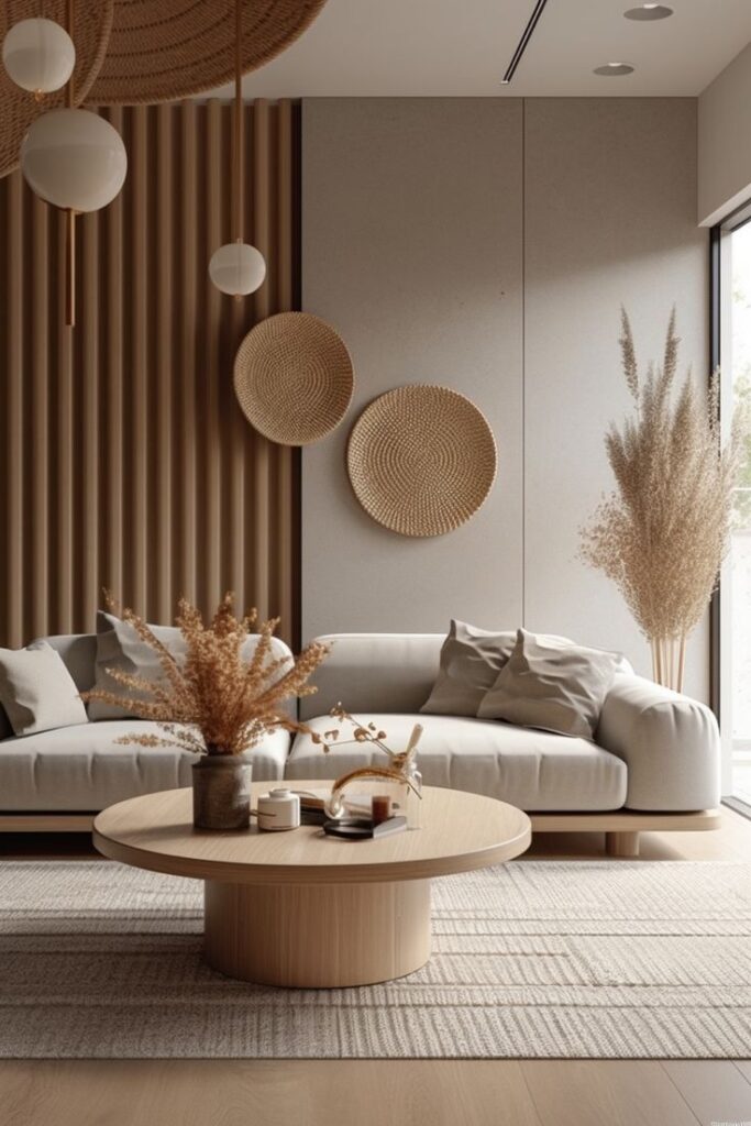
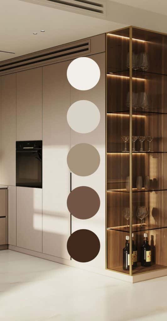
Designers trust Pantone because it removes guesswork when choosing colors. The system works internationally, which is vital for projects using global suppliers or clients.
Pantone helps teams communicate better by providing precise color specifications. This reduces the chance of costly errors during building or decorating.
Working with Pantone also speeds up approval processes. Clients can see exact color samples and know what to expect, making decisions easier and faster. The system supports creativity while keeping designs consistent.
How Interior Designers Use Pantone
Interior designers rely on Pantone to handle color accurately and creatively in their projects. They use it to pick colors, build solid design plans, and shape the room’s feel and mood.
Color Selection and Coordination
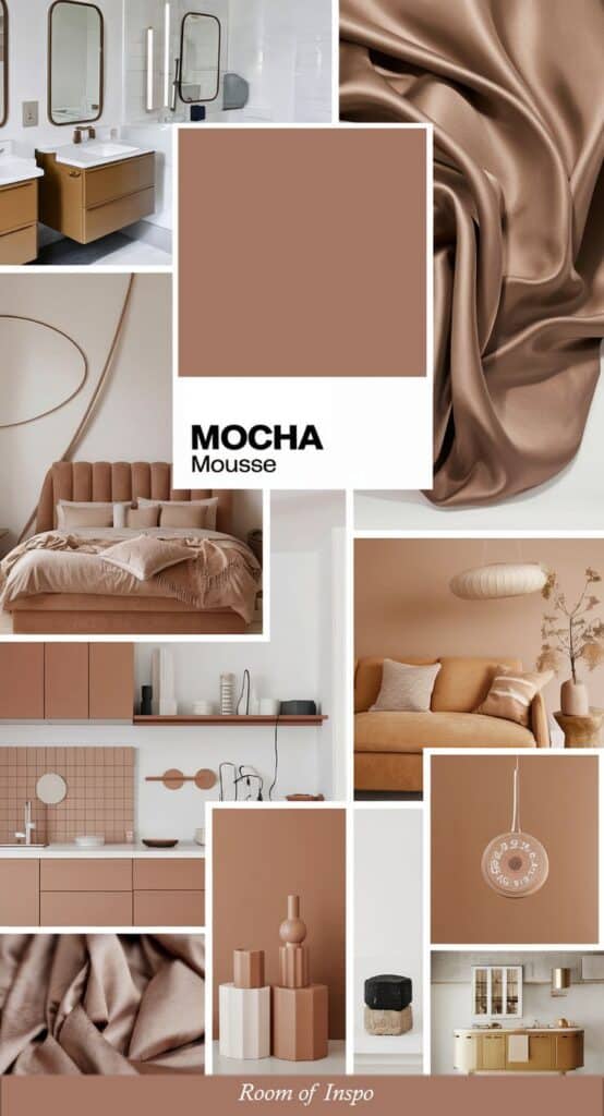
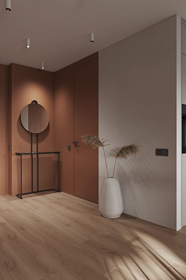
Designers use Pantone to find exact shades that suit a space’s purpose and style. This system helps them avoid guesswork by providing a universal color code that manufacturers, clients, and contractors understand.
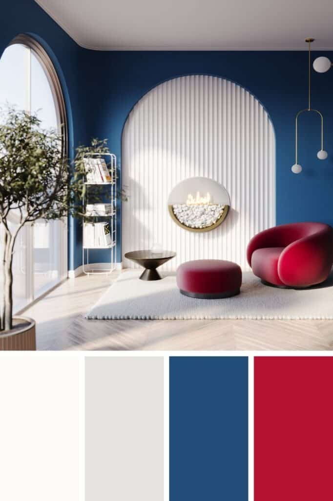
Pantone guides them in pairing colors correctly. Designers often create color palettes by mixing complementary or harmonious Pantone colors. This ensures balance and consistency across walls, furniture, fabrics, and decor.
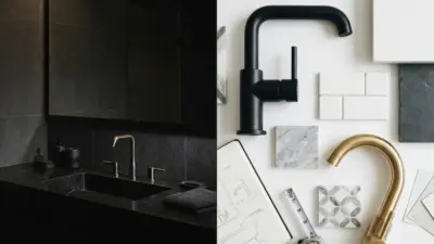
By using Pantone swatches, they can compare tones side-by-side and decide what works best under different lighting conditions.
Incorporating Pantone in Design Concepts
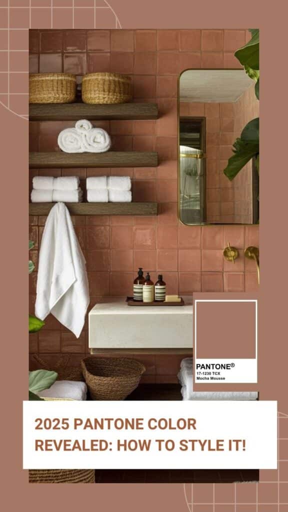
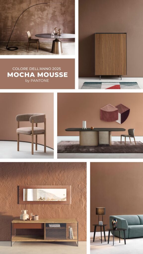
Pantone colors serve as a foundation for many design ideas. Designers start with a specific Pantone shade to build themes around it, linking colors to materials, textures, and shapes.
This approach simplifies communication with clients. When a designer says “Pantone 186 C” (a bright red), the client and vendors know exactly which shade to expect.
They also use Pantone in digital drawings and mood boards to show clients how the final space will look, making changes easier before construction or buying materials.
Pantone for Mood and Atmosphere Creation
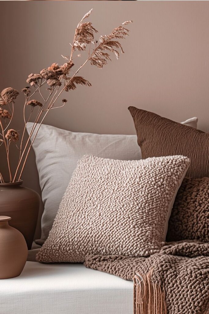
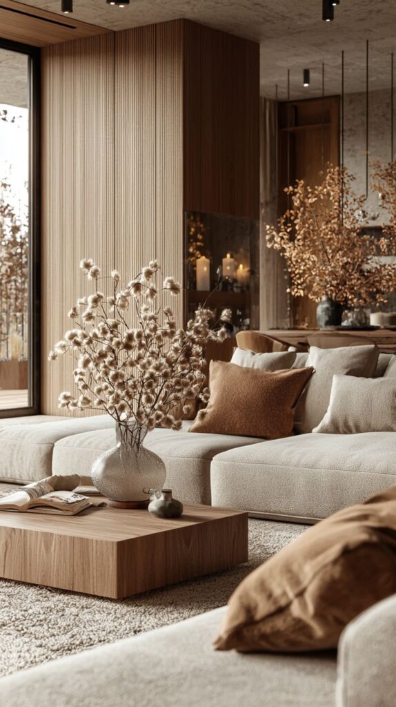
Colors affect emotions. Designers use Pantone to pick tones that set the right mood in each room.
For example, calm blues like Pantone 7455 are chosen for bedrooms or offices to promote relaxation and focus. Warm colors, such as Pantone 7417, brighten living spaces to add energy and welcome feelings.
Using Pantone ensures these emotional goals are met with exact, repeatable colors, avoiding unexpected results from vague color descriptions.
Pantone Color of the Year in Interior Design
Pantone’s Color of the Year sets a clear direction for many designers. It shapes color choices and styles used in homes and commercial spaces. The selected color pops up in fabrics, paints, and decor, making it a key trend marker.
Influence on Seasonal Trends
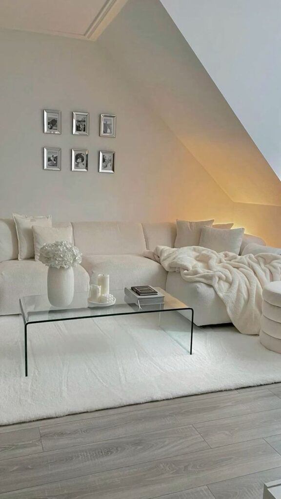
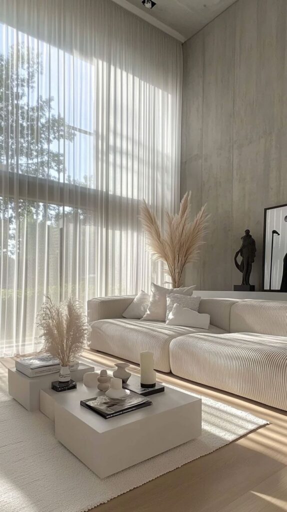
The Color of the Year often guides seasonal palettes. Designers pair it with complementary shades to create fresh looks. For example, if the color is a warm orange, they might match it with earthy browns or soft yellows.
This shift affects more than paint. It influences wallpaper, furniture upholstery, and accessories. Retailers stock products featuring the color, making it easier for clients to update spaces. Interior designers rely on this color to keep their work modern and relevant each year.
Popular Projects Featuring Pantone Colors
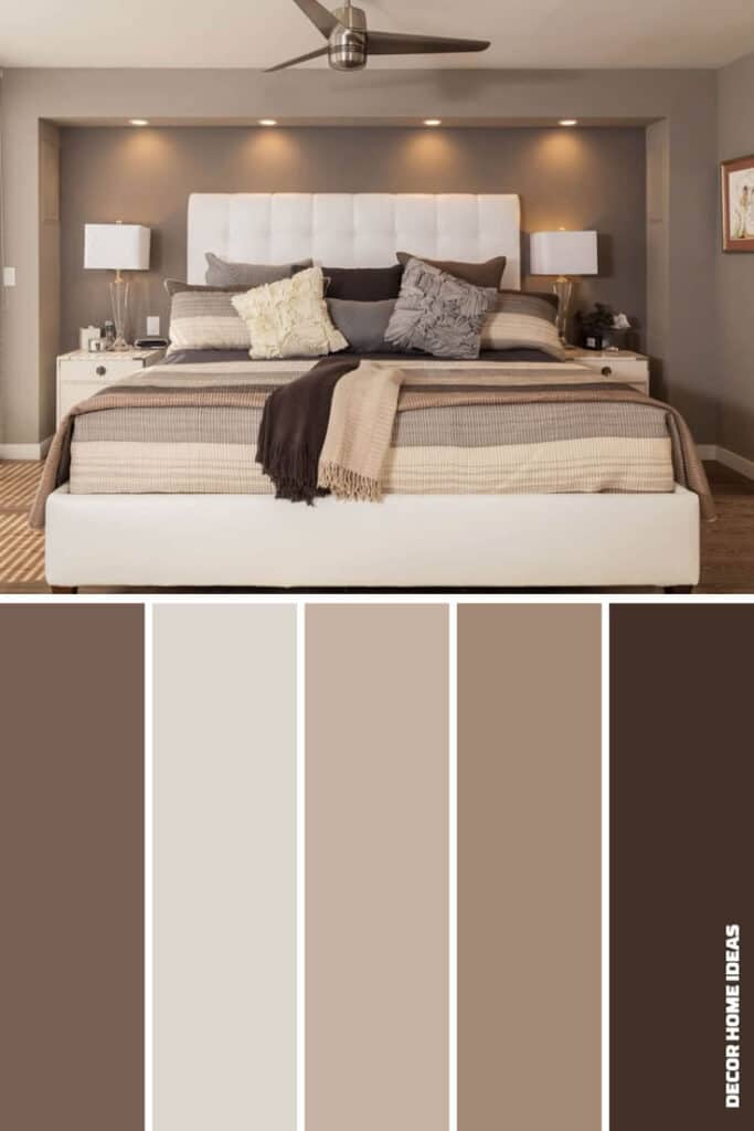
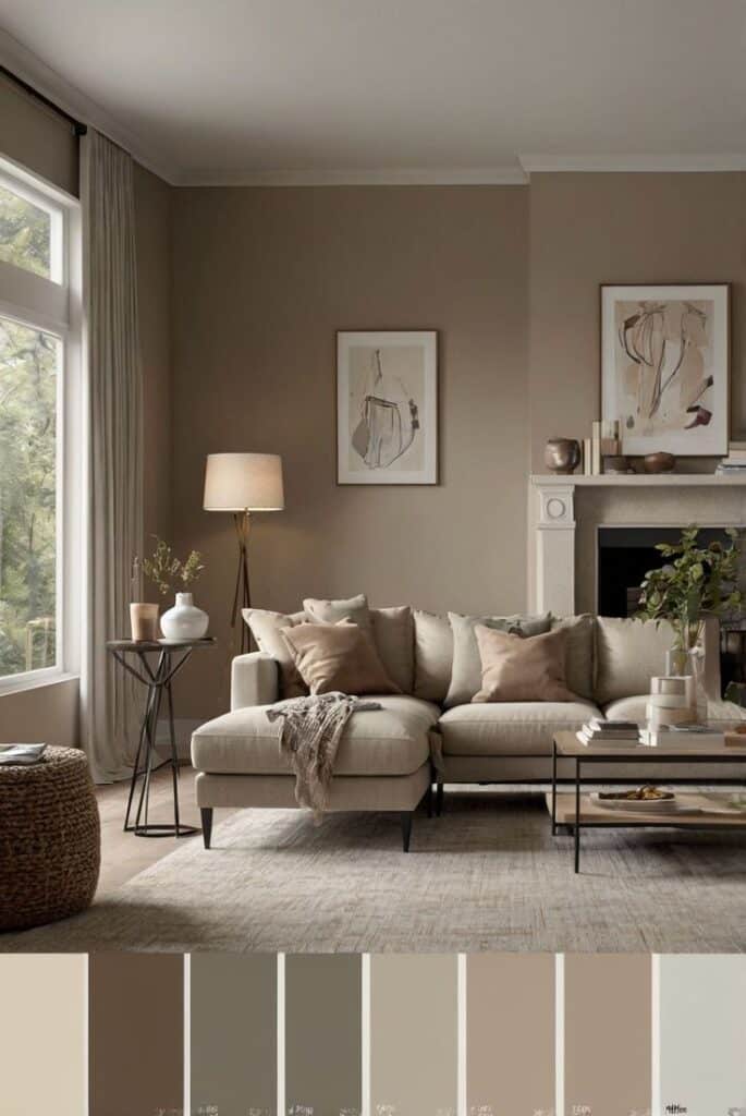
Many projects use the Color of the Year to attract attention. Residential spaces, especially living rooms and kitchens, often highlight it on accent walls or decor items. Offices and retail stores use it to build inviting atmospheres that feel current.
Interior designers sometimes create mood boards focused entirely on this color. They layer textures like velvet cushions or ceramic vases in this shade. It helps clients visualize how the Color of the Year can fit into their spaces. Using this color also shows designers’ awareness of market trends.
Tools and Resources for Pantone Integration
Interior designers rely on specific tools and partnerships to use Pantone colors accurately. They use both physical and digital aids to select and match colors. Close communication with suppliers ensures the chosen colors translate well in materials.
Pantone Color Guides and Digital Tools
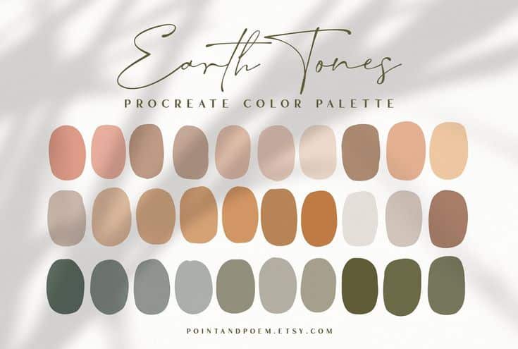
Pantone offers various color guides that designers use to see exact shades in print. The Pantone Formula Guide shows solid colors, while the Pantone Color Bridge compares Pantone colors to CMYK values for printing.
Digital tools include the Pantone Connect app, which helps designers browse and save colors on their devices. It also integrates with popular design software like Adobe Photoshop and Illustrator. These tools give accurate color codes and allow easy sharing with clients and teams.
Using physical guides alongside digital resources helps prevent color mismatches in design projects. Designers can check colors in different lights and formats, ensuring consistency.
Collaboration with Manufacturers and Suppliers
Working with manufacturers is crucial because Pantone colors can look different on fabrics, paint, or other materials. Designers share Pantone codes with suppliers to get exact matches.
Regular communication helps fix color issues early. Sometimes, samples or swatches are ordered to test before full production. Suppliers often have Pantone standards built into their production, reducing errors.
This collaboration helps keep the intended color consistent from design to final product. It also speeds up approval processes with clients because the outcomes match expectations more closely.
Industry Insights: Leading Interior Designers Using Pantone
Top interior designers use Pantone colors to create precise moods and cohesiveness in their spaces. They share practical examples and tips that help others apply these colors effectively.
Notable Projects and Case Studies
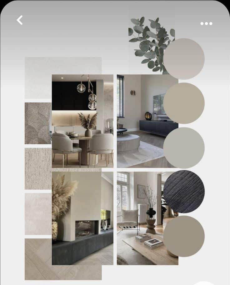
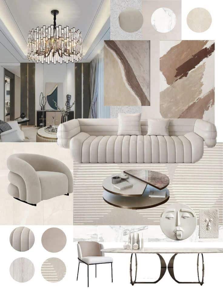
Several leading designers have showcased Pantone’s value in well-known projects. For example, Kelly Wearstler used Pantone’s Color of the Year to transform a hotel lobby, creating a bold yet balanced look. David Rockwell employed Pantone palettes in restaurant interiors, ensuring the colors matched brand identity perfectly.
These projects highlight how Pantone guides both creativity and client communication. Using Pantone swatches guarantees colors appear the same across different materials, which reduces errors in design stages. This approach also helps create memorable and harmonious spaces in residential and commercial projects.
Expert Tips and Best Practices
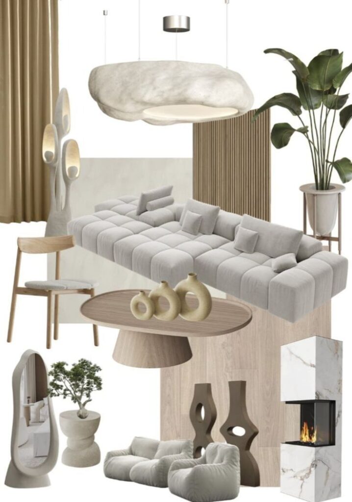
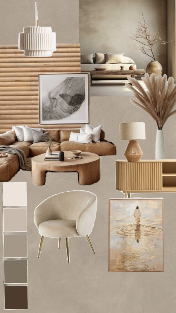
Top designers advise always starting with Pantone chips when picking colors. They recommend testing these colors under different light conditions since lighting affects how colors look in a room. Designers also suggest combining Pantone with neutral tones to avoid overwhelming a space.
Documentation is important, too. Using Pantone codes in contracts and plans ensures everyone involved—like painters and fabricators—uses the right shades. Finally, some experts stress the value of updating palettes yearly to keep designs fresh and aligned with current trends.
Challenges and Solutions with Pantone in Interiors
Working with Pantone colors in interior design often brings specific problems related to how colors show up on different surfaces and what clients want. Designers must manage these issues to keep colors true and clients satisfied.
Color Accuracy Across Materials
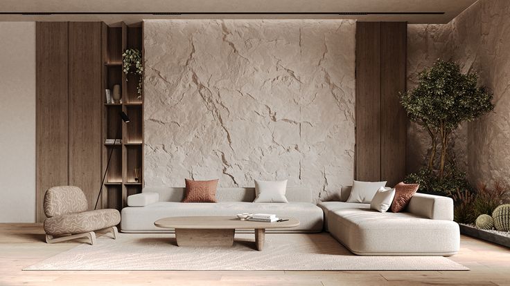
Pantone colors can look different depending on the material used. For example, a Pantone shade on fabric may appear darker or lighter than the same color on paint or wallpaper. This happens because materials have different textures and finishes, which affect how light reflects.
To solve this, designers test Pantone samples on the exact materials before finalizing choices. They also use physical color chips for comparison. Digital tools help, but nothing matches checking real samples under natural light. This reduces mistakes and ensures the chosen colors look as expected in the finished space.
Balancing Pantone with Client Preferences
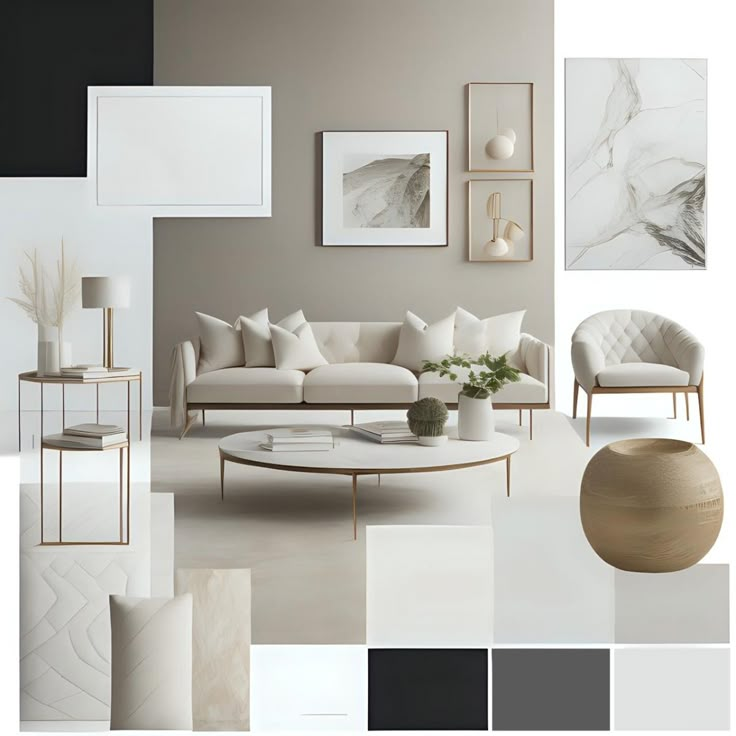
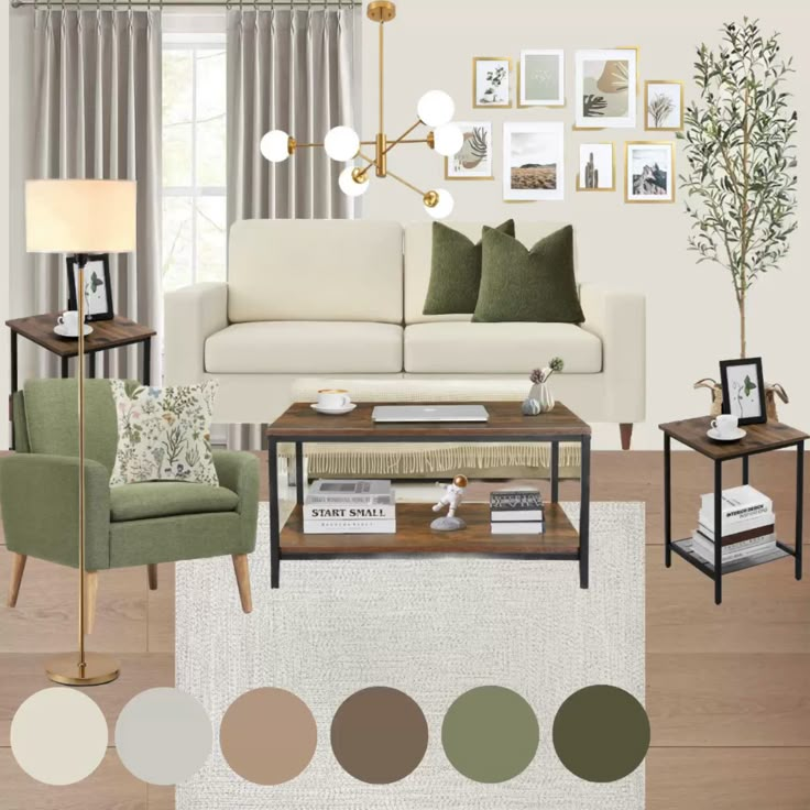
Clients may have strong opinions that don’t always match chosen Pantone colors. Sometimes a client prefers a warmer or cooler tone that differs from the exact Pantone shade. Designers need to blend Pantone’s strict color system with what the client wants.
They address this by showing different Pantone options and alternatives close in shade. Explaining the effect of color temperature and room lighting helps clients understand choices. Designers may adjust Pantone colors slightly or recommend complementary hues to create a pleasing result without losing the Pantone guidance. Clear communication is key to avoid misunderstandings.
Future Trends for Interior Designers Using Pantone
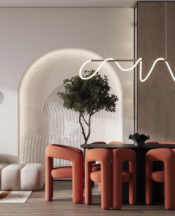
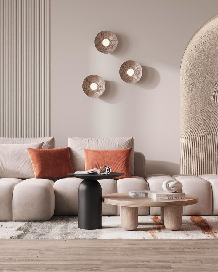
Interior designers will increasingly rely on digital tools linked to Pantone colors. These tools help create accurate color previews on screens and in virtual reality spaces. It makes color selection faster and more precise.
Sustainability will shape color choices. Pantone’s focus on eco-friendly pigments will grow, encouraging designers to pick colors that are less harmful to the environment. This supports a greener design process.
The rise of personalized color palettes is expected. Designers will use Pantone’s data to customize colors for individual clients, matching personal tastes and lifestyle needs. This approach adds uniqueness to every project.
Colors inspired by nature, such as earthy tones and muted greens, will continue to be popular. Pantone’s yearly color reports often highlight these shades, guiding designers toward calm and balanced interiors.
Integration with smart home technology will influence color trends. Designers might use Pantone colors that work well with lighting systems that change tone throughout the day. This dynamic use of color enhances comfort and mood.
| Trend | Explanation |
|---|---|
| Digital Tools | Accurate color previews in virtual spaces |
| Sustainability | Eco-friendly pigments for greener interiors |
| Personalized Palettes | Tailored colors for individual clients |
| Nature-Inspired Colors | Earthy and calming tones |
| Smart Technology | Colors that adapt with lighting systems |
- 1.3Kshares
- Facebook0
- Pinterest1.3K
- Twitter0
- Reddit0

