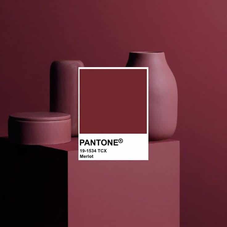
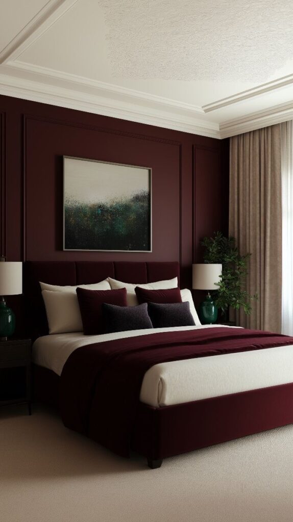
Burgundy Pantone style brings a rich, warm tone to home design that can create a sophisticated and cozy atmosphere. It offers a versatile color option that works well in many rooms, adding depth and elegance without overwhelming the space.
Using burgundy in interiors can highlight certain features or set a mood depending on the lighting and accompanying colors. It pairs nicely with neutral tones and metallic accents, making it easy to mix and match with existing decor.
This style is not only for walls or large furniture but also shines in smaller details like pillows, rugs, or art pieces. Understanding how to balance burgundy can help homeowners create inviting spaces with style and personality.
Key Takeways
- Burgundy adds warmth and sophistication to various rooms.
- It blends well with neutrals and metallic finishes.
- Small accents in burgundy can enhance the overall design.
Understanding Burgundy Pantone Style
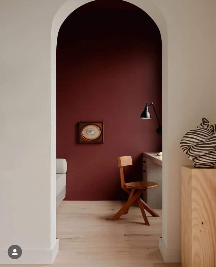
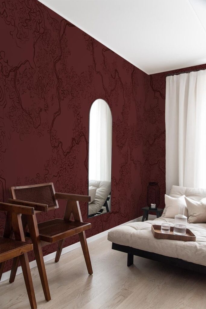
Burgundy Pantone is a deep red tone often used in home design for its warmth and richness. Its history and psychological effects shape how it is used to create atmosphere and style in interiors.
Defining Burgundy Pantone Color
Burgundy Pantone is a specific shade of dark red with hints of brown and purple. It is named after the Burgundy wine region in France, reflecting its rich, wine-like color. The Pantone system gives it a unique code to ensure exact color matching across different materials and products.
This color stands out for its bold yet elegant appearance. It is darker and more subdued than bright red, making it easier to use in both modern and traditional home spaces. Burgundy Pantone works well with neutral colors like beige, gray, and even navy for contrast.
History and Evolution in Home Design
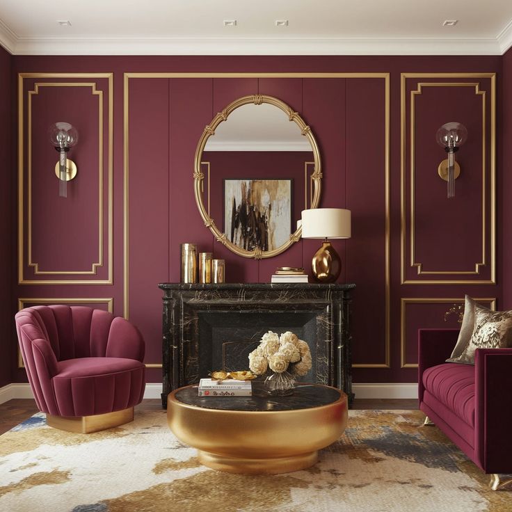
Burgundy has long been associated with luxury and sophistication. Originally used in royal and religious settings, it became popular in home design during the 19th and 20th centuries. Interior designers used it in fabrics, wallpapers, and trims to add a sense of warmth and class.
In recent decades, burgundy Pantone has evolved to fit modern styles. Designers now often pair it with minimalist furniture and metallic accents to balance its boldness. It is used not only in living rooms and bedrooms but also in kitchens and dining areas to create rich, inviting spaces.
Significance of Color Psychology
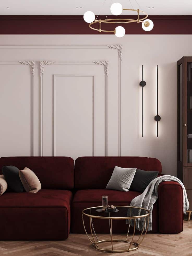
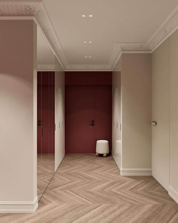
Burgundy Pantone evokes feelings of comfort, power, and stability. It combines the energy of red with the grounded quality of brown, creating a balanced emotional effect. People often feel calm and secure in a room decorated with this color.
In home design, burgundy can help create intimate and cozy environments. Its psychological impact encourages relaxation and focus, which makes it ideal for spaces where people gather or work. This color also symbolizes wealth and success, adding a subtle sense of prestige to interiors.
Key psychological traits of burgundy:
- Warmth
- Confidence
- Comfort
- Strength
Incorporating Burgundy Pantone in Interior Design
Burgundy Pantone adds depth and warmth to a space. It works well on walls, furniture, and fabrics to create a balanced and stylish room.
Accent Walls and Statement Ceilings
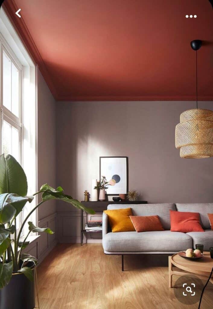
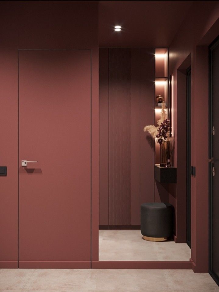
Using burgundy on an accent wall can make a room feel cozy and inviting. It works best on a wall that draws attention, like behind a bed or in a living room seating area.
A burgundy ceiling offers a bold, unexpected touch. It works well in rooms with high ceilings and neutral walls.
Pair burgundy walls or ceilings with light-colored trim or furniture to avoid making the space feel too dark. Matte or eggshell finishes help keep the look soft.
Furniture Selection and Placement
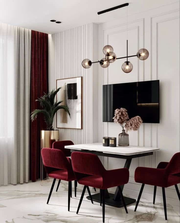
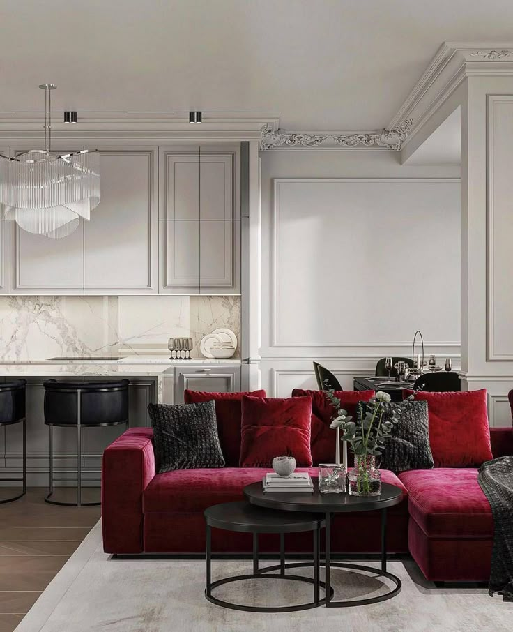
Burgundy furniture pieces can be the focal point in a room. Sofas, armchairs, or ottomans in burgundy create richness without overwhelming.
The color pairs well with wood tones like walnut or oak. Place burgundy furniture near windows or lighter areas to balance the room’s light.
Avoid using burgundy on every piece. Use it paired with neutral or muted tones like beige, gray, or cream for contrast.
Textiles, Fabrics, and Upholstery
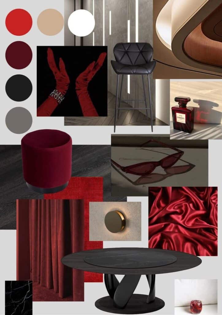
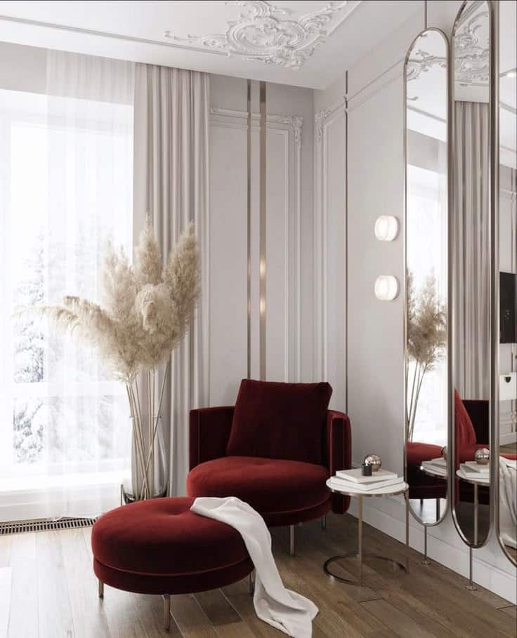
Burgundy textiles add texture and warmth. Curtains, pillows, and rugs in burgundy soften spaces and create visual interest.
Velvet or suede fabrics highlight burgundy’s richness and feel luxurious. For a casual look, cotton or linen works well.
Mix burgundy textiles with patterns that include gold, navy, or soft pink for variety. Layering different fabrics keeps the design dynamic without clutter.
Burgundy Pantone in Room-Specific Settings
Burgundy Pantone works differently depending on the room it is used in. It can bring warmth, elegance, or a cozy feel based on the space. Choosing the right shade and pairing it well helps balance the room’s look.
Living Room Applications
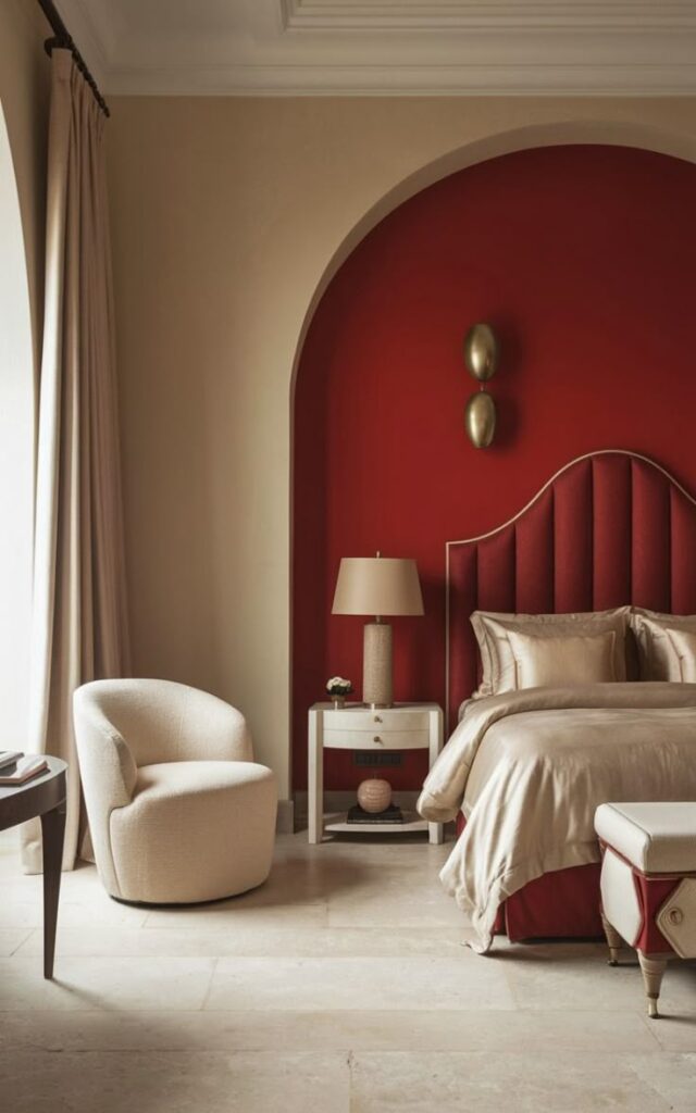
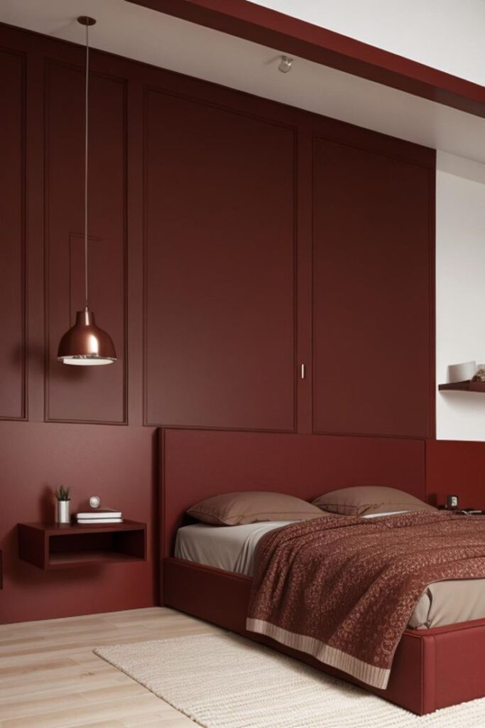
In living rooms, burgundy adds a rich, welcoming tone. Walls painted burgundy create a dramatic backdrop for neutral furniture. It works well with creams, tans, and greys.
Using burgundy in accents like throw pillows, rugs, or curtains gives the space color without overwhelming it. Leather sofas in dark burgundy can feel sophisticated.
Good lighting is important. Warm lights enhance burgundy’s depth, making the room feel cozy but still bright. Avoid too many dark colors together, or the room may feel small.
Bedrooms and Personal Spaces
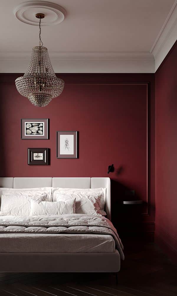
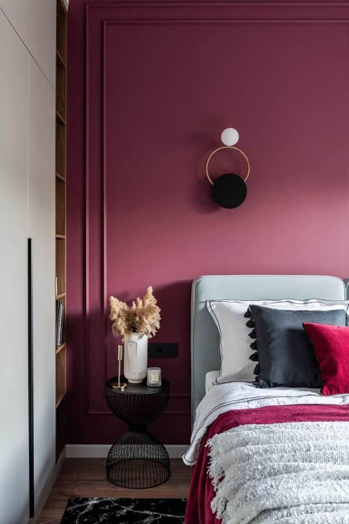
Burgundy in bedrooms promotes warmth and calm. It suits bedding, curtains, or even an accent wall behind the bed. The color helps create a relaxing and intimate mood.
Pairing burgundy with soft textures like velvet or linen works best. White or blush tones soften the boldness of burgundy and keep the space airy.
In smaller bedrooms, burgundy is better in small doses to avoid making the room feel closed in. Lamps, headboards, or small rugs can add the right touch without overpowering.
Kitchens and Dining Areas
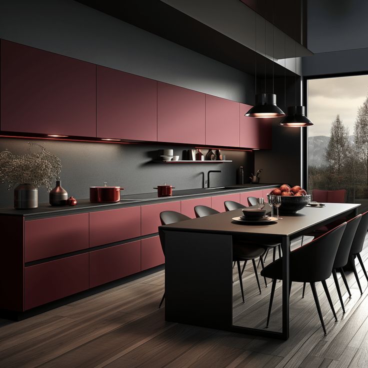
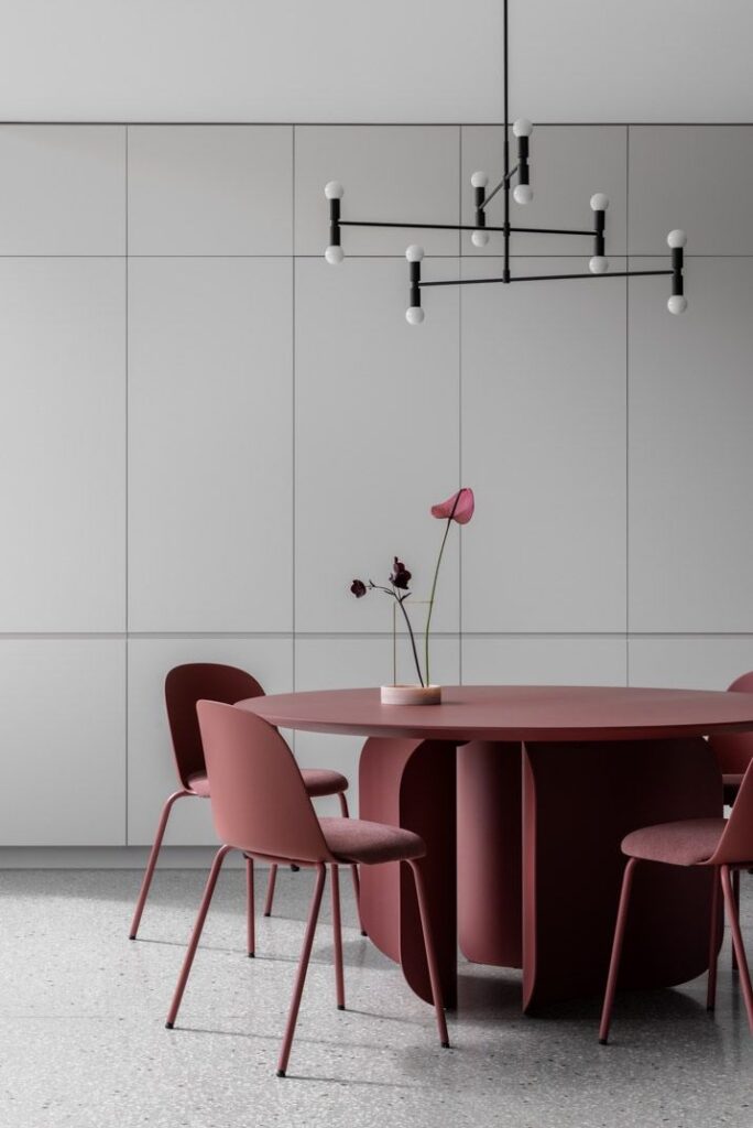
In kitchens and dining rooms, burgundy adds richness and appetite appeal. Cabinets or backsplashes in burgundy make a bold statement without looking too heavy when paired with light countertops.
Dining chairs or table runners in burgundy can warm up these areas. The color pairs well with metals like brass or copper for a stylish effect.
Good lighting is key to prevent the space from feeling dark. Burgundy works best where natural light or bright artificial light is present to balance its strong tone.
Styling With Burgundy Pantone Accents
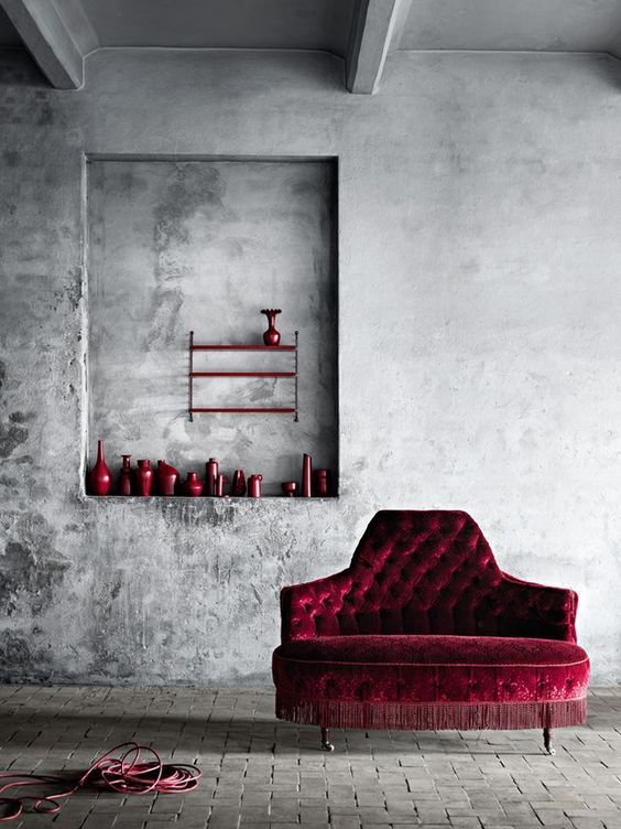
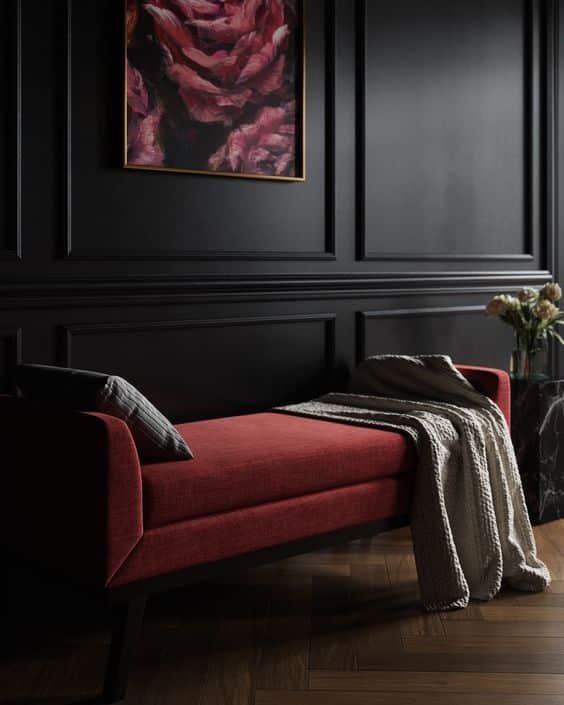
Burgundy Pantone adds warmth and depth when used properly in home design. It works best when paired with carefully chosen accents and art. These areas highlight how to bring this color into rooms without overwhelming the space.
Accessories and Decorative Elements
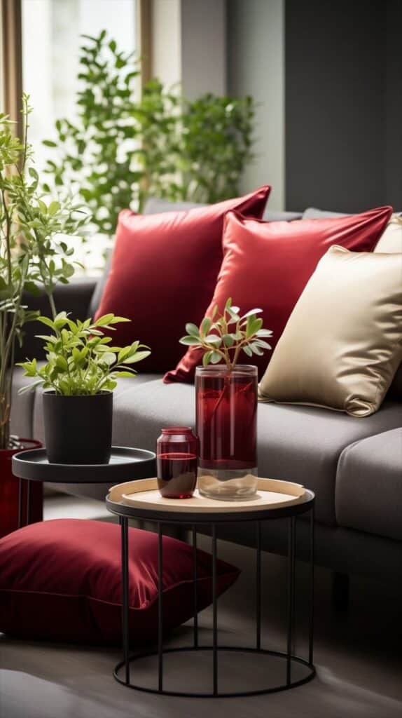
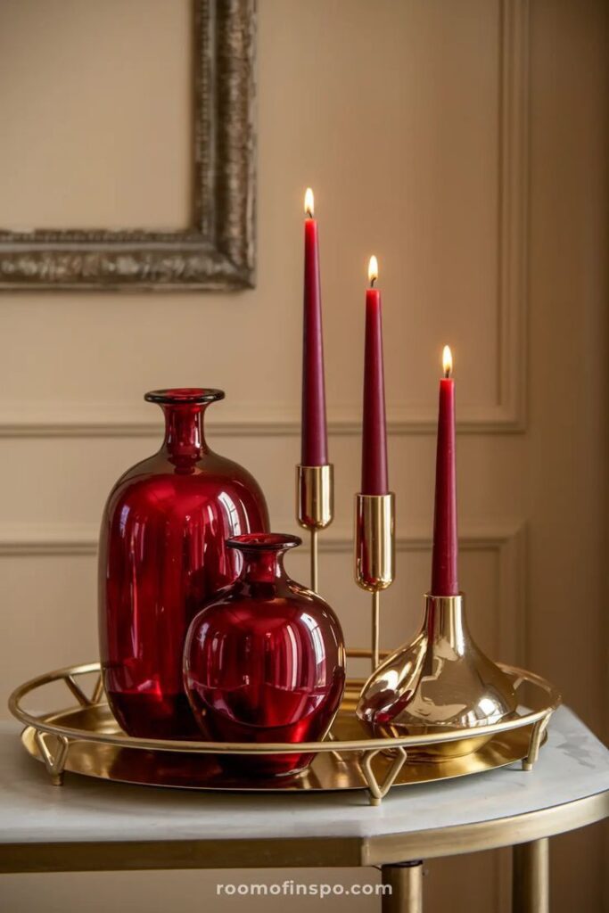
Burgundy accessories bring a rich touch to any room. Throw pillows, rugs, and curtains in this color create strong focal points. Velvet or suede materials enhance the luxurious feel.
Small items like vases, candle holders, and picture frames in burgundy add subtle pops of color without dominating the room. They work well with neutral tones like beige, gray, or soft white.
In kitchens, burgundy dishware or table linens create a cozy, inviting look. Mixing metals such as gold or black with burgundy accessories highlights the color’s sophistication.
Artworks and Wall Decor
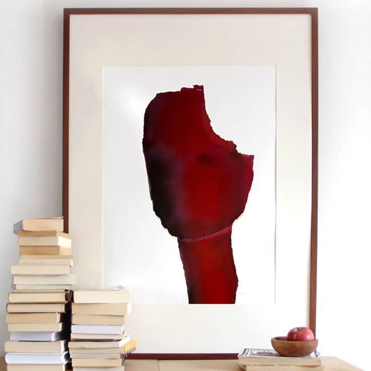
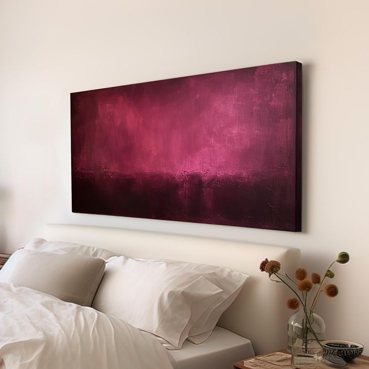
Burgundy in art draws immediate attention. Large paintings or prints with burgundy tones anchor living spaces and bedrooms alike.
Gallery walls with a few burgundy-themed pieces break up neutral walls with color and interest. Choosing abstract designs or warm landscapes suits this hue well.
Wall tapestries or framed textiles in burgundy add texture along with color. These pieces bring a handcrafted feel that complements both modern and traditional styles.
Heavier frames in dark wood or black help burgundy art stand out while maintaining balanced decor.
Color Combinations and Palettes
Burgundy works well with many colors, creating different moods and styles. It can either soften bold combinations or stand out as a strong accent. Choosing the right colors alongside burgundy helps balance a room’s look.
Pairing With Neutrals
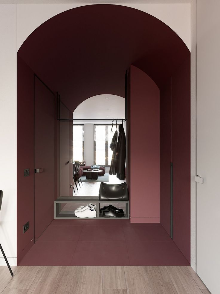
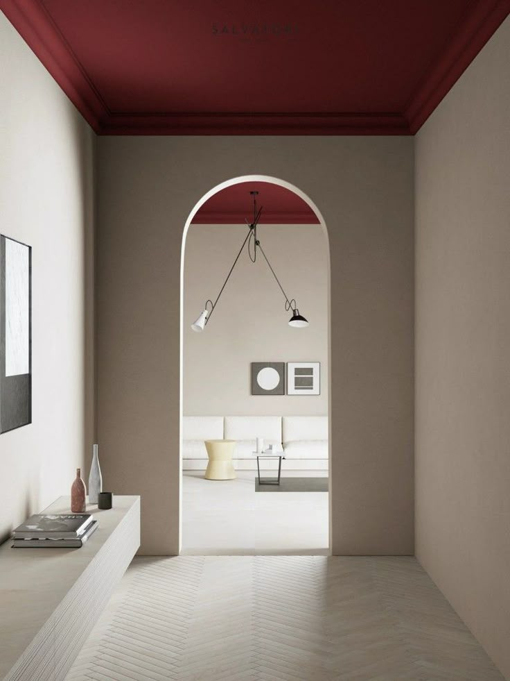
Burgundy pairs smoothly with neutral colors such as beige, gray, and cream. These tones let burgundy become the room’s focus without overwhelming the space. Light gray walls with burgundy furniture add a modern, calm feel.
Neutral wood tones, like oak or walnut, combine naturally with burgundy. They bring warmth and keep the space grounded. White trim or ceiling details can brighten the look without clashing.
For a cozy atmosphere, dark neutrals like charcoal or taupe work well. They make the burgundy deeper and richer while keeping the room inviting.
Complementary and Contrasting Colors
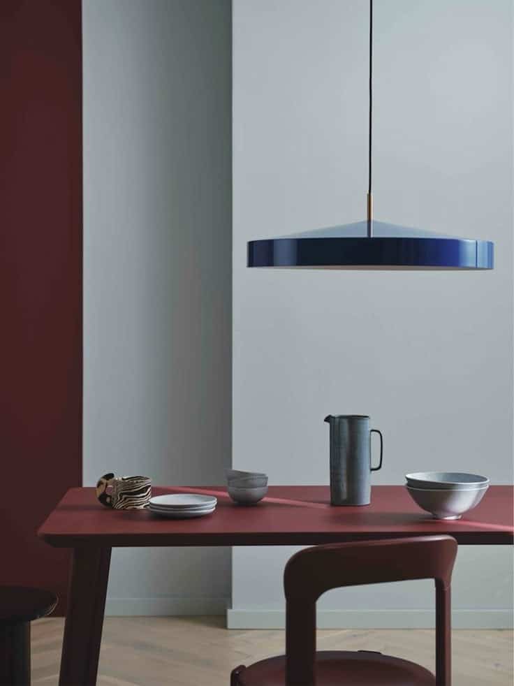
Green is the complementary color to burgundy, offering a bold contrast. Olive green or sage walls create a balanced look when paired with burgundy accents. Fresh plants add this natural green touch simply.
For a more vibrant palette, mustard yellow or burnt orange adds energy. These colors create warmth and interest, especially in living or dining areas. However, it’s best to use them in small amounts to avoid overpowering.
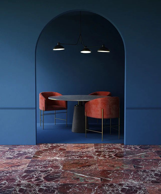
For a modern contrast, navy blue works well with burgundy. Both are dark but different enough to make the room feel layered. Using burgundy on textiles and navy on walls or furniture is a common choice.
Seasonal Palette Trends

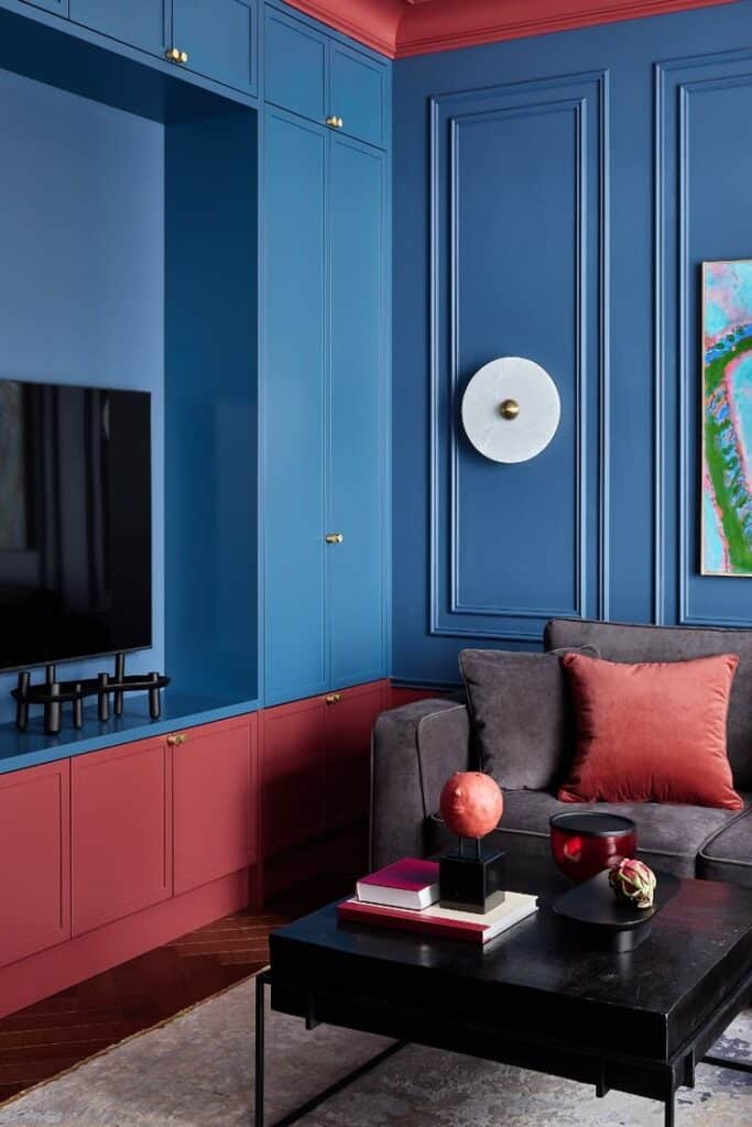
In cooler months, burgundy pairs with deep greens, golds, and rich browns to emphasize warmth. These colors reflect fall and winter moods, perfect for cozy spaces.
Spring and summer palettes include lighter tones like soft pink, blush, and pale gray. These soften burgundy’s intensity and create a fresh, airy style.
For year-round use, blending burgundy with warm neutrals and gold accents keeps the look elegant and timeless. This combination works well in both classic and contemporary rooms.
Lighting Considerations for Burgundy Spaces
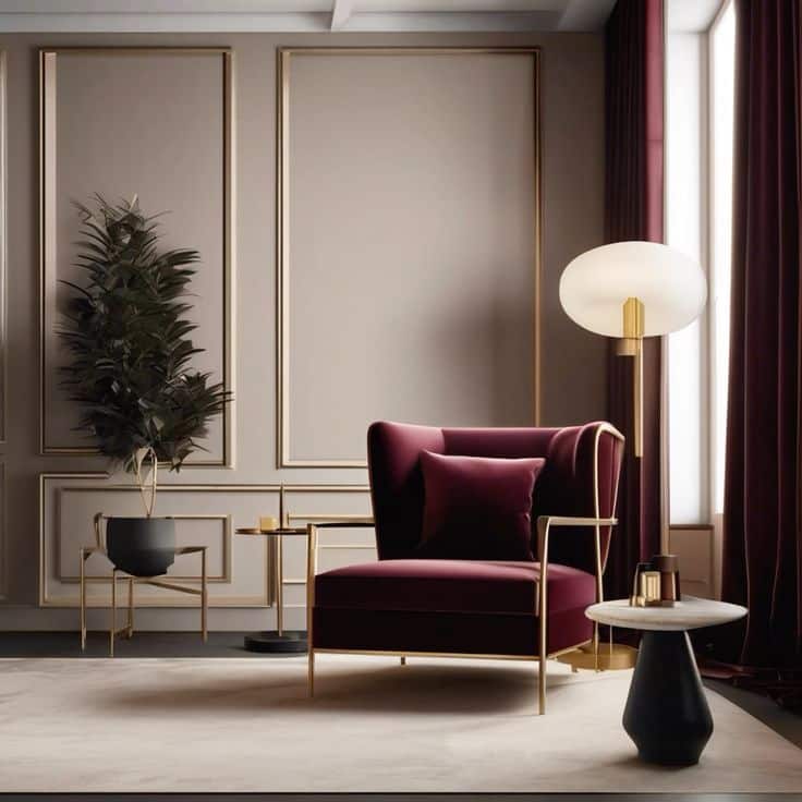
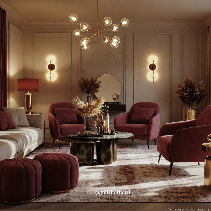
Burgundy requires careful lighting to bring out its rich tone without making a room feel dark. Different light types impact how the color looks and the room’s mood. Proper lighting also helps add warmth and depth to the space.
Natural Versus Artificial Light
Natural light shows burgundy in its truest form. Bright sunlight highlights the subtle red and purple undertones. Rooms with large windows or skylights are ideal to avoid the color feeling heavy.
Artificial lighting needs balance. Warm white bulbs (2700K-3000K) bring out burgundy’s warmth. Cooler lights (over 4000K) can make the color seem dull or washed out.
Using dimmable artificial lights lets the user adjust brightness based on the time of day. This flexibility helps maintain the rich, inviting look of burgundy all day.
Enhancing Depth and Warmth
Layered lighting adds depth to burgundy rooms. Ambient lighting provides overall brightness, while accent lights highlight walls or artwork for texture.
Using light fixtures with gold or bronze tones complements burgundy well, increasing the feeling of warmth. Reflective surfaces like mirrors can also spread light and prevent the space from feeling cramped.
Soft lampshades and indirect lighting reduce harsh shadows. This technique keeps the color cozy and inviting without overwhelming the room.
Burgundy Pantone in Outdoor Living Areas
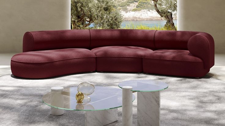
Burgundy Pantone adds a rich and warm touch to outdoor spaces. It works well on cushions, umbrellas, and outdoor rugs to create a cozy atmosphere.
Using burgundy in planters or garden furniture can bring depth without overpowering the natural greenery. It pairs nicely with wood tones and neutral colors like beige or gray.
Outdoor lighting, such as lanterns or string lights with burgundy accents, creates a soft glow. This color helps define seating areas and adds a stylish flair.
Here are some ideas to use burgundy in outdoor living areas:
- Burgundy cushions on wicker or metal chairs
- An area rug with burgundy patterns
- Burgundy-painted flower pots
- Patio umbrellas or canopies in burgundy
- Accent pieces like blankets or throws
Burgundy also highlights seasonal decor. It works well with autumn leaves or winter pine, making outdoor spaces inviting year-round.
Care should be taken to select weather-resistant materials. Fade-proof fabrics and durable paints ensure the color lasts through seasons.
Maintenance and Longevity of Burgundy Elements
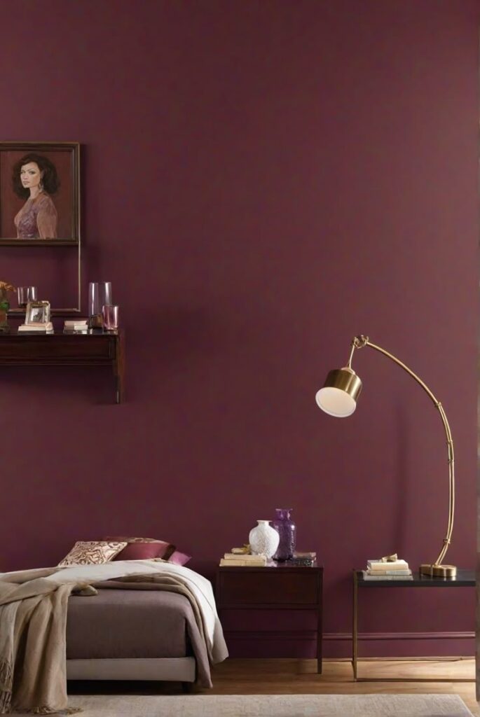

Burgundy elements can last long with proper care. The deep color may fade if exposed to strong sunlight for a long time. It is best to place burgundy fabrics or paint away from direct sun.
For fabrics, regular cleaning is important. Using gentle detergents and cold water helps keep the color rich. Avoid bleach or harsh chemicals that can damage the fibers.
Wood or metal items painted burgundy need occasional dusting and cleaning. A soft cloth with mild soap can remove dirt without harming the finish. Repainting may be needed after a few years to maintain color intensity.
Here is a simple care checklist:
| Item Type | Cleaning Method | Tips |
|---|---|---|
| Fabric | Gentle detergent, cold water | Avoid bleach, sun exposure |
| Painted wood | Mild soap, soft cloth | Repaint every 2-3 years |
| Metal | Mild soap, soft cloth | Prevent rust with coatings |
Avoid heavy scrubbing on any burgundy surface to stop color loss. Moisture control is key to prevent damage, especially in fabrics and wood.
Keeping the environment stable in temperature and humidity helps the burgundy elements stay in good shape for years.
Current Trends and Future Directions
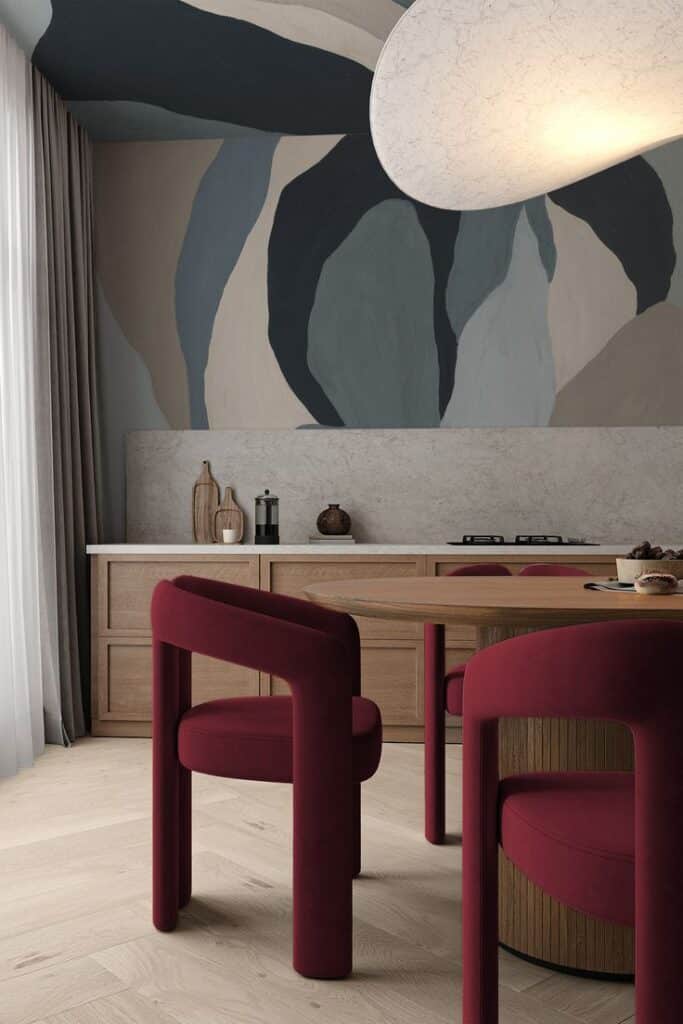
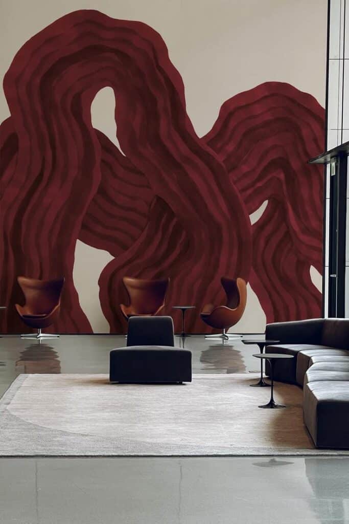
Burgundy continues to grow in popularity as a staple color in home design. Designers use it frequently in accents like cushions, rugs, and curtains to add warmth without overpowering a space.
It pairs well with neutral shades such as beige, gray, and white. This creates a balanced look that feels both modern and cozy. Burgundy is also often combined with metallic finishes like gold and brass to bring elegance and richness.
In future designs, eco-friendly materials dyed with natural pigments in burgundy tones are gaining attention. This reflects a broader shift toward sustainability in home decor.
Smart lighting is being used to change how burgundy appears in a room. Adjustable LED lights allow the color to look different based on mood and time of day.
Key trends include:
- Use of burgundy in minimalist styles
- Mixing burgundy with softer pastel colors
- Burgundy in textured fabrics like velvet and suede
Designers expect burgundy to remain a versatile choice. Its ability to work in both traditional and contemporary spaces makes it adaptable for various styles.
- 1.6Kshares
- Facebook0
- Pinterest1.6K
- Twitter0
- Reddit0


