I keep a chipped ceramic cup on my desk for Shu Pu-erh, the kind of aged, earthy tea that tastes like it has been steeping since 2015 (it basically has). The room around it is stripped down — one shelf, one chair, a stretch of raw oak — but it does not feel like a hospital waiting room. That is the whole point of warm minimalism, and it is exactly why 2026 is shaping up to be its breakout year.
For a decade, “minimalist” meant white walls, gray sofas, and a coffee table you were scared to put a mug on. Warm minimalism keeps the restraint but drops the chill: oatmeal linen instead of stark white, travertine instead of polished concrete, curves instead of boxy corners.
- What warm minimalism actually is
- Warm minimalism vs. Japandi vs. Scandinavian
- The color palette that actually works
- Materials and textures that do the warming
- Why curved furniture reads warmer than boxy pieces
- Lighting: getting the warm glow right
- Room-by-room, budget-aware
- Doing it in a rental or on a budget
- Bringing it together
- Frequently Asked Questions
I have spent 15 years moving between automotive surfacing, jewelry design, and interior work, and this shift makes sense to me on a level most decorating articles do not touch. By the end of this guide, you will know exactly which colors, materials, and furniture shapes make a room read as warm instead of cold — and why curves matter more than people think.
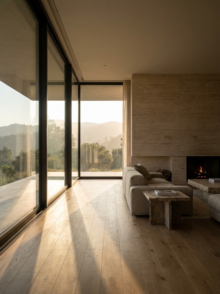
What warm minimalism actually is
Regular minimalism has a strict rulebook: pare down, keep surfaces bare, let negative space do the talking. Warm minimalism keeps the “pare down” part and drops the “bare” part. You still edit ruthlessly — but what stays gets chosen for how it feels under your hand, not just how it looks in a photo.
Where it splits from “regular” minimalism
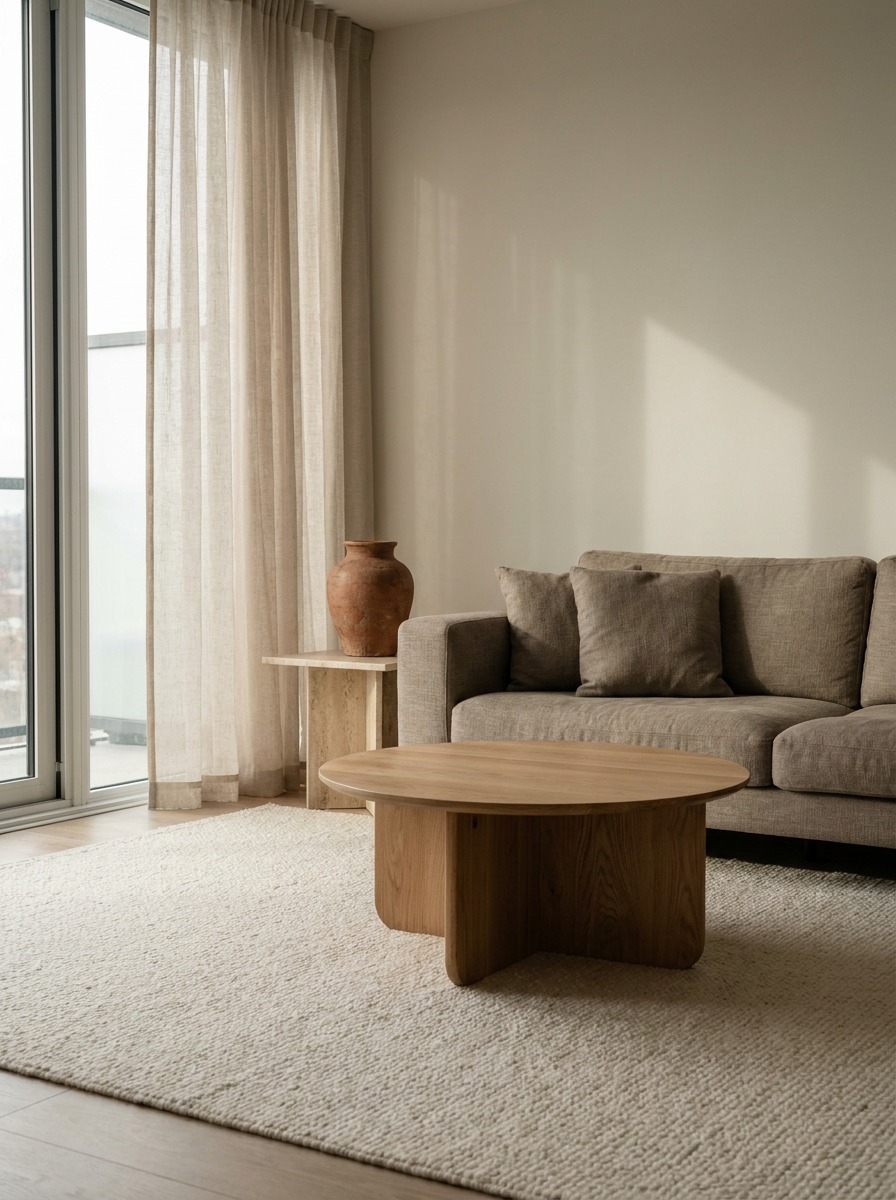
The tell is texture. A 2015-era minimalist living room might run a charcoal wool sofa, a glass coffee table, and nothing else. A warm minimalist version keeps that same silhouette but swaps the upholstery to boucle, sets it beside a low oak table (something like Menu’s Passage table, around $900), and calls it done. Same restraint. Completely different temperature.
I have noticed this most clearly in my own apartment in Kyiv, where I replaced a glass-and-chrome side table with a single slab of raw travertine on a steel base — same footprint, same “one object per corner” rule, but the room stopped feeling like a showroom the day I made the swap.
Why “less but warmer” beats “less is more”
“Less is more” was never really about owning fewer things. It was about owning the right things. Warm minimalism just admits that “right” includes how something feels, not only how it photographs.
TIP Before you remove anything from a room, touch it first. If it is cold to the hand — glass, chrome, glossy lacquer — it is a candidate to swap, not necessarily to remove. Changing a piece’s material often does more for warmth than decluttering ever will.
Warm minimalism vs. Japandi vs. Scandinavian
People throw these three terms around like they are interchangeable, and honestly, the confusion is fair — all three chase a calm, uncluttered room. But if you actually design in these styles, the differences show up fast, usually in the first five minutes of a client sourcing call.
The overlap
All three share the basics: neutral palettes, natural materials, minimal decoration, functional furniture. That is why they blur together in a quick Pinterest scroll. Scandinavian design leans on light woods (birch, ash) and high-contrast whites.
Japandi fuses Japanese wabi-sabi with Scandinavian restraint — think dark wood, matte black accents, and deliberate asymmetry. Warm minimalism does not come from a specific regional tradition at all. It is closer to a correction: minimalism that got tired of feeling cold and borrowed warmth from wherever it could.
The actual difference
Here is the fastest way I explain it to clients:
| Style | Palette | Materials | Mood |
|---|---|---|---|
| Scandinavian | White, light wood, soft pastels | Birch, wool, cotton | Bright, airy |
| Japandi | Charcoal, walnut, black accents | Dark wood, ceramic, stone | Quiet, deliberate |
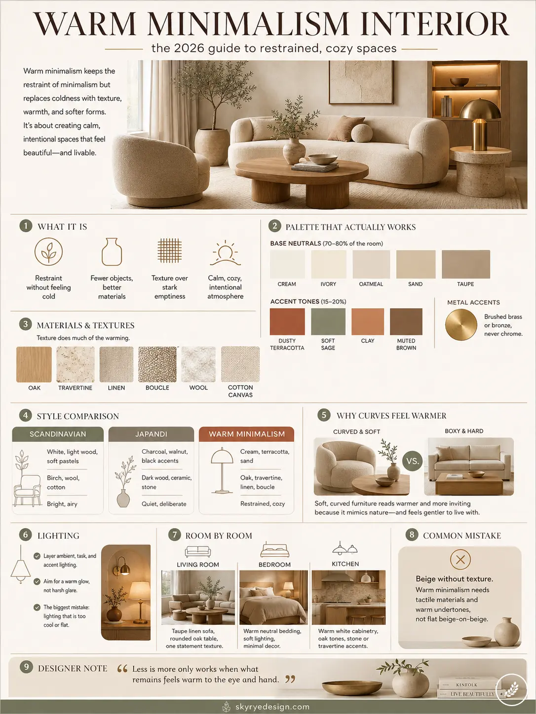
| Warm minimalism | Cream, terracotta, sand | Oak, travertine, linen, boucle | Restrained, cozy |
In my experience, the giveaway is undertone. Scandinavian rooms often run cool-white walls with blue undertones. Japandi runs dark and moody. Warm minimalism sits in the middle — always warm-toned, never stark, never cluttered enough to tip into boho.
One practical test: if a room photo makes you want to put on a sweater, it is probably Japandi or cool Scandinavian. If it makes you want to sit down with tea and not move, that is warm minimalism doing its job.
The color palette that actually works
Get the palette wrong and no amount of linen or oak will save the room — it will still read as beige-on-beige rather than warm. I learned this the hard way early on, painting a client’s hallway what the swatch called “warm white” only to watch it turn faintly gray by 4 PM. Undertone matters more than the color name on the can.
Base neutrals
Stick to genuinely warm neutrals: cream, ivory, oatmeal, sand, and taupe. These form 70-80% of a warm minimalist room — walls, large upholstery, rugs. Benjamin Moore’s Swiss Coffee or Farrow & Ball’s String are both safe starting points; both hold a yellow-cream undertone even in low light, which is the test that matters.
Earthy accents and the undertone rule
Layer in accent tones at 15-20% of the room: dusty terracotta, soft sage green, clay, muted brown. A single terracotta vase or a sage-green throw does more work than an entire accent wall.
Here is the rule I give clients: avoid anything with a blue-gray undertone, even if the paint chip looks “warm” in the store. Hold it against a genuinely warm neutral like oatmeal — if it looks cool by comparison, it will fight the room once real daylight hits it.
TIP Quick palette to copy — walls: warm cream or oatmeal; large furniture: taupe or sand linen; accent 1: dusty terracotta; accent 2: soft sage; metal accents: brushed brass or bronze, never chrome.
Materials and textures that do the warming
Color gets you halfway there. Texture does the rest — and it is the part most articles skip, probably because it is harder to photograph than a paint swatch.
The fiber layer
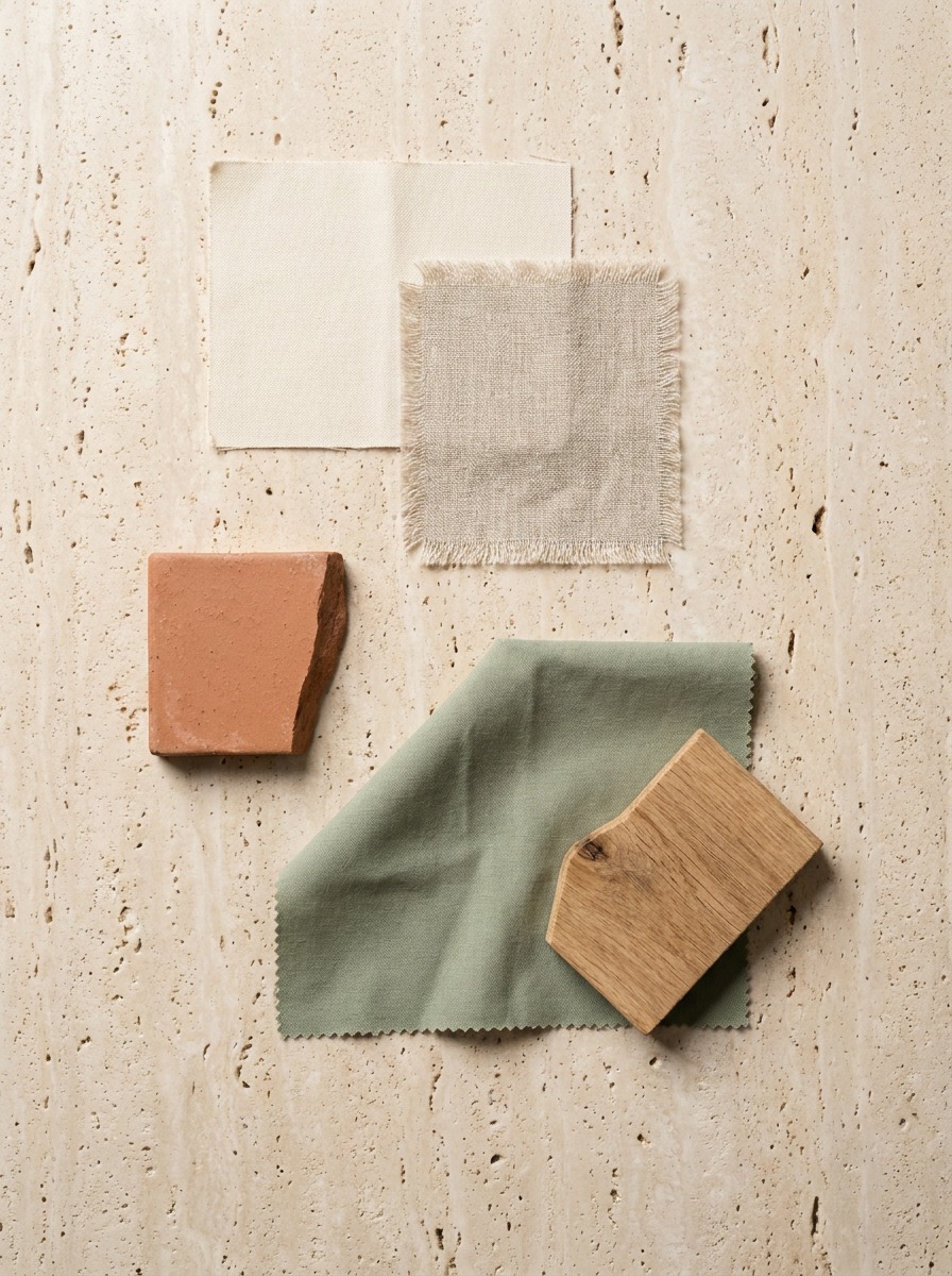
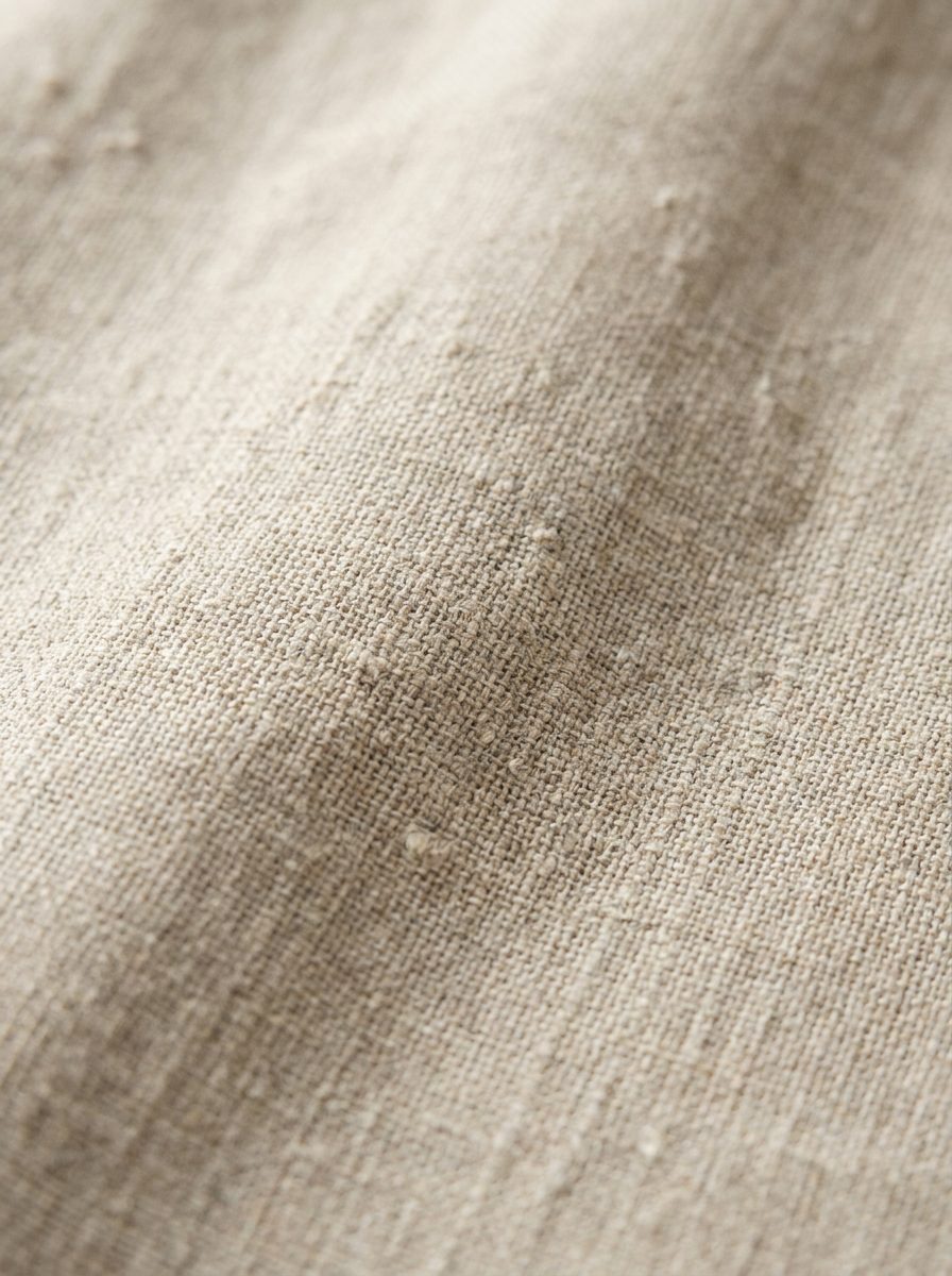
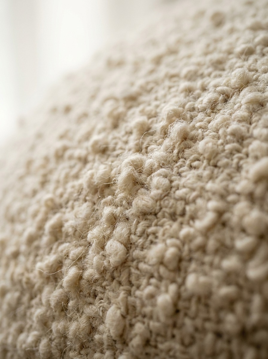
Raw linen, chunky wool, cotton canvas, and boucle are doing the heavy lifting here. A boucle armchair (something like Article’s Nagoya, around $1,200) reads warmer than an identical chair in smooth velvet, even in the exact same cream shade — your eye reads texture as temperature before it registers color. Raw linen curtains instead of blackout polyester panels make the same difference at a fraction of the cost.
Hard surfaces: where most people get cheap and should not
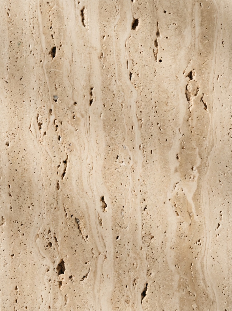
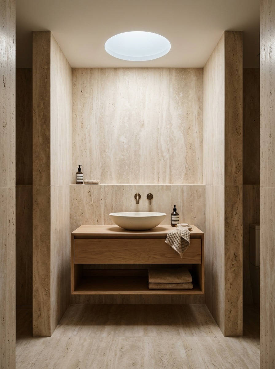
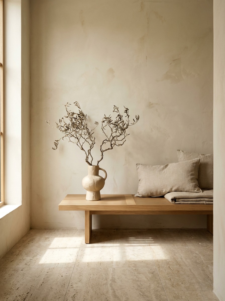
This is where I tell clients to spend, if they are spending anywhere. Light-toned woods — oak or walnut — travertine, and natural stone ground a room in a way engineered materials cannot fake. A travertine side table (I run one from a local Kyiv stonemason, roughly $400 for a small round piece) does more for warmth than three throw pillows combined.
Academic life-drawing training changes how you see this stuff, honestly. You spend years learning how light falls differently across matte versus polished surfaces — how a raw linen fold catches shadow softly while a lacquered surface throws a hard specular highlight. Once you have drawn that difference by hand, you cannot unsee it in a room. It is why I steer clients away from anything glossy in a warm minimalist space, even in the “right” color.
TIP If you can only upgrade one material, upgrade what you touch most — sofa upholstery or the dining table surface. Those two objects carry more of the room’s “temperature” than walls or floor ever do.
Why curved furniture reads warmer than boxy pieces
Here is the part of warm minimalism nobody explains properly, because it is not really a decorating rule — it is a surfacing principle, and most writers covering this topic have never had to think about surfacing at all.
The automotive parallel
When I worked on surface language for the Jaguar F-Pace, the whole design argument came down to how light travels across a panel. A hard break-line — the kind you would find on an old boxy CX-5 dashboard, before Mazda softened its Kodo language — catches light in one sharp band and drops into shadow immediately after. A continuous, flowing surface (the F-Pace’s shoulder line is a good example) lets light roll across it gradually, so the whole panel reads as one soft gradient instead of a hard edge and a dark hole.
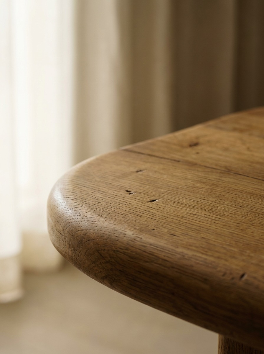
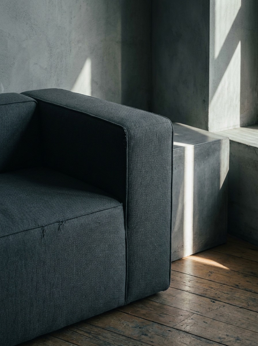
Furniture does the exact same thing at a smaller scale. A boxy sofa arm throws a hard shadow line the second the sun moves. A rounded arm — like the kind you would see on a Ferm Living Turn sofa — lets that same light glow across the curve instead of snapping into shadow. Your eye reads that gradient as warmth, literally and visually, before you have consciously noticed the shape at all.
Applying it in the room
You do not need to gut your furniture to use this. Start with the pieces that catch the most light: coffee tables, armchair arms, lamp bases. A low, rounded coffee table (something like HAY’s Barh table) does more for a room’s warmth than swapping every straight-edged piece around it.
TIP Stand in the room at the time of day you use it most, and watch where hard shadows fall. Those are your priority swaps — not the whole room, just the objects catching direct light.
Lighting: getting the warm glow right
I have walked into rooms with the perfect palette, the right boucle sofa, travertine table — and it still felt cold. Nine times out of ten, the culprit is bulb temperature, and it is the cheapest fix in this entire guide.
The one mistake that undoes everything
Cool-white LED bulbs (anything above 3000K) will fight every warm material choice you have made. It does not matter how much oak and linen is in the room — a 4000K bulb reads as clinical, full stop. Stick to 2700K, sometimes labeled “soft white” or “warm white” on the box. Philips and Ikea’s own house-brand bulbs both make solid 2700K options for under $10 each, so this is not a budget excuse.
Layering, not just swapping bulbs
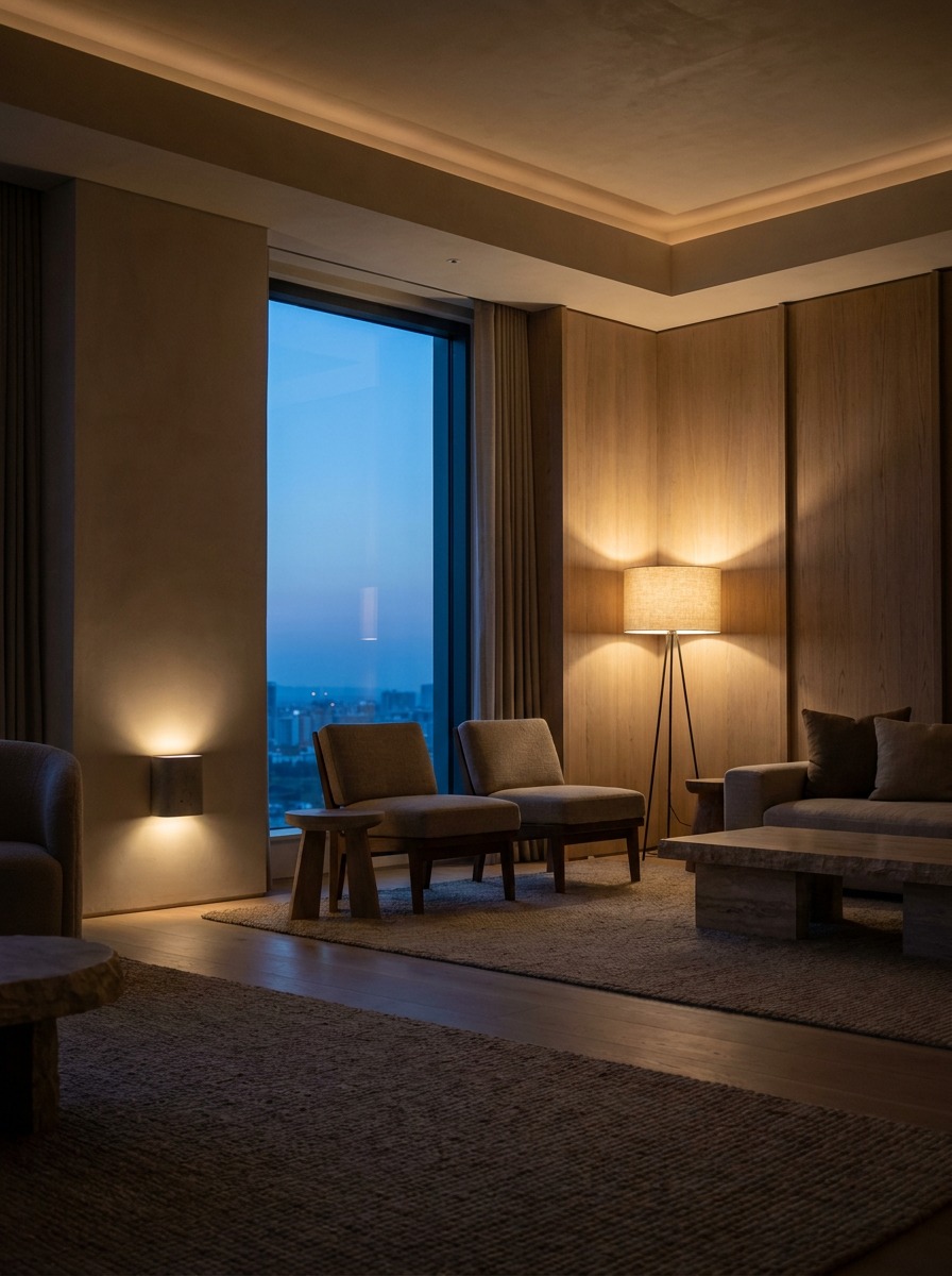
A single overhead fixture, even at the right temperature, still reads flat. Warm minimalist rooms work in layers: a soft overhead source dimmed low for ambient light, a floor or table lamp at reading height for task light (linen or paper shades soften it further), and a wall sconce or low pendant positioned so you catch the glow, not the bulb, at eye level.
In my own living room, I run a single floor lamp with a linen shade in the corner and skip the overhead light entirely after 6 PM. It is a small habit, but it changes the whole feel of the room more than any furniture purchase has.
TIP If you can only change one thing tonight, swap your living room bulbs to 2700K. It is a $15 fix that does more than most people expect.
Room-by-room, budget-aware
Theory is easy. Applying it to an actual room — especially one you do not own or cannot gut — is where most people get stuck. Here is how I would tackle each space, starting cheap and scaling up.
Living room
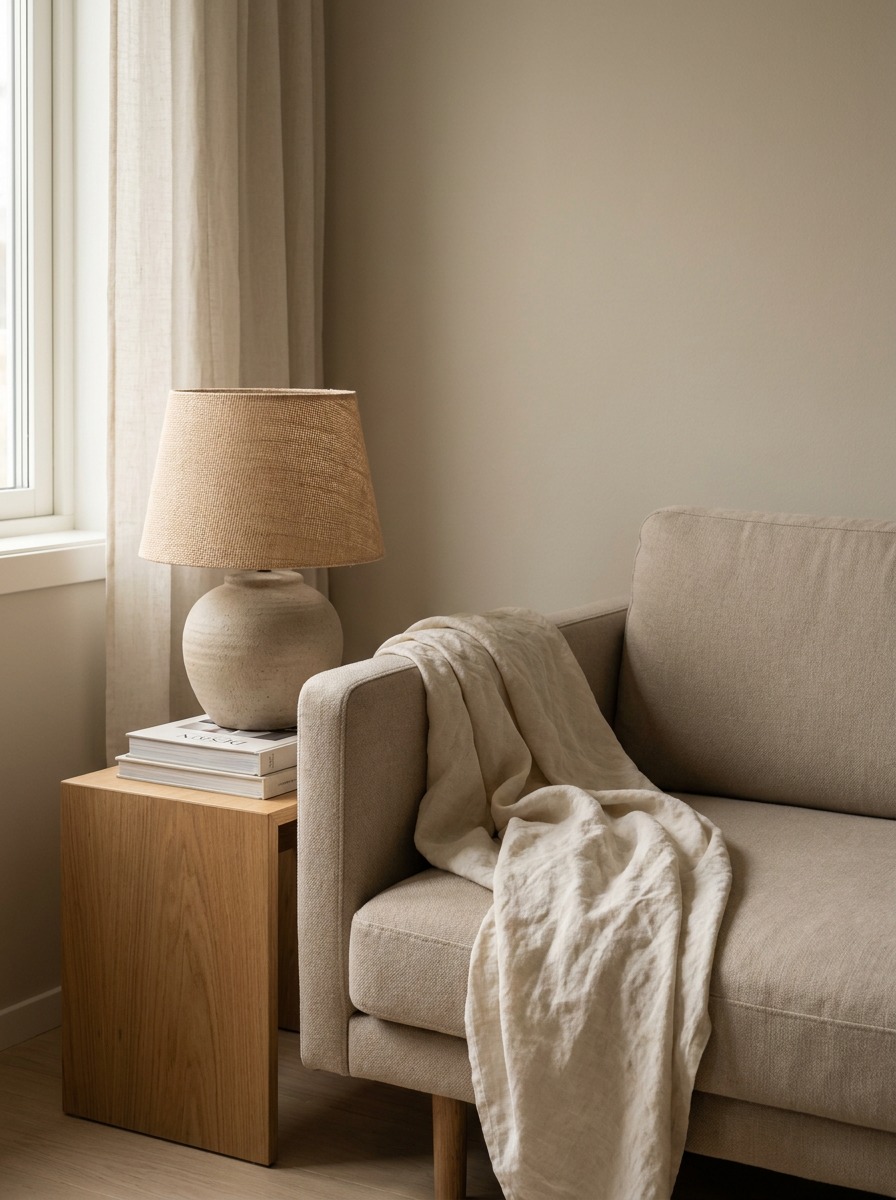
This is where the biggest visual payoff lives, and where I would spend first if budget is tight. Start with textiles: a boucle or heavy linen throw over your existing sofa (even a cheap one) shifts the whole room’s temperature for under $100. If you are ready to invest, a low rounded coffee table is the single highest-impact swap — it hits the shape rule from the curves section and anchors the whole layout.
Bedroom
Keep it simpler here than the living room — this is the one room where “less” should genuinely mean less.
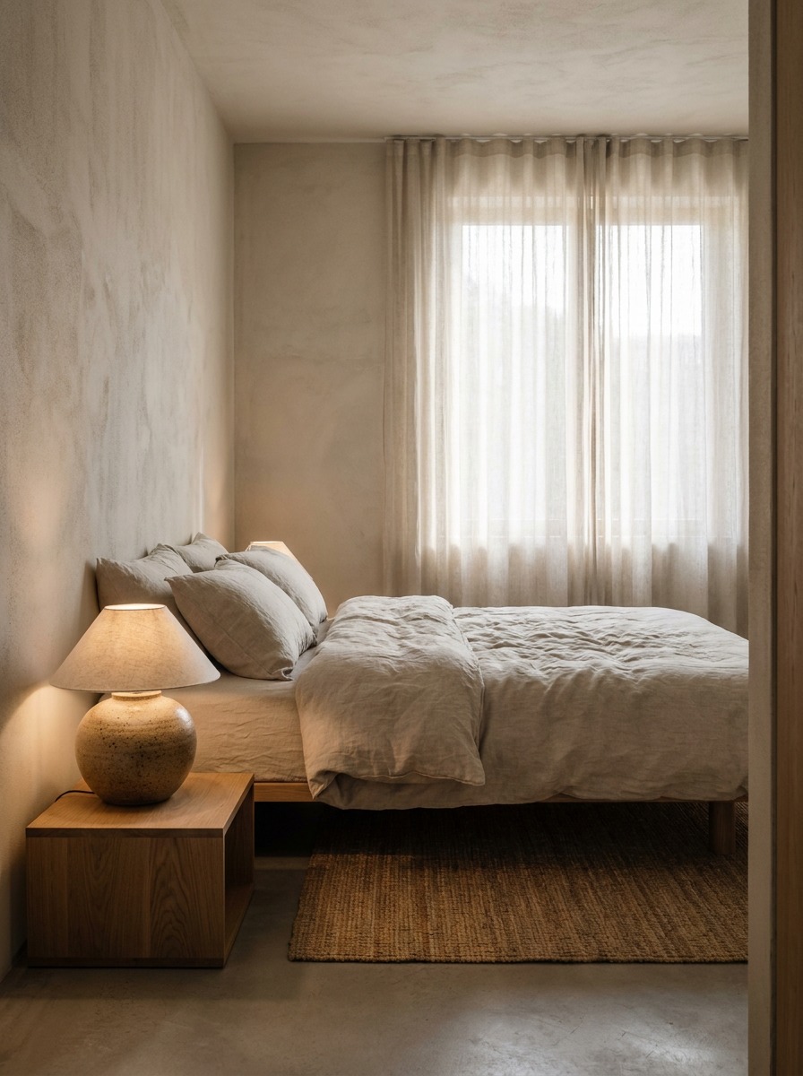
Warm linen bedding (Cultiver or Parachute both run true warm-white, not stark white), a single ceramic bedside lamp at 2700K, and one textured element — a jute rug or a woven basket — is enough. Resist the urge to add a second accent color; bedrooms read calmest with one neutral and one texture doing all the work.
Kitchen
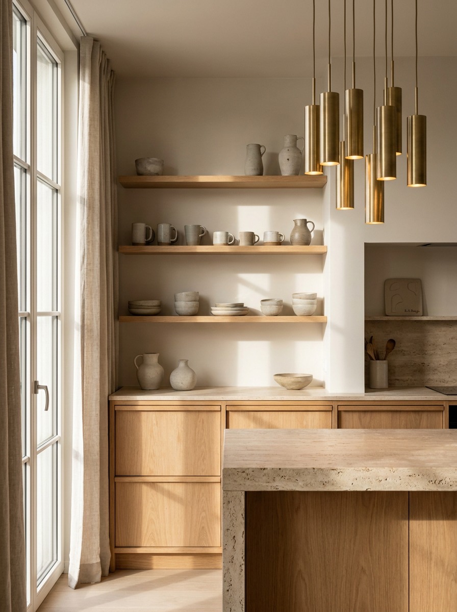
Kitchens are the hardest room for this style because hard surfaces (countertops, cabinet fronts) already dominate. Focus on what you can actually change: open shelving in oak instead of upper cabinets, warm-toned handmade ceramics on display instead of hidden in cupboards, and, again, bulb temperature over the counter. If you are renovating, light oak cabinet fronts beat white or gray laminate every time for this look.
Doing it in a rental or on a budget
You do not need to touch walls or floors to get most of the effect. In order of impact per dollar: a lighting swap (2700K bulbs throughout, $15-30), a textile layer (linen or boucle throw, warm-toned rug, $50-150), one material anchor (a single travertine or oak side table placed where it catches direct light, $200-500), and ceramics or ambient objects over anything glossy or mass-molded ($30-100).
I have done full apartment refreshes for clients on exactly this order of operations, and the lighting swap alone usually gets a room 40% of the way there before a single piece of furniture moves.
Bringing it together
Warm minimalism is not a shopping list — it is a principle: restraint and warmth working together instead of against each other. Palette gets you the base, texture does the real emotional work, curved shapes catch light the way hard edges never will, and lighting temperature can undo or complete the whole effect for the cost of a light bulb.
Do not try to redo a whole room this weekend. Pick one thing — swap your bulbs, add a linen throw, or move one glossy object out for something matte — and let the room tell you what it needs next.
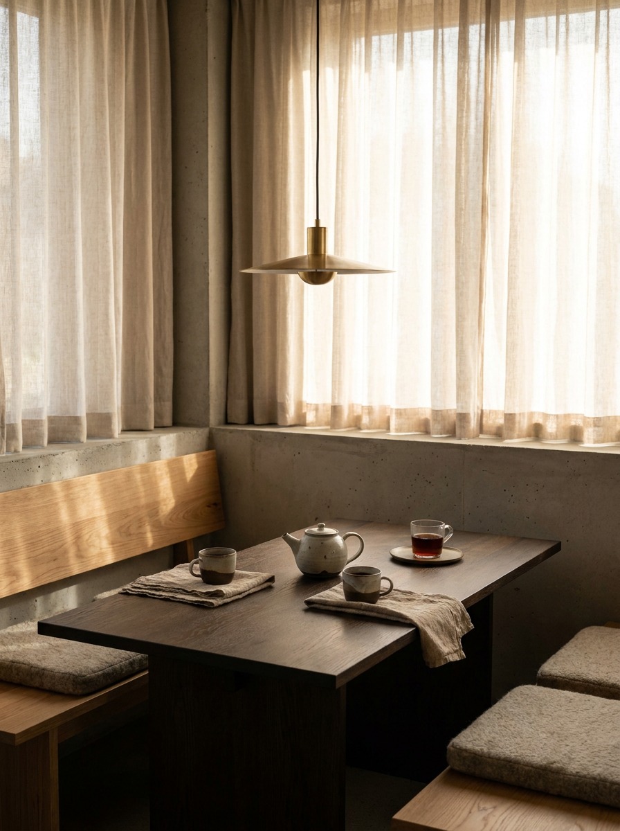
Warm minimalism becomes more personal when one object carries meaning. A small painting, bell, or candle can turn a bare corner into calm spiritual home decor without breaking the quiet mood.
Frequently Asked Questions
What is warm minimalism in interior design?
Warm minimalism keeps the “less but better” mindset of traditional minimalism but swaps cold materials for warm ones. Instead of white walls, chrome, and glass, you get cream and oatmeal tones, oak, travertine, linen, and boucle. The room stays uncluttered — it just does not feel sterile anymore.
Is warm minimalism the same as Japandi?
No. Japandi blends Japanese wabi-sabi with Scandinavian design and tends to run darker — charcoal, walnut, matte black accents. Warm minimalism sits lighter and always warm-toned: cream, sand, terracotta. If a room makes you want a sweater, that is Japandi. If it makes you want to sit down with tea, that is warm minimalism.
What colors count as warm minimalist?
Base neutrals like cream, ivory, oatmeal, sand, and taupe should make up 70-80% of the room. Layer in earthy accents — terracotta, sage, clay — at 15-20%. Avoid anything with a blue-gray undertone, even if the paint chip name says “warm.”
How do I warm up a minimalist room without adding clutter?
Change materials, not quantity. Swap a glass coffee table for oak, chrome for brushed brass, smooth velvet for boucle. Texture reads as temperature before color does, so upgrading what you touch most — sofa upholstery, a tabletop — does more than adding decor.
Can you do warm minimalism in a rental?
Yes, and it is cheap to start. Swap bulbs to 2700K (soft white) for $15-30, add a linen or boucle throw for $50-150, then bring in one material anchor like a small travertine or oak side table. None of it requires touching walls or floors.
What is the biggest mistake people make with this style?
Using cool-white LED bulbs above 3000K. It does not matter how right your palette and materials are — a 4000K bulb reads clinical and undoes the whole effect. It is the cheapest fix in the entire style, and the one people skip most.
For a broader comfort-first approach, this cozy interior design choices guide connects warm lighting, heating, fireplace planning, kitchen rituals, and texture into one livable home framework.
- 104shares
- Facebook0
- Pinterest104
- Twitter0
- Reddit0