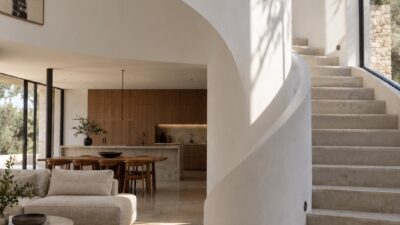
Luxury interior design reads clearly before you notice any single object. The room feels balanced, the eye knows where to rest, and the materials reward a closer look. Over fifteen years of moving between automotive design, academic drawing, and interiors, I have found that the same skill sits underneath all three: learning to read proportion, negative space, and visual weight before focusing on the objects themselves.
That is why expensive furniture alone never guarantees a convincing result. Professionals work through a sequence: space planning first, then scale and sightlines, a material hierarchy, layered light, and finally the art and objects that give the room its identity. Each decision prepares the next one.
- What makes an interior feel luxurious before you buy anything
- Start with space planning, circulation, and sightlines
- Build a material hierarchy instead of matching every finish
- Layer lighting for depth, focus, and atmosphere
- Curate furniture, art, and objects around a focal point
- Create continuity without making every room look the same
- A professional luxury interior design checklist
- Luxury interior design FAQ
- Related reading
This guide follows that process. The same logic works in a studio apartment and a large estate: plan before you buy, decide what matters most, and edit until every element has a job.
What makes an interior feel luxurious before you buy anything
Luxury as composition, not price
A room built entirely from expensive pieces can still feel flat, just as a painting made with costly pigment can have weak composition. Luxury begins with the relationship between mass, negative space, color temperature, and texture. Those relationships determine whether the room feels calm and deliberate or merely full.
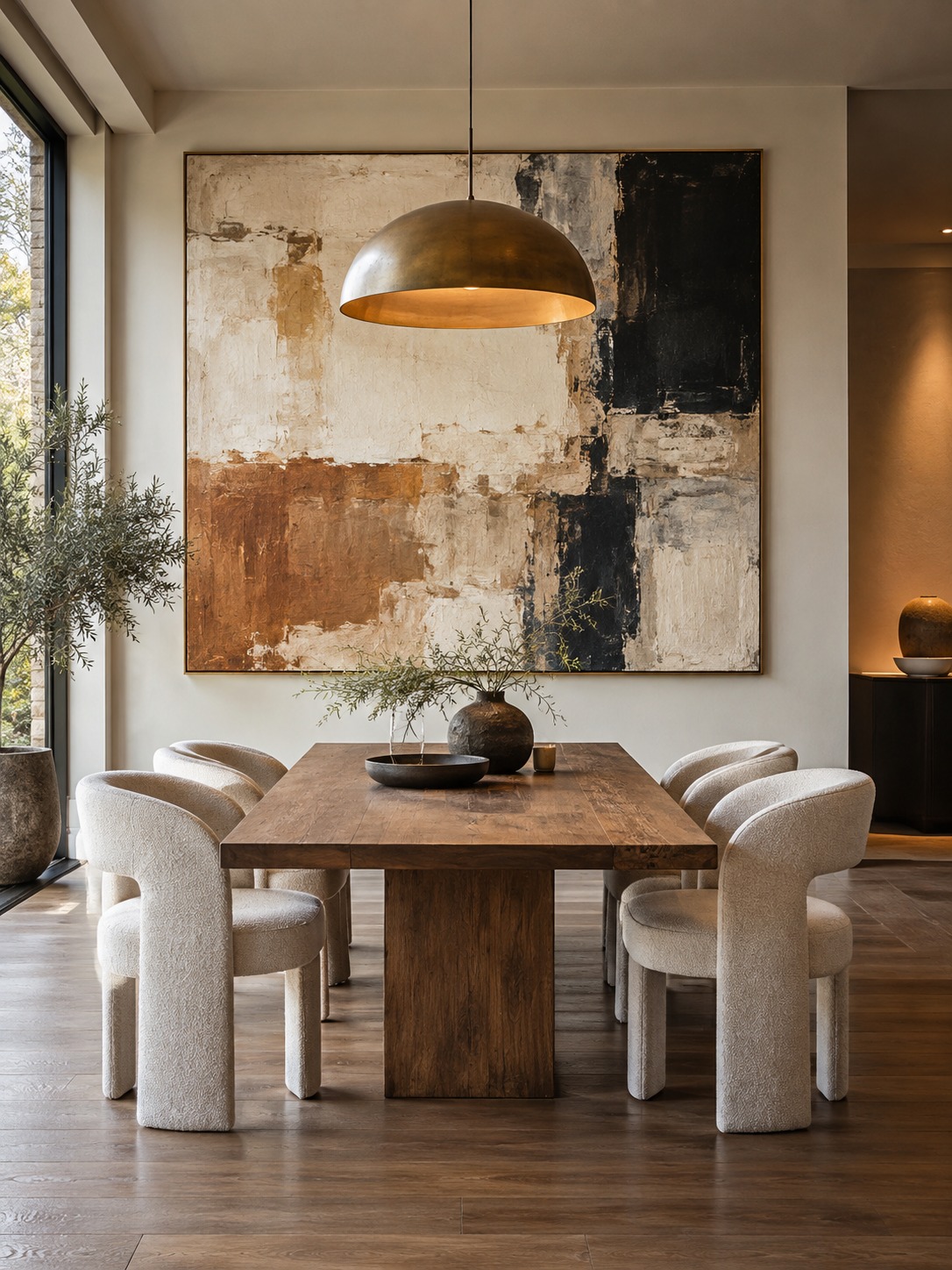
I approach a living room much as I would block in a figure drawing: Where does the visual weight sit? Where does the eye pause? What is the negative space doing? A single oversized pendant above a dining table feels luxurious when it gives the room one point of gravity instead of competing with six other statements.
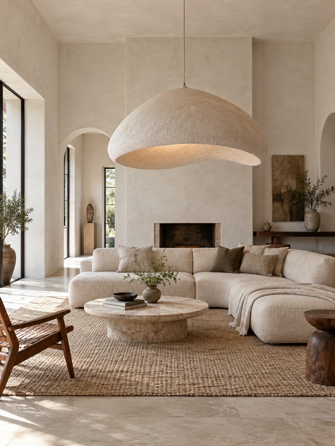
Visual weight is also a balance problem. A dark, substantial sofa on one side of a room needs an answer on the other, perhaps a lighter furniture grouping, a large mirror, or simply more open floor. The guide to balance in interior design explains when symmetry helps and when an asymmetrical arrangement feels more natural.
The difference between visual richness and clutter
Richness and clutter are separated by intent. Twelve carefully chosen objects can feel layered; forty unrelated objects usually feel noisy, regardless of their price. A useful test is simple: if removing an item would not change the composition, that item probably does not need to be there.
This is the same editing instinct that separates a confident sketch from an overworked one. Every mark in the first version has a purpose. Interiors work the same way. Restraint does not remove character; it makes character easier to see. Even a small stylish room benefits from that discipline because limited square footage makes every extra object more noticeable.
Start with space planning, circulation, and sightlines
Map movement and daily routines
Before selecting a finish, a professional maps how people move through the space: where they enter, where they pause, where they sit for twenty minutes, and where they pass through in three seconds. This determines furniture placement, doorway clearances, and which walls can hold a statement piece without interrupting traffic.
If you are comparing firms through a search such as interior designer houston, ask how they document circulation before discussing fabrics and finishes. A clear answer matters because even beautiful furniture will feel wrong when it blocks the way a household actually uses the room.
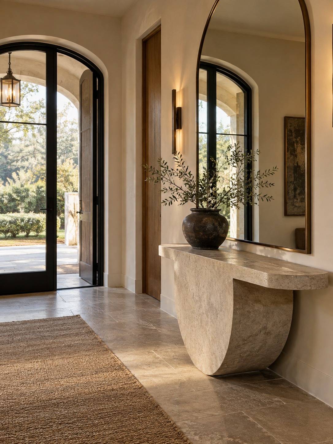
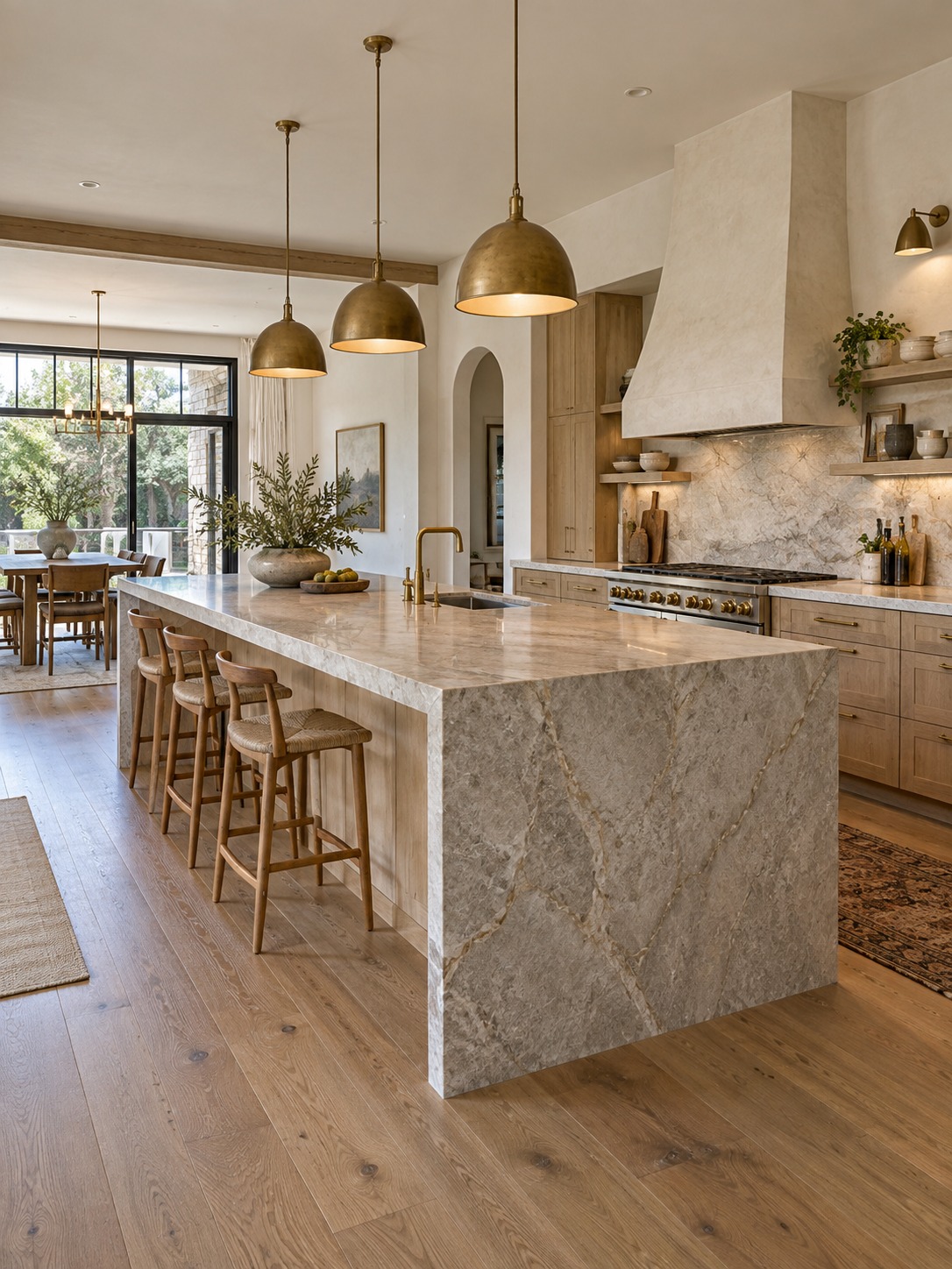
A kitchen makes the principle easy to see. The island may be the visual anchor, but it still needs practical clearances around seating, storage, appliances, and the route to the dining area. The plan succeeds when those work zones remain obvious without turning the room into a diagram.
Use scale, proportion, and negative space
Scale is where many well-decorated rooms lose authority. A sofa can fit the floor plan and still look too small beneath a tall ceiling, or too large when it consumes the breathing room around doors and windows. Negative space is not leftover space waiting to be filled. It is part of the composition, much like the margin on a printed page.
I still run the proportion checks I learned while sketching cars: where does the form’s visual mass sit relative to its footprint, and does the silhouette feel top-heavy or grounded? The same eye applies to furniture against architecture. The practical ratios in proportion in interior design turn that instinct into something you can test on a floor plan.
Decide what the eye should notice first
Every well-composed room has a hierarchy: one thing the eye finds first, a second read, and then quieter supporting details. Without that order, strong pieces compete with each other. Choosing the focal point early, whether it is a fireplace, artwork, or a dramatic light fixture, guides furniture placement and material contrast throughout the rest of the room.
Build a material hierarchy instead of matching every finish
Contrast stone, wood, plaster, glass, metal, and textiles
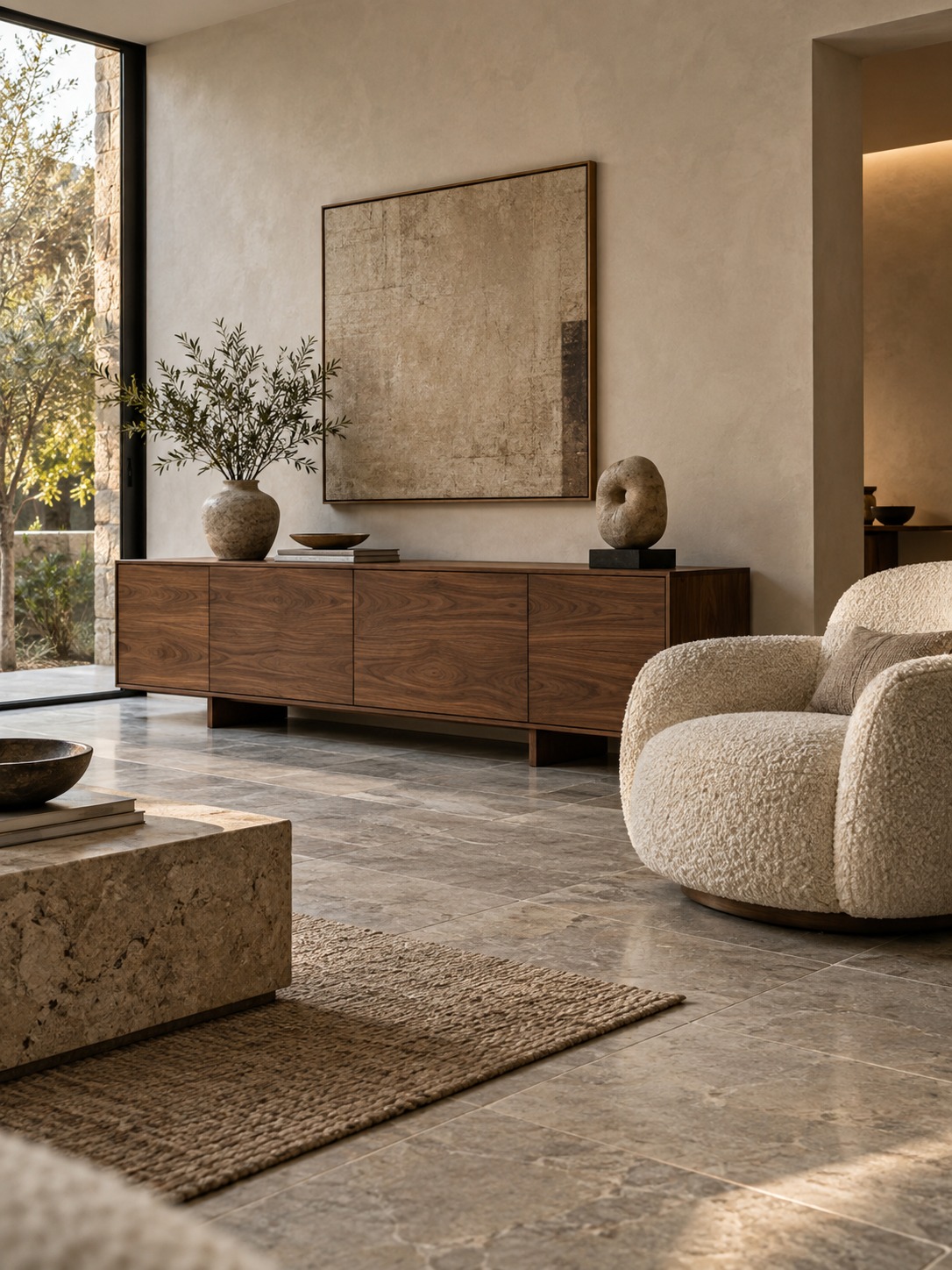
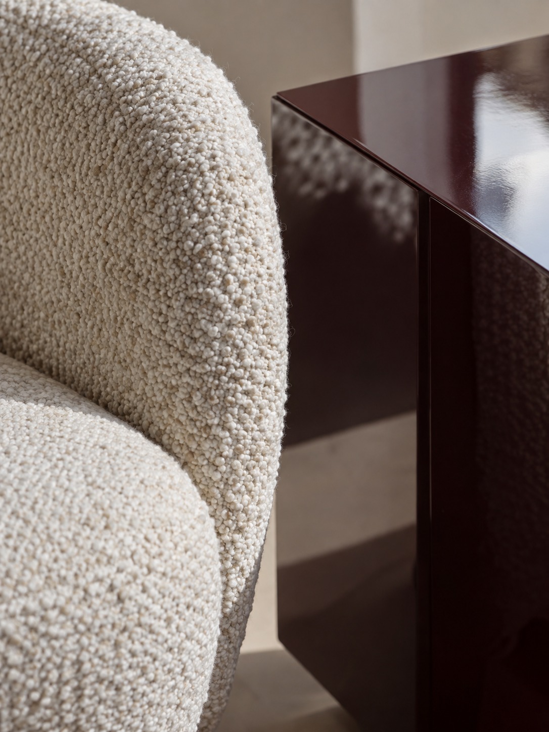
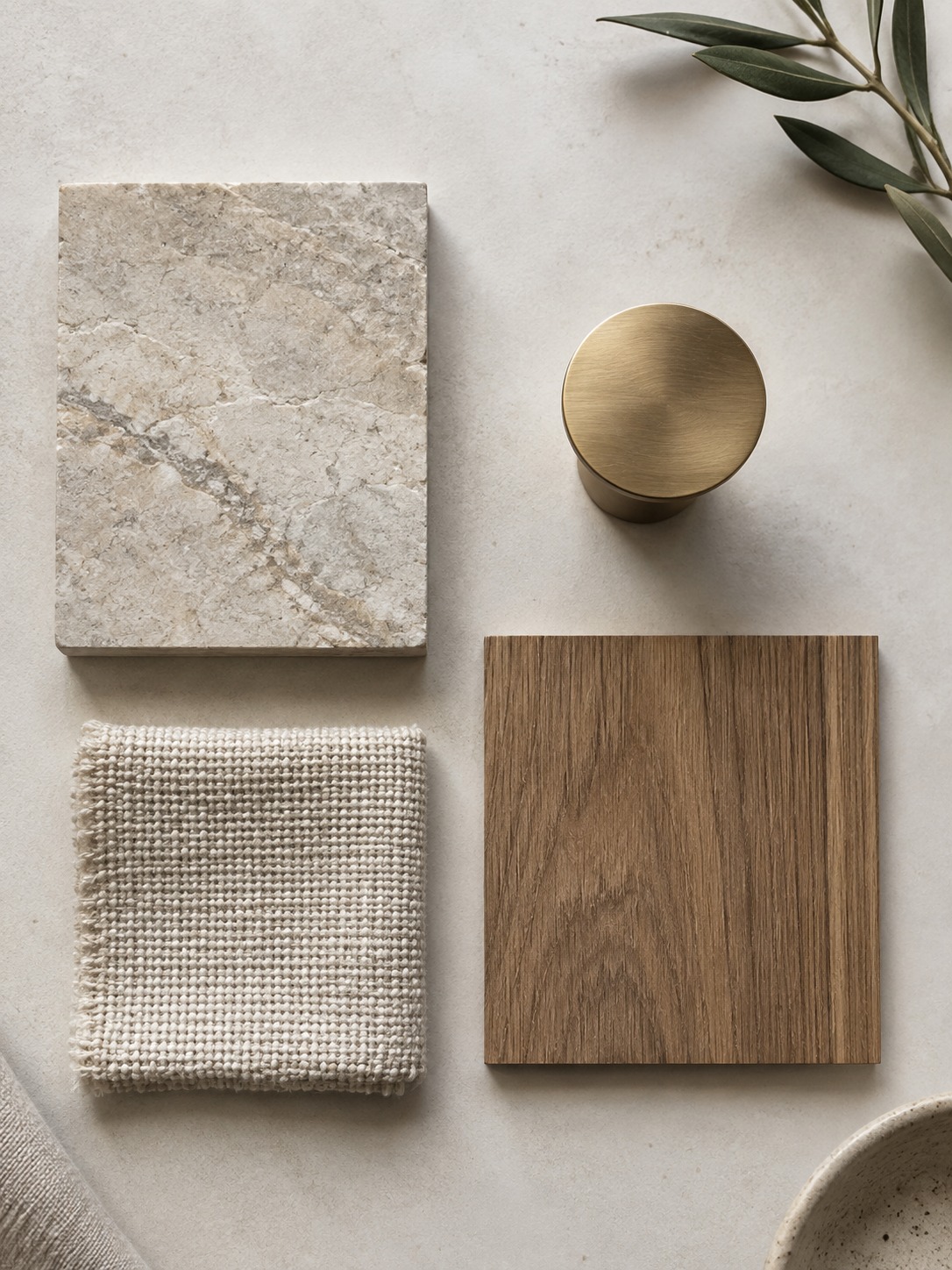
Matching every wood tone and metal finish can make a room feel like a showroom display. A material hierarchy uses contrast deliberately: honed stone beside soft plaster, warm walnut against cool metal, or a nubby boucle chair next to a glossy lacquered console. Contrast lets each surface read clearly instead of blending into visual sameness.
Spend where the eye and hand meet the room
The material budget does not need to be spread evenly. Surfaces people touch and inspect closely, such as a countertop edge, a door handle, or a table surface, deserve more attention than a ceiling nobody studies at arm’s length. Concentrating quality at these contact points often feels more luxurious than applying the same level of finish everywhere.
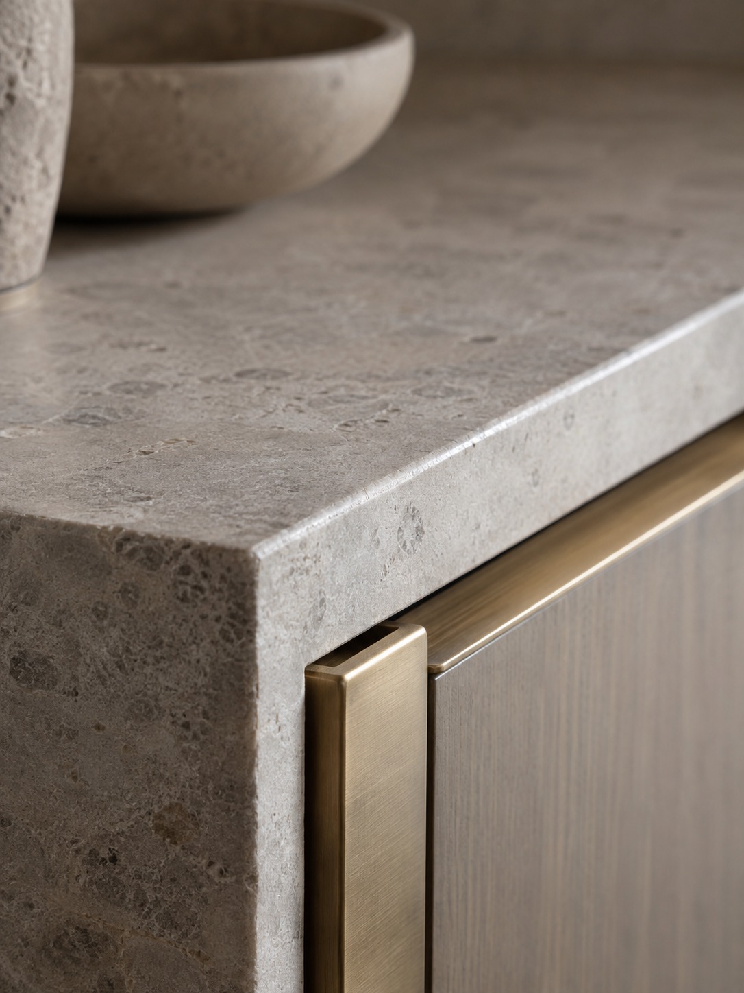
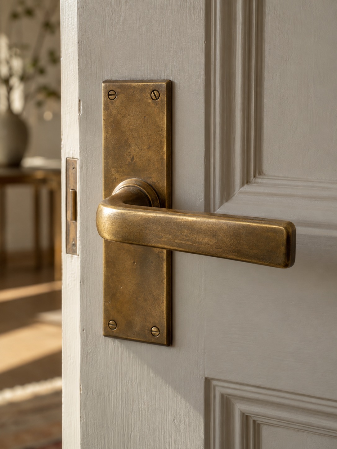
Hardware is the clearest example. A solid brass handle registers through its weight and temperature every time someone opens a door. Faucets, stair rails, switches, and cabinet pulls work the same way. These small encounters happen dozens of times a day, so they have more influence on perceived quality than their size suggests.
Repeat selected materials to create continuity
A hierarchy still needs a thread running through it. Repeating one wood species, metal finish, or stone family across several rooms keeps the home connected while leaving room for individual character. The guide to interior design textures explains which pairings tend to read warm, cool, soft, or architectural.
Layer lighting for depth, focus, and atmosphere
Use ambient, task, and accent light
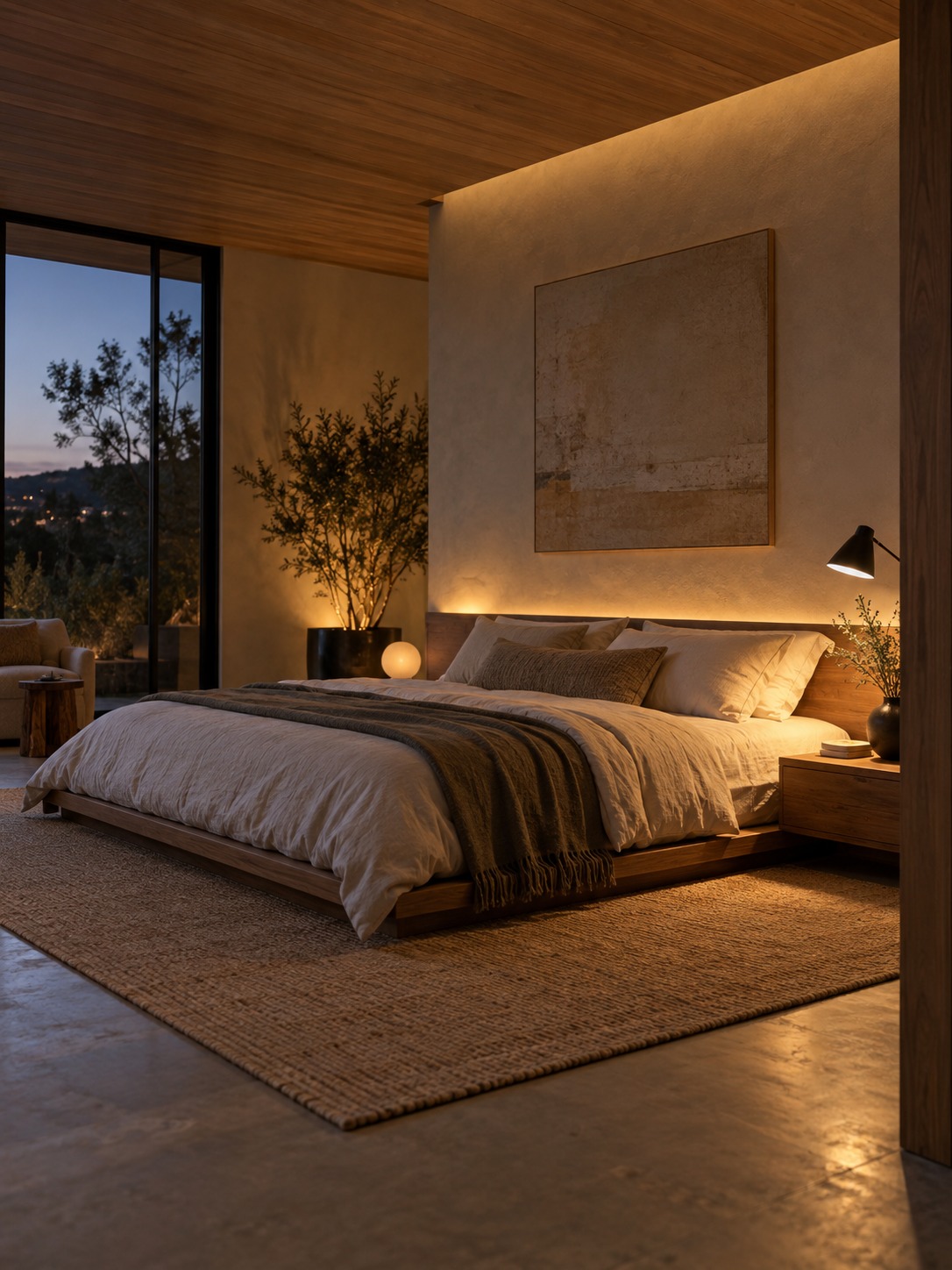
Lighting design fails when it is treated as one decision. Ambient light establishes the baseline mood, usually through indirect or diffuse sources. Task light supports a specific activity at a reading chair, kitchen counter, or desk. Accent light draws attention to art, shelving, texture, or architecture. A room missing one layer often feels flat or uncomfortably harsh.
Use light to reveal texture, art, and architecture
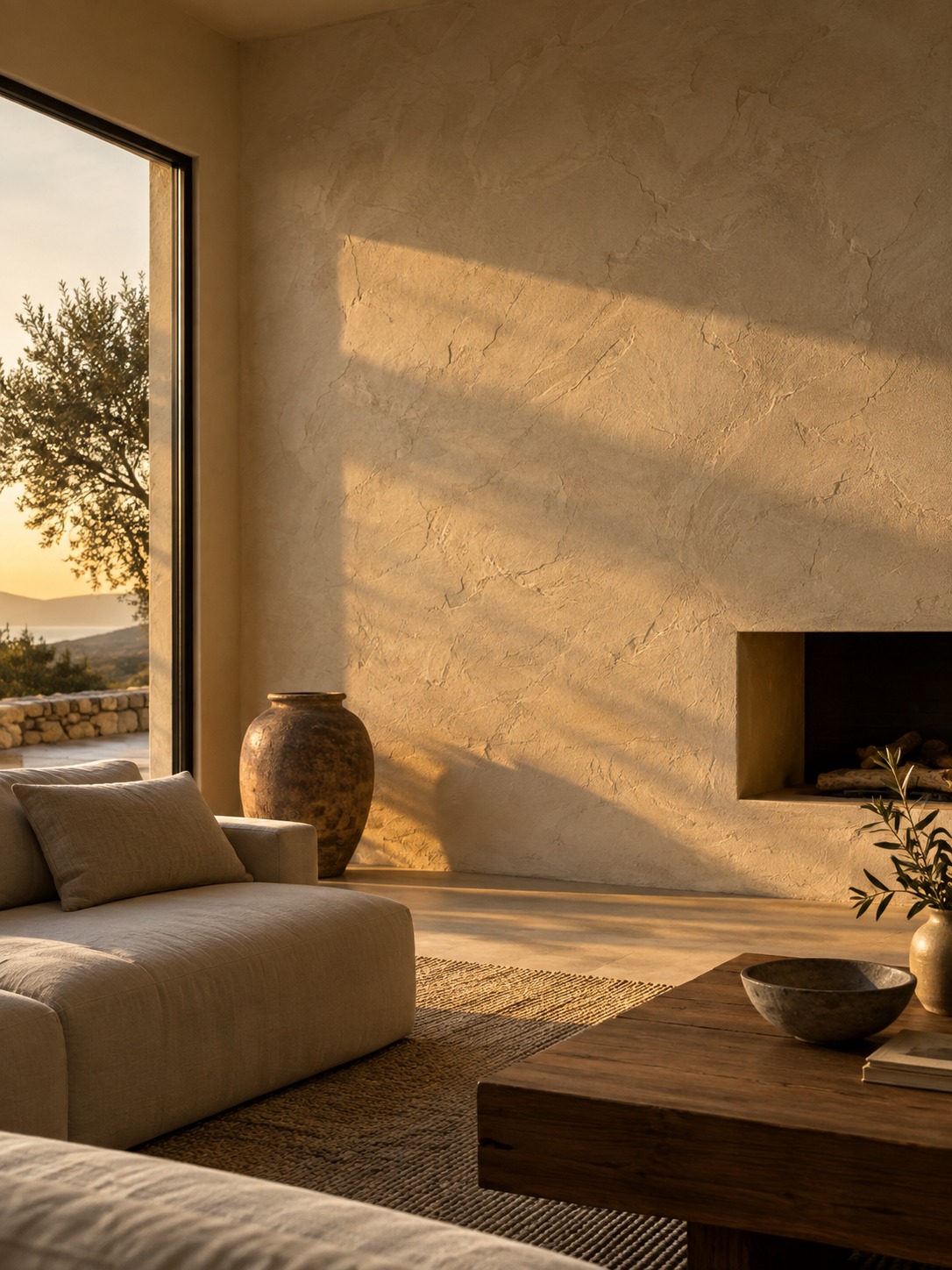
Light can reveal or erase the details that made a material worth choosing. A low, raking angle across plaster shows the marks of the trowel; flat overhead light can make the same wall look blank. That is why the direction of light matters as much as the fixture itself.
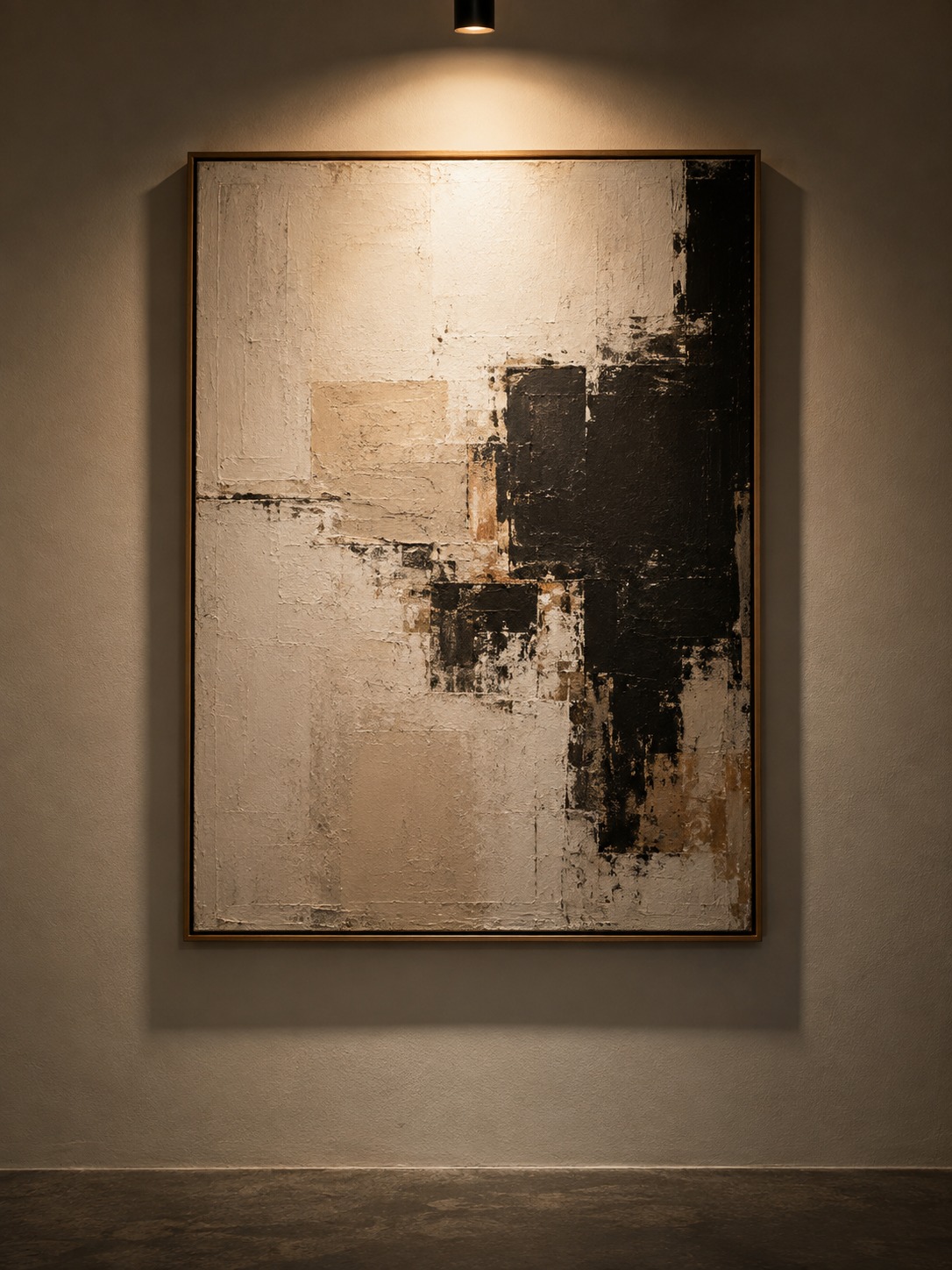
Artwork needs the same care. A controlled beam gives a textured surface depth and keeps the frame legible against the wall. Poorly placed light creates glare, hard shadows, or a washed-out center that makes the work look like a poster.
Plan day-to-night lighting scenes
A room with one lighting setting is under-designed. Plan at least two or three scenes: bright and functional during the day, dimmed and layered in the evening, and a separate setting for entertaining. Dimmers and independent controls for each layer make that flexibility possible, which is why the wiring decision belongs early in the project.
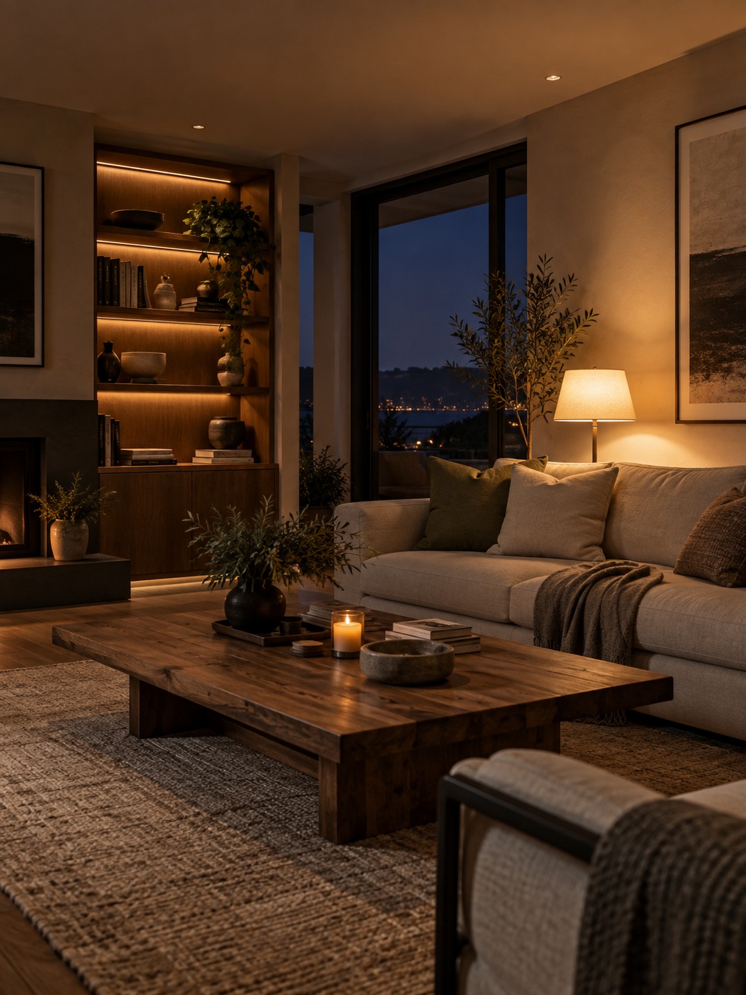
The same logic extends beyond lighting into furniture, textiles, and objects. How to Layer a Room Like a Pro covers that broader process step by step.
Curate furniture, art, and objects around a focal point
Coordinate scale and silhouette instead of buying a matching set
A matching furniture set can flatten a room into a catalog page. Coordination is more useful than duplication. A curved sofa does not need a chair with the same arm; it needs a chair whose proportions and visual weight hold a convincing conversation with the sofa.
Combine bespoke, vintage, and contemporary pieces
Rooms that feel genuinely collected often mix eras. One vintage chair beside contemporary furniture can add more character than a complete set purchased in a single visit. Age, patina, and small signs of use introduce a history that new pieces cannot manufacture.
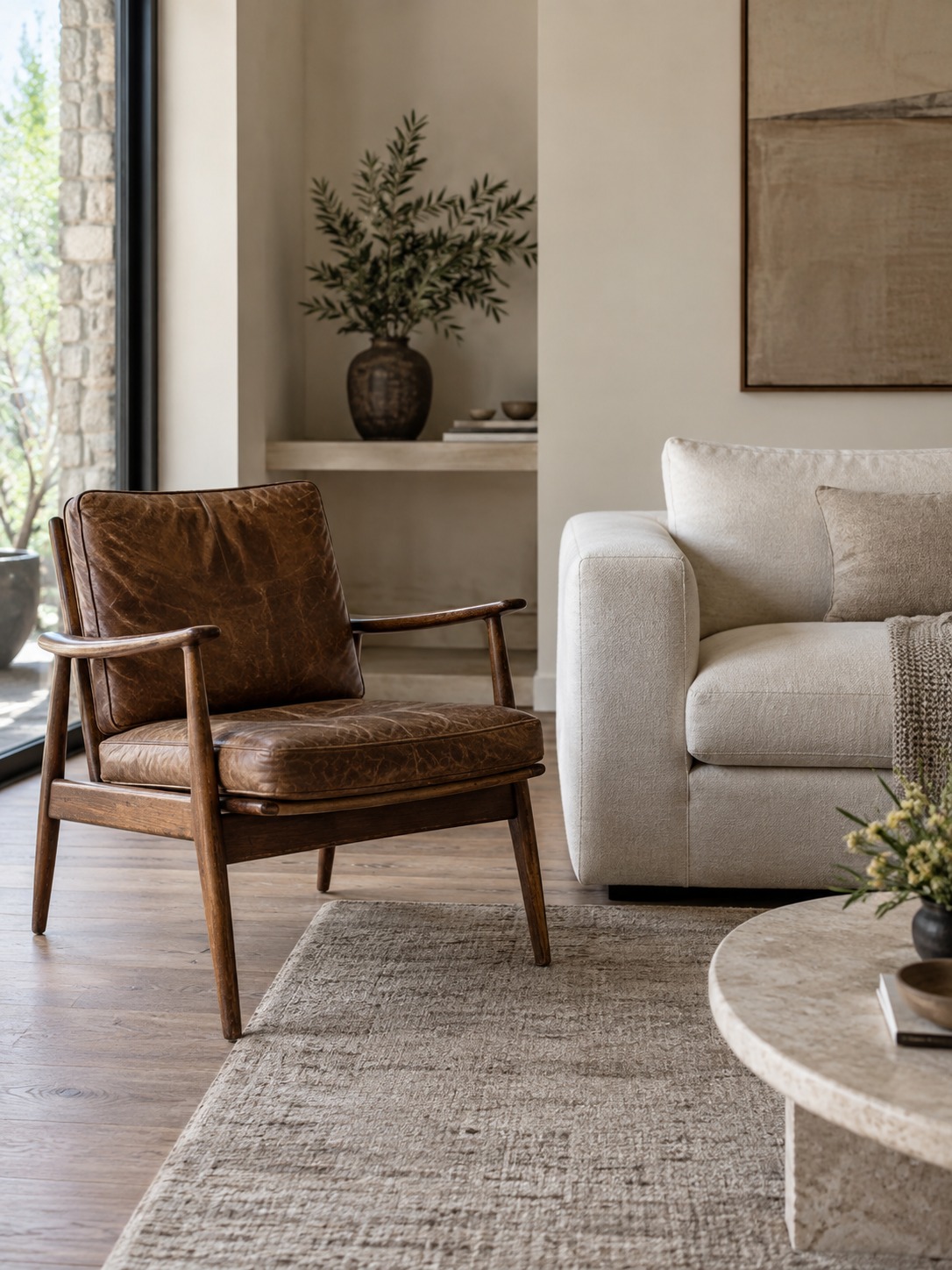
Bespoke work contributes in a different way. Custom millwork, a tailored banquette, or a table designed to fit an awkward bay gives the architecture and furniture a direct relationship. The value is not simply exclusivity; it is the precision of the fit and the evidence of skilled hands.
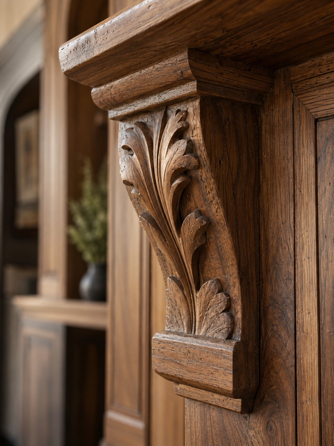
Edit accessories so every object has a role
Every object on a shelf or console should hold visual weight, add color, introduce texture, or tell a small story. If it does none of those things, remove it and look again. Editing works like cropping a photograph: taking away the weak material makes the remaining composition stronger.
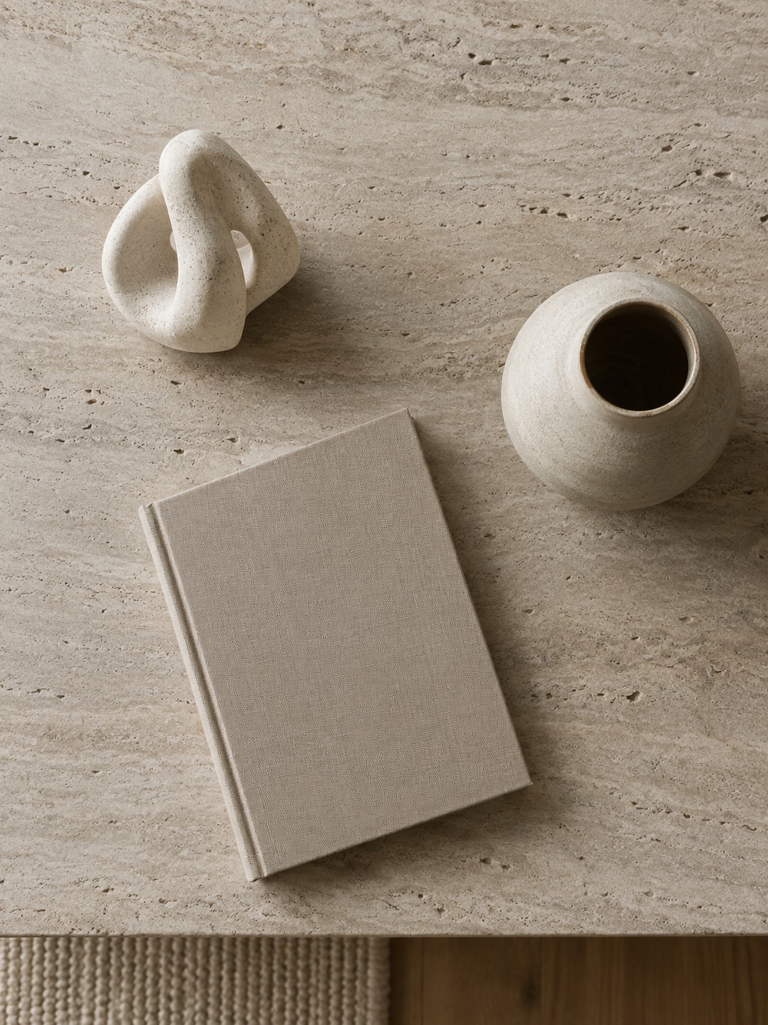
Create continuity without making every room look the same
Repeat color temperature, finishes, and architectural details
A home feels coherent when a few quiet constants travel through it: a consistent light color temperature, a repeated trim profile, or one hardware finish. These details connect a warm living room to a cooler bathroom without forcing both spaces to use the same palette.
Change texture, art, and furniture form from room to room
Continuity does not require sameness. The most convincing luxury interiors allow texture, art, and furniture silhouettes to change with each room while a few material and lighting decisions hold the house together. A bedroom can feel soft and enclosed while the living room remains open and architectural.
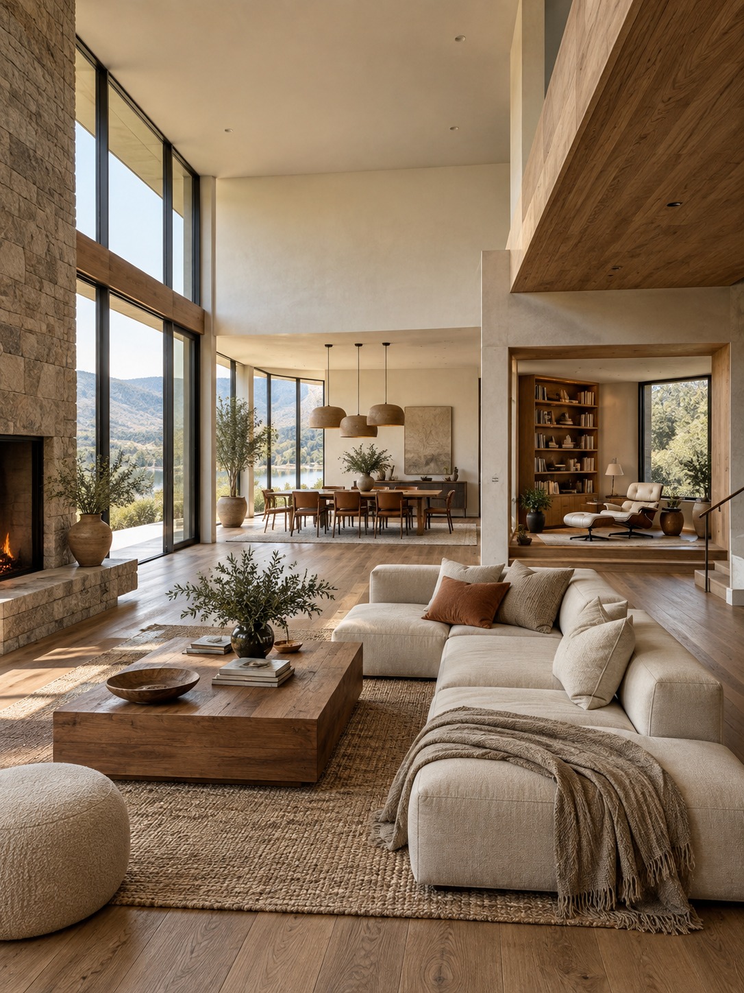
A professional luxury interior design checklist
Before finishing a room, run through these questions:
- Was the circulation and daily-use pattern mapped before furniture was chosen?
- Is there one clear focal point rather than three competing ones?
- Does the material palette use intentional contrast instead of matching every finish?
- Is the lighting planned in at least three layers with separate controls?
- Does at least one piece have real age, history, or a bespoke origin?
- Would removing any single accessory change the composition?
- Do color temperature and repeated finishes connect this room to the rest of the home?
Luxury interior design FAQ
What makes an interior look luxurious?
Composition matters more than cost. A room feels luxurious when scale, material contrast, lighting layers, and a clear focal point work together. Expensive pieces cannot compensate for weak circulation or a room with no visual hierarchy.
Does luxury interior design require expensive furniture?
No. Space planning, proportion, material hierarchy, layered light, and a clear focal point matter more than any single price tag. Spending on surfaces people touch and see closely often produces a stronger result than spreading the budget evenly.
Why is space planning important in luxury interiors?
Every later decision depends on it. Furniture scale, sightlines, focal points, and lighting locations all respond to the way people move through the space. Skipping this step is a common reason costly furniture still feels awkward in a room.
What are the three layers of interior lighting?
Ambient light sets the baseline mood, task light supports activities such as reading or cooking, and accent light draws attention to art, shelves, or architectural details. Rooms that rely on only one layer tend to feel flat or harsh.
How do interior designers create continuity between rooms?
They repeat a few constants, such as color temperature, trim profiles, hardware, or one material family, while allowing furniture form, art, and texture to change. Continuity comes from a handful of quiet threads, not identical rooms.
Related reading
If you want the baseline principles behind this process, start with the 7 Golden Rules of Interior Design. It covers the fundamentals this guide applies without repeating the same process.
- 92shares
- Facebook0
- Pinterest92
- Twitter0
- Reddit0