A student sent me a scan of a life drawing she was genuinely proud of, and the drawing itself was strong, confident line weight, real understanding of proportion, the kind of piece that deserved a second look. The scan was 480 pixels wide, soft, slightly yellow from an old flatbed scanner, and it undercut every bit of that confidence the moment anyone opened it larger than a thumbnail. The drawing hadn’t gotten worse. The file just never caught up to the work.
That gap between the quality of the actual creative decision and the quality of the file representing it is more common than most designers admit, and it’s rarely about talent. A phone photo of a sketch picks up glare. A scanned traditional piece caps out at whatever DPI the scanner offered years ago. A screen-recorded process video comes back with a trial watermark stamped across every frame. None of that reflects the work. All of it undermines how the work actually gets seen.
This is a workflow guide for closing that gap, specifically for designers, illustrators, and surface or pattern artists who already do the hard creative part well and just need the presentation layer to catch up. It covers when and how to upscale finished artwork without faking detail that was never there, how to clean a process video before publishing it, and where the ethical line sits on both.
None of this replaces the actual skill of drawing, designing, or composing well in the first place. It’s the equivalent of framing a finished painting properly instead of leaving it propped against a wall in bad light, presentation work that protects and communicates the quality already achieved rather than manufacturing quality that isn’t there.
Why visual polish matters after the creative work is done
Resolution and file cleanliness matter most exactly at the moments that count: a print run, a large display, a first impression scrolling through a feed. You don’t need every quick doodle sitting at maximum resolution. Your hero pieces, your shop thumbnails, your portfolio highlights need to hold up under real scrutiny, at real size, because that’s precisely where a soft or compressed file reads as amateur even when the underlying work is genuinely strong.
This distinction is worth making explicit because it changes where you actually spend the effort. Polishing everything equally wastes time on files that will only ever be viewed as thumbnails. Polishing selectively, the pieces that are actually going to carry weight in a portfolio, a shop listing, or a client presentation, is where this workflow earns its place.
It’s also worth naming the specific cost of skipping this step, since it’s easy to underestimate. A viewer scrolling a feed or browsing a shop makes a judgment about quality in a fraction of a second, well before they’ve had time to actually study the composition or the linework. A soft, low-resolution image loses that split-second judgment before your actual skill ever gets a fair evaluation, which is a genuinely avoidable loss given how quickly it can be fixed.
Where designers lose quality: scans, phone photos, compressed references, thumbnails, reels
Most creative files start life smaller and softer than the work itself deserves, and it’s worth naming the specific failure points rather than treating quality loss as one vague problem. A phone photo of a sketch under indoor lighting picks up glare and loses fine line detail. A flatbed scan is permanently capped at whatever DPI setting was used, often years ago on hardware nobody would choose today. A reference photo pulled from the web frequently arrives at 500 pixels wide or less, barely usable for serious study. And process footage, a timelapse, a speedpaint, a screen capture, tends to arrive watermarked from a recording tool’s trial period, from licensed stock b-roll, or from a platform overlay applied automatically on export.
Each of these failure points has a slightly different fix, which is worth knowing before assuming one tool solves everything. A soft phone photo or an old scan benefits most from upscaling. A compressed reference image is often best re-sourced at higher resolution if the original is findable, rather than upscaled from an already-degraded copy. Watermarked video needs the cleanup process covered later in this guide, not an upscaler at all, since resolution and watermark removal are genuinely separate problems that happen to both fall under the same broad category of “fixing a file after the fact.”
How an AI image upscaler fits into an artist’s workflow
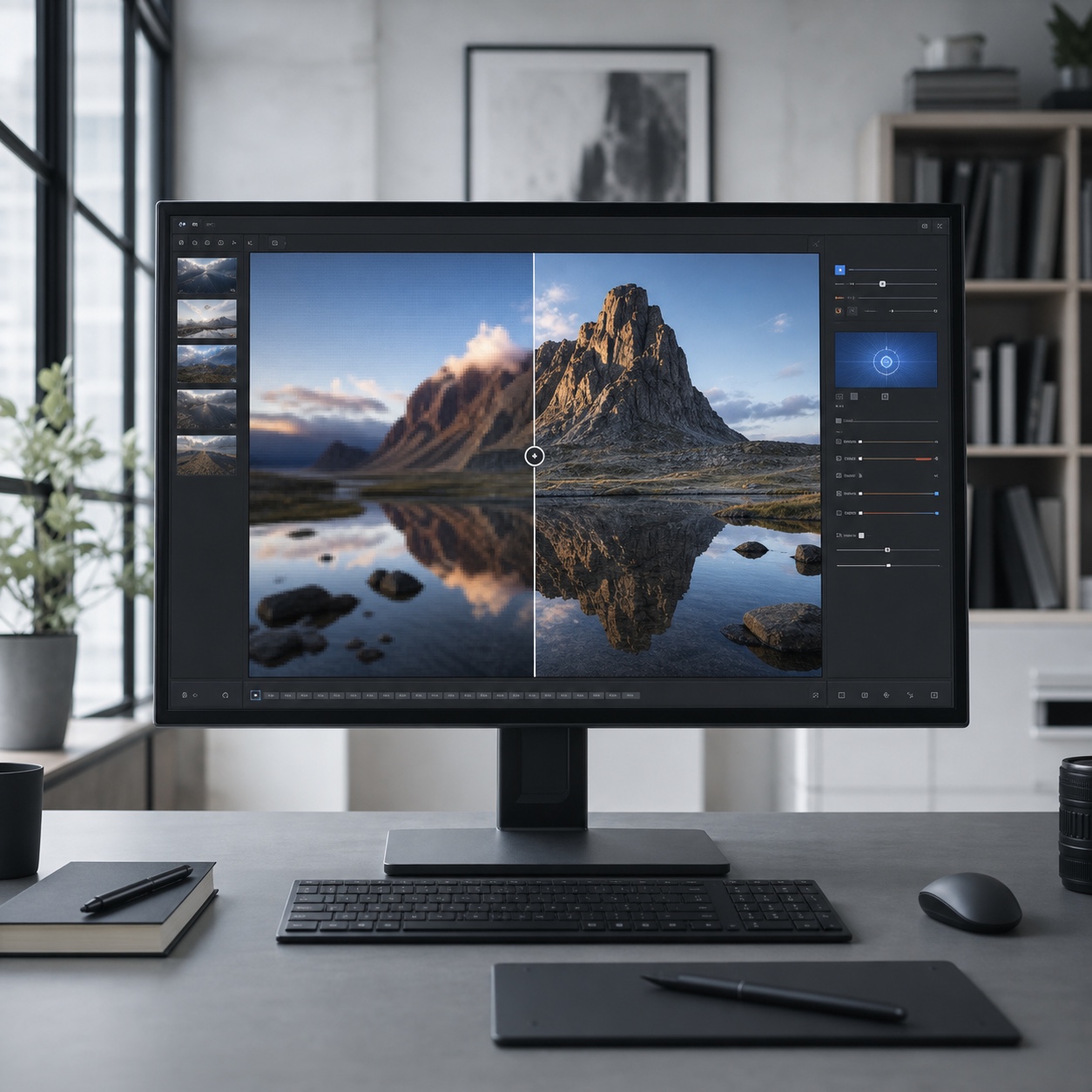
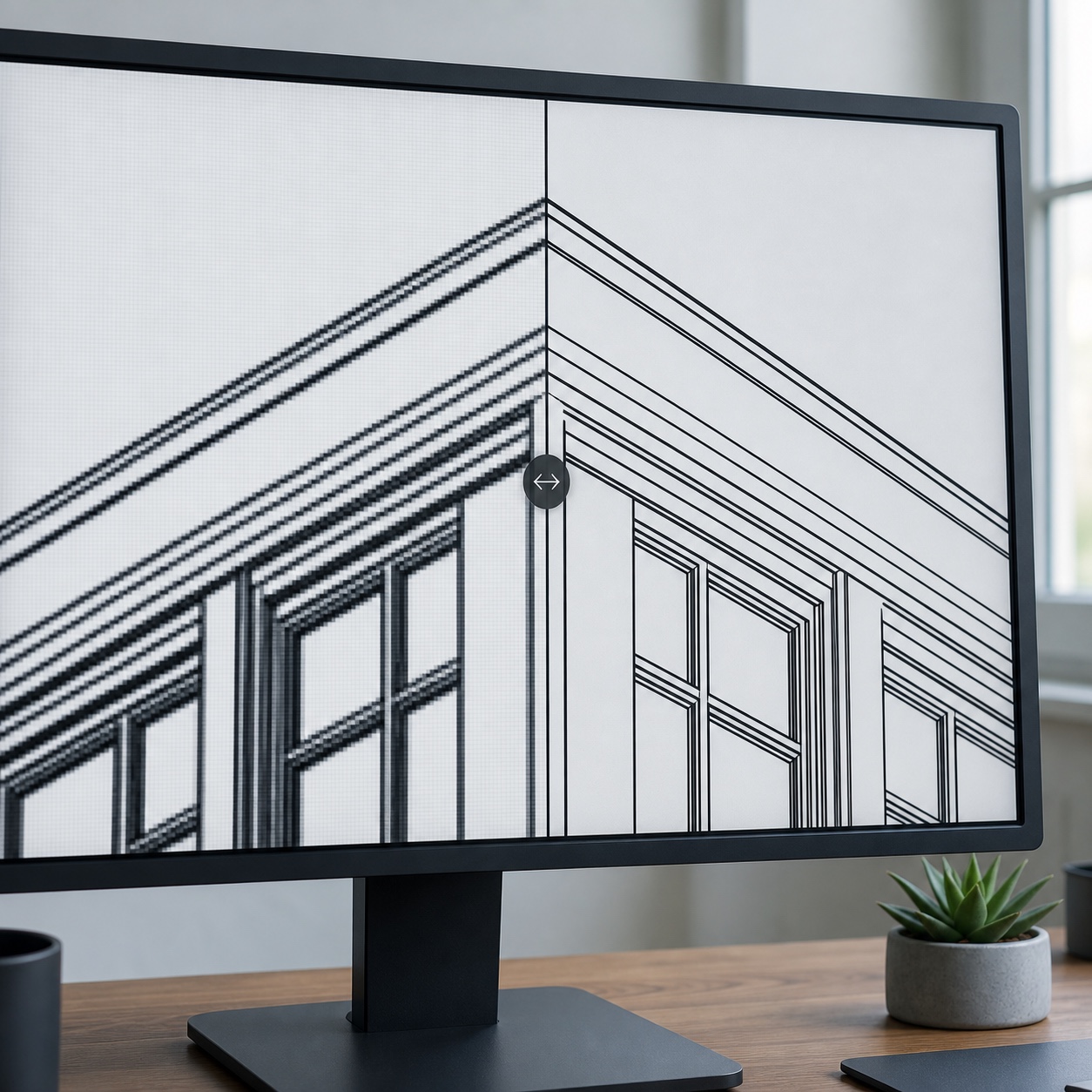
Traditional resizing simply stretches existing pixels, which is why a small image just becomes a bigger, blurrier version of itself rather than a genuinely sharper one. AI super-resolution works on a different principle entirely: it reconstructs plausible detail, sharpening edges, restoring texture, making line work read as crisp again, rather than just interpolating between the pixels that already exist.
When to upscale: portfolio heroes, shop listings, zines, posters, client files
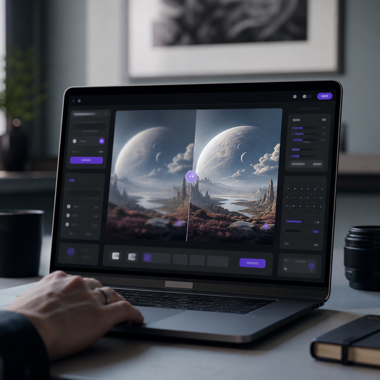
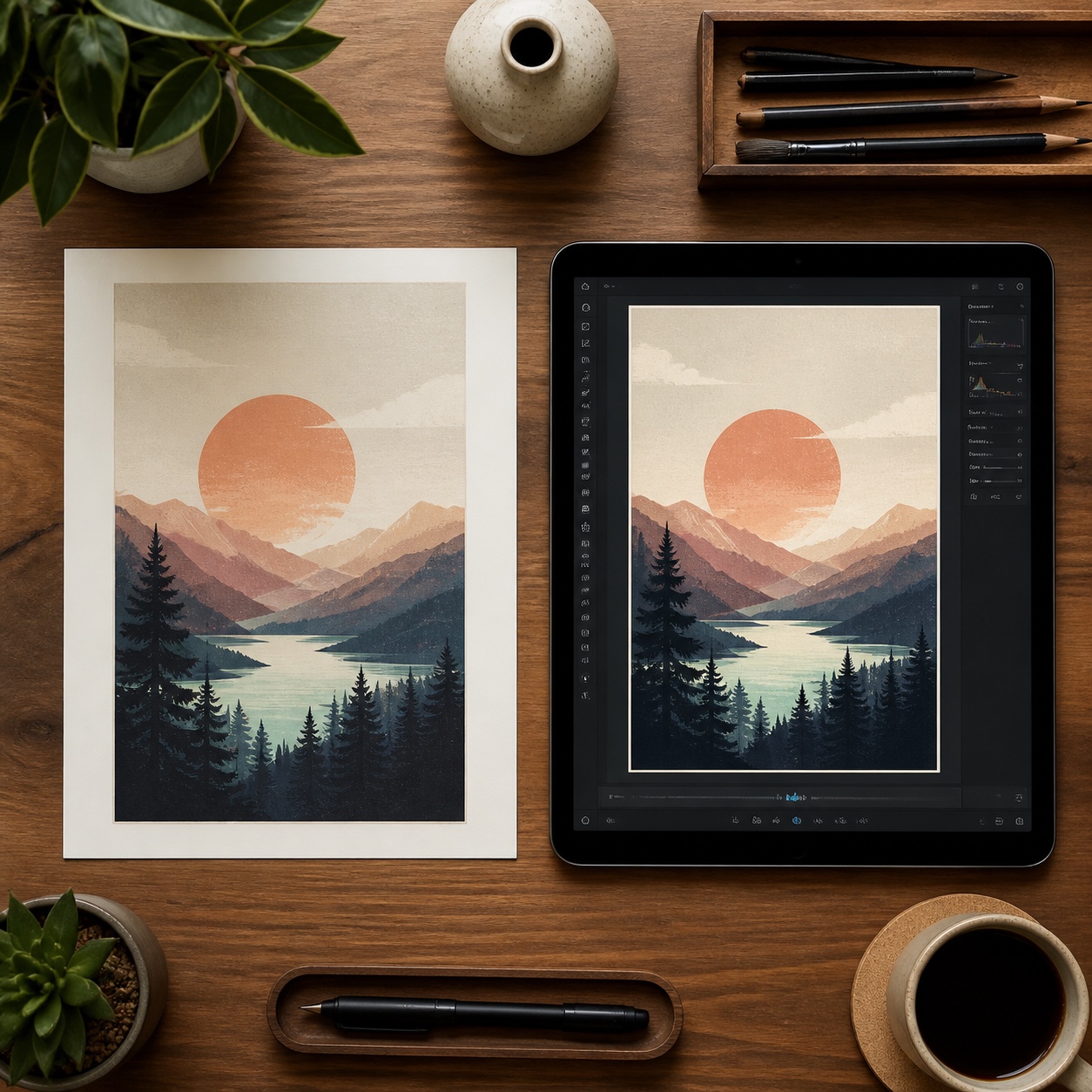
When you’re regularly preparing artwork for print, product, or large-format display, an 8k photo upscaler AI is the practical shortcut worth knowing well. Upload the source file, choose a target scale, and receive a high-resolution result, often up to 8K, without installing dedicated software or learning a new editing suite. This earns its place specifically for portfolio hero pieces, shop thumbnails that need to hold up at full size, zine and poster print prep, and client deliverables where the original was inevitably captured on a phone rather than professional equipment.
Surface and pattern designers get a specific, valuable use case here too: enlarging a small motif so its repeats stay clean at actual fabric or wallpaper scale, a problem that’s otherwise genuinely difficult to solve without redrawing the motif from scratch at higher resolution. Our roundup of free AI tools for artists and our roundup of free AI photo editor platforms both cover a wider set of tools worth knowing alongside a dedicated upscaler, useful if this becomes a regular part of your finishing process rather than an occasional fix. Our review of Upscale Pro goes deeper into one specific option worth evaluating directly, since the actual output quality varies meaningfully between competing upscalers even when the marketing claims sound identical.
What to avoid: over-sharpening, fake texture, compressed screenshots
Feed the upscaler the best-quality source you actually have, not a screenshot of an already-compressed image, since AI reconstruction works from a real signal and has nothing genuine to build on when the input is already degraded twice over. Over-sharpening is a real risk too, an aggressive upscale can introduce a crunchy, artificial edge quality that reads as obviously processed rather than naturally sharp, so it’s worth comparing a few scale settings rather than always defaulting to the maximum available.
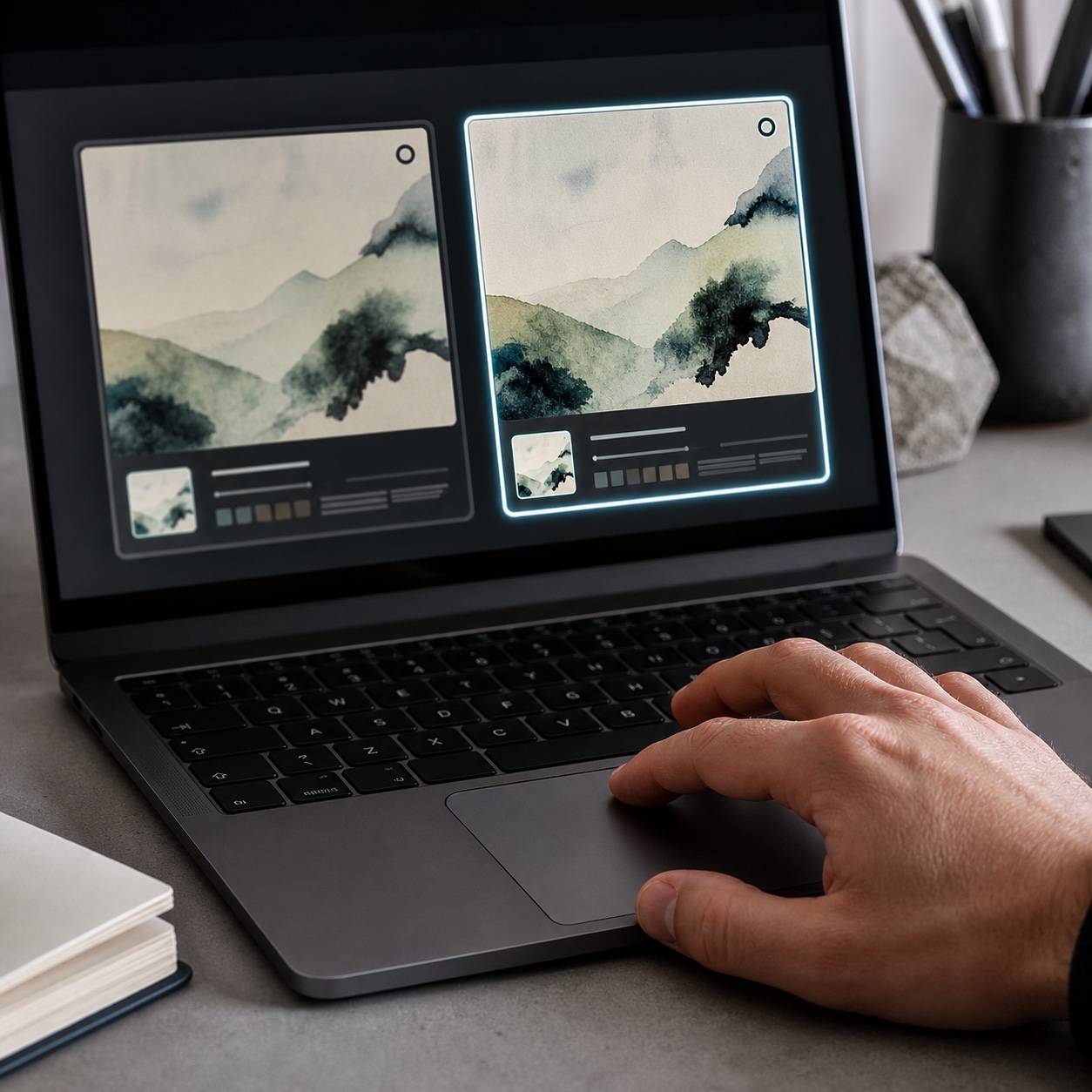
Design note: Always keep your unedited master file separate from the upscaled export. Upscaling is a finishing step applied to a specific deliverable, not a replacement for the original, and you’ll want that original intact the next time you need a different crop, scale, or edit.
How AI image enhancers differ from traditional resizing
The distinction worth understanding clearly: traditional resizing tools, the kind built into most image editors by default, use interpolation, essentially averaging nearby pixel values to fill in new pixels when an image is enlarged. That process has no access to information that wasn’t already there, which is exactly why it produces a softer, blurrier result rather than a genuinely sharper one. AI-based enhancement works from a model trained on enormous amounts of real image data, letting it make an informed prediction about what fine detail, an edge, a texture, a strand of hair, likely looked like at higher resolution, rather than simply blending existing pixels together.
This is worth understanding at a conceptual level even if you never look under the hood of a specific tool, because it changes what you can reasonably expect from the result. AI enhancement is genuinely reconstructing plausible detail, not recovering information that was somehow secretly hidden in the original file. A severely degraded or heavily compressed source still limits what any enhancer can convincingly produce, no matter how capable the underlying model is.
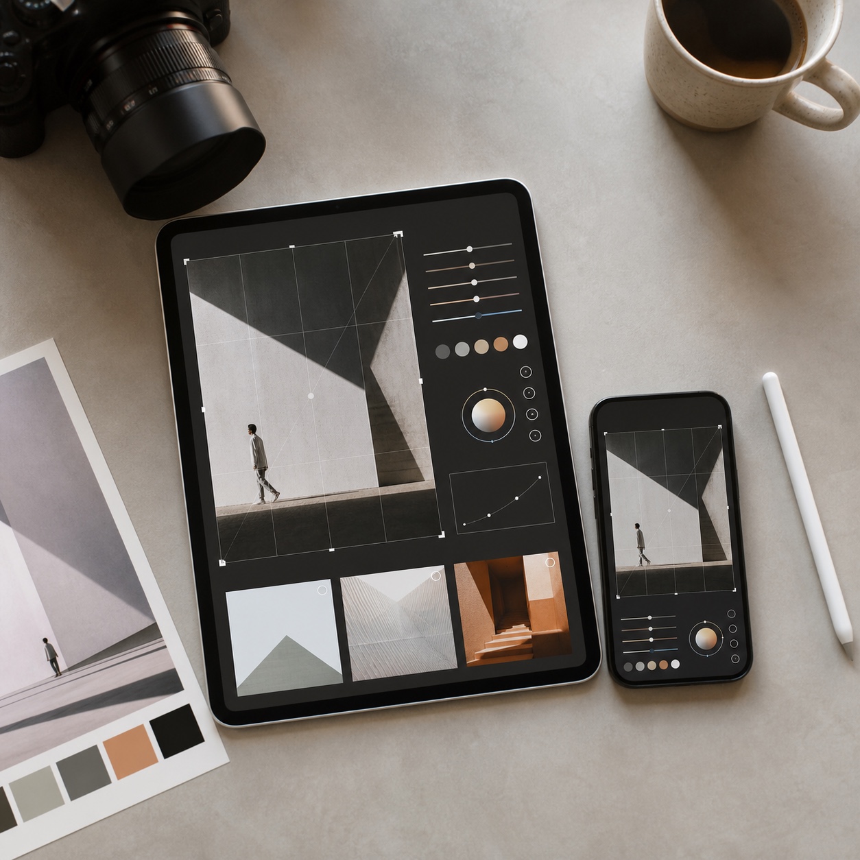
Preparing artwork for print, web and Pinterest without redrawing it
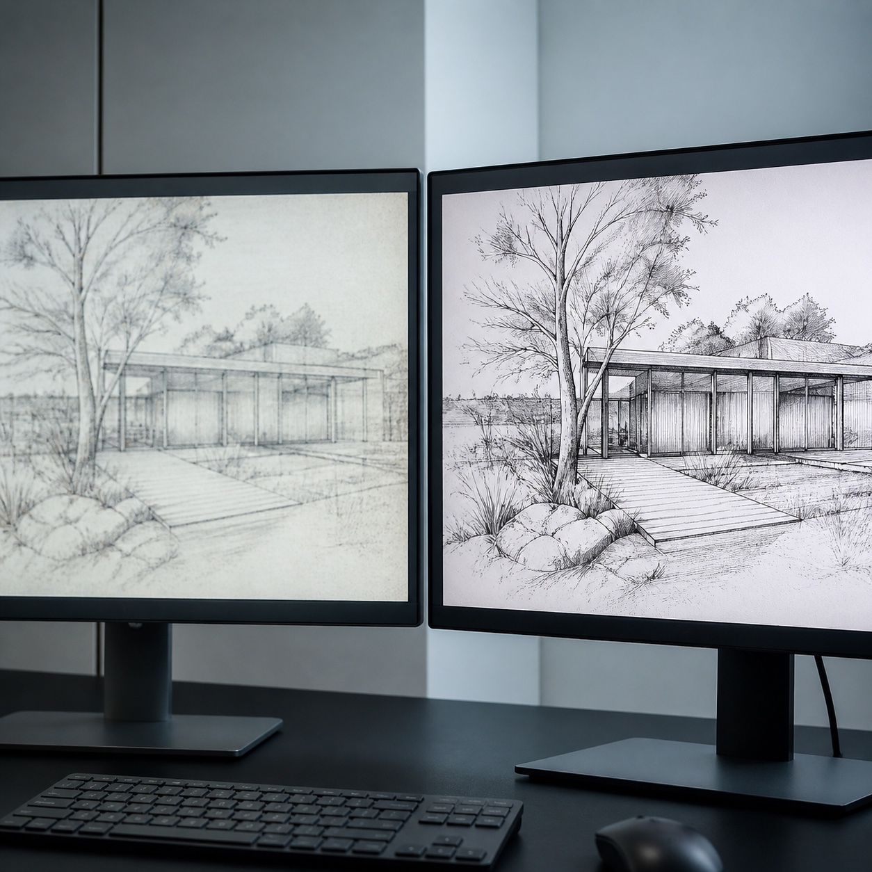
Different output destinations have genuinely different technical requirements, and it’s worth treating them as separate finishing passes rather than exporting one file everywhere. Print needs the highest resolution and the most conservative color handling, since mistakes are expensive and permanent once a run is committed. Web and portfolio display need a file sharp enough to hold up at typical screen sizes without being needlessly large for load time. Pinterest and social platforms specifically reward a crisp, high-contrast image that reads clearly even as a small thumbnail in a crowded feed, which is precisely the kind of clarity a well-executed upscale can restore to an older, softer piece. Our graphic design portfolio examples and our comparison of the best art portfolio websites both cover how finished visual work actually gets presented and compared across these different contexts, useful once you’re thinking about a whole portfolio rather than a single piece.
It’s worth building a small export checklist per destination rather than reinventing the process every time you publish something new. Print gets the highest-resolution master, checked against the specific print size and DPI requirement. Web gets a compressed, web-optimized version sized appropriately for the display context. Social gets a version cropped and framed specifically for how that platform actually presents images in a feed, not just the same file resized down. Treating these as three distinct exports, rather than one file stretched across three uses, is a small habit that consistently produces better results across every context.
How to clean process videos without making them look edited
Video is where a lot of otherwise strong creative presentation stalls out. A recorded timelapse, speedpaint, or screen capture of your design process so often comes back carrying a watermark, from the recording tool’s trial period, from licensed stock b-roll, from a platform overlay, and that mark instantly reads as unprofessional exactly where you’re trying to show your best, most considered work.
This matters more for process content specifically than for almost any other video a designer might publish, since the entire value of a process video is showing your actual work honestly and clearly. A watermark sitting across the middle of the frame competes directly with the thing viewers actually came to watch, your hand moving, your decisions unfolding in real time, which makes cleanup here a genuinely different priority than it would be for, say, a casual social clip where a small logo in the corner barely registers.
Removing watermarks from your own or licensed footage
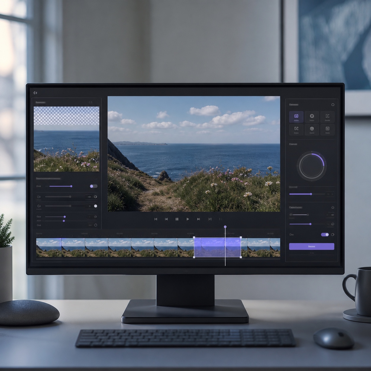
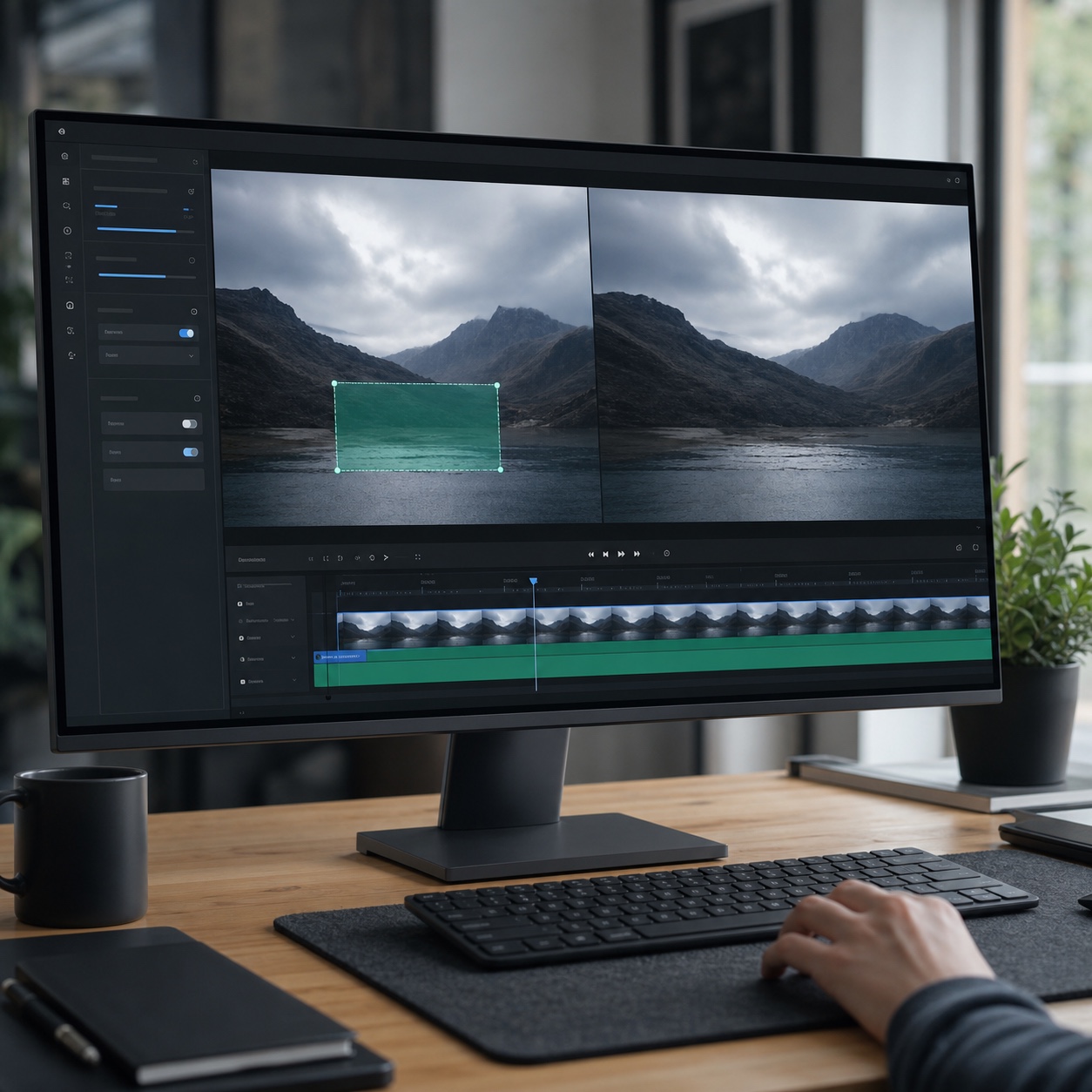
The old manual fix, masking a watermark frame by frame and hoping the background behind it doesn’t shift, produces obvious flicker and visible seams on anything but a completely static scene. AI treats this as an inpainting problem instead: it studies the surrounding frames, fills the marked region with content that genuinely matches what should be there, and keeps the result visually consistent even as the scene moves underneath it. If you remove watermark from video with a tool built for this specifically, the workflow is genuinely simple, upload the clip, mark the watermark region, download the cleaned result, without touching a timeline or a single keyframe manually. Our guide to the best AI video enhancer software and our guide to text-to-video generators for designers both cover adjacent video tooling worth knowing if process footage becomes a regular part of your published output.
When not to remove a watermark
One firm rule worth stating plainly: only remove a watermark from footage you actually created or are explicitly licensed to edit. Respecting other creators’ marks is a basic part of belonging to a creative community in good standing, and using this technique to strip attribution from someone else’s work crosses a line no amount of technical capability makes acceptable.
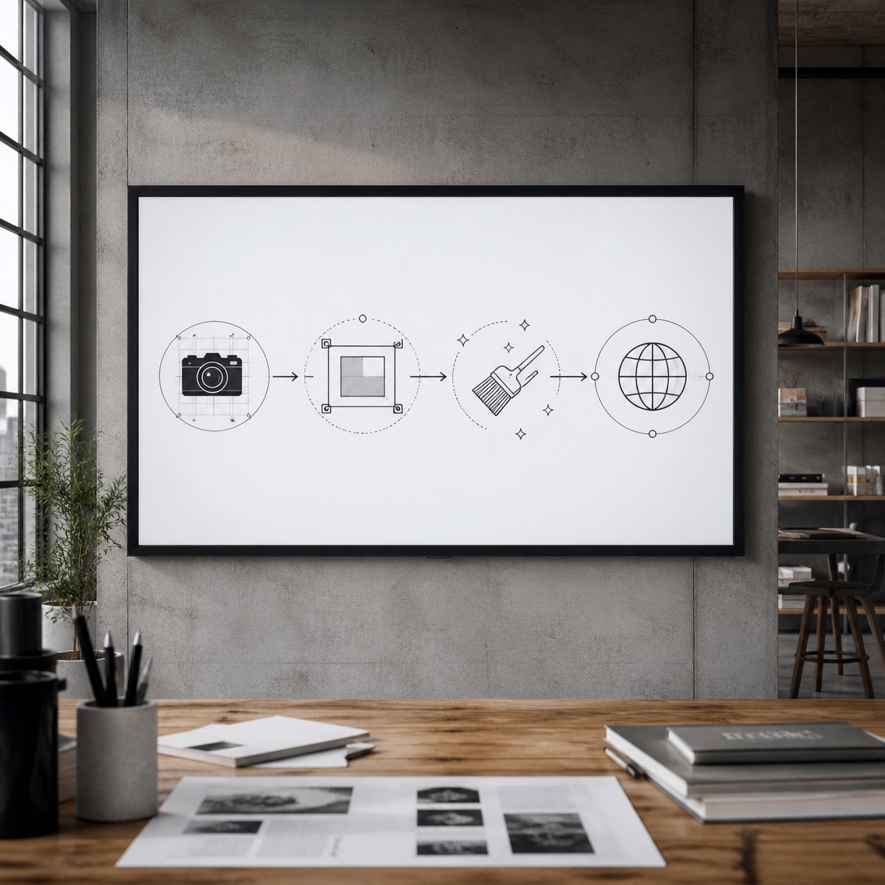
A simple visual-quality workflow for artists and designers
None of this needs a complicated pipeline. A short, repeatable routine keeps output consistent across an entire portfolio rather than treating each piece as its own one-off fix.
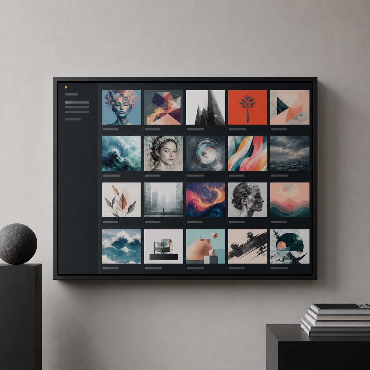
Consistency across a body of work matters more than any single piece’s individual polish. A portfolio where every image holds a similar level of sharpness and every video is equally clean reads as a coherent, professional body of work. A portfolio with a few pristine pieces sitting next to several soft, uneven ones reads as inconsistent, even when the actual creative quality across all of them is genuinely comparable.
Capture at the best source quality
Photograph in genuinely good, even light, scan at the highest practical DPI your equipment offers, and record video at the best setting your device allows. Every downstream step, upscaling, cleanup, color correction, performs better starting from real captured detail than from a degraded or compressed source trying to fake its way back to quality that was never actually captured.
When the scan needs cleanup before it becomes portfolio material, a free AI photo editor can remove background noise and sharpen the file before you upscale it.
Upscale only the keepers
Run hero images, print files, and shop-facing pieces through an upscaler deliberately, rather than applying it to every file in a working folder. This keeps the workflow fast and keeps the upscaled output meaningfully special rather than a default step applied indiscriminately to work that was never going to be viewed at a size where the difference matters.
Clean video before publishing
Strip any trial or licensed-stock watermark from a clip before it goes public, as a standard final step rather than an afterthought discovered after a video’s already live and getting views. Building this into the same checklist as color grading or trimming keeps it from becoming the thing that gets skipped under deadline pressure.
Preview on phone, desktop and print size
Check the finished file across the actual contexts it’ll be viewed in, since a phone screen, a desktop monitor, and a physical print all render sharpness, color, and contrast differently enough that a piece that looks perfect on one can reveal problems on another. This final check catches issues before a viewer does, which is always the better order for those two things to happen.

FAQ
Q: What is the best AI tool for designers who need sharper portfolio images?
A: An AI image upscaler built specifically for reconstructing detail, rather than a general-purpose resize function, is the right category of tool for portfolio work. Look for one that lets you compare scale settings and preview the result before committing, since aggressive upscaling can introduce an artificial, over-sharpened quality if pushed too far past what the source image can genuinely support.
Q: Can AI upscale artwork for print?
A: Yes, this is one of the most useful applications of AI upscaling for designers specifically. A relatively small source file, a phone photo of a sketch or an older low-DPI scan, can be reconstructed to a resolution suitable for a poster, zine, or product print run, though results still depend heavily on how much genuine detail existed in the original capture.
Q: Is it ethical to remove a watermark from a video?
A: It’s ethical when the footage is your own work or content you’re explicitly licensed to edit, removing a trial watermark from your own screen recording or a distributor’s mark from stock footage you’ve licensed for use. It crosses an ethical line when applied to another creator’s published work to strip their attribution or credit without permission.
Q: Should designers use AI image enhancers on finished work?
A: Selectively, yes, particularly on hero pieces, shop listings, and client deliverables where a soft or low-resolution file undersells genuinely strong creative work. It’s not necessary or useful to run every file through enhancement, since the benefit matters most at the sizes and contexts where viewers will actually scrutinize the image closely.
Q: What file should I keep after upscaling artwork?
A: Always keep your original, unedited master file separate from the upscaled export. Treat upscaling as a finishing step applied to a specific deliverable, print file, portfolio hero, client export, rather than a replacement for the source, since you’ll likely need a different crop, scale, or edit from that same original at some point later.
Want to get sharper at presenting your finished work?
Browse portfolio building and digital art finishing classes on Skillshare and get a discount on your first month with code AFF30D25: skillshare.eqcm.net/AFF30D25.
- 1share
- Facebook0
- Pinterest1
- Twitter0
- Reddit0