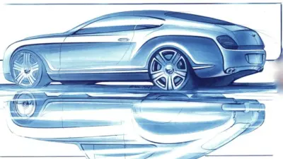
Creating an aesthetic zine layout is all about balancing simplicity and style to make your content stand out. A great zine layout uses clean lines, clear fonts, and well-chosen colors to create a look that feels both inviting and unique. This helps readers focus on the message while enjoying the visual experience.
Many zines use handmade or DIY elements, like hand-drawn images or textured backgrounds, to add personality. Readers appreciate layouts that feel personal without being cluttered, so keeping things organized and easy to follow is key. Using templates or design tools can also make this process faster and more fun.
Whether it’s a poetry collection, art showcase, or personal journal, an aesthetic zine reflects the creator’s style while staying simple enough for readers to enjoy. With thoughtful design choices, anyone can make a zine that looks polished and meaningful.
Essential Design Principles for Aesthetic Zines
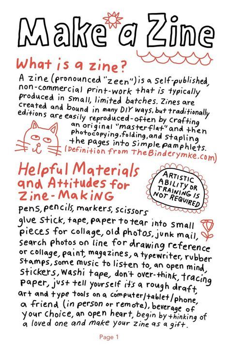
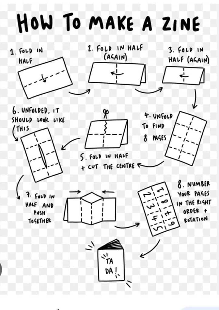
Creating an aesthetic zine means paying close attention to how text, colors, and images work together. The right combination of typography, color choices, and visual order makes a zine easy to read and visually interesting. These design elements guide the reader through the pages smoothly.
Balancing Typography and White Space
Typography includes the fonts, sizes, and styles used in a zine. Using too many fonts can make the pages look messy. Choosing one or two fonts works best—one for headings and one for body text.
White space, or empty space around text and images, is just as important. It helps the eye rest and stops the page from feeling crowded. Proper white space improves readability and highlights important parts of the zine.
A good balance looks clean but still creative. For example, a bold title with lots of white space around it grabs attention. Body text that is well spaced makes reading easier.
Choosing a Color Palette
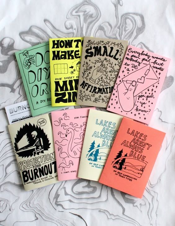
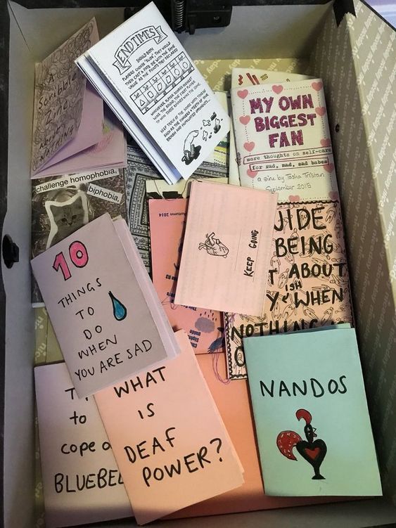
Color sets the mood of the zine. Picking a limited color palette keeps the design consistent and pleasing to the eye. Usually, using 3 to 5 colors works well.
Colors should match the tone of the zine. Soft pastel tones create a calm vibe, while bright colors feel energetic. Combining neutral colors with one or two accent colors adds interest without overwhelming.
Using color in backgrounds, fonts, or borders connects the pages visually. It’s important to check that colors contrast well, so text stays readable. Tools like color wheels or online palette makers help find matching tones.
Creating Visual Hierarchy
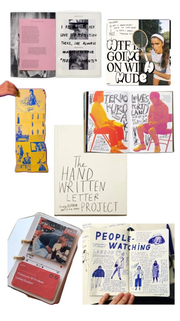
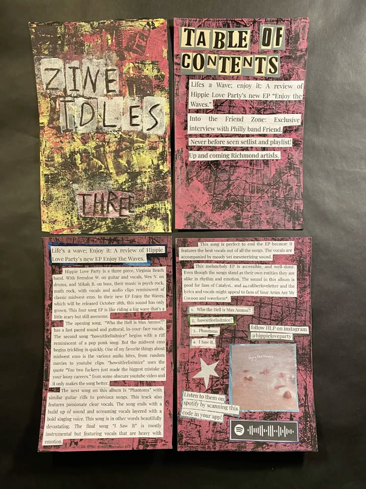
Visual hierarchy guides the reader to what’s most important on each page. Size, color, and placement all play a role here.
Big, bold headlines stand out and show what the section is about. Subheadings and smaller text come next, breaking up large blocks of words. Images or illustrations can highlight key points or add visual breaks.
Consistent spacing and alignment keep everything organized. Readers can quickly see where to look first, second, and last. This order makes reading the zine more natural and enjoyable.
Planning Your Zine Layout
Planning a zine layout means figuring out how each page looks, deciding the order of content, and placing images in the best spots. This careful planning makes the zine easy to follow and visually appealing.
Sketching Page Thumbnails
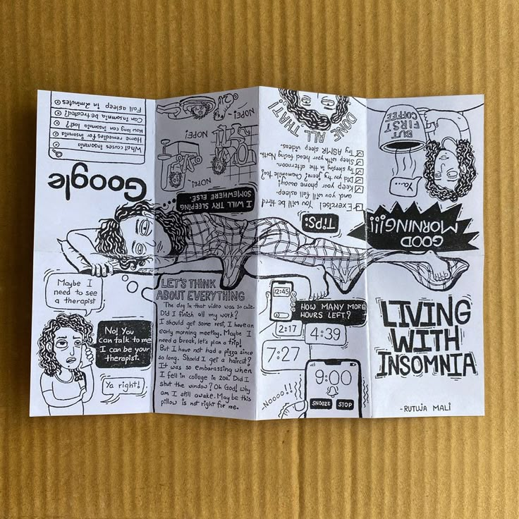
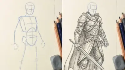
Sketching page thumbnails helps visualize the zine before making it. Small, quick drawings show where text, images, and titles will go on each page. This step saves time by spotting problems early.
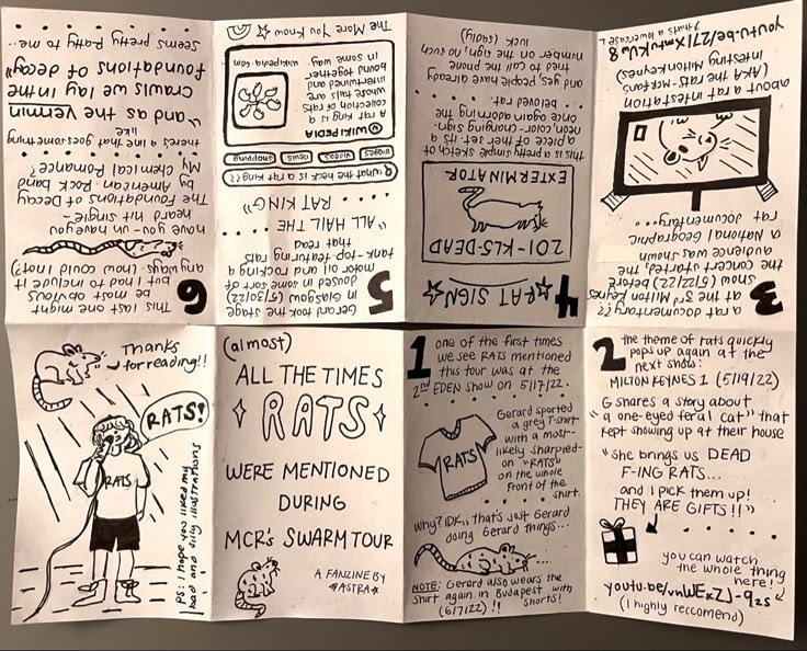
Using a simple grid for each page thumbnail helps keep everything aligned. Thumbnails also show how pages will flow visually when flipping through the zine.
Keeping sketches rough is fine. The goal is to test different layouts fast and see what feels balanced and interesting. It’s easier to fix mistakes on paper than after designing digitally.
Organizing Content Flow
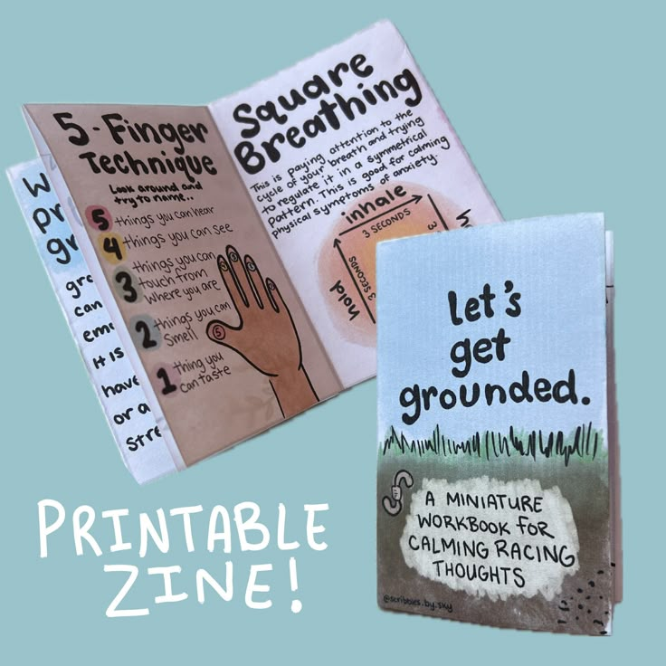
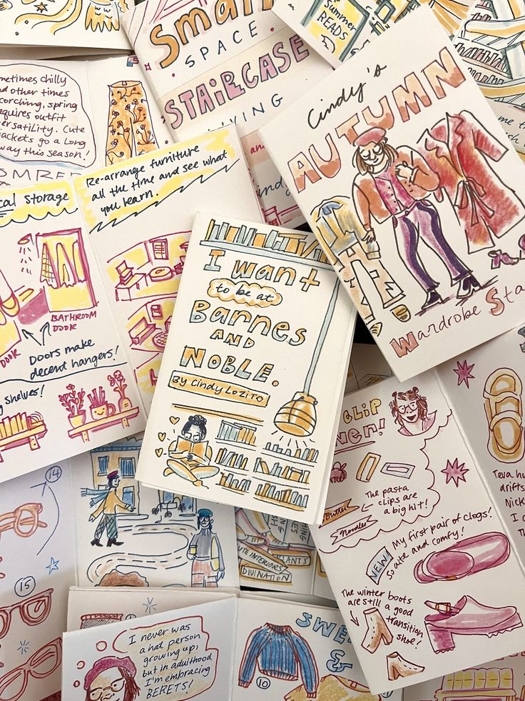
Content flow means planning the order and pacing of the zine’s stories, images, and sections. A reader should be able to move smoothly from page to page without feeling confused.
Start by grouping related ideas or themes. Then, decide which part should come first to grab attention. Use headings and consistent styles to connect ideas.
Balancing text and visuals helps keep readers engaged. Too many words in a row can feel heavy. Breaking things up with images or white space makes the zine inviting.
Incorporating Imagery Effectively
Images should support the message or mood of the zine. They can be photos, drawings, or patterns. Choosing clear, high-quality pictures is key.
Spacing images with margins helps each picture stand out. Overcrowding pages makes it hard to focus. Using different sizes or cropping images adds visual interest.
Images can also guide the reader’s eyes. Placing pictures near relevant text strengthens the story. When planning, it’s good to mix full-page images with smaller ones for variety.
Creative Techniques for Visual Appeal
Creating eye-catching zine layouts means mixing different styles and formats to keep readers interested. Playing with handmade touches, organizing content in grids, and adding layers of textures help make each page stand out. These ideas help balance creativity and clarity.
Mixing Handmade and Digital Elements
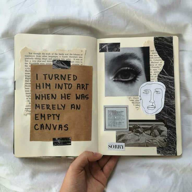
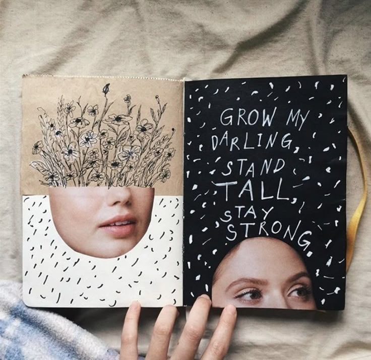
Combining handmade art with digital tools adds a fresh look to zines. Someone might start with hand-drawn sketches or handwritten notes, then scan and edit them on a computer. This mix preserves a personal feel while allowing easy changes.
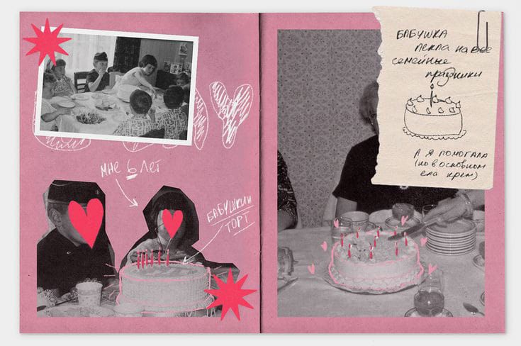
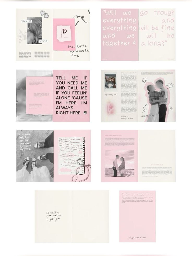
Using digital software to add color, adjust spacing, or insert typed text helps keep the layout clean and organized. Handmade details like doodles or textured paper backgrounds bring warmth and uniqueness, making the zine feel authentic.
This blend encourages experimentation. For example, scanned collage pieces can be layered with digital effects to create a striking contrast. It gives the zine a sense of depth and originality that digital-only designs might miss.
Experimenting with Grid Structures
Grids act as invisible guides that organize content clearly. They help align images, text, and white space. A good grid creates neat sections, making it easier for readers to follow the flow of information.
Zine makers often try different grids, such as columns, squares, or even asymmetrical layouts. Using uneven grids can add surprise and movement to the pages. The key is to balance order with creativity so the layout doesn’t feel chaotic.
Working within a grid also speeds up the design process. It helps maintain consistency, especially across multiple pages. Yet, there’s room to break the grid creatively—like overlapping text or images—to grab attention.
Layering Textures and Patterns
Adding layers of texture and patterns makes pages more tactile and interesting. This can include patterns like stripes, dots, or even scanned paper textures. They provide visual variety without overwhelming the main content.
Textures can be subtle, like a faint paper grain behind text, or bold, such as colorful brush strokes under photos. Combining different patterns can create a dynamic background that draws the eye but still lets important parts stand out.
This technique helps separate sections or highlight specific content. It works well with both handmade and digital elements, giving the zine a richer feel. Using texture thoughtfully improves the overall mood and theme.
- 2.6Kshares
- Facebook0
- Pinterest2.6K
- Twitter0
- Reddit0

