Graffiti drawing opens up a world of creative expression, letting you turn simple sketches into vibrant, meaningful art. By exploring different graffiti styles and techniques, you can find fresh ideas and inspiration for your next drawing project. Whether you are an experienced artist or just starting out, taking the time to study unique graffiti lettering, characters, and patterns will enhance your skills and make your artwork stand out.
At the beginning of your graffiti journey, it’s important to focus on foundational skills and preparation. Building a strong base will help students and artists alike develop confidence and creativity as they progress.
You’ll find that experimenting with shapes, lines, and colors unlocks new possibilities, from bold, colorful patterns to minimalist, striking designs. Online resources, like curated collections and drawing tutorials, offer helpful tips for your creative journey. We hope that students and readers will find inspiration and pride in their graffiti creations. Discovering the right tools and learning to share and protect your graffiti drawings online ensures your art reaches a wider audience and stays secure.
Key Takeaways
- Explore specific ideas and techniques to improve your graffiti drawings.
- Use online resources and creative tools to develop your style.
- Learn ways to showcase and protect your graffiti art digitally.
- Check out additional resources or related posts for more graffiti ideas.
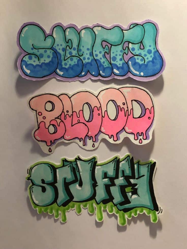
Understanding Graffiti Art Styles
Graffiti art blends unique styles, expressive techniques, and a history shaped by both underground culture and mainstream influences. For beginners, block letters and bubble letters are great starting points—block letters offer a solid foundation for exploring graffiti, while bubble letters are an iconic and beginner-friendly form of graffiti. Learning the foundations helps you create more authentic and impactful graffiti illustrations.
Many graffiti styles capture a raw and expressive energy, making them great choices for artists who want their work to stand out.


History and Evolution of Graffiti Art
Graffiti has roots dating back to ancient civilizations, with examples found on Roman walls and Greek ruins. Modern graffiti, however, emerged in the late 1960s in urban areas like Philadelphia and New York City.
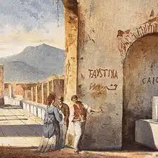
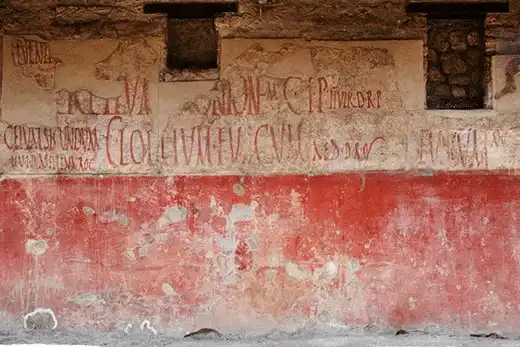
At first, graffiti revolved around “tagging,” where you’d see artists quickly write or sign their name. A graffiti tag is your artist’s signature and an essential part of every street artist’s identity. This evolved into more elaborate letterforms, known as “pieces,” often painted on subway trains and city walls.
During the 1980s, graffiti started gaining recognition as an art movement, appearing in galleries and influencing street culture worldwide. Today, it encompasses a wide range of media and styles, from quick tags to large-scale, mural-like illustrations and even digital art.
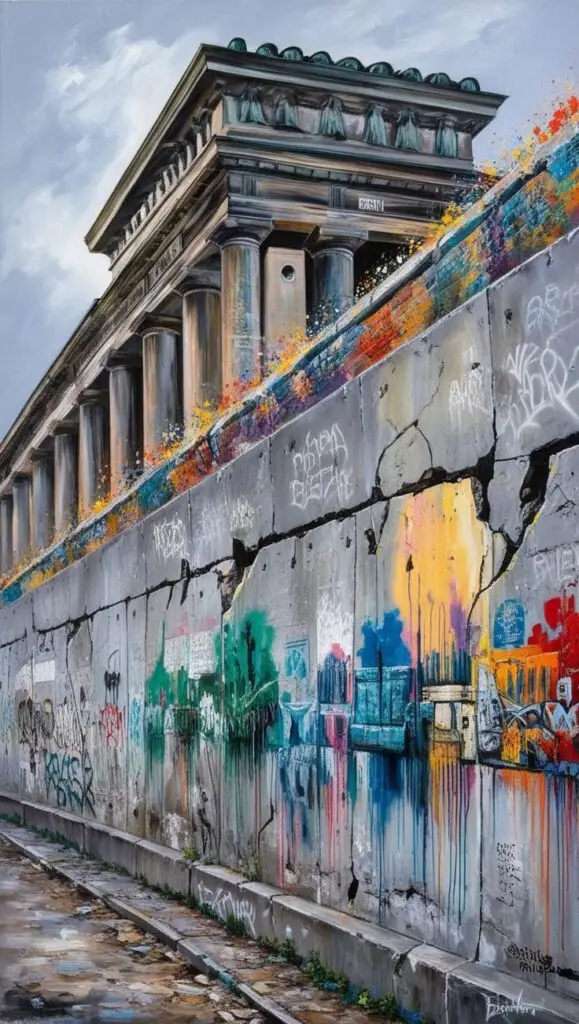

Key Elements of Graffiti Designs
Graffiti art features several distinct characteristics that set it apart from other forms of illustration:
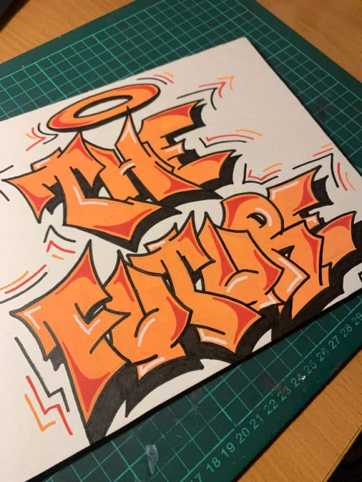
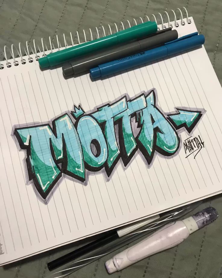
- Lettering: Most styles are text-based, with exaggerated forms, overlapping letters, and variable line weights.
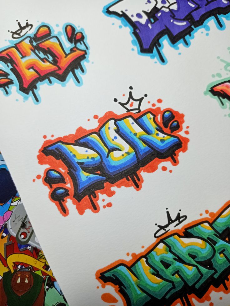
- Effects: Artists often add drop shadows, 3D effects, highlights, and arrows or broken segments to give dimension and flair.
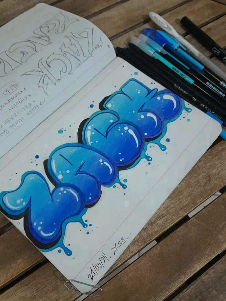
- Color: Bright, contrasting colors are common. Many works include paint drips and gradient fills for impact.
- Layout: Elements like overlapping letters or layered backgrounds give depth. Using multiple layers of colors or patterns can enhance the complexity and visual appeal of your graffiti. Arrows and icons can add movement and emphasis.
You can see these techniques in styles ranging from simple bubble letters to the more complex wildstyle, which features interlocking letters and intricate shapes. Throw-ups are another style, characterized by quick, simple pieces with rounded letters and basic fills. Each element helps showcase your unique style while connecting to wider graffiti traditions.
Famous Graffiti Artists and Influences
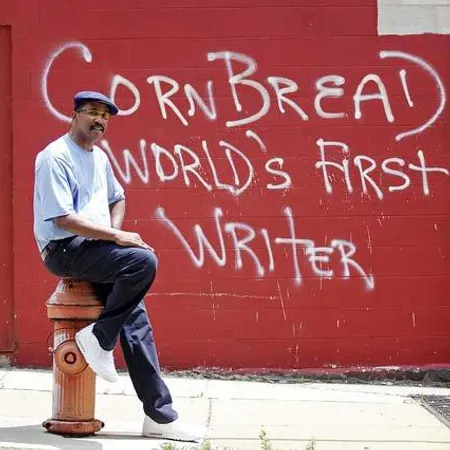
Several artists have played key roles in shaping graffiti art globally. Cornbread from Philadelphia and TAKI 183 from New York are widely credited with popularizing modern tagging.

Artists like Keith Haring and Jean-Michel Basquiat brought graffiti into art galleries, helping bridge street art with contemporary illustration. In Europe, painters like Banksy used stencils and social commentary to reach new audiences.
These artists inspire emerging creators in both technique and message. Their influence is seen in everything from mural-sized pieces to small, expressive sketches in blackbooks and sketchpads. Their styles and approaches continue to inform how you can develop your own graffiti illustrations.
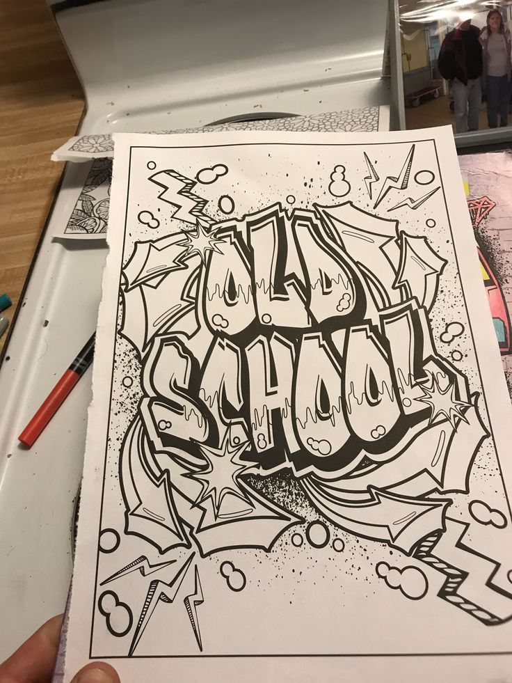
Inspiring Graffiti Ideas for Drawing
Graffiti art offers you a wide range of creative directions, from stylized lettering to imaginative characters and dynamic abstract patterns. Exploring these techniques can help you develop a distinct artistic voice and sharpen your drawing skills within the graffiti genre.
Lettering Techniques and Alphabets
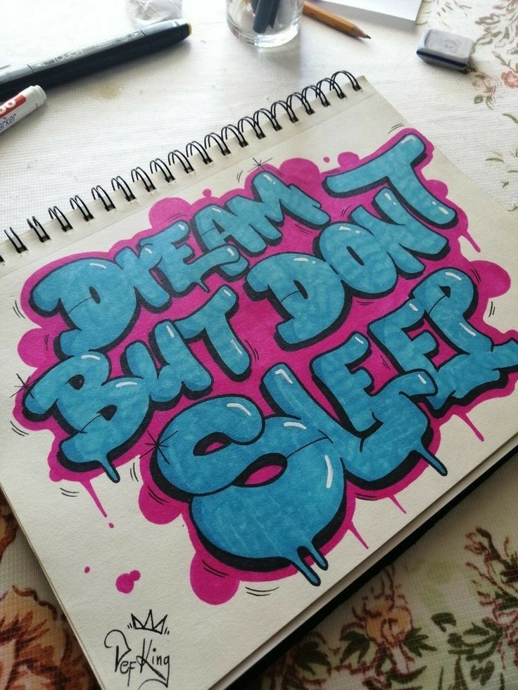
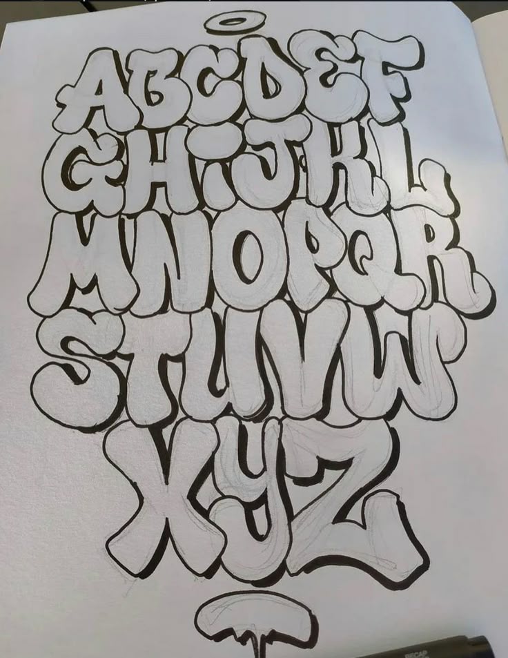
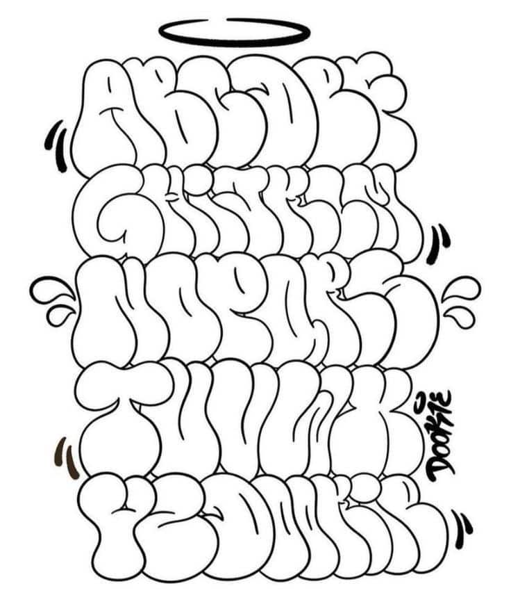
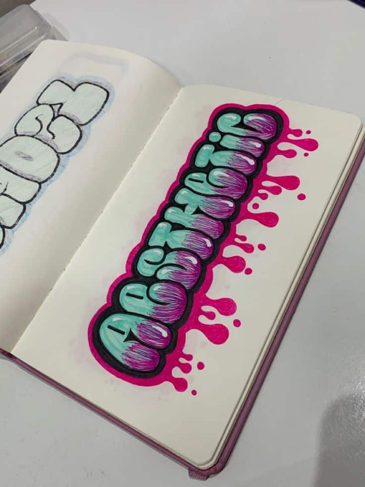
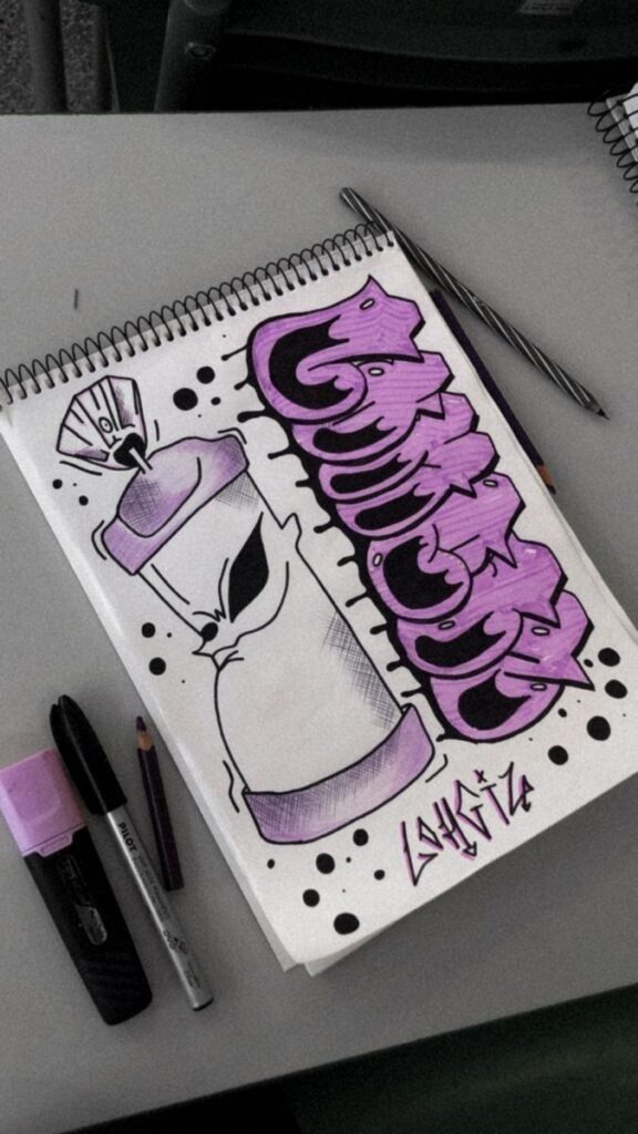
Lettering is a foundational element of graffiti. You can experiment with a wide selection of alphabets, from classic bubble letters to sharp, angular wildstyle fonts. Varying line weight, adding drop shadows, and incorporating highlights can help your letters stand out.
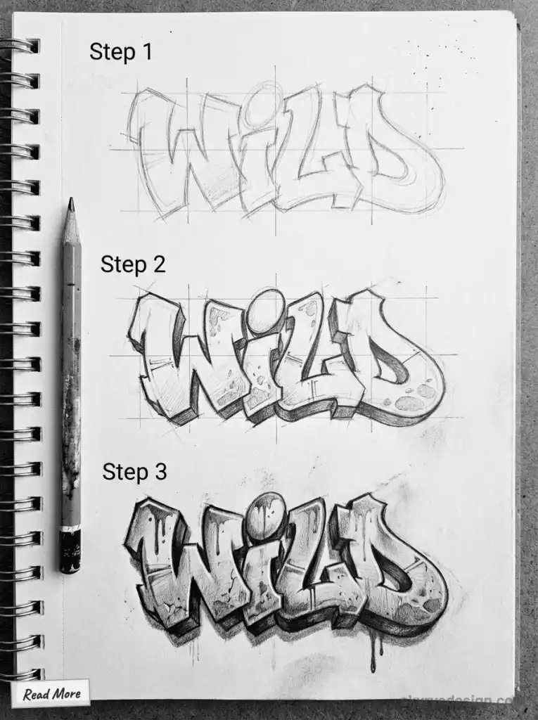
Try layering multiple colors or adding gradients to give your text more depth. Outlines and inner details, such as cracks or arrows, will add complexity and uniqueness to your work. If you want inspiration, browsing online collections, like those shared on Pinterest, can introduce you to new approaches and styles.


For those looking to experiment digitally, a graffiti generator is a useful tool. These online graffiti design generators allow you to type your name or any text, select a font or style, and instantly generate graffiti designs. Many graffiti generators include features like color pickers, so you can customize the appearance of your graffiti and try out different types of lettering before committing to a final design.
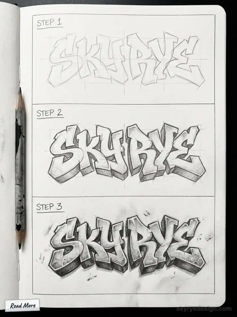
Practice sketching individual letters before creating tags or more complex word art. Use guides, grids, or even tracing paper to perfect proportions and balance in your graffiti writing.
Character Creation and Cartoons
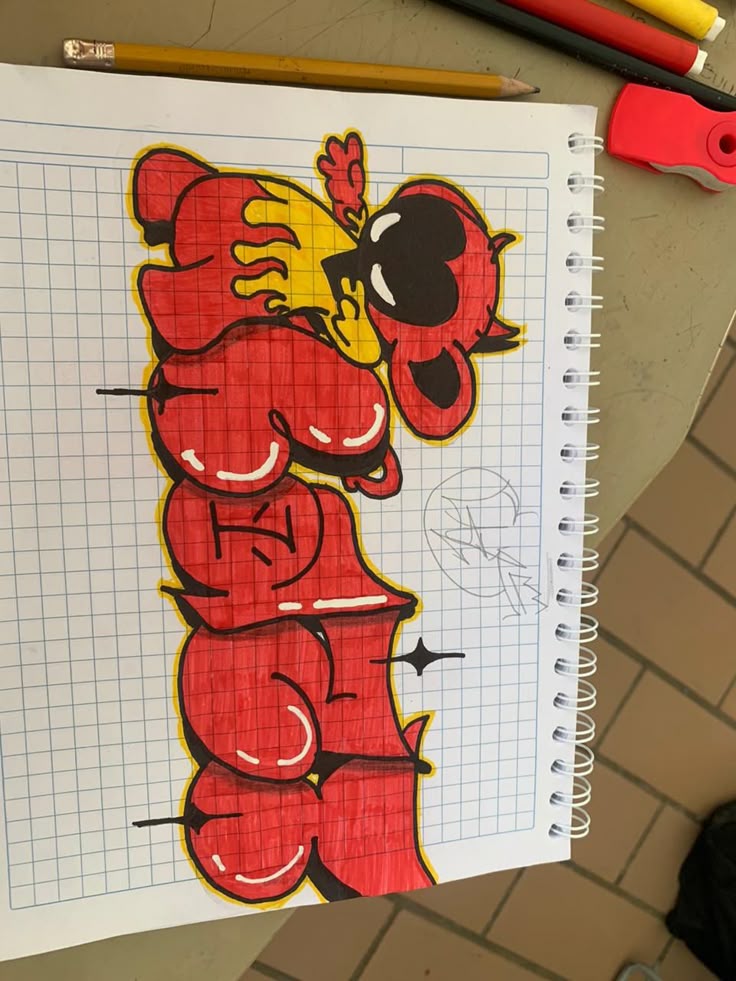
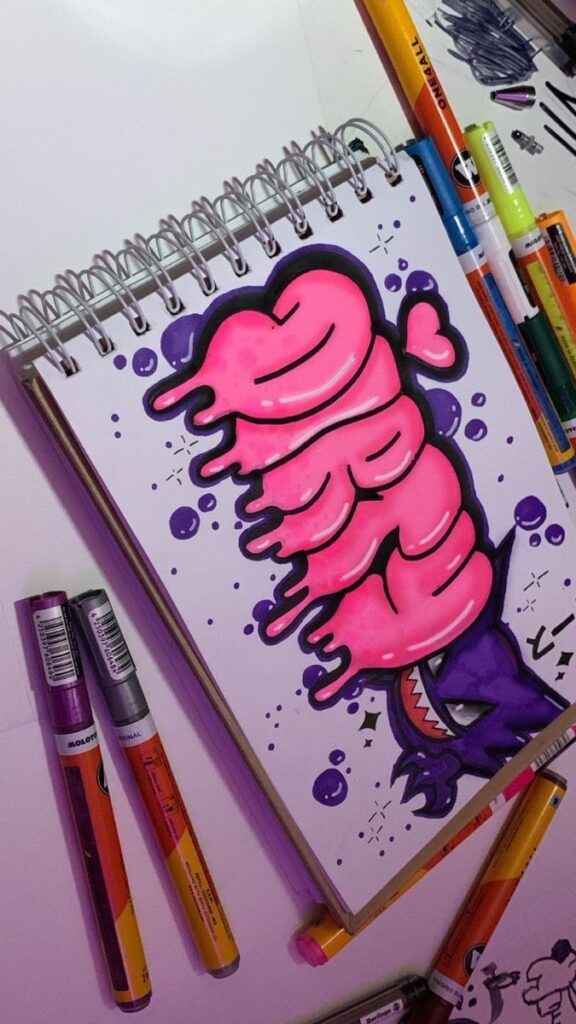
Including characters in your graffiti can make your artwork more expressive. Many graffiti artists develop cartoon-like figures, animals, or fantastical beings to give their murals more personality.
Start with basic shapes to outline heads, bodies, and features. Exaggerate eyes, hands, or facial expressions for a bold graffiti look. Outlining with thick markers or black vectors gives strong emphasis and separation from the background.
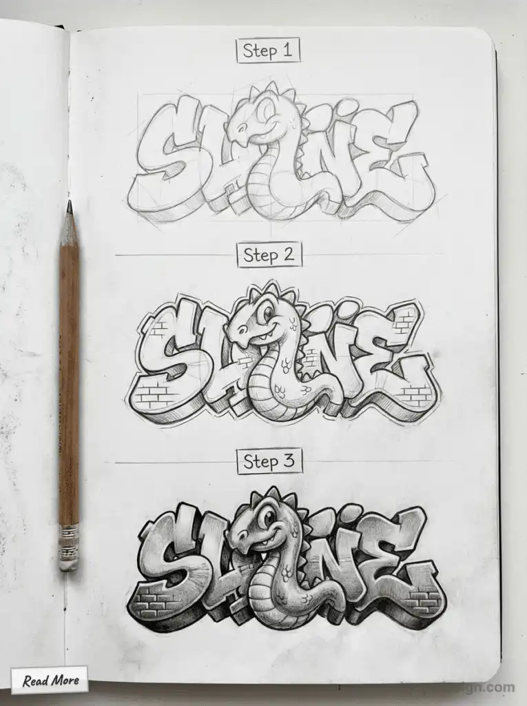
Bright, contrasting colors bring cartoon graffiti to life and attract attention. You might study online tutorials or social media examples to mimic shading or dynamic posing. Personalize your character with unique accessories, clothing, or recurring motifs.

Abstract Forms and Patterns
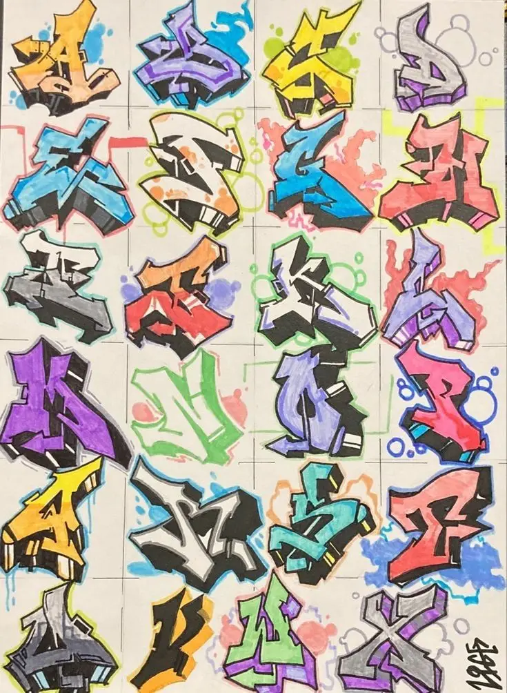
Abstract graffiti focuses on non-representational shapes and bold patterns for visual impact. You can blend curves, geometric vectors, and layered splashes of color to craft energizing designs.
Experiment with repeating motifs, alternating line weights, or contrasting color schemes. Use negative space to balance dense and sparse areas, which helps maintain visual harmony in your drawing. Overlapping forms create a sense of movement and depth.
Adding textures and gradients can make abstract graffiti appear three-dimensional. Consider incorporating iconic graffiti marks such as drips, arrows, and bursts to anchor your patterns within authentic graffiti styles.
Creative Tools and Resources
Access to varied tools and resources can significantly enhance your graffiti drawing process. Graffiti can be created on various surfaces, from traditional canvases to cardboard, which is often used for stencils and relief elements. Using the right references and technology helps you create unique, polished artwork while saving time and effort. Pen markers work well to look like spray paint.
It’s important to complete each project thoroughly for a polished result. Artists can also incorporate different materials and techniques to further enhance their graffiti artwork.
Reference Images and Stock Photos

Reference images are helpful for shaping your designs and improving accuracy. Platforms like Dreamstime offer a broad collection of royalty-free and editorial stock photos, including urban environments, wall textures, and existing graffiti.
Search for terms like “graffiti wall” or “street art textures” to find high-resolution images. Pay attention to license types; some are free for personal projects, while others may require extended or exclusive licenses for commercial work. Creating a folder of reference images can speed up your workflow and inspire fresh ideas. Stock photos also let you study different lettering styles and spray-paint effects.
Using Ai Generated Content
AI-generated content is becoming a practical resource for graffiti artists. Tools like graffiti generators or image AI platforms can create unique graffiti-style text, backgrounds, and mockups by inputting your chosen word, phrase, or theme.
Platforms sometimes provide options for customizing color schemes, effects, and letter shapes. AI content generators can serve as a starting point, but you should modify their output to maintain originality. These resources speed up brainstorming and can help overcome creative blocks. Always verify if the generated image is available for commercial use or falls under specific licensing requirements.
Video Tutorials for Graffiti Drawing
Video tutorials provide step-by-step demonstrations, making complex graffiti techniques accessible. YouTube and art-focused sites offer a wide range of instructional videos for every skill level, from sketching simple bubble letters to mastering layered effects.
Many tutorials break down lettering construction, color gradients, and outlining details, which are easier to follow visually than written guides. Some creators include downloadable reference guides or template worksheets. Consider subscribing to reputable graffiti channels or art educators for regular, updated content. Watching a variety of artists helps you discover diverse techniques and develop your personal style.
Exploring Vectors and Illustrations
Vectors and digital illustrations are essential for creating scalable graffiti designs. Websites such as Dreamstime feature both exclusive and royalty-free graffiti vector sets, suitable for print projects or digital applications. Vector art retains its sharpness at any size, which is ideal for large-format prints or logo designs.
Look for vector packs that offer editable elements like customizable letters, spray paint splatters, and wall backgrounds. Some collections come with extended licenses, allowing more flexible use, especially in commercial projects. Experimenting with digital illustrations helps you layer effects, add color variations, and quickly update designs without redrawing from scratch. This flexibility can considerably streamline your creative process.
Optimizing Your Graffiti Artwork
Careful attention to orientation, resolution, and color use helps your graffiti ideas become visually compelling. By considering the technical and creative aspects early on, you ensure a professional and memorable outcome.
Displaying your completed graffiti artwork can foster a sense of pride and encourage continued investment in future art projects.
Choosing Image Orientation and Resolution
Selecting the right image orientation sets the stage for how your graffiti will be perceived. Horizontal (landscape) orientation works well for wide, expansive pieces and murals, while vertical (portrait) orientation emphasizes height—ideal for columns, doors, or narrow spaces.
When planning your design, consider if a 360° panoramic image would make sense, especially for wraps around cylindrical surfaces or immersive street art. Test different orientations with rough sketches before committing.
Resolution is critical for preserving detail in your artwork. If you’re designing digitally, use a minimum of 300 DPI for crisp, professional results in prints or stencils. Higher resolution images allow you to experiment with fine lines and sharp edges, reducing pixelation and blurring when scaled. Make sure your initial sketches are large enough to support resizing and detail adjustments later in the process.
Enhancing Color Composition
Effective color composition grabs attention and communicates your style. Start by choosing a basic color palette—typically 3 to 5 main colors—for consistency and balance. Contrast is essential; pair bold tones with muted shades or black outlines for stronger visibility.


Use color intentionally to guide the viewer’s eye. For example:
- Background color: Sets the overall mood (e.g., dark backgrounds for bright letters).
- Letter fill: Adds energy and vibrance.
- Highlight and shadow colors: Create depth.
Consider how your colors will look under different lighting conditions or across various surfaces. When planning, it can be useful to test colors on smaller surfaces or in digital mockups before executing your final piece.
Refer to color theory basics such as complementary and analogous color schemes to create harmony or visual tension as needed. By organizing your palette and applying it thoughtfully, you strengthen the impact and clarity of your graffiti designs.
Sharing and Protecting Graffiti Drawings Online
Protecting your graffiti art while making it available online involves using privacy tools and understanding licensing. Choosing the right precautions can help you share your creations safely and maintain control over how they’re used.
Consider posting your graffiti artwork online to showcase your creativity and connect with others. For more inspiration and resources, check out more posts from the community to see what others are creating and sharing.
Using Safe Search Filters
When you share graffiti drawings on digital platforms, using safe search filters helps limit public exposure to your images. Enabling these filters on sites like Google, Pinterest, or Instagram restricts access, especially for younger or sensitive audiences.
Most graffiti artists want their work to last longer or be seen, so they place more ornate pieces in harder-to-reach locations.
Safe search filters also decrease the chances of your work appearing in inappropriate or unrelated contexts. This option is especially helpful for teachers posting student graffiti art or artists concerned about misuse.
Most platforms allow you to set your content as private, friends-only, or for a specific community. Always review and adjust these settings before uploading. Pairing strong privacy settings with safe search can add an extra layer of protection for your drawings.
Understanding Royalty-Free and Licensing Options
Before posting your graffiti art online, you should understand how licensing determines who can use or share your images. There are several main types:
- Royalty-Free: Art is licensed for general reuse without ongoing fees, but certain restrictions can apply.
- Exclusive: Only one user or buyer can use your artwork; no one else has rights.
- Extended Licenses: Allow broader use, like merchandising, beyond basic editorial or personal use.
- Editorial: Allows use in news or educational content but not for commercial purposes.
Choosing the right license gives you control. For example, sharing under an exclusive license prevents others from distributing your graffiti drawings elsewhere, while a royalty-free license can increase exposure but limit your ability to restrict copies. Always read the fine print and select the option that provides the level of protection or openness you need.
Frequently Asked Questions (FAQ)


What are the 8 types of graffiti?
The eight common types of graffiti include tagging, throw-ups, blockbusters, wildstyle, stencil graffiti, sticker graffiti, poster graffiti, and street art murals. Each type varies in complexity, style, and purpose, ranging from simple signatures to elaborate, colorful murals.
Is graffiti actually illegal?
Graffiti is often considered illegal when done without permission on public or private property. However, many cities have designated areas or walls where graffiti is allowed or even encouraged as a form of artistic expression. Always check local laws and obtain permission before creating graffiti art.
What are some good graffiti words?
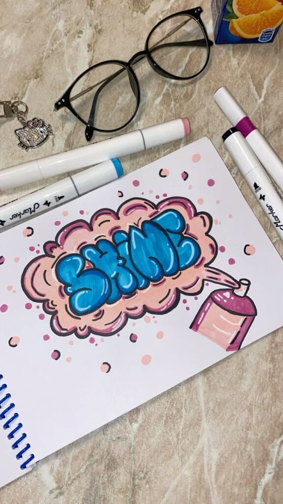
Good graffiti words are usually short, impactful, and easy to stylize. Common choices include personal names, nicknames, positive words like “Dream,” “Peace,” or “Shine,” and expressive terms that reflect the artist’s personality or message.
Where is 5 points graffiti?
5 Points Graffiti refers to a well-known graffiti hotspot located in various cities, but one of the most famous is in New York City’s Five Points neighborhood, historically known for its vibrant street art culture. The term may also refer to specific graffiti walls or areas named “5 Points” in different urban locations.
- 2.7Kshares
- Facebook0
- Pinterest2.7K
- Twitter0
- Reddit0
