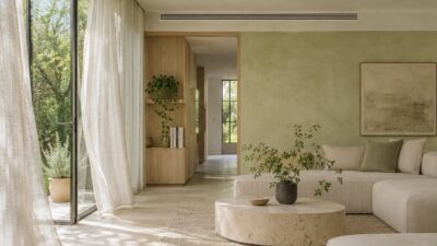
Geometric wallpaper with minimalist decor works when the pattern is treated as the room’s main visual event. Limit the palette, leave breathing space around the wall, and make the furniture quieter than the repeat. If the sofa, rug, art, and wallpaper all compete at the same volume, the room stops feeling minimal no matter how few objects it contains.
I judge wallpaper from the doorway, not from six inches away. At that distance, the repeat becomes a large shape and you can see whether it supports the room or breaks it into visual noise. The eight decisions below cover colour, pattern scale, texture, art, furniture, and the difference between a useful accent wall and a random decorated wall.
How to pair geometric wallpaper with minimalist decor
Choose one geometric wallpaper as the focal surface, pull two or three colours from it for the rest of the room, and keep large furniture forms simple. Match the pattern scale to the viewing distance: broad repeats need space, while fine repeats can work in smaller zones. Add contrast through natural wood, linen, stone, glass, or metal rather than another competing print. Finish by checking the wall in daylight and lamplight, because contrast and sheen can change dramatically after sunset.
| Decision | Minimalist approach | Common mistake |
|---|---|---|
| Colour | Two or three repeated tones | Matching every wallpaper colour |
| Pattern | One dominant geometric repeat | Adding several competing motifs |
| Materials | Wood, linen, stone, glass, or metal | Using texture without a hierarchy |
| Wall placement | A surface with a clear visual job | Choosing a wall only because it is empty |
| Scale | Judge from normal viewing distance | Selecting from a small sample alone |
| Art | Simple forms with breathing room | Stacking detailed art over a busy repeat |
| Furniture | Clean silhouettes and useful storage | Letting every object become a focal point |


1. Build the palette from the wallpaper
Start with the background colour, the dominant line colour, and one quieter accent. Repeat those tones in larger areas such as upholstery, curtains, or a rug rather than trying to match every shade in the print. A warm ivory background with charcoal lines, for example, can take walnut furniture and one muted green accent without losing its calm base.
Use a physical sample and move it around the room for a full day. Pale colours can turn grey in a north-facing space, while metallic or coated details may become much stronger under lamps. Commercial collections such as Think Noir Wallpaper are useful for comparing colourways, but judge the sample against your own floor, furniture, and light before ordering.
2. Let one pattern lead
A geometric wall already supplies rhythm. Pair it with plain upholstery, a restrained rug, and furniture with readable silhouettes. If another pattern is necessary, change its scale completely: a tiny woven texture can sit beside a large wall repeat more easily than a second medium-sized motif. The goal is hierarchy, not perfect matching.
Warm minimalism is especially useful here because it relies on quiet forms rather than an empty white box. The warm minimalist home decor guide shows how soft light, simple furniture, and natural materials can support a patterned focal wall without competing with it.
3. Use natural materials to soften sharp geometry
Geometric repeats can feel precise and hard-edged. Wood grain, linen, wool, stone, and leafy plants introduce irregular shapes that keep the room from looking diagrammatic. Choose one or two material families and repeat them. A pale oak bench, linen cushion, and single ceramic pot usually work better than a collection of unrelated rustic accessories.
Plants should solve a compositional problem, not fill every empty corner. One tall plant can balance a strong vertical repeat, while a low spreading plant can soften a hard console line. Use the interior decorating with plants guide to match scale and placement to the room rather than choosing greenery as generic filler.
4. Add texture without adding another visual argument
Texture gives minimalist rooms depth, but each surface does not need to announce itself. Combine one tactile fabric, one natural material, and one smoother finish. Matte wallpaper can sit with brushed metal and linen; a lightly reflective wallcovering may need quieter upholstery and fewer polished accessories.
Look at gloss as well as colour. Two beige materials can behave very differently when one absorbs light and the other reflects it. The interior design texture guide explains how wood, stone, metal, fabric, and synthetic finishes change under different lighting conditions.


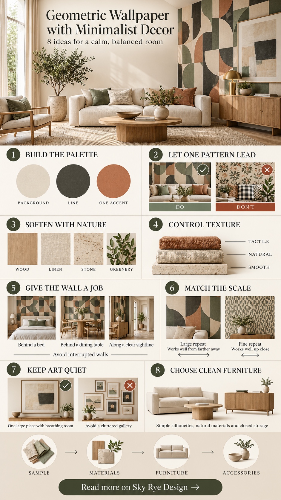
5. Give the accent wall a reason to exist
The strongest accent wall usually supports the main function of the room: behind a bed, behind a dining table, along an entry sequence, or at the end of a clear sightline. Avoid choosing the wall with the most doors, switches, shelves, or competing furniture edges. Those interruptions make even a simple repeat look fragmented.
Before committing, tape the full wallpaper sample at eye level and photograph it from the doorway. If the pattern improves the room’s balance, continue. If it only makes an empty wall busier, the surface may need art, storage, or better lighting instead. For a broader material comparison, see how wallpaper and textured finishes change modern interiors.
6. Match pattern scale to the room and viewing distance
Large repeats need enough uninterrupted wall area to become legible. In a narrow entry or small powder room, a bold repeat can still work because the viewer reads it as an immersive surface. In a living room broken by windows and cabinets, a smaller or more forgiving repeat may connect the remaining wall sections better.
Do not choose scale from an online thumbnail. Print or order the largest available sample, hold it beside the furniture, then step back to the normal viewing position. This is the same proportion check used across the seven interior design principles: judge visual weight across the complete room, not one object in isolation.
7. Keep artwork simpler than the wall
Art over geometric wallpaper needs a clear outline and enough negative space to separate it from the repeat. A single large canvas, a pair of quiet prints, or a sculptural object often works better than a dense gallery wall. Frames can either disappear into the wall colours or create one deliberate contrast; accidental near-matches tend to look unsettled.
Test the complete outside boundary with painter’s tape before drilling. If you are unsure about width, colour, or placement, the living-room canvas art guide gives practical checks for scale, furniture relationships, and ceiling height.
8. Choose furniture by silhouette and function
Clean-lined furniture gives the eye somewhere to rest. Look at the outline first: a low sofa, slim console, or closed storage unit should read clearly against the pattern. Avoid open shelving filled with small objects directly in front of a busy wall; the overlapping edges turn useful storage into visual noise.
Function is part of the minimalist look. Hidden storage, nesting tables, and benches with a clear purpose reduce the number of separate pieces in the room. The existing multipurpose furniture ideas offer options for small rooms where the wallpaper already provides the decoration.
Room-by-room wallpaper decisions
| Room | Useful wallpaper role | Keep quiet |
|---|---|---|
| Entry | Set the visual direction at the first sightline | Console styling and floor pattern |
| Living room | Anchor the main seating or media wall | Rug, upholstery, and artwork detail |
| Bedroom | Create a headboard wall without extra furniture | Bedding pattern and bedside accessories |
| Dining area | Define the zone in an open-plan layout | Chair silhouettes and table styling |
| Small room | Use one immersive surface or fine repeat | Number of finishes and decorative objects |
Common mistakes to avoid
- Choosing from a screen alone. Colour, repeat size, and sheen need a physical sample.
- Adding several patterns at the same scale. Change the scale or remove the secondary motif.
- Using every colour in the print. Repeat only two or three tones across the room.
- Ignoring wall interruptions. Doors, switches, shelves, and windows can break the repeat awkwardly.
- Styling too close to the wall. Leave negative space so the pattern remains readable.
- Judging only in daylight. Check contrast and reflectivity under the lamps used at night.
Before you order the wallpaper
Measure the full wall, subtract large openings, then check the roll width, roll length, pattern repeat, and matching method stated by the manufacturer. A straight match and an offset match can require different amounts of material. Keep the batch or lot number consistent so the colour does not shift between rolls, and order enough for pattern matching and future repairs rather than only the mathematical wall area.
The wall also needs to be sound, smooth, clean, and dry. Mark the first vertical reference line with a level instead of trusting a corner, because old walls are rarely perfectly square. If the paper is expensive, heavily textured, metallic, or installed across several interrupted surfaces, professional installation may cost less than replacing misaligned drops. Keep one labelled offcut with the care instructions for later touch-ups.
Sample first, then edit the room
The safest sequence is wallpaper sample, paint and material samples, furniture plan, then accessories. Photograph the room from the main doorway after each decision. If the wall still reads first and the furniture remains easy to understand, the hierarchy is working. If the eye jumps between several patterns and objects, remove one layer instead of adding another.
For more options, browse the Sky Rye Design home archive. If you are sourcing accessories after the wall is settled, this House Beautiful overview of home stores is one place to compare categories. Keep the final edit strict: one focal wall, a limited palette, useful furniture, and enough open space for the pattern to breathe.
- 5shares
- Facebook0
- Pinterest5
- Twitter0
- Reddit0