Last year I helped a friend redo her living room, and the first thing she bought wasn’t the sofa or the rug. It was a six-foot fiddle leaf fig. It sat in the corner by the window looking expensive and completely wrong. Not because it was a bad plant. Because nobody had asked what job it was supposed to do in that room.
- Plants are design objects, not accessories
- Match the plant to your style
- The height-layering formula that actually works
- Color and texture: foliage as a material swatch
- Room-by-room placement
- Real vs. faux: the honest design call
- When not to add a plant
- Conclusion
- Frequently Asked Questions
- Q: What are the best low-light plants for interior decorating?
- Q: How many plants is too many for one room?
- Q: Are fake plants OK for interior design, or should I always use real ones?
- Q: What is the best plant for a bathroom?
- Q: Where should I put a large plant in a small living room?
- Q: What color pots work with 2026 warm-neutral interiors?
- Q: How do I stop a plant corner from looking cluttered?
That’s the mistake almost every plant guide sets you up for. They tell you which species tolerates low light and how often to water it, then leave the actual placement to instinct. I trained as an industrial designer — years of life drawing, then a decade spent arguing over how a wheel arch should read against a body panel — and a plant is no different from any other object with mass and silhouette. It has weight. It competes for attention or it supports it.
This isn’t a care guide. It’s how to choose a plant’s size, shape, and color the way you’d choose a chair — so it actually earns its corner.
Plants are design objects, not accessories
Every plant guide I’ve read treats greenery like a finishing touch — something you add after the room’s already decided. That’s backwards. A large plant occupies more visual real estate than most side tables, and it deserves the same scrutiny you’d give a chair before buying it.
Why “just add greenery” fails as a strategy
I’ve seen this go wrong the same way twice now, once in that friend’s living room, once in a client’s home office I helped rearrange. Both times, the plant was chosen first and the room built around it never quite happened. The fig sat there like a guest nobody invited to sit down.
The fix isn’t complicated. Before you buy anything, look at what’s already competing for attention in the room — a patterned rug, a gallery wall, a statement light fixture. A plant with a bold silhouette, like a Monstera deliciosa or a Bird of Paradise, needs a relatively quiet backdrop to read as intentional. Drop the same plant into a room full of other loud shapes, and it just adds noise.
Visual weight — treating a plant like a piece of furniture
Think about how you’d place an armchair. You wouldn’t shove it into a corner without checking sightlines, scale, and what it’s balancing against. Plants need the same math.
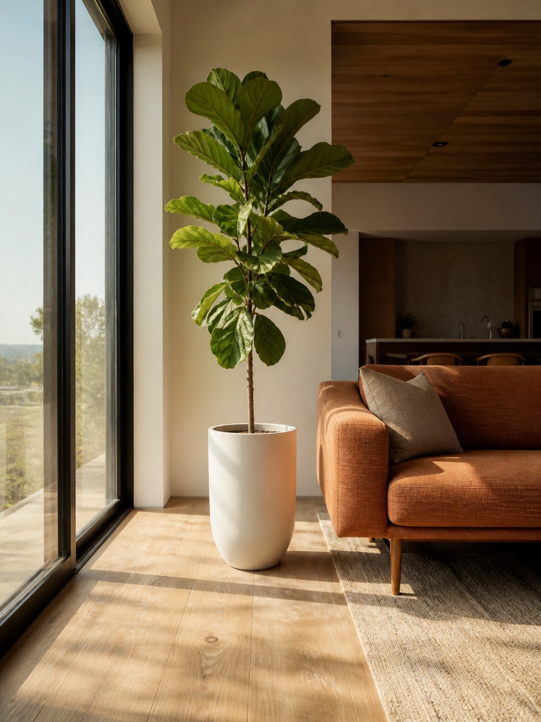
A six-foot fiddle leaf fig has roughly the visual mass of a floor lamp. If your room already has a tall bookshelf on one side, that plant belongs opposite it, not stacked next to it. This is the same weight-distribution thinking I used constantly on interior projects: heavy visual elements go on opposite sides of a room, not clustered together.
DESIGNER TIP Stand at your main doorway and look at the room as a silhouette, almost squinting so details blur. Whatever shape reads strongest is your visual anchor — that’s where a statement plant should go, or where it shouldn’t compete.
Get this right first, and every plant decision after it gets easier, because you’re no longer guessing at scale room by room.
Match the plant to your style
Walk into five different living rooms and the “right” plant changes completely, even if the room’s the same size. Style dictates plant choice as much as it dictates furniture, and most guides skip straight past that.
Mid-century and warm minimalist
This is the pairing everyone already knows, but rarely gets the pot right. A fiddle leaf fig or rubber plant works because its bold, upright form matches the clean lines mid-century furniture already has. I’d skip the woven baskets here — they read too textured against straight-legged furniture. Go with a matte ceramic pot instead, something like West Elm’s Tapered Ceramic planter (around $70 for a 12-inch size), which keeps the whole composition quiet.
One thing I’ve noticed doing this for clients: people size the pot to the plant, not to the room. A fiddle leaf fig in a 10-inch pot looks like it’s standing on its tiptoes next to a low mid-century sofa. Go bigger than feels natural — a 14 to 16-inch pot grounds the plant properly.
Farmhouse
Farmhouse leans functional. Herbs, aloe, or a trailing arrowhead vine in a vintage metal planter or a repurposed enamel pot do more work here than a showy Monstera ever would. The plant should look like it earns its keep, not like it’s posing.
Eucalyptus is underused in this style. It’s cheap (a bunch runs $10 to $15 at most florists), dries beautifully if you don’t keep it watered, and gives you that slightly wild, collected-over-time look farmhouse interiors are built on.
Dark, cocooning 2026 interiors
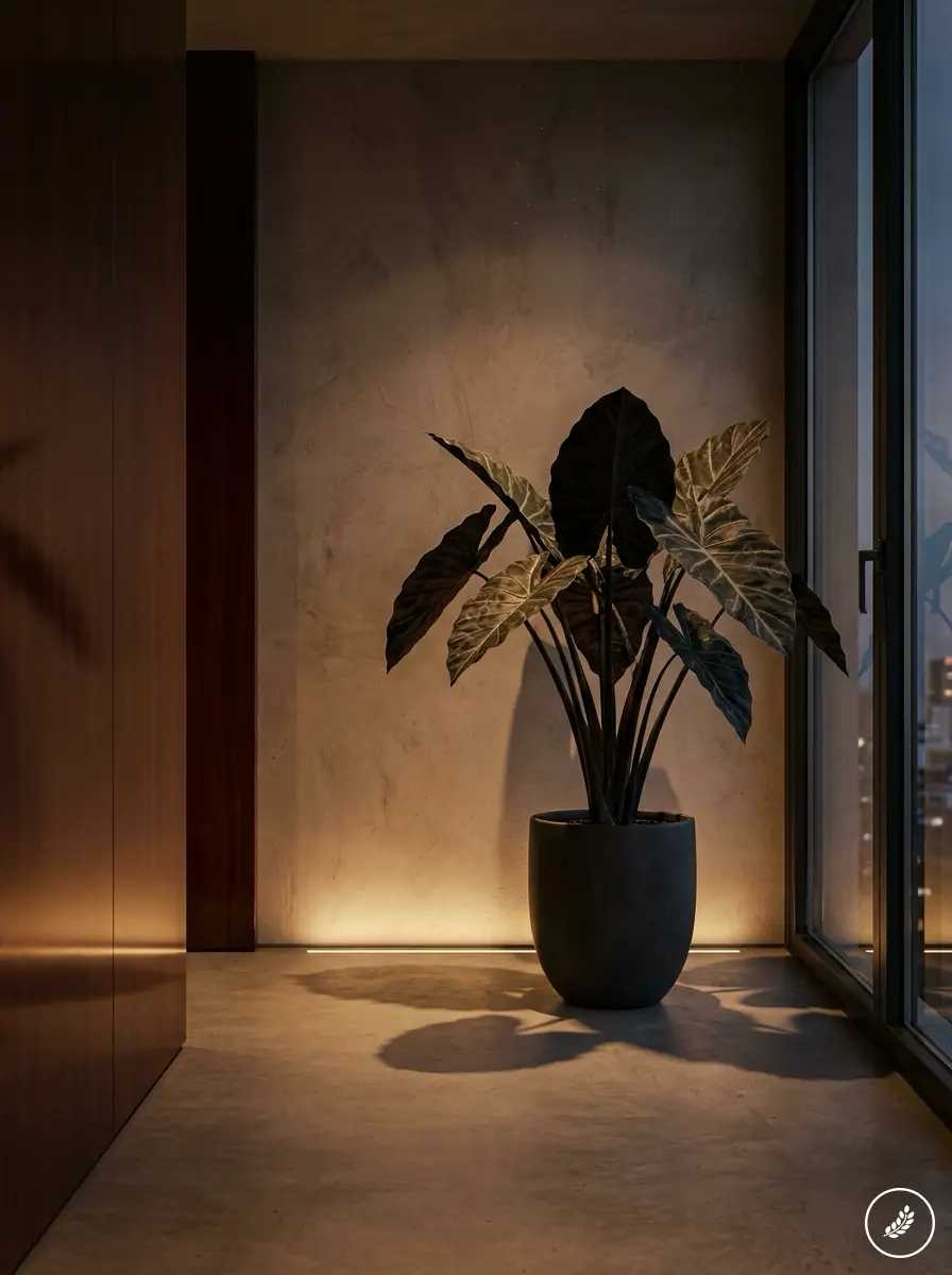
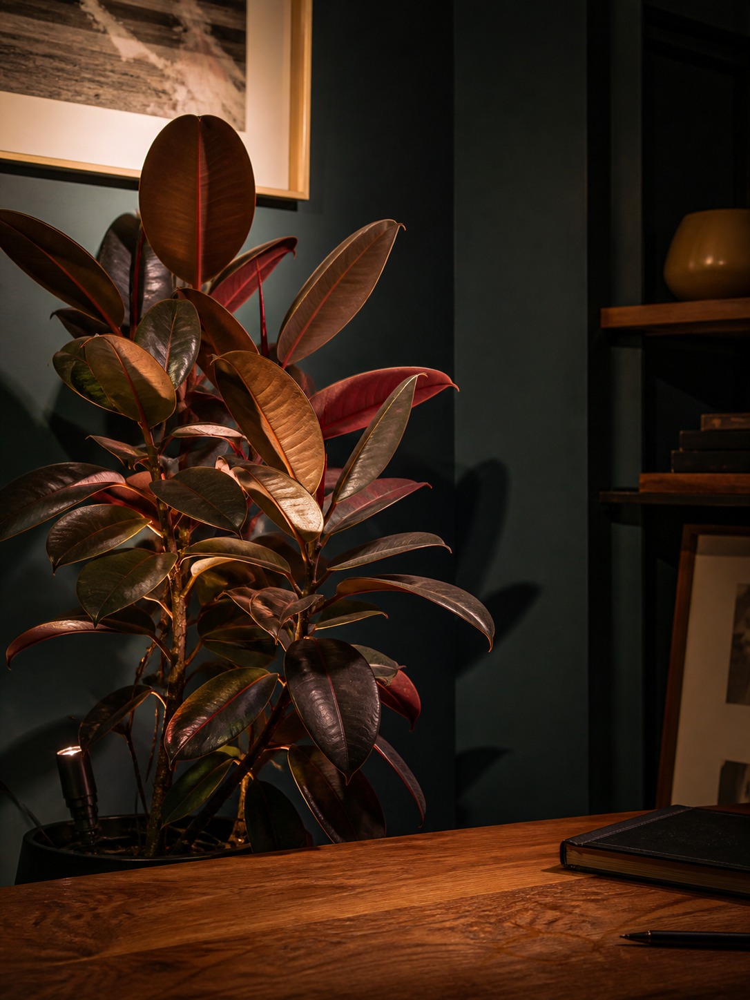
This is the trend I’m most excited about right now. Deep wall colors (mahogany, midnight teal, merlot) need plants that can hold their own in low light and still read as dramatic rather than washed out. A ‘Black Velvet’ Alocasia or a burgundy-leaved rubber plant does exactly that; the dark foliage practically disappears into the wall color during the day and comes alive under a warm accent light at night.
I tried this in a home office redesign with charcoal walls last winter — added a single Alocasia and a small clip-on uplight aimed at the leaves from below. It turned a plant that would’ve been invisible in daylight into the room’s evening focal point. That’s the trick with dark interiors: plan for how the plant looks lit, not just how it looks by the window.
| Style | Plant | Pot |
|---|---|---|
| Mid-century / warm minimalist | Fiddle leaf fig, rubber plant | Matte ceramic, straight lines |
| Farmhouse | Herbs, aloe, arrowhead vine | Vintage metal, enamel |
| Dark cocooning | ‘Black Velvet’ Alocasia, burgundy rubber plant | Dark or matte black ceramic |
Once you know which lane your room’s in, the next question is scale — which is where most of these choices actually go wrong.
The height-layering formula that actually works
“Tall in back, small in front” is the one piece of plant-styling advice every article repeats, and it’s not wrong, just incomplete. It tells you the order. It doesn’t tell you why some layered plant groupings look curated and others look like a garden center display got knocked over.
Why tall-back, small-front isn’t the whole rule
The missing piece is negative space — the gaps between plants matter as much as the plants themselves. In drawing, you’re trained to look at the spaces around an object before the object itself, because that’s what actually tells you if a composition is balanced. Plant groupings work the same way.
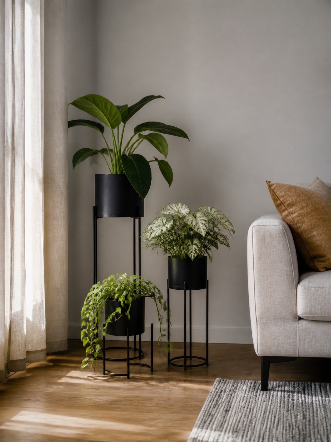
Three plants of identical height, spaced evenly, read as a hedge. Three plants at staggered heights with uneven gaps between them read as a considered arrangement. I typically aim for a rough ratio where each plant is roughly two-thirds the height of the one behind it, with the gaps varying so your eye has somewhere to land and somewhere to rest.
A simple proportion check before you buy
Here’s a test I use before adding any plant to an existing grouping: stand back and cover the space where the new plant would go with your hand. If the room looks incomplete without it, the plant probably belongs there. If the room looks fine either way, you’re about to add clutter, not composition.
For a single statement plant, the proportion check is different — measure the empty wall or corner it’s going into, and aim for the plant’s total height (pot included) to land somewhere between half and two-thirds of that space’s height. Go taller and it starts to feel like it’s straining against the ceiling. Go shorter and it reads as an afterthought rather than a focal point.
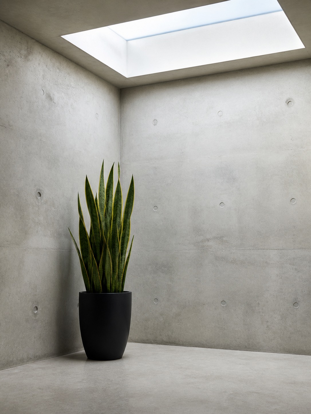
I made this mistake myself early on with a 3-foot snake plant in a corner that needed something closer to 5 feet. It wasn’t a bad plant choice. It was just the wrong size for the job the corner needed done.
Once the scale and spacing are right, color is the next variable worth getting deliberate about — and it’s the one most people leave to chance entirely.
Color and texture: foliage as a material swatch
Nobody picks a sofa fabric without thinking about the room’s palette. Plants get a pass on this constantly, and it shows — a bright lime-green pothos can fight a warm, earthy room just as hard as the wrong throw pillow would.
Warm neutral palettes and bold green contrast
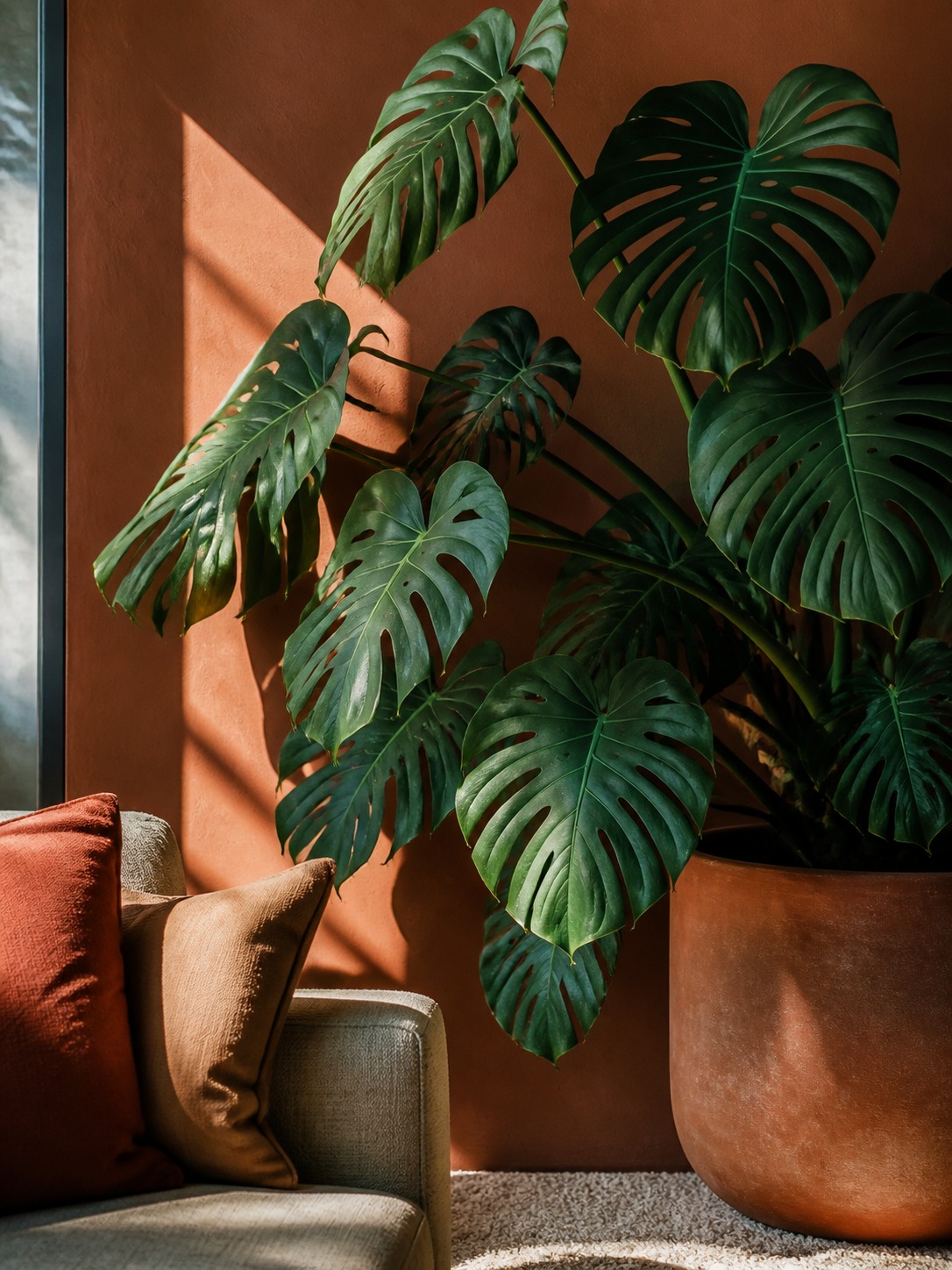
2026 interiors are leaning heavily into clay, sand, muted terracotta, and layered warm neutrals, the same palette I covered in my office paint color guide, with walls, upholstery, and rugs all sitting in that same warm register. Against that backdrop, foliage color is doing real contrast work, not just filling space. Deep, saturated greens like Monstera deliciosa or the patterned leaves of Calathea ornata read as intentional against warm walls in a way a pale variegated plant won’t.
I think about foliage the same way I’d think about a material finish on a product — matte versus gloss, warm versus cool undertone. A plant’s leaf color has an undertone too. Monstera and rubber plants skew toward cool, saturated greens. Something like a Chinese money plant or certain philodendrons skew warmer, almost olive. Match the undertone to your room’s dominant material — cool green against warm terracotta pops; warm-toned foliage against the same terracotta almost disappears into it.
Leaf shape as contrast
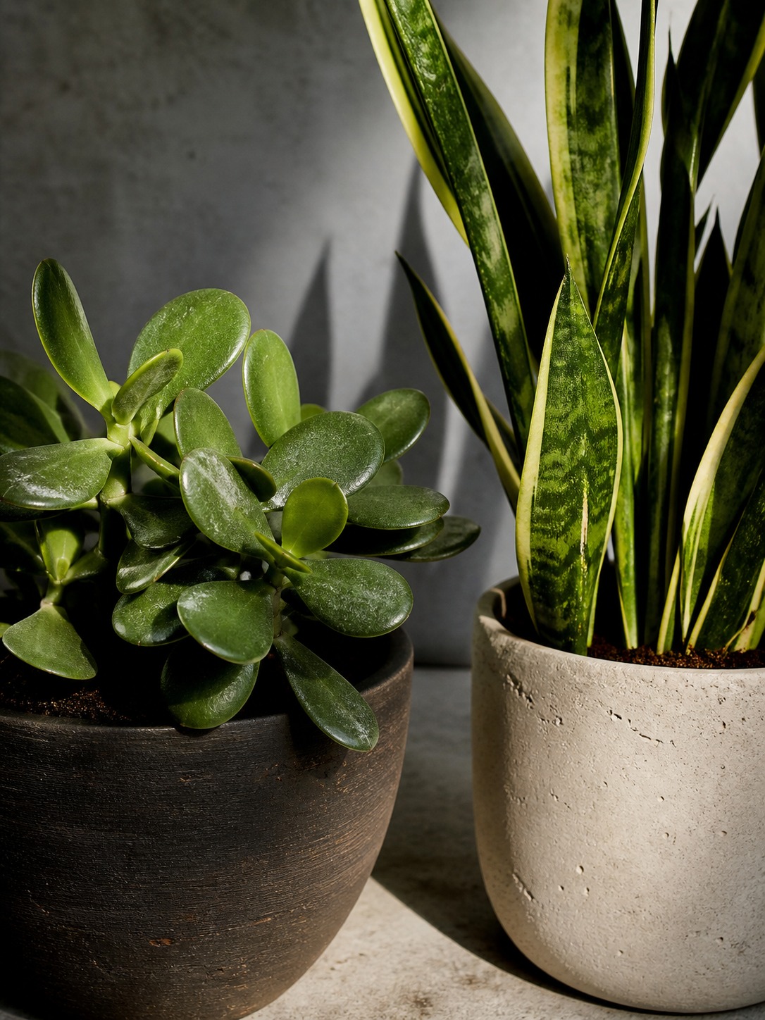
This is the part competitors consistently miss. Leaf shape functions exactly like furniture silhouette. A room built on straight lines (square coffee tables, boxy sofas, grid-pattern shelving) benefits from a rounded-leaf plant breaking up all that geometry. Lamb’s ear, a jade plant, or a pilea with its coin-shaped leaves does this well.
Flip it for a room already full of soft, curved furniture: an architectural plant with sharp, sculptural foliage (a snake plant, a bird of paradise) gives the eye something structured to land on instead of everything blurring into the same softness.
DESIGNER TIP Hold a photo of a candidate plant next to a photo of your room’s furniture. If every shape in the frame is the same family (all curved, or all angular), something will feel flat. Aim for one deliberate break in the pattern, not zero and not five.
Getting the color and shape right solves how a plant reads visually. Where you actually put it, room by room, is the next piece.
Room-by-room placement
Every room has different lighting, humidity, and traffic patterns, and the “right” plant strategy shifts with all three. Here’s how I’d approach the rooms people ask about most.
Living room focal points and awkward corners
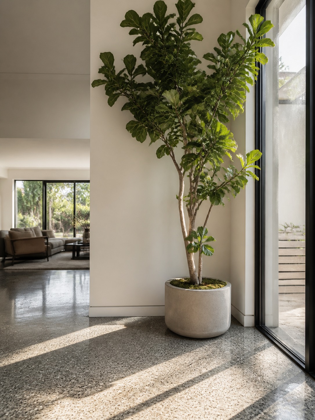
Living rooms usually have one obvious dead zone — an empty corner, an oddly placed window, a stretch of wall that doesn’t fit a bookshelf or a piece of art. That’s exactly where a statement plant earns its keep. A tall plant near a window does double duty: it fills the corner and softens the transition between the room and whatever’s outside, especially useful if the view isn’t great.
I did this in my own apartment with a corner that used to just collect clutter — mail, a bag, whatever needed somewhere to land. A single tall plant on a plant stand solved it completely, partly because it gave the eye a reason to stop there instead of scanning past.
For awkward angles (an odd wall junction, furniture that doesn’t quite line up), a trailing or soft-leaved plant works better than a structured one. The flowing shape smooths out the visual disruption instead of adding another hard edge to a spot that already has too many.
Bathroom and kitchen
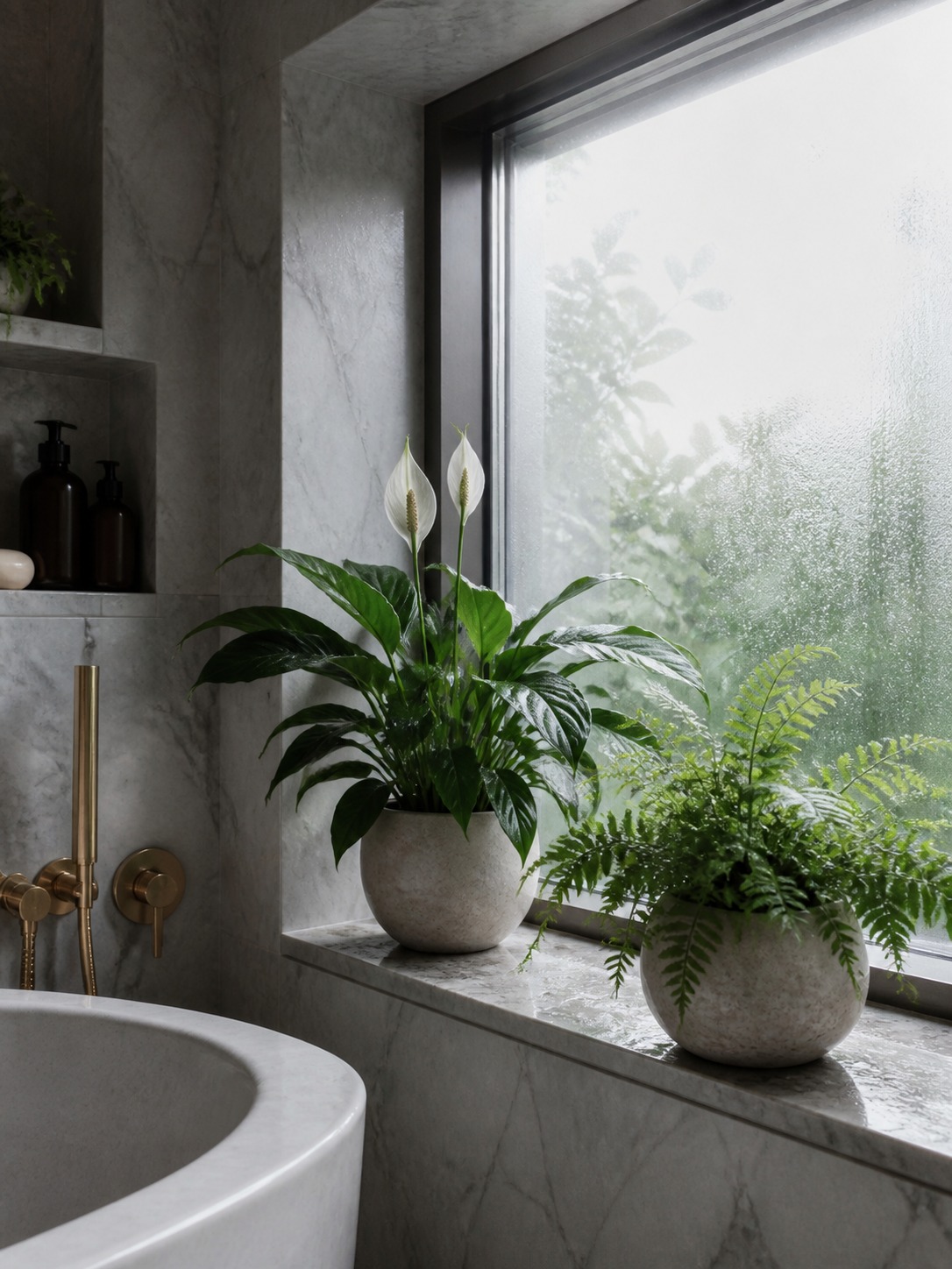
Bathrooms are underused for plants, which is a shame because the humidity from showers is exactly what humidity-loving species want. Ferns, orchids, and peace lilies all do well here, and a peace lily in particular handles the lower light most bathrooms have. If your bathroom window is small or nonexistent, snake plants and ZZ plants tolerate that darkness without sulking.
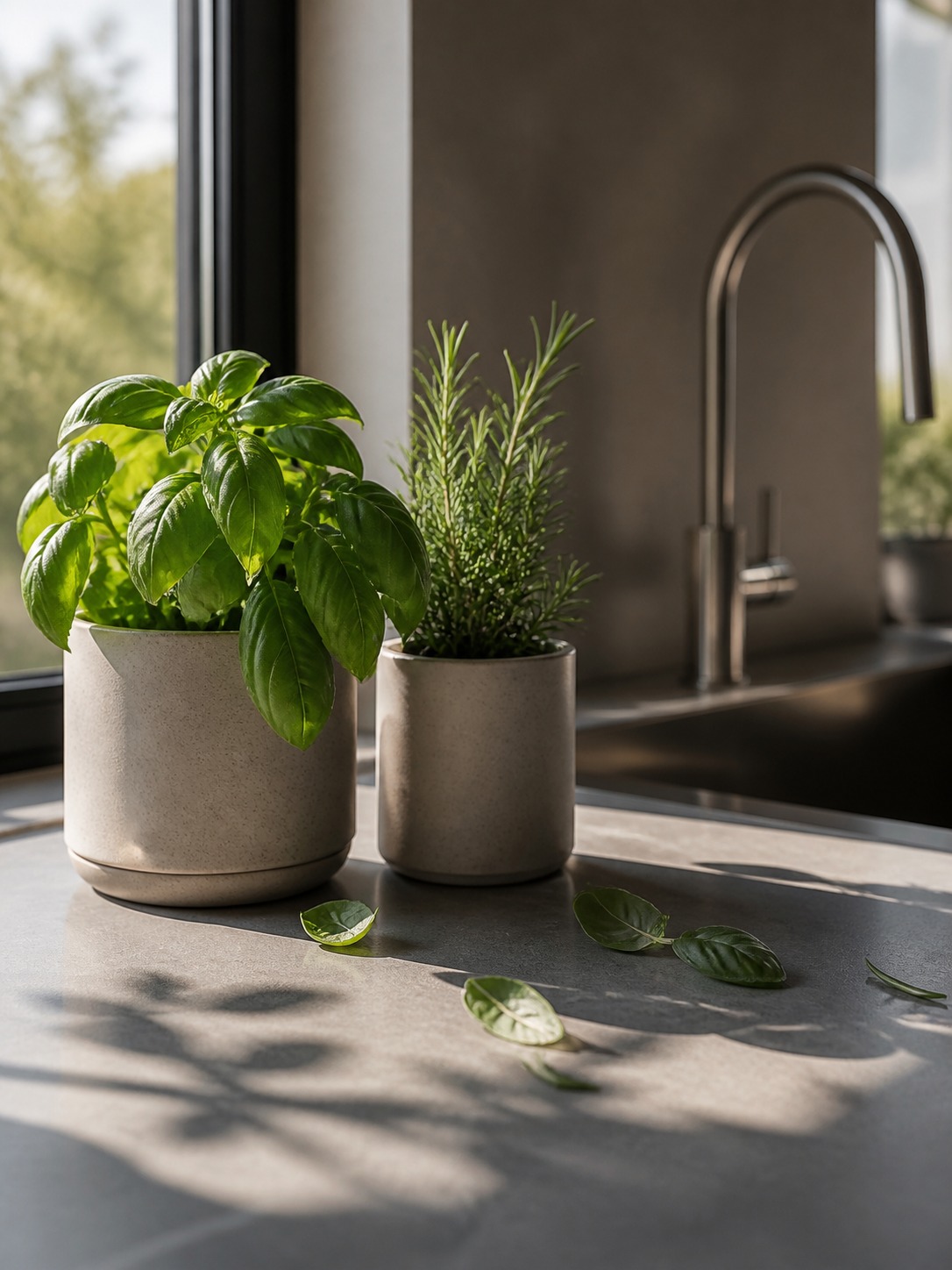
Kitchens are trickier — heat, grease, and inconsistent light near the stove rule out a lot of species. Herbs (basil, rosemary, mint) work well on a windowsill that gets a few hours of direct sun, and they’re functional in a way that justifies the counter space they take up. If your kitchen doesn’t get enough light for herbs to thrive, that’s a legitimate spot to use a well-made faux version instead of forcing a real plant to fail slowly on your counter.
Bedroom — what to avoid
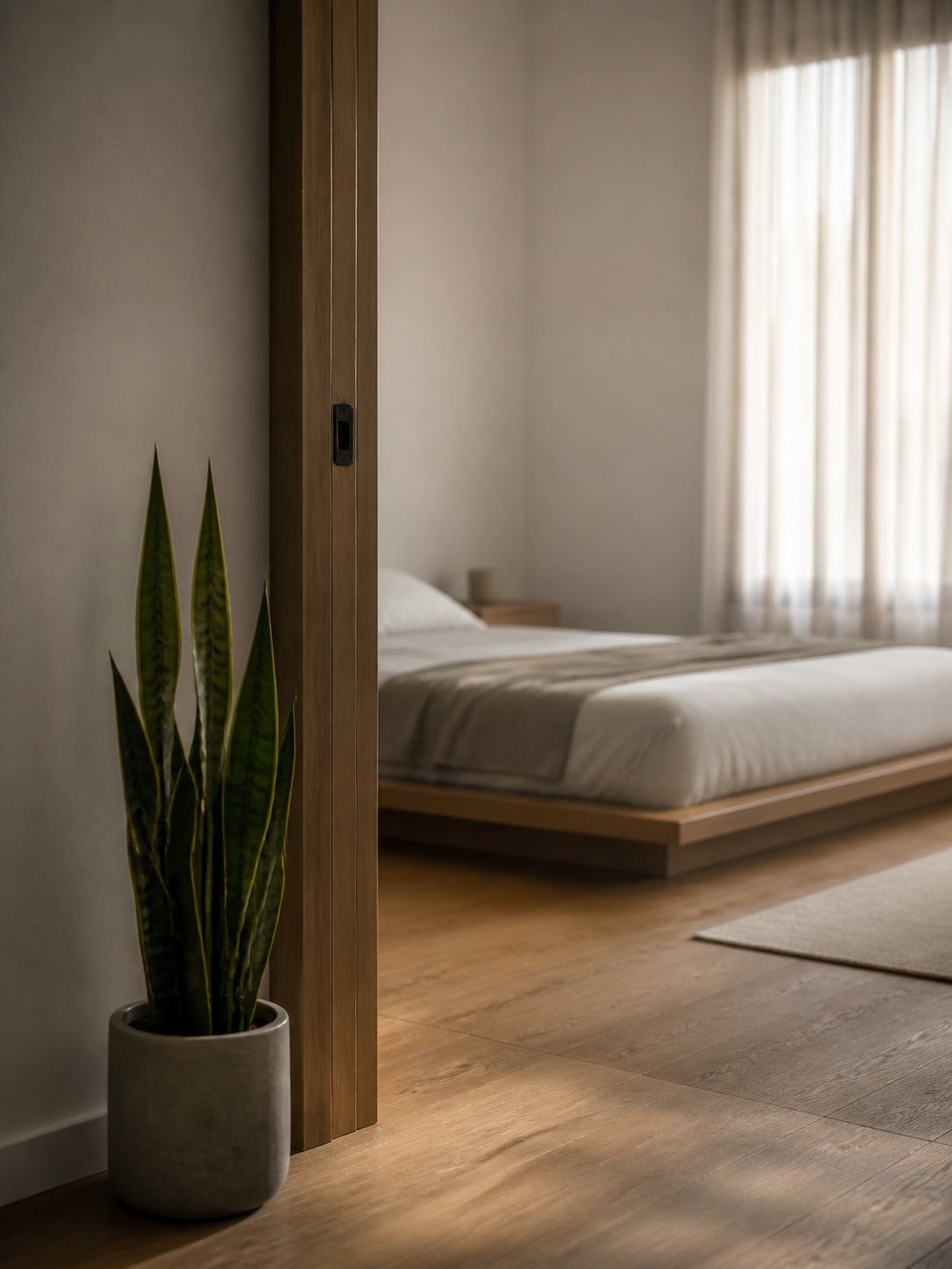
Bedrooms are where I see the most placement mistakes. People add plants purely for the calming aesthetic and then forget them entirely once the room’s dark and they’re not in there during the day. Skip anything demanding here — trailing pothos or a snake plant tolerates neglect far better than a fern will.
The other mistake is placement near the bed itself. A plant with a strong upright silhouette right next to a headboard tends to visually crowd the sleeping area rather than soften it. Keep statement plants near the room’s entry or a window instead, where they can anchor the space without looming over you at night.
Placement solves where a plant goes. The next question is one almost nobody asks honestly: whether that plant should be real at all.
Real vs. faux: the honest design call
Most design content treats faux plants as a last resort — something you settle for when you’ve killed too many real ones. I think that’s the wrong framing entirely. Faux is sometimes the better design decision, full stop, and pretending otherwise leads to people fighting a room’s lighting instead of working with it.
Where faux is genuinely the better choice
Any spot with no natural light and no realistic path to supplemental grow lighting is a faux spot. A windowless hallway, the top of a kitchen cabinet, a dim entryway — these are not moral failures, they’re just rooms without the conditions a plant needs. A well-made faux plant here does its design job (filling the space, softening a hard edge) without the slow decline of a real one struggling to survive.
High-reach spots are the other obvious case. Nobody’s climbing up to water a plant on top of an armoire every week, and a dying plant up there is far worse for the room than a faux one that never changes.
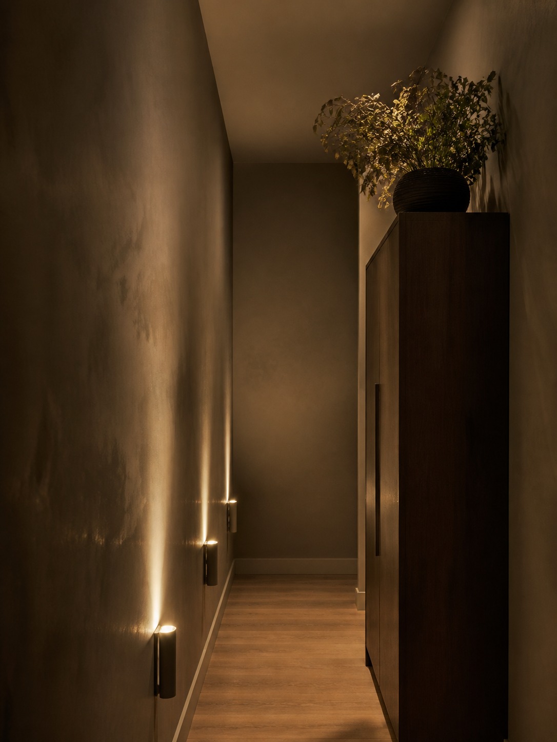
Quality matters more than people think. A cheap faux plant with uniform, glossy leaves reads as fake from across the room. Look for varieties with some leaf variation built in — slightly different sizes, a few duller or curled leaves mixed in with the perfect ones. That imperfection is what sells it.
Mixing real and faux without it looking fake
The trick I use is never putting a faux plant directly next to a real one of the same species — the comparison makes the faux one obvious immediately. Instead, pair a faux plant with real plants of a different type, or place them in different zones of the same room entirely.
I did exactly this in a client’s home office last year: a real pothos on the desk where it gets daily attention and decent light, and a faux fiddle leaf fig in the corner that gets almost none. From across the room, both read as intentional. Up close, only one needs watering.
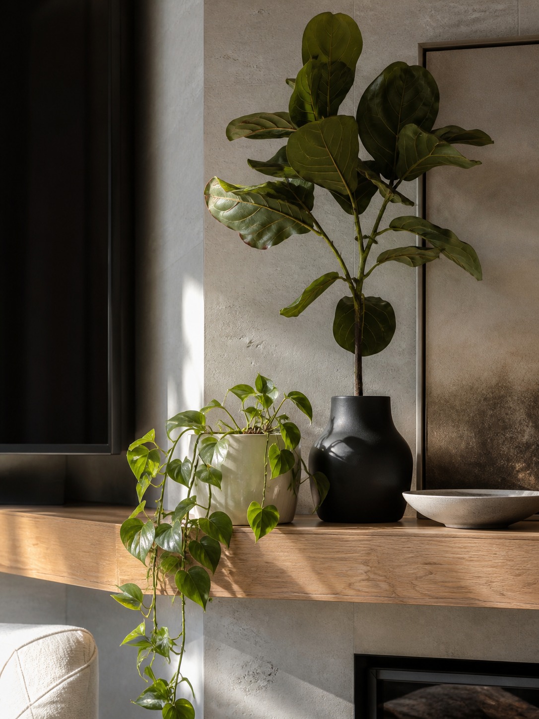
There’s one more question that ties everything in this article together, and it’s the one nobody wants to answer: when a plant just shouldn’t go somewhere at all.
When not to add a plant
Every plant guide assumes more greenery is always better. It’s not. Sometimes the right design decision is to leave a space alone, and knowing when that’s true is worth more than another list of low-light species.
Busy walls and competing patterns
If a wall already has a gallery arrangement, a bold wallpaper, or a large piece of art doing the visual work, adding a plant with its own strong silhouette next to it usually creates competition instead of harmony. I’ve walked into rooms where a beautiful Monstera was placed directly beside an equally striking framed print, and neither one got to be the focal point — they just canceled each other out.
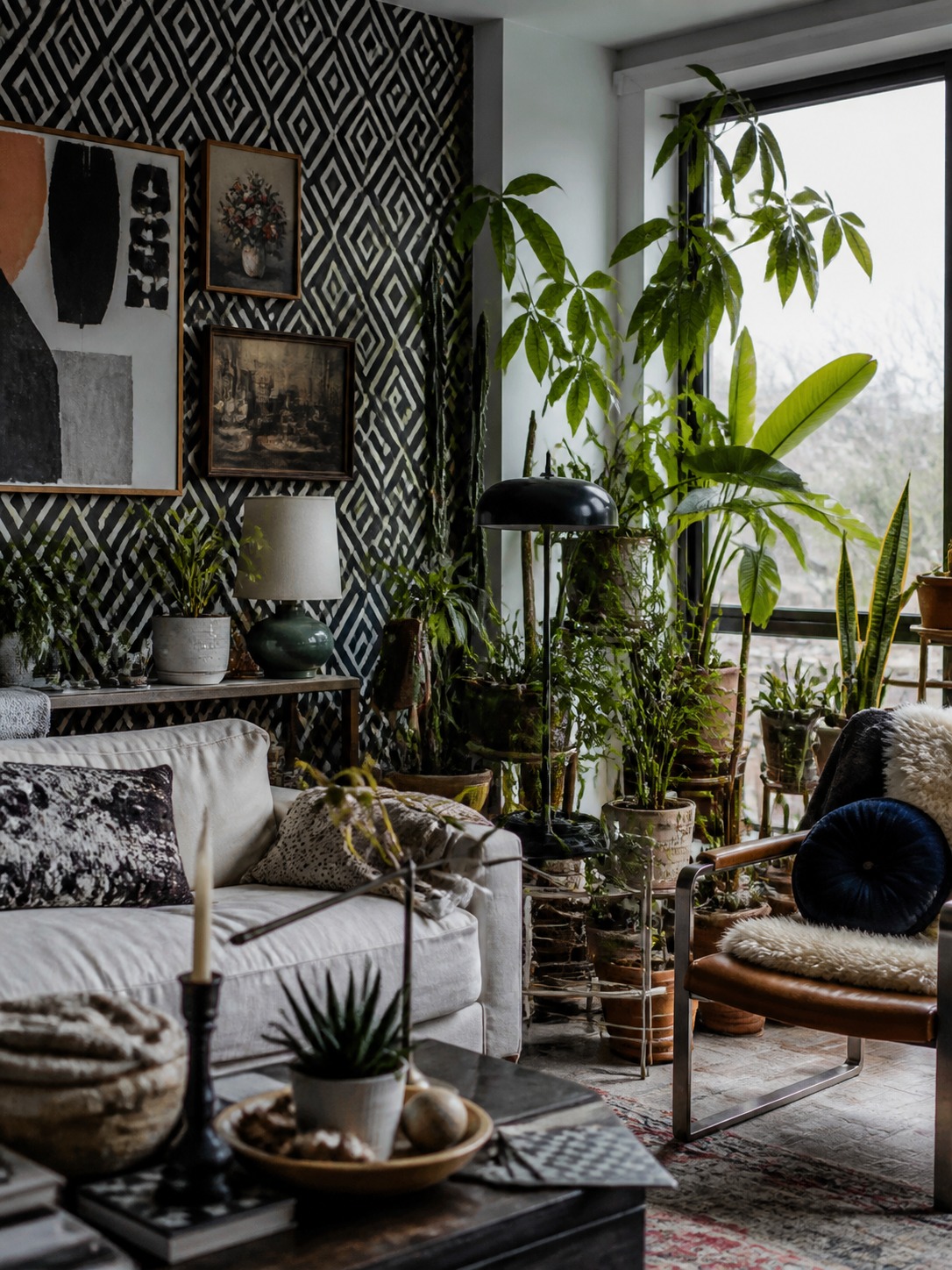
The fix isn’t always “remove the plant.” Sometimes it’s moving it to a quieter wall a few feet away, where it can be the only strong shape in that particular sightline. A room can hold multiple focal points. It just can’t hold two competing ones in the same glance.
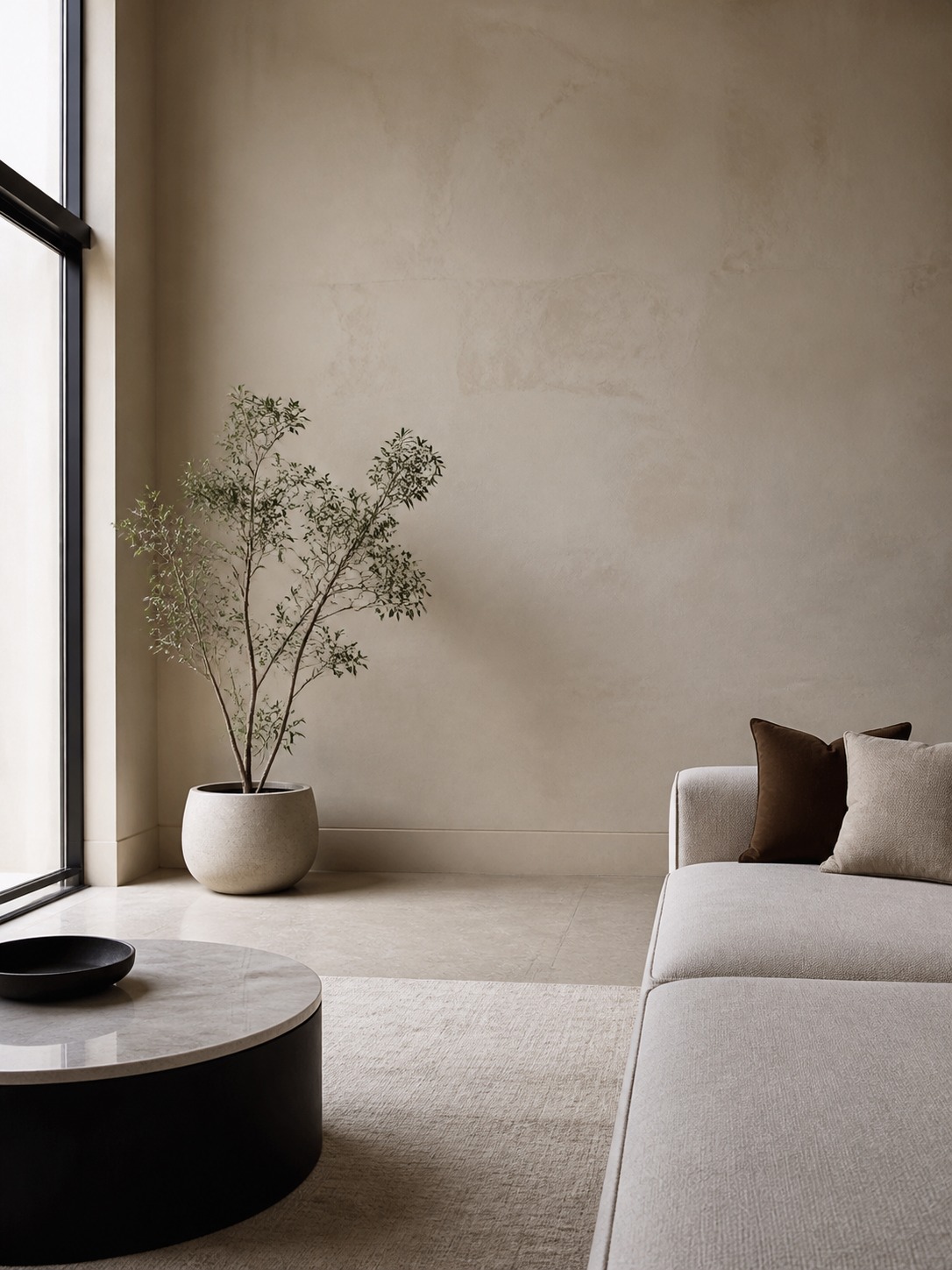
Wrong leaf shape for the room’s existing lines
This connects back to the color and texture section, but it’s worth calling out on its own: a plant with the wrong silhouette doesn’t just fail to help a room, it actively works against it. Drop an architectural, spiky snake plant into a room that’s already full of hard angles (a glass coffee table, a geometric rug, boxy shelving) and you’ve added another sharp shape to a space that needed softening, not more edges.
I turned down adding a plant entirely on a project last year for exactly this reason. The client’s living room had strong architectural lines throughout, and every plant we tried on paper just added noise. We ended up using a single trailing pothos tucked into a bookshelf instead of a statement floor plant, and the room read as more finished with less green in it, not more.
That’s the real skill here — not knowing which plants exist, but knowing when to stop. A room doesn’t need a plant in every corner to feel alive. It needs the right plant in the right corner, and sometimes that means no plant at all.
Conclusion
Interior decorating with plants isn’t really about which species survives your light conditions. It’s about treating a plant the way you’d treat any other object with real visual weight — checking its scale against the room, its color against your palette, its silhouette against everything else already competing for attention.
Pick one section from this article and apply it to a single corner before you buy anything new. Stand back, cover the empty space with your hand, and see if the room actually needs something there. If it does, you’ll know exactly what shape, size, and color to look for.
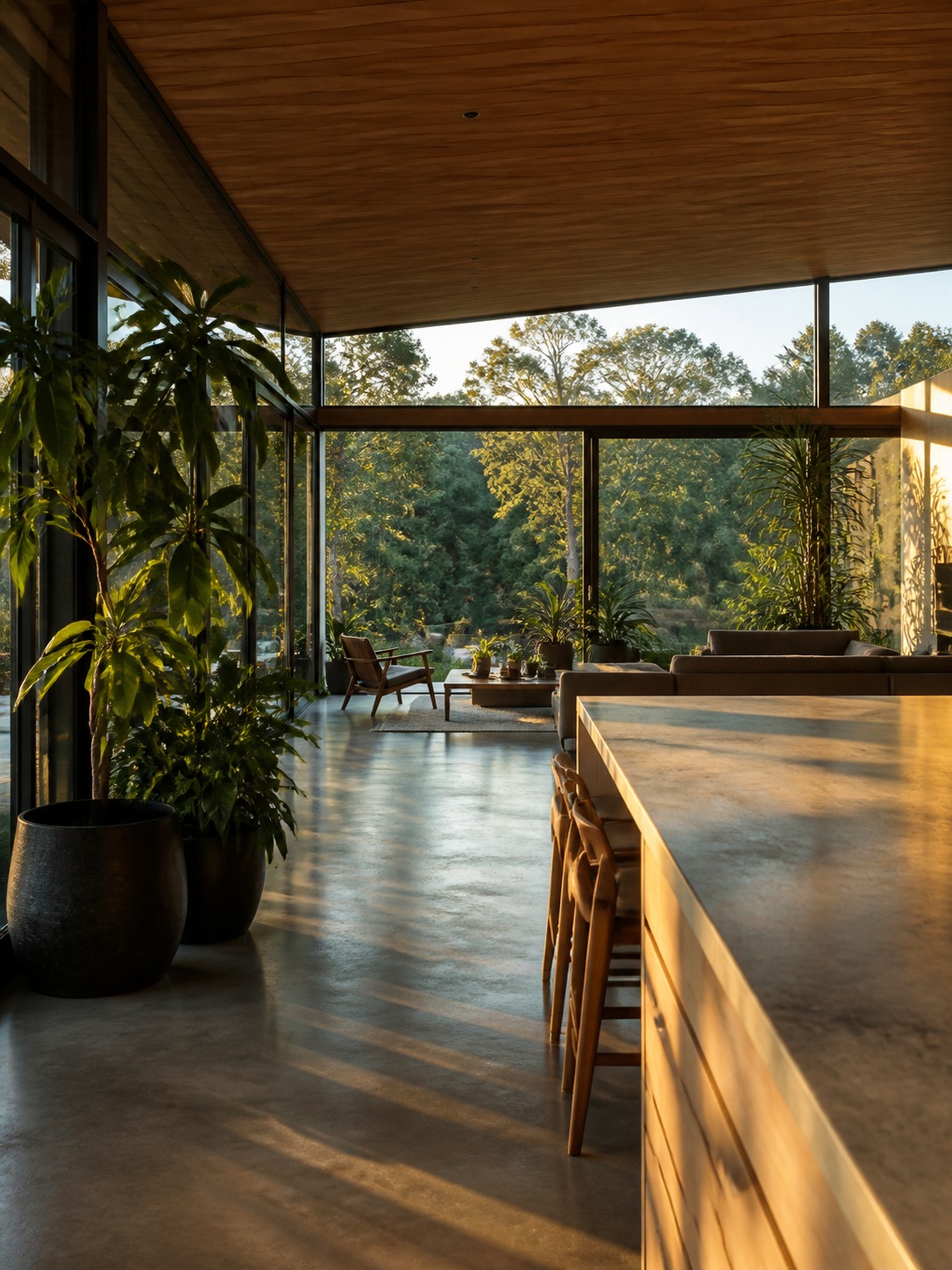
Plants also pair well with symbolic objects when the shelf or corner still has breathing room. For a fuller example, see this guide to spiritual home decor with plants and small altar details.
Frequently Asked Questions
Q: What are the best low-light plants for interior decorating?
A: Snake plants and ZZ plants top the list because both tolerate rooms with little to no direct sun and still hold a strong architectural silhouette, useful if you are using them as a design anchor rather than an afterthought. Peace lilies work too and flower even in dimmer corners. Skip fiddle leaf figs here; without real light they get leggy fast.
Q: How many plants is too many for one room?
A: There is no fixed number, but there is a test: cover the space where the next plant would go with your hand. If the room looks incomplete without it, add it. If the room looks fine either way, you have hit your limit. Past that point, more plants just compete with each other instead of adding to the composition.
Q: Are fake plants OK for interior design, or should I always use real ones?
A: Faux is a legitimate design choice, not a compromise. Windowless hallways, high shelves nobody is watering weekly, and dim entryways are all better served by a quality faux plant than a real one slowly declining. Look for varieties with some leaf variation built in, since perfectly uniform leaves are what make faux plants read as fake.
Q: What is the best plant for a bathroom?
A: Ferns, orchids, and peace lilies all thrive on shower humidity, which most bathrooms have in surplus. If your bathroom has little to no window light, skip the fern and choose a peace lily or snake plant instead; both handle humidity without needing direct sun.
Q: Where should I put a large plant in a small living room?
A: Look for the room’s one dead corner, often near a window or wherever clutter tends to collect. A tall plant there fills the wasted space and gives your eye a place to land. Size it to roughly half to two-thirds the height of that wall or corner so it does not strain against the ceiling or read as an afterthought.
Q: What color pots work with 2026 warm-neutral interiors?
A: Matte ceramic pots in clay, sand, or muted terracotta tones blend into a warm-neutral palette rather than competing with it, letting the plant’s foliage color do the contrast work instead. Save dark or black pots for cooler, moodier rooms, where warm neutrals would make them read as a harsh, out-of-place note.
Q: How do I stop a plant corner from looking cluttered?
A: Vary the heights and the gaps between plants; evenly spaced plants of similar height read as a hedge, not a curated grouping. Aim for each plant to be roughly two-thirds the height of the one behind it, with uneven spacing so your eye has somewhere to rest between them.
- 46shares
- Facebook0
- Pinterest43
- Twitter3
- Reddit0