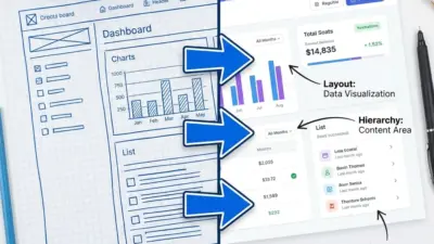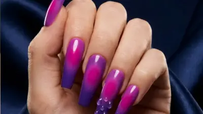

Graphic design ideas come from understanding simple principles and mixing creativity with clear goals. Many successful designs use basic shapes, balanced colors, and readable fonts to communicate messages effectively. The best graphic design ideas focus on combining these elements to create visual content that stands out and connects with the audience.
Designers often draw inspiration from trends like digital graphics, bold typography, and motion effects, which help keep work fresh and engaging. They also think about how designs work across different platforms, like websites, social media, and packaging. Knowing where and how a design will be used is key to choosing the right ideas.
Exploring new techniques and themes, including using sustainable materials or unique illustrations, helps designers push boundaries. These ideas can make a brand’s image clearer and more memorable. Good design is both creative and practical, balancing style with function.
Key Takeaways
- Effective designs mix basic principles with creative choices.
- Designs should fit their platform and audience needs.
- New ideas help create clear and memorable visuals.
Understanding Graphic Design Principles
Graphic design uses specific rules to guide how elements like color, text, and images work together. These rules help make designs clear, attractive, and easy to understand. Learning about color use, fonts, layout, and how the eye moves through a design helps create strong visual messages.
Color Theory in Design
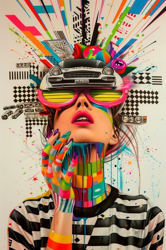

Color theory explains how colors interact and affect the mood of a design. Designers use primary colors (red, blue, yellow) to mix secondary and tertiary colors. Complementary colors (opposite on the color wheel) create contrast and grab attention.
Colors also have meanings. For example, blue often feels calm or trustworthy, while red can show energy or urgency. Choosing the right color scheme can make a message stronger and help viewers understand the tone.
Different types of color schemes include:
- Monochromatic: Different shades of one color.
- Analogous: Colors next to each other on the wheel.
- Complementary: Colors opposite each other.
Typography Essentials
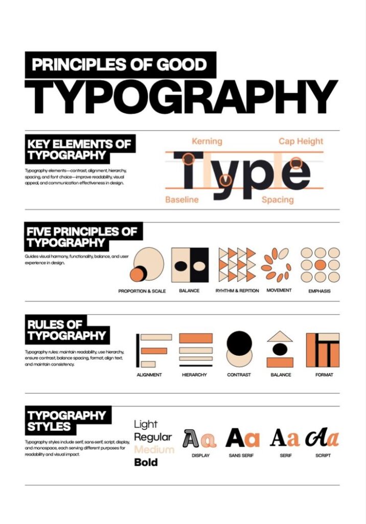
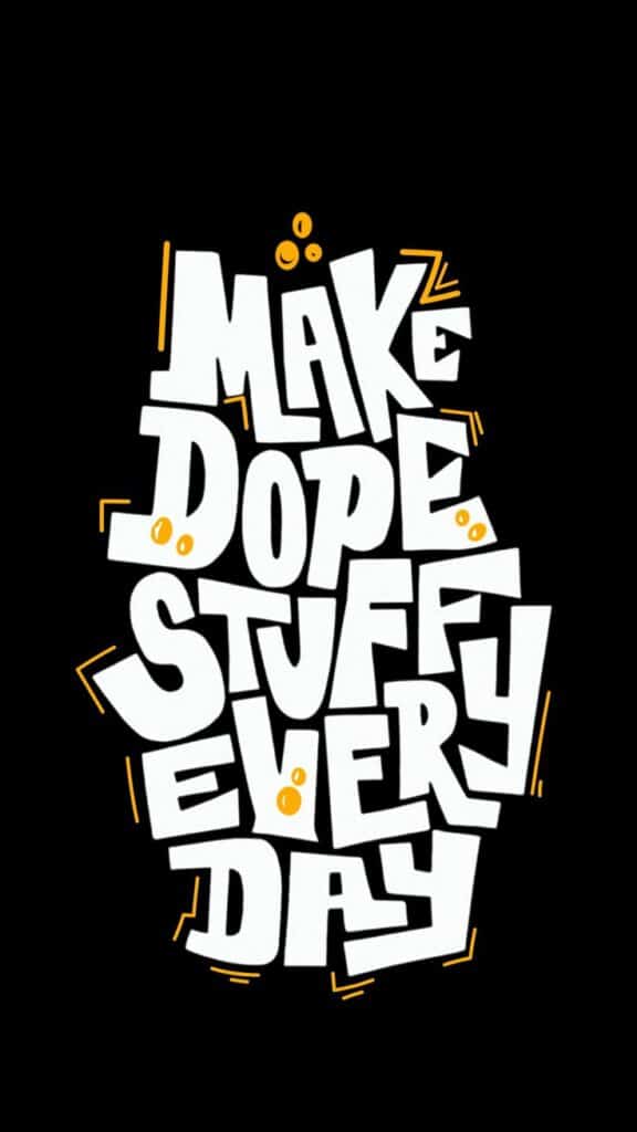
Typography is the style and arrangement of text. It affects readability and the feel of a design. Choosing the right font tells the viewer if the message is serious, fun, or casual.
Key parts of typography:
- Font choice: Serif fonts feel formal; sans-serif fonts are modern and clean.
- Size: Larger text grabs attention; smaller text adds detail.
- Spacing: Good spacing between letters and lines improves reading.
Proper typography helps guide the reader without distracting them.
Layout and Composition
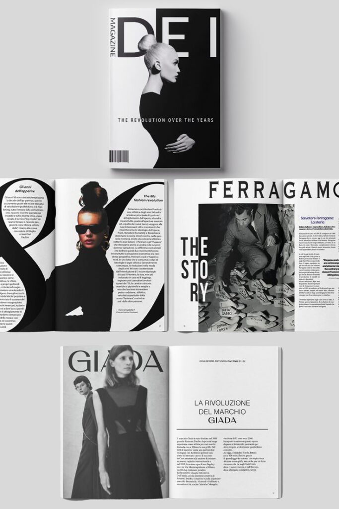
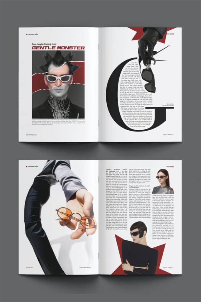
Layout is how all elements are arranged on a page or screen. Good composition balances text, images, and space to create order.
Designers use techniques like:
- Grids: Help align and organize sections.
- White space: Empty areas that prevent clutter and improve focus.
- Balance: Distributes elements evenly for a stable look.
A well-planned layout keeps information clear and appealing.
Visual Hierarchy
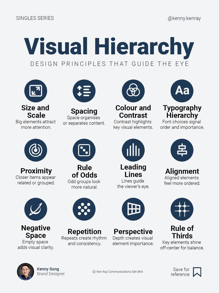
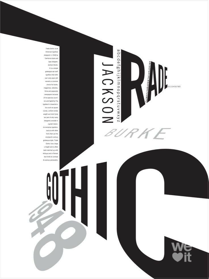
Visual hierarchy controls the order viewers notice things in a design. It uses size, color, and placement to highlight what is most important first.
For example:
- Headlines are bold and large.
- Subheadings are smaller but still clear.
- Body text is simple and easy to read.
Visual hierarchy guides the viewer smoothly through information, making sure the key points stand out clearly.
Creative Brainstorming Techniques
Creative ideas come from using specific tools and processes that help organize thoughts and explore new concepts. These techniques focus on visualizing, collecting, and expanding ideas clearly and effectively.
Mind Mapping Methods
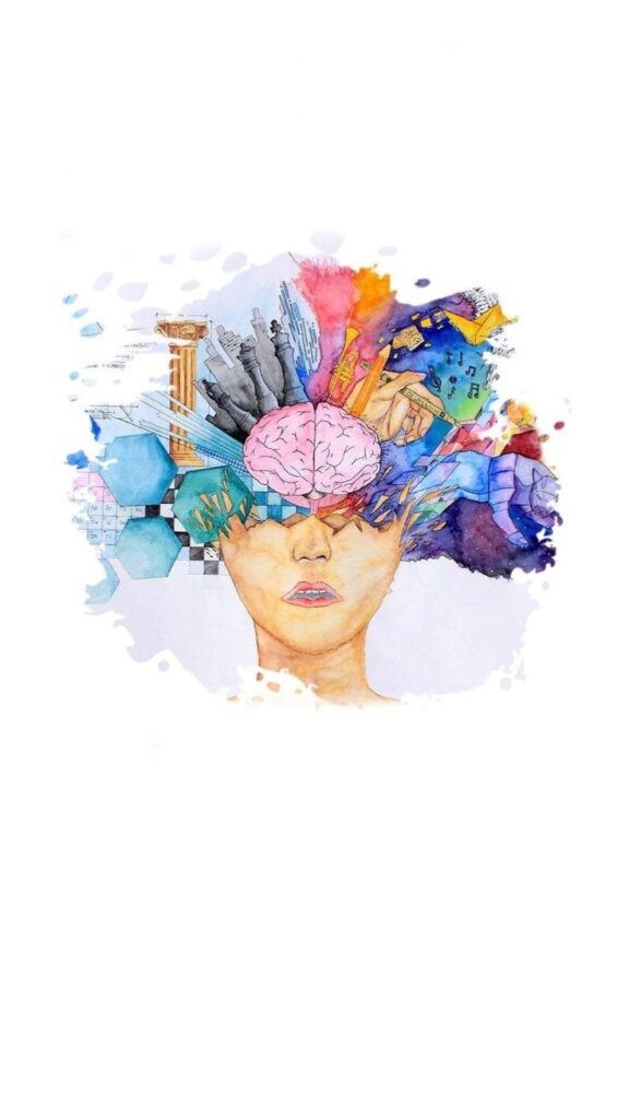
Mind mapping helps organize ideas around a central theme. It starts with writing the main topic in the center of a page. Then, related ideas branch out from the center in connected lines.
This method shows how different ideas link together. It allows a designer to explore many concepts without losing focus. Mind maps can include words, colors, and images to make connections clearer.
Using digital tools or paper works well for mind mapping. It encourages free thinking by letting ideas flow quickly and visibly. This method is good when starting a new project or trying to solve design problems.
Inspiration Boards
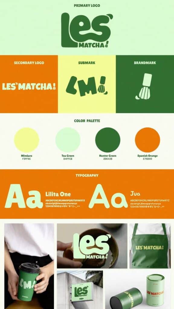
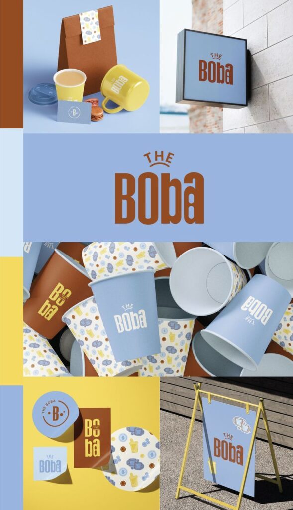
Inspiration boards collect images, colors, fonts, and patterns that fit the design goal. They help gather ideas visually in one place.
Designers use physical boards or digital apps to arrange materials. This helps see how things fit together. It guides decisions about style and mood before starting the actual work.
The key is to keep boards focused on the goal and not crowded. Including examples from various sources, like websites or magazines, adds variety. Inspiration boards make abstract ideas real and ready to use.
Sketching and Doodling
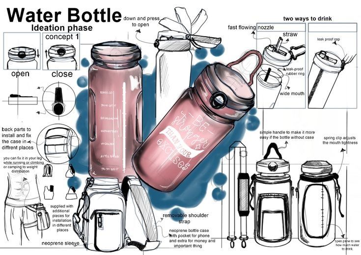
Sketching is drawing rough ideas quickly by hand. It helps capture thoughts before they are fully formed. Doodling can also free the mind and spark creativity during thinking.
Both techniques keep the focus on exploring shapes, layouts, and concepts fast. Sketches don’t need to be perfect; they serve as a visual draft.
Many designers carry a notebook or tablet for sketching anytime. Revisiting sketches later helps improve or combine ideas. This method turns abstract thoughts into visual possibilities that guide the design process.
Modern Graphic Design Ideas
Modern graphic design focuses on clear visuals, strong color choices, and engaging textures. It combines simplicity with creativity to create eye-catching work that communicates well.
Minimalist Concepts
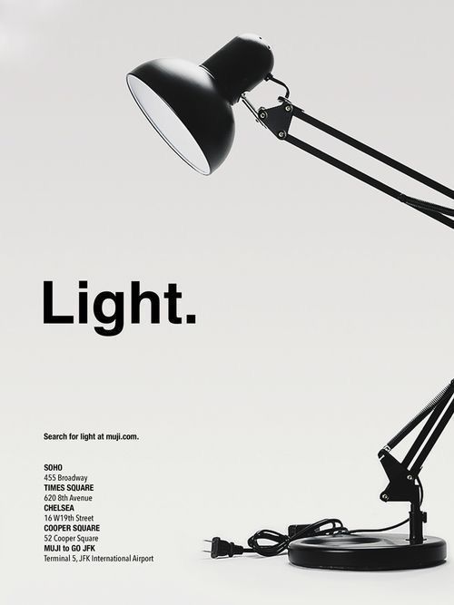
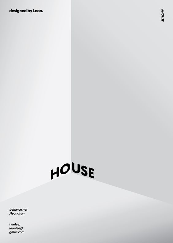
Minimalist design uses as few elements as possible to deliver a clear message. It relies on clean lines, plenty of white space, and limited color palettes. This style gets rid of anything unnecessary, helping viewers focus on the main idea.
Designers often use simple shapes like circles and squares. Typography is usually bold but uncluttered, with lots of room around the text. Minimalism is great for logos, posters, and websites that need to look modern and professional without feeling busy.
Bold Retro Styles
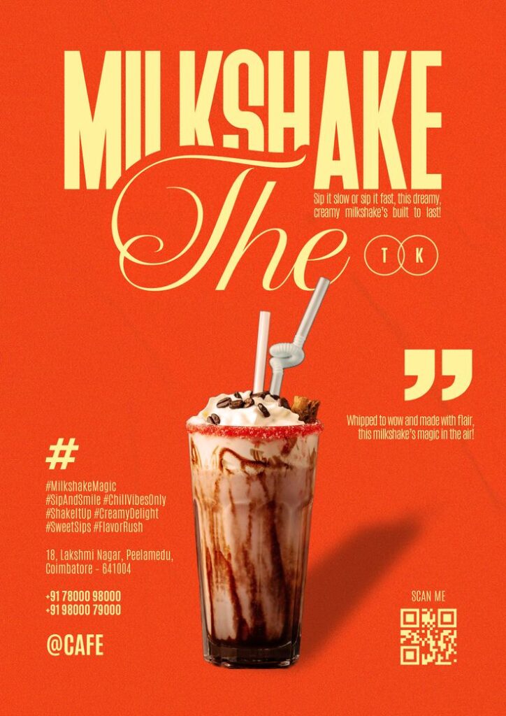

Bold retro styles bring back design looks from the 60s to the 80s. They often feature bright colors, strong geometric shapes, and playful typography. This creates a fun and nostalgic feel for the viewer.
Popular elements include neon colors, thick outlines, and vintage patterns. Retro design mixes old-school charm with modern digital tools. It works well for brands wanting to stand out or connect with viewers who enjoy pop culture from past decades.
3D Design Trends
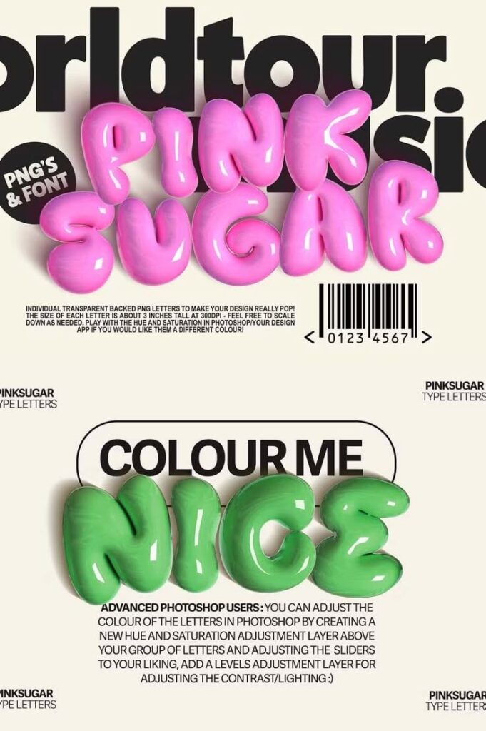
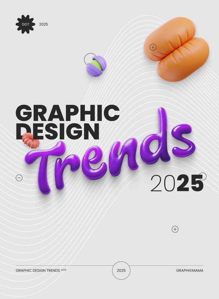
3D design adds depth and realism to graphics. It uses shading, lighting, and perspective to make images pop off flat surfaces. This technique helps create immersive visuals, especially in branding, animations, and packaging.
Modern 3D trends focus on smooth shapes and bold colors. Designers use software like Blender or Cinema 4D to craft realistic or stylized objects. These designs attract attention by looking dynamic and modern, often making digital content more engaging.
Digital Graphics for Social Media
Effective social media graphics need clear messages, eye-catching colors, and consistent styles. They should match the platform’s audience and format to gain more attention.
Instagram Post Ideas
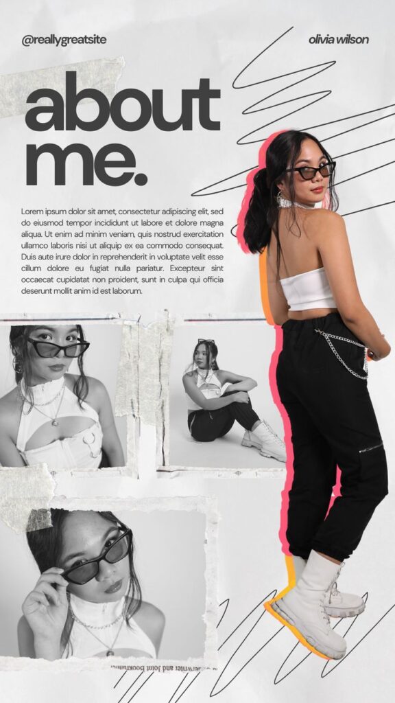
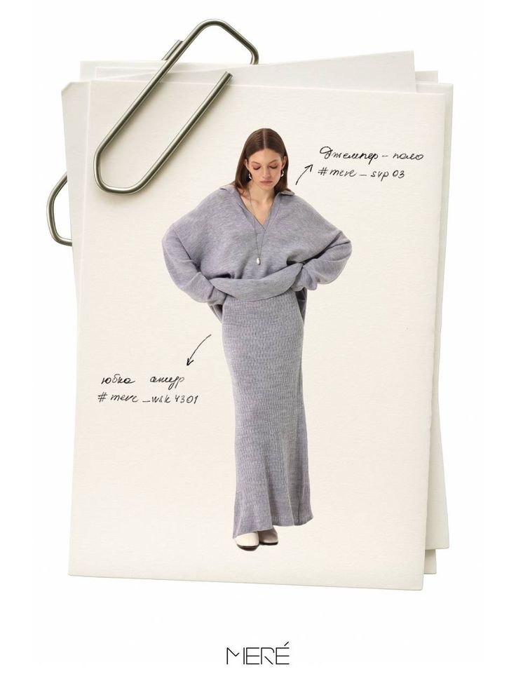
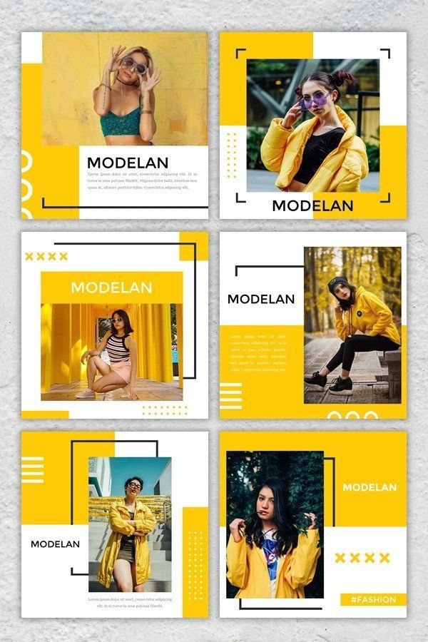
Instagram posts perform well with clean designs and bold visuals. Using a mix of photos, illustrations, and text overlays helps to engage viewers quickly.
Designers often choose bright colors and clear fonts to make messages easy to read on small screens. Posts with quotes, tips, or quick facts work well if the text is limited to a few words.
Using a consistent grid or theme in posts helps build a recognizable brand. Adding branded elements like logos or hashtags inside the image increases reach and brand recall.
Facebook Banner Inspiration

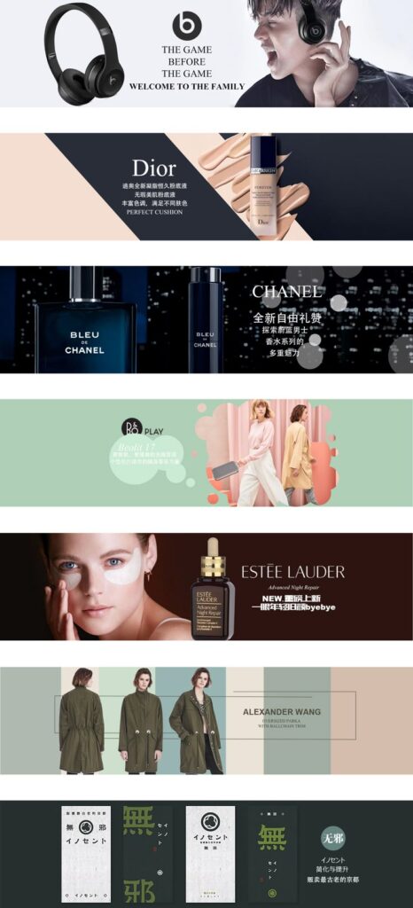
Facebook banners are large, so designers must use high-resolution images with simple layouts. This ensures banners look good on all devices.
The most important part of a banner is a clear focal point, such as a product image or tagline. Text should be short and placed where it won’t get hidden by profile pictures or buttons.
Many banners include contact info or links to store pages. Using a color palette that matches the brand increases consistency. Including a call-to-action (CTA) can boost clicks from the banner.
LinkedIn Visual Branding
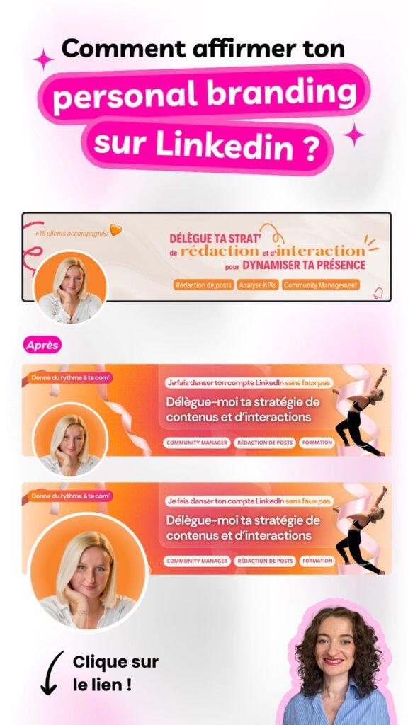
LinkedIn graphics should appear professional and clean. Blues, grays, and whites are common colors that create a business-like feel.
Profile and banner images need to support a person’s or company’s brand identity. Including job titles, skills, or service highlights in graphics helps build trust.
Infographics and charts perform well, as they share useful data quickly. Keeping designs simple but detailed enough to add value is important for LinkedIn audiences.
Brand Identity and Logo Concepts
A strong brand identity starts with clear design choices that reflect a company’s personality. Logo designs should be simple but creative. Color palettes must support the brand’s message and make it easy to recognize in different settings.
Innovative Logo Approaches

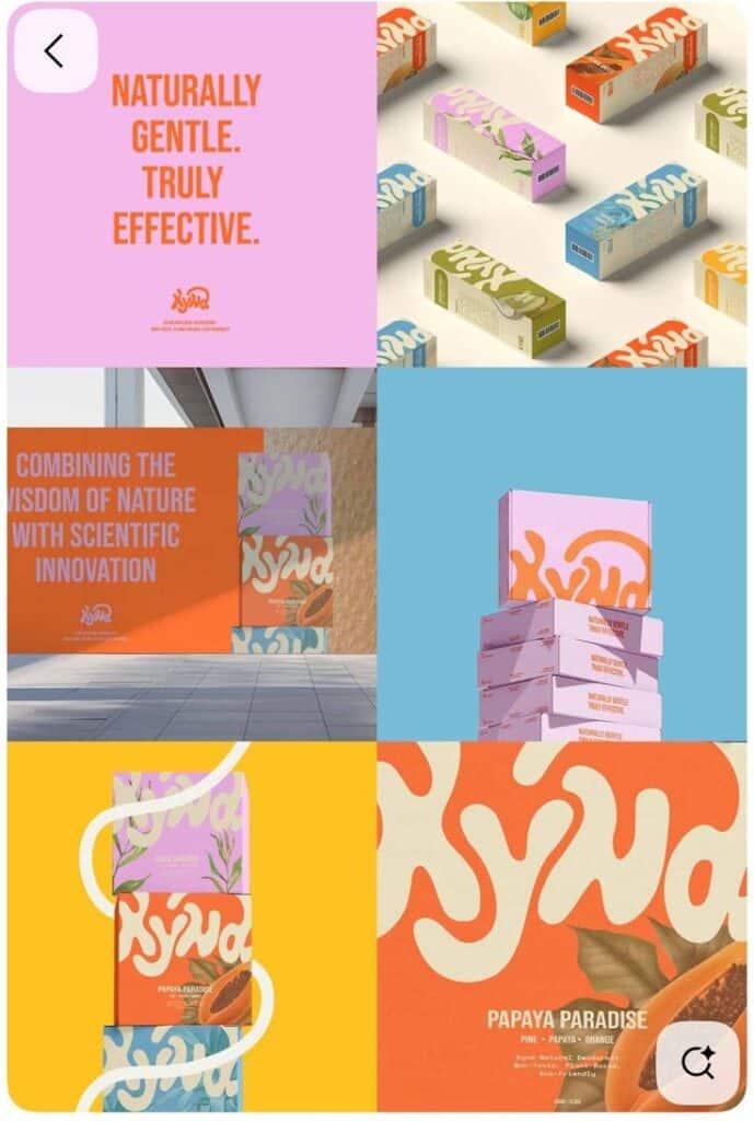
Innovative logos often use clever shapes or negative space to create hidden meanings. This can make the design more interesting and memorable. For example, a logo might combine two images into one to show what the business does.
Using geometric shapes is another way to achieve clean, modern looks. Many top brands rely on simple lines and shapes to keep their logos versatile. This ensures the logo works well on small screens or large signs.
Typography also plays a big role. Custom fonts help logos stand out. Combining unique fonts with simple graphics can create a balanced design that is easy to read and remember.
Memorable Brand Color Palettes
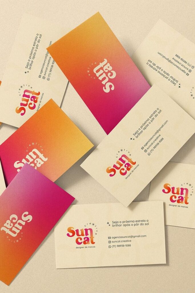
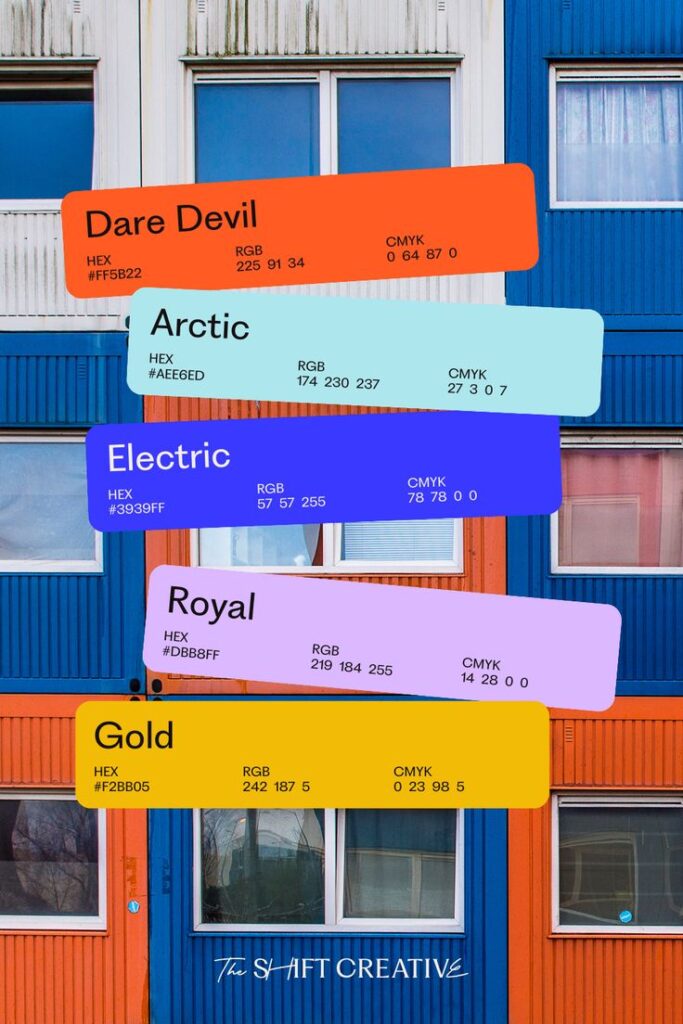
Colors affect emotions and how people view a brand. Choosing two or three main colors keeps the palette simple and consistent. Bright colors can grab attention, while muted tones suggest professionalism or calmness.
Brands often use colors to reflect their industry. For example:
| Industry | Common Colors | Effect |
|---|---|---|
| Tech | Blue, gray | Trust, innovation |
| Food & Drink | Red, orange | Energy, appetite |
| Health | Green, white | Freshness, healing |
Contrast is important. Pairing light and dark colors improves readability. Testing colors on different backgrounds ensures logos stay clear in print and digital formats.
Packaging and Print Design Ideas
Effective packaging and print design help products stand out on shelves and communicate a brand’s message clearly. These designs often focus on shape, color, texture, and layout to grab attention and enhance user experience.
Unique Packaging Styles
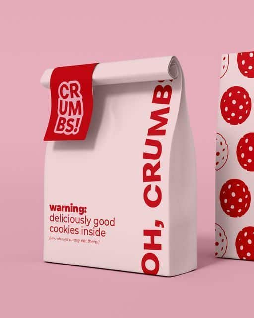
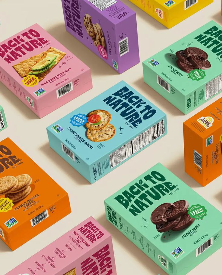
Unique packaging uses bold shapes and materials to create memorable product experiences. For example, hexagonal boxes or pyramid-shaped containers can draw attention more than regular rectangular boxes. Using eco-friendly materials like recycled paper or biodegradable plastics adds value and appeals to conscious buyers.
Designers often add special features like embossing, spot UV coating, or die-cut windows. These details make the packaging look premium and interesting. Clear, simple typography helps customers quickly understand what the product is and its benefits.
Creative Brochure Layouts
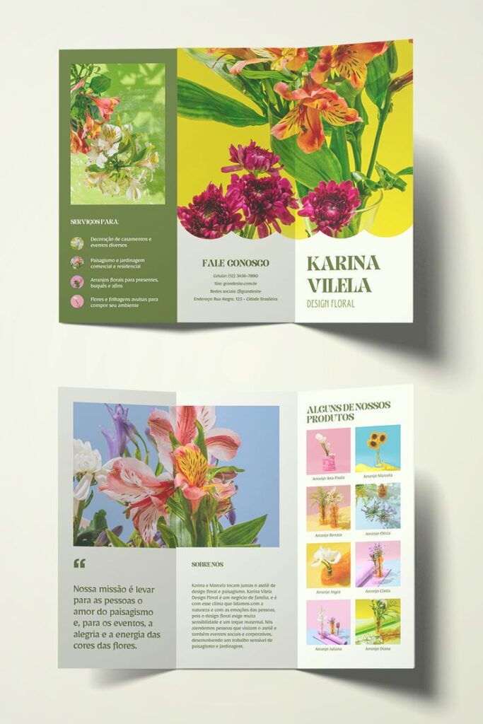
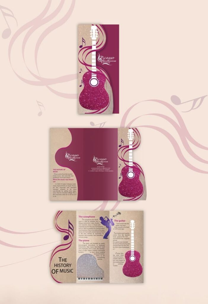
Brochures become more effective with clean, organized layouts. Using grids to structure information makes the content easy to follow. Visual elements like icons and images break up text and highlight key points.
Designers use bold headings and consistent color schemes to create flow. White space is important to avoid clutter and increase readability. Folding styles like tri-fold or accordion fold allow for interactive experiences, guiding readers through the story step-by-step.
Website and App Graphic Elements
Good graphic elements can improve how users interact with websites and apps. These elements help make navigation clear and create a unique brand feel. Design choices like buttons, menus, and icons shape the user’s experience in key ways.
Interactive User Interface Ideas
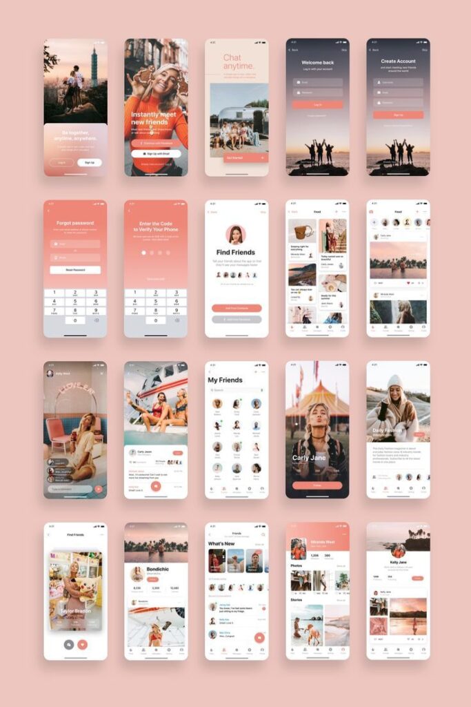
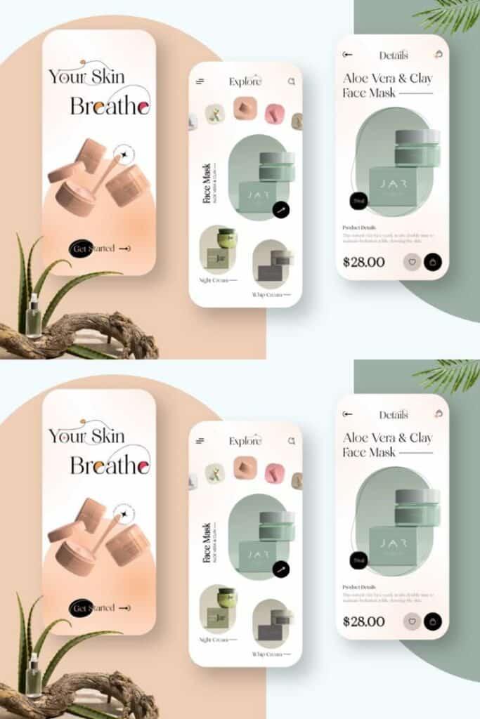
Interactive elements should be easy to spot and use. Clear buttons with color changes when hovered or clicked give users feedback. Using animation for loading screens or menu transitions keeps the interface lively without being distracting.
Consistency is important. The same style of buttons, fonts, and colors across pages helps users understand how to navigate. Adding simple effects, like shadows or borders, can highlight clickable items.
Micro-interactions such as toggles, sliders, or progress bars engage users. These small details inform users of changes, improving satisfaction and ease of use.
Custom Icon Designs
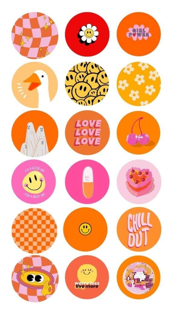
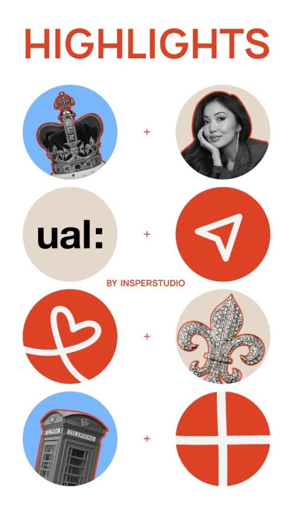
Custom icons enhance brand identity and improve usability. Unique icons tailored to the app or website’s purpose make it easier for users to recognize features quickly.
Icons should be simple and clear to avoid confusion. They need to be readable at different sizes and consistent in line weight and style.
Using an icon set that matches the overall color scheme keeps the design harmonious. Designers often create icons in multiple states (normal, hover, active) to give visual feedback.
| Key Points for Custom Icons | Details |
|---|---|
| Simplicity | Easy to understand at small sizes |
| Consistency | Uniform style throughout the site |
| Feedback | Different states for user interaction |
| Branding | Reflects the brand’s personality |
Typography-Driven Designs
Typography-driven designs rely on how text looks to capture attention and communicate messages clearly. These designs use creative lettering and strong font choices to shape a visual narrative. The focus is on type style, size, and arrangement to make the text the main design element.
Hand-Lettering Techniques
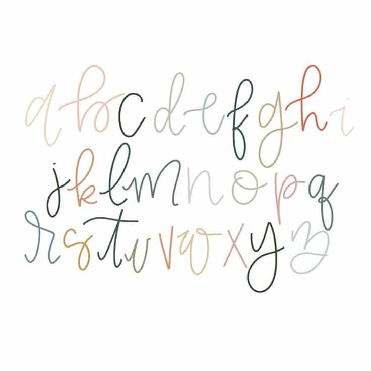
Hand-lettering involves creating custom letter shapes by hand rather than using standard fonts. It adds a personal, artistic touch that can make a design feel unique and expressive. Designers use tools like brush pens, calligraphy markers, or digital tablets to craft letters.
This technique allows for varied line thickness, flourishes, and textures that give characters personality. Hand-lettering works well for logos, posters, and invitations where originality is important. It encourages experimentation with letter shapes and spacing to enhance readability and style.
Bold Type Treatments
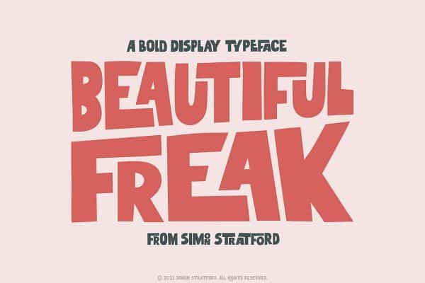
Bold type treatments focus on using strong, heavy fonts or making certain words stand out through size and weight. This method grabs attention quickly and creates clear visual hierarchies. Bold fonts are often used for headlines, titles, and important information.
Combining bold type with contrasting colors or backgrounds increases legibility and impact. Designers may mix bold with lighter or italic fonts to guide the reader’s eye and emphasize key points. Proper spacing and alignment keep bold text from appearing cluttered or overwhelming.
Illustration and Mixed Media Concepts
These concepts explore how combining different styles and materials can create unique visuals. They focus on clarity and creativity while ensuring the final work communicates its message effectively.
Vector Artwork Ideas
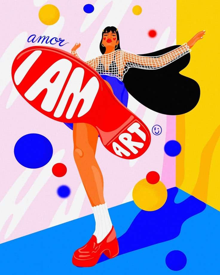
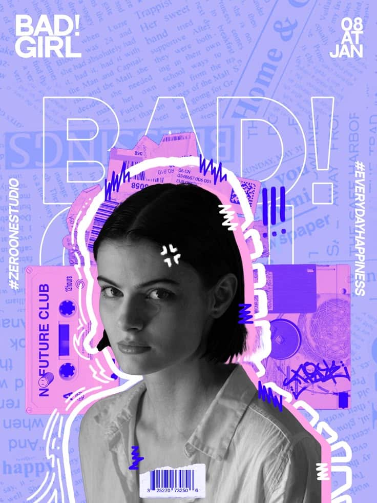
Vector artwork is made with points and paths instead of pixels. This means it can be resized without losing quality. Designers often use bright colors and clean shapes to make images stand out.
A key idea is to create simple but bold designs. Using flat colors and limited gradients helps keep the image clear. Designers can also play with geometric shapes and symmetry to balance the composition.
Using layers and grouping elements allows for easy editing. Vector art is suitable for logos, icons, and posters where sharp lines and scalability matter.
Collage and Texture Approaches
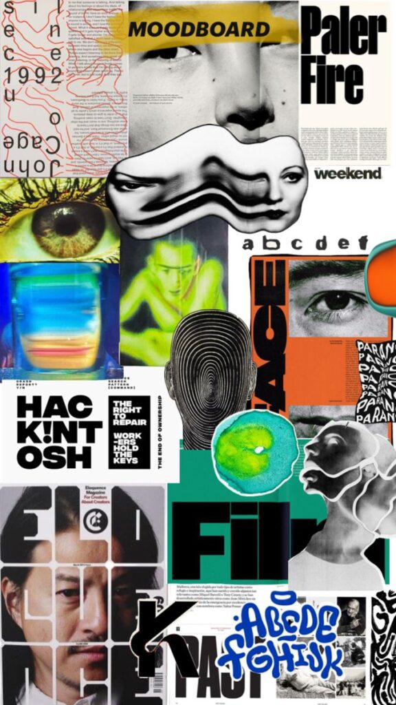

Collage mixes different materials like paper, fabric, and photographs to add visual interest. It works by layering textures and images to create depth.
Texture in collage can be rough, smooth, or patterned. Using natural materials like cloth or paper adds a tactile quality that digital art alone can’t achieve.
Combining digital and physical collage techniques also expands creative options. Designers might scan textured materials or draw over collages to blend styles.
A useful list for collage textures:
- Torn paper edges
- Fabric scraps
- Printed patterns
- Brush strokes
- Photographic elements
These ideas help produce rich, dynamic images that attract attention.
Motion and Animation in Graphics
Motion adds life and depth to graphic design. It creates a dynamic experience that captures attention. Animation techniques can make visuals more memorable and engaging.
Animated Logo Designs

Animated logos use movement to enhance brand identity. A simple animation like a fade-in, rotation, or morphing shape draws viewers’ focus. These designs often repeat smoothly to keep consistency without distraction.
Key benefits include clearer storytelling and stronger brand recall. Brands may animate elements linked to company values or products. For example, a tech company might use glowing circuits or digital pulses.
Designers balance complexity with clarity. Too much motion can overwhelm the viewer or slow page load times. Using subtle movements keeps logos professional and effective across platforms like websites and social media.
Kinetic Typography Concepts

Kinetic typography involves moving text to convey meaning or emotion. It combines fonts, size changes, color shifts, and motion paths to guide reader focus. This method helps emphasize key messages in ads, videos, or presentations.
Common techniques include sliding text, pulsing letters, or bouncing words. Movement timing matches speech or music rhythms for better engagement.
This style improves readability and adds personality to plain text. Designers pick fonts and animation types that reflect the tone of the content, whether serious, playful, or dramatic.
Effective kinetic typography balances animation speed and legibility to avoid confusing viewers. It turns static words into visual storytelling tools.
Sustainable and Eco-Friendly Design Trends
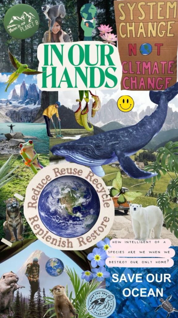

Sustainable graphic design focuses on reducing waste and using eco-friendly materials. Designers choose resources that have less impact on the environment, such as recycled paper or plant-based inks.
Many designers use minimalist layouts to save ink and energy. Simple designs with fewer colors and shapes reduce printing costs and environmental damage.
Digital design also plays a role. Creating online content instead of printed materials cuts down paper use. This helps businesses lower their carbon footprint.
Here are some common eco-friendly practices used in graphic design:
| Practice | Description |
|---|---|
| Recycled materials | Using paper and other supplies made from recycled sources. |
| Soy-based inks | Inks made from soy that are less toxic and easier to recycle. |
| Digital-first design | Prioritizing digital content over print to reduce waste. |
| Minimal color use | Limiting colors to save ink and energy during printing. |
Designers also focus on durability, creating work that lasts longer instead of single-use projects. This approach supports sustainability by reducing the need for frequent reprints.
Overall, sustainable graphic design is about balancing creativity with environmental responsibility. It encourages thoughtful choices that lower the ecological impact without sacrificing quality.
- 3.7Kshares
- Facebook0
- Pinterest3.7K
- Twitter0
- Reddit0
