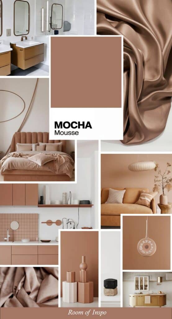
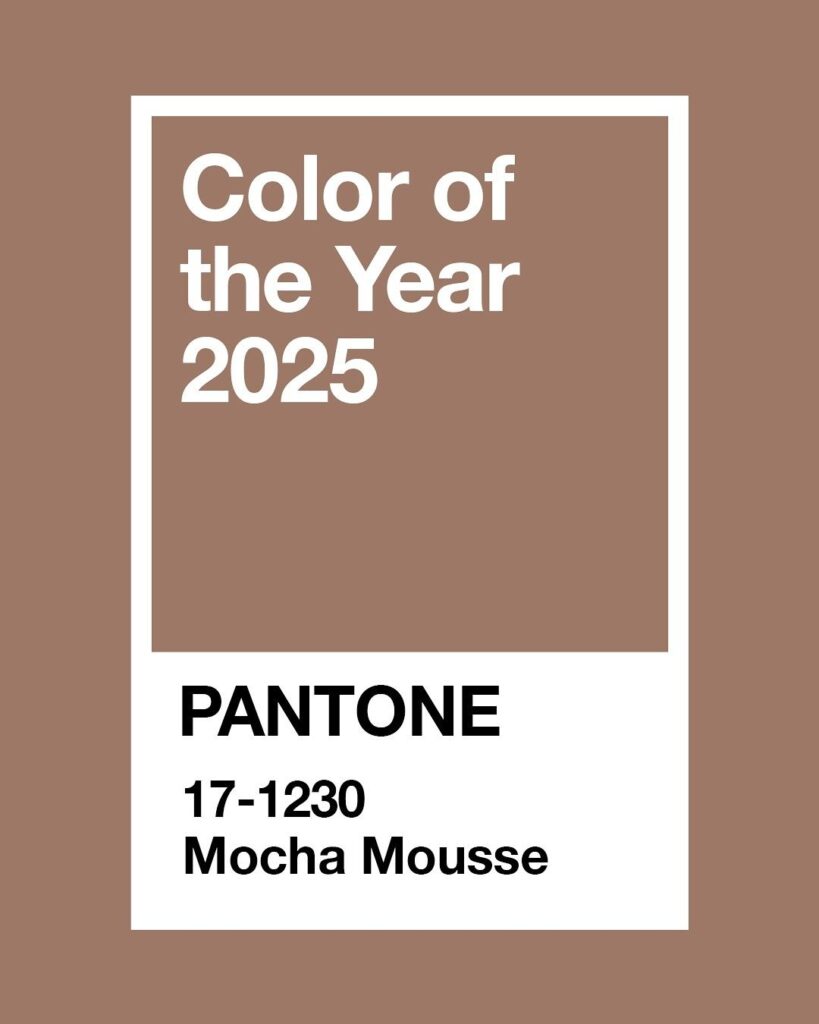
Every year, Pantone chooses a special color meant to set the tone for design, fashion, and culture worldwide. The Pantone Color of the Year is a carefully selected hue that influences trends across many industries. This color reflects what is happening in society and what people may need in their lives.
Pantone experts study different fields like art, technology, and social movements before picking the color. It’s not just about picking a pretty shade; it’s about capturing a mood or feeling for the year ahead. This choice guides designers and brands in their creative decisions for months.
People look forward to the announcement because it helps shape products and styles in homes, clothing, and advertising. Knowing this color helps individuals and companies stay current and relevant in a changing world.
Key Takeways
- The Pantone Color of the Year impacts many design fields.
- Experts choose the color based on cultural trends and mood.
- The color guides creative choices across products and marketing.
What Is the Pantone Color of the Year?

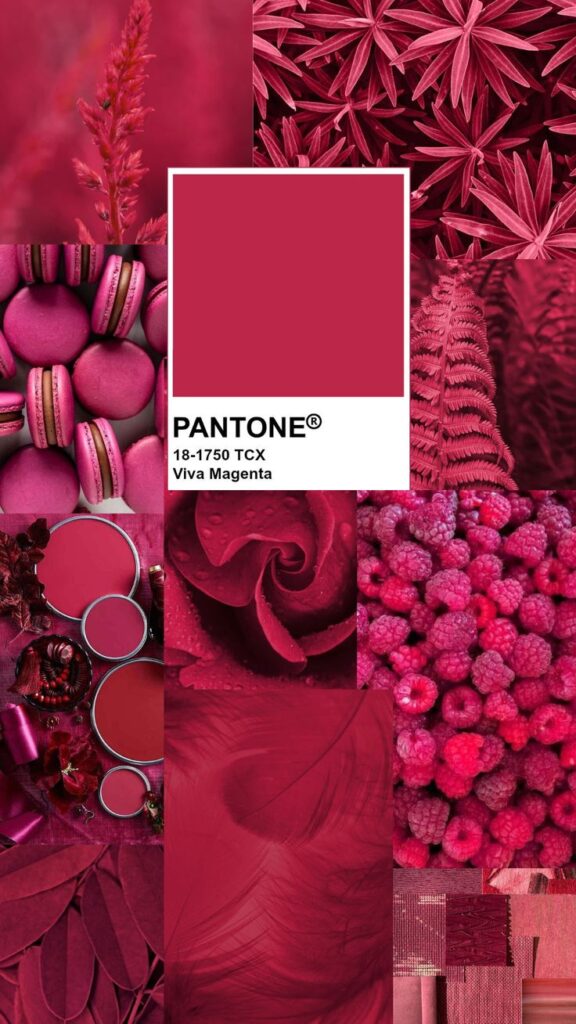
The Pantone Color of the Year is a color chosen each year by the Pantone Color Institute. It represents a trend in color that influences many industries like fashion, design, and marketing.
Each year, experts study global trends in culture, technology, and society. They pick a color that reflects the mood and values of the time. This color often appears in products, advertising, and art throughout the year.
The chosen color is more than just a shade. It is meant to inspire creativity and connect people. Pantone shares a detailed description of why they selected the color and what it symbolizes.
Pantone Color of the Year highlights:
| Year | Color Name | Color Code |
|---|---|---|
| 2023 | Viva Magenta | 18-1750 |
| 2024 | Digital Lavender | 15-3935 |
The color can be bold or soft. It changes each year depending on what Pantone’s experts observe in culture and design.
History of the Pantone Color of the Year
The Pantone Color of the Year was created to reflect cultural moods and trends. This yearly announcement has influenced fashion, design, and marketing worldwide. It started from a simple idea and grew into a global phenomenon with notable colors shaping visual styles over time.
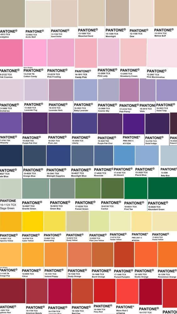
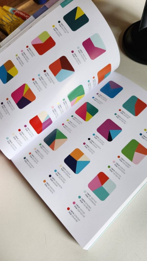
Origins of the Program
Pantone introduced the Color of the Year in 2000. The goal was to highlight a color that could capture the feelings and attitudes seen in society. A team of experts studies trends in art, entertainment, fashion, and technology before choosing the color.
The selection process is careful and detailed. They look for colors that represent the current cultural climate and can inspire designers. It is meant to influence people’s choices in fashion, home decor, and product design.
Key Milestones
In 2000, Pantone started with Cerulean Blue. Since then, the program has grown in importance and recognition. In 2016, for the first time, two colors were chosen: Rose Quartz and Serenity.
Other milestones include how the chosen colors have sometimes reflected societal moods. For example, in 2020, Classic Blue signified calm and stability during uncertain times. The program’s choices often spark discussions about culture and design trends globally.

Notable Past Colors
Some past Colors of the Year include:
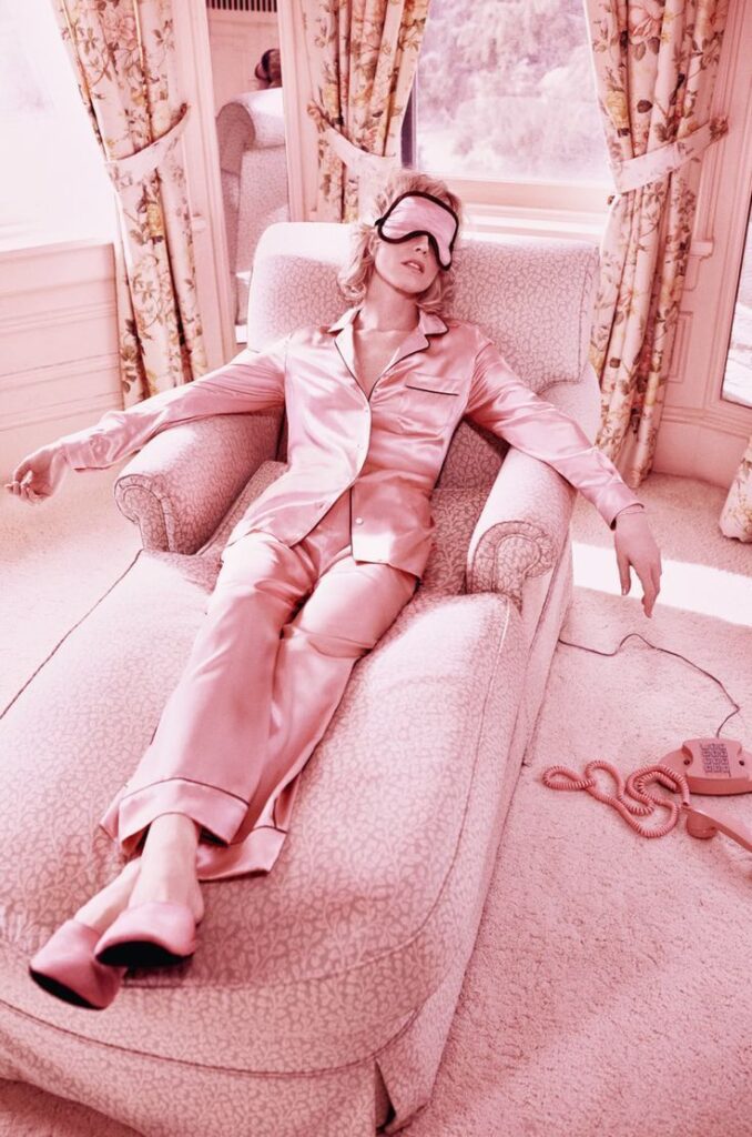
- Millennial Pink (2016): Popular in fashion and social media.
- Ultra Violet (2018): Linked to creativity and originality.
- Living Coral (2019): Represented optimism and warmth.
- Classic Blue (2020): Symbolized calmness and dependability.
These colors frequently influence more than design—they shape advertising, technology products, and public mood. Each year, the chosen shade reflects something unique about the time.
Selection Process
The Pantone Color of the Year is chosen through a detailed method. It involves careful judgment based on specific guidelines and input from experts. Trends and social influences also play a strong role.
Criteria for Selection
The color must reflect current cultural moods and social attitudes. It often shows optimism, stability, or change in society. The choice balances beauty, versatility, and emotional impact.
Colors are also assessed for how well they perform in design and marketing. Pantone looks for hues that can be used across fashion, tech, products, and interiors. The color must be adaptable and easy to pair with other shades.
Pantone Color Institute Team
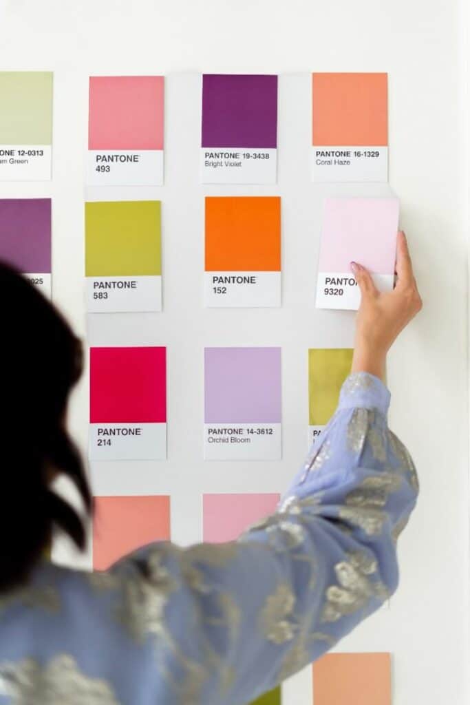
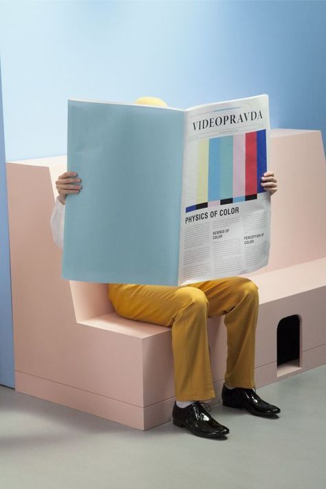
A team of color experts leads the selection. This includes designers, trend forecasters, and color psychologists. They review thousands of color options each year.
The team works year-round to spot new ideas. They analyze art, media, travel, and technology to find emerging colors. Final decisions are made after group discussions and testing.
Research and Influences
The process relies on global trend research. The team studies fashion shows, films, and pop culture worldwide. They observe political and economic changes that affect color moods.
Environmental issues and digital advances also influence choices. Sometimes, a color symbolizes a response to world events. The research ensures the chosen color stays relevant and meaningful.
Influence on Design and Fashion
The Pantone Color of the Year shapes many industries by setting clear trends for colors that will be popular and widely used. This choice affects the way designers create fashion, interior spaces, and products. Specific shades drive the color palette choices and influence purchasing decisions for months.
Impact on Fashion Industry

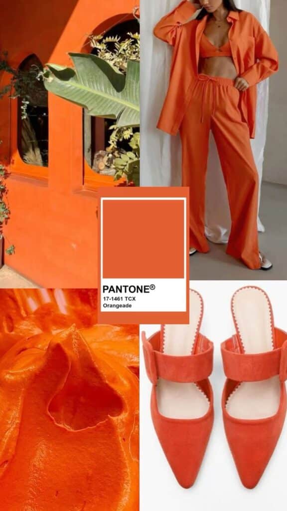
Designers use the Pantone Color of the Year to guide their fabric selections and seasonal collections. This color often appears on runways, in retail stores, and in collaborations between brands. It helps create fresh looks that feel current and relevant.
Fashion buyers and merchandisers rely on this color to predict consumer interest. Brands may produce clothing, accessories, and footwear featuring this shade to attract trend-conscious customers. It also impacts marketing campaigns focused on key colors.
Adoption in Interior Design


Interior designers incorporate the chosen color into spaces to convey mood and style. It appears in paint, textiles, furniture, and decorative items. Using this color can make rooms feel modern and up-to-date.
The color influences popular palettes for homes, offices, and public spaces. It helps professionals coordinate with other colors and materials. Choosing this Pantone shade ensures interiors feel connected to current design trends.
Effect on Product Development
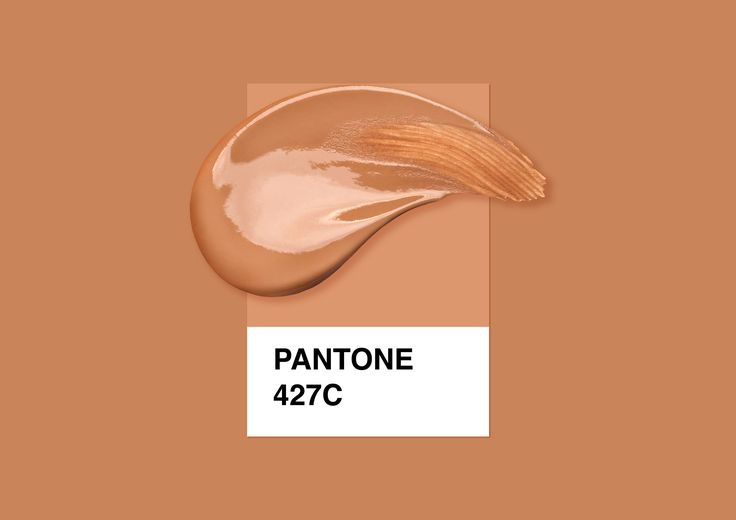
Manufacturers use the Pantone Color of the Year when designing new products to attract buyers. This can include electronics, packaging, and household goods. Products featuring this color often stand out on shelves.
The color choice affects materials and finishes selected for new releases. By aligning products with this trend, companies can increase appeal and relevance in the market. It also supports a cohesive look across multiple product lines.
Pantone Color of the Year 2025
The Pantone Color of the Year 2025 highlights a specific hue chosen for its cultural relevance and design impact. This color reflects current social trends and influences multiple industries such as fashion, interior design, and marketing.
Official Announcement
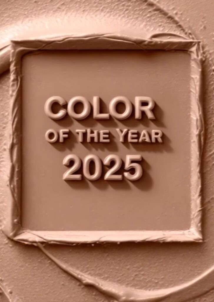
Pantone announced the 2025 Color of the Year on December 6, 2024. The selection was revealed through a global press release supported by social media and live events. The announcement targeted designers, brands, and consumers worldwide.
The reveal included the official Pantone color code and name. Pantone explained the rigorous process involved in selecting the color, which includes trend analysis and input from experts in color theory, art, and consumer behavior.
Chosen Color Overview
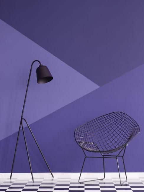
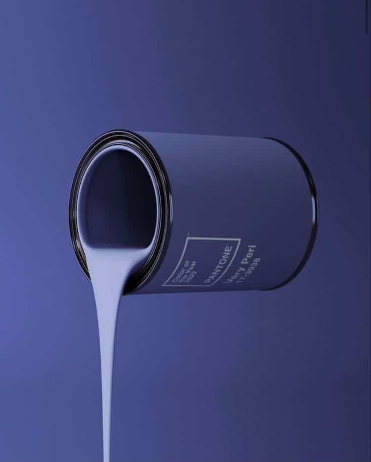
The 2025 color is PANTONE 17-3938 Very Peri, a dynamic periwinkle blue with violet-red undertones. This shade combines cool blue hues with energetic warmth, creating a unique and versatile color.
It works well in both fashion and technology sectors. Designers appreciate its bold yet approachable tone, making it suitable for creative and corporate environments alike.
Meaning and Symbolism
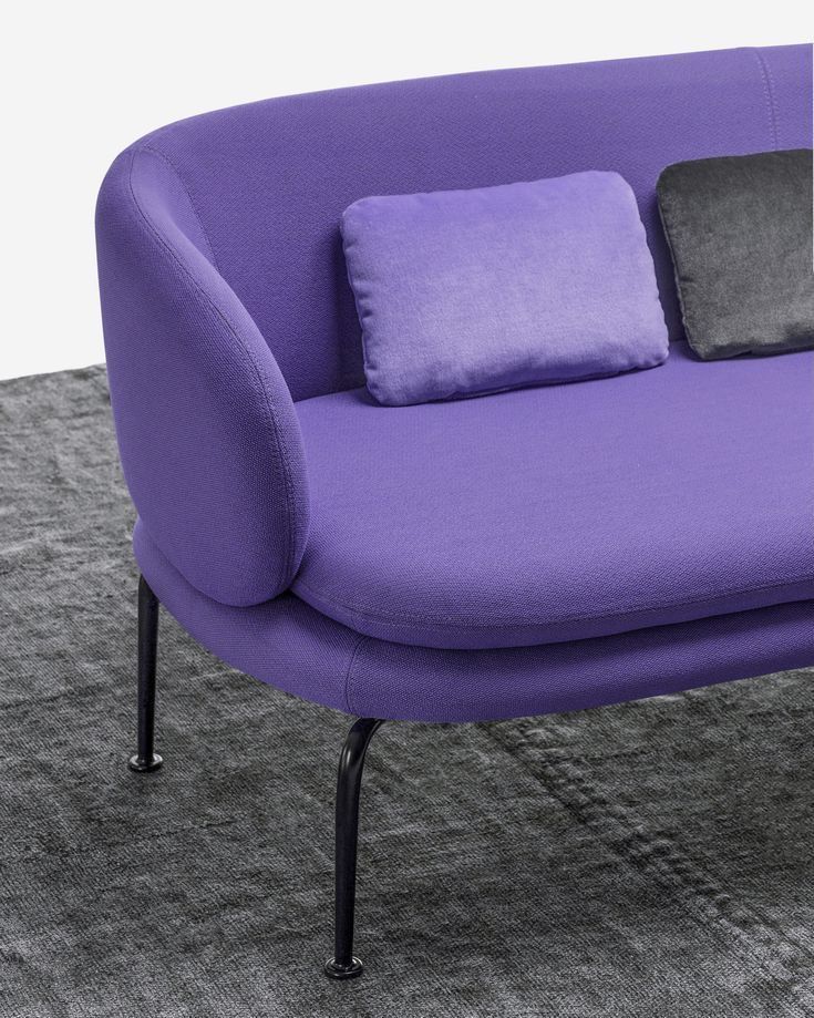
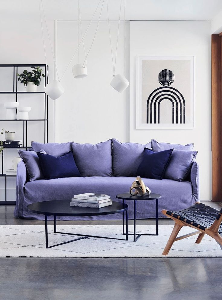
Very Peri represents transformation and new possibilities. It captures the spirit of innovation and creativity in an evolving world. The color symbolizes courage and curiosity amid change.
It’s also linked to hope and imagination, encouraging people to explore new ideas with confidence. Brands use Very Peri to signal forward-thinking and positive energy in their messaging.
Trends Inspired by Recent Pantone Colors
Recent Pantone Colors of the Year have shaped how designers and consumers use color. Choices in color pairs, where the colors appear, and how people respond to them show clear trends.
Color Combinations
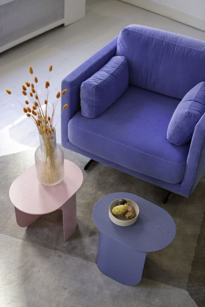
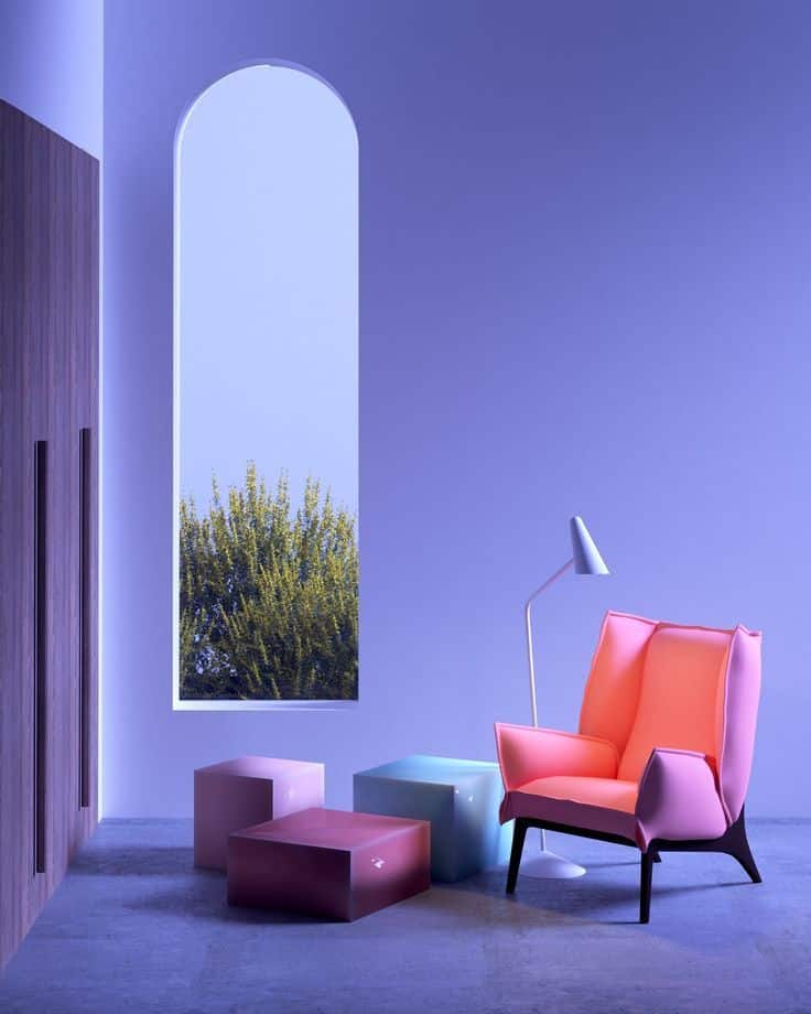
Pantone’s recent colors often pair with neutral tones like beige, gray, or white to balance boldness. For example, a bright coral may be matched with soft cream to reduce visual intensity.
Some colors are combined with unexpected shades to create energy. A classic blue might appear alongside vibrant yellow. This contrast draws attention in fashion and home decor.
Monochromatic palettes are also common. Using different shades of the same color adds depth without complicating the look. This technique works well in graphic design and branding.
Popular Applications
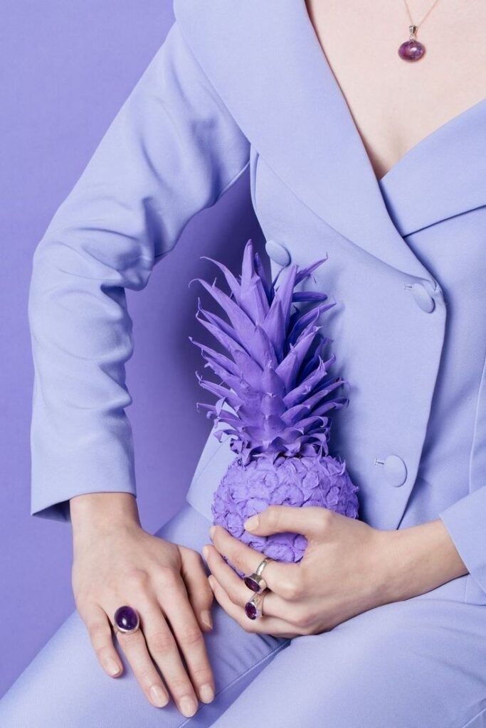
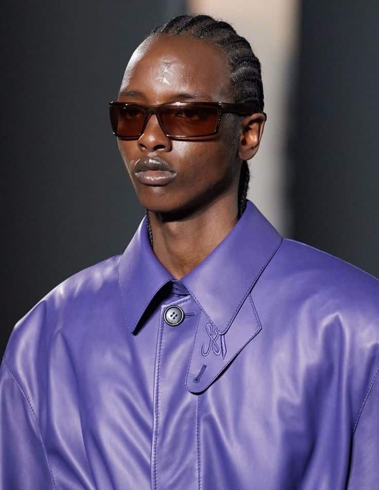
Fashion uses Pantone colors for seasonal collections, especially in footwear and accessories. Clothing brands often highlight these colors to connect with current style trends.
Interior design applies these hues to walls, furniture, and textiles. For example, muted greens inspire a calming environment in living rooms and offices.
Product packaging leverages these colors to catch buyers’ eyes on shelves. Tech gadgets, cosmetics, and food brands frequently update their designs based on the annual color.
Consumer Reception
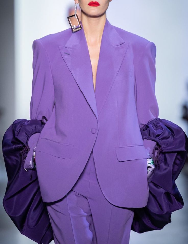
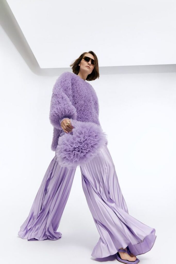
Consumers generally respond positively to Pantone selections, associating them with modernity and freshness. Social media trends amplify interest as influencers feature new color styles.
However, some choices are polarizing. Bright or unusual shades may get mixed reactions, sometimes limiting their commercial success.
Surveys show a preference for colors that feel natural or comforting during uncertain times. This affects how widely these colors are adopted in daily life.
Comparing Pantone Color of the Year with Other Color Trends
The Pantone Color of the Year often influences many industries, but it works differently compared to other color trends. Its impact varies depending on the source and market.
Pantone vs. Paint Companies
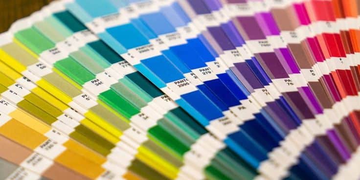
Pantone sets a single color annually based on broad cultural and design research. Paint companies, like Sherwin-Williams or Benjamin Moore, release multiple color palettes each year. These palettes focus more on consumer preferences and practical home use.
Pantone’s color drives fashion, graphic design, and branding more than paint trends. Paint companies often consider room lighting, material textures, and customer feedback. This results in a wider variety of colors suited for interior spaces.
In comparison, Pantone’s choice is a strong, symbolic color meant to capture a feeling or mood for the whole year. Paint brands prioritize palette flexibility and home decorating needs over symbolism.
Influence on Global Markets
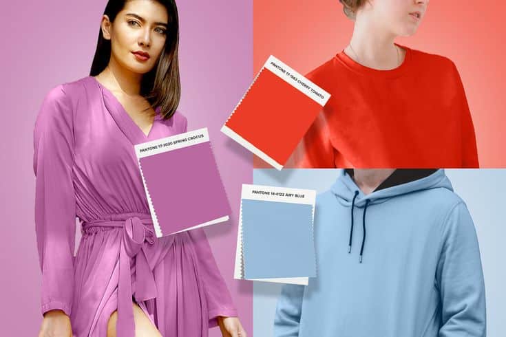
Pantone’s Color of the Year affects the global fashion and design markets through media coverage and partnerships. It sets a tone that many industries follow when creating new products.
In contrast, color trends from paint companies mainly influence local or national home improvement markets. Their sales data and customer trends shape their yearly color selections.
Pantone also works with large brands worldwide, giving it broad reach. Paint companies’ trends have less global impact but more direct influence on home and office decor choices.
| Aspect | Pantone Color of the Year | Paint Company Color Trends |
|---|---|---|
| Number of Colors | One key color per year | Multiple colors and palettes yearly |
| Influence Scope | Global fashion, design, branding | Local/national home design markets |
| Basis for Selection | Cultural mood and design research | Consumer preferences, sales data |
| Industry Impact | Fashion, graphic design, product | Home improvement, interior painting |
Predicting Future Pantone Colors
The choice of future Pantone Colors is based on clear trends and scientific methods. Both cultural changes and data analysis play a key role in shaping these predictions.
Emerging Influences
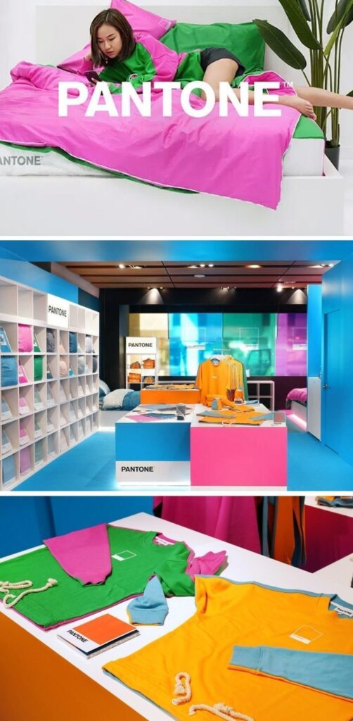

Pantone experts watch many areas to find colors that will resonate. These include shifts in technology, fashion, nature, and social movements. For example, the rise of clean energy and sustainability often leads to choosing earthy or green tones.
Global events like political changes or health crises also affect color preferences. When people seek calmness, Pantone may highlight soothing blues or soft neutrals. Designers and artists influence choices by introducing new color combinations in their work.
Forecasting Methods
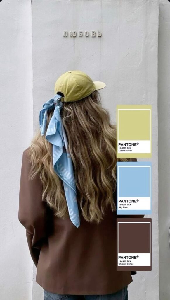
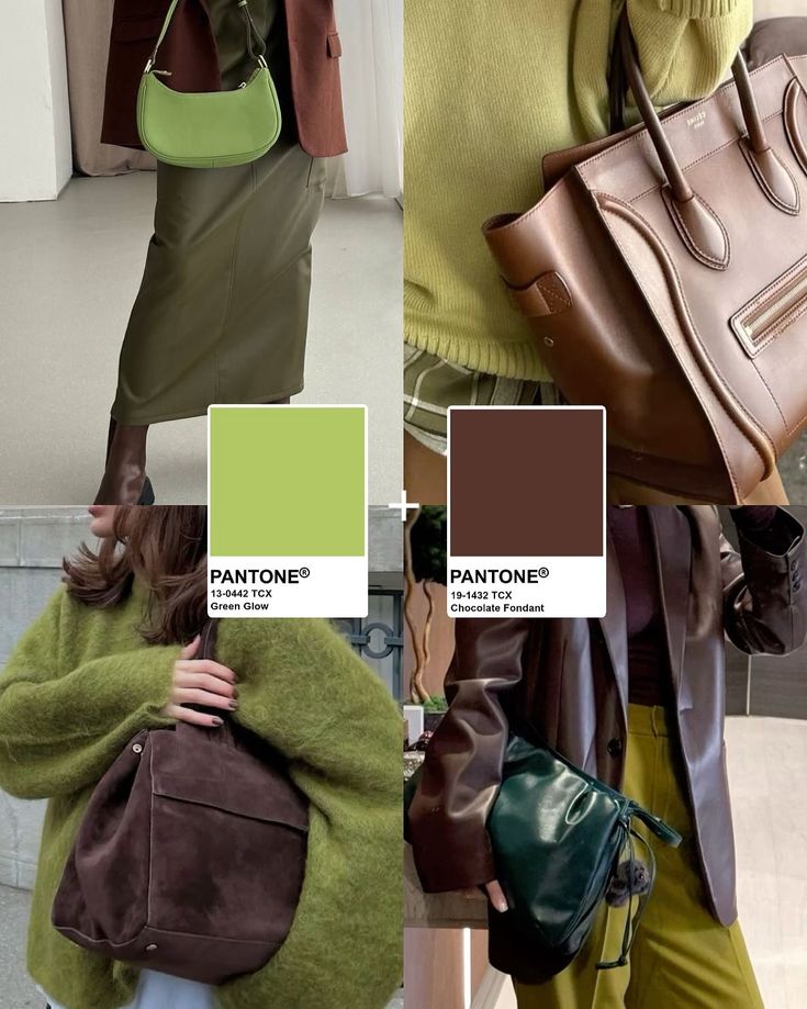
Pantone uses a mix of technology and expert insight. They track product launches, runway shows, advertising, and film. Data on consumer buying habits supports these observations.
They also attend global trade shows and collaborate with trend forecasters. This helps identify emerging colors before they become mainstream. A team of experts reviews all this information to finalize the color choice.
Key tools include:
- Social media analysis
- Market research
- Cultural studies
- Environmental data
These methods keep their predictions accurate and relevant.
Pantone Color of the Year in Branding and Marketing
Pantone’s color choice influences how brands plan and execute their marketing efforts. It often shapes product designs, promotional materials, and consumer engagement strategies.
Brand Collaborations
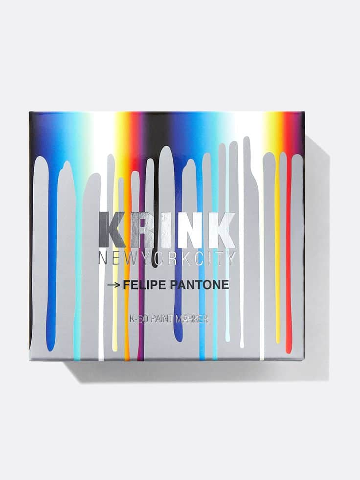
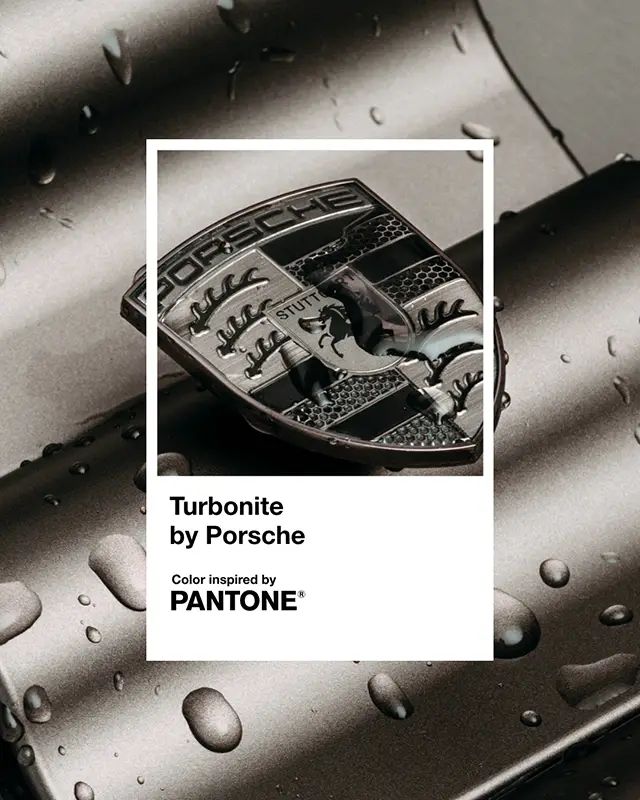
Brands use the Pantone Color of the Year to create limited-edition products or special collections. This helps them attract attention and boost sales by tapping into a current trend.
Collaborations often involve designers, artists, or other brands to make unique items using the chosen color. This partnership builds excitement and freshens the brand’s image.
Some companies also launch packaging updates in the Pantone color. This seasonal change signals to customers that the brand is current and fashion-forward.
Campaign Strategies

Marketers integrate the Pantone Color of the Year into their ads to evoke specific moods tied to that color’s meaning. For example, a calming blue might promote trust and reliability.
The color is used across multiple platforms, including social media, websites, and print ads. Consistent use helps reinforce brand identity and increases recognition.
Campaigns often highlight the color in visuals and slogans, linking it to the brand’s message or product benefits. This creates a clear, focused appeal to consumers.
How to Use the Pantone Color of the Year
The Pantone Color of the Year can be applied in different ways, from fashion choices to digital design. Knowing practical methods makes it easier to use this color effectively.
Incorporating into Personal Style
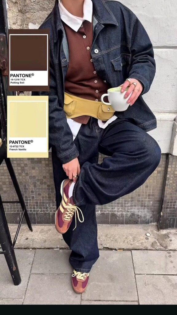
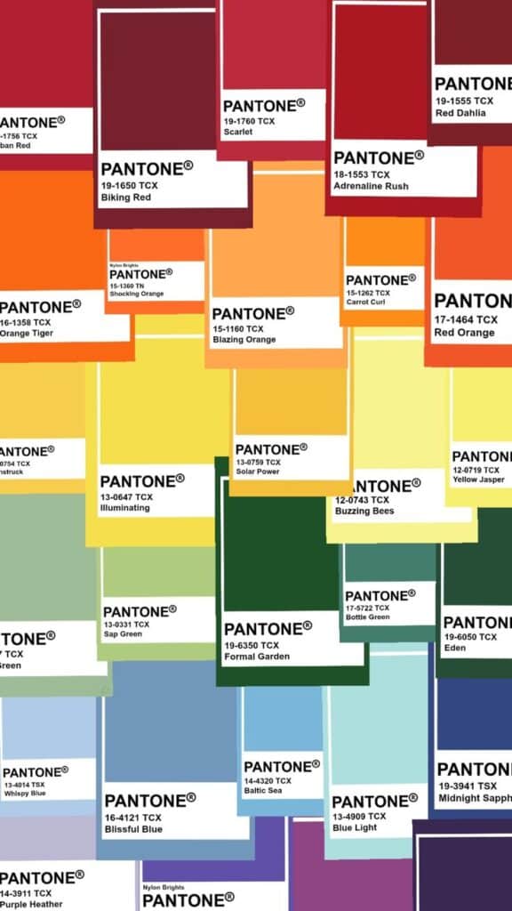
Using the Pantone Color of the Year in clothing and accessories updates a wardrobe without a full makeover. It works well in smaller items like scarves, ties, or shoes to add a pop of color.
She or he can also choose statement pieces such as jackets or dresses that feature the color. Balancing the color with neutral tones like black, white, or beige keeps the look clean.
Mixing textures like cotton, leather, or silk with the Pantone shade can create variety without clashing. This color also pairs with similar hues for a bold effect or with contrasting colors for a sharper look.
Utilizing in Digital Media
In digital design, the Pantone Color of the Year sets a current and trendy tone. Using it in website headers, buttons, or icons can attract viewers’ attention.
Designers should check color contrast for readability, especially with text or backgrounds. The color can complement a digital palette if used sparingly to highlight key areas.
Social media graphics and ads also benefit from this color as it shows awareness of design trends. It works well with flat design and minimalist styles when balanced correctly.
Tips for using the color digitally:
- Use the Pantone color for call-to-action buttons.
- Pair it with neutral backgrounds for clarity.
- Avoid overusing to keep a clean look.
- 3shares
- Facebook0
- Pinterest0
- Twitter3
- Reddit0


